Many healthcare platforms fail because their interfaces were never designed to work as one connected system. Just imagine a patient portal that looks nothing like the clinician dashboard that feeds it. Or the scheduling module, which behaves differently from the lab results screen. And every new feature ships with its own interpretation of what a button, an alert, or a data table should look like.


It’s a structural problem, stemming from the absence of design systems built for the specific demands of clinical environments. In this article, we’ll break down why generic design frameworks fall short in health tech and how product teams can close the gap between “looks fine” and “works safely at scale.” Drawing on our own experience designing complex healthcare products at Halo Lab, we’ll explain what a healthcare-specific design system actually looks like.
Why most healthcare digital products feel inconsistent
Open any hospital’s patient portal, then switch to their provider-facing dashboard, then check the mobile app. More often than not, these three experiences feel like they were designed by entirely separate teams with no shared playbook.
Often, healthcare organizations develop digital solutions independently. For example, one third-party vendor might handle the integration of an electronic health record system. Another vendor could focus on building a telehealth module. At the same time, a separate team may develop a mobile app and related features (alerts, form fields, navigation elements, etc.) that guide patients to these solutions. The result is a patchwork of interfaces that may individually work, but collectively create friction for everyone who touches them.
{{banner}}
The fragmentation is getting worse
The fragmentation isn’t just a cosmetic issue. It has real clinical consequences. When a nurse sees a red badge in one module but a red banner in another — both meaning “urgent” — she has to pause and re-interpret. That pause, in a fast-moving clinical environment, costs time. And in healthcare, time costs more than money.
The shift toward multi-product ecosystems in healthcare has accelerated the problem. A mid-sized health system may have several software applications to help manage appointments, lab testing, video visits, corporate in-app messaging, and revenue, with each system using a different graphic or visual platform.
This challenge mirrors what we see in enterprise B2B SaaS design, but healthcare adds regulatory stakes and clinical safety concerns. Add wearable integrations and third-party pharmacy tools, and you have a digital estate that looks less like a unified platform and more like a junk drawer of disconnected screens.
The American Medical Association estimates that clerical and administrative activities, such as documentation, order entry, billing and coding, and system security, made up nearly half of total EHR usage, totaling 157 minutes or 44.2%. If the professionals who use these tools every day struggle to navigate them, what happens when patients — often anxious, overwhelmed, or elderly — try to make sense of their own health data across these interfaces?
What a design system actually is
Let’s clear up a misconception before we continue. The term “design system” refers to much more than simply a style guide. It includes living examples of reusable components, tokens, patterns, and guidance for how to build an interface for any product over time, regardless of the organization or team that lags.
Imagine all the buildings in a given city built to different codes based on their specifications; a design system is an organized set of construction codes that governs the construction of all the structures within that defined area. Some doors open inward, others outward. Light switches are in different places. Stairwells look different in every structure. You can still use any individual building — but the city as a whole is disorienting. If you want a deeper primer on what goes into a design system from a UX perspective, explore our UX design system guide.
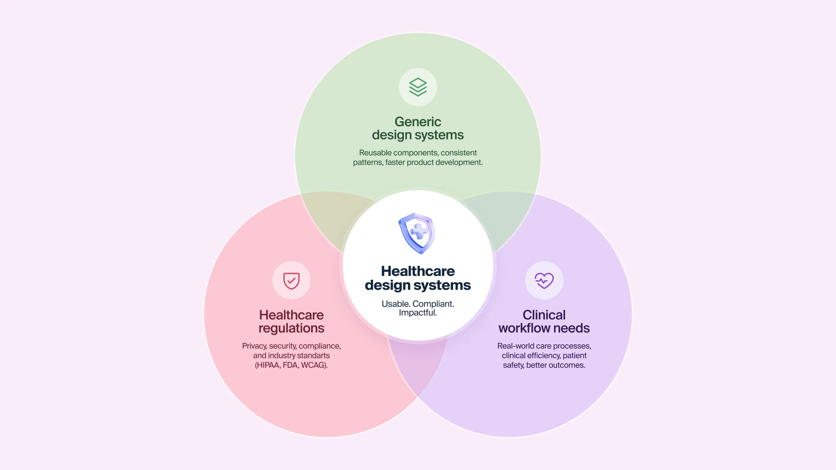
Why generic design systems don’t work for healthcare
Companies like Google, IBM, and Shopify have well-known public design systems — Material Design, Carbon, and Polaris. They’re excellent resources and sensible starting points. But they were built for consumer and enterprise SaaS, not for environments where a misplaced alert can delay a medication order, or where the user might be a 73-year-old patient recovering from surgery.
“Design systems give teams creative freedom by removing the guesswork. When the infrastructure is solid, innovation becomes safer.”
Healthcare design systems need components that generic systems simply don’t include:
- Clinical data visualization patterns define how to display vital signs, lab trends, and medication timelines in ways that are immediately interpretable by clinicians under pressure.
- Role-based interface logic states that a nurse, a physician, a patient, and a billing administrator all need different views of the same data, with different interaction patterns and different levels of complexity.
- Accessibility standards calibrated for medical contexts. It’s not just about meeting the minimum requirements, but about designing for users with tremors, low vision, cognitive fatigue, or limited digital literacy.
- Consent and privacy UX patterns. These components help to handle data permissions, identity verification, and sensitive information display in a way that builds trust without adding friction.
- Alert hierarchy and severity mapping is a critical vital sign alert, and a billing reminder should never look the same; the design system should enforce that distinction at the component level.
Without these healthcare-specific patterns baked into the system, teams default to improvisation. And improvisation at scale across multiple products, multiple teams, multiple releases is how inconsistency becomes structural.
{{banner-2}}
The real cost of not having healthcare design systems
The absence of a dedicated healthcare design system doesn’t just affect the look and feel of products. It impacts speed, safety, and budget in ways that often go untracked.
Slower development cycles
When all product teams are creating constituent parts individually, it takes much longer to develop new products. For instance, designers create buttons, text fields, and navigators whenever a single team has previously made these items (six months prior). Developers also create original CSS styles for each of these elements instead of pulling them from a common repository. QA engineers test the same interaction patterns repeatedly because there’s no documented standard to verify against. This redundancy is one of the most underestimated costs in healthcare software development.
Higher clinical risk
Clinical users have to deal with additional cognitive load due to inconsistent user interfaces (UIs). In the case of clinicians who have to remember what the “red” color is for the EHR, scheduling tool, and lab module, this requires them to use mental resources toward interface translations rather than patient care.
According to the National Academies of Sciences, Engineering, and Medicine, roughly 40,000 to 80,000 deaths each year are due to diagnostic errors within the United States. While poorly designed UIs are not the only factor involved, fragmented and confusing interfaces do delay diagnostic processes and cause missed alert notifications and data entry mistakes.
Mounting technical debt
There is an accumulating total of debt as each new feature is added, when there is no unified system to develop against. For example, a custom modal from one team may conflict with another team’s notification style. As product teams develop components, their component naming conventions begin to drift. Accessibility compliance (which should be consistent across the entire product suite) becomes an issue at the product level. Thus, accessibility compliance will be audited and addressed as though each module were a stand-alone item.
Over time, this debt becomes a barrier to growth. Launching a new product feature requires reconciling multiple inconsistent codebases. Onboarding a new designer means learning three different component libraries instead of one.
What a healthcare-specific design system looks like in practice
Several organizations have begun building design systems tailored specifically to healthcare, and the results illustrate what’s possible when the infrastructure matches the domain. Let’s take a look at these exemplary systems.
The NHS design system
Perhaps the most mature healthcare-specific design system in the world, the NHS digital service manual provides components, patterns, and content guidance specifically designed for health and care services. It was built on top of the GOV.UK design system, but adapted for the unique needs of healthcare users. Its longer-form content pages, clinical signposting components, and accessibility standards go beyond minimum compliance.
What makes the NHS approach instructive is not just the components themselves, but the governance model behind them. Teams across the NHS contribute to and draw from the shared system, and each component has documented research backing its design decisions. This community-driven approach means the system improves as more teams adopt it.
Better’s clinical design system
Better, a digital health company, built a design system specifically for clinical applications. It includes four distinct layers: basic UI building blocks, application-level patterns, clinical form components, and a content style guide for notifications and alerts. The clinical form layer is particularly significant, since its forms are the primary data-collection instrument in healthcare. Better dedicated substantial effort to making them safer to fill and easier to build.
Their team also adopted guidelines from the NHS and other healthcare organizations, then extended them with patterns specific to their own product suite. This is a sensible model, where you start from established healthcare design standards, then layer your product-specific needs on top.
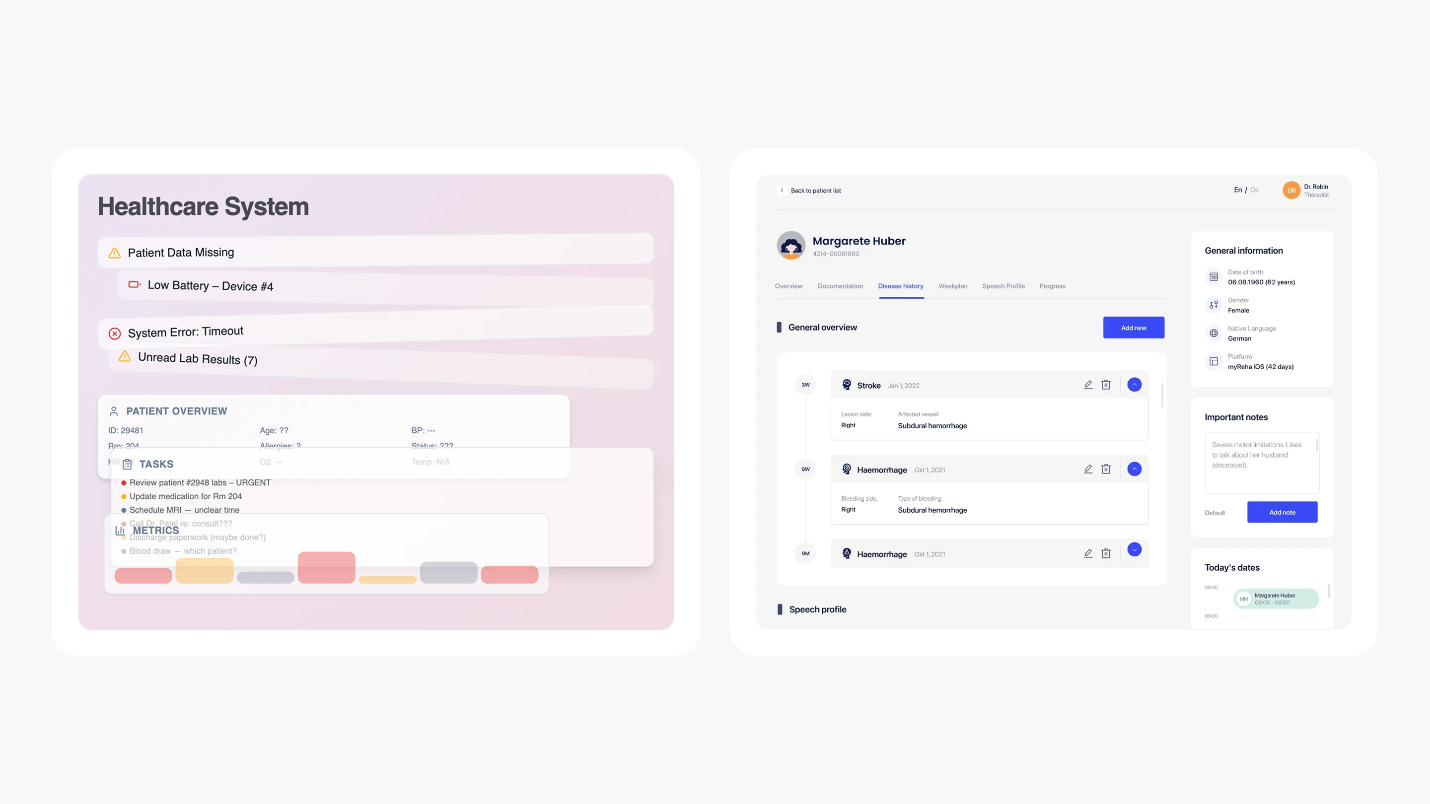
What Halo Lab has learned building healthcare products
In our work on the LIS (Laboratory Information System), we designed a complex role-based system serving lab technicians, pathologists, and administrators — each needing distinct workflows within a single interface. The challenge was maintaining consistency across very different user journeys without creating cognitive overload. We built a reusable component library with Material UI components, which gave us speed and visual coherence from the start.

A similar approach shaped our work on Develop Health, a US healthcare AI startup that automates prior authorization and optimizes medication access. The branding and web design deliberately broke away from the typical cold-blue healthcare aesthetic — using a bold orange-and-yellow palette grounded in Swiss-style design principles. Every visual decision, from color tokens to typography scale, was documented as part of a cohesive system that the client’s team could extend as the product grew.
“When every screen follows the same design logic, clinicians spend less time learning the interface and more time caring for patients.”
How to build a healthcare design system that actually works
If your healthcare product doesn’t have a design system, or if it relies on a generic one that wasn’t built for clinical contexts, here’s a practical framework for closing the gap.
Start with an audit
Before building anything new, map what you already have. Catalog every button style, every form pattern, every alert variant across your product suite. You’ll almost certainly find dozens of inconsistencies. It could be things from different border radii on the same type of card, to conflicting color tokens for the same semantic meaning, to three different ways to display an error state.
This audit serves two purposes: it reveals the scale of the inconsistency problem, and it gives you a shared evidence base to justify the investment in a design system to stakeholders who might otherwise see it as a “nice-to-have.”
Define your clinical user roles before your components
Healthcare products fail to achieve consistency when they design components in isolation from the workflows they serve. A date picker for scheduling a patient appointment has different requirements from a date picker for recording a lab sample collection time. The first needs range selection and calendar views, the second requires precision down to the minute with a timestamp.
Map your user roles — patient, clinician, administrator, lab technician, billing specialist — and document how each role flows through your product. Then design components that serve those flows.
Build healthcare-specific pattern libraries
Beyond basic UI components, your design system needs patterns that address healthcare’s unique needs:
- Patient identification patterns determine how a patient’s name, date of birth, and medical record number are displayed consistently across all screens, enabling clinicians to verify they are viewing the correct record.
- Clinical alert patterns constitute a system with distinct visual treatments for critical, warning, informational, and success states, enforced at the component level.
- Data-dense dashboard patterns are the layouts that present vitals, medications, and care plans at high density without sacrificing readability.
- Consent and verification flows are standardized multi-step patterns for identity verification, data sharing permissions, and informed consent.
Document decisions
In documentation, every component should include not just usage guidelines, but the reasoning behind its design. Why does the critical alert use this specific red? Because it was tested for visibility under fluorescent clinical lighting. Why should we choose this position for the patient identifier? Because eye-tracking research showed clinicians scan that area first. Such an approach means that when a new designer joins the team, they don’t just know what to build — they understand why it was built that way.
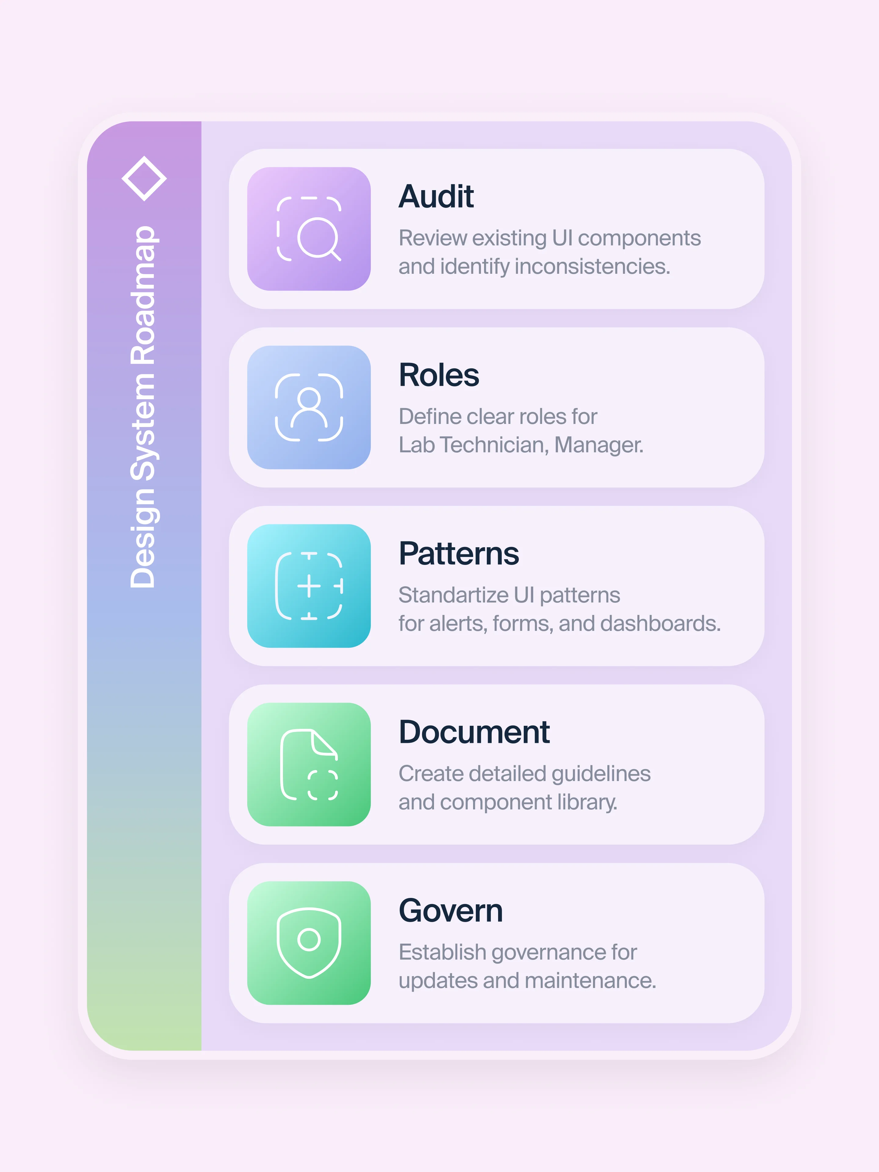
Establish governance from day one
What happens with a design system without governance? Teams start creating “one-off” variations. Components fork. Documentation falls behind the code. And the system itself decays.
Healthcare design systems need a clear governance model:
- who approves new components;
- how contributions from different product teams are reviewed;
- how accessibility compliance is maintained across releases;
- how the system evolves as regulatory requirements change.
The NHS model — where teams across the organization contribute to and draw from a shared system — is a good reference point.
Common mistakes that undermine healthcare design systems
Even teams that invest in building design systems in healthcare can stumble. Here are the patterns we see most often.
Treating the design system as a one-time project
A design system is a living product, not a deliverable. If the team that built it disbands after launch, the system starts to degrade within months. Thus, your aim is to budget for ongoing maintenance, just as you would for any product.
Ignoring the developer handoff
A design system that exists only in Figma is half a system. Components need to be implemented in code, with matching naming conventions, documented props, and accessibility attributes baked in. If designers and developers use different languages to describe the same component, inconsistency creeps back in.
Over-engineering before validating
Some teams spend months building an elaborate token system and component architecture before testing whether the components actually work in real clinical workflows. Start lean. Ship a handful of core components, test them with real users in real environments, iterate, then expand.
Forgetting accessibility at the system level
Accessibility in healthcare is a requirement. Your design system should enforce accessible color contrast, keyboard navigation, screen-reader compatibility, and touch-target sizing at the component level. This way, individual product teams can’t accidentally ship inaccessible interfaces.
“If your design system doesn’t enforce accessibility, every product built on it inherits the same blind spots.”
From fragmented screens to unified care experiences
Healthcare technology today is largely shaped by highly skilled teams working with similar tools and resources. However, many companies are still building new solutions without a shared foundation to consistently meet clinical requirements or deliver a unified experience.
Closing that gap starts with treating design systems in healthcare as a strategic investment, not a design team side project. It means building components that reflect clinical reality and maintaining them with the same rigor you’d apply to any other critical piece of healthcare infrastructure.
At Halo Lab, we’ve seen firsthand how the right design foundation transforms healthcare products — from our work on complex lab information systems to AI-powered diagnostic platforms. The pattern is always the same: when the system is right, the product gets better faster, safer, and more consistently.
{{banner-3}}
FAQ
Why invest in branding services services services?
What is a design system in healthcare?
It is a structured collection of reusable UI components, design tokens, patterns, and documentation built specifically for health and care digital products. Unlike generic design systems, it includes components for clinical data visualization, role-based interfaces, alert severity hierarchies, and accessibility standards calibrated for medical environments.
Why can’t healthcare teams just use Material Design or another generic design system?
Generic systems like Material Design provide solid foundations, but they lack healthcare-specific components — clinical alert hierarchies, patient identification patterns, consent flows, and data-dense dashboard layouts.
How long does it take to build a healthcare design system?
The timeline depends on the scope of your product suite. A focused system for a single product can reach a usable first version in 8–12 weeks. Enterprise-wide systems for organizations with multiple products and teams typically take 4–6 months for an initial release, followed by ongoing iteration.
Does a design system help with regulatory compliance?
Yes. A well-built design system can encode accessibility standards, privacy patterns, and data-handling conventions at the component level. This means compliance is built into the building blocks they use. For a deeper look at the compliance landscape, see our guide to healthcare app security and compliance.
How does Halo Lab approach design systems for healthcare products?
We start with a thorough audit of existing interfaces and clinical workflows, then build a component system tailored to the product’s specific user roles and interaction patterns. Our approach prioritizes clinical safety, accessibility, and developer handoff — so the system works in Figma and in code.
Can a design system reduce healthcare product development costs?
Absolutely. By eliminating duplicate component creation, reducing QA overhead, and accelerating onboarding for new team members, healthcare design systems typically deliver significant efficiency gains.
.webp)