Building a Swiss-style brand identity and website for a healthcare AI platform
About the project
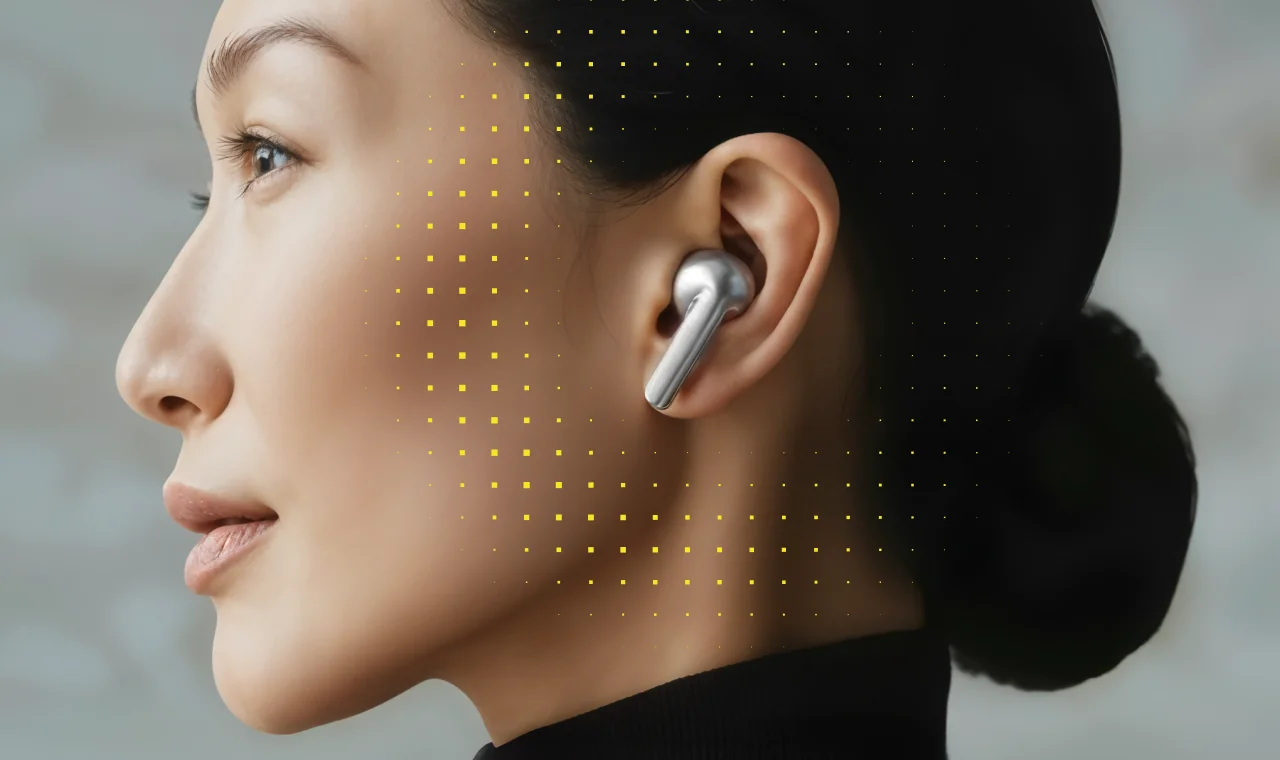
Develop Health is a US-based AI company building medication utilization infrastructure for digital health companies. Their platform helps optimize healthcare processes and improve patient outcomes with innovative AI technology.
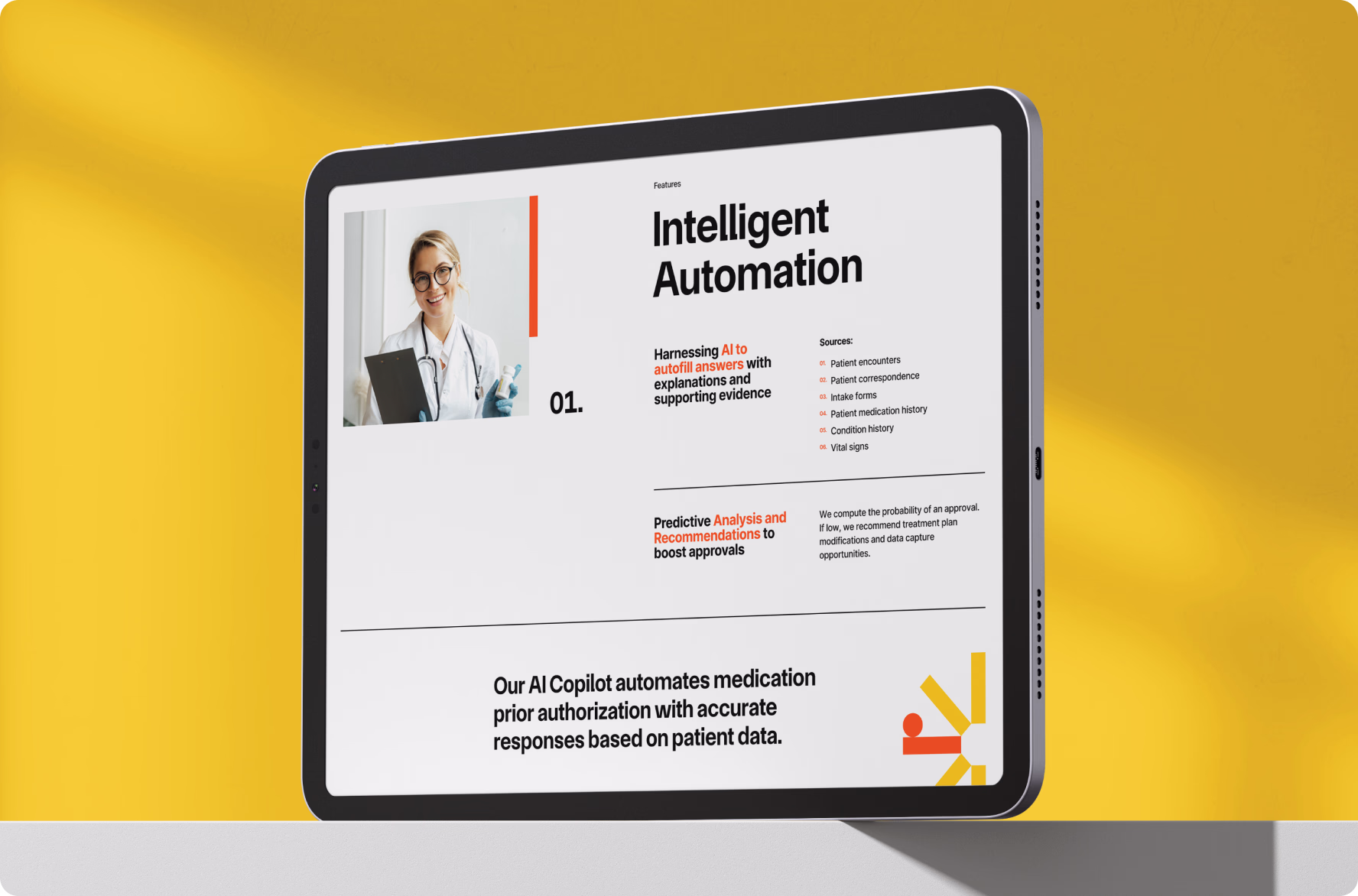
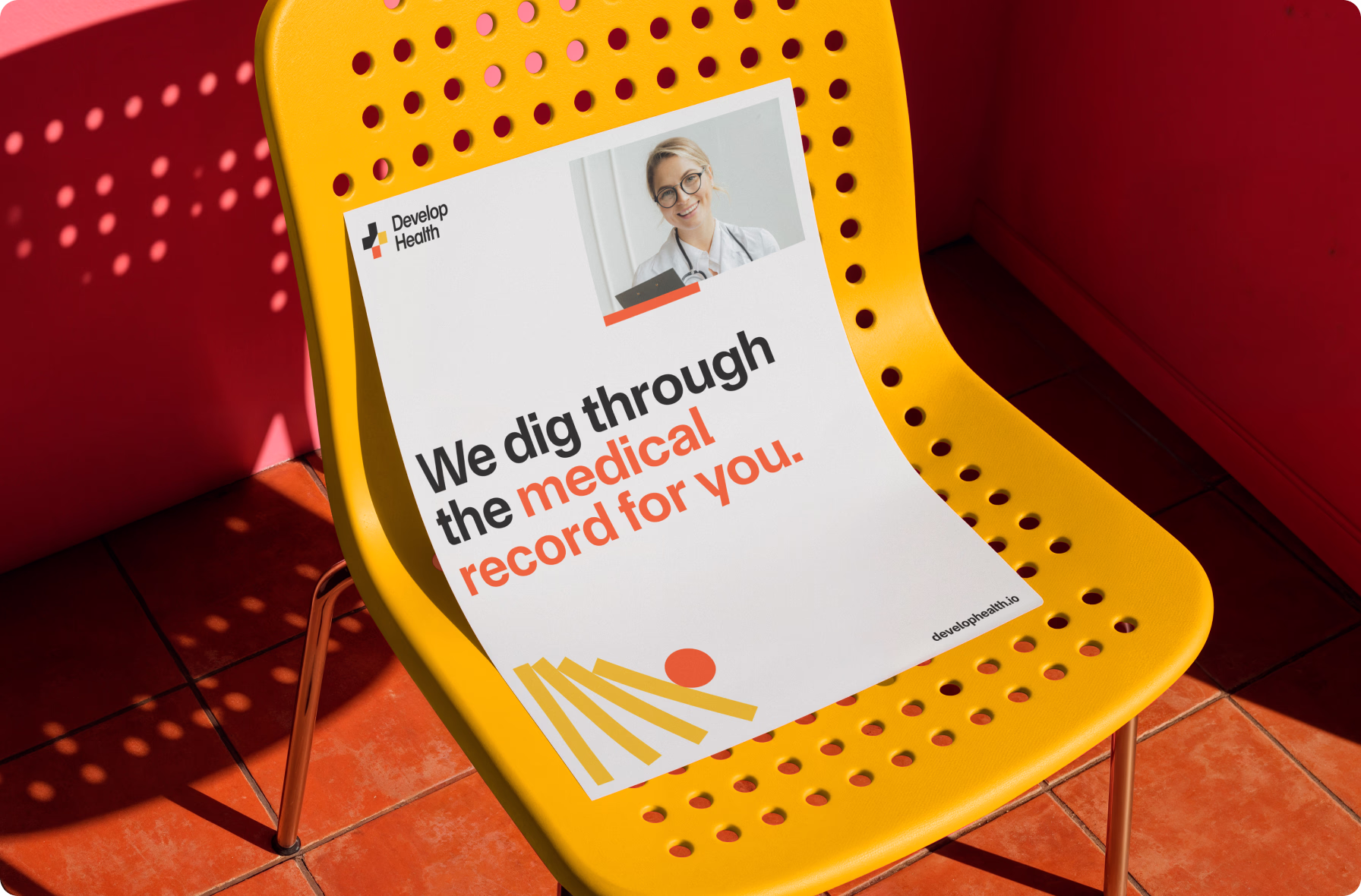
By auto-filling prior authorization forms using patient record data, Develop Health eliminates administrative bottlenecks — enabling providers to secure approvals faster and get patients to treatment without delay.
{{numbers}}

Challenge
Hospitals and digital health companies lose hours to prior authorization requests, fueling clinician burnout and delaying patient care. Develop Health came to Halo Lab as an early-stage startup to build a brand and web presence conveying precision and trust to a skeptical B2B audience.
Our process
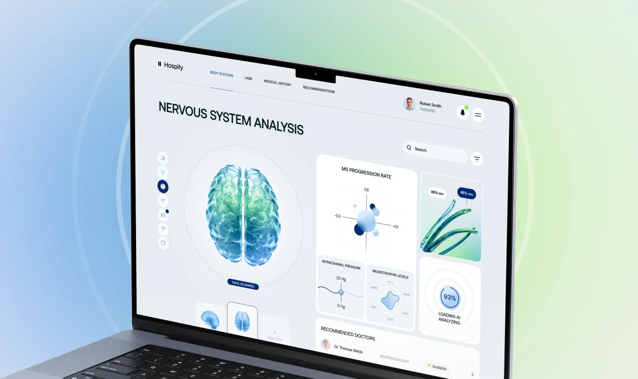
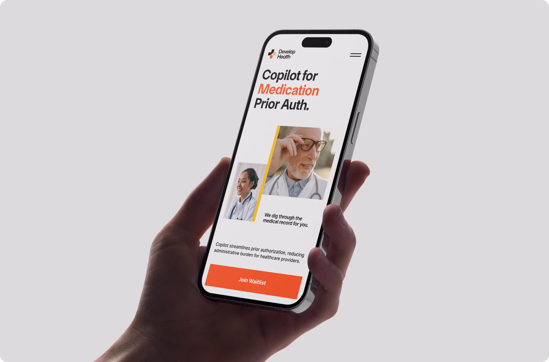
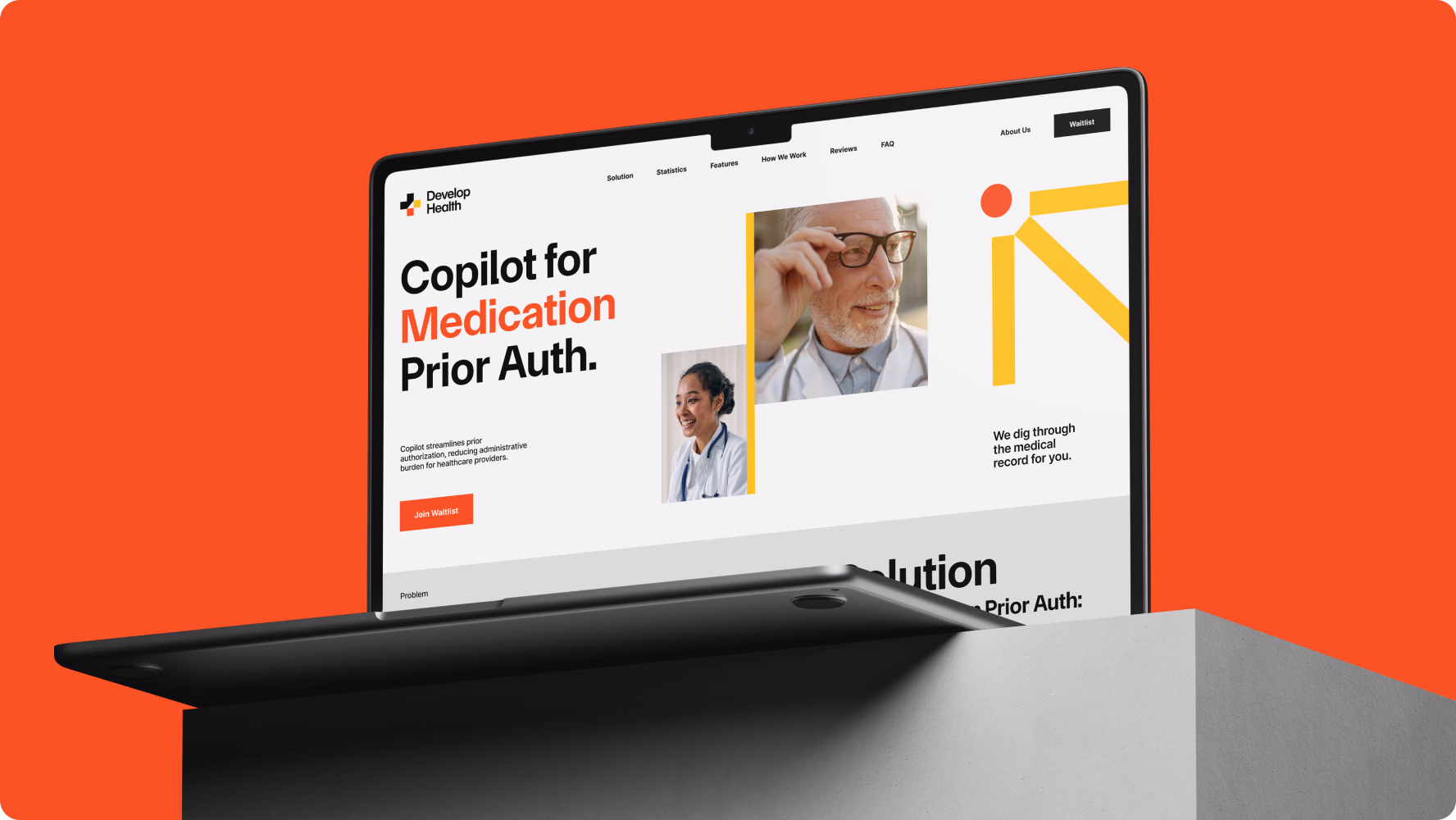
We built Develop Health's brand identity and Webflow landing page from the ground up, applying a clean, geometry-focused design language to create a credible and highly distinctive digital presence.
{{dropdowns-1}}
{{slider-1}}
Results
Our collaboration with Develop Health resulted in a complete brand system and a live Webflow website, positioning the company as a precise and trustworthy player in a crowded digital healthcare market. A Swiss-style visual language helped establish a distinctive identity early on, while a social-proof-driven site structure and a HubSpot-integrated waitlist form created a solid foundation for B2B growth.
Our approach
In a market where credibility shapes every decision, we applied precise, minimalist design principles to build a brand that earns trust without relying on traditional medical aesthetics.
{{approach}}


01 · Discovery & research
We started with a competitor analysis and surfaced a consistent gap: most platforms lacked trust indicators or social proof entirely. Combined brand and web research defined the Swiss-style direction that guided all creative decisions.
Deliverables
- 5 competitors analyzed
- Brand & web research
02 · Brand identity
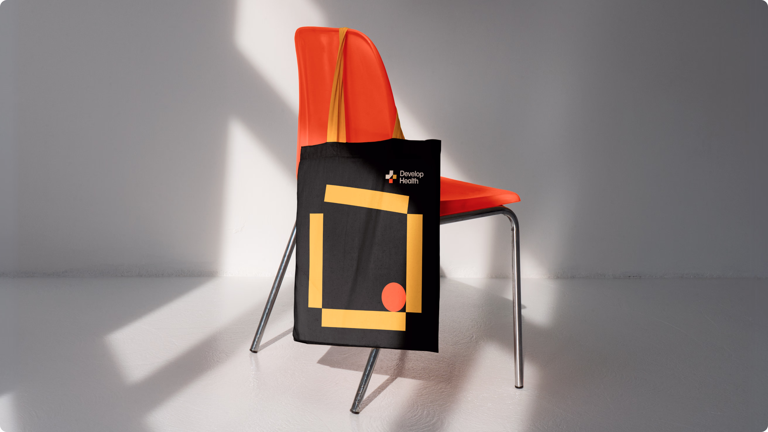
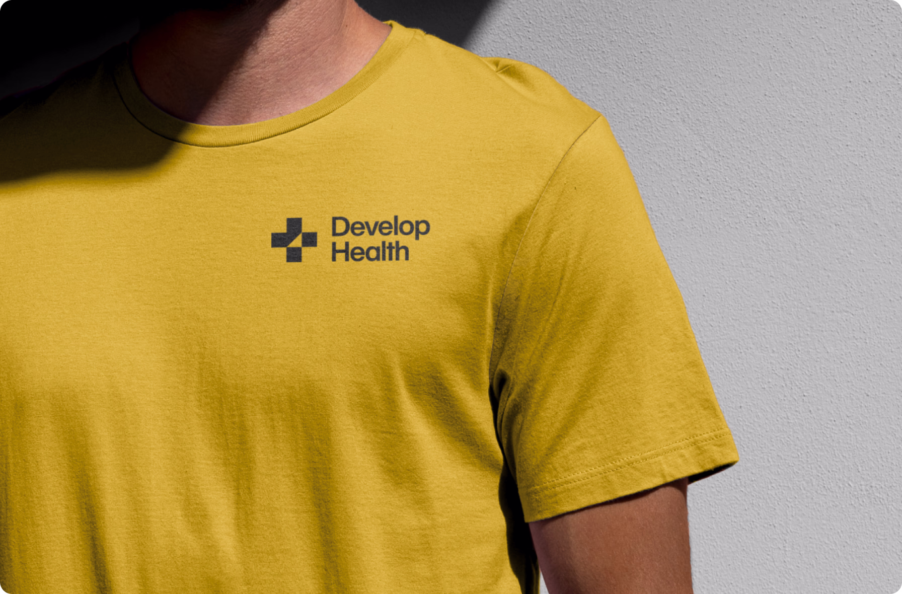
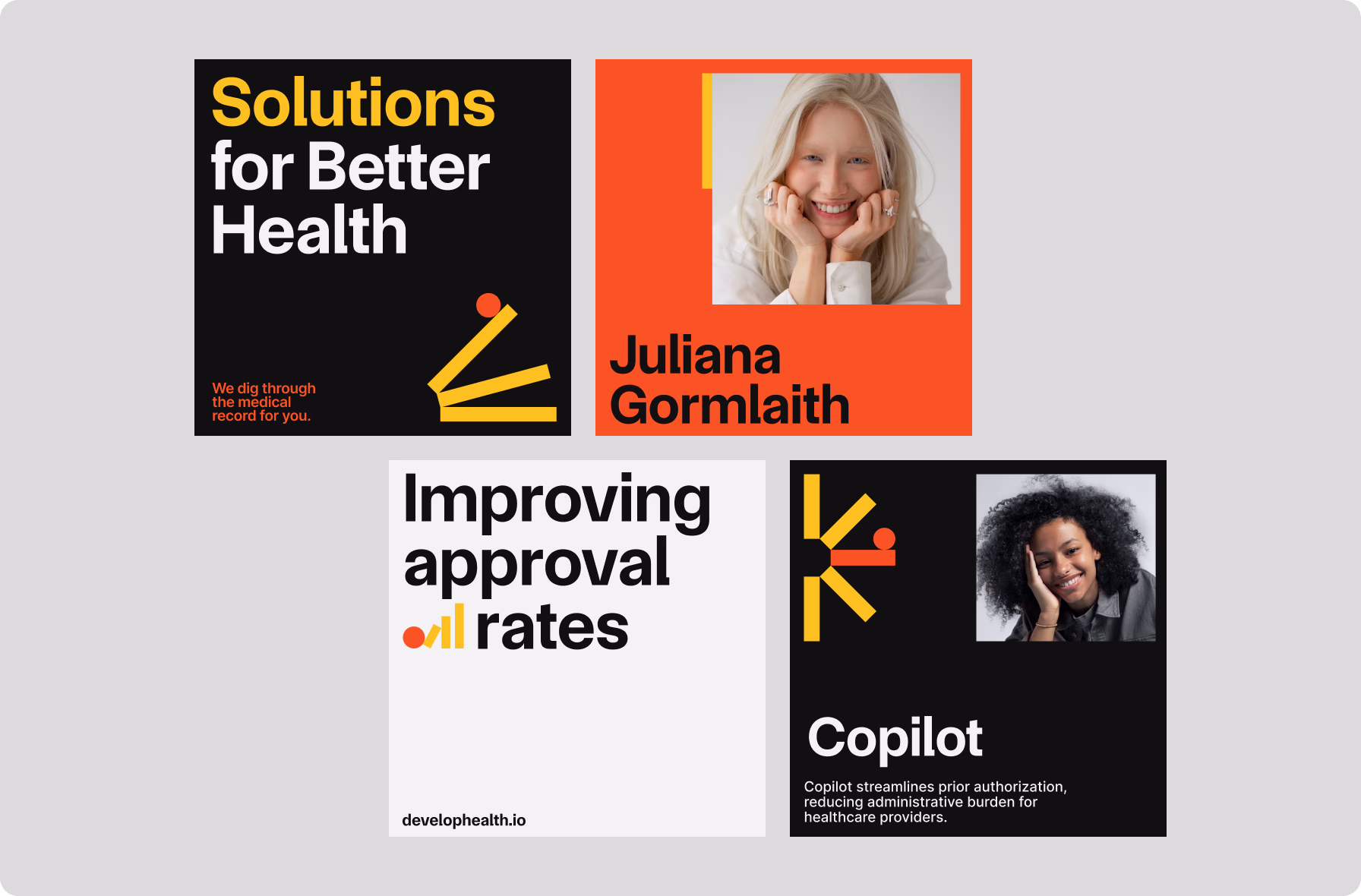
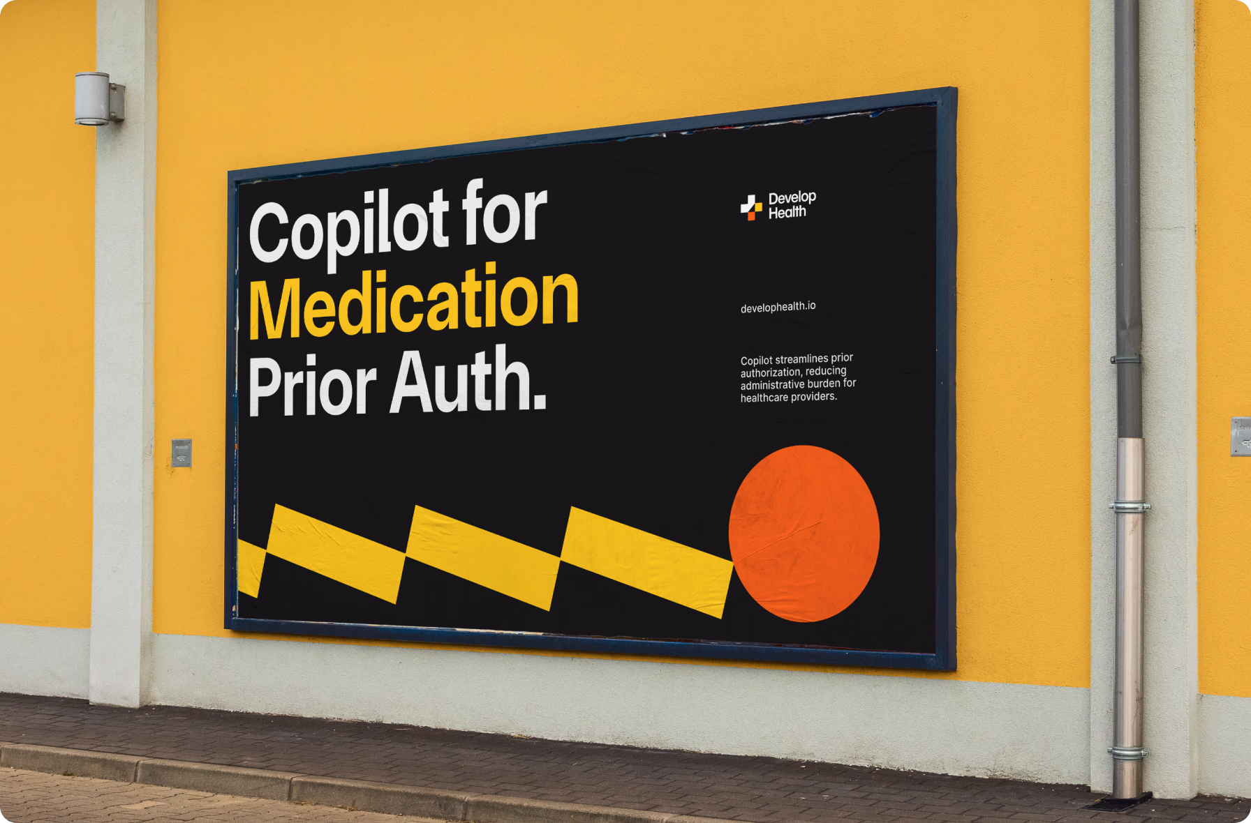
We distilled the medical cross into a minimalist logotype with a pointer mark — signaling direction and precision. Abstract geometry and a black-and-white palette with red and yellow accents reflect clinical clarity and structured thinking.
Deliverables
- 10 logo sketches
- 2 branding concepts
- Brand book
03 · Web design
With credibility at the core, we designed a clean two-page site built around social proof and structured content hierarchy. The layout puts content first, supported by branded graphics that reinforce expertise and highlight product quality.
Deliverables
- 2 web design concepts
- Dev-ready landing page
- Desktop & mobile layouts
04 · Webflow development
Built using a modern tool stack, the site integrates HubSpot via Make.com and uses Swiper, AOS, and Finsweet for animations. Four CMS collections keep content fully editable in the long term, with Captcha securing all form submissions.
Deliverables
- Launch-ready website
- 4 CMS collections
- Admin screencast
Team
A cross-functional team worked in close sync, continuously adapting to new insights from classroom trials and robot behavior.
- 1 Project Manager
- 2 Brand Designers
- 2 UI/UX Designers
- 2 Web Designers
- 1 Front-end Developer
- 1 Back-end Developer
- 1 QA Engineer
Technologies
Our stack supported offline interaction, hardware communication, scalable content management, and smooth cross-platform UI.


Team
- 1 Project Manager
- 1 Brand Designer
- 2 Web Designers
- 1 Webflow Developer
Technologies