The reason aviation checklists work is that every line item on them traces back to a real incident report from a real crash. Healthcare design checklists tend to lose that connection somewhere along the way. The main advice is to “Test with diverse users.” Sure, but who were the users, who recruited them, how much were they paid, and what was the scenario?


This guide tries something a little different. It groups the work into seven decision points, each carrying a related risk and a testable acceptance criterion. Ultimately, the seven steps roughly follow the lifecycle of a clinical AI product, from kickoff through to post-launch.
What it costs to leave equity out of the healthcare design checklist
First, let’s put three primary-source studies on the table before we get into the seven steps. They pre-empt most of the “but does this really happen?” objections.
Pulse oximetry — the device that says 95%
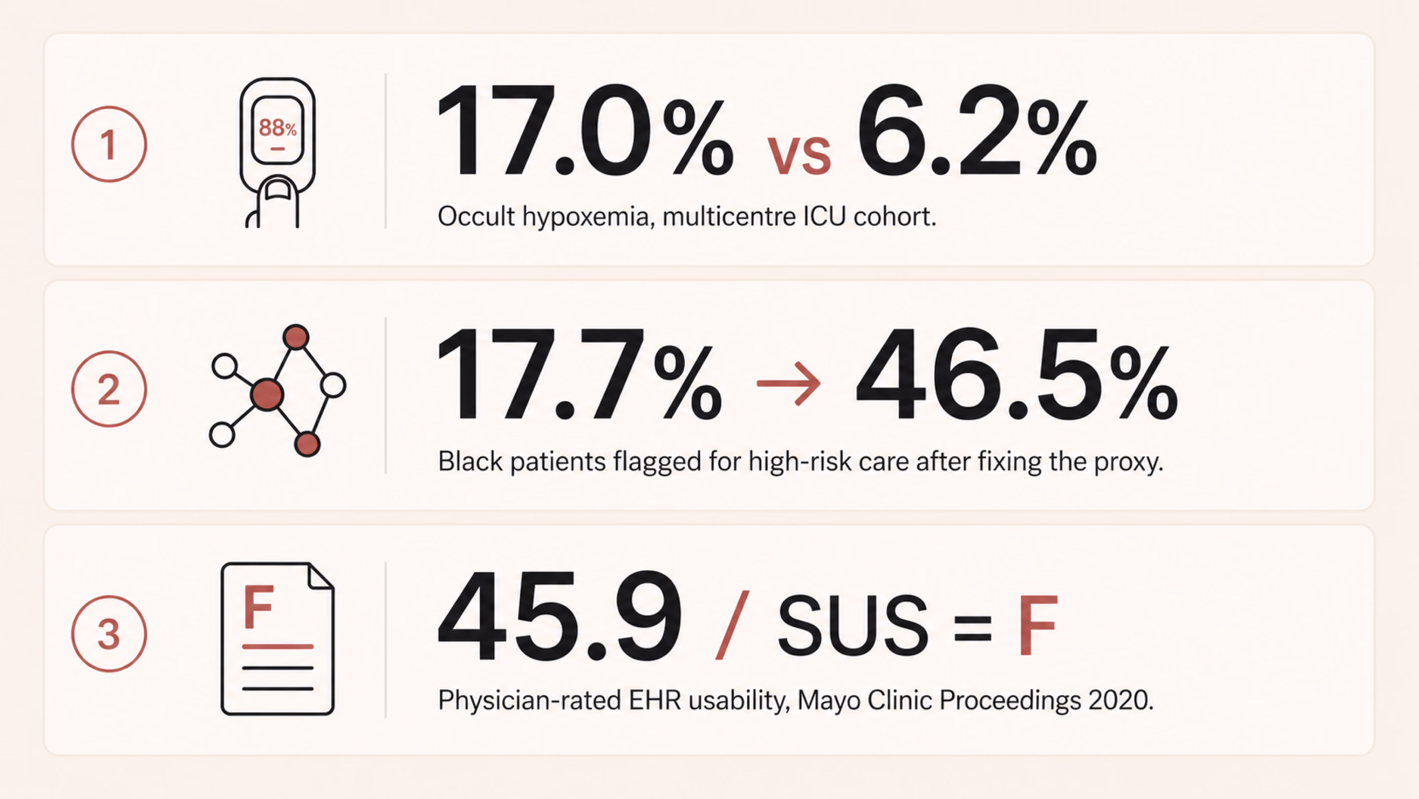
Pulse oximeters are the kind of device most clinicians stop noticing once it’s clipped to a finger. Sjoding and colleagues at Michigan changed that. In their New England Journal of Medicine paper, a multicentre cohort of roughly 8,400 patients across 178 ICUs demonstrated a clear gap. The pulse oximeter often showed a reassuring reading of 92–96%, even when the more accurate blood test showed oxygen levels below 88%, which is dangerously low. This mismatch occurred in 17.0% of measurements for Black patients, compared with 6.2% for White patients.
The device wasn’t “malfunctioning.” It was working as designed, based on how it had been calibrated. But because that calibration didn’t fully account for all patient groups, it was more likely to miss dangerous low oxygen levels in some people than others.
Risk-stratification algorithms when cost stands in for sickness
There is one healthcare algorithm that shows how a reasonable design choice can quietly produce unequal outcomes. Obermeyer and colleagues, writing in Science in 2019, picked apart such an algorithm. US health systems use it to flag patients for high-risk care management programs. At identical risk scores, Black patients turned out to be measurably sicker than White patients. The gap was about 26% higher on average, with 97th-percentile chronic conditions. Why?
The algorithm predicted future healthcare costs as a stand-in for future health needs. Historically, less money has been spent caring for Black patients with the same severity. Replacing the proxy lifted the share of Black patients flagged for extra care from 17.7% up to 46.5%.
EHR usability — bad design exhausting the workforce
On a less life-or-death but still consequential note, Melnick and co-authors used a national physician survey for their Mayo Clinic Proceedings paper. They evaluated electronic health record (EHR) systems using a standard usability test called the System Usability Scale. The average score was 45.9, putting these systems in the bottom 9% of all software across industries. In simple terms, that’s a failing grade.
The study also found that for every one-point improvement in usability, the likelihood of doctor burnout dropped by about 3%. And burnout isn’t just a workplace issue, since tired, stressed clinicians are more likely to make mistakes.
In other words, the people dealing with the worst-designed systems are often the ones responsible for catching and preventing errors elsewhere. This shows how good design has real effects on safety and outcomes. The deeper relationship between user-centered design and measurable business outcomes is laid out in our piece on UI/UX design that converts.
Three different products, built by three different teams, but they show the same pattern. Each system performed well for the group it was tested on, yet worked less effectively for the broader population it was eventually used with. When that kind of mismatch repeats, it points to a design blind spot. And if a healthcare UX checklist doesn’t explicitly account for that risk, it will keep allowing the same problem to recur.
{{banner}}
Step 1 — Frame the problem
Many clinical tools fail at the brief, not the build. A team picks a few clinical questions — like predicting 30-day readmission, triaging chest pain, and monitoring adherence — and starts sketching screens. Often, before anyone maps who the product affects and who it misses. By the time those gaps show up, three sprints of UI have been built around them.
The cost of that omission is what you can probably picture already. Performance looks great on the holdout set. After deployment, performance degrades unevenly. The groups at the worst end of the gap are usually the ones least likely to file a structured complaint.
The solution here is forcing the conversation early. Which patient groups does this product actually affect and how? Directly, or by influencing clinician decisions? Among those groups, which are underrepresented in your training data, your validation data, or your design research panel? Those are three different things, but they’re often confused.
The next crucial thing is to know exactly how much it will cost. A false negative doesn’t carry the same consequences in every context. In one case, it might simply delay a call to the infection control team; in another, it could mean a transplant referral is never made. The stakes can be even higher. For example, one in three maternal deaths occurs in the six weeks after childbirth, and many could be prevented with timely follow-up care. In such cases, a missed signal can have serious consequences.
Then there’s the question of how to look at it, which many people find most uncomfortable. Who isn’t in the room? If a payer is at the table but a community health worker isn’t, that reflects a choice about whose priorities matter most, even if no one would put it that way.

The output of this work is a one-page intent document. It gets signed off by clinical, design, and engineering leads. Two columns: the populations the tool serves, and the populations it could miss. If you can’t fill in both columns, the brief isn’t finished yet.
Step 2 — Audit the dataset like a clinician audits a chart
Designers don’t generally open the dataset. The underlying data typically belongs to whoever owns the model. The design team inherits whatever bias was already in there by the time the screens are finalized. That has to change, even if it just means learning enough vocabulary to ask the data team uncomfortable questions.
The questions worth asking aren’t complicated. They just don’t tend to come up unprompted. Here are the examples:
- How are race, ethnicity, primary language, age, sex assigned at birth, and gender identity actually represented in the training set?
- Where does the dataset use a proxy for any of those?
- What was substituted in and why?
- Was the labeling done by people who reflect the patient population?
After all, annotation bias is a real, measurable source of model bias. The target variable is often a proxy, such as cost, readmission, or prior diagnosis, and those proxies can encode existing real-world inequities. It’s also important to look at the smallest group in the validation set and examine how the model performs for it. If a group is underrepresented, the interface should not project false confidence in the model’s output for that group. We’ll come back to that in step four.
An audit also shows you which groups you need to include more of in your user research. The usual rule, testing with five to eight people, doesn’t work well here. If a problem mainly affects a small group (say, 12% of patients), you might not include enough of them to even notice the issue. To spot the pattern, you need to make sure several people from that smaller group are part of your study.

Once you’ve made sure the right groups are represented in your research, the next step is making those assumptions explicit. A practical acceptance criterion is having a model card or something close to it. It’s a one-page summary that outlines:
- the model’s intended use;
- the population it was trained on;
- how it performs across different groups;
- the limitations the team has chosen to accept.
If the model team can’t provide one, that gap is itself the most important signal going into your next planning meeting.
{{banner-2}}
Step 3 — Design for the person who’s actually in front of the device
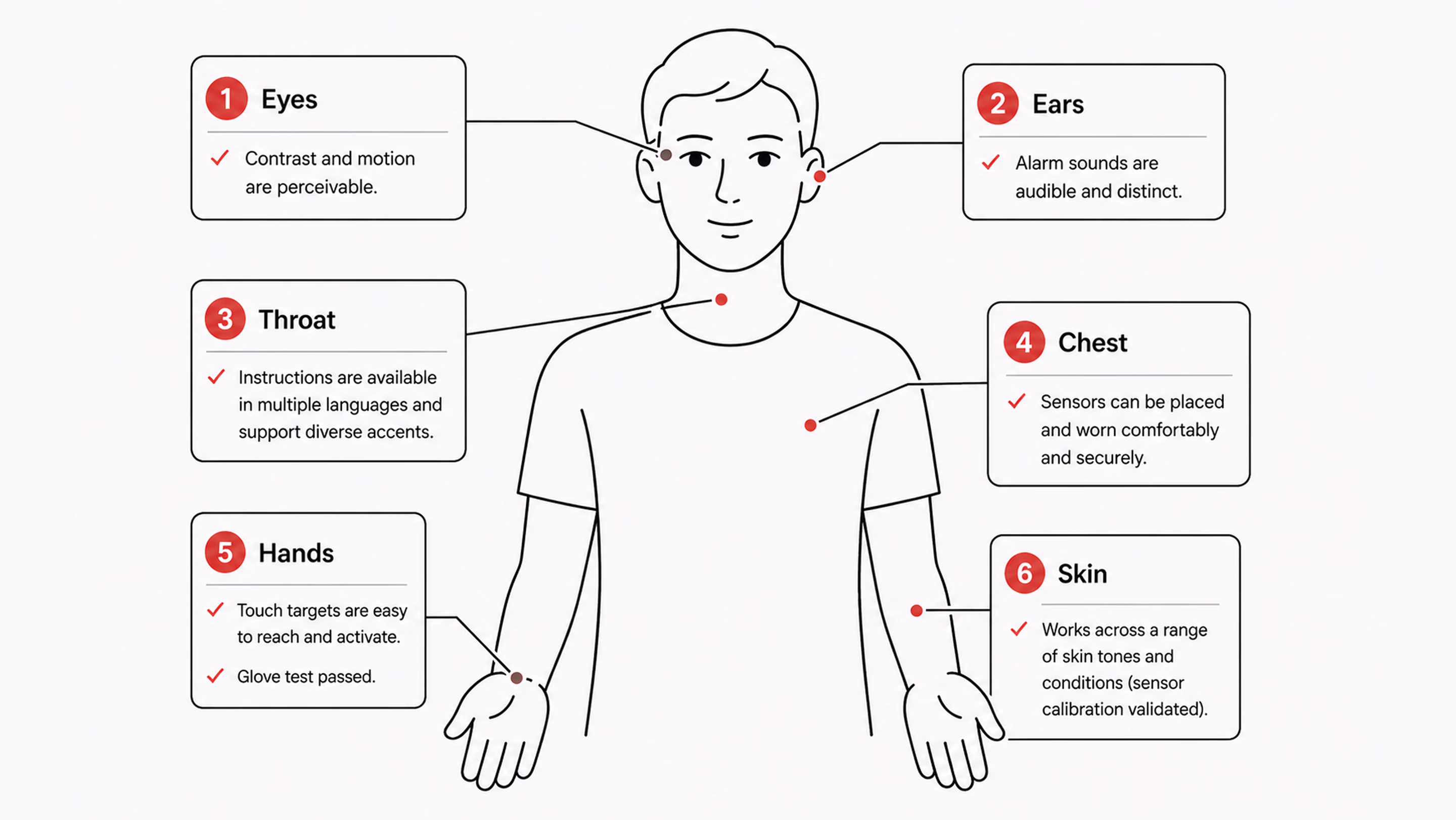
Sensors meet skin. Voice models meet accents and tracheostomies. Touch targets meet hands that tremor, hands inside latex gloves, and hands that are also currently holding a syringe. Designing for an abstract average user is a luxury that a lot of consumer products can get away with. In healthcare, it tends to translate fairly directly into harm.
Many interfaces often assume a user with full vision, fluent English, steady hands, light skin, fast broadband, and a quiet room. Most patients are not all of those things. Most clinicians, three-quarters of the way through a twelve-hour shift, aren’t either. So the work of turning abstract concepts into concrete design decisions is, in practice, a list of testable propositions.
Sensor calibration
Ask yourself, “Does the product read from a sensor of any kind — camera-based heart rate, pulse oximetry, dermatology AI, retinal screening?” There should be a clear record of the skin-tone range used for validation. Where possible, use the Monk Skin Tone scale; where it isn’t, use the Fitzpatrick scale instead. When uncertainty is high, it should also be shown directly in the interface. Telling a user the device is less confident is much better than letting it silently mislead.
Language and reading level
Patient-facing copy should default to a sixth-to-eighth-grade reading level for clarity and accessibility. Multilingual support should be validated by native speakers, not just generated through a machine translation pipeline. The 2003 National Assessment of Adult Literacy, conducted by the US Department of Education, found that only 12% of US adults have proficient health literacy. That means 88% benefit from plain language as the default, not as the accommodation. More recent studies show that 60%+ adults have inadequate health literacy. It doesn’t match the “88%” exactly, but still shows a majority struggle.
Accessibility past WCAG is its own conversation. The broader question of how products work for users with permanent or temporary disabilities is worth a deeper read. See our take on inclusive design and why it matters for digital products.
Contrast and keyboard navigation
The most important thing for clinical interfaces is touch targets that are at least 44×44pt. Voice control should match touch interactions in how it works. Screen readers should clearly say clinical data, like “systolic blood pressure 142, elevated,” instead of “SBP 142.” It’s also important to offer reduced motion options for dashboards that show live vital signs.
Environment
A lot of clinical UX fails in field testing. The screen needs to be easy to read at 30% brightness in a brightly lit hospital bay. The ambient light there is much better than what a designer’s monitor can simulate. Touch targets need to work through nitrile gloves. Gloves feel almost the same as bare fingers, but they react differently to touchscreens. The audible alert needs to be distinguishable in a code situation when three or four other alarms are also sounding. None of these conditions exists in the studio where the prototype is usually designed and reviewed.
Step 4 — Build explainability into the surface, not into a footnote
Black-box AI is a UX problem long before it becomes an ethical one. A clinician who can’t see why the algorithm flagged a particular patient won’t trust it. Firstly, they’ll work around it where the workflow permits. Then, they’ll start ignoring it altogether, including in the cases where it happened to be right.
The more interesting failure isn’t when the recommendation is ignored. It’s when a clinician accepts an unclear suggestion because it already matches what they were thinking. The system then gets credit for a decision the clinician had effectively already made.
What effective explainability looks like in practice
A few patterns consistently improve clinical AI UX. First, show the inputs in plain medical terms. For this, list the top 3–5 factors behind a prediction (e.g., rising lactate, falling blood pressure over 90 minutes, increased heart rate). That’s more useful than abstract values hidden in tooltips.
Second, be honest about uncertainty. A 78% confidence score isn’t a 78% chance of being correct. If performance varies across patient groups, make that visible in the interface rather than burying it in documentation.
Make disagreement easy and structured
Create a simple process that allows a person to express disagreement and provide a reason for it in just one tap. Have it capture feedback in a structured way, and have the team review it each week. This action prevents things from going wrong and is the most direct way to keep improving.
Another thing to bear in mind is that a linked rationale isn’t the same as explainability. A modal that opens an eight-page document on how to do something makes people feel bad instead of helping. What works is a short, simple English summary of the reasoning. If someone needs more information, they can click on “Learn more.”
How to test whether it works
A good way to check if your surface is actually working is to do a comprehension check. Show three clinicians the same case that has been flagged by the AI. Ask them, in their own words, why the system raised the flag. If two out of three people can’t answer the questions properly, it means that the explanation isn’t clear. And in this case, it doesn't matter how clean the visual design is.

Step 5 — Treat alerts as clinical interventions, not notifications
Every alert is an interruption to the work the user is currently doing. Each interruption, in turn, costs time and attention from the same human you’re trying to support. This is the worst thing that could happen. A patient’s health is getting worse while a nurse deals with the seventh alert that can’t be fixed in twenty minutes.
A workable alert system starts by separating signals into two dimensions: urgency and required action. Not all alerts are the same. A passive notification, an actionable alert, and a hard-stop interruption serve fundamentally different purposes, and they should differ accordingly in their appearance and behavior.
From there, the default should lean toward restraint. If the team can’t clearly state what a clinician should do within the next two minutes, the alert likely doesn’t belong in real time. It can live in a sidebar, be included in an end-of-shift summary, or be dropped altogether.
Building on that same idea of keeping alerts tied to clear action and urgency, the system also needs to handle user dismissal in a transparent, non-coercive way. If a clinician chooses to turn off or ignore a signal, the system shouldn’t block that decision or shame it. Instead, it should briefly and calmly clarify the consequence: what might be missed if the underlying signal is real. The point is not to pressure, but to make the trade-off visible.
This is where observability becomes essential. The alert system should track:
- how often alerts fire;
- how often they’re acknowledged;
- how often they lead to action;
- how quickly different user roles respond.
Once acknowledgments without follow-up action consistently exceed a threshold (say, 70%), that alert is effectively not functioning as intended. At that point, the data is already telling you it’s noise, and you either redesign it or remove it.
This is also where high-level design principles often break down. Phrases like “reduce alert fatigue” are too vague to guide decisions. In contrast, something like “each alert must state the required clinical action within five seconds of reading” is concrete enough to test, measure, and improve.
“Default to silence. If you can’t describe the action a clinician should take in the next two minutes, the alert probably shouldn’t exist.”
Step 6 — Test with the people the system will fail first
Standard usability testing is, more or less, a five-person panel that mirrors the average user. Healthcare flips that. The five people you most need in the room for a clinical product are the five people the average panel was designed to exclude. Their presence in the test sample is what predicts whether you’ll catch the failures concentrated in their part of the population.
Recruiting around this means stratifying by failure risk rather than by convenience. If your dataset audit identified three groups with weaker model performance, those three need to be represented in the panel. Placeholder slots filled by whoever the agency could reach in a week won’t do the job. You should go through community health partners, such as federally qualified health centers, patient advocacy groups, faith-based community networks, and only then will you see participants whom panel agencies systematically miss. The mechanics of choosing the right method for each phase are worth a separate read; we’ve laid them out in our guide to UX research methods.
The next principle of testing is paying people fairly. Healthcare research panels chronically underpay relative to enterprise B2B research. The participants’ time is at least as valuable. If you’re asking for 90 minutes of someone’s life, including transit time, pay it like consulting time, not like a Starbucks gift card.
What’s more, test in real environments where you can. A simulated bedside on Zoom is not a bedside. If a hospital partnership isn’t available yet, contextual interviews work. Try primary care clinics, community pharmacies, and patients’ own kitchens. They get you closer to the actual conditions of use than a clean studio session ever will.
Finally, reporting is where the discipline shows. Task success and time-on-task should be broken down by group rather than aggregated, since averages can easily hide meaningful variation. If any subgroup falls more than 15% behind the overall performance, that gap should block a launch, not sit quietly in a report.
{{banner-3}}
Step 7 — Plan for monitoring after launch
Some product teams quietly assume the design work ends at general availability. However, a medical device design review checklist must include a post-market surveillance plan, with named responsibilities and trigger conditions.
The failure pattern is usually simple and predictable. Model performance drifts six months in. Either because the underlying patient population has shifted slightly, or an EHR field has changed how a particular feature is being logged upstream. Because these changes happen outside the model team’s immediate visibility, they often go unnoticed. The design team has usually moved on, and no one is actively watching for gradual degradation. As a result, drift only becomes visible when it surfaces through an external signal, such as a malpractice claim, a regulatory inquiry, or media attention.
Post-launch responsibilities
After launch, the design team doesn’t control everything, but it does own a small, critical set of artifacts that keep the system observable. The first is a live performance dashboard broken down by subgroup. The same demographic slices used during validation should continue to run on production data, with alerts when any group crosses a performance threshold.
Alongside that, there should be an in-product feedback path (e.g., an “I disagree” option) that is actively reviewed and triaged weekly. These signals shouldn’t disappear into logs; they need to surface in sprint reviews as real inputs. Finally, clinicians need a visible version log to see when and how the model changes, especially after retraining.
Trust, transparency, and controlled change
Silent updates tend to undermine trust far more than imperfect but visible systems. When models change without explanation, clinicians lose the ability to build reliable mental models of behavior. To avoid this, teams also need a clear decommission plan:
- what conditions trigger a pause;
- who can authorize it;
- how clinicians and patients are informed if a model is temporarily taken offline.
For Software as a Medical Device, these practices align closely with the FDA’s Predetermined Change Control Plan framework. By mid-2025, the FDA had cleared over 1,200 AI-enabled medical devices, with totals continuing to rise past 1,300. Post-launch artifacts like dashboards, feedback logs, and version histories increasingly become part of the regulatory record. Designing them early is not just operationally useful — it becomes part of the compliance lifecycle evidence.
From data to insight: a real example
On the dashboard side specifically, this is the kind of work we did with nyra health. It’s a clinical platform tracking neurological recovery progress across many sessions per patient. We reorganized a dense table into a progressive-disclosure view. High-level summaries appeared first, with drill-downs into complaints and trends only when needed.
The key outcome was structural insight. The new layout made group-level patterns previously hidden in flat tables visible. That’s exactly the kind of post-launch observability this stage is meant to enable. If you’re designing a telehealth product or reassessing an existing clinical workflow, our team can help evaluate how information is structured, surfaced, and interpreted across the experience.

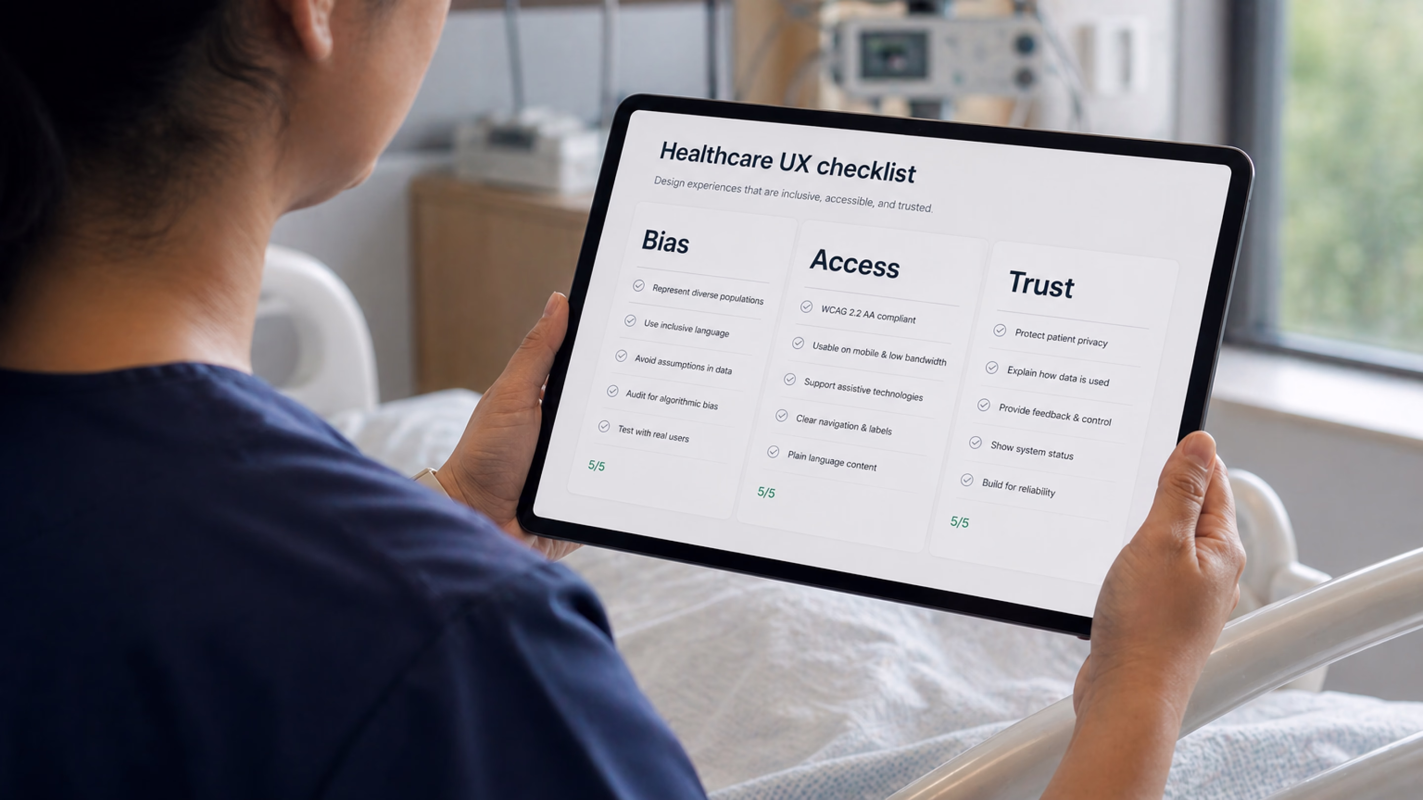
The seven-step healthcare UX checklist at a glance
Having read about seven steps in detail, you can now scan the checklist below. It serves as a shared reference for teams and vendors, intended to support consistent application before any patient-facing release.
Three pieces of pushback
Designing clinical AI and digital health tools that don’t leave anyone behind often runs into three recurring objections.
First, equity work slows teams down. Sometimes it does, but so do QA and security reviews. Any discipline meant to prevent foreseeable failures is often treated as overhead until something breaks and forces a costly reset. In practice, the cost is usually delayed, not avoided.
Second, people often assume that only regulated clinical devices need strict fairness/safety checks. However, regulation is about liability and reporting, not whether harm is possible. A wellness app influencing something like insulin dosing may fall outside medical device rules, but it can still cause serious harm. The same design safeguards still apply; only the documentation requirements change.
Third, there is no budget for testing at this depth. If that’s the constraint, the honest response is to narrow the intended user base, clearly document limitations, or route excluded users to alternatives. Shipping without acknowledging the gap tends to be more expensive over time.
The end goal: safer care for real people
In the end, designing clinical AI for different patient groups is not about adding more layers to the process. It is about forcing one difficult question into the open: who could this system fail, and would the team know before harm occurs?
Every step in this checklist points back to the same principle: healthcare products don’t operate in averages, they operate in lives. When systems are built only around the “typical” user, edge cases are not edge cases for the people living them. Good design makes those risks visible early, tests them honestly, and gives teams a way to correct course before failure becomes harm.
FAQ
Why invest in branding services services services?
What does a healthcare UX checklist need to cover in 2026 that it didn’t five years ago?
It needs to include bias auditing of training data, embodiment design (skin tone, language, connectivity, environment), AI explainability, alert taxonomy, stratified user testing, and post-launch subgroup monitoring. To learn more, read our article about 2026 healthcare UX trends.
How is a medical device design review checklist different from a regular UX checklist?
A Design History File (DHF), required under 21 CFR 820.30, contains or references the records of design control activities. It typically includes risk analysis, design inputs and outputs, and verification and validation evidence, all backed by traceable documentation. A UX checklist sits upstream of that — it feeds into the Design History File rather than replacing it. The two should reinforce each other without duplicating work.
Do teams need separate checklists for patient- and clinician-facing tools?
The principles overlap, but the priorities differ. Patient-facing tools emphasize health literacy, language access, anxiety reduction, and trust. Clinician-facing tools focus more on cognitive load, alert precision, and workflow fit. Most real products serve both groups, so a single checklist that adapts its lens by user role is usually more effective than maintaining two separate ones that must be kept in sync.
What’s the biggest single failure mode in clinical AI products?
Teams often adopt a clinical problem and start designing screens before clearly defining which populations the tool is intended to serve and which it may systematically miss. Once that gap exists, everything downstream (data audits, testing strategy, and post-launch monitoring) inherits it and amplifies it.
How do teams recruit users from communities they aren’t connected to?
Recruit through community health organizations, federally qualified health centers, patient advocacy groups, and faith-based networks. These partners help reach participants outside commercial panels.
Does this checklist still apply to non-regulated medical products?
Yes. The difference is framing: it becomes customer trust and product quality work rather than compliance work. And the documentation it produces is still valuable, especially for clinical partners and procurement teams, even if no regulator ever reviews it.
How long does it take to retrofit an existing tool to this checklist?
It depends on where the gaps are. A focused audit against the seven steps usually takes about 2–3 weeks. Priority fixes vary: UI-level changes like explainability improvements, alert restructuring, and copy updates can often be done in a couple of sprints. Anything involving datasets, model retraining, or monitoring infrastructure typically takes months.