Designing a human-centered brand identity for an AI diagnostics platform
About the project
Hospity is a healthcare company behind an AI-powered diagnostics platform for medical professionals and patients. It addresses time-intensive clinical workflows by centralizing case management and surfacing AI-driven insights across specialties.
Designed for clinicians and patients alike, the platform balances diagnostic precision with accessible guidance. Workflow automation reduces manual steps while role-adapted interfaces serve users across varying levels of medical expertise.

Challenge
Hospity had a product in development but no visual identity — nothing to signal credibility to clinicians or familiarity to patients. They came to Halo Lab to build a brand and design system from scratch: a unified visual language ready for a clinically sensitive market.
Our process
We translated Hospity’s commitment to technology and care into a trusted brand identity and design system tailored for medical and patient environments.
{{dropdowns-1}}
{{slider-1}}
Results
Hospity entered the healthcare AI market with a brand and platform identity strong enough to speak to both clinicians and patients from day one. The visual language established clear positioning in a competitive space, while the scalable design system gave the product a foundation to grow without losing consistency.
Our approach
Our team shaped Hospity's design system around a simple principle: healthcare technology should inspire confidence without losing its human side, translating that into a cohesive visual identity.
{{approach}}


01 · Discovery & research
We analyzed the healthcare AI market and mapped the needs of two core audiences — clinicians and patients. Competitive research shaped a brand positioning rooted in clarity, credibility, and human connection, guiding the creative direction.
Deliverables
- Key competitors analyzed
- Market & audience research
02 · Logo & brand identity
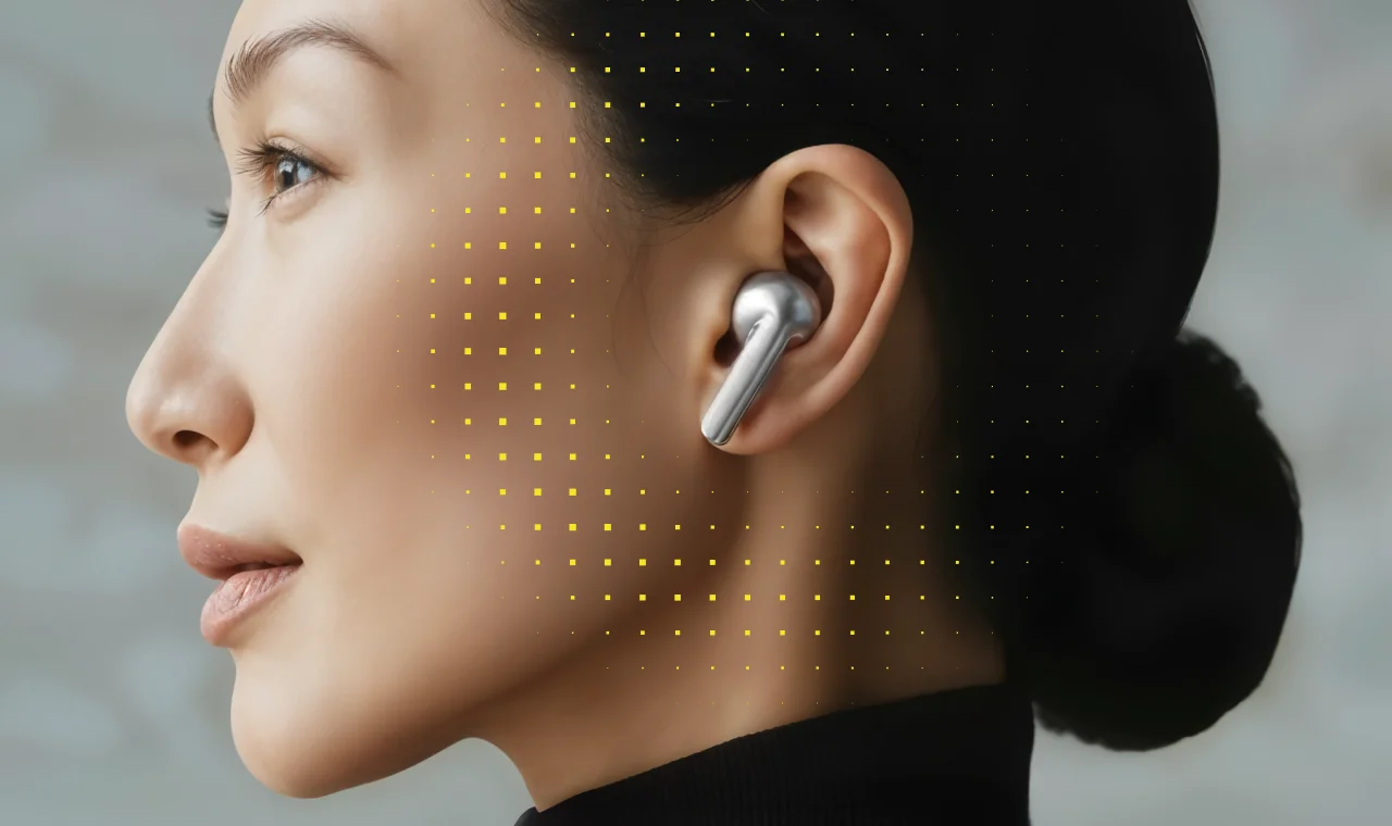
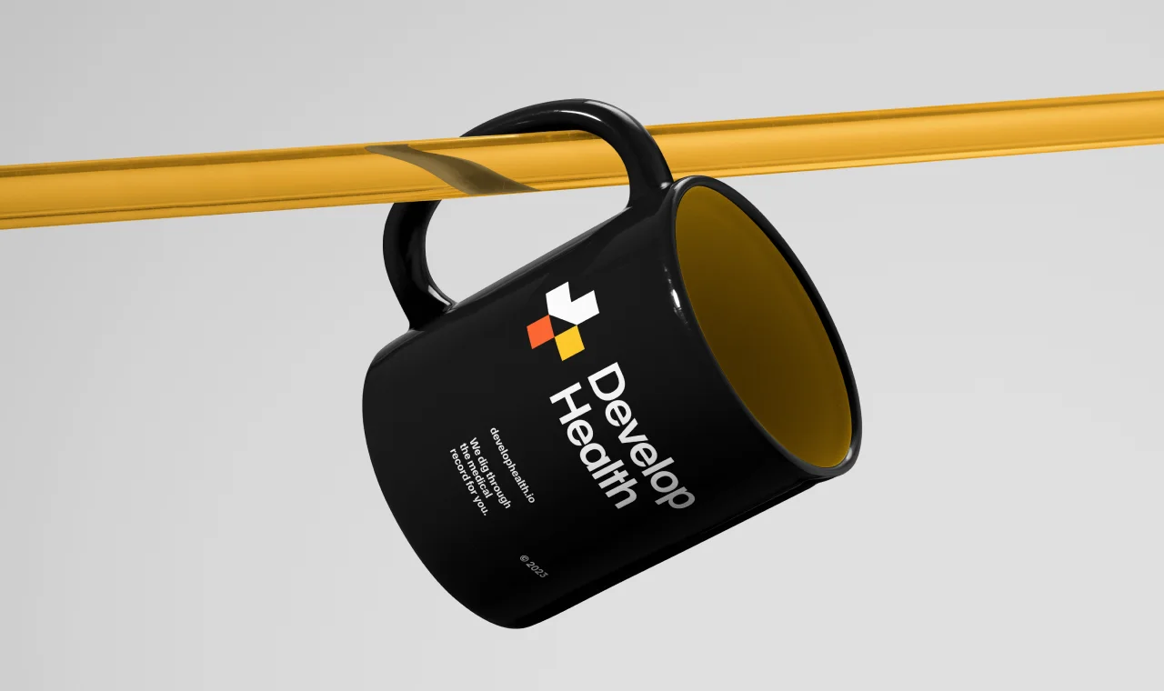
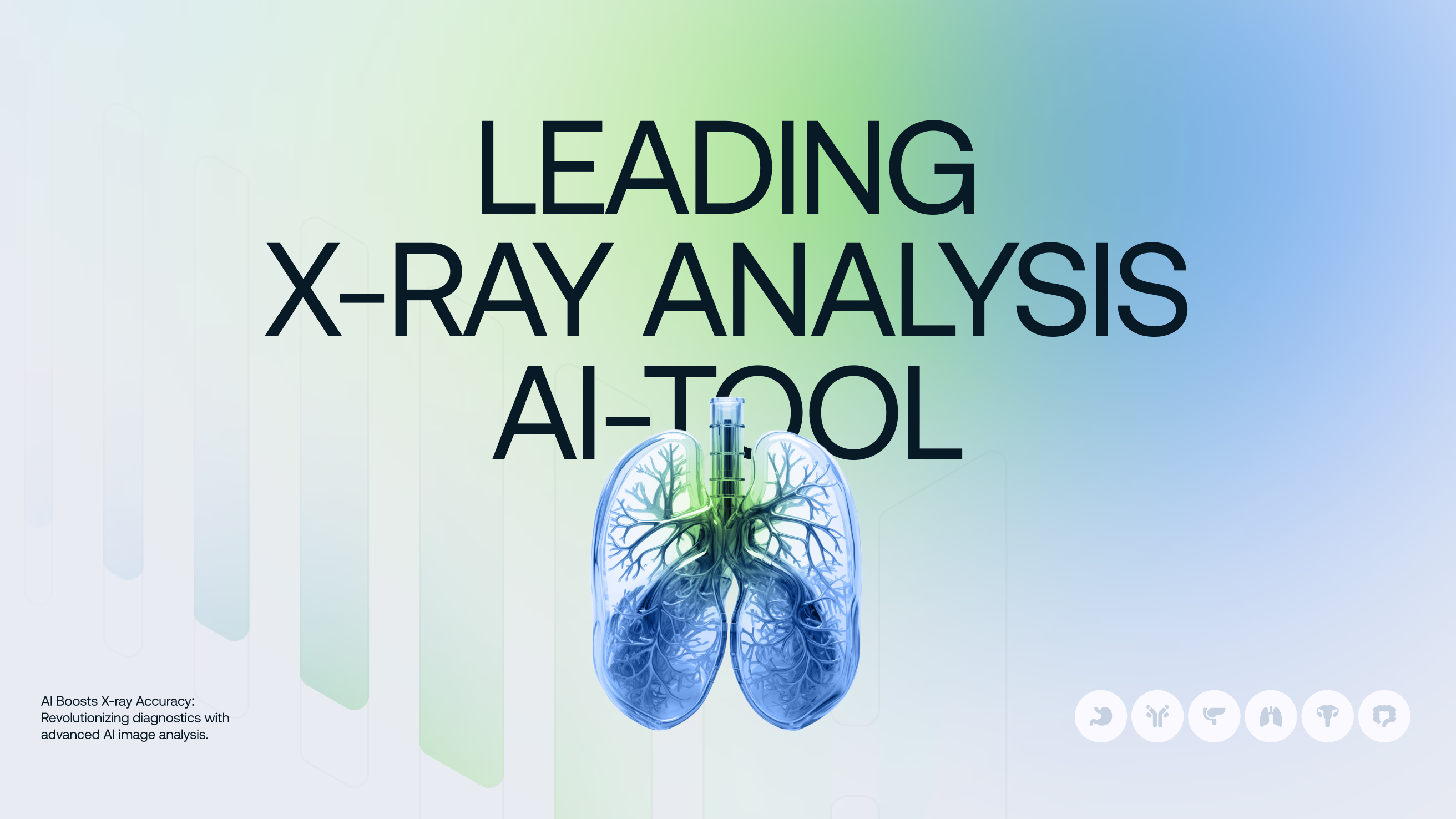
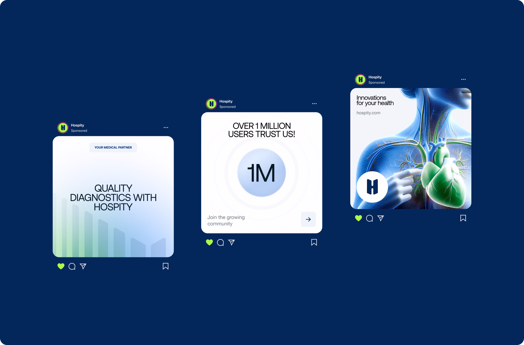
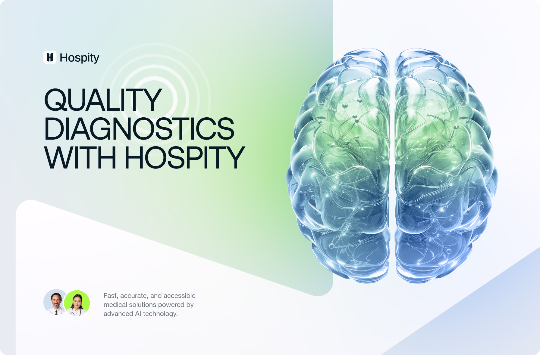
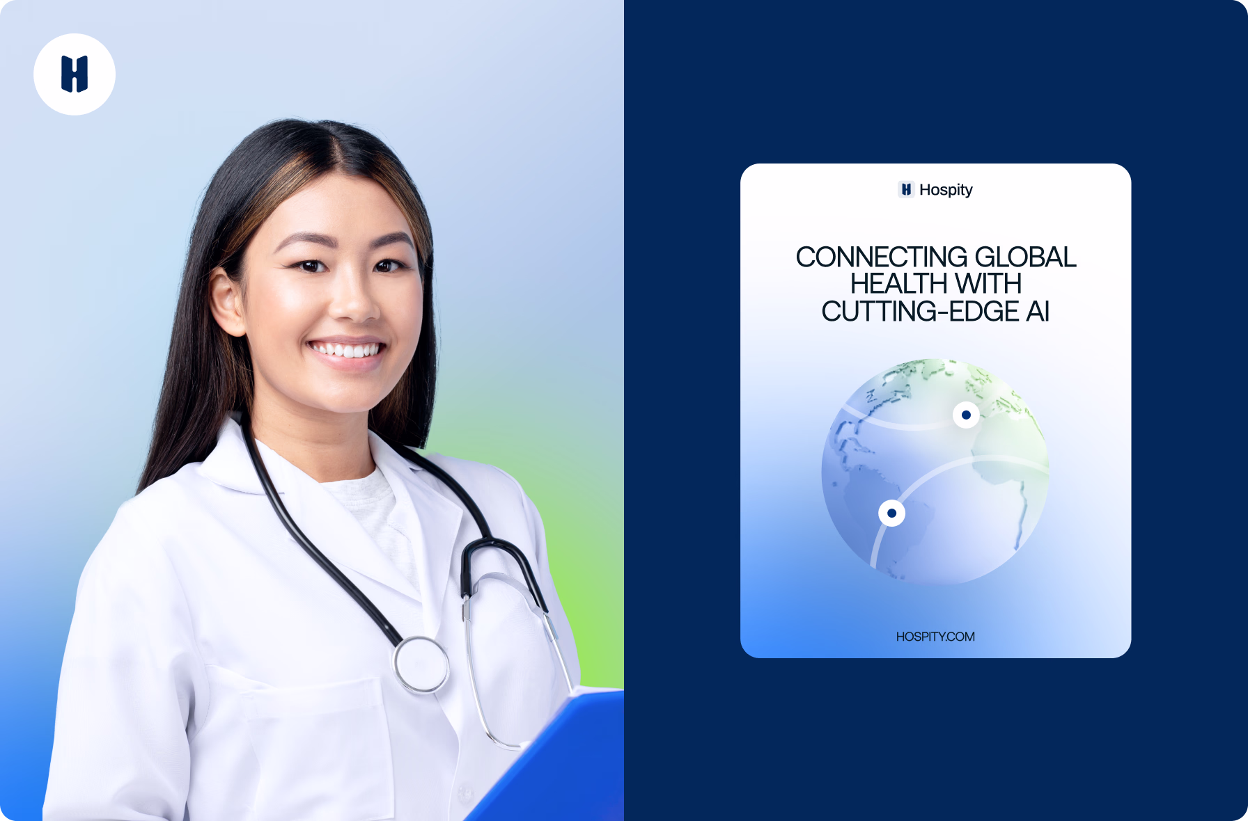
We built the brand around a minimalist logotype — the letter ‘H’ anchoring values of health, hope, and healing. Green and blue tones, the Aeonik typeface, and healthcare imagery combined to signal clinical credibility and human care.
Deliverables
- Logotype system
- Color & typography guidelines
03 · UI/UX design
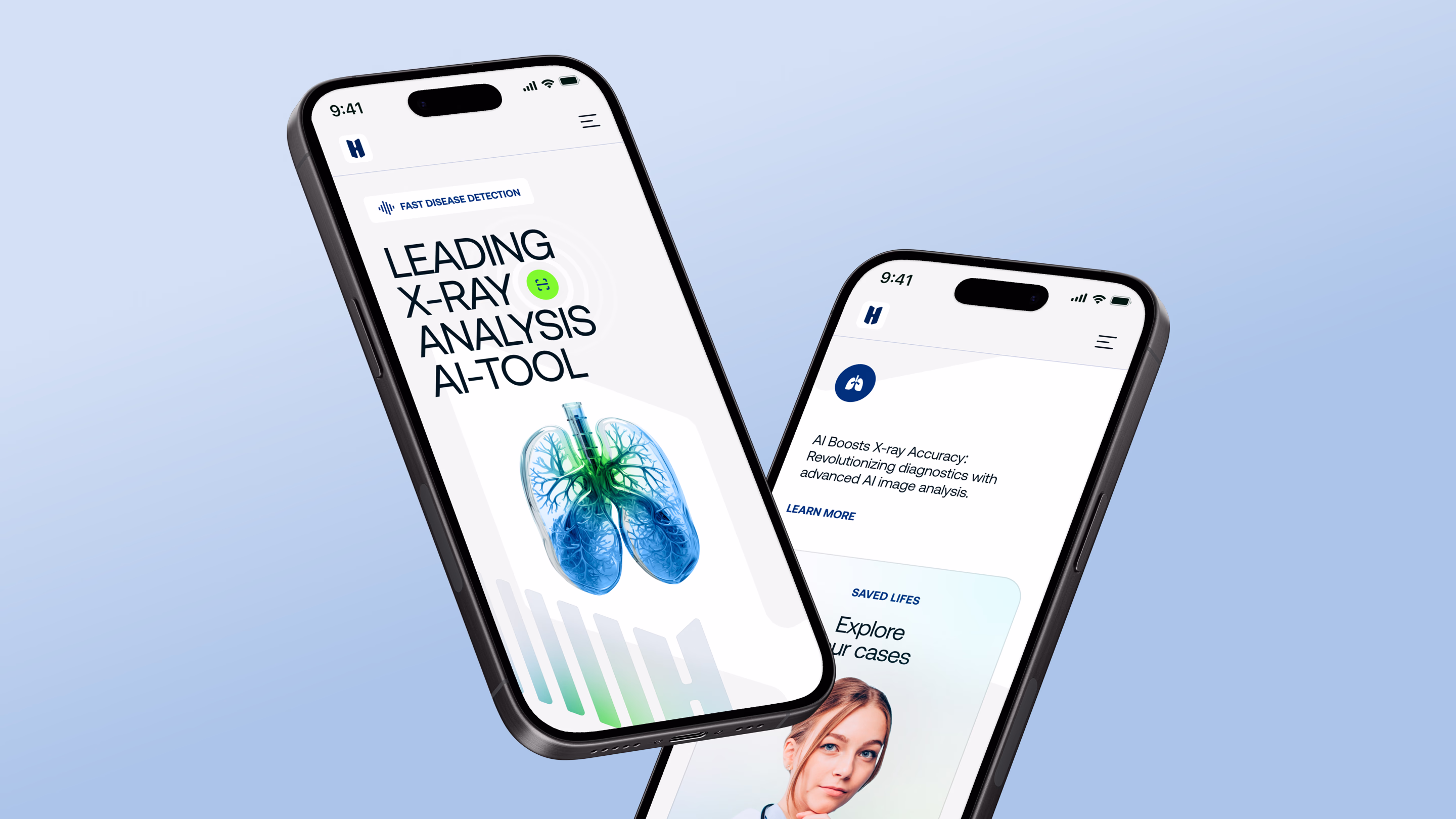
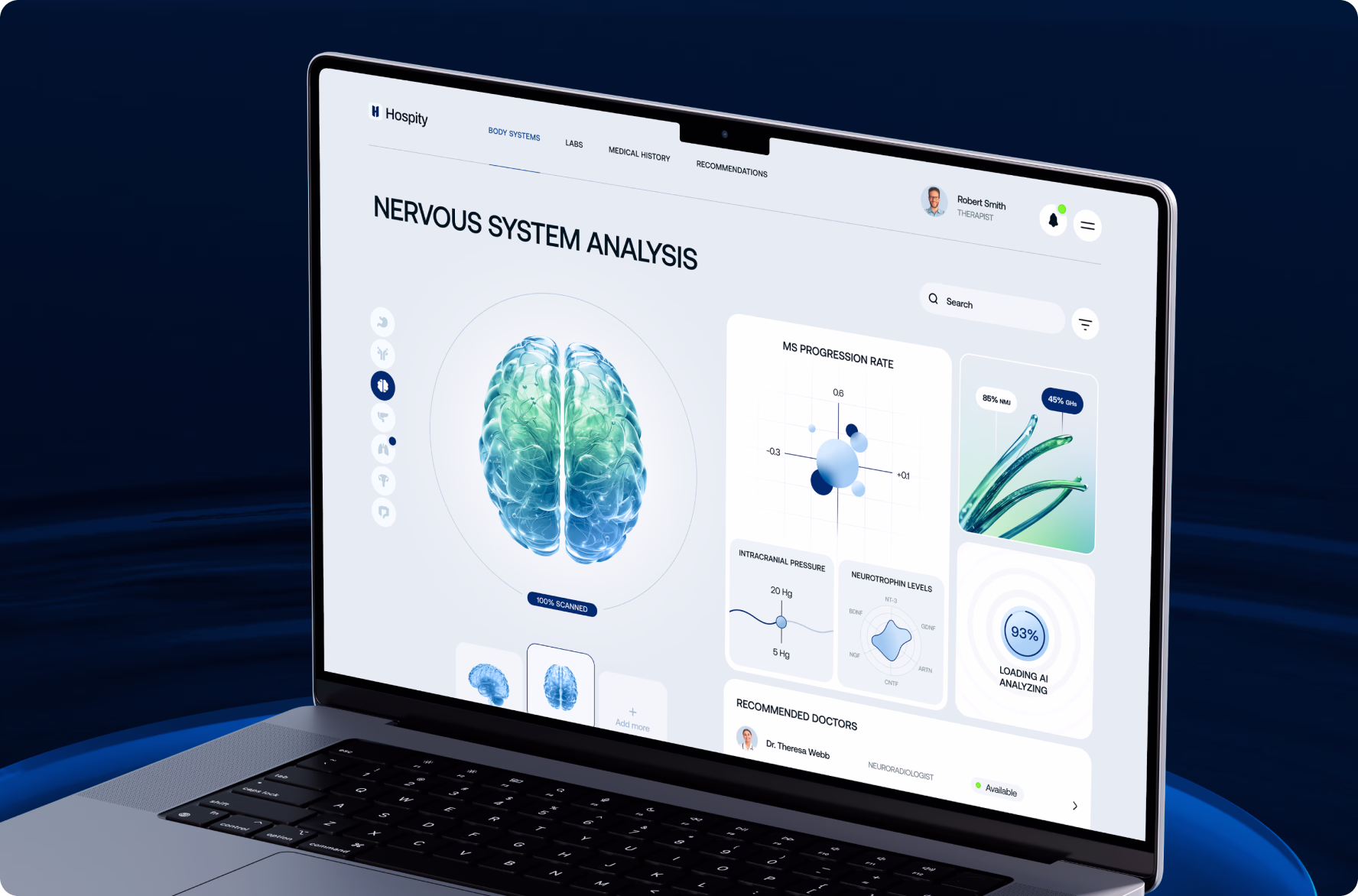
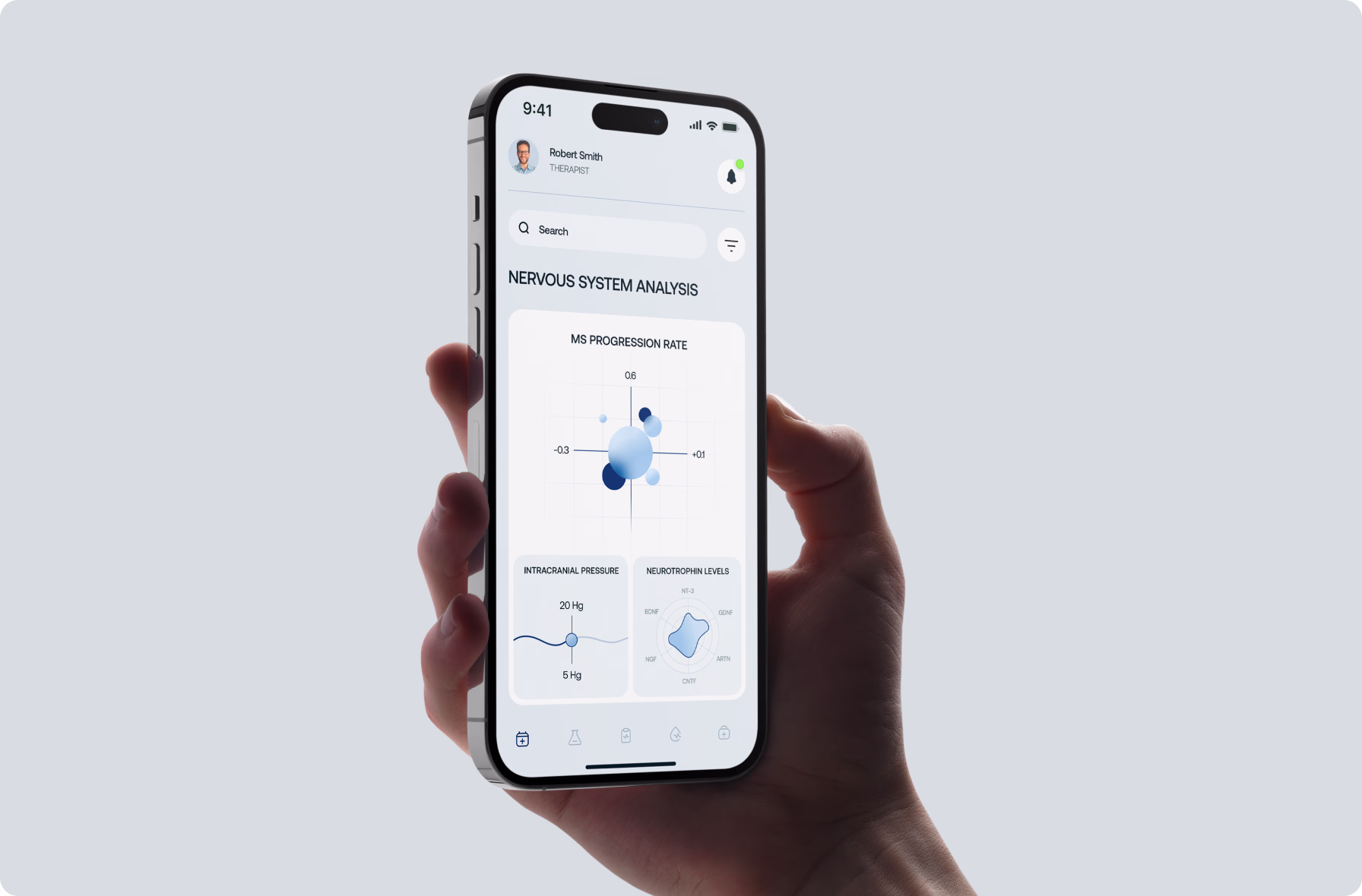
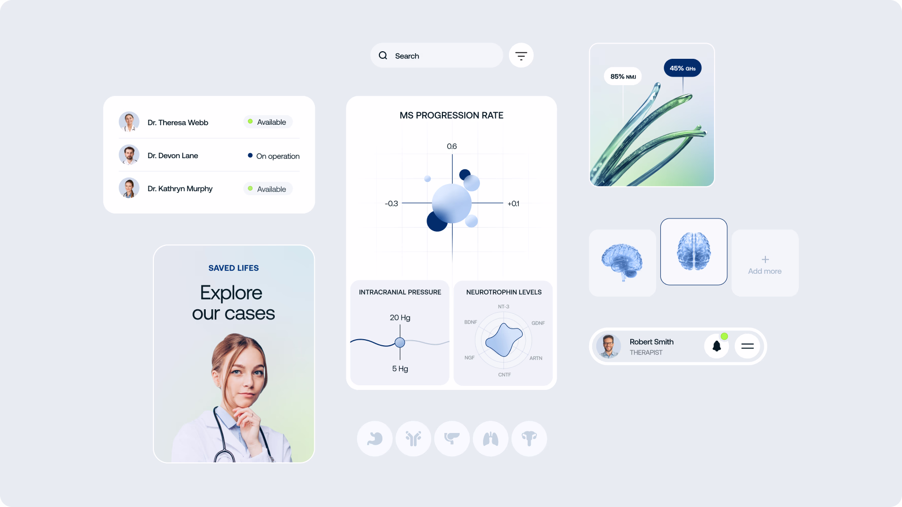
With the brand established, we designed the platform interface for clinicians and patients. Screens covered core diagnostic workflows, case management views, and data dashboards, shaped by the principles of accessibility and clarity.
Deliverables
- Core platform screens
- Design system
04 · Finalization & handoff
We consolidated the brand identity and platform UI into a structured handoff package covering all key touchpoints. The final delivery included a scalable design system and brand guidelines ready for deployment across digital and print channels.
Deliverables
- Production-ready assets
- Brand guidelines
Team
A cross-functional team worked in close sync, continuously adapting to new insights from classroom trials and robot behavior.
- 1 Project Manager
- 2 Brand Designers
- 2 UI/UX Designers
- 2 Web Designers
- 1 Front-end Developer
- 1 Back-end Developer
- 1 QA Engineer
Technologies
Our stack supported offline interaction, hardware communication, scalable content management, and smooth cross-platform UI.


Team
- 1 Project Manager
- 1 Brand Designer
- 2 UI/UX Designers
Technologies