


Your product is scaling, and with it, design entropy. As features multiply and teams expand, invisible misalignments creep in. Designers reinvent the same components, developers decode outdated specs, and users are left navigating a patchwork of experiences. Consistency erodes, velocity slows, and your product’s identity quietly fragments — even when everyone is pushing toward the same vision.


This article is your blueprint for transforming that chaos into coherence. We’ll clarify what a modern UX design system truly is, pinpoint the right time to build one, and outline how to create a scalable framework without over-engineering your process. You’ll find practical examples, common pitfalls to sidestep, and a clear case for the long-term advantage it brings — especially for SaaS products and teams operating at scale.
What is a UX design system?
More than just a component library, a UX design system is a complete ecosystem for consistency. It combines reusable UI assets, interaction principles, and comprehensive documentation into a single source of truth, empowering teams to build coherent experiences efficiently and at scale.
Well-structured design systems in UX typically include:
- A visual language (colors, typography, spacing)
- A library of UI components and patterns
- Interaction behavior guidelines
- Voice and tone standards for content
- Accessibility principles
- Design tokens for consistent implementation
- Documentation covering usage rules, edge cases, and constraints
In essence, it’s the infrastructure that lets quality and coherence scale automatically with your product.
Why a UX design system is more than a style guide
The terms “style guide” and “design system” are sometimes used interchangeably. However, they serve very different purposes. A style guide focuses on brand elements — fonts, color palettes, logo usage, and visual tone. It helps maintain aesthetic consistency across marketing assets and high-level branding.
On the other hand, a UX design system goes much deeper. Such a system covers how users interact with components, how states behave, what content guidelines to follow, and how accessibility is handled across the product.
This distinction becomes clearer when looking at real-world systems. For example, our article Top 14 brand design systems shows how leading companies go far beyond branding. Their systems support complete product design and not just visual consistency.

How purpose shapes every UX design system
No two UX design systems are exactly alike. The structure, tools, and level of detail vary depending on a product’s scope, technical constraints, and team size.
An enterprise SaaS company, for instance, may need a complex system that supports multiple apps, platforms, and use cases. That framework might include dozens of component variants, accessibility audits, and documentation that covers responsive behavior in depth.
A startup with a single product might opt for a lightweight system, starting with a narrow scope focused on essentials like buttons, inputs, colors, and layouts. This foundational core is then designed to expand organically as features multiply and requirements solidify.
The purpose of your product will define what your UX system includes. That’s why it’s important to avoid copying someone else’s system directly. Instead, you should build based on your product’s needs, team structure, and design maturity.
The warning signs your design process is out of control
You don’t need a full-blown audit to tell when things are falling apart. The signs often show up in day-to-day work. If your team is spending more time fixing inconsistencies than building new features, you’re likely operating without a scalable UX system in place. Here are some of the most common red flags to watch out for:
Inconsistent UI components
You open a recent release and notice three to four different button styles across just two sections. Dropdowns behave differently on the same flow. Designers rely on slightly different shadows, corner radii, or colors depending on who designed the screen.
Ultimately, consistency is a functional requirement. It’s the bedrock of intuitive usability, steadfast brand trust, and sustainable maintenance. When components vary unnecessarily, users pick up on it. And developers waste time reproducing slight variations that should have been standardized from the start.
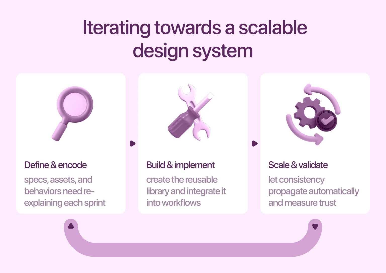
Slow handoffs between design and development
If specs, assets, and behaviors need to be re-explained each sprint, it’s a sign your workflows are too fragmented. Without a shared library of components, developers are left guessing. And designers spend too much time writing out usage instructions that should be baked into the system.
The result? Delays, misalignments, and constant clarification, all of which hurt your ability to ship at speed. What begins as minor friction compounds into a major drag on innovation.

Repeated redesigns and rework
Without a clear system in place, even slight changes to components or layout patterns ripple across your entire product. A simple update to a card layout, for instance, forces a manual hunt-and-replace operation across dozens of screens.
This leads to frustration, bottlenecks, and technical debt. A culture of “if it’s not broken, don’t touch it” sets in, stifling innovation. Teams begin to dread redesigns — not because the ideas are bad, but because the rework is too difficult.
Frustrated teams and confused users
Inconsistent interfaces impact internal velocity, and user experience too. This duality creates a lose-lose scenario. When patterns vary from screen to screen, users are forced to relearn how your product works.
Internally, the lack of structure often leads to finger-pointing between teams. Designers feel their work is being misinterpreted. On the other hand, developers feel like they’re building from scratch each time. Over time, that tension compounds. We covered the early warning signs in our guide How to find UX design problems.
Key building blocks of a UX design system
Building a UX design system isn’t about dumping every visual asset into a shared folder. Instead, it’s about creating a living structure that balances creativity with consistency. A strong system must grow with your product and be flexible enough to adapt without losing alignment. Let’s explore what a complete, well-functioning UX system typically includes:
Visual language
This is the foundation. The visual language defines the look and feel of your product across typography, color palettes, spacing systems, grids, iconography, and elevation rules.
Why it matters: visuals directly impact usability and accessibility. For instance, poor color contrast can hurt legibility and leave users with visual impairments behind. Even something as overlooked as spacing plays a critical role in how clean and intuitive your interface feels. Learn more in our post on Negative space in design, which offers a deep dive into spacing, flow, and clarity.
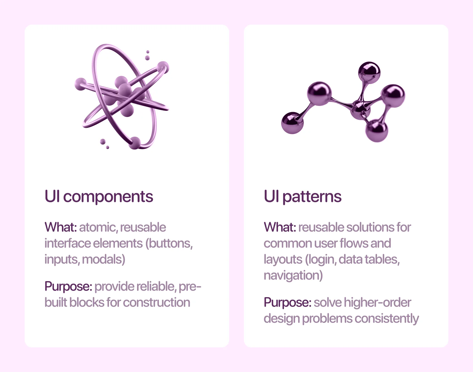
UI components & patterns
A UX design system should provide a reliable library of interface components — buttons, toggles, modals, tabs, form inputs, cards, alerts, and more — along with clear documentation for when and how to use them.
It’s also important to go beyond components and include reusable patterns. A component might be a button, but a pattern is a larger reusable structure — a login flow, a form layout, or a card grid. Patterns like these follow clear rules of hierarchy, spacing, and interaction, as we illustrate in our Card UI design guide.
{{banner}}
Interaction guidelines
Your system should define micro-interactions, transitions, hover effects, touch feedback, and more. This layer of polish transforms a static interface into a responsive, intuitive environment, providing users with crucial feedback on their actions.
If animations are leveraged, when do they trigger? Are they fast or slow? Should a dropdown slide in or fade in? These guidelines create a sense of continuity across your product. Their real value lies in marrying technique with rationale, ensuring every motion serves a purpose, from guiding attention to confirming an input.
Explore real-world motion ideas on our blog, including the best website animation techniques.
Content standards
Design isn’t complete without the right words. A well-rounded UX system includes tone of voice, grammar rules, naming conventions, and usage guidelines for everything from tooltips to error messages.
Microcopy plays a huge role in usability. Clear, intentional language can reduce user friction, prevent errors, and create a friendlier product experience. Define how you speak to users, whether it’s first or second person, formal or casual, concise or expressive. And most importantly, make sure the tone stays consistent across flows.
Accessibility principles
Accessibility should never be an afterthought. From day one, your system should support inclusive design — covering everything from color contrast and font sizes to keyboard navigation and screen reader compatibility.
By including accessibility standards early, you reduce future retrofits, improve compliance, and ensure your product works for everyone — a principle we detailed in Mental health and inclusive UX.
The strategic benefits of a UX design system
When done right, a UX design system becomes a competitive advantage. It turns design from a bottleneck into a multiplier, helping teams move faster, stay aligned, and create consistently great experiences. Here’s how it pays off:
Streamlined сollaboration between teams
A UX design system acts as a shared language for designers, developers, and product managers, eliminating ambiguity around core elements like buttons and error states. This clarity cuts through the noise of endless clarification, enabling teams to work in parallel without friction. Designers can prototype new flows while developers build features, all moving in sync.
Beyond streamlining workflows, the system drastically reduces decision fatigue. By pre-defining stylistic and interactive patterns, it liberates cognitive resources. Teams stop debating pixel-perfect details in every sprint and can redirect that energy toward solving higher-order problems — ultimately focusing on functionality and user outcomes.
“Design systems don’t limit creativity, but they free teams to spend their energy on solving bigger problems.”
Faster product iterations
Your brand should feel unmistakably yours everywhere. A UX design system operationalizes this by encoding core elements — typography, color, tone of voice, and interaction patterns — into a reusable component library.
Once defined, this consistency scales automatically. Every new feature, screen, or platform inherits a unified identity, building trust and recognition without requiring manual oversight for each implementation.
Consistent brand experience across platforms
Every product touchpoint — from a signup form to a dashboard — shapes your brand perception. A design system ensures this impact is deliberate, not accidental. It translates abstract brand values into concrete, reusable components and clear governance for their application across all platforms.
This consistency, baked directly into components, scales automatically. The result is a trusted, recognizable experience that makes users feel at home anywhere, strengthening brand identity with each interaction.
Cost and time savings in the long run
Let’s be honest: building a UX design system takes time. But once it’s in place, the payoff compounds quickly. Think of it as building a production line for quality and consistency.
Every hour you spend now documenting a reusable card layout, writing a tone-of-voice guide, or aligning on color usage will save your team dozens of hours over the next year. You reduce rework, lower QA costs, and cut down on support tickets caused by confusing or inconsistent design.
“Design systems are long-term investments that unlock speed, scalability, and sanity.”
How to create a UX design system that works
Creating a UX design system doesn’t mean locking your team into rigid rules. It means building the right foundation — one that’s strong enough to scale and flexible enough to evolve. Here’s a proven step-by-step process to create a system that gets used.
Step 1 – audit what you have
Start with a full inventory. Gather every UI component, screen, asset, and front-end element currently in use across your product(s). Take screenshots, label patterns, identify duplicate buttons, colors, font sizes, and layout structures.
This audit reveals just how much design debt has built up and gives you the raw material for building a unified system. Look for patterns: are there three “submit” buttons that look slightly different? Are there inconsistent modal behaviors? Now’s the time to clean the house.
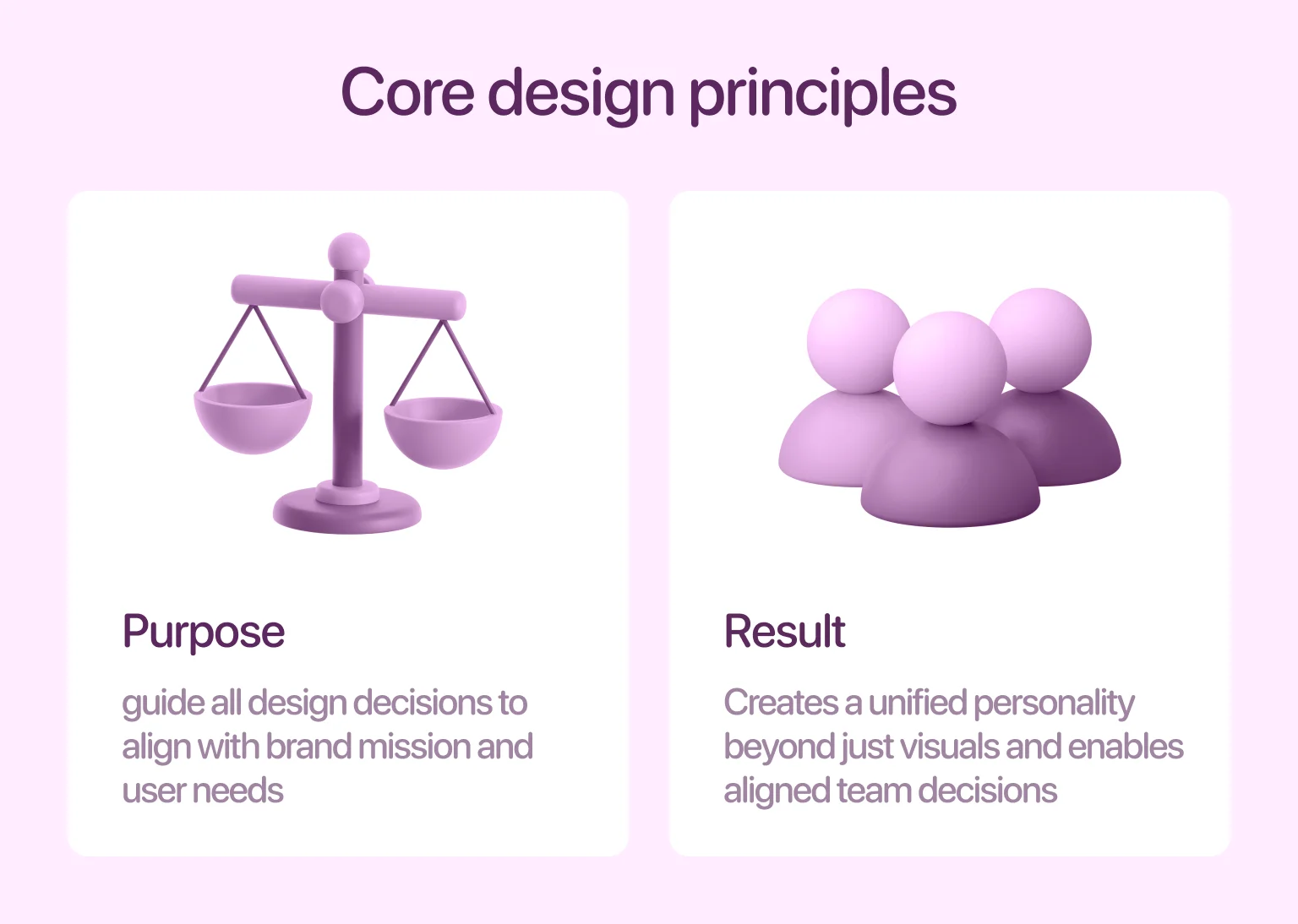
Step 2 – define core design principles
Before building any components, define the principles behind your design decisions. These should align with your brand mission, product goals, and user needs. Are you building for clarity or delight? Do you prioritize speed or flexibility? Should interactions feel playful or serious? Documenting these principles helps your team make aligned decisions even when new situations arise. This step also ensures that your system reflects your brand’s personality and not just its colors.
Step 3 – build a visual & interaction library
Now, start designing. Create standardized versions of your most-used components: buttons, inputs, alerts, cards, menus, and more. Define their states (default, hover, active, disabled), sizes, and spacing rules.
But don’t stop at visuals and add interaction rules too. How should a toggle animate? When does a toast notification appear? Build these into your design files using tools like Figma, and organize them into a reusable component library. The key here is clarity. A good component must be well-documented enough that anyone can use it with confidence.
Step 4 – integrate development code standards
Designers and developers should work from the same system. That means your design tokens (like colors, font sizes, and spacing units) should map directly to front-end code.
Use tools like Storybook, Zeroheight, or Figma-to-Code plug-ins to connect design specs with React/Vue/HTML components. This is where your UX system becomes an engine and not just a guideline. When devs can pull system-based components directly into their repo, you eliminate guesswork and shorten build time.
Step 5 – document everything in a central hub
It’s not a system if no one can find it. Build a central knowledge base where team members can explore components, patterns, accessibility rules, and usage guidelines. Your documentation tool can be as simple as Notion or as robust as Confluence, as long as it provides structure, clarity, and discoverability. Every button, tone rule, spacing scale, and animation guideline should be easily accessible and linked directly to design assets and code snippets.
Step 6 – train your team and onboard new members
A system is only useful if people actually use it. That means training your team continuously. Host live walkthroughs. Add documentation links to Slack channels and design reviews. Embed Figma libraries into project files. Make sure every designer, developer, and PM knows where to find and how to use your system.
For new hires, the system should be part of the onboarding process. Not an extra resource — a core part of how your team designs. When everyone understands the importance of UX, system adoption becomes much easier.
Common mistakes to avoid when implementing a UX design system
Design systems are powerful, but only when they’re implemented with care. It’s easy to get caught up in creating a perfect library, only to discover that no one’s using it or that it’s too rigid to adapt. Avoiding a few key mistakes can make the difference between a thriving system and one that gathers dust.
Treating it as a one-time project instead of an evolving asset
A UX design system is never truly finished because your product evolves, your team grows, and new use cases emerge. If you treat the system as a one-off deliverable that you launch once and forget, it will quickly become outdated and ignored.
The most effective systems function as living tools that are updated alongside the product roadmap, refined with team feedback, and iterated as technology changes, while version control, governance, and regular maintenance ensure long-term success.
Ignoring accessibility from the start
Accessibility isn’t something you can tack on later. Yet many teams wait until after a design system is built to start thinking about color contrast, keyboard navigation, or screen reader compatibility.
The cost of retrofitting accessibility is high — not just in time, but in potential risk and user exclusion. Instead, bake it into your system from day one. Every component, pattern, and style rule should be evaluated through an inclusive lens.
Overcomplicating the system
One of the most common issues with new UX systems is over-engineering. Teams create too many component variants, overly complex documentation, or rigid rules that stifle creativity.
The goal of a design system is to simplify and not to add friction. A lean, well-documented library of 20 components is far more usable than a bloated one with 200 that no one understands.
Skipping developer involvement in the early stages
Designers often take the lead in building out initial components and documentation, but development input is critical early on. Without developer collaboration, components may be difficult to implement, inefficient in production, or disconnected from the tech stack.
Bringing developers into the process ensures the system aligns with how your product is built and not just how it looks in Figma. It also encourages joint ownership, so adoption becomes a shared goal.
Real-world examples of UX design systems in action
Some of the most widely used digital products are powered by robust design systems. These systems aren’t just internal tools, but they’re strategic assets that enable consistency, speed, and user trust at scale. Let’s look at three notable UX design system examples:
Google’s Material Design
Material Design is one of the most comprehensive and widely adopted UX systems in the industry. Created by Google, it defines component libraries and visual styles, motion, depth, interaction patterns, and adaptive behaviors across platforms.
Its strength lies in how deeply it integrates with Google’s ecosystem, from Android apps to web tools like Gmail and Google Docs. Material Design has helped unify a vast product suite under one cohesive language while still allowing flexibility for branding and use-case variations.
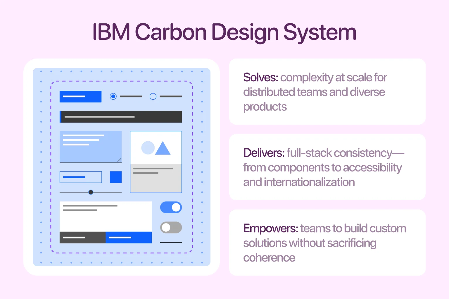
IBM Carbon Design System
IBM’s Carbon Design System is built for enterprise-scale applications. It offers a robust framework that includes not just components and layout grids, but accessibility standards, color tokens, data visualizations, and even internationalization support.
The system is open source and used across dozens of IBM products, helping large, distributed teams maintain consistency while supporting custom use cases.
Atlassian Design Guidelines
Atlassian, the company behind tools like Jira, Trello, and Confluence, created a design system that focuses on clarity, transparency, and user empowerment. Their system includes design tokens, layout systems, component documentation, and a robust content guide focused on voice and tone.
A unique aspect of Atlassian’s system is how it supports collaboration within its tools, enabling consistent UI behaviors across products used side by side by the same teams. We applied similar principles of clarity and consistency in our METI project, which shows how thoughtful design systems can bring personality and structure even to highly technical interfaces.
Maintaining and scaling your UX design system over time
A design system goes far beyond a collection of reusable buttons and styles. It functions as a product in its own right. Like any product, it needs long-term care, documentation, and processes to scale with your team and your product roadmap. Without ongoing investment, even the best systems begin to break down. Here are the three pillars of a sustainable system:
Setting governance rules
Governance is essential for maintaining a design system as it evolves. It clarifies who is authorized to make changes and how they should do so. Without clear ownership, duplicate components, inconsistent rules, and undocumented modifications can easily occur, leading to confusion, rework, and ultimately abandonment.
To prevent this, establish roles and responsibilities early on. Some teams rely on a centralized design ops team to oversee the system, while others adopt a federated approach where contributors from different squads suggest changes through a review process.
Version control for design assets
Just like code, your UX system should be versioned. When components or styles change, you’ll need a way to track what changed, why it changed, and what teams need to know to adopt it. Tools like Figma’s version history, Storybook’s changelogs, or even Git-connected documentation allow teams to roll out changes incrementally and avoid surprises. Version control also helps when rolling back, because not every update will be a winner. Keeping your system versioned builds trust. It shows your team that change is intentional and documented.
Continuous feedback loops from users and teams
No system can predict every edge case, and what works today may not work six months from now. That’s why feedback from real teams using the system is essential. You can set up recurring audits, conduct usage surveys, or open feedback channels in tools like Notion, Slack, or Jira.
When someone works around your design system, it’s not just an issue but an insight. It tells you where your system isn’t serving the team’s needs. The most resilient UX design systems are shaped by the teams that use them. They grow based on real-world needs, not just theory.
From mess to mastery
To wrap things up, a design system is really about making everyone’s work smoother. When your team shares the same patterns, language, and expectations, the entire product starts to feel more intentional and less chaotic. And now you know: the real power of a design system isn’t in the components, but in the clarity it brings to how your team works.
If you ever reach a point where things feel too fragmented or hard to maintain, that’s exactly the kind of challenge we help teams solve at Halo Lab. With the right structure in place, scaling your product becomes a lot more predictable — and a lot more enjoyable.
FAQ
Why invest in branding services services services?
Can one UX design system work for multiple products?
Yes, if the products share a foundational design philosophy and the system is built as a flexible, modular framework from the start.
How do you measure the effectiveness of a UX design system?
Key indicators include high adoption and component reuse, measurable improvements in team speed and UI consistency, and direct, positive feedback from designers and developers.
What risks can arise when scaling a design system?
Without strong governance, scaling risks bloat, inconsistency, and a loss of trust as the system becomes complex and difficult to maintain.
How do you roll out changes without breaking existing products?
Successful rollout relies on versioned releases, clear communication, and migration support, treating the design system with the same care as the products that depend on it.
Can AI be integrated into a design system?
Yes, if it demonstrably reduces friction — by automating documentation, aiding discovery, or enhancing accessibility — without adding undue complexity.