Imagine taking your child to a routine check-up, then trying to access the doctor’s follow-up instructions — only to face confusing medical jargon and a phone-unfriendly PDF. Most people won’t struggle through it. They’ll leave the portal and call the clinic instead. That’s the reality of many healthcare interfaces today.


Healthcare systems typically design their products around clinical workflows, billing codes, or compliance checklists. However, rarely does patient-centered design in healthcare begin with the person at home, as it should. This ends up in patients getting even more confused, fearful, or tired in search of an answer than before they sought it.
There is a huge divide between how the healthcare system tries to communicate with families and how families understand what they’re being told. Many US citizens cannot read health information at a basic level. Disregarding this fact, patient portals are typically written at a graduate level when they provide a discharge summary. This isn’t a flaw on the individual’s part, though.
Our post is for healthcare product owners, hospital innovation leads, and scale-up founders who suspect their digital products are useless for the people they serve. We’ll look at why patient-centered healthcare design keeps failing families, what poor communication in healthcare actually costs, and what your product team can do differently.
The real cost of poor communication in healthcare interfaces
Communication failures are the leading root cause of sentinel events — the most serious category of medical errors. And a significant portion of those failures now happens through digital interfaces.
Poor communication in health care only frustrates patients. It is also a major cause of emergency room visits due to difficulty understanding discharge instructions. In fact, ineffective communication can also lead to medication errors when important dispensing information is hidden behind dropdowns on dosage selectors.
In a product context, “poor communication” can look like:
- a patient portal showing lab results without explaining what they mean;
- a medication app listing drug names without saying what they’re for;
- a telehealth visit ending without giving the patient anything to review afterward.
The last effect of low-quality communication is well-illustrated by a 2026 study published in the American Journal of Managed Care. It found that older adults, Black patients, and non-English speakers were less likely to use patient portals than younger, White, and English-speaking patients. So, when these tools are poorly designed in terms of communication, it can disproportionately affect certain groups, exacerbating existing gaps in access to care.
“Interfaces designed for compliance officers instead of patients aren’t neutral — they actively exclude the people most in need of clear health information.”
What families actually experience
When a family member receives a new diagnosis, they don’t think in terms of ICD codes or formulary tiers. They think: What does this mean? What do we do next? Will they be okay?
But patient-centered hospital design — whether physical or digital — rarely accounts for the family as a user. Most EHR-connected portals treat the “patient” as a single authenticated individual. Caregivers, spouses, parents managing a child’s care? They’re afterthoughts. Or they’re sharing login credentials in ways that violate security policies because the system gave them no other option.
The result? Families are left trying to piece things together, from screenshots of patient portals, photos of discharge papers, and conversations they only partly remember because the clinician was busy typing during the visit.

Why many patient portals fail the education test
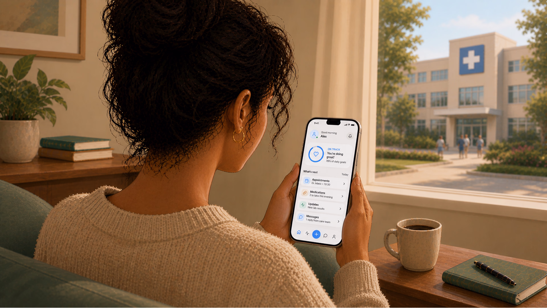
A portal that shows you a hemoglobin A1c value of 7.2% is giving you access. A portal that says “Your blood sugar average over 3 months is slightly above the recommended range — here’s what that means and what to discuss with your doctor” is giving you understanding.
{{banner}}
The literacy mismatch
Studies continue to demonstrate that individuals with low overall health literacy are less likely to utilize portals. They express lower satisfaction with their use of portals and make less use of information obtained from portals as well. All of these are possible only if a person actually knows about health portals. In many cases, less literate patients simply don’t realize that health portals exist.
Rethinking the entire information architecture is required to close the gap. This means:
- modifying the reading level for every label;
- rethinking how you create notifications;
- improving how you design the post-visit summaries.
In short, patient-centered design should treat comprehension as a required element rather than a desirable one.
EHR interfaces weren’t designed for patients at all
Most EHR systems score abysmally on usability. In one study, physicians gave their EHR systems an average usability score of 45.9 out of 100. Then, the question arises, if the software is barely usable for trained clinicians who spend years learning it, what chance does a 72-year-old patient with a new diabetes diagnosis have?
The core problem is that these systems were originally designed for documentation, not for patients. When patient portals were added later, they just inherited the same structure. What’s more, the same technical language and the same assumptions about who would be using them stayed intact. At no point was there a real check on whether patients could actually understand what they were seeing. If your platform is still built on legacy systems that make it hard to improve the patient experience, the issue likely goes beyond just user experience. It may be a healthcare software modernization challenge.

What does patient-centered design look like in healthcare?
There are three basic things you should know in order to include patient education in design. Let’s take a closer look at them.
Start with the family, not the patient record
Patient-centered healthcare design begins with understanding who is actually using the product. In pediatric care, it’s almost never the patient — it’s a parent. In geriatric care, it’s often an adult child. In chronic disease management, it’s frequently a spouse or partner who manages medications.
Your task is to create designs that enable actual clients to use the system, i.e., allowing multiple users access with permission restrictions based on role. Another thing to consider is designing caregiver dashboard views to help caregivers manage their patients. Patient notifications, like reminders, should also be easy to share when needed, without compromising patients’ privacy. Additionally, consent flows need to be updated to reflect how people actually use these systems.
When we designed AceCancer, a platform for oncology patients built with Ace Engine, the entire product was architected around a reality most healthcare tools ignore: cancer is not a solo experience. The patient tracks their disease progression. But the family needs updates. The caregivers need task visibility. The medical staff needs a parallel clinical interface that doesn't collide with what the family sees. Over 15 months, we built a system where patients control what gets shared and with whom — updates on treatment progress, appointment outcomes, symptom changes — while caregivers receive information structured for action, not anxiety. The design challenge wasn't showing data. It was deciding what each person in the care circle needs to see, when, and in what tone.
Write for comprehension, not for compliance
In order to create a clear healthcare interface, you should treat every piece of text in it as a design decision. Good patient-centered design runs every patient-facing string through a readability filter. The recommendations are pretty simple:
- target a 6th-grade reading level for patient-facing content;
- use short sentences;
- replace medical jargon with plain-language equivalents;
- offer the clinical term as a tooltip or expandable detail for users who want it.
You might see it as simplification, but it’s rather designing for the actual cognitive state of users, i.e., stressed, distracted, in pain, etc., and those who are assisting others in crisis. Therefore, an interface that can convey messages clearly under these conditions will have been better engineered than one that cannot.
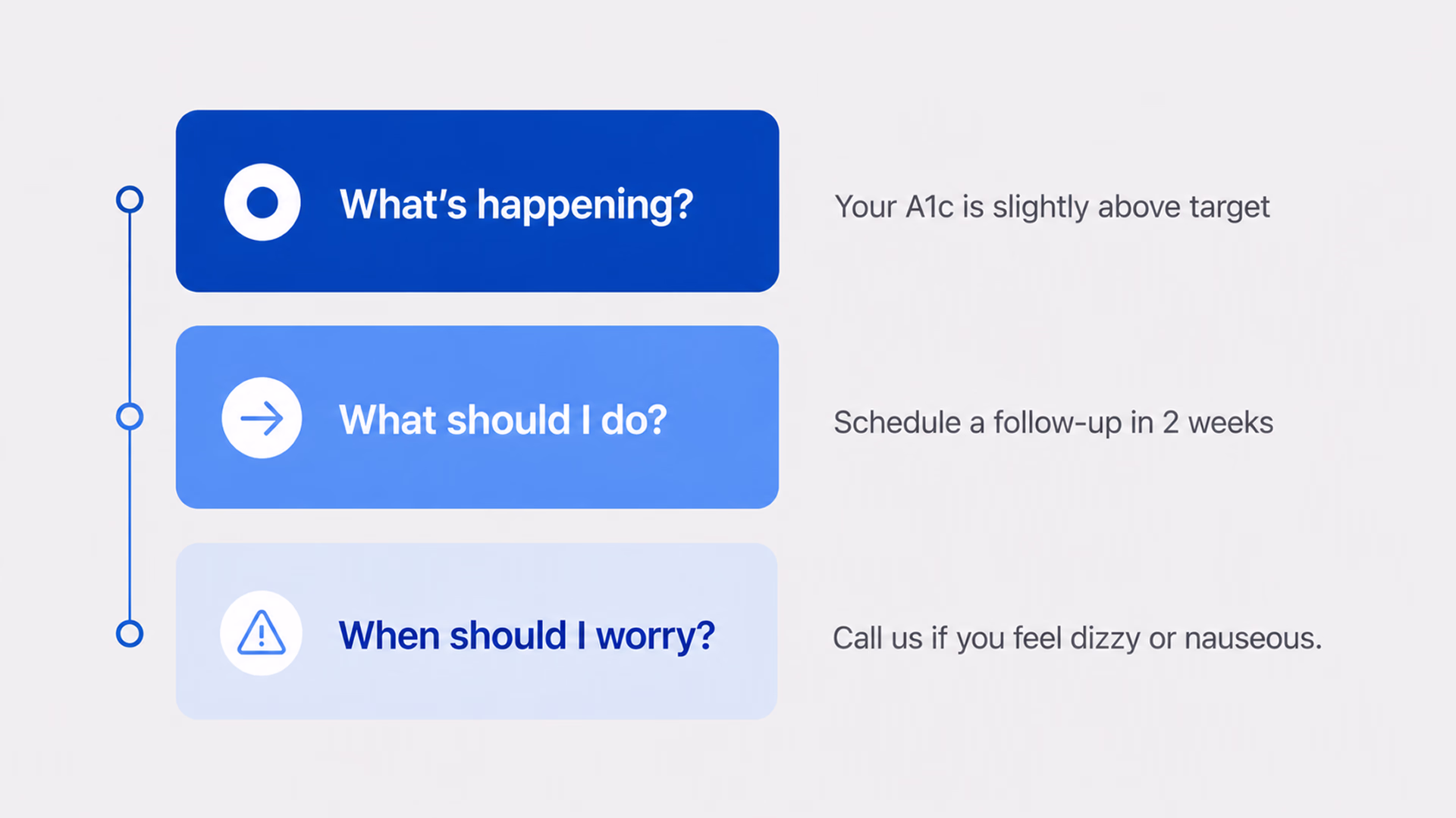
Structure information around decisions, not data points
The final important factor is how you structure health information on your portal. Families want answers to a few questions in the beginning, namely: What happened? What should they do? When should they be concerned about something?
Build your post-visit summary, test result notification, and care plan screen around these three questions. Remember, the first thing to present is the action item. Then provide some context. Finally, offer additional detail on demand — don’t load all the details into the opening paragraph of a screen. This is the basis for “information hierarchy.”
If you’re building healthcare software and your test results screen shows data before context, your interface isn’t optimized for the person reading it.
This tension between clinical depth and patient clarity defined our work on nAbleIVF, a full-stack platform for fertility clinics built for Nth Technology. The system handles everything from cycle planning and embryology workflows to billing and analytics — highly specialized clinical data that fertility specialists navigate daily. But it also includes a patient portal where people going through one of the most emotionally charged medical experiences of their lives check lab results, review cycle details, manage consent forms, and message their care team. The same platform, two fundamentally different users. We structured the patient-facing side around the questions patients actually ask — "what did my results mean?", "what happens next in my cycle?", "is this normal?" — rather than mirroring the clinical data architecture that powers the provider view.
The patient-centered hospital design
There’s an interesting parallel between digital patient education failures and physical healthcare environments. Patient-centered hospital design has long emphasized wayfinding, comfort, and reducing anxiety through environmental cues, such as natural light and noise reduction.
Digital health care interfaces should work according to these same principles, but they don’t. Instead, we see:
- Registration flows treated like tax forms;
- Appointment Confirmation messages that are just large text blocks without formatting;
- Post-Visit Surveys requesting feedback on the Visit Experience, even before the patient has been diagnosed.
There’s a clear gap between the care the hospital aims to provide in person and what patients experience through its digital tools. Patients notice this too. For example, a hospital might emphasize comfort and support in its physical spaces, but its app may leave patients on their own without guidance. That kind of mismatch can weaken trust in the organization.
“Patients do not look for ‘formulary status,’ but instead seek the answer to ‘will this medication be affordable for me?”
In practice, it’s well-illustrated by color-coded lines on the floor in physical hospitals to help you navigate to the various departments. There is no similar system within patient web portals. When patients log in to the patient portal, they will see a “dashboard” and will need to try to determine where their specific information is located. For example, will their prescription be located under “Medications,” “Visit Summary,” or “Messages from Provider?”
{{banner-2}}
Five patterns that fix patient education in digital products
Having outlined the problems with healthcare portals’ design, we’ll now share how product teams can actually tackle them.
1. Education layering in context
The first step toward better healthcare design is to integrate “education” into the interface, rather than providing it separately or in a different location on the site. When someone reviews their lab results, the results should be accompanied by a plain-English explanation of what they mean. This can be accomplished effectively by using progressive disclosure:
- the headline lab result will link to an explanation in layman’s terms;
- that link will lead to a detailed clinical context for that result;
- that context will contain links to additional reading material related to that result.
Each of these connections can be hyperlinked or designated as optional, though the first two should always be the defaults.
2. Communication beyond reading
There are many patients who cannot read or do not understand what they read. They communicate through video, graphics (infographics), audio, etc. The design of a truly patient-centered approach incorporates the same information across these formats so that an individual can access what works best for them.
This is not only beneficial for people who do not have the ability or resources to read, but also for those who do and choose to use content delivered in modes other than text. For this last group, each format will ultimately allow the same interpretation of any treatment plan.
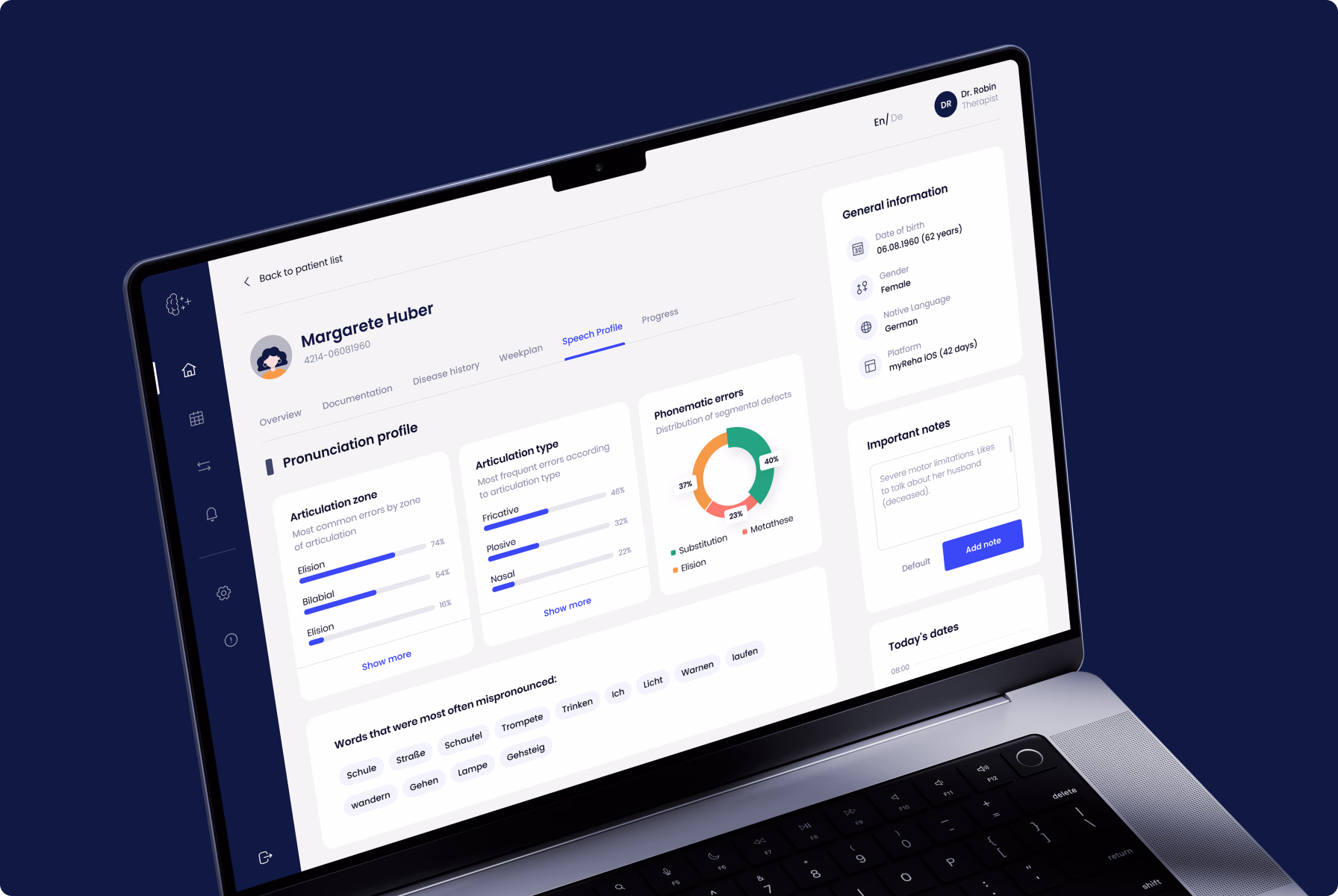
This principle shaped every design decision on myReha, a digital therapeutics platform for patients recovering from stroke, Alzheimer's, and multiple sclerosis. When your users have neurological impairments — limited motor control, memory gaps, reduced attention span — "read the instructions" isn't a viable strategy. The product needed to communicate through multiple channels simultaneously: visual cues, simplified interactions, guided audio, and adaptive interfaces that respond to the patient's cognitive state on any given day. The engagement component wasn't a feature we added on top. It was the architecture itself — every screen designed to keep a cognitively impaired patient moving forward without overwhelming them. If you can design for a stroke recovery patient on a difficult day, you can design for anyone.
3. Designing with the care team in mind
When designing for “real” instead of “ideal,” you should account for not only the primary caregiver, but any or all of the primary and secondary caregivers (i.e., the care team) associated with the patient. (i.e., shared accounts, role-based access, and the ability of the non-professional caregiver to mark an item as completed for the patient). If you do not plan to support the actual care team associated with a patient, you are designing for the electronic medical record (EMR), not for the family who is managing the patient’s care.
4. Post-visit follow-through design
After the patient goes home, the appointment is over. And then there is either nothing or, worse, you get a bunch of jargon seven days later in an after-visit summary. The main objective here is to redesign this experience. Send out a plain-language summary to the patient within an hour of their appointment. Use three bullet points for the key items. Give the patient an action item. This is where either patient education happens or dies, and many platforms do not take this into account at all.
5. Build in actual design feedback loops
Some healthcare products collect patient satisfaction scores, but do not use this data to improve design. For a better design, you need to build in feedback loops that allow patients to report bad content or unclear instructions, or to request simpler language. Then, route those signals to your design team. Patients will tell you where your product doesn’t work, but you ought to listen.
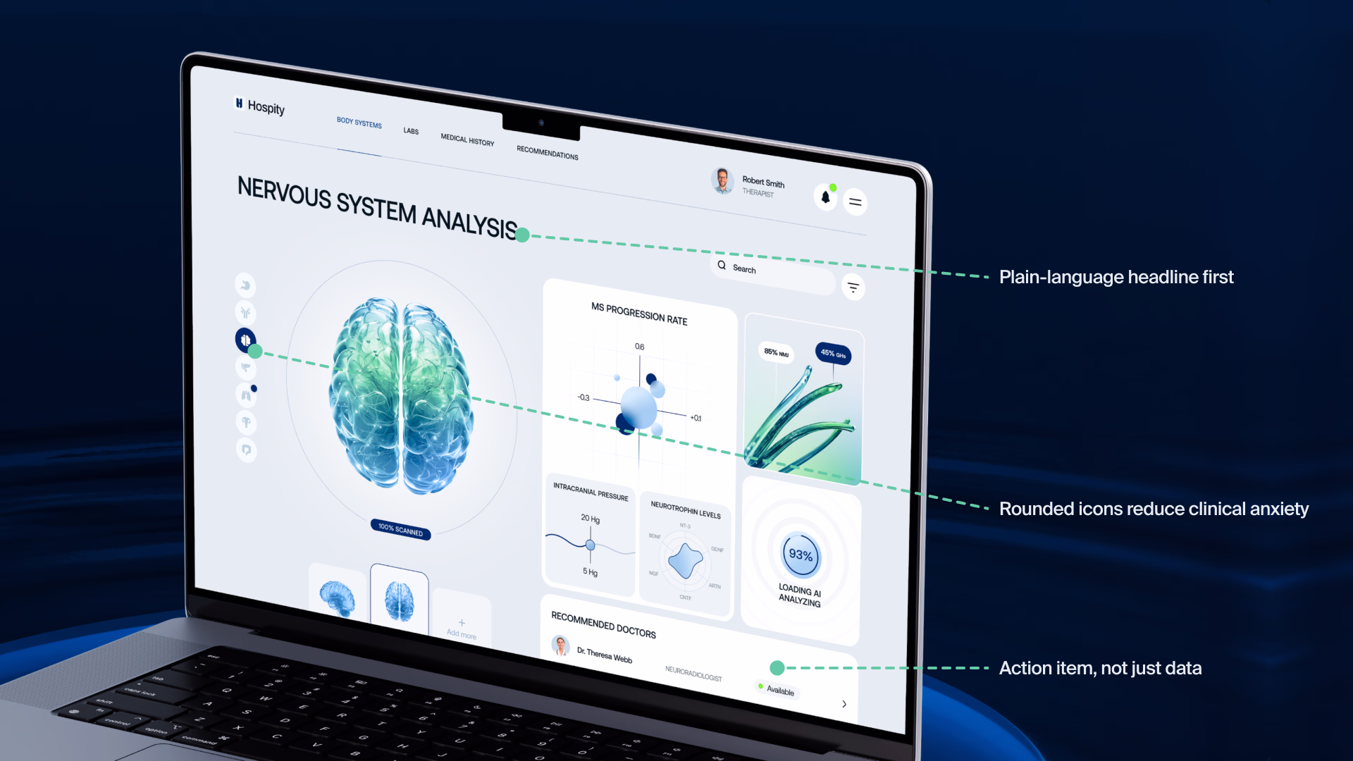
Five patterns in practice: Hospity case
These aren’t hypothetical patterns. At Halo Lab, we’ve applied them across healthcare website design and product projects. When we worked on Hospity, an AI-powered healthcare platform, the challenge was making complex diagnostic data feel approachable for both clinicians and patients. Our branding and UI/UX design work focused on building a visual language that communicated clarity and trust. It included rounded icons, supportive imagery, and an interface that reduced cognitive overhead rather than adding to it. The result was a product that felt human, even when the technology behind it was deeply technical.
How to audit your healthcare product for patient education gaps
Before you redesign anything, it’s worthwhile to audit what you have. Here’s a practical approach.
The “hand it to your mom” test
Open your patient portal on a phone — not a desktop, because that’s how most patients use it. Hand it to a family member who isn’t in healthcare. Ask them to find their last test result and explain what it means.
Your main task is just to watch and not help. If they can’t find that test result in under three minutes, your product has a patient-centered design problem. If they complete the task but can’t explain the result, your product has a communication problem. Both are design problems.
Map every patient-facing touchpoint
Another way to audit your website is to list every screen, notification, email, and SMS your product sends to patients. For each one, answer:
- Is this written at a 6th-grade reading level?
- Does it include a clear action item?
- Is it accessible on mobile?
- Could a family member act on it without being the authenticated patient?
If you answer “no” to more than two of those on any touchpoint, that touchpoint is failing. Prioritize the ones tied to medication, follow-up care, and diagnostic results — those are where poor communication in healthcare causes the most harm.
Run a caregiver journey map
The last test checks whether your product is suitable for someone who helps your patient manage their illness. Take your standard user journey and run it again — this time, from the perspective of a caregiver who is not the patient. Where do they get stuck? Where does the product assume they don’t exist? Where are they forced into workarounds?
Healthcare products that undergo a product audit focused on real user behavior surface design flaws that usability testing with ideal users would never reveal.
Families deserve interfaces that make health make sense
Healthcare product teams have spent two decades digitizing clinical workflows. But somewhere between the EHR and the patient’s phone screen, the system’s actual purpose got lost. Patient-centered design asks a fundamentally different question than most healthcare software projects start with. Not “how do we display this data?” but “how do we help this person understand what’s happening to their body and what to do about it?”
That shift changes everything — the information hierarchy, the language, the user roles, the notification logic, the entire architecture of how health information moves from system to human.
FAQ
Why invest in branding services services services?
What is patient-centered design in healthcare?
It is an approach that focuses on patients and their needs when creating a product. In digital healthcare, it means designing clear, easy-to-use interfaces with simple language, supporting family caregivers, and organizing information around decisions rather than raw data.
Why do patient portals fail to educate patients effectively?
Many portals were built on top of EHR systems designed for providers, not patients. As a result, they use complex medical language, confusing data structures, and a provider-focused organization.
How does poor communication affect patient outcomes?
Communication failures are a major cause of problems like medication errors, missed follow-ups, unnecessary hospital readmissions, and delayed diagnoses. Studies show that poor communication is the leading cause of serious medical incidents. And when digital tools increase the amount of communication needed, they can sometimes create new problems instead of fixing them.
How can startups use patient-centered design cheaply?
Start by taking all patient-facing text and rewording it to a 6th-grade reading level. Then conduct three caregiver walk-throughs, document all the places where patients are getting stuck, and make this your number one priority. After that, fix post-visit summaries and drug instructions, as these are the highest-risk areas.
How does accessibility impact patient-centered design?
Accessibility is essential in healthcare technology. People using these tools include older adults with low vision, non-native speakers, individuals with cognitive disabilities, and stressed caregivers. To serve everyone, systems must include features like multiple languages, WCAG compliance, adjustable text size, and alternative content formats.