Patient portals have never been more powerful — packed with messaging, telehealth, bill pay, health tracking, prescription refills, and AI-powered triage. And yet, the vast majority of patients still pick up the phone. The problems with patient portals run deeper than anyone wants to admit, and no amount of new features will fix what’s fundamentally a design failure.


Over 61% of U.S. adults have accessed a patient portal at least once, according to recent HINTS data. Awareness? That box is checked. But sustained engagement tells a different story. Only about 20% of enrolled patients use their portal regularly. Most log in once to check a lab result, then never come back.
The patient engagement solutions market is projected to reach $21.6 billion in 2026, growing at roughly 18% annually. Billions of dollars are flowing into digital patient tools. So where’s the disconnect? This blog post breaks down the most persistent problems with patient portals and explains why the “add more features” approach backfires.
{{banner}}
The feature overload problem
Let’s start with the most counterintuitive truth about digital health tools. Adding more capabilities to a patient portal almost always worsens engagement.
Think about the last time you opened a banking app. You probably needed to do one thing — check your balance, move money, maybe pay a bill. Now imagine that every time you opened it, you were greeted with retirement planning dashboards, investment calculators, insurance comparisons, and tax filing tools, all fighting for your attention on a single screen. You’d close the app.
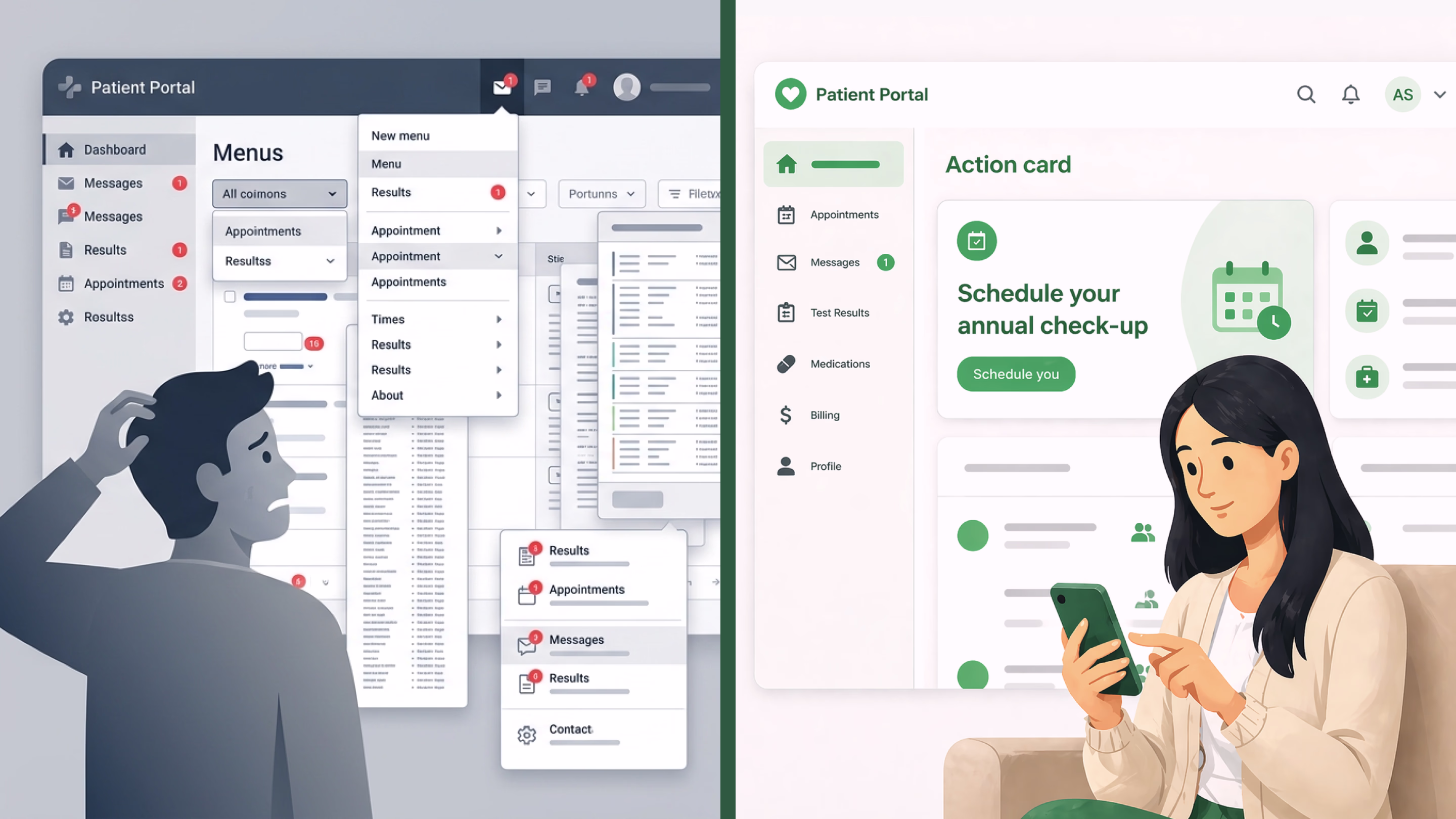
That’s what most patient portals feel like. With all these confusing layouts, poor page organization, and information overload, novice users feel frustrated. The root cause is a product mindset borrowed from enterprise software: more features equals more value. But patients are not power users. They’re often anxious, in pain, or managing a condition they barely understand. Every additional menu item is a cognitive weight they didn’t ask to carry.
“Patients do not want another dashboard. They want an answer to ‘what should I do next?’”
The challenges of patient portals become obvious when you look at how these systems were actually built. Most grew out of EHR vendor add-ons, designed for regulatory compliance rather than patient experience. Compliance got the portal launched. But compliance never kept anyone engaged.
The emotional gap in patient portals
Here’s something that rarely shows up in product requirements documents. Patients crave emotional context, and portals offer none. On the other hand, a phone call conveys empathy. Tone, pauses, reassurance — things a typical portal interface simply cannot replicate.
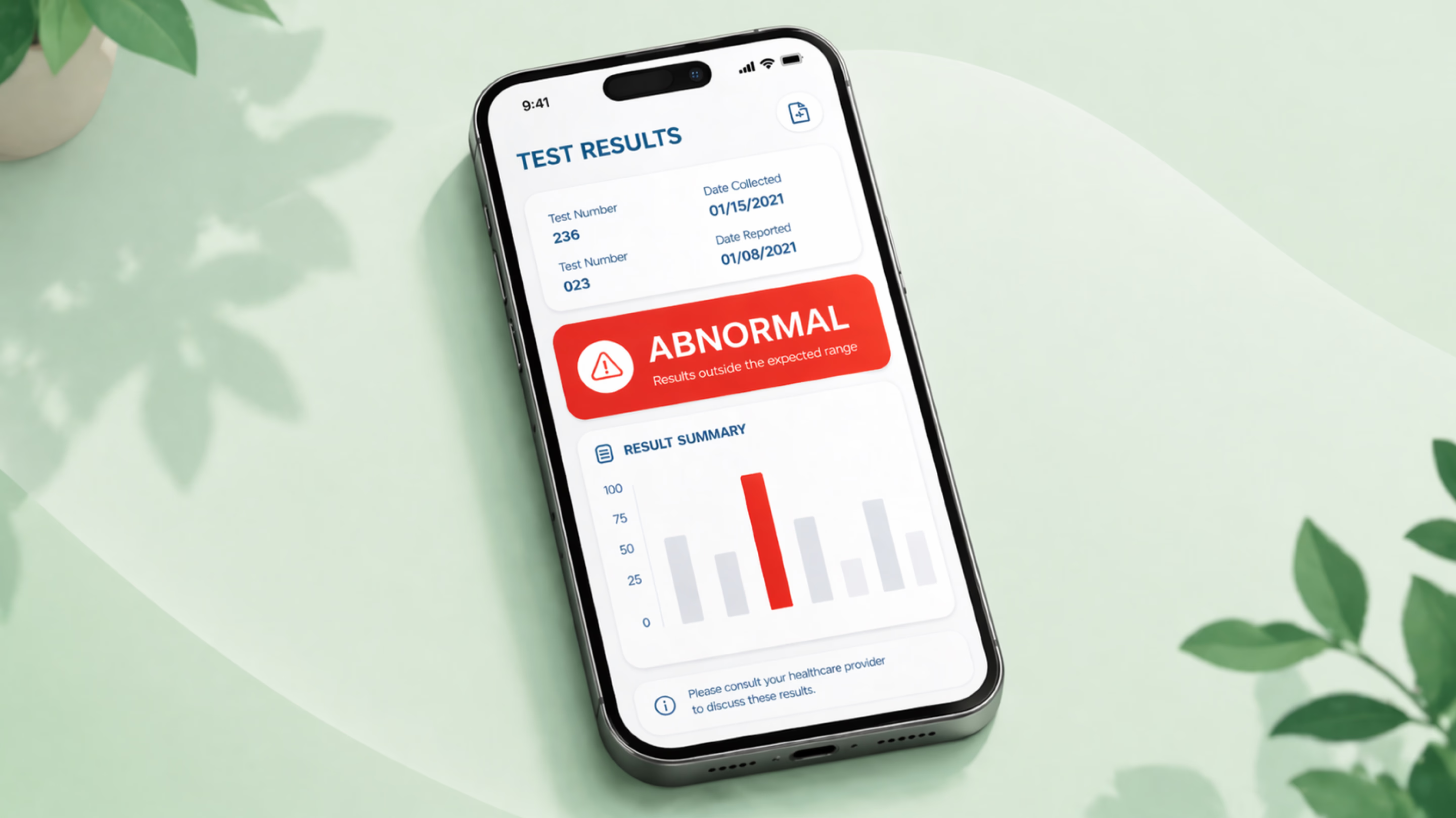
When a patient sees “abnormal result” on their screen without any context, the experience can range from confusing to genuinely panic-inducing. Patients receiving abnormal results were significantly more likely to report negative emotions (56% vs 21% for normal results). And no “Learn More” link can fix that.
The thing is, the problems with patient portals aren’t just technical, but emotional. And until product teams start treating portal design as an exercise in empathy, the phone will keep ringing. They should ask the questions that patients agonize over, like “Will someone understand how worried I am?” or “Should I hear this from a real human?”
Thoughtful healthcare portal building can genuinely close this gap. When interfaces acknowledge that patients bring fear and uncertainty to every interaction, digital channels start to earn the trust they need to replace phone calls.
The hidden friction of fragmented patient portals
Patients often have to manage separate portals for different providers, creating a fragmented experience with multiple logins. The frustration of forgetting passwords and having to reset credentials eventually leads to giving up and calling instead.
Some individuals don’t use patient portals at all, simply because they lack reliable internet access. And for those who do get online, managing separate accounts for different providers is time-consuming enough to undo whatever convenience the portal was supposed to offer.
Care partners — spouses, adult children, siblings — make things even more complicated. Most portals don’t support collaborative access in any meaningful way. So families resort to sharing login credentials, which directly conflicts with privacy protections and the systems’ own legal obligations. The processes for granting shared access are so burdensome that most families skip them entirely.
The challenges of patient portals multiply fast when fragmentation enters the picture. And for older adults or less tech-confident users, the experience of juggling multiple systems feels hostile. Frankly, we can’t blame anyone who decides the phone is easier.
The health literacy blind spot
Patient portals were designed by people who understand medical terminology. However, they’re used by people who mostly don’t. Providers have raised this concern themselves, noting that portals can confuse patients, alienate non-users, and exacerbate health disparities.
“Every assumption baked into a portal’s design, be it reading level, language, or digital fluency, decides who gets to participate in their own care.”
The problems with patient portals are amplified when the interface assumes a reading level, a digital fluency, and a comfort with medical jargon that huge segments of the population simply don’t have. This is where inclusive design becomes essential — designing not for an imagined “average user,” but for the widest possible range of real humans interacting with the product.
The provider burden no one talks about
Patients aren’t the only ones suffering. Clinicians are drowning too. Just think about it: pediatricians spend an average of 3.4 hours per day documenting care in EHR systems. The typical active time per encounter in the EHR is around 16 minutes, with a significant portion happening after hours:
- layer portal messages;
- complex patient inquiries that require thoughtful responses;
- prescription refill requests;
- follow-up questions about test results.
Patient portals were supposed to reduce phone call volume and save providers time. In practice, they’ve often added another communication channel to manage without reducing any of the existing ones. The operational challenges of patient portals create a vicious cycle: slow portal responses push patients back to phone calls, which increases administrative burden, which makes portal responses even slower. Without proper workflow design and triaging built into the portal itself, the tool becomes part of the problem it was meant to solve.
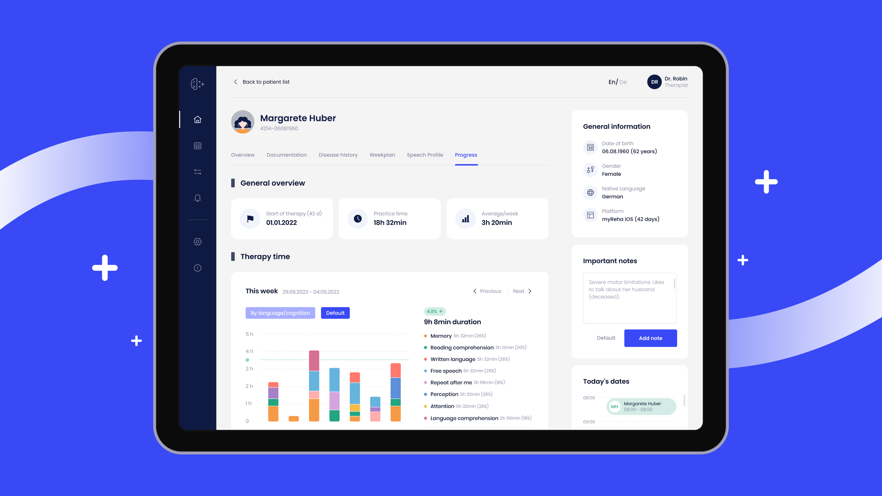
Healthcare organizations need to rethink portal interactions from both sides of the screen. That means designing for clinical efficiency as much as for patient experience. It’s something our team at Halo Lab addressed when we redesigned the Nyra Health platform. In this case, we created an intuitive interface that simplified complex neurological patient data for medical professionals while keeping the experience clear and warm for patients. The result was a 16% increase in platform engagement.
What good portal design actually looks like
So if more features aren’t the answer, what is? Design that starts with human behavior. Here are some recommendations to help you achieve a good portal design.
Begin with the one thing
The best consumer apps don’t greet you with a dashboard of everything you could ever do. They surface the one action you most likely need right now. Banking apps show your balance. Ride-hailing apps show a “where to?” prompt.
Patient portals should do the same. If a patient has a pending lab result, show that. If they have an upcoming appointment, provide preparation instructions. If there’s nothing urgent, show a calm, uncluttered home state. Remember that progressive disclosure — revealing complexity only as the user needs it — is the antidote to feature bloat.
Design for emotion
Presenting an “abnormal” flag without context is a design failure. Results should be delivered with clear, plain-language explanations. Visual hierarchy should guide patients toward understanding rather than panic. And when results are sensitive, the portal should proactively suggest next steps instead of leaving patients alone with a scary data point.
This principle aligns with a broader philosophy we’ve explored in our article on how UX design reduces anxiety. When interfaces are designed with emotional intelligence, they don’t just display information — they support people through it.
Unify the experience
Interoperability is a UX imperative. Patients should not need separate portals for separate providers. The next wave of healthcare UX is about unified health ecosystems. It encompasses integrated dashboards that pull together EHR data, lab results, medications, and provider communications from across the care journey into a single coherent view.
Make onboarding effortless
Hospital onboarding strategies for patient portals are often laughable. An inpatient might get a brief demo during discharge. Outpatients might receive a pamphlet at checkout. Compare that to the frequent, well-timed texts pharmacies send to prompt prescription refills. The difference? Pharmacies understand behavioral nudges. Hospitals mostly don’t. Good onboarding means meeting patients where they are — via text, email, even in-app walkthroughs — with just enough guidance to complete their first meaningful action.
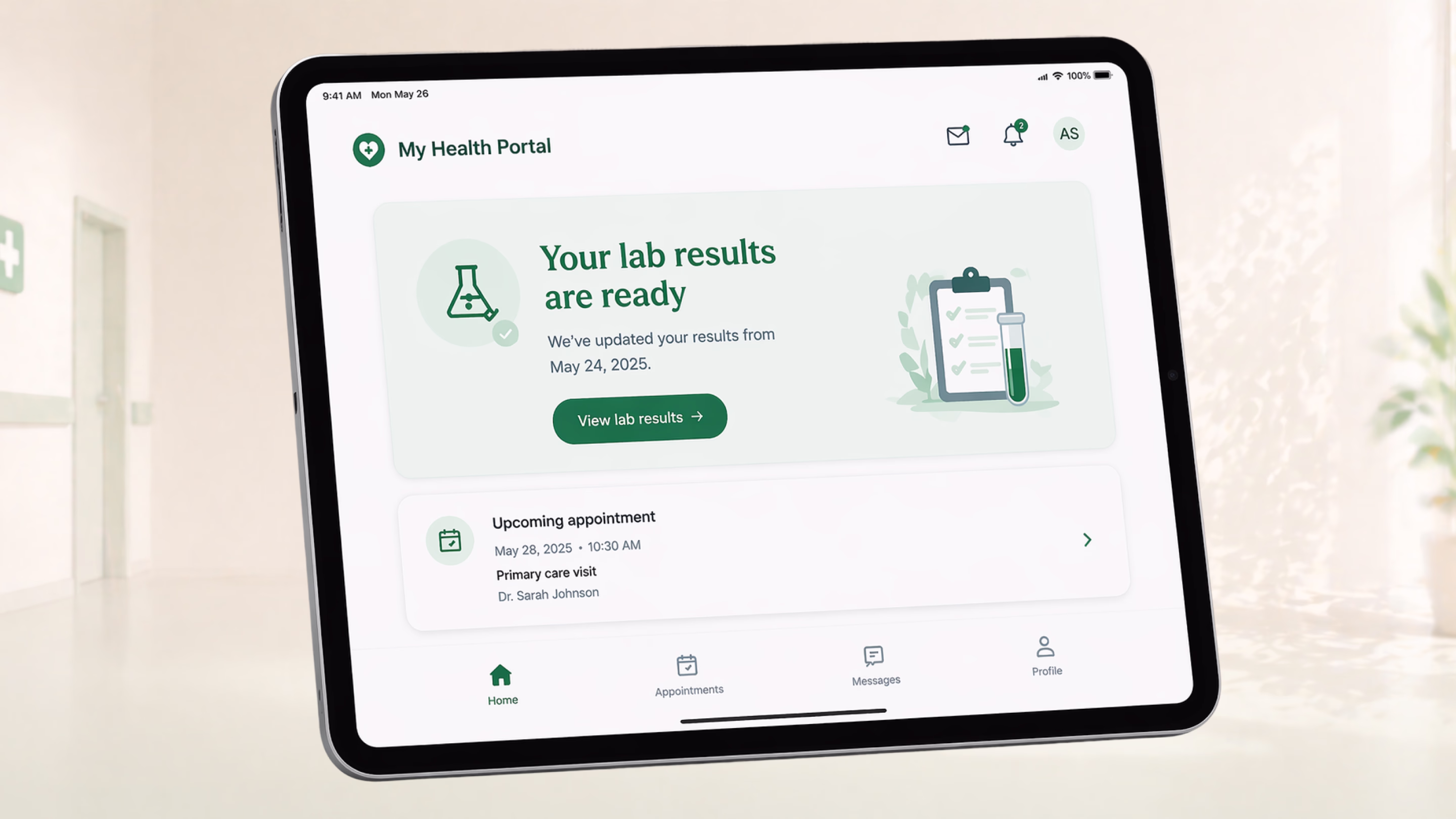
Good portal design surfaces what matters most right now
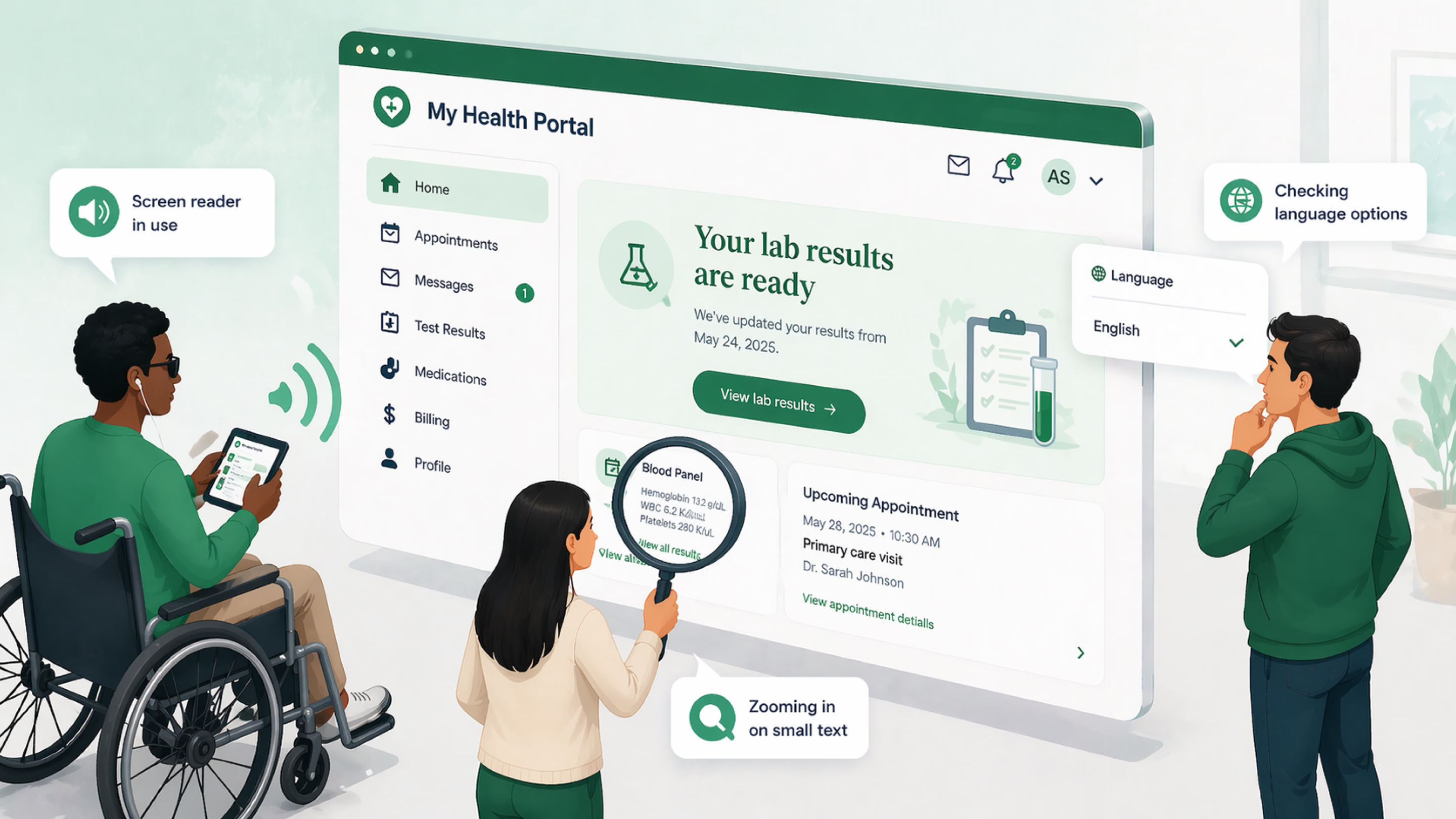
Treat accessibility as a foundation
Elderly patients with chronic illness often necessitate software products that include accessibility features such as:
- keyboard navigation;
- screen reader compatibility;
- high-contrast colors;
- multi-language options that extend beyond Google Translate;
- adjustable text sizes (not optional).
When we worked on the Home Medix platform, accessibility was foundational — high-contrast visuals, intuitive workflows, and an interface designed specifically for seniors with limited technical literacy. It’s the same thinking that should inform every patient portal built today.
The design mindset shift healthcare needs
The problems with patient portals won’t be solved by the next feature sprint. They require a fundamentally different approach — one that treats the portal as a relationship. This means:
- conducting real user research (not just stakeholder interviews).
- testing designs with the patients most likely to struggle.
- measuring success by engagement depth: repeat visits, completed actions, reduced call volume.
- partnering with teams who understand that healthcare design is a different discipline.
We’ve seen this transformation firsthand with projects like Hospity, where our team built a trust-forward interface for an AI-powered diagnostic platform. We blended clarity, warmth, and deep medical functionality into a single experience. When the design does the hard work, patients don’t need to.
Product teams looking to identify and fix UX issues in their existing portals can start with a UX audit. This way, they will spot friction points and prioritize fixes based on actual behavioral data rather than assumptions.
When your portal stops being a problem and starts being a product
Healthcare organizations that treat patient portals as compliance obligations will keep getting compliance-level engagement: sporadic logins, low adoption, overloaded phone lines.
Organizations that treat portals as digital products worthy of serious design investment will observe something different. They’ll see patients who return, complete tasks, manage their conditions, and stop calling for things the portal could handle.
Even though the challenges of patient portals are real, they’re solvable with better design. At Halo Lab, we work with healthcare companies to redesign digital experiences that patients and providers actually want to use — from healthcare app development to full-scale software modernization.
{{banner-2}}
FAQ
Why invest in branding services services services?
What are the biggest problems with patient portals?
The most common issues include confusing navigation, information overload, poor health literacy accommodation, fragmentation across multiple systems, lack of emotional context for sensitive results, and limited accessibility for older or non-English-speaking users.
Why don’t patients use their portals even after signing up?
Most patients sign up because they’re prompted to, then log in once for a specific task like viewing lab results. They don’t return because the experience doesn’t offer enough value relative to the friction involved. Clunky interfaces, forgotten passwords, medical jargon, and a lack of proactive guidance all contribute to drop-off.
Can better design actually improve patient portal engagement?
Yes. Design-led improvements like progressive disclosure, plain-language result delivery, unified multi-provider views, streamlined onboarding, and accessibility-first interfaces have been shown to significantly increase engagement. The key is designing for the patient’s actual needs and emotional state rather than adding more features.
How does patient portal design affect health equity?
It directly impacts who can and cannot participate in their own care digitally. Portals that assume high health literacy, strong digital skills, and English fluency exclude large segments of the population: older adults, non-White patients, and non-English speakers.
What should healthcare organizations look for in a portal design partner?
They should seek teams with specific healthcare UX experience who understand compliance requirements, patient psychology, and clinical workflows. The right partner will prioritize user research with real patients, test designs with diverse populations, and measure success by engagement quality.