


When an ICU patient starts to deteriorate, the change is often visible on a monitor. The issue here is ensuring that the right person recognizes what this means in time to act.



Alarm response is shaped by staffing levels, clinical workflows, alarm configuration, hospital protocols, and the interface that clinicians rely on at the bedside. Much of this system is communicated to clinicians through the data displayed by the interface, the way it emphasizes certain information, and the actions it prompts them to take.
That becomes harder when every meaningful signal has to compete with a constant stream of alarms. For example, a 21-bed surgical ICU in Germany recorded an average of 152.5 alarms per bed per day, while a 2026 cross-sectional study found 168 to 234 audible alarms per patient per day. And volume is only part of the problem: the Joint Commission estimates that 85 to 99 percent of alarms require no action. So what helps a critical signal stay recognizable, urgent, and actionable in that environment?
In the ICU, the interface is part of the safety system
A patient’s oxygen saturation reads 94, then 92, then 90 over fifteen minutes. Down the corridor, another patient’s pulse oximeter has slipped off a finger, and the monitor reports a low saturation there too. Both can appear as low-SpO2 alarms, even though one may reflect real deterioration and the other a sensor problem. The nurse still has to determine whether the signal reflects a clinical change or a technical issue.
A well-designed monitor determines which information gets emphasis, what remains secondary, and how priority is communicated within the system’s clinical and technical constraints. Those decisions are made long before the clinician sees the screen: in product design, in alarm standards, and in how the hospital configures its defaults.
The Joint Commission’s Sentinel Event data shows how serious alarm failures can become: between 2009 and 2012, 98 alarm-related events were reported, 80 of them fatal. Contributing factors included alarm settings that were not customized, alarms that could not be heard in all areas, and failures to respond to alarm signals. These events show how much can go wrong between a critical condition appearing on a monitor and a clinician responding to it.
Five interface challenges between detection and response
A critical signal can lose clarity at several points between detection and response. The following challenges show where that happens and how interface design can give clinicians the context, priority, and feedback they need along the way.
{{banner}}
1. When the monitor shows numbers but hides the trajectory
A single vital-sign reading shows the patient’s state at one moment. It says much less about the direction in which that state is moving. A systematic review in PLOS One found that vital-sign trends can add useful context when assessing clinical deterioration, compared with isolated readings alone.
A blood pressure of 95 on its own may still fall within acceptable limits for some patients. If it was 130 forty minutes ago and has fallen steadily since, the same reading carries a different meaning. A monitor that shows only the current value gives the clinician the number without the trajectory that helps explain it.
The design response starts with keeping the trajectory in the clinician’s immediate view. A clinically relevant trend should sit alongside the latest reading rather than behind another tap or detail screen. Visual cues can then draw attention to the direction and pace of change, while the clinical rules behind those cues determine which changes are significant enough to flag.
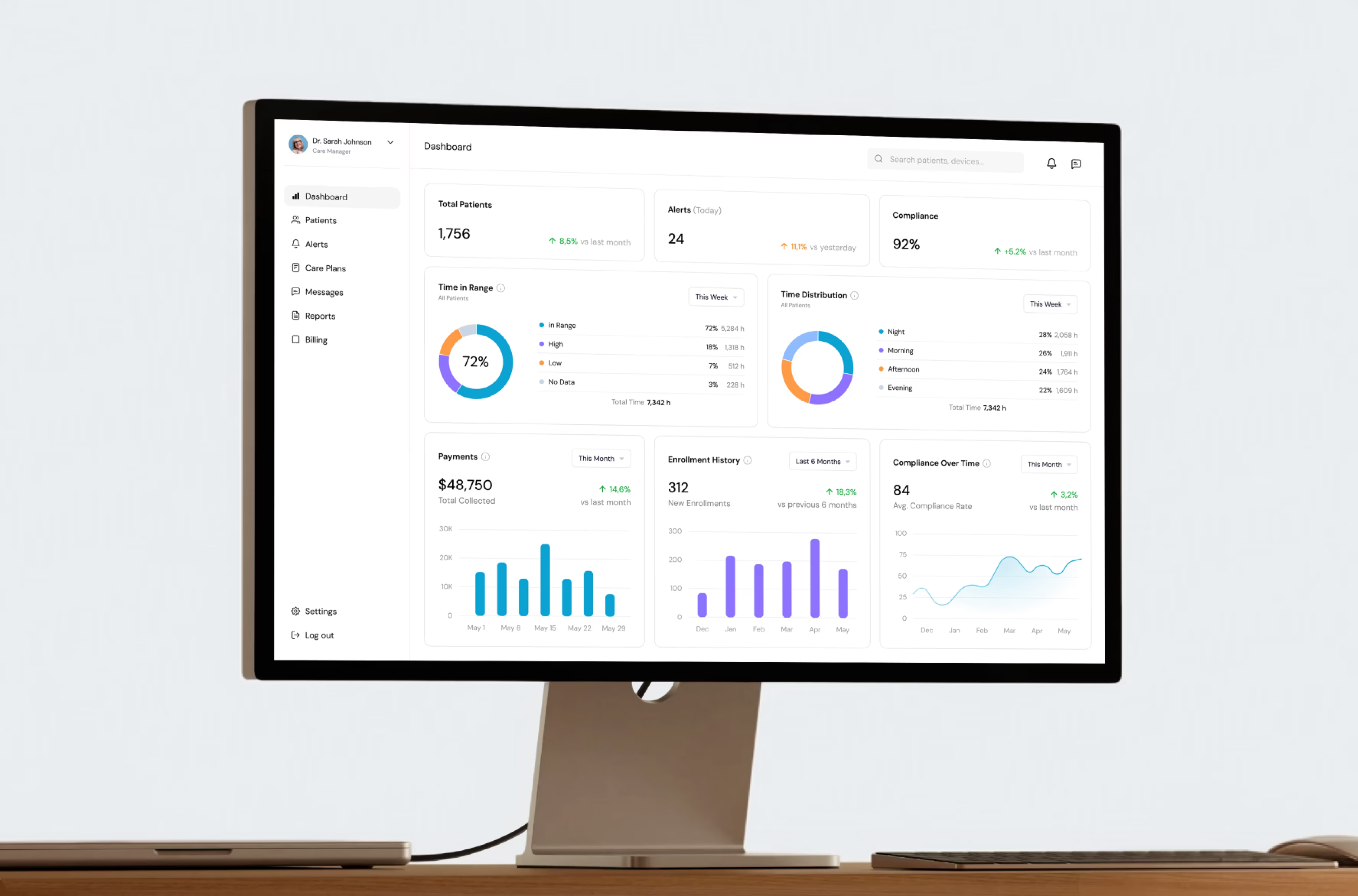
We applied the same principle in a hospital-grade remote patient monitoring platform that brings live blood pressure, oxygen saturation, and glucose readings into a clinician-facing view. The interface was designed to present large volumes of medical data clearly and make changes in patient readings easier to interpret over time.
2. When the priority system stops carrying information
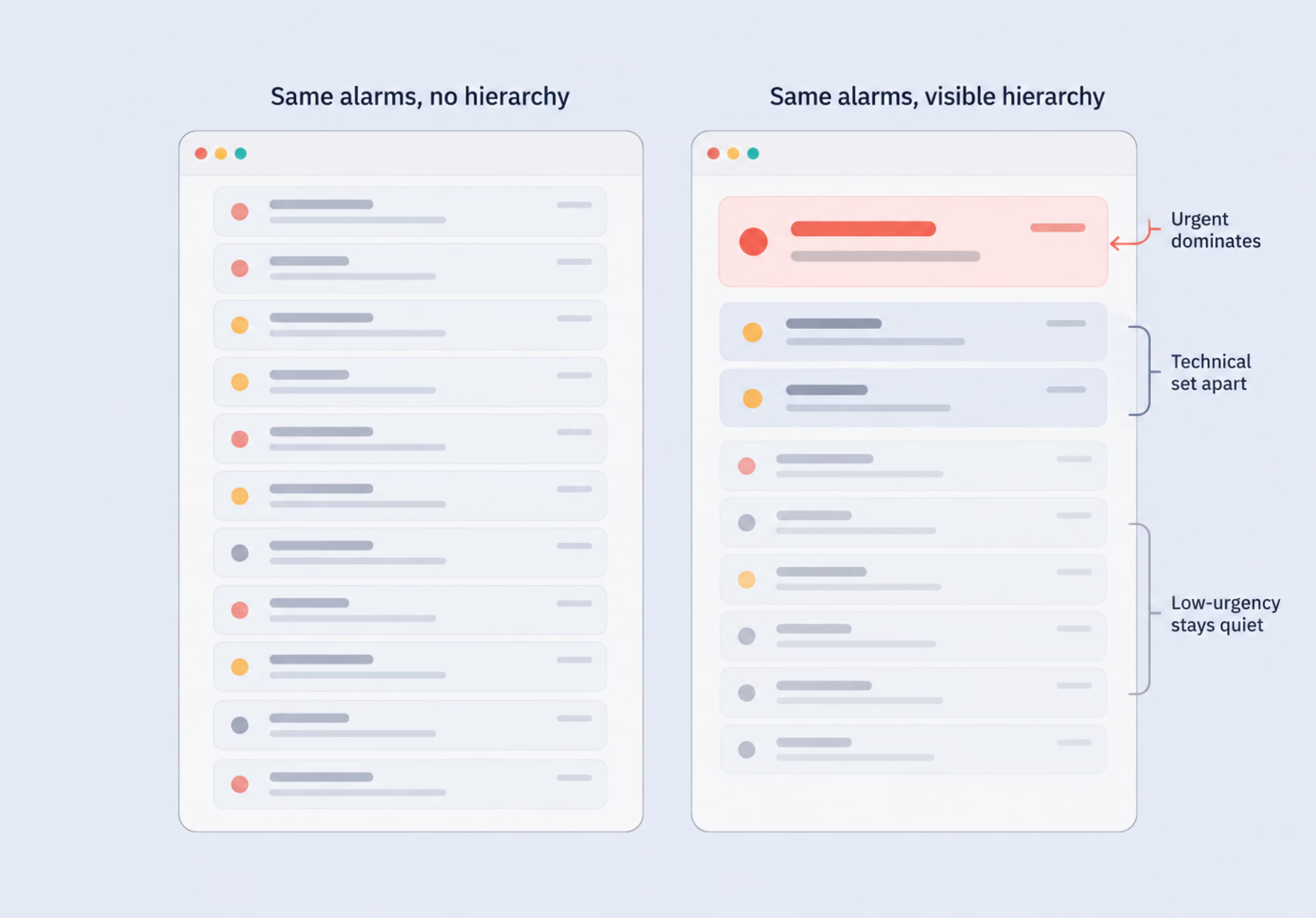
Constant competition between alarms contributes to alarm fatigue, as repeated low-value or non-actionable alerts make it harder to maintain the same level of attention to every signal. Critical, technical, and lower-urgency notifications may all appear in the same visual field, making immediate priorities less obvious.
The design problem is not creating clinical priority from scratch. That priority already comes from the monitoring system and its underlying rules. IEC 60601-1-8 sets requirements for medical alarm systems and signals, including how different levels of urgency are communicated. The interface has to make that priority obvious on the screen. A high-priority alarm should dominate visually, while technical or lower-urgency states remain visible without competing for the same attention.
Clear hierarchy can come from several design decisions:
- stronger visual emphasis for urgent states;
- distinct treatment for technical issues;
- less prominent presentation of information that does not require immediate action.
The goal is to let clinicians understand the order of attention at a glance. When priority is visible in the interface, the clinician spends less time deciding what deserves attention and more time responding to the signal that matters.
3. Directing attention on a saturated screen
A correctly ranked alarm still has to reach the nurse’s eyes. On a screen filled with waveforms, trend lines, numbers, and status chips at similar visual weight, even a correctly prioritized alarm can be hard to pick out quickly.
A screen like that is slower to scan because competing elements make the visual path less obvious. In 9,000 pediatric safety reports reviewed by MedStar researchers, EHR usability issues linked to medication errors frequently involved visual display and system feedback, including information that was difficult to find or interpret. Despite focusing on medication ordering, the study illustrates a similar usability risk: poor visual organization can obscure clinically relevant information.
This is often where design meets resistance, because every stakeholder wants their own metric on the main view. Add all of them, and the screen gets saturated again. The eye needs an obvious place to start and a predictable path through the screen. Grouping related data, keeping key information in consistent locations, and using spacing to separate primary content from supporting detail can reduce the amount of searching required.
A crowded screen informs no one
4. When the signal is clear, but the next step is not
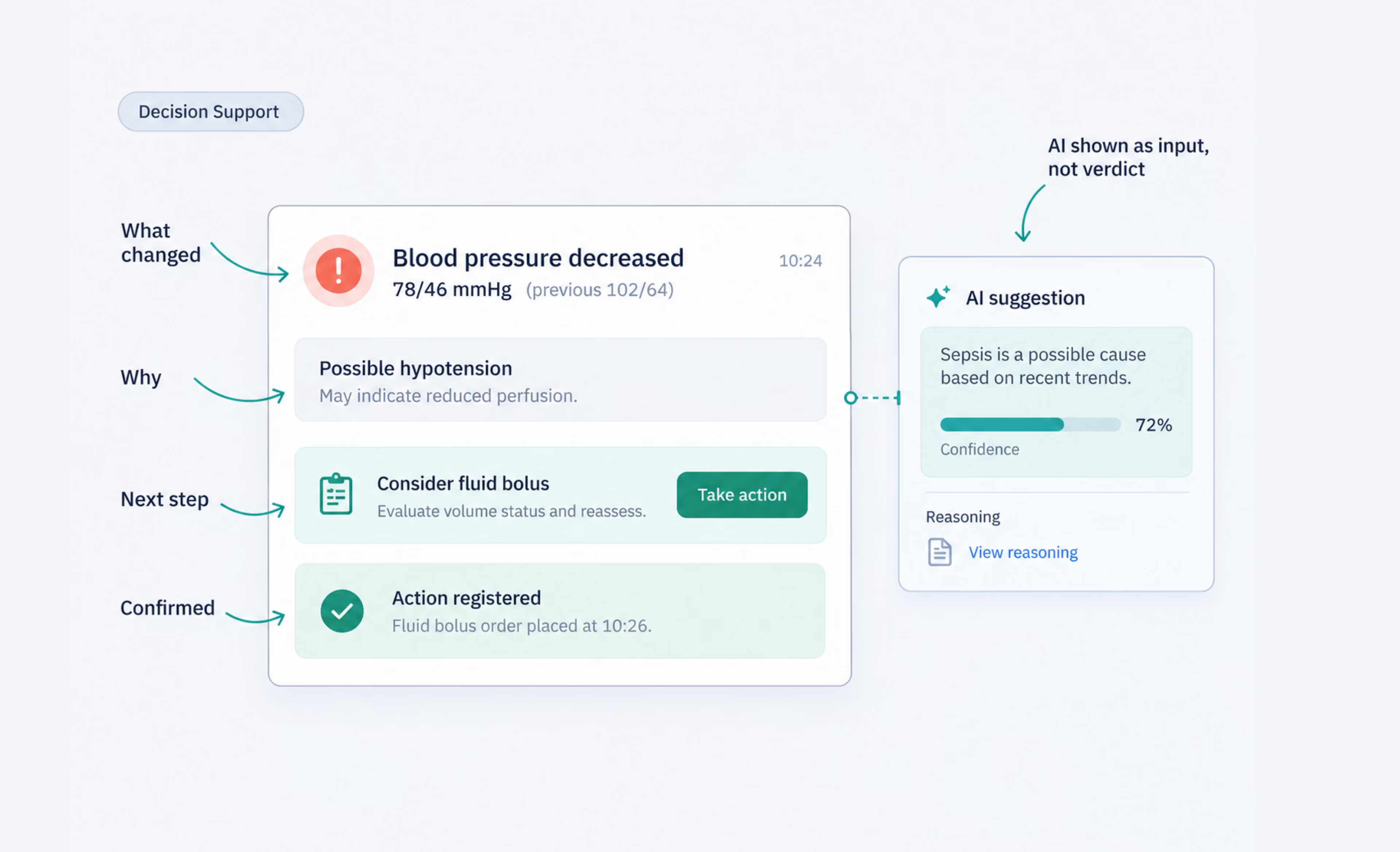
An alert that identifies a problem without enough context forces the clinician to spend extra time interpreting it. A useful alert should make three things clear:
- what changed;
- why it matters;
- what action or assessment may be needed next.
What counts as clinically important and what response is recommended comes from clinical rules. The interface decides how that guidance is structured and how quickly it can be understood. The same pattern as with other interface parts can be applied here: the most important information should appear first, supporting detail should stay available without blocking the main message, and the next action should be easy to identify without opening several layers of the interface.
If automated decision support is part of the workflow, the interface has to show the system’s recommendations or solutions as possible courses of action, not as standalone decisions. That can mean separating measured data from system interpretation, showing uncertainty when it is available, and keeping the evidence behind a recommendation accessible. In a Radiology study, incorrect AI suggestions pulled both experienced and less experienced radiologists toward the wrong answer, showing how strongly an automated recommendation can influence clinical judgment.
5. The interface has to confirm the action landed
After silencing an alarm, changing a setting, or entering an order, a clinician needs clear confirmation that the action registered. Without that feedback, the interface leaves room for uncertainty.
That uncertainty can take different forms: an alarm appears silenced but returns because the condition persists, a setting does not remain in the state the clinician expected, or an order looks complete before the system has actually registered it. In each case, the interface suggests closure before the system state is clear.
The design task is to make the result of an action unmistakable without adding more visual noise. Confirmation should appear close to the control that triggered the change and use a clear state change rather than relying only on a generic confirmation message. Failed or incomplete actions need a distinct treatment, and recovery controls should remain easy to find when reversal is appropriate.
Design around the clinical task
The same idea keeps coming back across all five challenges: the interface must carry critical signals from detection to response without losing the context that clinicians need.
This does not mean stripping every clinical screen down to a handful of numbers. In critical care, for example, an intensivist may need to have several waveforms, vital signs, and related parameters in view at once during resuscitation. A better goal is to organize this information around the task, making the data required for the next decision easy to find and interpret.
When done well, the interface becomes something that clinicians can read with confidence, even when the situation around them is moving quickly. They can see what has changed, understand what requires attention, and proceed to make the necessary decisions.
{{banner-2}}
FAQ
Why invest in branding services services services?
How is healthcare UX related to patient safety in the ICU?
The interface shapes what the clinician sees, what stands out first, and how easily the next action can be understood. Staffing, protocols, and alarm configuration also influence the response, while the screen brings much of that system into the clinician’s immediate view.
What actually causes alarm fatigue, and can design fix it?
Alarm fatigue grows when clinicians face a high volume of technical, false, or otherwise non-actionable alarms. Clinical teams reduce that burden through alarm policies and configuration, while design helps by making priority and alarm type easier to distinguish and by keeping adjustments and alarm data easy to access.
Should a monitor show trends, not just real-time values?
It needs both. The real-time value shows the patient’s current state, while the trend adds context about direction and pace of change. Together, they can make developing deterioration easier to recognize than an isolated reading alone.
How do you show AI suggestions to clinicians without causing harm?
Treat automated suggestions as decision support rather than a final answer. Separate measured data from the system’s interpretation, show uncertainty when that information is available, and keep the evidence behind a recommendation accessible so clinicians can evaluate it rather than simply accept it.
Does a simpler interface imply a safer one?
Not necessarily. Critical-care interfaces often need to show several related signals at once, so reducing density for its own sake can remove useful context. The better approach is to organize information around the role, situation, and task, using clear hierarchy and progressive disclosure where it helps.