A screen that requires effort to read costs time. In a unit where staff can be responsible for up to ten patients at once, that approach is simply dangerous. But how can design minimize cognitive burden in the ICU?


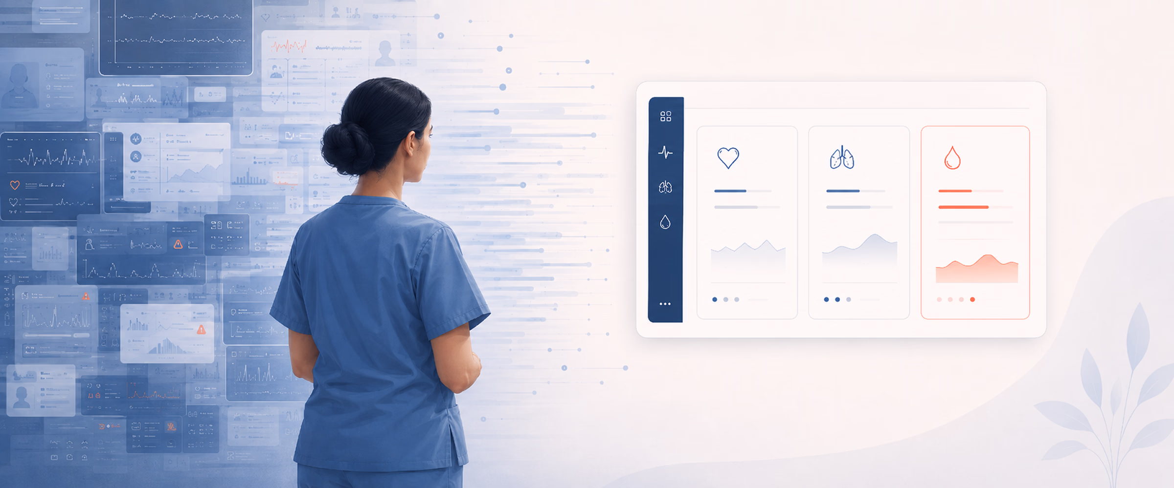
A single ICU patient generates around 1,300 data points a day — up to ten times more than any other hospital ward. According to an observational study, during ICU rounds, providers faced an average extraneous cognitive load of 20.5 events per hour — one interruption, split-attention episode, or communication deviation every 2 minutes and 51 seconds. The human mind can’t handle so many at once.
Meanwhile, some clinical software treats the screen as a container. Pour in every metric, every alert, every chart, and let the doctor sort it out. In an ICU, where a member of staff can be responsible for up to ten patients a day, it’s dangerous. The interface becomes one more thing competing for attention that should be on the patient.
This guide shows how to reduce cognitive load in the ICU through deliberate interface design. The project behind the article was a critical-care visualization platform for Seattle Children’s Hospital. The clinical model worked, but the interface didn’t keep up. It dumped every available metric on screen with no hierarchy, forcing staff to parse and separate zones by hand before they could read anything. On the beds overview, 125 active patient cards offered no way to tell, at a glance, who needed help first.
Three things that overload an ICU clinician
A review of the platform behind the redesign showed that clinicians are overloaded across three major areas. It is important to identify these areas separately, since each one is displayed on a different screen and requires a different solution.
Severe cognitive overload. Every metric lands on screen at the same size, same color, same weight. No layout separation, no structural hierarchy between data blocks. Staff burn mental effort just parsing the screen and figuring out where to look before they can read anything.
No instant data clarity. Clinicians can’t grasp what’s wrong with a patient at a glance. They read raw numbers and do the interpreting in their heads. That’s mental work the screen should be doing.
The 125-patient wall. On the ward overview, a flat grid of 125 near-identical patient cards offered no prioritization. Spotting the one who’s crashing meant scanning all of them. In an emergency, scanning is the time you don’t have.
The first two problems live on the patient page — the screen a clinician opens once they know who they’re treating. The third lives on the overview — the screen that tells them who to treat next. Each needs its own set of moves.
The patient page: lead with meaning and follow with detail
You can find the answer to the hierarchy and the data-clarity problems on the same surface: the individual patient view. Thus, let us present four field-tested moves to do the work.
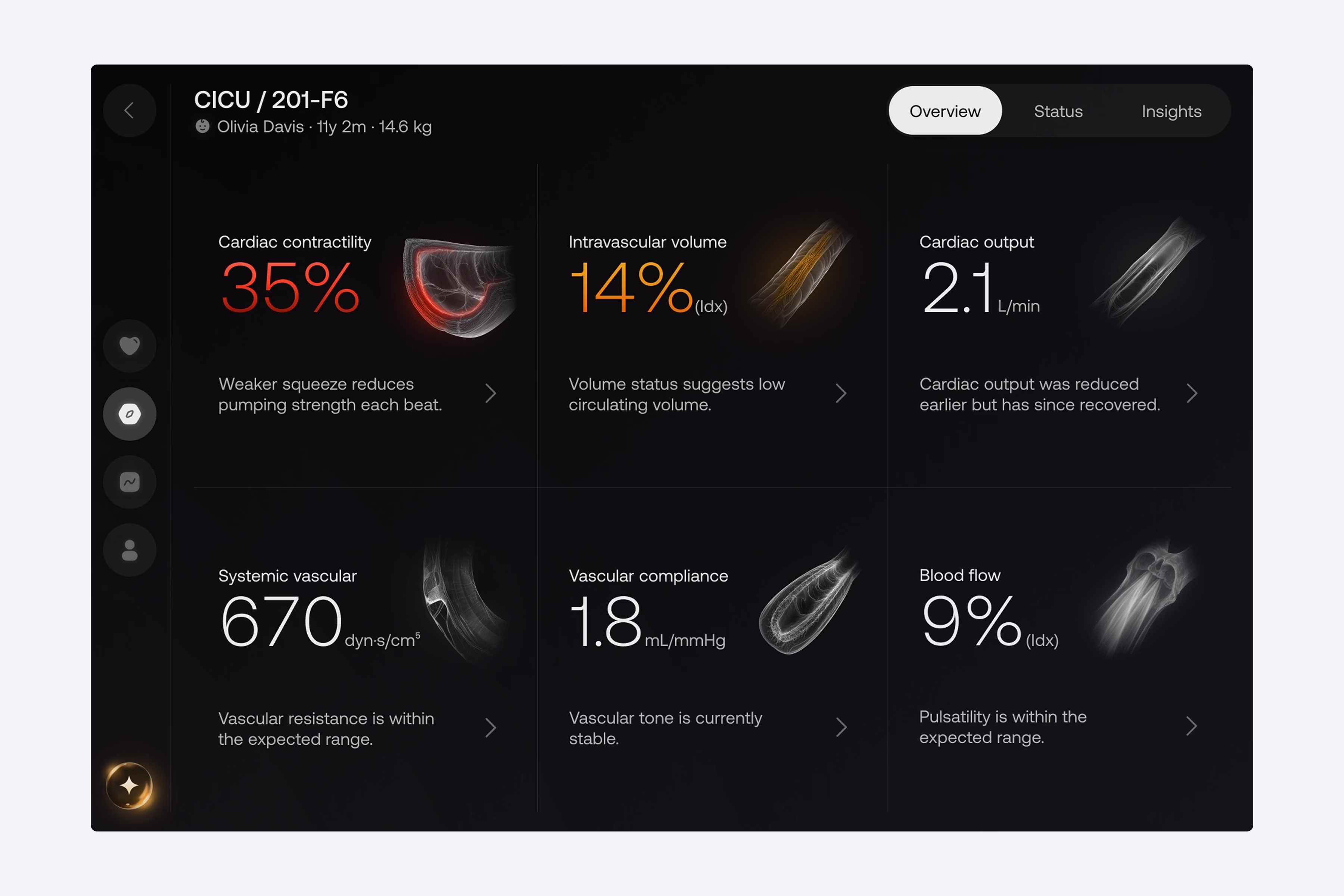
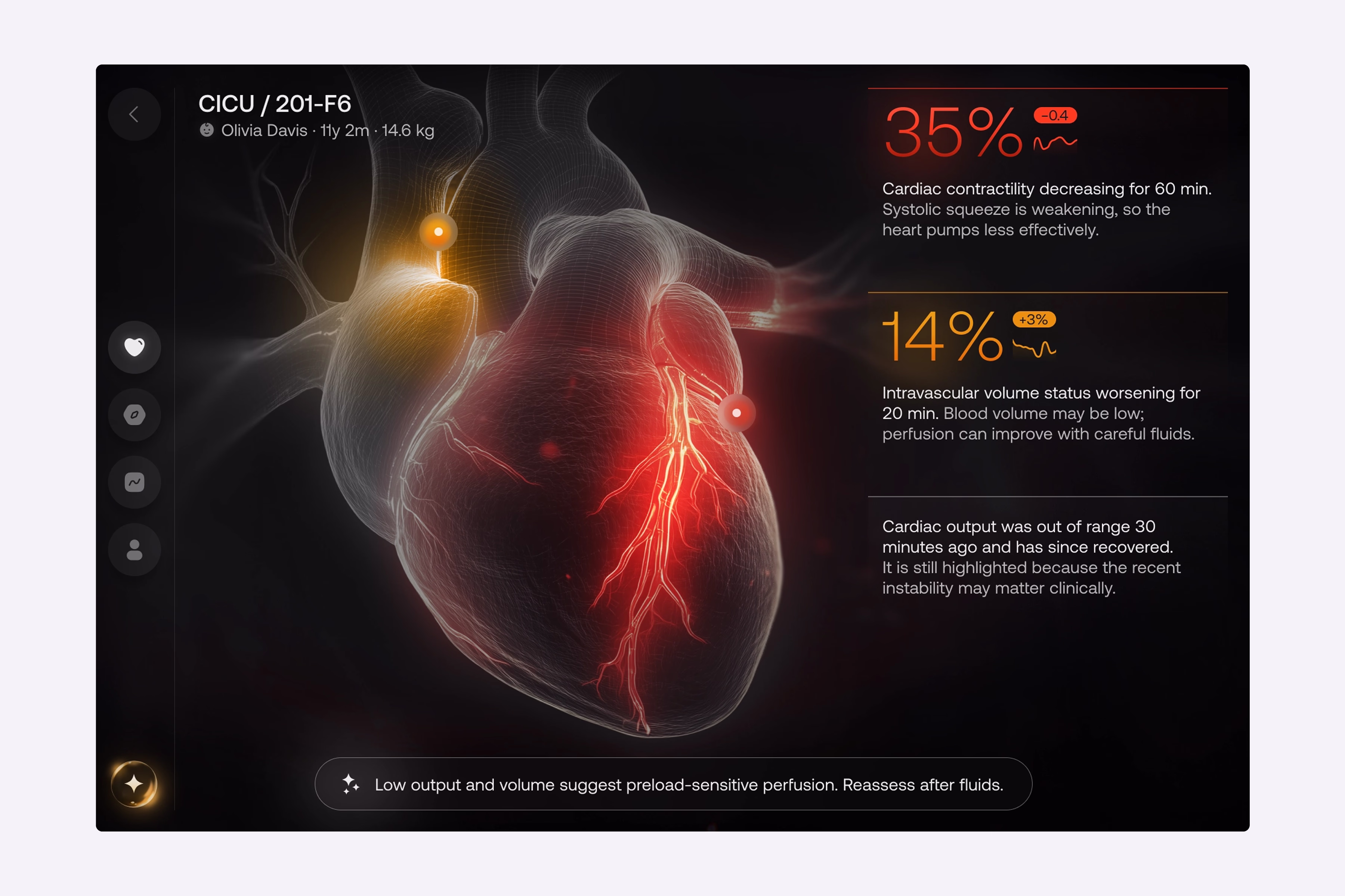
A focal point before any number
In our hospital case, we removed non-critical metrics from the main view and built the layout around a single dominant visual. This digital twin attracts the clinician’s attention first and highlights the problem area before they read any text or digits. Only then do they move to the animated data streams and expandable details for some context. Basically, the screen tells them where something is wrong, then lets them dig into why. This is the core of healthcare UI/UX design for high-pressure settings, which is to lead with meaning and follow with detail.
Color that carries urgency, and nothing else
Another crucial insight for reducing cognitive load is that color can make information more urgent. We, for example, minimized the use of color, using only two indicators to show status: yellow for caution and red for danger. There was no indicator of normality in green or blue watercolor.
By removing the normalcy indicator, we reduced the possible search areas for staff to determine what type of person they were searching for from three to two. Staff do not need to spend time looking for healthy patients and can immediately determine the severity of each flagged case. We used the same principles to design navigational elements. Rather than creating text links, one icon was created to establish context without adding noise.
“Every color on the screen has to earn its place by signaling urgency.”
Zoned tabs for depth
Beyond the core Overview, we put deeper data in dedicated tabs — Drivers, Trends, and Patient Details. Each dataset gets its own zone instead of crowding the main view. Inside the Drivers tab, the reading order has been inverted on purpose: with so many metric cards, each carrying its own visual, scanning visuals first would be slow. Therefore, we display the numbers first.
A clinician will spot a value flagged in red or yellow, then move on to the label and description. It’s the same color system with an opposite scanning path, both tuned for speed. As for descriptions, we use progressive disclosure: a short summary is displayed on the card, with a clear path to the full report. Nothing is hidden to prevent the view from becoming cluttered.
AI suggestions
Positioning the transparent recommendation engine at the bottom of the Overview makes it visible and readily accessible without occupying any space in the primary dataset. The engine’s tab allows clinicians to visualize potential outcomes prior to any intervention by utilizing real-time metrics. AI integration supports decision-making rather than adding to alert noise.
The beds overview page: find the sickest patient fast
The 125-patient wall is a different problem on a different screen, and it gets its own set of moves.
Group, then sort by risk. Instead of a flat grid of identical cards, the overview groups patients by department and ward. Then, it automatically promotes any card with a warning or critical status to the top of a dedicated attention group. As a result, staff no longer scan 125 profiles hunting for the one who’s deteriorating, since the system does it for them.
Cards stripped to the essentials. In our client’s updated interface, we’ve kept only the bed code, patient name, and status marker, and pulled granular real-time metrics off the cards entirely. This stems from the fact that displaying precise clinical values at this level only clutters the screen and slows reaction. In this case, the status indicator captures attention, and everything else is disclosed on the patient’s own page. All in all, a strong patient monitoring dashboard design is mostly about what you choose not to show.
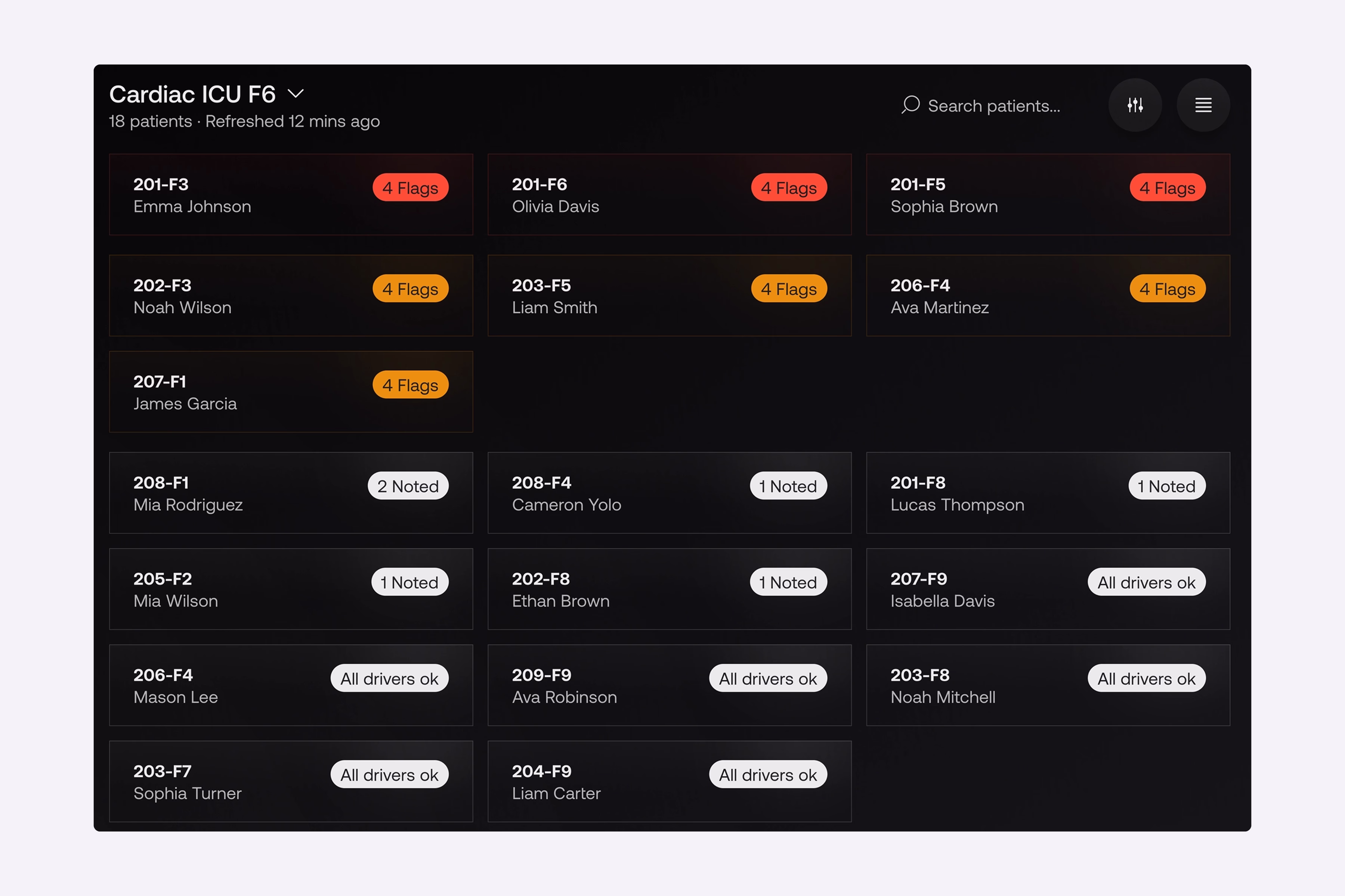
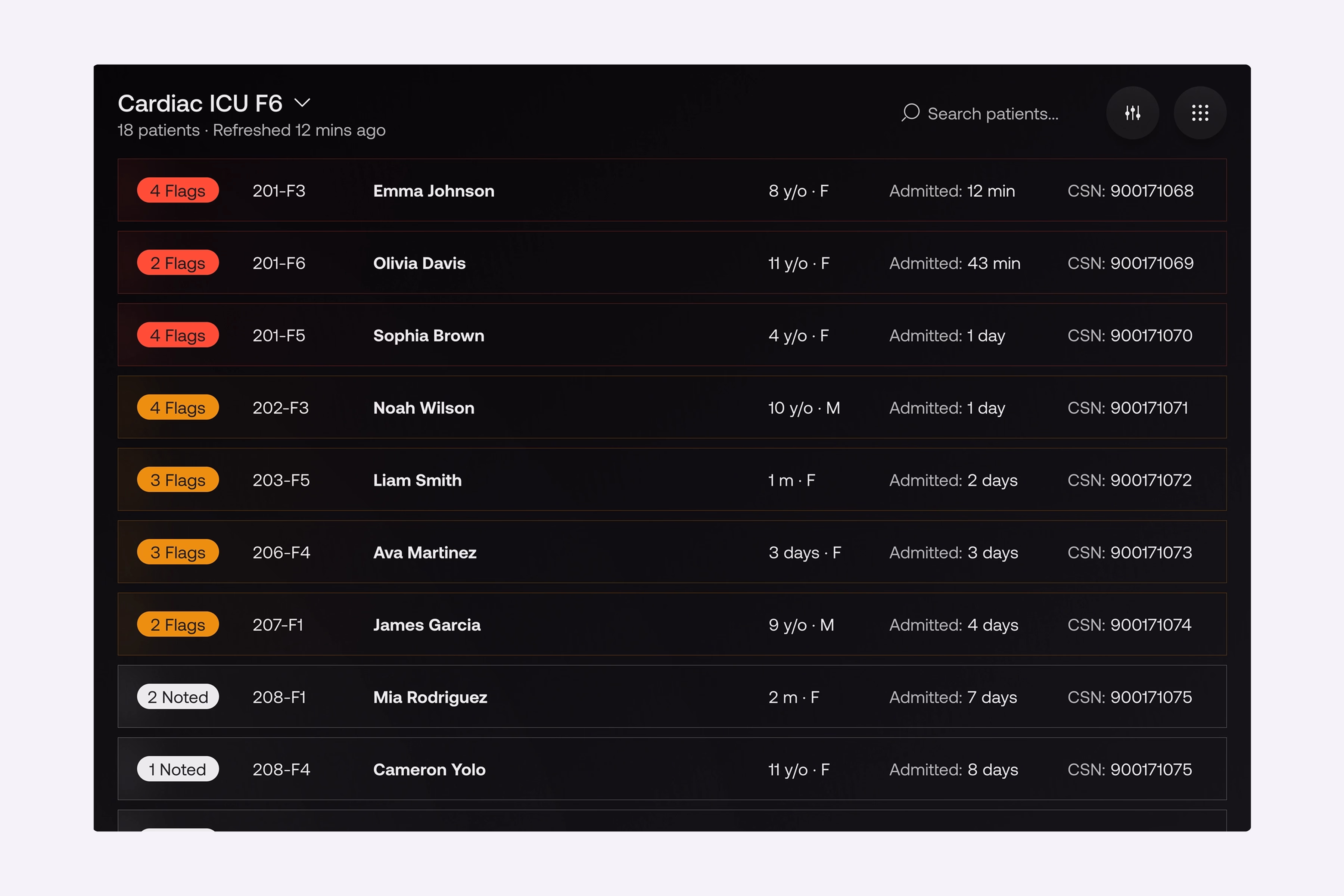
A table view with the same logic. For shifts that need a broader look across hospital departments, we built a high-density table view as an alternative layout. The behavior is identical to the cards: high-risk rows are highlighted and promoted to the top. So, regardless of how staff prefer to work, urgent patient data surfaces itself.
{{banner}}
Fast search and advanced filtering. Even with smart sorting, sometimes you need a specific patient fast. Search and filter controls sit on top of the structure, so finding anyone in a busy shift takes seconds.
“Don’t ask a tired clinician to find the emergency. Make the emergency find them.”
The bedside monitor
The two surfaces above need to connect to a third — the hardware that isn’t interactive at all. For Seattle Children’s Hospital, we built a bedside monitor mode: a continuous, hands-free view of the patient’s real-time status, so staff don’t have to log into a tablet just to check vitals.
The bedside layout is an exact mirror of the main Patient Overview tab. Staff are already familiar with that screen. By keeping the patterns identical, we have eliminated the need for them to relearn. During high-pressure rounds, staff can scan the bedside display immediately. The same healthcare data visualization language is used for the deep-dive tabs on the workstation and the wall screen.
Ways the redesign reduces cognitive load on the ICU floor
Redesign changes how staff move through the screen, and that shift is bigger than any individual fix. What actually happens? We’ll explain in detail below.
Shift handovers stop starting with a search
The first time of every shift went into scanning the full beds grid, top to bottom, hunting for anything that stood out. The redesign helped handovers start at the attention group. Whoever was sickest was already at the top, already in red or yellow, already pulled out of the surrounding noise. The opening of the shift stopped being a search and became a briefing, since the cognitive cost of “where do I look first” dropped to zero.
The reading order on the patient page is inverted
Clinicians read numbers first. They would see the vitals, the lab values, the medication doses, and then build a mental picture of the patient from those data points. With the Digital Twin in place, they began to look at the visualization first, spotted the highlighted problem area, and after that, went to the numbers for confirmation. This is the same logic behind every well-designed healthcare dashboard — the screen does the first pass of synthesis, and the human does the second.
Junior staff get faster and faster
Senior clinicians always reach a point where they can interpret raw numbers at speed, and this is possible with experience. Junior staff don’t have that yet, and the old interface punished them for it. They’d spend extra seconds parsing values that their seniors read instantly.
In the new interface, the Digital Twin and the two-color system narrowed that gap. If a junior nurse sees a critical state on a card, they can act on it without the pattern recognition built up over the years. Generally, when the interface absorbs interpretive load, the experience floor rises for the whole team. However, none of this comes from a single feature. For such a result, the system must hold together across three surfaces, with the same logic in every view.
What this kind of project actually requires
A redesign like Seattle Children’s Hospital’s is a clinical research exercise that ends in a UI. The patterns above look obvious in retrospect — they were not obvious before the observation work. Any team building a critical-care interface that skips the front-end research ends up with a different platform, usually one that adds features instead of removing them. To avoid common mistakes in this process, we’ve prepared 5 recommendations for you and your team.
The research comes before the layout
When a standard product team runs five user interviews and calls it research, they are making a mistake. In fact, a critical-care project needs clinicians in the room from week one. They must read wireframes, challenge defaults, and walk through edge cases that the design team would never invent on their own.
Before any design decisions for the hospital platform, we ran structured interviews with the people who understood the system from different angles:
- technical leads who knew where the legacy platform was breaking;
- clinical leads who knew where it was costing time;
- innovation leaders who knew where the organization wanted critical care to go in the next three years.
The pattern is the same whether the product is critical-care monitoring, patient-facing apps, or AI-assisted clinical decision support. In the end, designing without clinical co-authorship ships a product the clinic doesn’t use.
Map decisions, not features
Most product teams start by listing features. Healthcare interfaces have to start somewhere else. First, ask the question, “What decisions does the clinician make, and in what time window?” In our case, we mapped every decision the staff made over a shift and bucketed them into three windows — seconds (alert response, deterioration spotting), minutes (medication choice, hypothesis-building), and hours (treatment plan adjustments).
The Digital Twin became the focal point because we counted how often clinicians had to make a seconds-window decision. The two-color system is justified by counting how often a “normal” indicator has diverted attention from a flagged case. The Drivers tab was created as a separate surface because minute-window decisions were constantly being interrupted by second-window decisions.
Compliance is a design input, not a final check
From day one, compliance is part of the development process for healthcare products. If you build a healthcare product without compliance considered from the start, you will end up spending money twice: once to build it, and again to retrofit it later. We considered regulatory constraints as part of the design process from the very first sketch.
Data residency, audit logs, and role-based access are not features that can be added to a product later; they determine the types of interactions that can occur with that product. The same principle applies to developing healthcare software; the architecture of the application must accommodate the design goals while also complying with regulatory requirements.
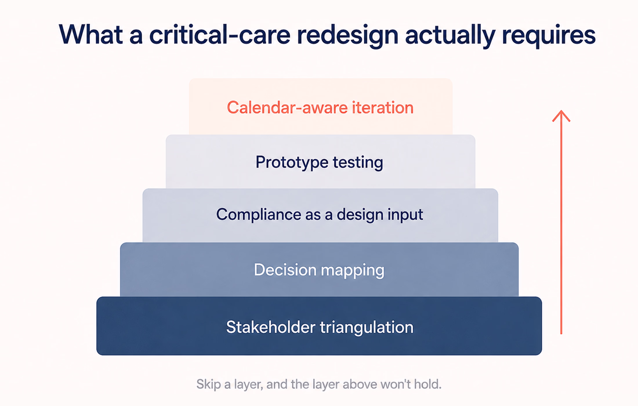
Test the prototype against real failure conditions
Most UI testing happens at a designer’s desk, on a calibrated monitor, in a quiet room. None of those conditions match the ICU. You need to test prototypes at 30% screen brightness to simulate the brightness of a clinical bay. If the prototype survives its desk review, it quite often fails at least one real-conditions test. That gap between desk and floor is where most clinical interfaces lose adoption.
Iteration cycles that respect the clinical calendar
In clinical environments, a new interface getting deployed mid-week disrupts care. In the same way, a new layout getting introduced during a busy season gets quietly disabled by frustrated staff.
Thus, one should plan releases against the unit’s calendar — quiet periods for major changes, training windows before high-stakes rollouts, rollback paths for anything that didn’t land. The same discipline applies to the broader trajectory of digital healthcare UX — the technology has to fit the rhythm of the place it’s deployed in, not the other way around.
If a team is scoping a critical-care interface and any of these steps gets cut for time, the resulting product will function. Yet, it will not get adopted. That’s the part most product roadmaps underestimate.
The interface is part of the clinical outcome
ICU software that dumps every metric on screen is a source of harm. When the interface forces clinicians to spend cognitive effort parsing before they can decide, that effort comes out of the budget they need for the patient. The five moves in this article can remove the friction. That’s what interface design does in a clinical setting: it doesn’t give clinicians new information; it makes the critical information arrive faster.
{{banner-2}}
FAQ
Why invest in branding services services services?
What causes cognitive overload in ICU interfaces?
The cause is mostly volume with no structure. ICU patients generate far more data than any other ward, and clinicians face hundreds of variables per patient on rounds. When software shows all of it at equal weight, cognitive overload appears.
How does interface design reduce medical error?
By lowering the mental effort the screen demands. A clearer interface helps clinicians spot the critical signal faster and misread fewer values under pressure.
How do you design for 100-plus patients on one screen?
You should promote any warning or critical case to a dedicated attention group at the top, keep each card minimal, and leave the details for the patient’s own page. You must strive for a screen that surfaces the emergency.

.webp)