Nurses work under constant clinical and administrative pressure, and poorly designed digital tools only add friction. Their interfaces should instead streamline documentation and reduce EHR alert fatigue, so clinicians can focus more on patient care.


An acute care nurse on a 12-hour shift makes between 631 and 875 flowsheet entries, roughly one data entry per minute. KLAS Arch Collaborative surveyed over 80,000 acute care nurses between 2022 and 2025 and found that 79% report time lost to unproductive charting. And 40% intend to leave the profession by 2029.
The clinical interface is not the only reason for this pressure, but it’s one of the few things hospitals can change. This guide turns our audit process into a practical checklist for spotting friction in the tools nurses use every shift.
Why a screen-by-screen audit beats another redesign RFP
Many EHR redesign projects look successful on paper. The vendor presents a detailed deck, the CNIO approves a long-term plan, and the project moves forward with clear milestones. Yet months later, nurses may still be documenting in parallel, switching between screens, and dismissing alerts that do not support the moment of care.
This is why a screen-by-screen audit can be more useful than a broad redesign RFP because it moves from general complaints about EHR usability to concrete workflow evidence. It shows exactly how tasks are performed — how many clicks are needed, where nurses pause, what fields repeat information, and which alerts disrupt work without clinical value. This level of detail turns vague issues like “the EHR is hard to use” into specific, actionable problems that can be designed, tested, and measured.
{{banner}}
Design audit checklist for clinical tools
This checklist breaks the audit into five sections. Each one shows what to check on a real clinical screen, how to identify the friction, and what design move can make the workflow clearer. The framework is based on the audit logic we use with healthcare clients, adapted here into a practical public checklist.
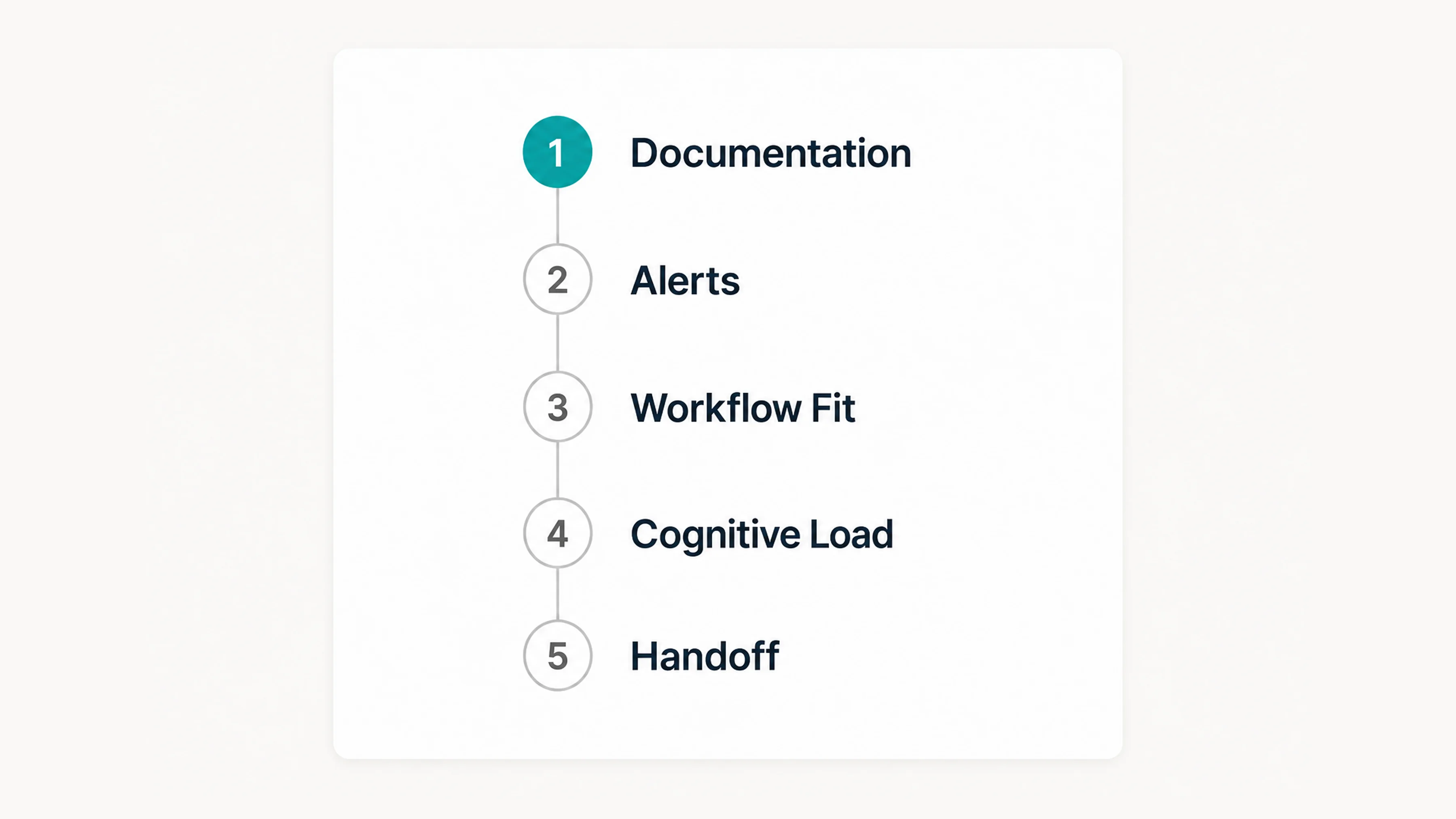
Section 1. Does this screen add charting time, or take it back?
Documentation has been the loudest pain point in every nursing survey over the last decade. It’s also the most measurable. These are three diagnostic tests for any documentation screen:
- Click count to complete the most common task. Open the screen. Complete the task — admission assessment, IV start, pain reassessment — with no shortcuts. Count clicks and tabs.
- Field redundancy. How many of the required fields appear elsewhere in the same chart? A blood pressure that’s already in the flowsheet should not reappear as a required field on the assessment.
- Time per shift in this tool. Pull EHR utilization data. If nurses spend more than 10 minutes per shift in one specific tool, it’s a redesign candidate.
Just think about it, in 2022, a typical Cleveland Clinic inpatient nurse spent approximately 123 minutes per shift actively navigating the electronic record. UCHealth measured over 30% of a 12-hour shift in the EHR before optimization. After a structured flowsheet review, they cut documentation time by 18 minutes per nurse per shift. This resulted in over 64,800 hours saved annually across the system.
If a documentation field neither influences care, meets compliance needs, nor is used by another clinician, it shouldn’t be included. UCHealth’s task force used exactly that filter. They kept a field only if it met one of those criteria. That’s a workflow problem with an interface fix: hide or remove the field, don’t ask nurses to keep filling it.
Once the audit shows which fields slow nurses down, the next step is to challenge every required entry. Build a one-screen, time-stamped log of required fields and ask the clinical owner of each one to defend why it exists. In the end, you must cut the ones nobody can defend.
If a documentation field doesn’t change patient care, satisfy regulatory requirements, or get read by another clinician, it shouldn’t be added.
Section 2. Do alerts route by urgency, or by whoever wrote the rule?
Alerts are the second-loudest pain point, as well as the places where the worst design instincts live: the safest-looking move is to fire more of them.
The data on what that produces is brutal. A systematic review found that 49–96% of alerts are overridden by prescribers. A 2025 multi-institutional study at UCHealth and Mass General Brigham found 71.8% of opioid drug allergy alerts were overridden. The Joint Commission has reported that 85–99% of alarms don’t require immediate intervention. A nurse who learns that 9 out of 10 alerts are noise will eventually treat the tenth one the same way.
Here are three diagnostic tests for any alert in the system:
- Are critical alerts different from low-priority ones in terms of how they look and behave, or does everything have the same yellow banner?
- The less-important alerts have to be batched together in their own summary at the end of the tasks and not interrupt mid IV-PUSH.
- Is an audit of the override being performed? What is the error rate per override alert? Anything over 70% will be reviewed for their retirement, narrowing, or context tightening.
The design response is to separate alerts into 3 categories based on clinical urgency:
- hard stops — interrupt the workflow only when immediate action is required;
- soft alerts — sit in a sidebar and clear when addressed;
- informational nudges — appear inside the workflow, not on top of it.
Then design with removal in mind. Give every alert an expiry date. If it’s still triggering after two years and most nurses ignore it, the alert, not the nurses, is the issue.
Section 3. Does the screen meet the nurse where they’re standing?
A nurse’s day is made up of three parts: the patient’s bedside, the nurse’s work area, and the hallway. The interface should look the same. Unfortunately, nurses often have to leave the patient’s room to enter information into the computer, go to a different screen to check the patient’s medication, and then return to the bedside to check the patient again. Each time the nurse moves from one place to another, they change what they are doing, which means they cannot focus on their original task.
The next three diagnostic tests are perfect for any nursing screen:
- Does it work on the device the nurse actually has in hand? If the assessment is designed for a 24-inch desktop monitor but the only screen near the patient is a 10-inch wall-mounted tablet, the design has already lost.
- Does it require leaving the room to complete? If yes, what specifically — and can that be moved to mobile?
- How does it handle interruption? Nurses get interrupted every few minutes. Can the screen hold a partially-entered state for 5 minutes, 30 minutes, or an hour? Or does walking away mean re-entering?
A 2025 study by JMIR Nursing, conducted at NYU Langone, found that nurses like using clinical mobile devices when they are with patients. But nurses do not seem to like the screens, which have not been changed to fit the device. The hardware is the same, but the design process and result are completely different.
Once you know where each screen is actually used, redesign the mismatches between device, location, and task. A bedside view should not be a compressed desktop screen. It should show the fields that matter at the patient’s side, while heavier review and documentation tasks can remain better suited to the nurse station. This is where healthcare app development experience matters: clinical mobile workflows require different field logic, interaction patterns, and safety checks than desktop EHR views.
Section 4. Can the nurse find critical information in three seconds?
A 12-hour shift is a sustained cognitive load test, and the interface should not make that load heavier. A 2024 JMIR Medical Informatics review found that EHR use is a direct driver of cognitive overload and burnout. Working memory holds only 3 to 5 items at once, but EHR screens routinely demand processing dozens of items.
A cognitive task analysis in the Journal of Biomedical Informatics cataloged 145 distinct cognitive demands of EHR use. Its conclusion: the systems fail to help clinicians hold the “big picture” of a patient. When every possible piece of patient data is laid out as if every piece is equally important, the nurse has to scan everything to find anything. By the third patient, the scan is fatigued, and the eye misses what matters.
You can audit your patient-summary screen with these three diagnostic tests:
- Decisions per screen. How many things does the nurse need to decide, evaluate, or input on this one screen? More than three is a redesign candidate.
- Critical-info-in-3-seconds. Show the screen to a nurse who doesn’t know the patient. Ask about the patient’s current condition, what is still pending, and what needs to be addressed. If any answer takes more than 3 seconds, it means there is something wrong with how the information is organized.
- Progressive disclosure. Is the detail revealed on demand, or is it all shown upfront? The summary screen should answer the question, “Is everything okay?” first. Detail comes second.
Nurses prefer vital signs clearly visible on the summary screen, alongside key patient details only.
The fix here is to turn the patient summary into a clear hierarchy, not a full data dump. The top zone should show current status, including vital signs, active alerts, and drips. The middle zone should show pending tasks and recent changes. The lower zone can hold history, notes, and supporting details that expand on demand. Once the hierarchy is in place, test it with five nurses who have not seen the patient before and check whether they can find the required information in a three-second scan.
Section 5. Does the screen survive the 7 AM handoff?
Handoff is when interface design either earns its keep or fails the patient. The outgoing nurse has 8–15 minutes per patient to transfer a shift’s worth of context. The incoming nurse has roughly the same time to absorb it. The screen between them is doing more work than at any other moment in the day. Here are three diagnostic tests for the handoff view:
- Status at a glance. Can the incoming nurse get a 30-second mental model of each patient without scrolling or opening anything?
- Structure that matches the verbal report. Most hospitals use SBAR (Situation, Background, Assessment, Recommendation) or I-PASS for verbal handoffs. Does the screen show the same information in the same way, or does it make the nurse translate the information from one way of showing it to another?
- Pending and outstanding. Is there one canonical view of what’s pending (labs not back, meds not yet given, family not yet contacted), or does the nurse have to assemble it from five different tabs?
The next step is to map the handoff screen against the verbal report and close the gaps. Align the screen with the team’s handoff structure, whether that is SBAR, I-PASS, or another local format. Add a single pending column for open labs, missed meds, family updates, and unresolved tasks. Then test the view during a real 7 AM handoff and remove anything the incoming nurse still has to hunt for in other tabs.
How the five sections actually map to your roadmap
Each section’s diagnostic gives you a checklist, and the design recommendation shows you what you could do about it. Put together, you should leave the audit with a prioritized backlog based on two things: how many nurses it impacts and how much time it saves.
In practice, the highest-ROI fixes tend to cluster in the first two sections: documentation and alerts. Cognitive load and handoff matter enormously but affect fewer screens. Workflow fit is a portfolio fix — important, but harder to ship in a quarter. Hospitals scoping a full optimization initiative often pair the audit with structured healthcare IT consulting. Finally, you end up with a step-by-step roadmap, not a one-time redesign.
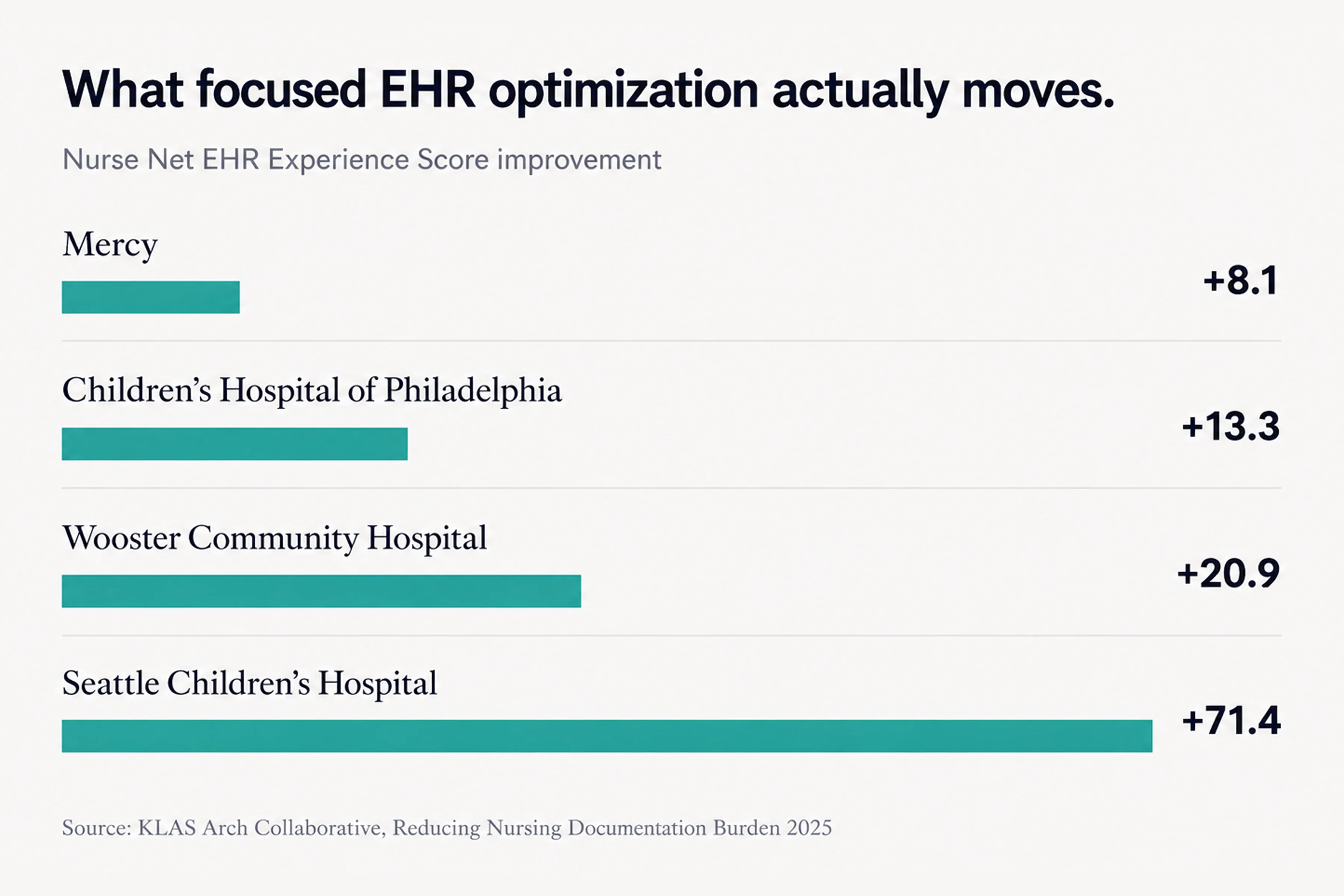
Here are some projects published by Arch Collaborative that shed light on the strategies behind their major gains in documentation experience for nurses:
- Mercy’s Project ANEW saved an average of 32 minutes of charting per nurse per day and improved nurses’ Net EHR Experience Score by 8.1 points across a 50-hospital system.
- Wooster Community Hospital’s F.U.N.-Time initiative eliminated 96 documentation fields and saved more than 15,000 nursing hours annually with a multidisciplinary task force.
- Johns Hopkins Medicine saved nurses 170,620 clicks in four months after a single round of optimization.
- Seattle Children’s Hospital achieved a 71.4-point improvement in nurses’ Net EHR Experience Score — the largest single increase recorded across the Arch Collaborative.
These examples were not framed as one-off visual redesigns. They relied on measurement, frontline input, workflow review, and focused optimization work — the same ingredients a screen-by-screen audit should turn into a usable roadmap.
{{banner-2}}
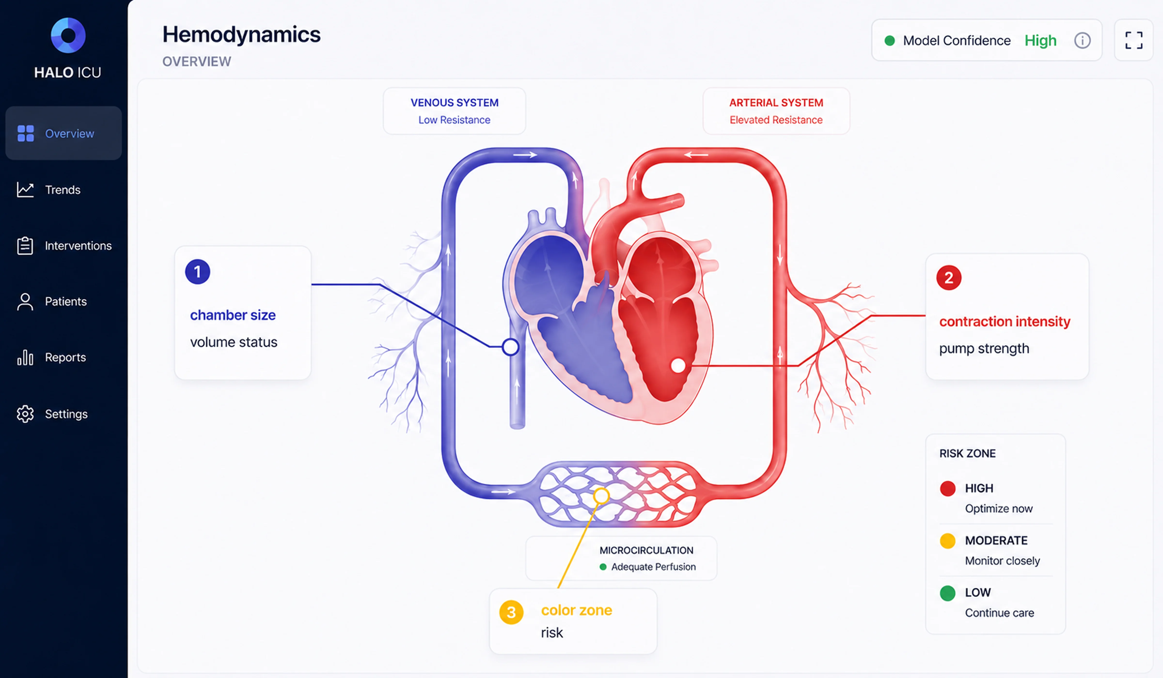
Applying the checklist to an ICU hemodynamic interface
The ICU is where the hardest version of this audit shows up. Hemodynamic monitoring brings together high data volume, time pressure, and patient risk, so the interface has to make critical information readable without forcing clinicians to interpret every signal manually. In one pediatric critical care project, Halo Lab applied the same checklist logic to a hemodynamic monitoring interface.
The problem maps directly to Section 4. Can the nurse find critical information in three seconds? A single ICU bed can produce over 50 simultaneous data streams, including arterial waveforms, heart rate, oxygen saturation, ventilator settings, drip rates, and lab values. At the start, the interface showed what could be measured, but didn’t synthesize what mattered. Clinicians still had to translate raw signals into a mental picture of the patient under pressure, often during night shifts and across multiple beds.
The bridge between the data and the clinician was a computational model. A 2023 model called iCVS, published in PLOS Computational Biology, infers hidden cardiovascular states — contractility, vascular resistance, filling status — from pressure waveforms already collected at the bedside. But model outputs still need interface translation. As numerical values alone, they are difficult to scan quickly in an urgent clinical moment.
Your goal is to design for the worst moment of a clinician’s shift, not the average one.
To make this information usable, the design translated these parameters into a visual system. Instead of numbers, clinicians see simplified graphical representations: chamber size reflects blood volume, contraction strength shows how well the heart is pumping, vessel width indicates resistance, and color signals the patient’s risk level. This allows clinicians to quickly grasp the patient’s condition without needing to interpret data manually.
The interface was also adapted for different contexts, including full bedside displays, compact summaries for nurse stations, and mid-sized views for handoffs and rounds. In healthcare UI/UX design, the goal is not to display more clinical data, but to make the right data usable in the right moment.
When less isn’t more
The above framework is simple because it uses fewer fields/alerts and progressive disclosure. There are two examples of when that instinct will need to change.
First, critical environments rely heavily on synthesis. A critical care nurse has to see everything regarding drip rates and trends. If the data is hidden behind clicks, it could mean a difference of seconds. But in places like ICUs, the answer is not just having more numbers on a screen. The right approach is to put all that data together in one easy-to-read picture. The important thing is not how simple or organized the data is, but how easy it will be for the user to understand it using a visual format.
Second, if you have a small hospital without a budget for informatics governance, real audits require a team made up of different specialists for audit, EHR usage data, time spent by the frontline nurse, and a vendor relationship that will allow for configuration change(s). A community hospital with 60 beds and a vanilla installation might need a different sequence. Start with the three biggest problems the night-shift charge nurse found, then implement the fixes. Only then, design the whole system. After you have done these steps, a larger framework will be available.
In both cases, the audit’s discipline still helps. The prescriptive moves change, but once you force them in unmodified, the result will be a redesign nurses don’t trust.
The interface is part of the care
Good interface design in healthcare is about making decisions faster and safer. Across documentation, alerts, workflows, and patient summaries, the same principle holds: reduce cognitive load where it doesn’t add value, and amplify clarity where it does. When nurses no longer have to translate, search, or second-guess the interface, they can focus on the patient in front of them. A structured audit gives teams a practical way to get there through small, targeted fixes that add up. Because in clinical environments, even a few seconds saved — or a single missed detail avoided — can change outcomes.
{{banner-3}}
FAQ
Why invest in branding services services services?
How long does an EHR nursing interface audit take?
If a small team of people looked closely at the five parts of this post, it would take them about three to four weeks. Plan two days of shadowing for each shift type (day, night, weekend), two weeks of analysis using EHR data, and one week to put the findings into a list of things to do in order. Big health systems with lots of units may need six to eight weeks to cover different areas.
How does EHR usability differ from nursing workflow fit?
Usability is whether a single screen is easy to use on its own. Workflow fit is about making sure that the order of the screens matches the order of the tasks a nurse performs during a shift. A screen can be used in a lab but not at the bedside because it forces the nurse to leave the room, switch devices, or break a clinical sequence.
How to reduce alert fatigue without missing critical alerts?
The reliable pattern is tiering plus override auditing. Alerts should be separated into three groups: hard stops, soft alerts, and informational nudges. Then, for each alert in the system, change the override rate. If the volume is set above 70%, it will be reviewed to determine whether it should be made quieter or the route changed. To make the critical alerts visible again, you just need to reduce the total volume.
Is mobile EHR access actually safer for nurses?
Mobile technology lets us chart more, which improves accuracy by bringing documentation closer to the moment of care. The problem is that mobile screens need a different design, instead of just being a smaller version of desktop screens. You can choose which fields appear at the bedside, build state preservation for interruptions, and design for one-handed use. If you don’t do that, mobile becomes a second-class interface and creates new errors.
Who should own EHR optimization in a hospital?
All three — IT, nursing, or informatics — structured as a governance team. Single-discipline ownership stalls. Multidisciplinary governance is the one variable that separates hospitals that move scores from those that don’t.
What does progressive disclosure mean in a nursing EHR?
Progressive disclosure is the design principle of showing what’s needed first and revealing detail on demand. For a patient summary screen, it means starting with the current status: stable, watch, or escalating. The nurse drills into vital signs trends, medication history, or notes only when needed. The opposite is the everything-at-once dashboard. That forces the nurse to scan every field to find anything.