






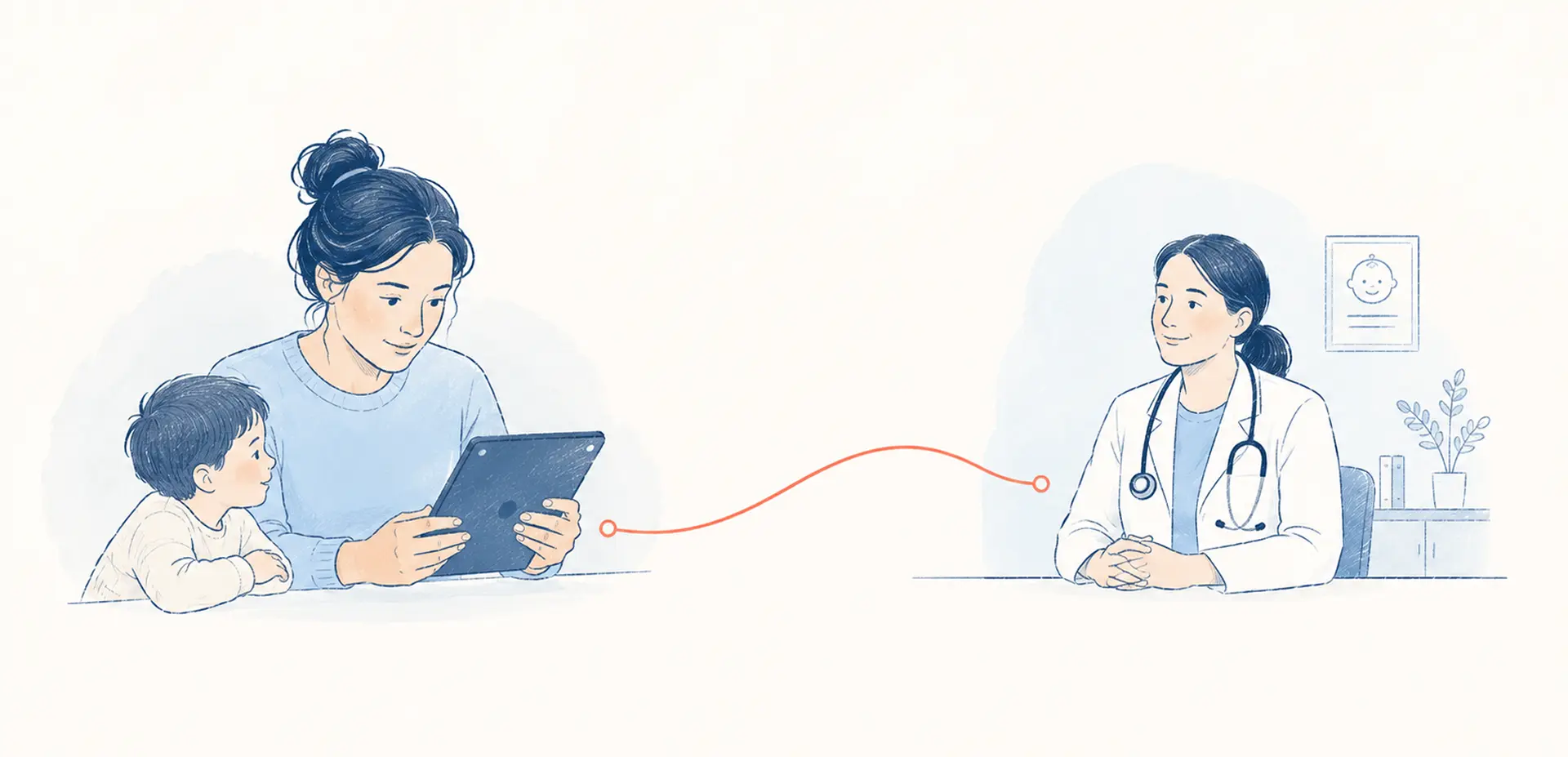
When it comes to pediatric telehealth apps, it’s rarely children who operate them. A parent books the visit, holds the device, and describes the symptoms, while a clinician analyzes this data. So, what’s really important in pediatric telehealth design?

The pediatric telehealth market is projected to reach $149 billion by 2030, per Grand View Research. The money is arriving. The instinct that shapes so many of these products — design it for the kid — is quietly backward, and it costs teams the one thing that matters: families who come back for a second visit.
If you mix up the order, you’ll see the same problems: parents stop using the app after one visit, clinicians get unreliable data from a gamified symptom check, and a review of compliance three months before launch forces a rebuild. This piece discusses five ways the design of telehealth for children doesn’t quite work as it should, along with the five design changes that fix each one.
{{banner}}
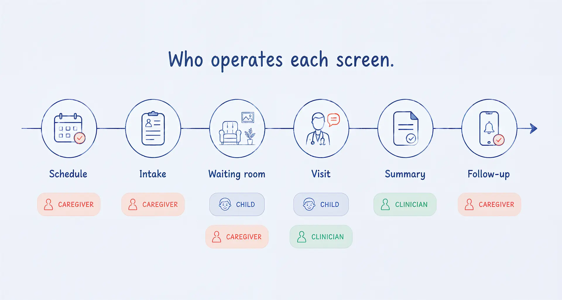
When you’re creating your telehealth program, it’s really important to think about the person who will be using it — the caregiver. The child’s caregiver should be a responsible adult (e.g., a parent, guardian, or school nurse) present during the visit, unless the child is legally permitted to consent to receiving care alone. The caregiver will arrange the appointment for the child, give them the device, explain why they are there, and help them to read the summary after the visit.
This type of visit is also called a “caregiver-initiated” visit. This might change how decisions are made. The scheduling screen is designed to make it easier for parents to set up appointments when they have just returned from work. The form is also designed with the parent in mind, so the child is the main focus. The waiting room is one of the few screens designed for children. If any of the other screens have the wrong operator selected, the entire visit could be at risk before the doctor even arrives.
Pediatric telehealth is a caregiver’s tool that a child occasionally steps into. Design it the other way around, and parents leave after one visit. {{sergiy-sumnikov}}
A foundational principle in pediatrics is that children are not small adults. That cuts both ways — you can’t shrink an adult app into a kids’ app, and you can’t assume the child is driving. Once you accept who the operator is, five failures become predictable. And now it’s time to learn about all of them.
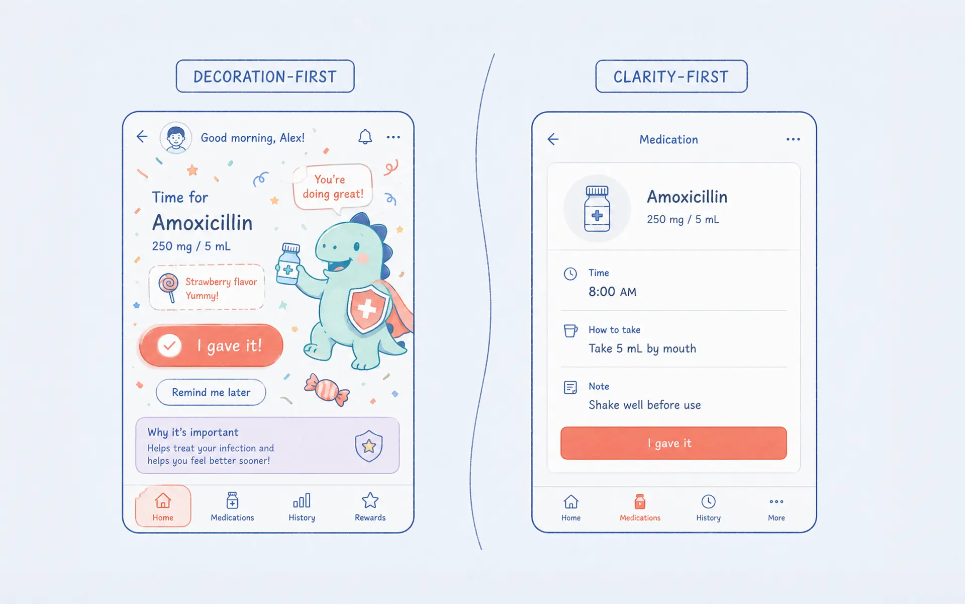
Treating child-friendliness as a paint job is the most common mistake in kids’ health app UX. Rounded fonts, a mascot, and a celebratory animation don’t mean you can call the product pediatric.
Even worse, the decoration is usually placed on the wrong screens. The screens that caregivers use need to be easy to understand, since they are used to report a fever, choose a dose, or read instructions. A cartoon on a medication screen shows that the company doesn’t take the visit seriously. Only save the warmth for the few screens that a child actually sees.
And “the child” isn’t one user either. A four-year-old can’t read. A nine-year-old reads but won’t sit through a form. A fifteen-year-old finds the mascot insulting and wants something that looks like the apps they already use. One decorated interface for “children” serves none of them.
Caregivers are the ones who decide if a visit was a success. They do this by asking about the patient’s health, getting permission for treatments, and checking that the patient will continue to follow the treatment plan. Most flows treat the parent as a “wrapper” to the child’s record.
In fact, caregivers help children by explaining the doctor’s questions in a way that they can understand. They hold or turn the camera so that the doctor can see the rash on a baby or child. They write down the amount of medication they need to pick up at the pharmacy. And frequently, the interface doesn’t offer much support for any of these activities.
Children without a usual source of primary care were significantly less likely to use telemedicine services, according to a 2023 study in JMIR Pediatrics and Parenting. The family-clinician relationship forms the foundation on which the adoption of telehealth will be based, and any design that does not include the caregiver will remove that foundation from this process.
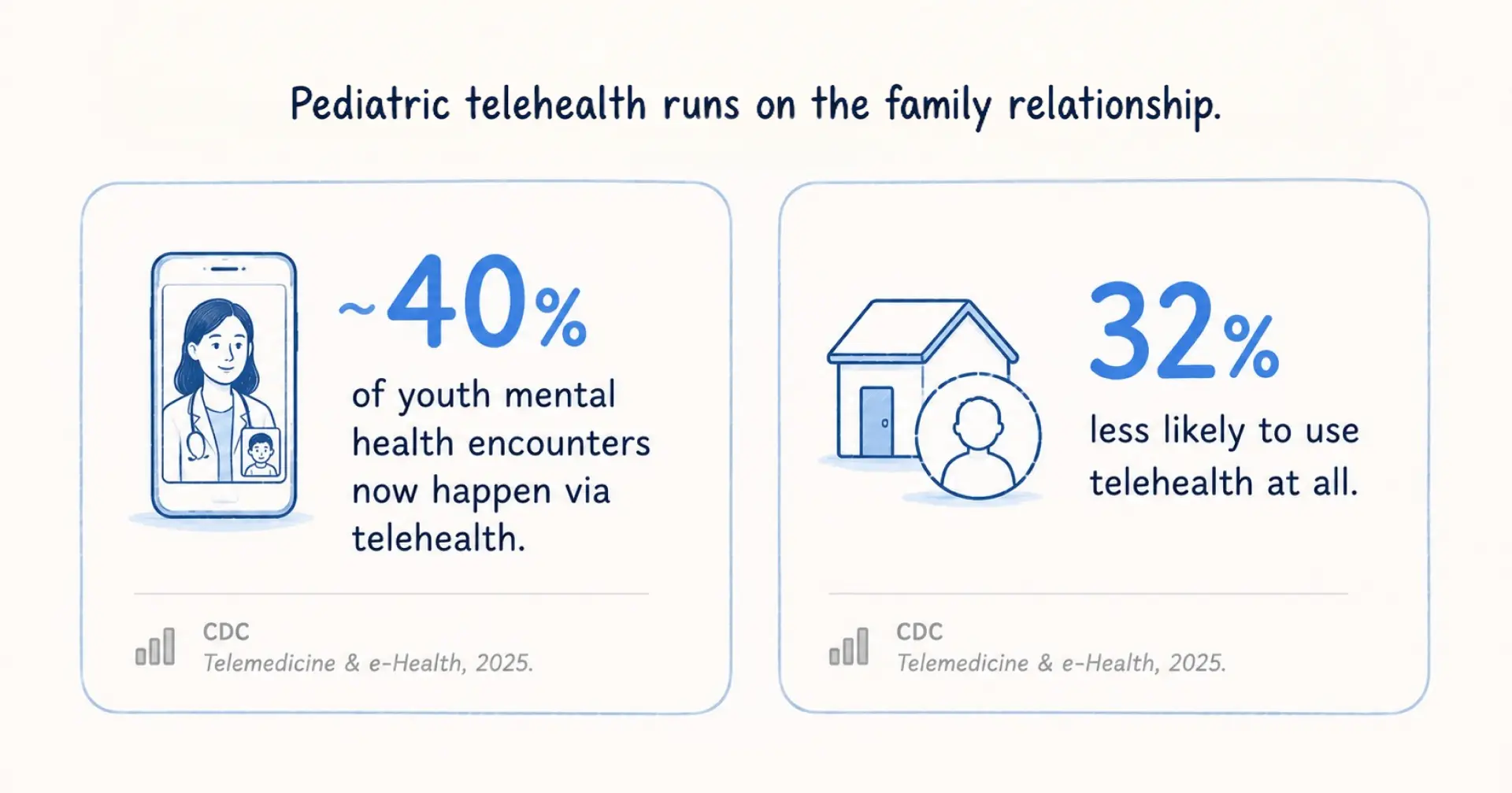
Michigan’s Mott Poll found a related gap: many caregivers arrive at well-child visits unprepared. A telehealth app that helps the parent prepare — a pre-visit checklist, a symptom note, a place to write questions — is doing clinical work, not just UI work.
On the screens a child uses, many telehealth UI still assume a literate adult with fine motor control and patience. Young children have none of those. As well as how it looks, the design must also consider how users of all ages and abilities can use it. For example, an item could be used by a fidgety preschooler, but also by a teenager dealing with their own chronic illness.
The waiting room is where this fails first. An adult will stare at a “please wait” spinner. A child won’t — they’re off to a game or off the couch before the doctor joins, and now the caregiver is chasing them instead of briefing the clinician. The empty waiting screen is a design decision, and it’s the wrong one for the one screen a child reliably sees.
When the design does engage a child well, a new trap opens: keeping children happy can corrupt the very data the visit exists to collect. Gamification is the obvious lever in child-friendly telehealth design. We reward the child for joining, animate the visit, and turn a symptom check into a game. It works — kids engage more. And it quietly threatens the signal the clinician relies on.
Imagine your pain scale as a line with cartoon characters, lined up in a row. If a child tapped the happy face, the whole screen would go dark to celebrate. Now, a clinician can’t tell if the child was feeling good or if they just liked how the cartoon character looked. This is the main issue with the user experience (UX) for pediatrics that most people would find hard to explain in words.
Every reward you add to keep a child engaged is a potential bias in the data a clinician acts on. {{sergiy-sumnikov}}
In adult telehealth, the patient consents on their own behalf. In pediatrics, a guardian consents on the child’s behalf. The AAP notes that during visits with adolescents, the clinician may ask the adult to step out so the young person can take more responsibility for their own care. In some regions, a teenager has the legal right to confidential treatment for certain conditions. Two separated parents may both need access, or one may not.
When building your app with proxy accounts, there are several important considerations. This is not just a legal requirement, but can have a big impact on the way the app looks and works. For example, it can allow a caregiver to manage their child’s medical record as if they were the patient. It can also allow multiple caregivers to access the app at once, as long as each one has the right roles and permissions. This can help protect the child and the caregiver. Another feature is “adolescent privacy mode,” which can hide certain types of sensitive information from parents when required by law.
If you’re creating an adult telehealth system to support pediatrics, you might not realize that consent flows, proxy logic, and age-banded permissions don’t just appear on a separate page at the end. These things affect how the data structure is set up and how easy it is to navigate the application. If something is built late, it means the whole application has to be rebuilt. If you get a healthcare IT consultant early on, it will save you money.
{{banner-2}}
Now that you know the 5 main challenges in pediatric telehealth, it’s high time you learned how to cope with them.
Remove the “children” persona from the product so that in every instance you can identify who will be using the different screens, i.e., parent/caregiver, clinician, child. Then, for those who go to the child, identify the age range (i.e., preschool, elementary, or adolescent). The person looking after the child will be in charge of arranging appointments, accepting new patients, and talking to the child after they have been seen by the doctor. The child will be able to decide how they spend their time in the waiting room and on the phone.
In reality, the experience will be different for parents/caregivers and six-year-olds. Parents/caregivers will see a clear and easy-to-use clinical intake process, while six-year-olds will see a calm waiting room. They have different screens for different users, but they all share the same goal of serving the needs of all users.
Make sure that the caregiver’s proper job is included when you visit. Give caregivers a list of things to do before they arrive. This will help make sure they are ready. It includes a simple summary of what is being picked up at the pharmacy. Make sure it’s written in plain language and that there’s enough information for them to take a screenshot of it for their records. Lastly, let a second carer join from a remote location without sharing passwords. This is the basic patient-facing app design for pediatrics, where you will decide whether or not people adopt it.
It should be normal for all devices used by children to have big touch screens and easy-to-use controls. Instead of having an empty waiting area, provide something interactive for the children to do. It could be calming, animated characters, or a countdown that they will understand. This will stop the carer from having to chase the child once the doctor arrives. Many providers have audio-only options for people who don’t have enough bandwidth to see more than one person at a time. Finally, follow the usual accessibility guidelines (e.g., contrast, captions, and screen reader labels) so that all caregivers and older children who use this can access it.
Use warmth in situations where little is at stake, and don’t use it when a clinician may take action based on responses. Children can be rewarded for sitting still and listening (use warmth for this). But make sure the symptoms, pain levels, and mood are unbiased, and don’t give any extra enjoyment to any answers. For example, reporting a “7 out of 10” must indicate the intensity of pain (not how much they want the number to bounce off the screen).
At the data model phase, plan for proxy accounts, multi-caregiver access, and age-based privacy settings. Determine how an adolescent’s privacy mode works, and understand that the rules will change depending on what the state law says. Create a complete map of who will see what and when before drawing the first screen. Doing this during upfront product discovery is far cheaper than discovering it in a HIPAA review three months before launch.
If you’re building for a single narrow age band — say, an adolescent-only mental health app — the operator question mostly collapses. The teenager is closer to a true self-operator, while the caregiver is largely a consent gatekeeper. Over-designing for younger children just adds clutter, while building for the teen. Instead, design for the latter, keep the parent flow minimal, and skip the age-band machinery.
And if you’re a small team without a compliance budget, scoping full multi-caregiver permissions and adolescent privacy modes upfront can stall an MVP that needs to prove demand first. In that case, ship for one clear caregiver-and-child pair and document every consent shortcut you take. The exception is regulated or high-acuity care, where you don’t have the option to defer consent. There, slow and documented beats fast and clever.
The reason some pediatric telehealth services fail isn’t missing features. Frequently, it fails when teams misidentify the user. To put it simply, the caregiver is the operator, the child is a participant, and the clinician depends on both. When products reflect that reality, retention improves, data becomes reliable, and compliance stops being a last-minute obstacle. As soon as you get the operator right, the rest of the system starts to hold.
{{banner-3}}
Usually, the caregiver, alongside the clinician. The American Academy of Pediatrics recommends that a responsible adult be present for a child’s telehealth visit, except when a minor can legally consent on their own. The child is the patient and appears on only a few screens — the waiting room, the call, and more of their own flow as a teenager.
Yes, adult telehealth serves one self-operating user. Pediatric telehealth serves a caregiver and a clinician, often a second caregiver, with the child as the subject. Every screen has to know which it’s built for, and the child-facing screens have to flex across a very wide range of ages and abilities.
Both sides of this issue depend on where it is placed. Gamification helps children to concentrate and get involved in activities. But if rewards are given out soon after a child has been seen by a doctor, such as for pain scales, mood checks, or reports on how they are feeling, it might change how the doctor interprets the information.
It’s hard to get permission and maintain the privacy of children and young people with more than one carer. This is because a child’s guardian must give permission, and many people who look after the child must also give permission. Parents’ rules about keeping teenagers’ information private can also vary by age. So, when information is first created, it’s better to make sure that the database is set up to give permission for different age groups. This is better than adding permission for different age groups to a settings page later.
The progress of your MVP will vary based on its size, configurations, and compliance. A more specific MVP for one age group and one type of care will move faster than a fully developed MVP for all ages and types of caregivers. The consent/proxy architecture typically represents the greatest unanticipated time requirement; therefore, scope these areas in advance to meet established timelines.


.avif)