




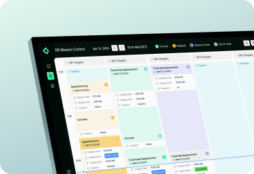



Design debt is the cost of carrying yesterday’s interface decisions into today’s product. On a growing healthcare platform, such actions can create friction across clinical workflows, add to operating overhead, and make future changes more complex and expensive.

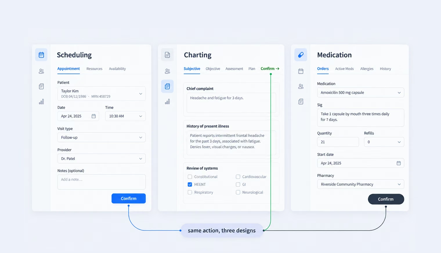
Cards on the table: design debt rarely sits in one screen or one product area, thus addressing it takes more than a quick UI refresh. This article examines where it accumulates across healthcare platforms, what it costs teams over time, and how to approach it systematically.
Design debt builds when short-term product decisions create long-term inconsistency across the interface. The pattern is similar to technical debt, but the consequences show up in what users have to interpret and do: navigation changes between modules, identical actions behave differently, terminology drifts, and teams solve the same interaction problem several ways.
In healthcare platforms, these inconsistencies tend to compound because products rarely evolve as one coordinated surface. Over time, different parts of the platform can drift apart as teams, technologies, and requirements change. A decision that works locally can therefore create friction across the wider system.
The result is more than an uneven interface. Clinicians spend attention relearning patterns, support teams explain exceptions, engineering maintains duplicate implementations, and accessibility or compliance issues have to be corrected repeatedly instead of once at the system level. Good clinical workflow design reduces that burden by treating consistency as part of how the product operates, not simply how it looks.
{{banner}}
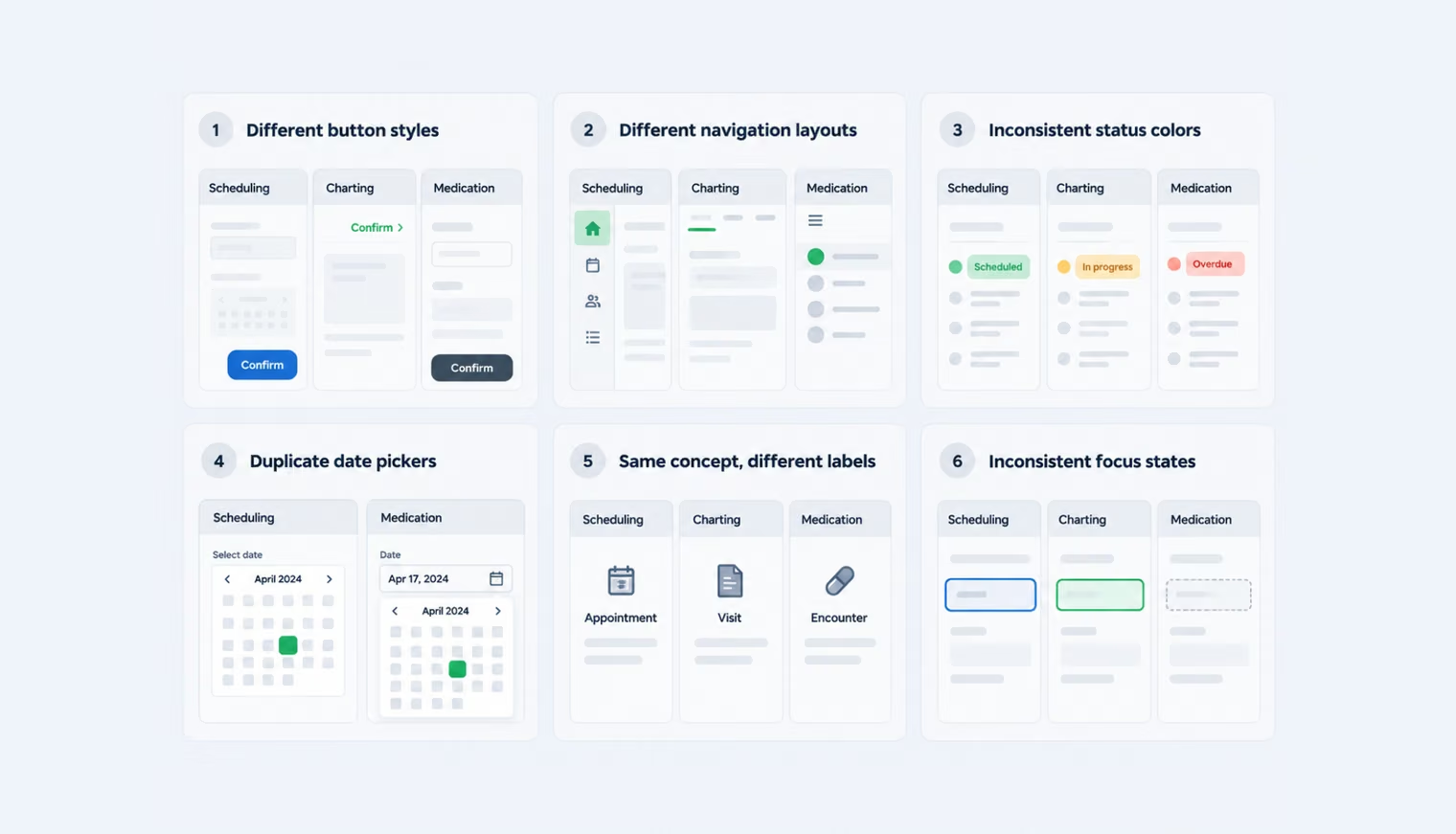
The easiest way to find healthcare design debt is to look for repeated inconsistencies across the product. These six patterns are common signals that the issue goes beyond a few imperfect screens.
The same primary action can look completely different across modules. In the assignment entry module, it’s a solid button in the lower-right corner. In scheduling, it’s a ghost button that only becomes prominent on hover. In billing, it appears as a text link that barely looks clickable.
Each choice may have worked on its own screen. Across one platform, however, users can no longer rely on a consistent pattern for the same action. That creates extra cognitive load and gives training and support teams another exception to explain.
A common design debt case is fragmented navigation across modules: charting uses left-rail tabs, billing relies on a top bar, while the administrative console hides sections behind a hamburger menu. Each structure may work in isolation, but together they force users to relearn where information and actions live every time they move between modules.
That extra orientation adds cognitive load to routine workflows and makes the platform feel like a collection of separate products rather than one system.
In our healthcare work, the color problem is rarely a missing palette — it’s that meanings drift. Red means “overdue” in the task list and “critical status” on the monitoring dashboard; amber signals a warning on one screen and serves as a brand accent on the next.
Color often acts as a fast status cue in clinical interfaces, so inconsistent meanings make that cue less reliable. The problem becomes especially visible in alerts and monitoring workflows, where users need to distinguish urgency quickly and consistently.
The same function often ends up with several separate implementations: multiple date pickers, patient search widgets, or consent modals built by different teams or at different stages of the product.
Each duplicate creates another implementation to maintain, test, and review for accessibility. A fix made in one component does not automatically reach the others, so the cost of even a small change multiplies across the platform.
The same clinical concept can acquire different names across a platform: “encounter” in one module, “visit” in another, and “appointment” in patient-facing communication. When labels and icons drift this way, users have to work out whether different terms refer to the same thing or to genuinely different states.
Unlike buttons or form fields, terminology and iconography are often less tightly governed in a design system. That makes semantic inconsistencies easy to introduce and harder to remove once they spread across modules and workflows.
Accessibility debt builds quickly when each product team solves the same requirements independently. One module may support keyboard navigation, clear focus states, and screen readers, while another recreates the same interaction without those behaviors.
The result is inconsistent accessibility across the platform and repeated remediation work. When accessible behavior is defined at the component and system level instead, teams can solve the requirement once and reuse it across products and workflows.
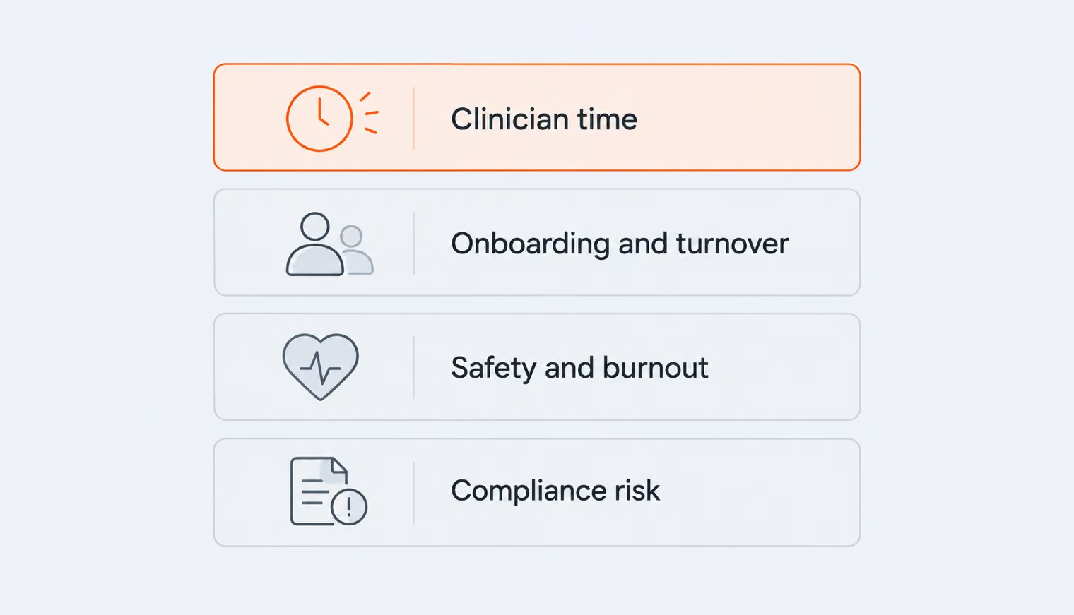
Design debt rarely appears as a line item in week one, which is why it survives so many roadmap reviews. Instead, its costs accumulate across support and onboarding, compliance and legal exposure, clinician burnout, and safety risks.
Any inconsistency in the interface can raise questions like, “Why does the confirmation look different?” or “Where’s the search bar?” Those questions may turn into support tickets, messages to customer success, or updates to training materials. On their own, they may seem minor, but repeated across users and modules, they become an ongoing support burden. Every new inconsistency adds another exception that teams have to explain and maintain.
A new nurse has to learn how to use several different interaction patterns at once if each of your modules operates differently. As a result, onboarding takes longer for every new employee in every department, which becomes a recurring expense — one your customers feel in every department if you sell the platform, one you pay directly if you run it.
Accessibility debt is when accessibility problems in a digital product are left unfixed and build up over time. For example, a healthcare portal may have poor color contrast, missing labels, or controls that are difficult to use with a keyboard. Fixing a few issues is manageable, but on a large product with years of accumulated problems, remediation can become a major project.
It also becomes a compliance issue. For example, under the HHS Section 504 rule, recipients of HHS federal financial assistance must make covered websites and mobile apps conform to WCAG 2.1 Level AA. The deadlines are May 11, 2027, for organizations with 15 or more employees and May 10, 2028, for smaller ones.
Those organizations remain responsible even when a vendor builds and hosts the product. For vendors, accessibility can also become a procurement issue when hospitals require products to meet their accessibility standards. In short, accessibility debt can lead to more remediation work, higher compliance costs, legal exposure, and lost business.
“The covered entity stays responsible for accessibility even when a vendor built and hosts the portal.”
In one study, doctors gave their electronic health record (EHR) systems an average score of 45.9 (out of 100, SUS), suggesting that they found them fairly difficult or frustrating to use. The study also found that better usability was linked to lower burnout: for every one-point increase in usability, the odds of burnout were about 3% lower. In other words, the easier an EHR system is to use, the less likely doctors are to experience burnout. Design debt is not the only cause of burnout, but difficult-to-use systems are one factor that healthcare organizations can actually address.
There is also a patient-safety cost. In an analysis of 9,000 EHR-related pediatric safety reports, 36% of the medication events involved a usability issue, most often tied to how information was displayed or how the system gave feedback. Put these findings together, and design debt stops being about aesthetics. The bill for design debt in healthcare is denominated in time, money, and risk.
You do not need a rebuild or a two-year design-system program to reduce design debt. A practical paydown sequence has three phases, each with a clear exit criterion. The scope still matters, though: this sequence will not erase a decade of accumulated debt in one quarter.
Start by listing the components, screens, and patterns across the product, then look for duplicates and inconsistencies. Run an accessibility baseline against WCAG AA. Next, connect the debt to the highest-traffic flows and the greatest clinical risk, because fixing those areas will have the biggest impact.
The goal is to end up with a ranked list of design debt, with an owner and rough cost for each item. So the work reads as a business case rather than a cleanup wish — whether you’re making that case to your board or hearing it from your team. If the debt isn’t documented, it stays invisible — and visible feature work will almost always take priority.
The next phase is to standardize the rules teams rely on most: status semantics, critical actions, navigation, forms, and accessibility behavior. Then bring the visual foundations — color, typography, spacing, and elevation — into the same system.
Create a core set of components that covers most everyday screens, including forms, tables, and dialogs. Pick one navigation pattern and stick to it across the product. It’s important to build accessibility into these components from the beginning. Contrast, focus states, labels, and target sizes should come as part of the component, not as fixes added later to individual screens.
You’re done with this phase when the foundation is small, adopted, and guarded by one simple rule. If a team needs to ship outside the system, the exception should be explicit, owned, and added to the debt backlog.
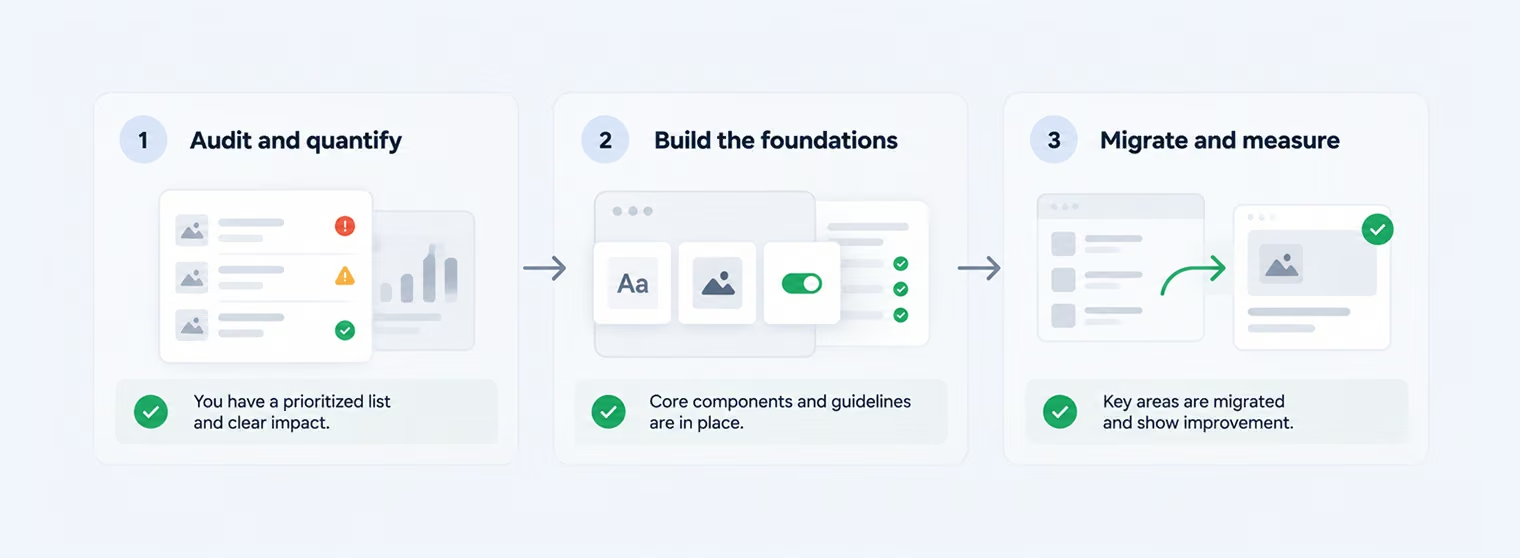
Finally, focus on the clinical flows that get the most use. Replace their one-off components with components from the system, then measure whether the changes actually help. Track things like task-level usability scores, the types of support issues users report, and how long it takes new users to become productive. You exit when the migrated flow shows measurable improvement on the metrics you selected, and the team can continue the paydown without outside help.
Three phases won’t erase a decade of design debt. But they can change the pattern: instead of adding more debt with every new release, the team starts reducing it.
{{banner-2}}
Much of our healthcare work starts with an existing platform that has grown complex over time. Here are two examples of how we’ve reduced design debt without starting over.
For a laboratory information system serving multi-branch hospitals, the client’s legacy platform had performance issues, fragmented workflows, and limited documentation that made developer onboarding difficult.
What we did:
In this case, design debt and structural debt had to be addressed together rather than treated as separate problems.
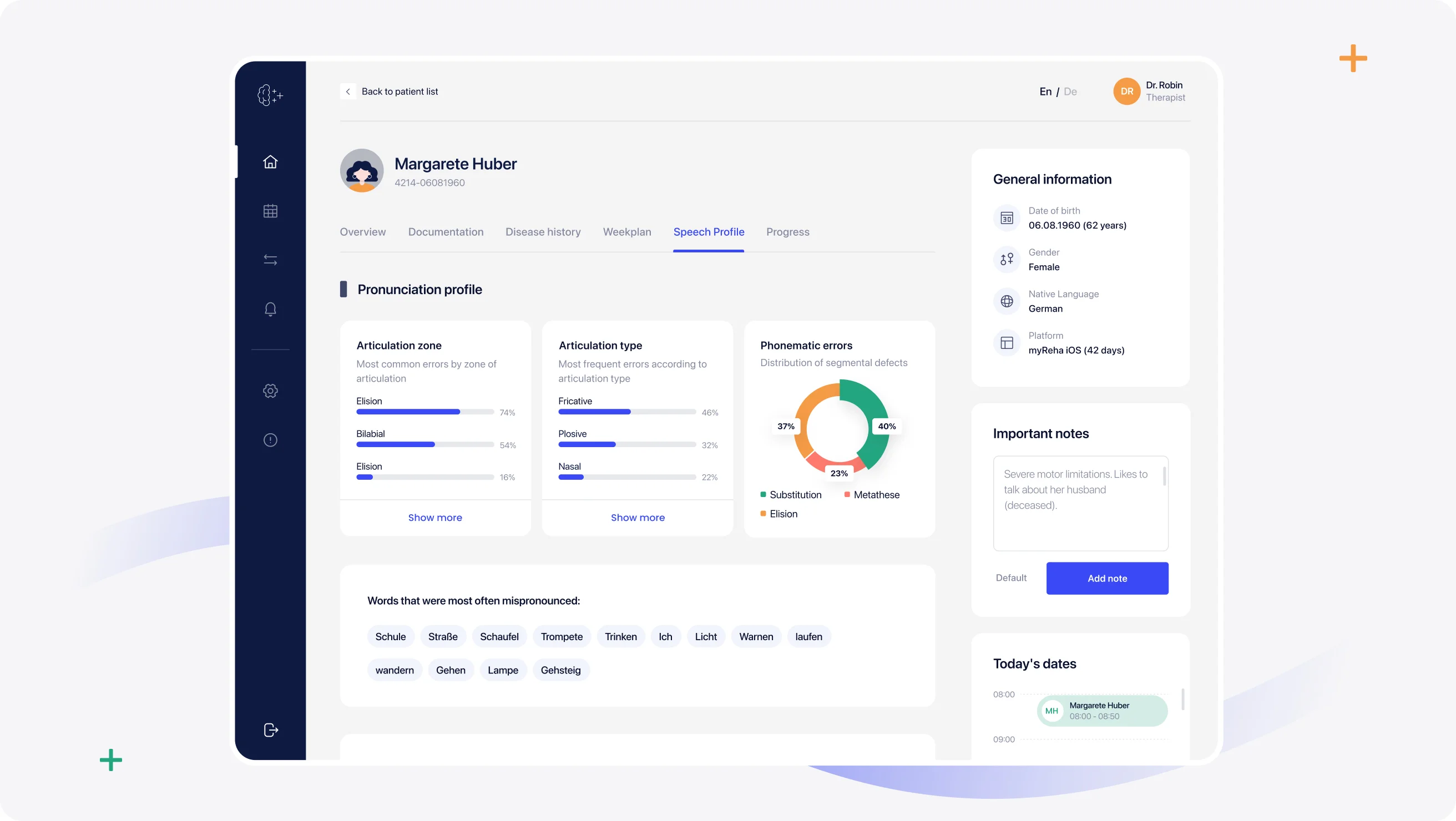
For nyra health, a certified digital neurotherapy platform out of Vienna, the engagement ran in reverse of the usual order: the work started with the design system and moved to branding afterward.
What we did:
The shared design system created a consistent foundation across nyra health’s clinician- and patient-facing products. After the work, the web platform recorded a 16% increase in traffic.
Halo Lab helps healthcare teams reduce design debt across live, complex products without starting over. We turn fragmented patterns into a stronger shared foundation that teams can keep building on. If your platform is starting to feel harder to change than it should, let’s talk.
It’s what piles up when teams take interface shortcuts to ship faster — a one-off component here, a skipped accessibility check there. Each shortcut is reasonable on its own. Add them up across a few years of parallel releases, and you get a platform where the same action can look different across modules. In healthcare, that’s expensive, because the person paying for the confusion is mid-shift with a patient waiting.
Technical debt lives in the code. Design debt lives in what the user sees and does — buttons, flows, navigation, wording. They overlap (a duplicated component is both), but a clean codebase can still ship a confusing interface.
Nobody can honestly give you one number. The cost usually shows up across support volume, onboarding time, duplicated design and engineering work, accessibility remediation, and time lost in inefficient workflows. The useful number is the one you can trace inside your own platform.
Yes. Inconsistent accessibility across a healthcare product can create compliance risk when parts of the experience fail to meet applicable requirements. For example, under the HHS Section 504 rule, recipients of HHS federal financial assistance must make covered web content and mobile apps conform to WCAG 2.1 AA by set compliance dates. The organization remains responsible for accessibility even when a vendor provides or maintains the digital service.
There is no fixed timeline. A focused audit and first round of high-priority fixes can happen relatively quickly, while migrating a large multi-module platform takes longer. The goal is not to wait until every inconsistency is gone, but to stop new debt from accumulating and work through the existing backlog in priority order.



.avif)