






A product can pass its usability tests, earn praise for a clean interface, and still lose a quiet stream of customers at every renewal. The screens work, and the scores look healthy, yet the churn keeps coming. So what is the interface failing to capture?

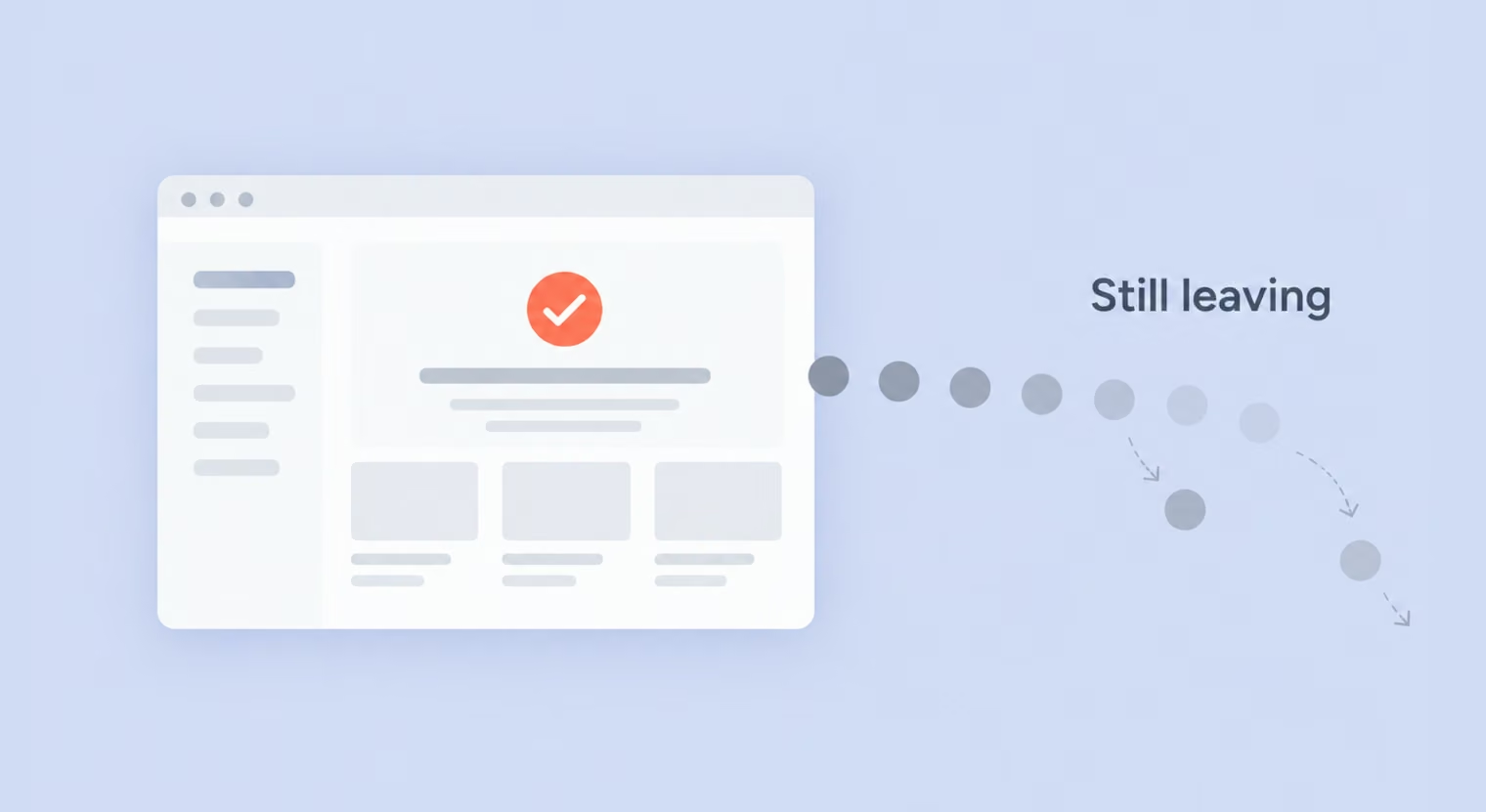
The difference between a product people enjoy and a company they stay with often lies in UX versus CX, and confusing the two gets expensive. When renewals slip, teams usually reach for the interface because it is visible, while the real cause often sits in pricing, onboarding, or a support queue nobody is watching.
Separating the two lets you name the right problem, put a budget where it will actually move retention, and stop redesigning screens that were not at fault. This article draws the line between UX and CX, shows where they overlap, and helps you identify both the source of a problem and the team best placed to fix it.
Before comparing them, it helps to define what each term actually covers. Product teams often blur the two and treat customer problems as UX issues simply because the interface is the most visible part they can change.
ISO 9241-210:2019, the international standard for human-centered design, defines user experience as a person’s perceptions and responses that result from using a product, system, or service, or from anticipating its use. The word “anticipated” matters here: UX includes the impression someone forms before they ever click and the feeling they carry away afterward, well beyond the moments in between.
That scope reaches past the interface. It takes in the content people read, how fast a page loads, and whether a screen reader can parse it.
Think of a sign-up form that asks for a phone number with no reason given: the field works, validates, and submits, and it still costs you trust. That is a UX problem, and so is a dashboard that loads the right numbers two seconds too slowly, or a checkout that hides its progress. Each is a surface where a person is trying to get something done, judged by how easily they move through it and how they feel along the way.
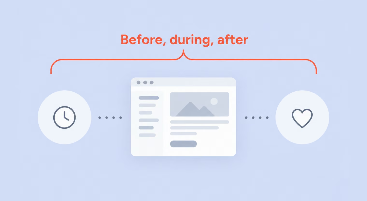
Gartner defines CX as the customer’s perceptions and related feelings caused by the one-off and cumulative effect of interactions with a supplier’s employees, systems, channels, or products. Because it builds up across all of them, a single strong interaction seldom rescues a relationship that a run of small failures has worn down.
Customer experience covers every touchpoint a person has with the company, from the first ad they see to the renewal notice years later. A single relationship runs through a long chain of them:
Picture a SaaS customer over eighteen months. The product works well, but the demo oversells, onboarding disappoints, billing is unclear, and support is slow. None of those moments may be enough to lose the customer on its own, but together they shape how the relationship feels by the time renewal comes around.
That cumulative experience is CX, with the product forming just one part of it. For a closer look at shaping the full journey, see our guide to customer experience design.
The difference between UX and CX becomes clearer across a few practical dimensions:
| Axis | User experience | Customer experience |
|---|---|---|
| Scope | Experience of using a product, system, or service | The broader relationship with the company |
| Time frame | Individual interactions and repeated use | The full customer lifecycle |
| Who experiences it | The person using the product | Customers and buyers across touchpoints |
| Core question | Can they do this easily? | Do they want to keep dealing with us? |
| Typical metrics | Task success, time on task, error rate, SUS | NPS, CSAT, Customer Effort Score, churn, retention, CLV |
| Research methods | Usability testing, session recordings, analytics | Surveys, interviews, journey mapping, support analysis |
| Typical owners | Product designers, UX researchers | CX managers, support, marketing, sales, operations |
Three of these axes carry the biggest consequences once you are deciding what to fix, so the sections below take them one at a time.
The practical weight of scope and time frame is that they determine how soon you can even see a problem. A usability flaw often appears within a specific interaction, so it can be easier to spot quickly: run a usability test, and you may see people stall at the same step.
A weakness in the wider customer experience is spread across many touchpoints and a relationship that unfolds over months. It surfaces slowly and in aggregate, often after the churn numbers move and the customers are already gone. That asymmetry pulls teams toward the interface, while the costlier problems in the relationship stay hidden until they have compounded.
UX and CX optimize for different outcomes. UX is concerned with whether someone can complete a task easily, whether that means finding a setting, finishing a purchase, or reading a chart. CX looks at the broader experience with the company: whether it is good enough to make the customer stay.
Those goals can point in opposite directions. A one-click upgrade can look like a UX win on task efficiency — smooth and fast — while still creating a CX problem if people end up in a plan they later regret and cancel. A team that optimizes for the task alone can ship a product that tests well in every session and still bleeds customers for reasons no usability score will surface.
What makes these numbers worth reading together is that they can flatly contradict each other: a task can get easier while the overall customer experience gets worse, and no single score will warn you. The behavioral ones track what a user actually does: task success rate, time on task, and error rate show whether they get through the work, and the System Usability Scale (SUS) captures users’ perceived usability. The remaining metrics look at the wider customer relationship:
Churn, retention, and customer lifetime value (CLV) round out that side, showing whether people stay and what they are worth over time.
The line between the two sets is softer than it looks, since the same measure can serve either question depending on the product and the stage of the journey. The useful habit, then, is to pair a behavioral number with a felt one, because each covers the other’s blind spot.
Users and customers diverge most clearly in B2B, where the person who buys the product is often not the one who works with it every day. An operations director or procurement team may sign the contract, while an entire department uses the software from nine to five. That difference changes how the numbers should be read.
Take a project-management tool bought by a VP of operations for a team of eighty. The buyer and the users judge it by different things, which creates two opposite mismatches:
Either way, a healthy score on one side can hide a real problem on the other.
That distinction changes the research itself. UX research has to reach the people using the product, while CX research also needs to account for the buyer who may rarely open it. The product has to work for both, sometimes through features that help buyers see and justify its value, such as usage reports, admin controls, or clear billing.
In many B2C products, the buyer and the user are the same person, so that distinction is less pronounced. Even then, buying and using happen in different contexts, and a choice that felt right at checkout may feel very different after weeks or months of use.
A strong score only helps if you know whose experience it reflects.
For customers who use the product, UX is one part of the broader customer experience. The sections below show where the two overlap and where design alone is not enough.
A product interface is one touchpoint among many, which means a flawless screen cannot rescue what surrounds it. Slow support, unclear billing policies, or a delivery that arrives late may have little to do with the product interface, yet all of them shape how the customer feels about the company.
In SaaS and eCommerce, the product is the main way the company shows up, so the design team ends up shaping a large share of the customer experience whether it plans to or not. Several screens belong to both layers at once: onboarding, the pricing page, billing and receipts, the subscription cancellation flow, and the notification emails that pull people back in.
A cancellation flow is a good test case. If the team optimizes only for short-term retention, it may be tempted to add friction to the process. From a broader customer-experience perspective, however, the exit should remain clear and straightforward, because the way someone leaves can shape whether they return later.
Some problems look like design and are, and some look like design but are not. Baymard Institute’s checkout research is a clean example of both. A checkout that feels too long is a real usability problem, and design can address much of that friction. Baymard found that an ideal checkout can be as short as 12 to 14 form elements, while the average US checkout has 23.48. Trimming fields, merging steps, and clarifying labels is squarely UX work, and it moves the number.
Form length is not the leading checkout-related reason for abandonment, though. Unexpected extra costs such as shipping, taxes, and fees rank higher. Design has real moves here:
Each of these removes the nasty surprise. What design cannot do is make the fee itself smaller. At that point, the decision belongs to whoever sets shipping and fees, and the design team’s job is to make the number legible early.
Good UX can make a cost clear. It cannot decide what that cost should be.
When a metric slips, the first useful move is to figure out where the problem starts, because the answer determines who fixes it and what to measure next. The signals below help place the problem before anyone commits a sprint to it.
Some patterns point clearly at the interface. Watch for these:
When the evidence looks like this, the fix lives in design, and it is usually cheaper and faster than the customer-experience equivalent. Our guide on how to find and fix UX issues goes deeper on running that down.
Other patterns point past the product entirely. The interface works, and people still leave. Look for:
Some problems straddle the line and need both teams. Churn in the first weeks after onboarding is the classic case, often driven at once by a rocky first-run experience and a pricing tier that felt wrong once the trial ended.
Exit surveys that mix “too confusing” with “too expensive” point the same way, and so does confusion on the pricing page, where design and pricing policy overlap. These cases go wrong when each team assumes the other owns them, and the issue bounces between backlogs for a quarter. That is exactly where a focused audit pays off.
{{banner}}
UX and CX teams are most effective when they work from the same customer evidence. Shared insights make it easier to see where a problem starts and who should own the fix.
In most companies, responsibilities tend to fall roughly along these lines, though the boundaries are rarely strict:
The lines blur at the edges, and that is where work gets passed back and forth. Take a week-two churn spike: the reflex is for one team to rework onboarding while the other drafts a win-back email, with neither comparing notes.
A better move is to put a single owner on the churn number and pull evidence from both sides, session recordings for where new users stall and exit-survey text for why they say they left.
Often the answer turns out to be split: a confusing first-run screen plus a pricing tier that felt wrong once the trial ended, and the joint view catches both. Shared evidence, clear ownership, and regular hand-offs keep the issue from getting lost between teams.
UX and CX teams usually need different views of the same customer journey. A customer journey map shows the path from awareness to renewal, while a user flow narrows in on what happens inside the product.
Service blueprints add the operational side, linking what the customer sees with the processes behind it. A slow refund, for instance, may have more to do with finance operations than with the interface. Keeping support insights and usability findings in a shared research repository also makes it easier to connect problems that would otherwise sit in separate teams. For a closer comparison, see our experience map vs. customer journey map guide.
Once the problems are on the table, the question is order. No universal sequence fits every product, so it helps to reason from impact, taking a few factors case by case. Start with the issue doing the most damage to customers and the business at once, then weigh these against each other:
That third point catches teams out. A UX symptom can sit downstream of a CX decision. If a pricing page is confusing because the pricing itself is convoluted, redesigning the page around it just dresses up the problem. Resolve the policy first, then design for the result.
Run those factors on a real backlog, and the order often surprises you. A flashy interface glitch that annoys a handful of power users can lose to a dull billing-email fix that touches every new customer in their first week.
Frequency and journey stage usually beat visual severity. Confidence matters just as much: a smaller fix you are sure about often beats a bigger one built on a hunch, because you can ship it, watch the number move, and learn either way. A practical rule is to clear critical blockers first, give every fix a named owner, and measure the wider journey after the change.
Before signing off on a redesign, ask one question: if this screen were already perfect, would the customer still walk? If the answer is yes, the problem likely sits elsewhere in the customer experience — in pricing, onboarding, support, or another part of the journey.
The point is not to choose between UX and CX, but to know which one is shaping the problem in front of you. That distinction helps teams put their effort where it can actually change the customer’s experience.
{{banner-2}}
Yes. UX focuses on the user’s experience with the product itself, whereas CX encompasses the broader relationship, including sales, billing, support, delivery, and other customer interactions.
UI is the visual and interactive surface: the buttons, layout, and screens. UX is the whole experience of using the product, including how those screens perform and whether they match expectations. CX is broader still, covering every interaction a person has with the company, online and off. For the first pair specifically, see our UI vs. UX design comparison.
Start with whichever is doing the most damage, which usually means looking hard at why people leave. If they cannot get value out of the product, UX comes first. If they get value and still churn, the trouble is elsewhere in the journey, and CX is the better bet.
Often, yes. In a small company, one team routinely covers both, and that can be an advantage, since the same people see the product and the relationship without a handoff in between. It gets harder as the company grows and the touchpoints multiply, which is when dedicated ownership starts to pay off.
Service design covers the whole system that delivers an experience, including the backstage processes, staff, and policies the customer never sees. If UX is the product and CX is the relationship, service design is the machinery behind both, making sure the front-stage experience is actually deliverable.
Neither outranks the other in the abstract. They answer different questions, and the one that matters more at any moment is the one where your customers are actually struggling. A strong relationship cannot save a product people cannot use, and a strong product cannot save a relationship that keeps breaking its promises.
Yes, and it happens often. People can enjoy using a product and still leave over slow support, a painful renewal, or a price that no longer feels fair. The interface was not the problem, which is why teams that look only at the interface stay stuck, redesigning a screen that was already doing its job.



.avif)