

A team ships a redesign everyone agrees is cleaner. The screens look better, the flow feels simpler, and the launch goes smoothly. A month later, though, the harder question remains: did anything actually improve for the people using it?


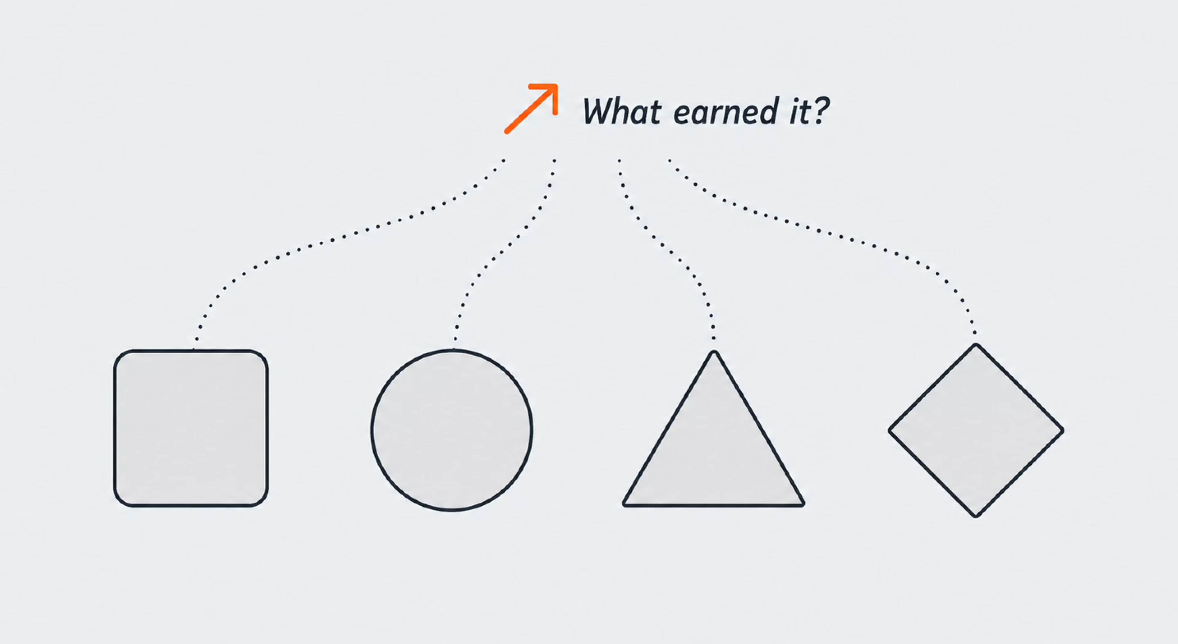
To answer that, teams need something more concrete than impressions. Product design metrics turn ideas like “easier to use” or “better experience” into signals that can actually be tracked. They show whether people complete key tasks, where they run into friction, which features they adopt, and whether they come back.
The real challenge is knowing which signals are worth watching in the first place. In this guide, we’ll look at how to choose the metrics that fit your product and goals, measure them reliably, and keep them useful beyond a single launch.
What are product design metrics?
Product design metrics are measurable signals that show how well a product works for its users and whether design decisions support the outcomes the product is meant to achieve. They can capture what happens during a task, how people feel about the experience, whether they adopt or return to the product, and how those behaviors connect to broader product goals.
That makes the category fairly broad, which is also why product design metrics and UX metrics are often discussed side by side. The difference is mostly one of emphasis.
Product design metrics vs. UX metrics
UX metrics tend to stay closer to the experience itself: whether people can complete a task, how long it takes, where errors occur, and how usable or satisfying the interaction feels.
Product design metrics can include those same signals but look at them in a wider product context. They connect the quality of the experience with outcomes such as feature adoption, retention, conversion, or support demand.
The boundary is flexible, and in practice the two sets often overlap. What matters more than the label is whether a metric helps explain what users are experiencing and what that means for the product.
{{banner}}
Why product design metrics matter
The point of measuring design is not to put every interaction on a dashboard. It is to provide enough evidence to tell what is helping, what needs another look, and how design contributes to the wider product.
Making better product decisions
Most releases are still a bet on what will help. Without a clear record of what changed afterward, teams can end up reopening the same questions each cycle or giving too much credit to whatever shipped most recently.
Tracking the right signals makes those decisions less speculative. A drop in task completion, for example, may flag a flow worth investigating, while stable results can show that a change had less impact than expected. Either way, the next step is based on what actually happened, not just on what the team expected to happen.
Aligning design with business goals
Design gains more weight in product conversations when teams can connect it to outcomes the business already tracks. Activation, conversion, support demand, or retention give design work a clearer context than preference alone.
That connection also makes prioritization easier. If a change is followed by fewer support requests, stronger activation, or better completion rates, design becomes easier to evaluate alongside other product and business priorities.
Using data without replacing judgment
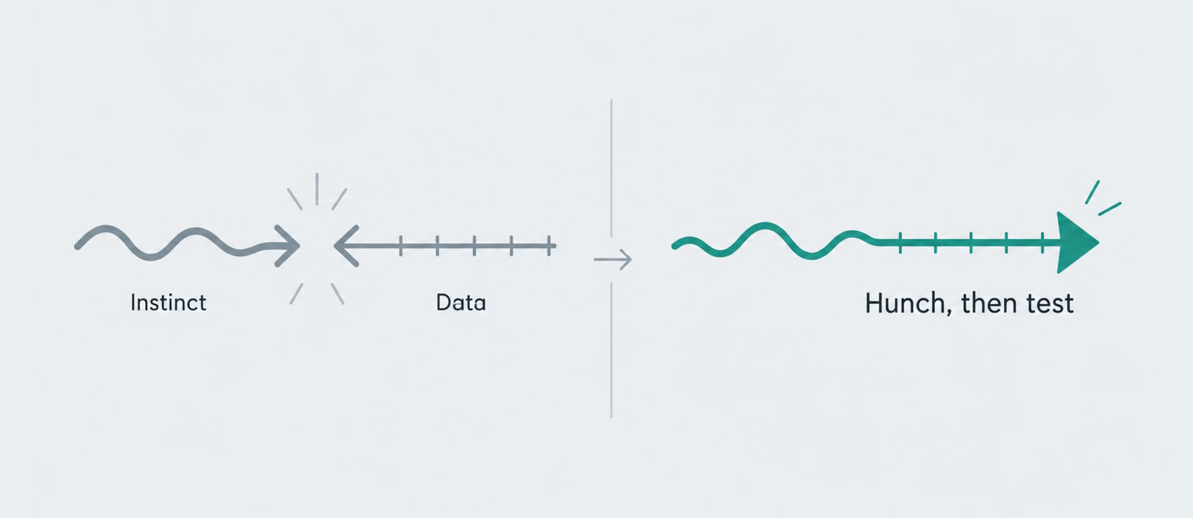
Data and intuition work best together, not against each other. Design judgment helps teams form hypotheses, spot patterns, and decide what is worth exploring; measurement shows whether those ideas hold up once people start using the product.
The goal is to use data as a check on experience, not as a substitute for it. It is to give good instincts something to push against, so teams can keep the ideas that work, question ineffective ones, and avoid repeating the same confident assumptions release after release.
The cost of unmeasured design decisions
A decision you decline to measure still gets an answer. It just arrives later, through user behavior, support issues, stalled adoption, or results that quietly miss the mark.
Without a baseline or agreed success signal, weak decisions can survive several release cycles because nobody can say clearly whether they helped. The cost extends beyond one missed improvement to the time spent building on an assumption that was never properly checked.
Choosing the right product design metrics
The hard part of measurement is usually deciding what to leave out. A dashboard can hold fifty numbers and still leave a team unsure what to change on Monday. The real skill is narrowing that down to the few numbers that can actually guide a decision.
Start with your business goals
The shortlist should start with the outcome the product needs to improve, then work backward to the user behaviors that contribute to it. If activation is the priority, that might mean tracking onboarding completion, time to first value, or whether new users reach a key action.
A retention problem calls for a different mix of measures, such as repeat use, feature engagement, or where users begin to drop away. Starting with the goal helps teams avoid tracking whatever the analytics tool happens to make easiest.
Consider your product stage
What deserves attention changes as the product matures. Early on, qualitative usability testing and simple behavioral signals can show whether people understand the core experience and reach its main value.
As usage grows, the questions usually shift toward scale: which users activate, who returns, which features become part of regular use, and where conversion or retention starts to change. The metric set should evolve with those questions rather than stay fixed from launch onward.

Balance user and business metrics
A user metric and a business metric often tell different parts of the same story. A high satisfaction score, for example, says little about the people who abandoned the flow before they ever reached the survey. Conversion alone has the opposite problem: it shows the outcome, but not how difficult the experience was along the way.
Read together, the two give teams a better chance of spotting trade-offs instead of optimizing one side at the expense of the other.
Avoid tracking too many KPIs
More metrics do not automatically create more clarity. Once a dashboard grows past the point where the team knows which signals should trigger action, measurement starts turning into reporting for its own sake.
A few warning signs are easy to spot:
- Nobody can name the metrics that matter most without checking the dashboard.
- The same numbers get reported every week but rarely change a decision.
- Several KPIs describe almost the same behavior.
- New metrics keep being added while old ones are never retired.
When that happens, cut the set back to the signals tied to current goals and decisions. The rest can still exist in analytics without competing for attention as core KPIs.
Key product design metrics to track
Useful measurement usually combines a few different views: what users do, how the experience feels, and how both connect to product outcomes. A strong metric set draws from more than one of those areas, so no single number gets to define success on its own. The metrics below are among the ones product teams use most often.
Task success rate
Task success rate answers one basic question: can users complete the task they set out to do? It is usually expressed as the percentage who reach a defined successful outcome.
On its own, though, the number does not explain why people succeeded or failed. If completion drops, usability testing or behavioral data can help reveal whether the problem sits in a confusing requirement, an unclear next step, or somewhere else in the flow.
Time on task and error rate
These two add context that task success alone cannot provide. The first shows how long users take to complete a task, while the second tracks the mistakes they make along the way. For routine actions, less time and fewer errors usually point to a smoother experience, though context still matters — taking longer is not necessarily a problem when the task involves comparison, learning, or an important decision.
Trends are often more useful than a single reading. If errors rise or a familiar task suddenly takes longer after a release, that is a signal worth investigating, especially when the change appears in the part of the experience that was updated.

Feature adoption rate
Feature adoption rate shows how many eligible users begin using a feature, based on a clearly defined action that counts as meaningful use. That distinction matters: simply opening a feature once does not always mean it has been adopted.
Low adoption can point to several different issues. Users may not discover the feature, understand its value, need it often enough, or know how to use it once they get there. It helps expose the gap between shipping a feature and seeing it become part of real product use, but it usually needs behavioral data or user research to explain why the gap exists.
User retention
For products built around repeated use, retention is one of the clearest long-term signals of whether people keep finding enough value to return. It is usually tracked by day, week, or cohort, depending on how often the product is expected to be used.
Retention makes more sense when read alongside shorter-term metrics. A redesign may improve task success or satisfaction without changing how often people come back, which does not automatically mean the work failed. It simply shows that the experience improved in one area without shifting the longer-term behavior the redesign was meant to influence.
A better first experience matters most when it gives people a reason to return.
System Usability Scale (SUS)
SUS is a standardized ten-item questionnaire that turns users’ responses into a score from 0 to 100. Its main advantage is comparability: teams can use the same measure across different versions of a product, different studies, or against established benchmarks.
A score around 68 is often used as a rough reference point, but the number is more useful as context than as a pass-or-fail grade. Run SUS before and after a redesign with comparable user groups, and the change can help show whether perceived usability moved in the intended direction.
Net Promoter Score (NPS)
NPS is based on a single question: how likely someone is to recommend the product, answered on a scale from zero to ten. The responses fall into three groups:
- Promoters (9 to 10), respondents most likely to recommend the product.
- Passives (7 to 8), generally satisfied but less enthusiastic.
- Detractors (0 to 6), respondents least likely to recommend it.
Subtract the percentage of detractors from the percentage of promoters, and the result falls somewhere between -100 and 100. NPS is a broad measure, better for tracking overall customer sentiment over time than for diagnosing a problem on any single screen.
Customer Satisfaction (CSAT)
CSAT measures how satisfied users feel with a particular interaction or experience, usually through a short rating question and reported as the share of positive responses. When collected immediately after a specific moment, it can capture satisfaction with that experience more directly than a broader relationship metric.
A drop in post-checkout CSAT, for example, can flag friction before it becomes visible in wider customer or business metrics. Like the other measures here, though, it works best as a signal to investigate rather than an explanation.
Conversion rate
Conversion rate is the share of users who complete a target action, such as starting a trial, booking a demo, or finishing a purchase. Design can influence that rate by making the path clearer and reducing unnecessary friction, but it is only one of several factors that shape conversion.
Three design-related factors often matter:
- Clarity: whether users understand what to do next and why it matters.
- Trust: whether the experience addresses the doubts that might stop them.
- Friction: whether the path asks for more effort or steps than the task requires.
Because conversion sits close to key business actions, even small design changes can show up quickly in the data. The challenge is separating that effect from other factors moving at the same time.
How to measure product design metrics
Choosing the right metric is only part of the job. How you collect it matters just as much, because each method reveals a different side of the experience. The clearest picture usually comes from combining a few and looking at where the signals reinforce — or contradict — one another.
User testing
User testing brings the team closer to the moments where friction actually happens. With realistic tasks, it becomes easier to see where people hesitate, what they expected to happen instead, and which parts of the flow consistently cause trouble.
That context is what makes testing valuable alongside metrics such as task success. A small qualitative study will not give statistical certainty, but it can help explain why a score is low and turn an abstract signal into a concrete area to investigate.
Watching someone use the product reveals friction the interface can hide.
Product analytics
Product analytics gives teams a broader view of what users actually do across funnels, feature usage, conversion, and retention. It can reveal where behavior starts to shift, where people drop away, and which parts of the product deserve a closer look.
What analytics cannot usually explain on its own is why that behavior changed. That is why instrumentation matters: teams need to track meaningful actions rather than everything that is easy to log. A well-structured funnel can narrow the investigation to a specific part of the experience instead of simply adding more numbers to a dashboard.
User feedback
Sometimes the missing piece is what users say about the experience themselves. Surveys, interviews, support tickets, and measures such as SUS, NPS, and CSAT can surface expectations, frustrations, and perceptions that behavioral data cannot capture directly.
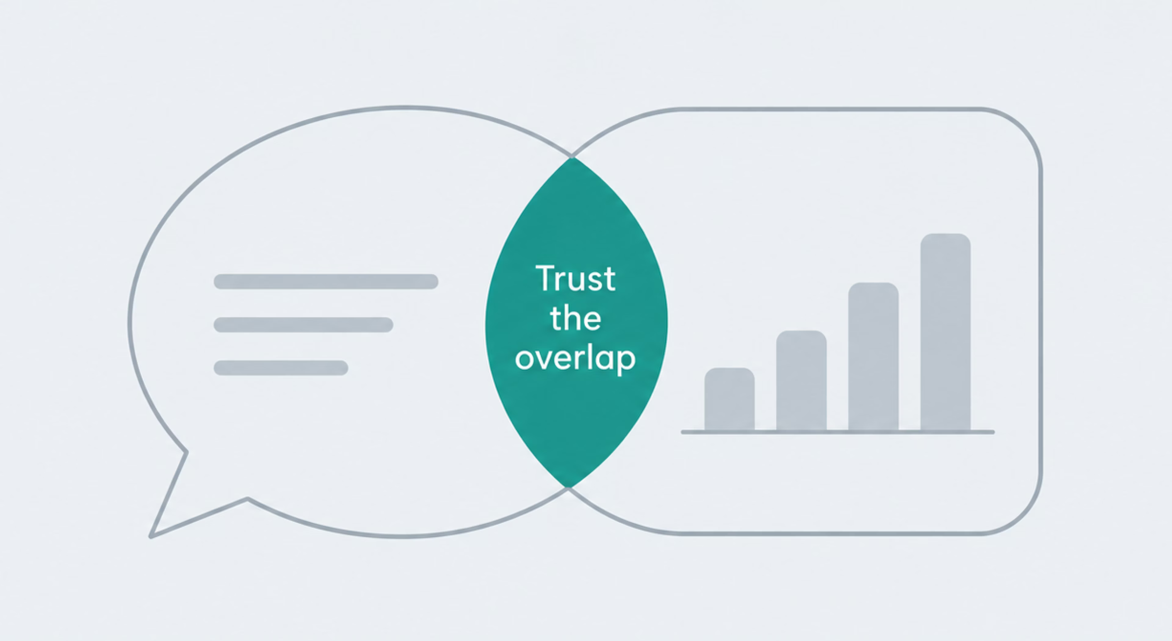
The risk is treating one strong opinion as representative of everyone. Feedback becomes much more useful when recurring themes are compared with testing and analytics: agreement can strengthen a hypothesis, while a mismatch can reveal a question worth exploring further.
How to build a product design metrics framework
A good metrics framework keeps measurement consistent from one launch to the next, leaving room for those signals to change over time. The steps below show how to set that up in practice.
Define success metrics before launch
Success is much easier to judge when the team agrees on what it should look like before the data starts coming in. A baseline, a target, and a clear decision rule give everyone the same reference point once the feature is live. Four questions usually cover the essentials:
- What behavior should change if this works as intended?
- What is the baseline, and what size of change would actually matter?
- Which primary metric will show that change most clearly, and which signals will help interpret it?
- What result would trigger another investigation or iteration?
With those questions answered, everyone knows what to watch from day one and has a clearer basis for interpreting the result.
Establish measurement methods and tools
A metric is only useful if the team knows where the data will come from and how it will be collected. Before launch, pair each one with a clear source: task success from usability testing, adoption and retention from product analytics, satisfaction from an in-product survey.
It also helps to agree on what exactly counts as the event or outcome being measured, so the definition stays consistent throughout the review. When the harder question is what to measure in the first place, product research can help define the right signals before the build begins.
Avoid vanity metrics
A metric becomes vanity when it looks impressive but tells little about whether the product is improving. Page views, total downloads, or registered users can all be useful in the right context, but they become weak KPIs when growth in the number has little bearing on a product decision.
A simple test is to ask what would change if the metric moved up or down. If the answer is “nothing,” it probably belongs outside the core design KPIs. Replace it with a signal closer to user behavior or product value, such as activation, successful task completion, or repeat use.
Review and refine your metrics over time
A useful metric set should change as the product and its priorities change. Signals that mattered at launch may become less important, while new behaviors, features, or business goals create different questions.
Review the framework at regular intervals and around major product changes. Retire metrics that no longer influence decisions, adjust definitions when the product evolves, and add new signals only when they answer a question the current set cannot.
Product design metrics in practice
The same metric categories can apply across different products, but their importance shifts with the way each product creates value. A few common product types make those differences easier to see.
SaaS products
Subscription products usually put activation and retention near the top of the list. The first tells you whether new users reach value early enough to keep going; the second shows whether that value is strong enough to bring them back over time.
Feature adoption matters too, especially when growth depends on users reaching more advanced capabilities or higher-value parts of the product. A strong sign-up rate can still hide weak engagement later in the journey, which is why acquisition and retention should be read together.
Mobile apps
Mobile apps often depend on whether users can reach value quickly and return often enough for the product to become part of their routine. Onboarding completion, retention, and engagement with the core action are therefore common priorities.
For the actions users repeat most often, even small points of friction can add up. Time on task and error rate can show where extra steps or unclear interactions make the experience harder than it needs to be, which is a core concern in mobile app design.
E-commerce platforms
E-commerce makes business outcomes especially visible, which puts conversion, cart abandonment, and average order value close to the center of measurement. Because these metrics sit near the purchase decision, changes can often appear in the data relatively quickly.
The sale should not be the only endpoint, though. A checkout may convert well while creating confusion that shows up later in returns, support requests, or post-purchase satisfaction. Reading those signals together gives a better picture of whether the experience is helping the business beyond the transaction itself.
Enterprise products
In enterprise software, the people who choose the product and the people who use it are often different, so the metric set needs to reflect both sides. Task success, error rate, and time on task show how well the experience works for day-to-day users.
Adoption across teams or seats answers a different question: whether the rollout has actually taken hold. Satisfaction measures such as SUS can add useful context because high usage alone does not always mean users are happy, especially when switching tools is difficult or the software is mandated by the organization.
{{banner-2}}
The takeaway for product teams
In the end, good measurement comes down to focus. A few well-chosen metrics tied to the product’s goals can tell you far more than a long list of disconnected numbers. The key is to know what each can and cannot explain, combine behavioral data with user feedback, and keep adjusting the set as the product changes. If the measurement leads to a clearer next decision, it is doing its job.
FAQ
Why invest in branding services services services?
How can product design success be measured?
Use a small set of metrics tied to the product goal. Combine behavioral signals such as task success or retention with satisfaction and business outcomes, then read them together rather than relying on one number.
What are the most important product design KPIs?
There is no universal set. Common choices include task success, retention, feature adoption, conversion, SUS, and CSAT. The right KPIs are the ones tied to the decision the team needs to make.
How often should product design metrics be reviewed?
Track behavioral metrics continuously where possible, and review the framework when product goals, features, or user behavior change significantly. Major releases or market shifts are also good points to reassess it.
What tools are used to track product design metrics?
Teams usually combine product analytics, usability testing, and survey tools. The exact platform matters less than whether the data supports the questions and decisions the team needs to address.
Should startups and enterprises track the same product design metrics?
Some metrics overlap, but priorities differ. Startups often focus on activation, usability, and early retention, while enterprise products may put more weight on adoption across teams, task efficiency, and user satisfaction.