Follow us on LinkedIn
Your product still solves the problem it was built for, but users are frustrated, support is stretched thin, and growth has hit a ceiling. It’s not broken, but it’s no longer working as it should. So now the real question: do you patch it again or reimagine the experience?
A product redesign is either a strategic accelerator or a proven resource drain. Done right, it cultivates an intuitive experience, maximizes user retention, and pioneers a revolutionary UI perspective. In this article, we'll break down when a redesign makes sense, when it doesn't, and how to navigate the redesign process without risking your audience. You'll see real product redesign examples, common mistakes, and practical steps to help your team move forward with confidence.
Why product redesign improves business health
Digital tools aren't built to last forever. As trends shift and technologies evolve, even top-performing interfaces start to feel dated. SaaS companies refresh their look every two to four years, not for vanity, but to fix UX gaps, improve retention, and maintain competitiveness.
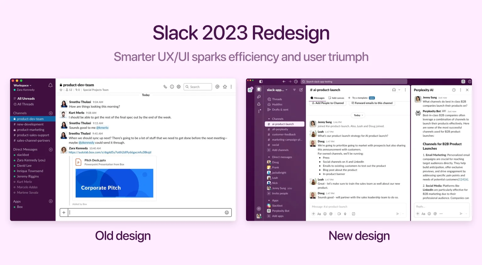
For example, consider the 2023 redesign of a product in Slack: a cleaner layout wasn't just a visual polish. The update introduced a more focused sidebar, condensed menus, and grouped related actions, allowing for fewer clicks. It reduced the time it took customers to find conversations and access shortcuts, which increased team-level productivity across enterprise clients. This demonstrates how updating your product can directly improve the outcomes that users care about most: speed, clarity, and interface control.
Here are a few ways a well-timed redesign supports business health:
- Boosts task completion speed and reduces user frustration
- Decreases support volume by addressing long-standing interface issues
- Increases user product loyalty through improved navigation and clarity
- Keeps your product visually relevant in competitive markets
- Creates space for new features or changes in positioning
Key motivations behind product redesign
When businesses consider overhauling a product, there are usually specific pain points or growth goals at play. These may relate to audience complaints, performance drops, branding issues, or tech limitations. In this part, we outline some of the most common and justifiable reasons for change in design.
Enhance usability and increase user satisfaction
Usability issues quietly erode trust over time. When interfaces confuse or delay people, they leave, sometimes without feedback. Improving navigation logic, labeling clarity, and visual hierarchy can prevent small frustrations from snowballing into churn. For existing products that need improvement, reducing visual noise, prioritizing common actions, and aligning content with customers' intent can restore momentum.
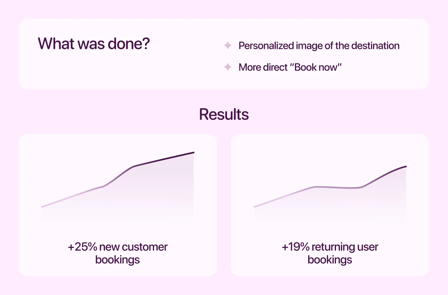
Take Airbnb's early version. Users struggled to complete bookings due to cluttered screens and unclear prompts. The company tackled this by running an A/B test on its search landing page. They replaced a generic background with a personalized image of the client's destination and swapped the "Check availability" button for a more direct "Book now" call-to-action. That experiment alone boosted conversions — bookings rose by 25% for new customers and 19% for returning users
Improve workflows and drive user engagement
A broken workflow is like a slow leak in a bucket — you won't see mass exits, but engagement drops steadily. When people must jump through hoops for basic actions, frustration builds. Refining flows can help people get things done faster and with less resistance.
Poor onboarding is a prime example. First-time clients who can't activate value within minutes are far more likely to leave. For actionable guidance on common UI patterns that improve workflow, see our article on SaaS design best practices. Need expert help? Our SaaS website design services focus on cutting clutter and lifting interaction quality.
Strengthen brand recognition and market position
Visual consistency builds trust. When your interface looks outdated or fragmented, people assume the experience is outdated too. A refreshed aesthetic signals intentionality and precision. This kind of update is strategic. When visual identity aligns with current expectations, it reinforces your position in the market and appeals to newer audiences.
For example, Duolingo's 2021 visual update — featuring refined animations, updated color schemes, and polished layouts — paired well with a notable surge in engagement. The app's monthly active users jumped from 27 million in 2019 to nearly 40 million by mid‑2021. That growth wasn't just due to better UX — it reflected how a cohesive visual identity helped strengthen brand appeal and deepen customer loyalty.
Add new features to stay aligned with trends
New features don't live in a vacuum — they demand space. If the interface is already packed with tools, even a valuable addition can get lost in the noise. Before adding anything new, teams need to assess how it fits into existing usage patterns, which paths it affects, and what might need to move or disappear. The structure must support discovery, without forcing people to relearn the product from scratch.
Instagram's Reels rollout shows this in action. Rather than tacking on another tab, they reshaped the experience to give the feature room to grow. This wasn't a small tweak — it restructured how users moved through the app. Google did something similar in Chrome, reorganizing tab and extension visibility to match how people actually use the browser. See the full story in our Chrome case study.
Expand into new markets or reach new audiences
Scaling globally introduces UX challenges that go far beyond translation. A payment flow that works in the U.S. may break in Brazil. A date picker optimized for Western formats might confuse users in Korea. Input types, reading direction, formatting standards, and cultural expectations all shape how interfaces should behave, and shortcuts here lead to drop-offs and frustration.
Spotify handles this with region-specific layouts. In India, podcast discovery is prioritized. In Japan, karaoke lyrics are deeply integrated. These tweaks aren't cosmetic — they reflect real differences in how people use the product. The right adjustments can multiply reach without diluting your core identity. For advice on adapting to new audiences, see our guide on inclusive design.
When you should avoid redesigning
Not every change leads to success. Some attempts backfire due to poor timing, weak rationale, or insufficient planning. Before acting, it's worth asking: Which of the following is not a reason for redesigning a product or service? Trends? Aesthetics? Envy? Without a clear justification, any of these can derail your roadmap.
This section highlights red flags that signal your team should hit pause before committing to a major overhaul. Mistakes at this stage can waste months and damage customer trust.
Misaligned motivation
Redesigns driven by vanity metrics, internal assumptions, or trend-chasing often do more harm than good. If a design change isn't tied to a real user problem or business need, it tends to create confusion or even backlash. The pressure to "keep up" can cause teams to act before thinking through consequences. If leadership pushes for change without evidence, pause and ask: What exactly are we solving?
When Yahoo redesigned its homepage in 2009 to mimic the minimalist design of its competitors, it overlooked what its audience valued most: accessible content and a familiar layout. The result was a drop in engagement and a public walk-back. Redesigns should align with actual customer behavior, not the latest visual trend. You can check up our article about heuristic evaluation techniques to vet whether there's substance behind the push for change.
Lack of data or user validation
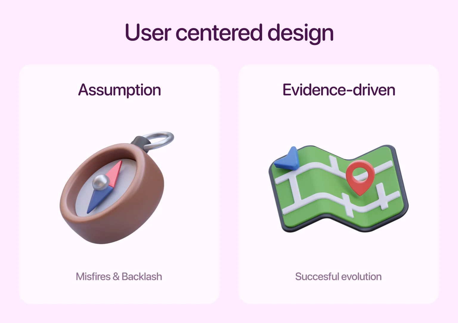
Assumptions are a weak foundation for redesign. Without testing ideas or gathering direct input, updates often miss key usability issues or introduce new ones. Teams need real evidence — analytics, recordings, interviews — to shape what they build. Even basic feedback loops can reveal misunderstandings or gaps that internal teams overlook. Ignoring this step leads to avoidable misfires.
Snapchat's 2017 redesign, launched with little public testing, was met with immediate user backlash. App Store reviews dropped, and more than 800,000 people signed a petition to reverse the change. It's a sharp reminder: test small before launching big. Not sure where to begin? Try Halo Lab's product research service to uncover what individuals actually need.
Internal constraints
No matter how strong the design vision, timing can derail it. Budget limits, developer resources, and technical dependencies often block execution. Redesigns that ignore internal reality lead to overpromises, delays, and broken experiences.
For example, when infrastructure or core features are mid-transition, piling a redesign on top strains already tight systems. Rather than forcing timing, assess your team's readiness honestly. Redesign only when you can commit enough focus and stability to do it well. Otherwise, you risk damaging trust both internally and externally.
Common challenges and user reactions to redesign
Even the best-planned redesigns can trigger users' resistance. Understanding the most frequent pitfalls helps build a rollout strategy that keeps engagement intact. Below, we highlight the three main challenges product teams face during post-redesign.
Design is not finished until the transition feels invisible — users should instinctively know where to click, swipe, and scroll.
Negative feedback and feature fatigue
Major updates can be overwhelming when they introduce too many changes at once. New layouts, updated workflows, and visual overhauls might technically improve the product, but without preparation, they create stress. Familiar features disappear, patterns break, and users struggle to reorient themselves.
This kind of disruption often results in frustration, even if the underlying functionality improves. People resist when they feel forced to relearn what once felt intuitive and natural. Communicating early, offering previews, and releasing changes incrementally can reduce friction and rebuild confidence.
Drop in traffic or engagement after redesign
When core features are relocated or de-emphasized, traffic can take a hit. Usage patterns depend on habit, and changes that disrupt those patterns — without a clear benefit — risk disengagement. This issue isn't always rooted in bad design. It's often caused by failing to understand how people actually use the interface day-to-day.
Successful redesigns require deep user research and testing to ensure changes enhance the experience rather than alienate existing users. Without this, even well-intentioned updates can unintentionally reduce visibility, disrupt workflows, and ultimately lead to lower engagement.
UI inconsistencies that confuse users
Users feel stability and trust when interfaces are consistent. Buttons that change position, icons that shift meaning, or labels that vary from one screen to the next throw people off. They react not just to how things look but to broken expectations.
This is why strong design systems are crucial. Instead of making piecemeal fixes, teams should validate changes across the full experience. Even visual updates need to pass a logic test: Does this interaction behave the same way every time? Familiarity is powerful, and preserving it deliberately ensures that when a design's behavior matches a user's mental model, engagement remains strong.
Revolutionary vs. evolutionary redesign: which one to choose?
Not all redesigns require starting from zero. Some call for sweeping changes, while others need refinement, not reinvention. Understanding the difference between revolutionary and evolutionary approaches helps you choose the path that fits your product's context, users, and business needs.
A revolutionary redesign replaces core mechanics or visuals in a short window. It often involves new frameworks, restructured navigation, or entirely new interaction models. This route suits products facing steep usability problems, poor engagement, or major strategic pivots. However, it carries more risk. Rapid, large-scale changes can confuse users, strain teams, and spark resistance, especially if the update lands without clear communication or support.
An evolutionary redesign takes a gradual route. Instead of flipping the interface overnight, it layers improvements over time, adjusting spacing, consolidating tools, reworking copy, or modernizing visuals while keeping familiar structures intact. This approach suits products that are stable but need to stay competitive or address friction points. It's less disruptive, easier to test in stages, and typically more cost-efficient.
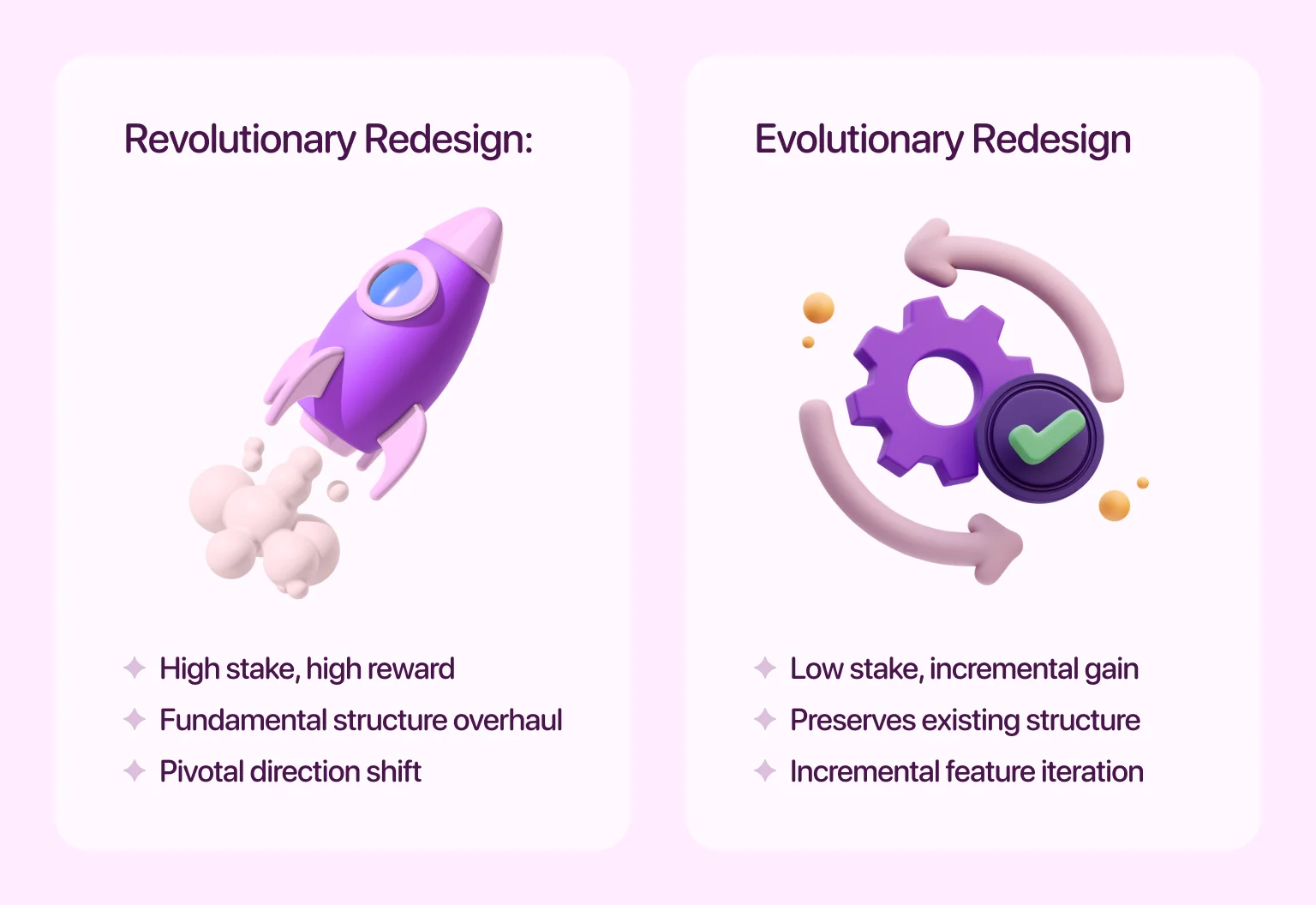
Choosing between the two depends on several factors:
- Severity of existing issues: Are you fixing cracks or rebuilding the foundation?
- User tolerance for change: Do you serve power users with ingrained habits or newer audiences more open to adaptation?
- Team capacity: Do you have the resources to overhaul architecture, or would smaller, focused efforts serve better?
- Business momentum: Are you reacting to stagnation, or pushing toward a new market, audience, or product tier?
The right choice between a major redesign and a gradual update is more than a matter of ambition. It depends on what your product and your team can realistically handle. A significant overhaul requires clear communication and synchronized effort, while a gradual approach calls for patience and consistent iteration.
A practical framework for redesign decisions
Once you've decided a redesign is worth pursuing, follow a structured path to reduce risk and maximize value. This framework outlines the key stages of a thoughtful, user-centered redesign process. Think of these steps as your product team's checklist — from uncovering problems to shipping improvements that genuinely matter to customers.
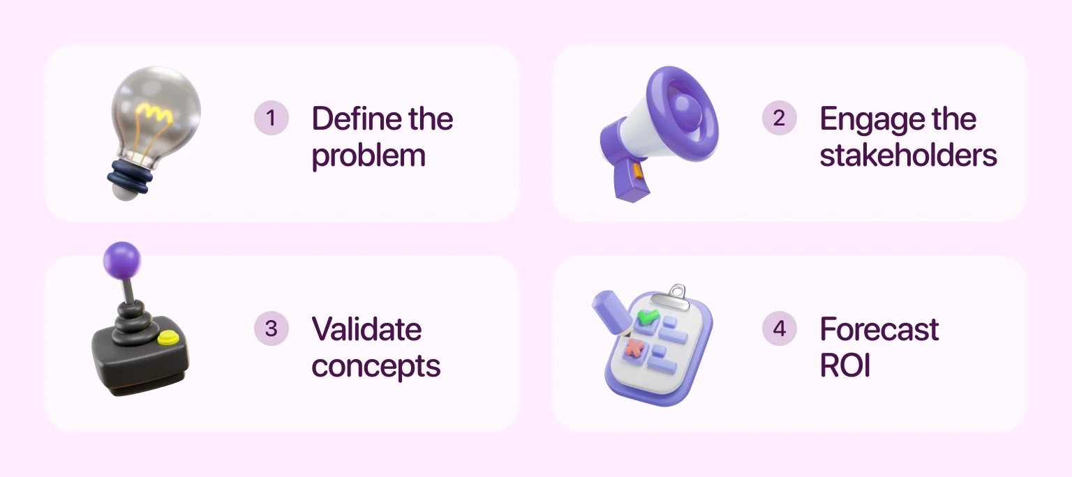
Step 1 – Define the core problem
The first step in designing or redesigning a product is identifying real client problems. Is churn high at onboarding? Are enterprise clients complaining about workflow limits? Pinpoint where friction lives. If you're unsure where to look, start with our UX strategy guide for a diagnostic approach. Without a clear objective, redesigns tend to become unfocused, wasting time and money. Align the problem with business goals so everyone works from the same blueprint.
Step 2 – Engage the right stakeholders
Successful updates are cross-functional. Designers, developers, marketers, and support teams should all weigh in. Early alignment helps spot dependencies, sync timelines, and surface conflicting objectives. This stage is where potential missteps often reveal themselves — misunderstood handoffs, unaccounted tech limitations, or clashing KPIs. Clarifying these areas early reduces friction later in the process. Stakeholder engagement is not about collecting blanket approval — it's about uncovering blind spots.
Someone in support might flag an edge case that no one on the product team considered. A developer may reveal a limitation that shapes the direction. Surface these insights early to build a solid foundation. To achieve this, consider our UI/UX design services to streamline your product development, defining clear user flows and creating designs that address real-world problems.
Step 3 – Validate concepts with real users
Don't wait until the prototype is finished to start testing — instead, use paper sketches, wireframes, or click-through models to gather early input. Ask the target audience to complete tasks, observe friction, and measure clarity.
MarketingSherpa reports that The Weather Channel used multivariate testing on its Notify landing page, optimizing messaging and layout, and achieved a 225% increase in free trial conversions. This improvement didn't come from adding features, but from refining presentation and clarity.
Step 4 – Forecast ROI and business impact
Set performance targets before development begins. This grounds the project in outcomes rather than aesthetics. Forecasting impact also helps justify the scope. If a feature refresh can reduce support load by 30%, it might be worth delaying other roadmap items. Model these trade-offs with finance, product, and growth teams.
Need help aligning design with real performance gains? Use our product design services to turn strategy into measurable results.
How to redesign without losing your users
Even strong visual and functional upgrades can fail if mishandled. A successful redesign depends on how well people are prepared, informed, and supported throughout the change. Missteps in timing or messaging can create confusion and resistance. That's why execution matters. In the next section, we'll break down how to communicate updates, manage rollouts, and collect feedback, so changes are not just introduced but welcomed.
Communicate сhanges early and еransparently
Change triggers resistance when it arrives without warning. To reduce friction, start communication before launch. Use updates to explain what's changing, why it matters, and how it improves the experience. Visibility alone isn't enough — clarity is key. Help people understand what to expect and how to navigate the new version.
Support these messages through consistent channels: blog posts, email updates, banners, or onboarding tours. The more predictable the rollout feels, the more likely people are to stay engaged. If you're reshaping navigation or altering key visuals, always give users a way to preview, react, and adjust. For practical guidance and proven tactics, see our website redesign article.
"If people don't know what's coming, they can't prepare for it. Early communication builds confidence and cuts confusion."
Use gradual rollouts and A/B testing
Launching a redesign all at once raises risk — significant changes can overwhelm users and hide emerging issues. Phased rollouts let teams test ideas in the real world. These experiments expose problems early, reduce user disruption, and guide smarter adaptations.
Netflix takes this approach. They push updates in phases, comparing different UI variations across user segments. This method helps them validate new layouts before wider deployment. As one design insider explained, Netflix follows a clear cycle: test changes, confirm the results, and then roll them out more broadly, while keeping stability top of mind. Follow a similar path. Run A/B tests or staggered rollouts, compare engagement data, and fine-tune before scaling up. This way, you base decisions on real behavior, not assumptions.
Gather post‑launch feedback and iterate
Once changes go live, the work isn't done. Collect direct feedback, analyze usage patterns, and check key metrics. Feedback loops shouldn't be optional. Prompt users for reactions with lightweight surveys or satisfaction scores. Watch for dips in engagement or new support tickets — these are your early warning signs. If results disappoint, respond quickly. Iterating based on real-world usage not only improves outcomes, but it also shows customers you're listening.
So, should you redesign or not?
A well-timed redesign can fix broken flows, elevate your brand, and unlock new growth, but this is only true when the process is strategic. You should redesign when your goal is to address real issues and improve the product, not when you are motivated by shallow reasons or trying to rush a project. Acting without clear goals and proper testing can easily backfire.
If you're unsure, consult with our UI/UX experts for a structured evaluation. We'll help you assess product pain points, review your current interface, and identify whether a redesign or a set of smaller iterations makes more sense. Our approach is grounded in evidence and built to support growth, not guesswork. Ready to move forward? Explore our product redesign service to get clarity, strategy, and execution in one place.
Writing team:
Have a project
in your mind?
Let’s communicate.
in your mind?
Let’s communicate.

Frequently Asked Questions
How do I know if my product needs a redesign?
Look at user behavior and feedback. High drop-off rates, repeated complaints about usability, or falling engagement can all signal it’s time. Internal triggers — like scaling challenges or tech limitations — also play a role.
What’s the difference between a redesign and an iteration?
An iteration is a small, ongoing tweak that fixes specific issues without changing the overall structure. A redesign is a deeper update that reshapes core functionality or appearance. Use iterations for isolated friction points; choose a redesign when fundamental problems or strategic shifts are involved.
Can a redesign hurt user retention?
Yes, if it’s poorly executed. Abrupt changes, confusing interfaces, or loss of familiar features can push customers away. Minimize the risk with testing, clear communication, and phased releases.
How often should a product be redesigned?
There’s no fixed rule, but most digital products benefit from a major update every 3–5 years. Market shifts, clients’ needs, or business pivots can accelerate this timeline.
What’s the first step in a redesign process?
The first step in designing or redesigning a product is identifying the core problem. Without clarity on what’s broken or outdated, redesign efforts drift and deliver less value.
How do I justify a redesign to stakeholders?
Tie the redesign to measurable outcomes — retention, revenue, and usability improvements. Show examples of existing products that need improvement, provide user data, and forecast ROI to build your case.


