






The mockups look sharp, everyone signs off, and the build starts. Three months later, the team is still arguing about what the product is supposed to do, and every screen already approved has become expensive to change. That argument was never really about the design.


Every product that feels coherent got that way deliberately. Somebody decided early on its purpose, audience, and how it should feel, then held every later decision against that answer. We’re talking about a design concept, a thing that costs a few weeks to get right and several months to get wrong. By the end of this article, you’ll know what a concept must contain, how one gets made, and how to judge the result.
A design concept is the core idea a product is built around. In practice, it consists of a short written statement plus a small set of visuals, like a mood board, a few key screens, and the interaction rules that connect them. The shortest design concept definition that survives a real project is this: the argument for the product, made visible before anyone commits to building it.
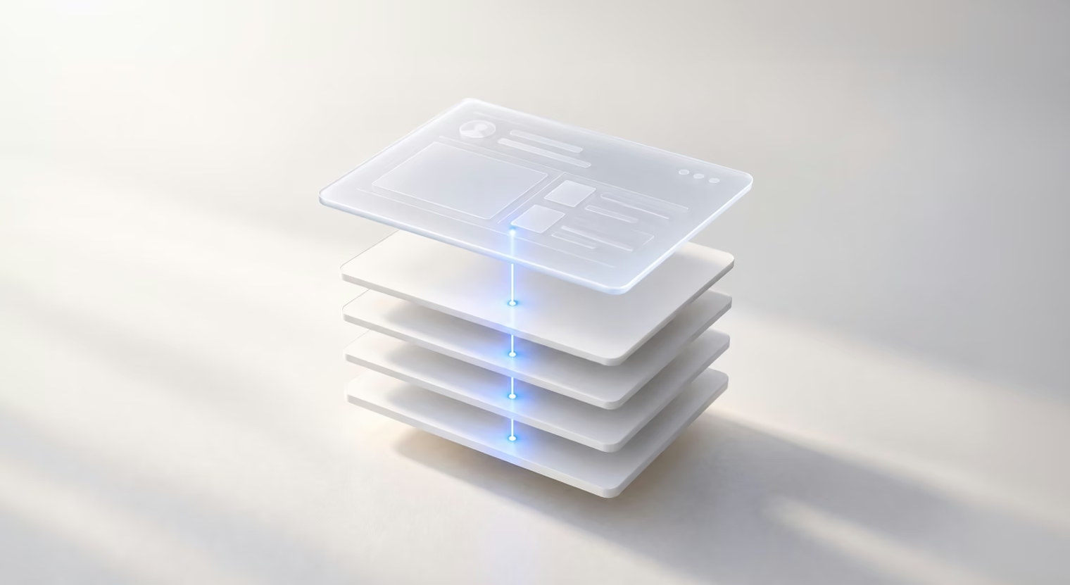
When a design project starts, it’s easy to mix up the brief, concept, and mockup because they often appear at different stages of the same process. The easiest way to tell them apart is to look at what each one helps the team decide:
Approving a mockup without an agreed concept means approving an answer to a question nobody wrote down. The screen looks finished, so the conversation feels finished, and the real disagreement surfaces in a sprint review with code already written. If you’re still at the brief stage, our guide on how to write a design brief covers what it should include.
A mockup is therefore one visual representation of a concept, not the concept itself. For a clearer look at how mockups fit alongside other design artifacts, see our breakdown of wireframe vs. mockup vs. prototype.
An idea on its own is too easy to interpret differently. A design concept makes it specific through a statement, visual references, interaction principles, and a few screens that put the direction to the test. Here’s what each part adds.
The statement is the written core — anything from one sharp sentence to a single page. A good statement is testable. “A budgeting app for freelancers with irregular income, built around the question, ‘Can I afford this month’” gives the team something to argue with. “A modern, user-friendly finance platform” gives them nothing to check a decision against.
A concept your team can’t repeat from memory won’t survive its first serious disagreement.
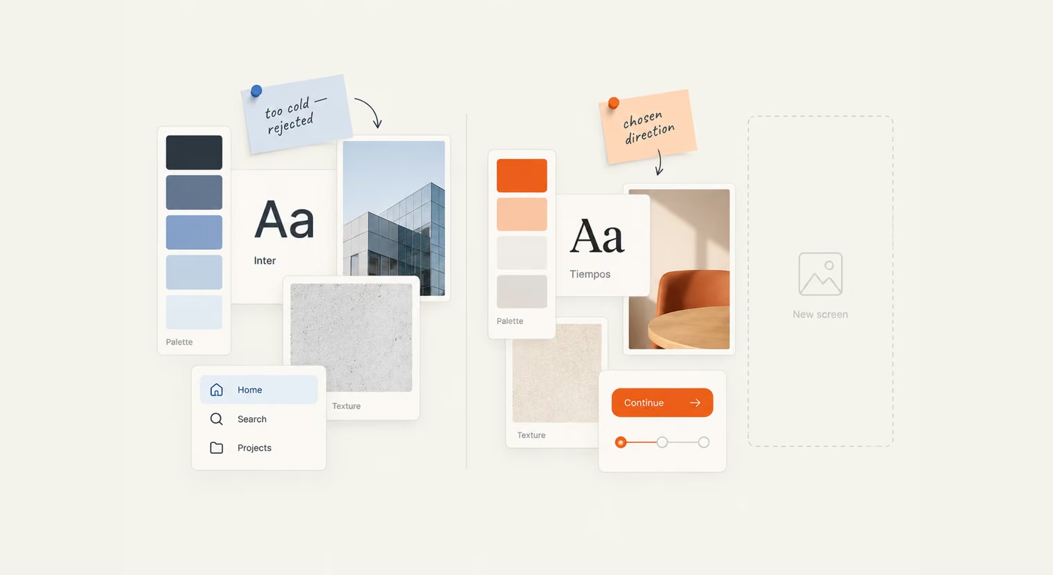
Visual direction sets the tone before anyone builds a screen. It’s a curated set of references (color, typography, imagery, texture, interface details from other products) assembled to answer a question that’s hard to settle in words: what should this feel like?
Mood boards in design make it easy to test a direction before much time goes into detailed UI work. A client who says “too cold, too corporate” while looking at references has just saved the team a round of UI work that would have missed the mark.
These are the rules the interface follows: how navigation works, what the information architecture focuses on, what users see on first run, and what happens when something goes wrong. Three or four principles are usually enough: one primary action per screen, progressive disclosure, and no dead ends.
Principles help because they guide decisions the team hasn’t made yet. When a new feature comes along in month eight, the team can check it against these rules instead of restarting the design discussion.
Finally, the concept needs proof: two to five screens, often wireframes or rough sketches, showing the idea at work on the flows that matter most. These screens exist to be argued about, so keeping them unfinished helps. Polished work makes people focus on color and copy. Meanwhile, rough work keeps people talking about structure, which is what you need at this stage.
Packaged together, those four pieces are what actually get handed over when a concept phase ends: a one-page statement, a mood board with the rejected directions kept beside it, three to five key screens, and a short principles sheet the team can check new features against.
A design concept is most useful when the direction still feels open, but the decisions ahead are about to get expensive. That usually happens in a few situations:
You may need one even outside these scenarios. If different people on the same team describe the product in different ways, or major design decisions keep reopening, the direction probably still needs to be defined more clearly.
{{banner}}
Good UX design has a direct impact on how people perceive, understand, and use a product. A design concept brings these benefits into focus early, helping you establish a clear direction, align the team, and avoid costly changes later.
The first few moments with an interface carry more weight than they seem to. Before users explore features or workflows, they are already reading the visual tone, hierarchy, and level of polish.
That early judgment is well documented in web contexts. Stanford’s Web Credibility Project, which involved more than 2,600 people across 100 websites, found that visual design appeared in 46.1% of comments about website credibility. At the concept stage, this gives teams a chance to decide what users should notice and feel before detailed UI starts filling in the rest.
A concept also decides what the product puts first. Once the team agrees on the main job the product does, each screen can make that job obvious: what the user is looking at, what matters most here, and where to go next. Without that agreement, screens tend to give every element equal weight, and users have to work out the priorities themselves. Clear priorities, a logical information structure, and predictable interactions let people understand the product before they have to think about how it works.
Consistency is a concept problem before it’s a design-system problem. A design system can make buttons look the same, but it can’t decide the product’s voice, how much it should explain, or when it should step back. Those answers come from the concept. Once they’re settled, a UX design system can carry them consistently across every screen.
Say you’re designing a meditation app for people who find meditation intimidating. The concept might be: “a meditation app for anxious beginners where nothing feels like pressure.” Soft colors, plenty of white space, one suggestion at a time, and no penalties for a missing streak all follow from that idea.
Six months later, new designers add reminders to train and error messages. They weren’t there for the concept phase, but they don’t have to guess. A friendly reminder feels like an invitation for a user, and a missed week gets a quiet “welcome back,” not a red streak warning.
In our experience, without a design concept, teams produce technically fine screens that don’t feel related: different button logic, competing tones of voice, multiple interpretations of one brand.
Written requirements read differently to everyone who touches them. A product manager, a developer, a QA lead, and a CEO can agree on the same paragraph and still picture four different products.
Having a concept replaces that ambiguity with something specific enough to react to. At this stage, differences are easier to resolve and can surface assumptions that would otherwise make their way into detailed design or development.
Changing a concept might mean rewriting a sentence or adjusting a sketch. The same change after the UI is fully designed means reworking components, states, edge cases, and copy. Once development has started, it also takes engineering time, QA, and work that may already be scheduled.
Rework is what an unresolved argument costs after it reaches the code.
That’s why early validation can save so much time. Testing a concept is simpler than testing a finished product: you can show people the key screens and the statement, ask them to explain what the product does, and see what they expect to happen next. If the direction is off, fixing it at this stage usually means adjusting the idea itself instead of paying for a much larger round of redesign and rework later.
{{banner-2}}
Each stage of the concept process answers a different question, from what problem is worth solving to which direction is strong enough to move forward with. Here’s how those decisions build on one another.
Start by gathering and defining the key inputs for the concept. Product research can help clarify what you already know, what still needs validation, and which constraints should shape the direction:
One of the most important decisions at this stage is who has final approval. If that stays unclear, the concept review can collect plenty of opinions without producing a clear decision.
Existing inputs show what the business already knows or assumes about the product, while UX research adds the user perspective. Choose the methods that fit the questions still open (interviews, surveys, session recordings, support-ticket analysis, or workshops) and use them to identify the friction points, behaviors, and motivations the concept needs to account for.
For a focused discovery phase, allow around two to three weeks, though the timing can vary depending on the methods, participant recruitment, and amount of research already available.
Turn the research into a clear set of priorities by looking for recurring patterns, mapping the current user journey, and defining the main problems the concept needs to solve. “How might we” questions can help frame those problems without jumping straight to solutions. A customer journey map is a useful format for that mapping.
From there, rank the issues and decide which one should lead the direction — if everything feels equally important, the concept will struggle to stay focused. The outcome should be a short, prioritized problem list with one clear issue guiding the concept forward.
Once the main problem is clear, explore several ways the concept could take shape visually. Sketching, mood boards, and two or three distinct directions make it easier to compare interpretations before committing to one. For Ahlya, a cycle-syncing wellness app, our research informed two contrasting directions: one warm and photo-led, the other clean and icon-based. Choosing the calmer direction settled how the product should position itself as a wellbeing space, and gave the design work that followed a clear visual reference.
Exploring more than one direction also gives stakeholders something concrete to compare, which usually leads to more specific feedback than reviewing a single option in isolation.
A concept needs context to be evaluated properly. Walk stakeholders through the problem, the proposed direction, and how it plays out in the key user flows so they can judge the reasoning behind the screens, not just the screens themselves. Without that context, feedback can quickly drift toward personal preference.
Keep the discussion tied to the goals from step one. Asking “Does this serve the user we defined?” is more useful than “Do we like the blue?”
After the direction is approved, document the statement, principles, chosen visual direction, and the options that were considered and rejected. Recording those decisions matters because it gives the team a clear reference later and reduces the chance of reopening questions that have already been settled. From there, the concept moves into detailed UI design, component libraries, prototypes, and developer handoff, with the agreed direction guiding the work that follows. Early UX prototypes are the fastest way to check that the concept still holds once people start clicking through it.
The clearest design concepts are the ones you can infer from the way a product behaves. Individual features may differ, but they still seem to point back to the same underlying idea. Here are a few products where that connection is especially easy to see:
The useful exercise is to look past individual features and ask what idea connects them. If the navigation, visual language, interactions, and key flows all point in the same direction, the concept is doing its job. If each part seems to solve a different problem, the product may have plenty of features but no clear idea holding them together.
A concept can look ready long before it actually is. The safest way to tell is to judge it against a few clear criteria and pay attention to the signs that the direction still has unresolved gaps.
Before signing off on a concept, ask four practical questions:
If the answers are clear and convincing, the concept is in a stronger position to move forward. Any uncertainty points to the area that still needs work.
A concept that still has gaps often gives itself away in a few ways:
A concept that works on four screens also needs to hold up on forty. The real question is whether it gives the team principles they can apply beyond the examples already designed.
Those principles might shape hierarchy, interaction patterns, visual tone, or the way new features fit into the experience. Without them, a polished set of screens can look convincing but offer little guidance once the product starts expanding.
One useful test is to take a feature that hasn’t been designed yet, such as an empty state, and ask whether the concept gives you enough direction to approach it consistently. If the answer is unclear, you may have a visual direction rather than a concept that can support the product as it grows.
A design concept will not decide whether a product succeeds on its own, but it shapes many of the decisions that follow. Once the idea behind the product is clear, new screens, features, and interactions have something to relate back to instead of being solved in isolation.
So when you look at your own concept, ask, “Can it carry more than the first presentation?” If it still makes sense when the product grows, the team changes, or a new problem appears, you have a direction that can keep the experience coherent over time.
{{banner-3}}
A typical concept team may include a product designer, UX researcher, product manager, developer who can flag feasibility issues early, and someone responsible for the brand. On the client side, the person with final approval should be involved from the start.
The main factors are product complexity, the amount of research required, and the number of key screens, review rounds, and design directions explored. If you already have solid user research and product data, the discovery phase may be shorter. Hardware and regulated products can require additional feasibility checks, specialist input, or constraints to account for, which may increase the scope.
A focused concept sprint for an MVP or a single product area may take around one to two weeks, while a broader concept phase for a complex platform can take several weeks. The timeline depends on how much research already exists, how many directions need to be explored, and how many stakeholders are involved in review.
Yes. A brief describes the problem, constraints, and success criteria, but stops short of proposing a solution. Going straight from the brief to the detailed design means the direction is decided gradually, screen by screen, instead of being agreed upon first.
Yes. Usability testing, prototyping, or technical discoveries may reveal something the concept phase could not account for. The important part is to treat those changes as deliberate revisions rather than letting the direction drift gradually over time.


.avif)