Stay

Building a trust-first brand and product for an expat insurance brokerage

2026

About the project

Every year, thousands of internationals relocate to Germany and face a high-stakes decision: how to insure their health, income, and future in a system built for insiders. Munich-based insurance brokerage Stay exists to make sure that decision is never made blind.

Through an extensive network of Germany’s leading providers, Stay offers tailored, unbiased solutions for public and private health insurance, pension planning, liability coverage, vehicle and home insurance, disability and life insurance, as well as relocation support.


Services
Branding
Website Design
UX/UI Web Product
  • International clients served 4,000+
  • Verified reviews on ProvenExpert and Google 109+
  • Insurance providers in network 200+
Want to discuss your product vision with our team?
Book a call
__wf_reserved_inherit

Challenge

In the expat insurance market, trust is the deciding factor. Yet the company’s old name, MW Expat, no longer reflected the credibility it had built, and a dated site couldn’t keep pace with digital-first brokers. Halo Lab set out to give Stay an identity as credible and progressive as the advice behind it and carry it through a site and portals without losing the personal touch.

Our process

Our deeper task was to equip outsiders with the confidence to navigate an unfamiliar system, so our design decisions across brand, website, and portals aimed to replace dependence with clarity and empowerment.

Rebranding

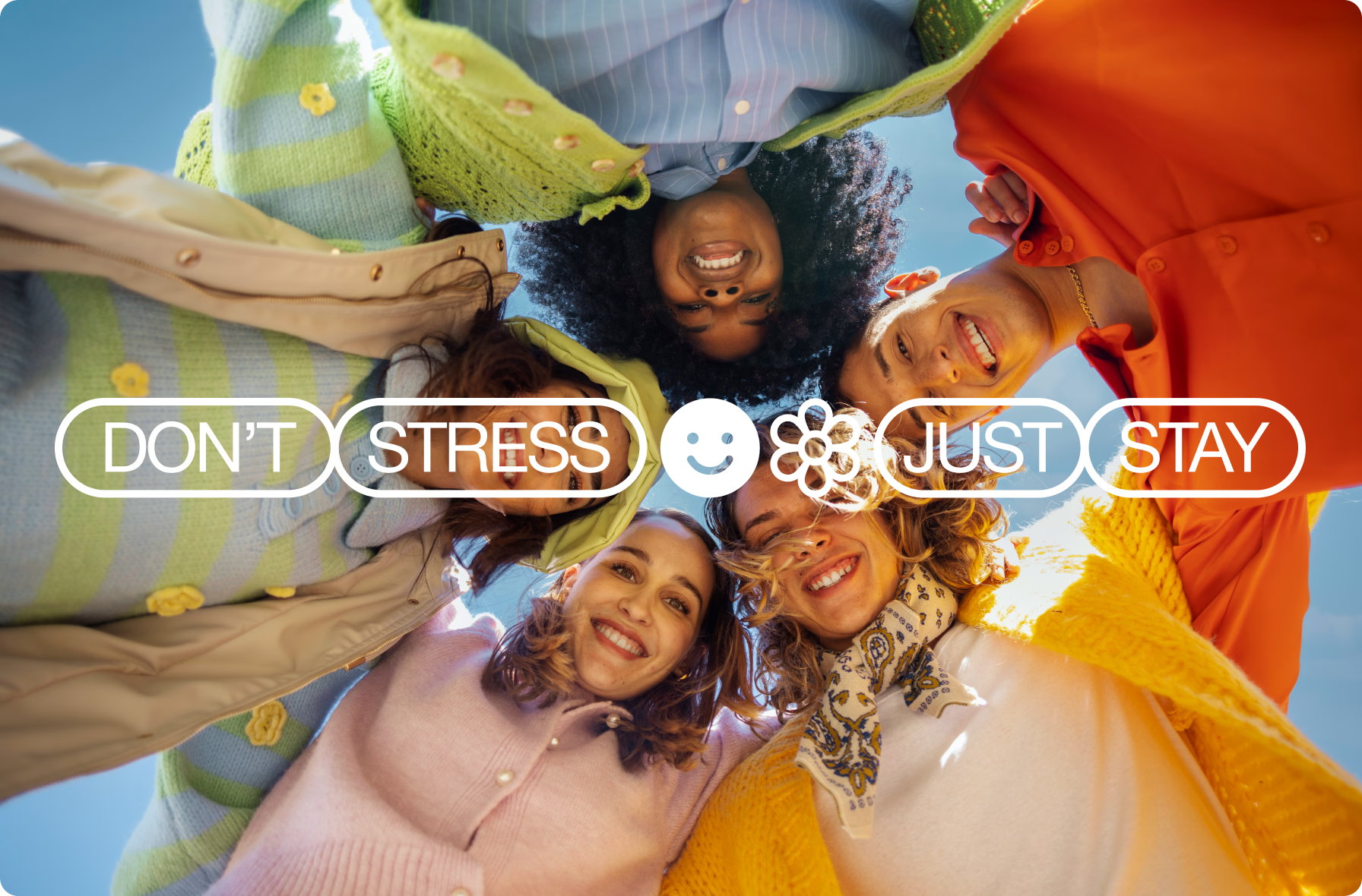
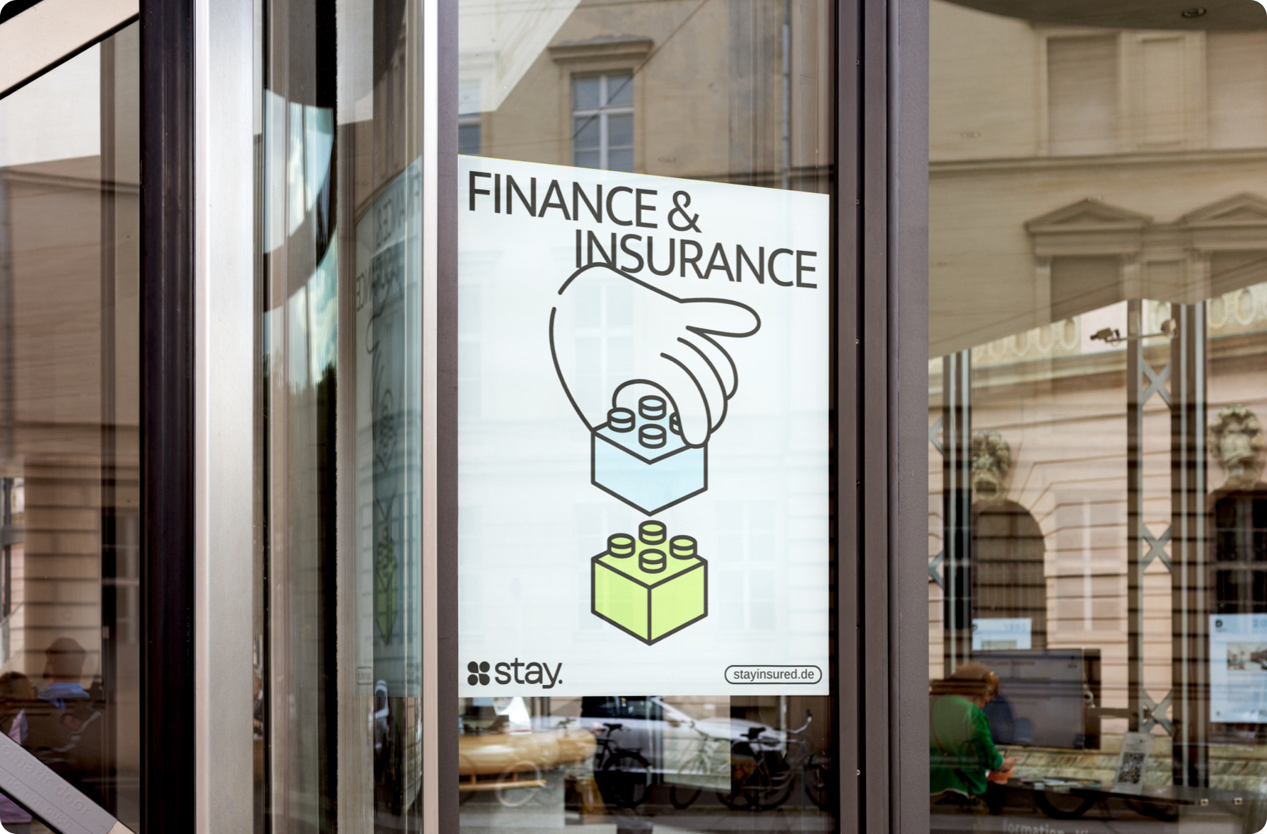
In an insurance industry full of corporate brands, what actually sets one apart is how it makes people feel understood. To give Stay that distinction, we put reassurance at the center, shaping an identity that felt open and people-first.

{{dropdowns-1}}

Web design

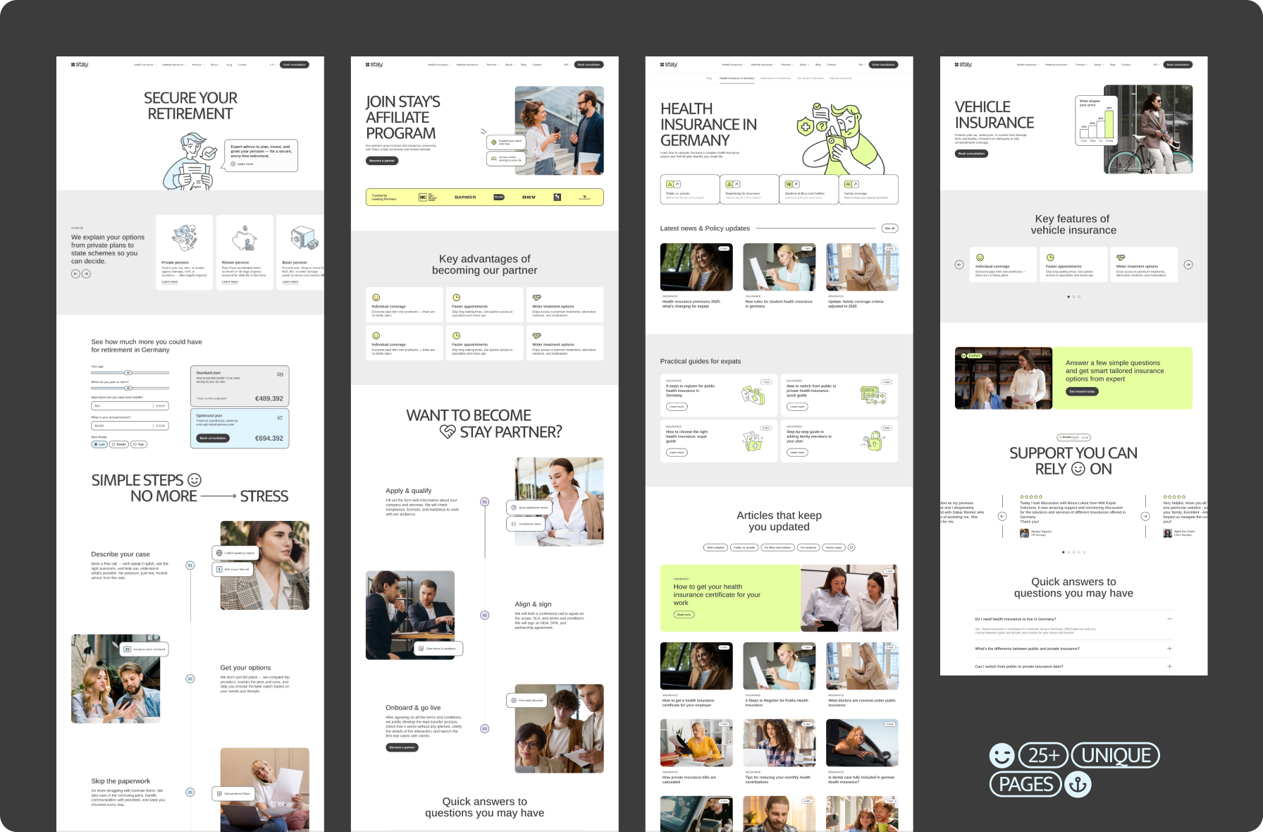
To extend the brand into the digital space, we designed a website that clearly communicated Stay’s unique value proposition while simplifying a complex insurance journey for users.

{{dropdowns-2}}

Product design

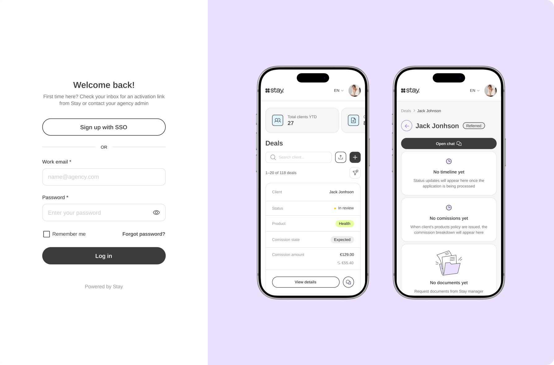
While the marketing team shaped the website, our product specialists focused on the client and partner portals, making sure Stay’s promise held up under real use.

{{dropdowns-3}}

Results

  • New brand identity established a people-first visual language that Stay’s clients can recognize and trust
  • Clear brand positioning helped the client build a stronger presence in the competitive expat insurance space
  • Well-structured website allowed users to find the right coverage faster and showed Stay’s expertise upfront
  • Comprehensive UI kit and marketing assets enabled consistent brand use across every channel, from the website to email and social media
  • Client and partner portals with a clarity-first UX gave both of Stay’s audiences full visibility into processes and statuses
  • Dev-ready handoff let Stay’s team move into development smoothly and grow the product cohesively

{{review}}

Our approach

Strong results start with open dialogue. At every stage, we work closely with the client’s team, running workshops, gathering feedback, and refining ideas through multiple iterations. If your product needs the same level of care, contact us — and we’ll help turn complexity into an experience people can understand, trust, and use with confidence.

{{approach}}

{{slider-1}}

5.0
star iconstar iconstar iconstar iconstar icon

“Halo Lab had a smooth and well-structured project management process. With meticulous attention to detail, they met deadlines and communicated efficiently. What stood out most was how deeply they dove into the user flows.”

__wf_reserved_inherit
Oleksii Didenko Digital Transformation Lead at Stay

Ready to discuss your project with us?

Let’s discuss how we can craft a distinctive brand identity that captivates, connects, and converts.
BOOK A CALL

01  ·  Research & creative direction

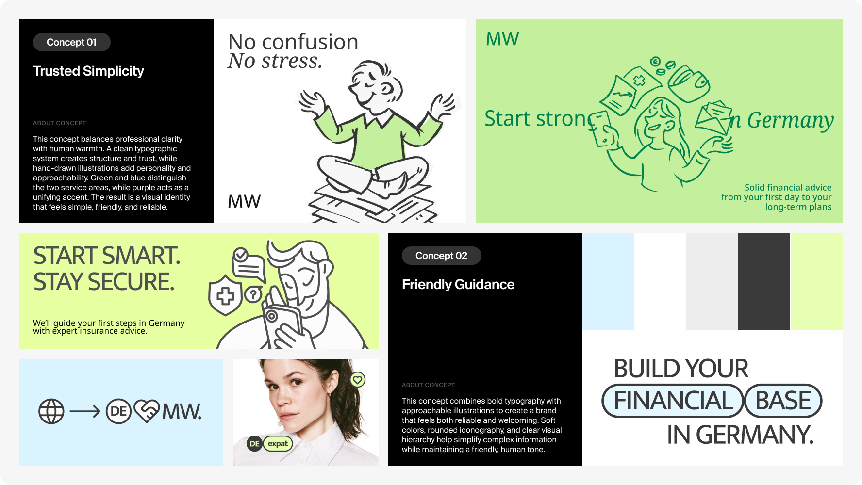
We mapped the expat insurance landscape, studying how competitors positioned themselves and where gaps remained for a brand that spoke to people, not just policies. This step provided Stay with a research-backed direction, visualized in a moodboard of design options.

Stay branding moodboard exploring trust-focused visual directions for expat insurance

Deliverables

  • 3 competitors analyzed
  • Conceptual moodboard

02  ·  Logo design

With core brand values in mind, we designed a logo that united them all in a single mark: interconnected shapes represented community, a wide, confident typeface conveyed trust, and speech-bubble elements highlighted open dialogue and human interaction.

Deliverables

  • 4 logo concepts
  • Logomark & wordmark

03  ·  Brand identity

To bring a sense of calm the insurance market rarely offers, we used a soft palette of white and gray as the base. At the heart of the identity lay gentle illustrations of real expat moments, bringing the support people often lack when starting over abroad.

Deliverables

  • 2 brand identity concepts
  • Color & typography systems
  • Brand kit

04  ·  Marketing materials

Our team produced a full suite of marketing materials, covering email newsletter templates, application status notification letters, a motion showreel, and social media posts, giving Stay ready-to-use assets that can scale across every future campaign.

Deliverables

  • Email newsletter templates
  • Motion showreel
  • Social media posts

01  ·  Site structure

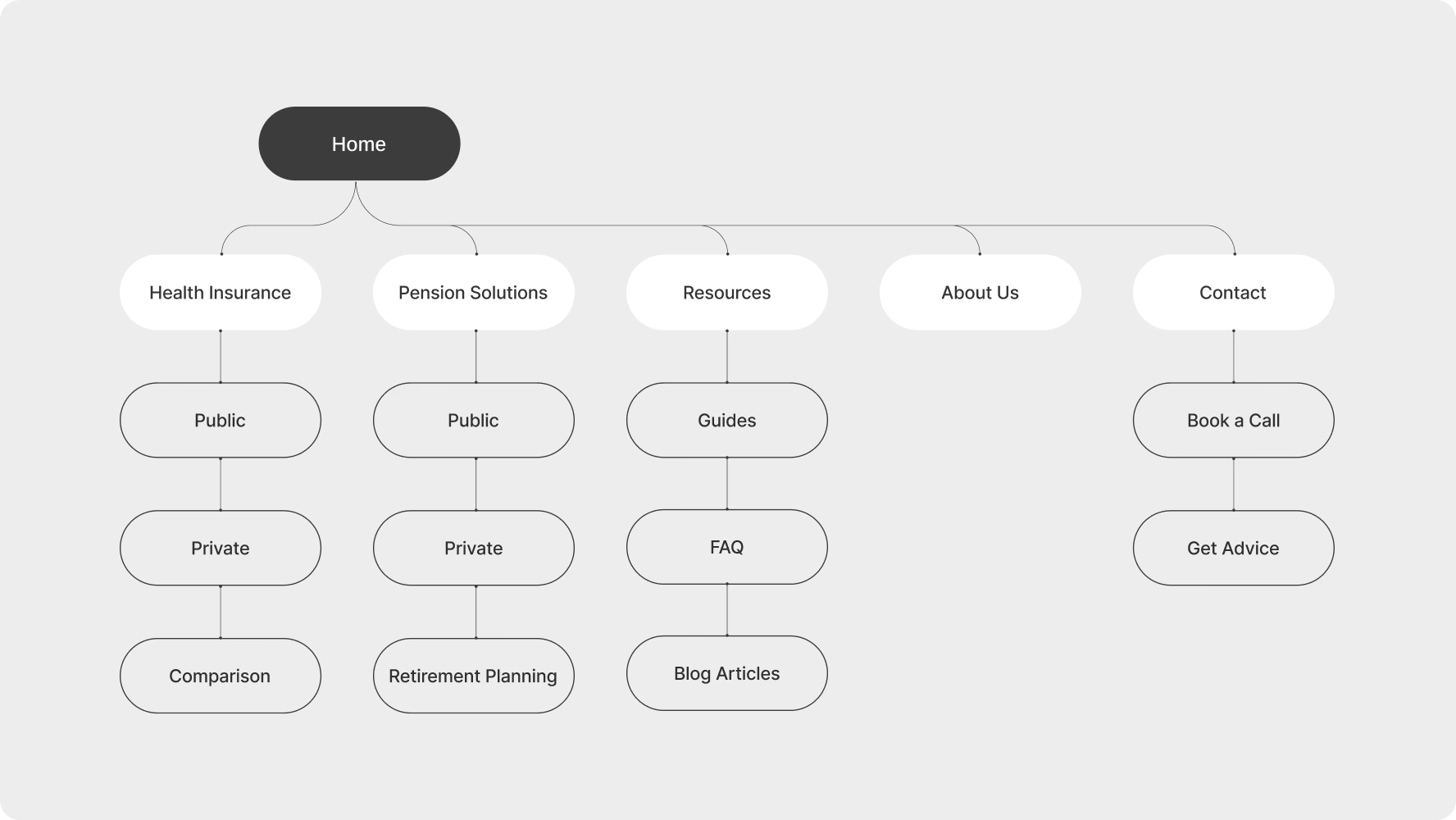
We started the web design process with a sitemap, outlining how users would navigate Stay’s core product areas and establishing a clear information architecture. This made it easier for visitors to find the right coverage without feeling lost.

Stay website sitemap for health insurance, pension solutions, resources, and contact pages

Deliverables

  • Full sitemap
  • Wireframes & user flows

02  ·  UI design

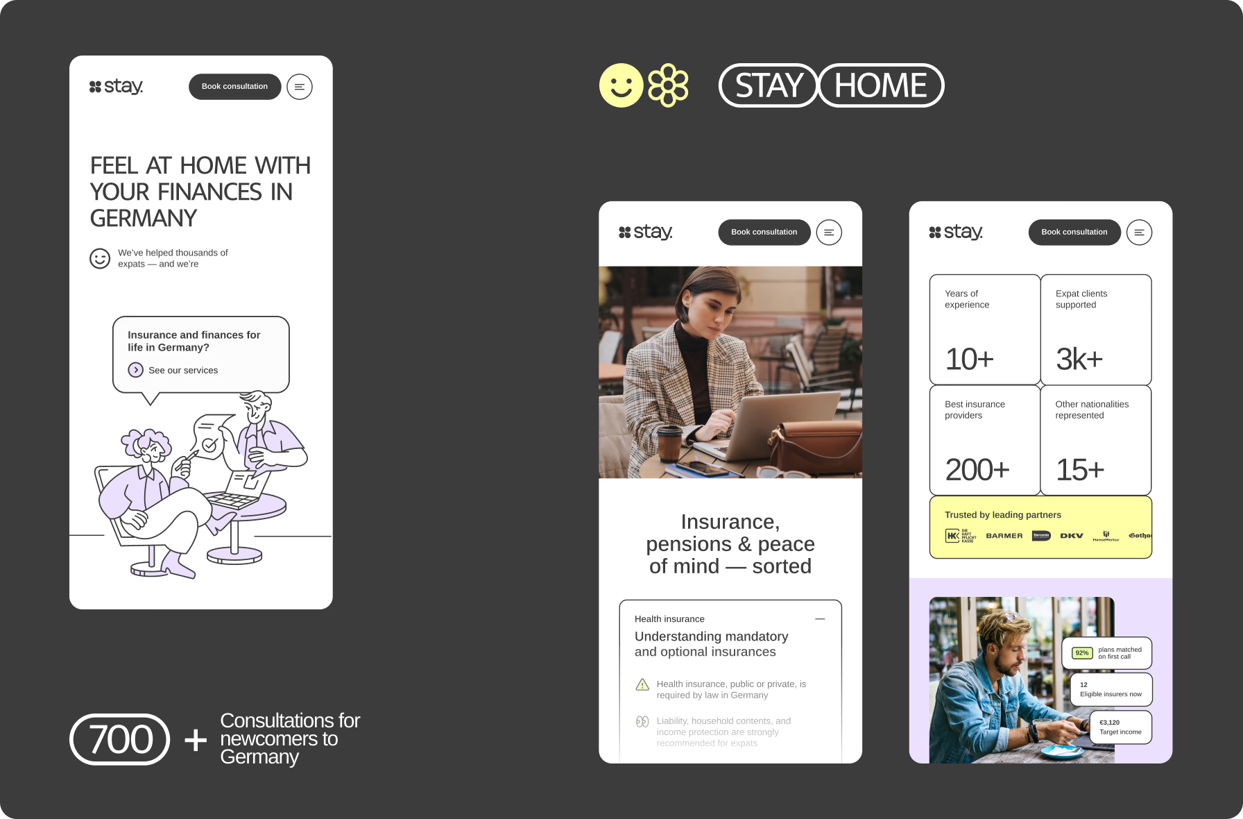
We opened the homepage with a speech-bubble hero, framing Stay as the direct answer to the question every visitor arrives with. Color carried the wayfinding for faster orientation, with green, yellow, and blue marking distinct service areas at a glance.

Deliverables

  • High-fidelity UI
  • Mobile & desktop layouts

03  ·  Calculators & tables

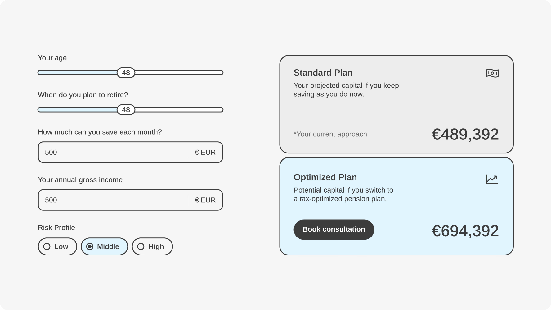
To simplify user decisions, we built dynamic calculators for pension and insurance. Comparison tables further guided decision-making, showing differences between public and private insurance, as well as standard and optimized plan outcomes.

Stay pension calculator comparing standard and tax-optimized retirement plans

Deliverables

  • Interactive calculators
  • Comparison tables

01  ·  Product & competitor research

We audited competitor platforms and found a recurring shortfall: portals treated as static repositories rather than tools for understanding. This gap guided Stay’s direction as a portal turning complex processes into guided steps, with expert support one click away.

__wf_reserved_inherit

Deliverables

  • 3 competitors analyzed
  • 2 product design concepts

02  ·  User flow mapping

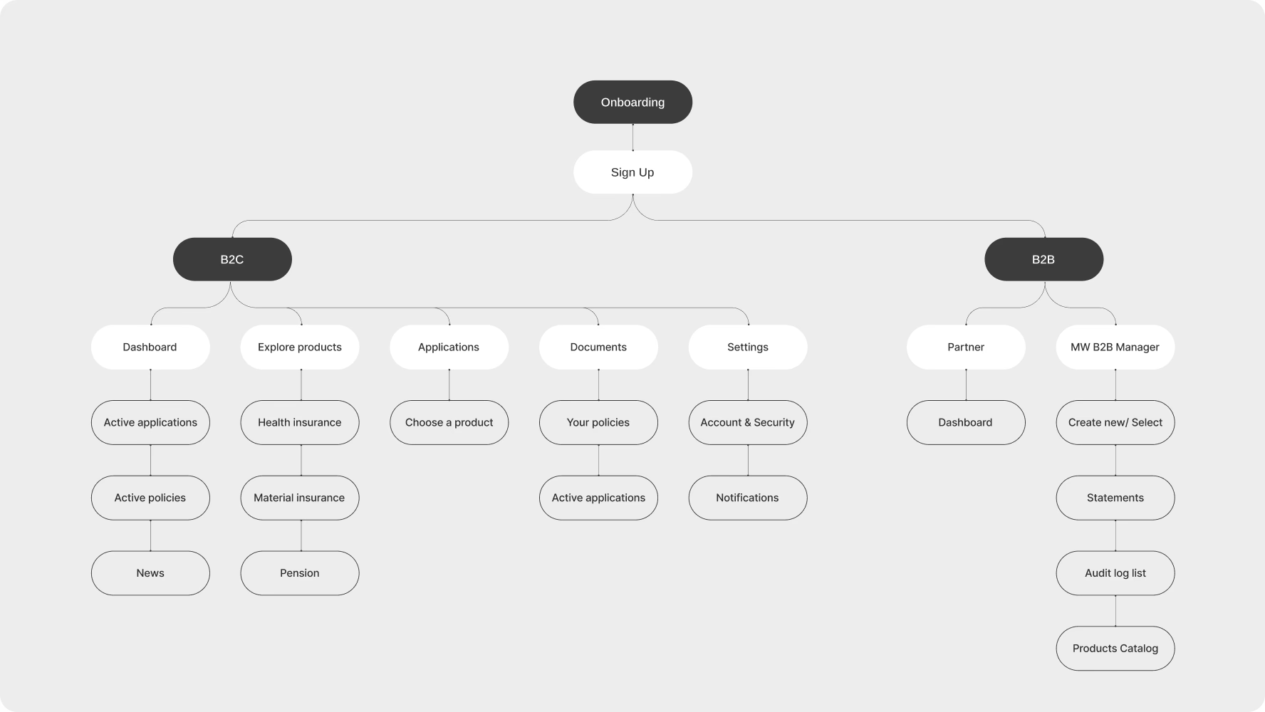
Before designing, we mapped every path a user could take across both portals: from sign-up to applications on the client side, and from dashboard to referral form on the B2B side. That groundwork let both audiences move through the process intuitively and without friction.

Stay client portal sitemap mapping B2C and B2B onboarding, applications, and documents

Deliverables

  • Portals flow structure
  • Low-fidelity wireframes

03  ·  Client portal

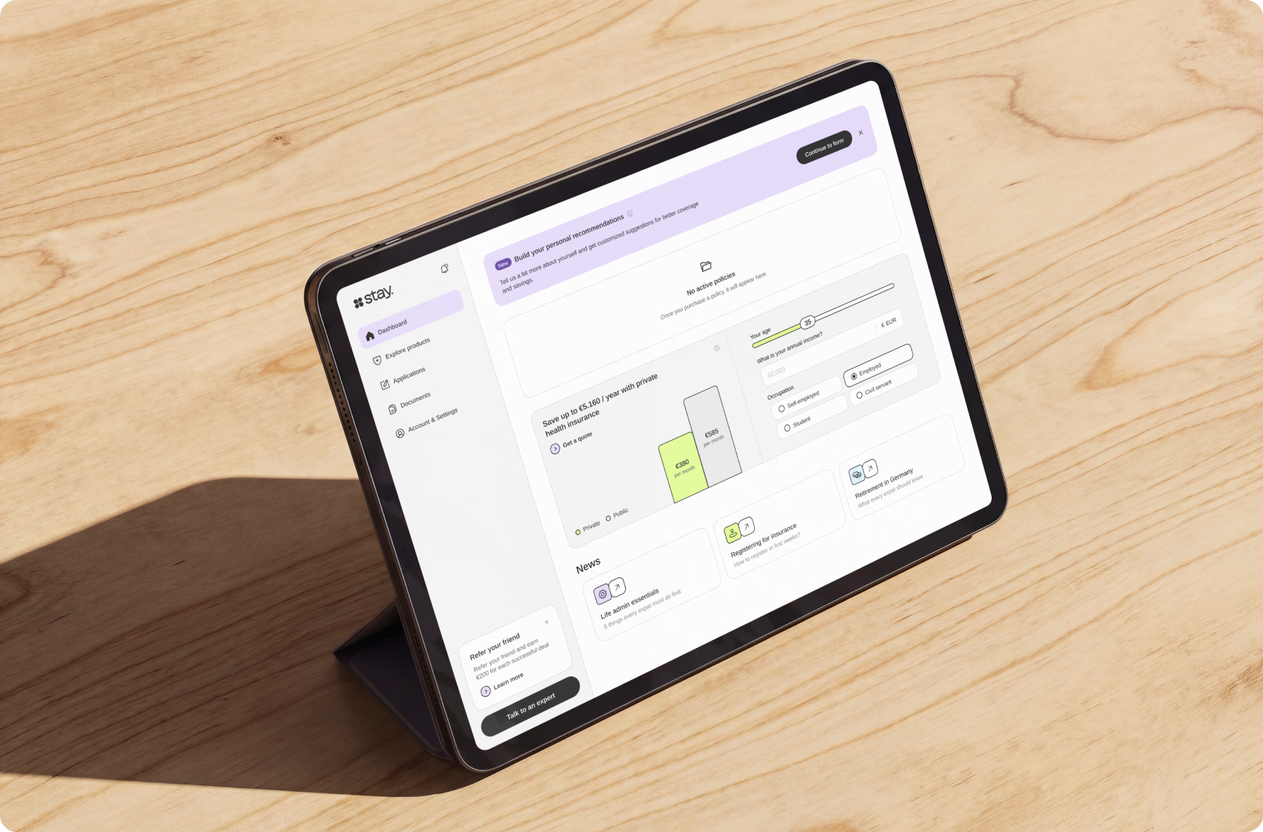
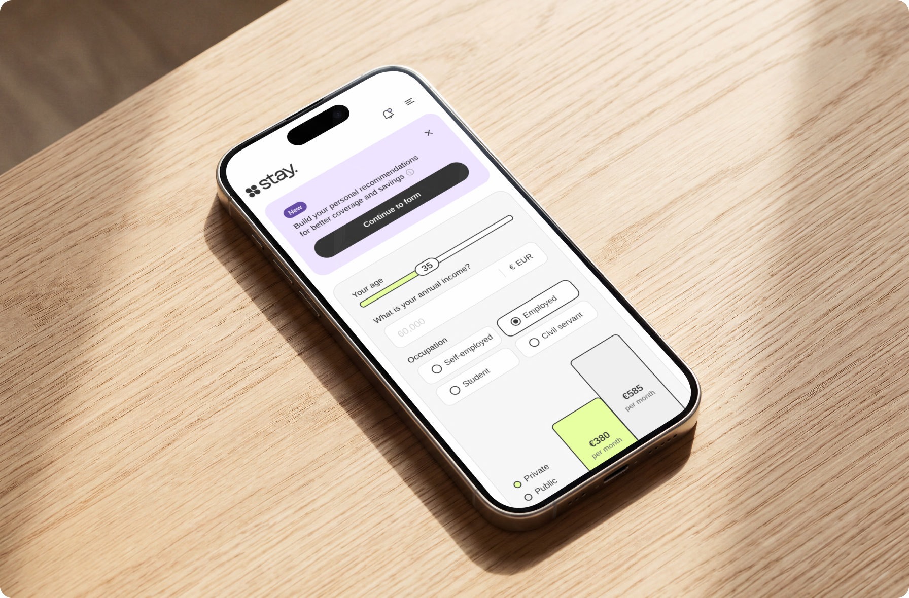
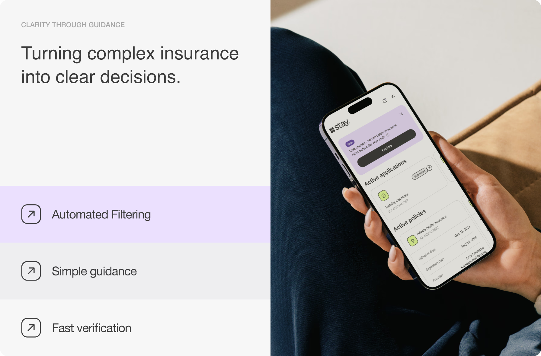
We carried the brand’s visual system into the portal through human-centered imagery and conceptual graphics. A dashboard gave clients a live application tracker and a chart comparing public and private insurance, making the process transparent and the choice tangible.

Deliverables

  • Component-based UI design
  • Interactive dashboard
  • Application tracker

04  ·  B2B portal

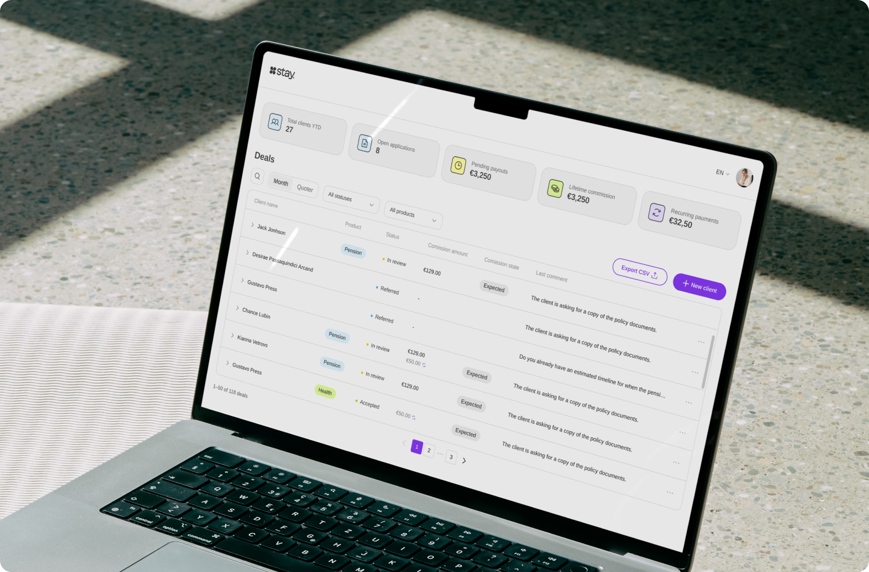
Built from a dedicated requirements brief, Stay’s partner portal for HR and relocation teams replaced email chains with real-time status tracking — so they always knew where a referral stood, without chasing updates and waiting on replies.

Deliverables

  • Partner dashboard design
  • Referral tracking system

05  ·  Design system & handoff

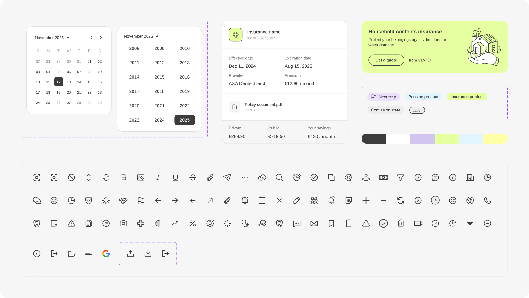
We structured all visual elements into a single design system covering components, states, spacing, and interaction rules, complemented by fully annotated specs. This provided Stay’s team with a solid foundation to scale and extend the product with confidence.

Stay UI design system with date pickers, insurance cards, status labels, colors, and interface icons

Deliverables

  • Design system
  • Dev-ready handoff

Team

  • 1 Project Manager
  • 1 Brand Designer
  • 2 UI/UX Designers
  • 1 Graphic Illustrator
  • 1 Motion Designer

Technologies

__wf_reserved_inherit
Figma