


Visual precision and brand clarity for next-gen banking users


A trusted digital banking platform redefining how people manage and understand their personal finances
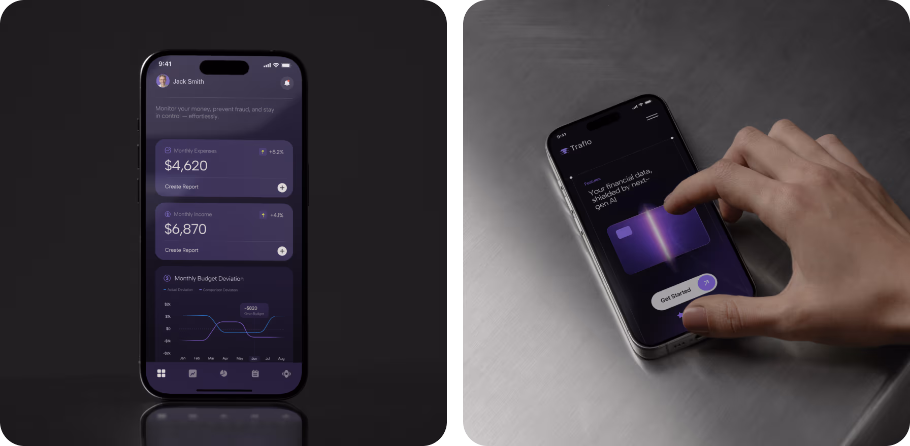
Traflo is a modern mobile banking solution built to make financial management intuitive and stress-free. It empowers users to monitor expenses, set goals, and handle savings with confidence through a human-focused experience.
Traditional banking often feels complicated and impersonal. Traflo addresses this by simplifying money management, removing unnecessary barriers, and giving users clear tools to make everyday financial decisions with ease.
A trusted digital banking platform redefining how people manage and understand their personal finances
Traflo is a modern mobile banking solution built to make financial management intuitive and stress-free. It empowers users to monitor expenses, set goals, and handle savings with confidence through a human-focused experience.
Traditional banking often feels complicated and impersonal. Traflo addresses this by simplifying money management, removing unnecessary barriers, and giving users clear tools to make everyday financial decisions with ease.

A symbol of balance for effortless banking
Our designers built the symbol around the idea of continuous flow — the essence of digital finance. The emblem resembles a stylized “T,” layered like data streams. It visualizes transaction movement, hinting at control.
Every curve was created through iterative testing in multiple digital settings. Precise grid alignment, contrast optimization, and edge calibration make the logo work equally well in app icons, dashboards, and printed materials.

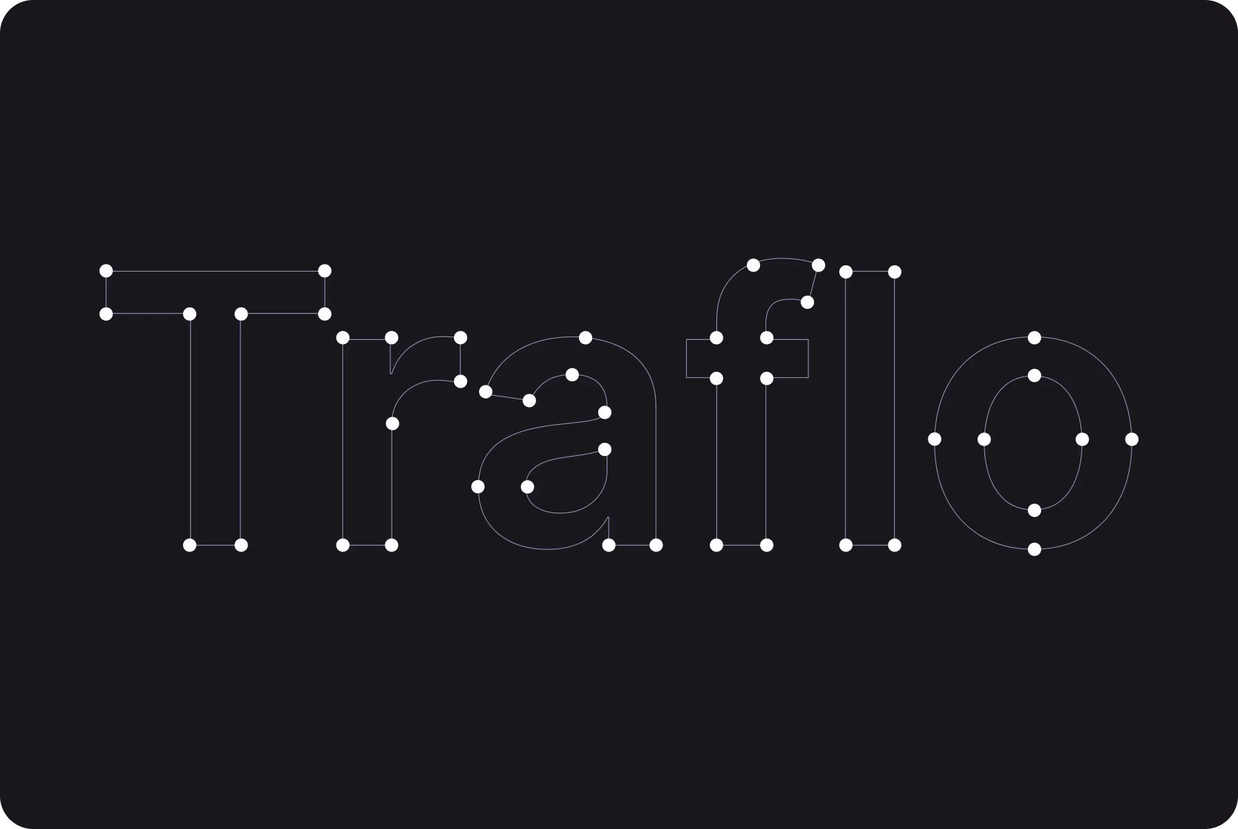
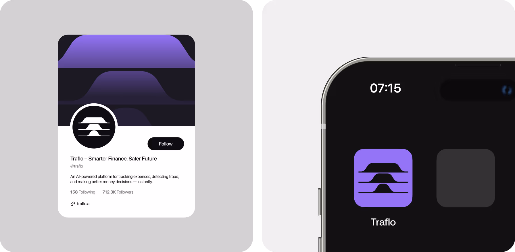
For a finance brand, clarity is everything, so we crafted the symbol with sharp logic and calm motion.
{{mais-t}}

Design rules that simplify complex decisions
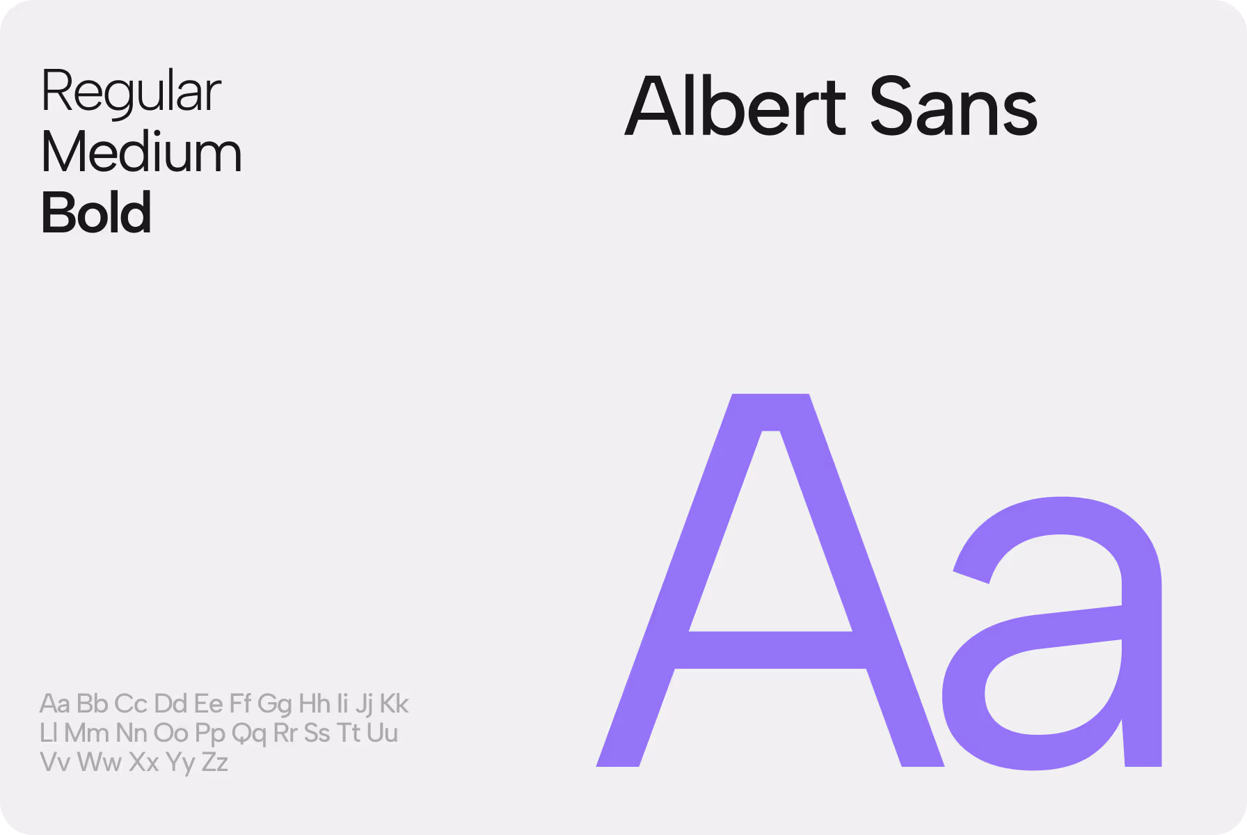
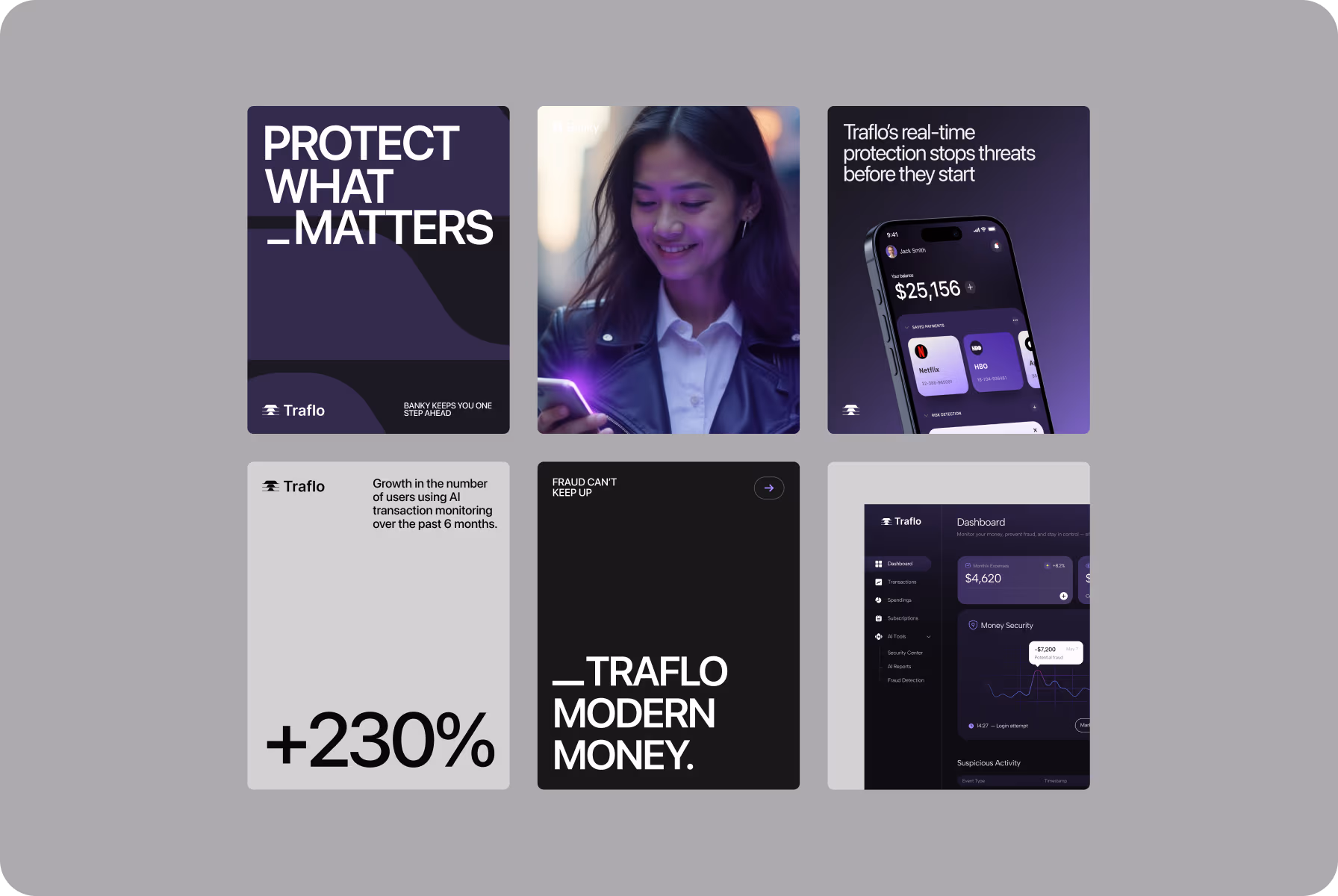
To help users feel confident in their decisions, we built a system rooted in clarity and rhythm. Deep violet tones and consistent layout spacing establish a calm, stable foundation for seamless financial interactions.
We refined the use of Albert Sans, customized iconography, and interface logic to ensure visual consistency across all touchpoints. This approach transforms complex data into a smoother, more intuitive experience.


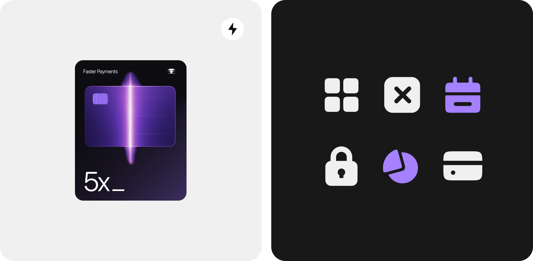

Every part of the system was shaped for clarity and focus, helping users move through financial tasks with ease and trust.
{{mais-t}}

Digital confidence created with visual rhythm
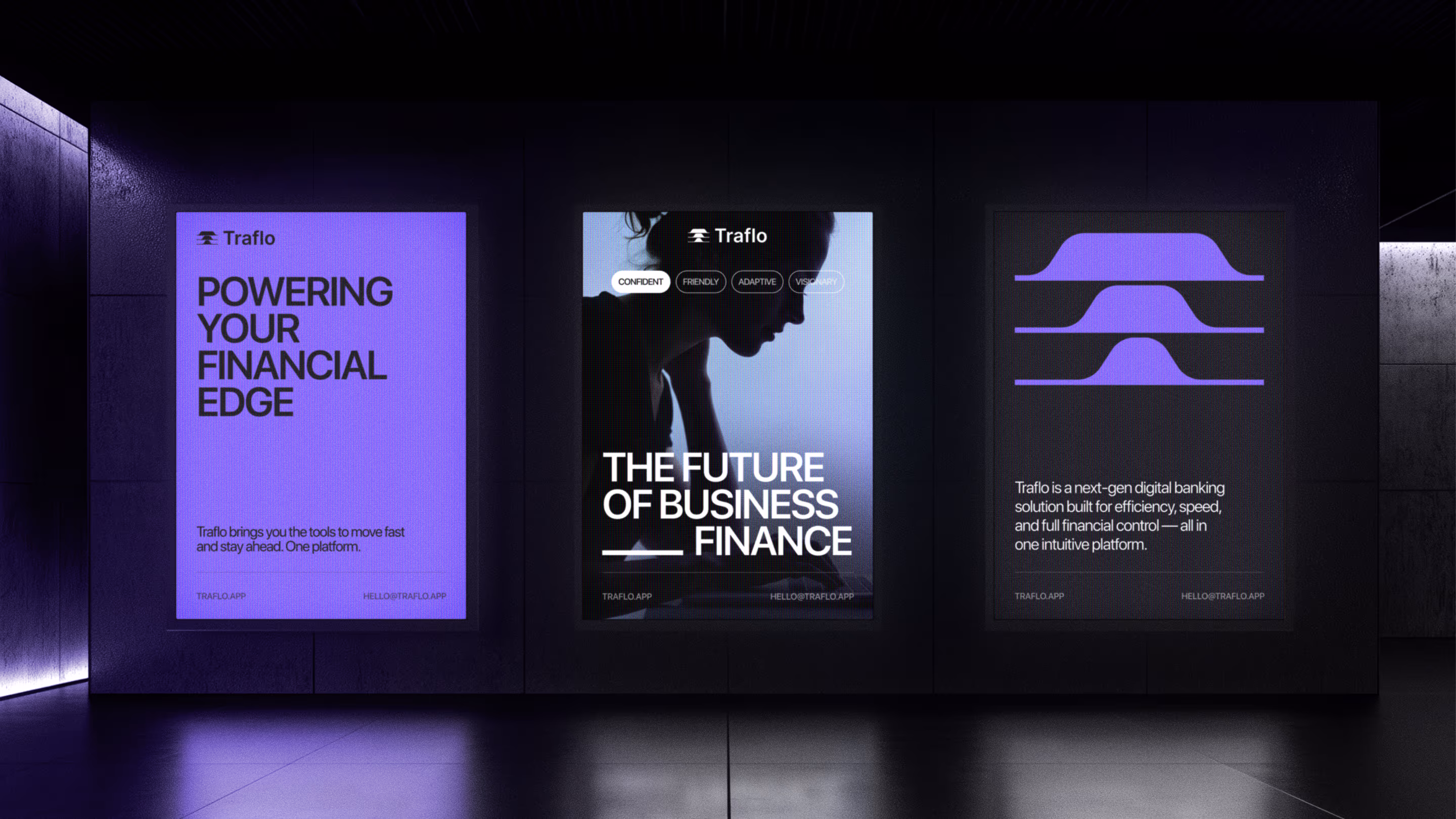
Developing a sophisticated yet grounded visual language was our goal. Our strategy involved using subtle contrast, precise messaging, and familiar, real-world imagery to authentically reflect the brand's underlying values.
This same logic governs every component, including digital content and marketing campaigns. This cohesive styling and consistent voice strengthen the brand's impression on users, establishing it as a representation of modern thought.

We explored several directions, but the mix of bold type and calm imagery captured the balance Traflo needed.
{{mais-t}}


Based on 80+ reviews

with 100% Job Success

AgencY IN UAE

WORLDWIDE
