








A React Native animation runs frame by frame, and each frame has about 16 milliseconds to draw. That work shares the JavaScript thread with every render, state update, and event handler — so when the app gets busy, the animation misses its frame and stutters. How does motion stay smooth when what drives it keeps getting blocked?

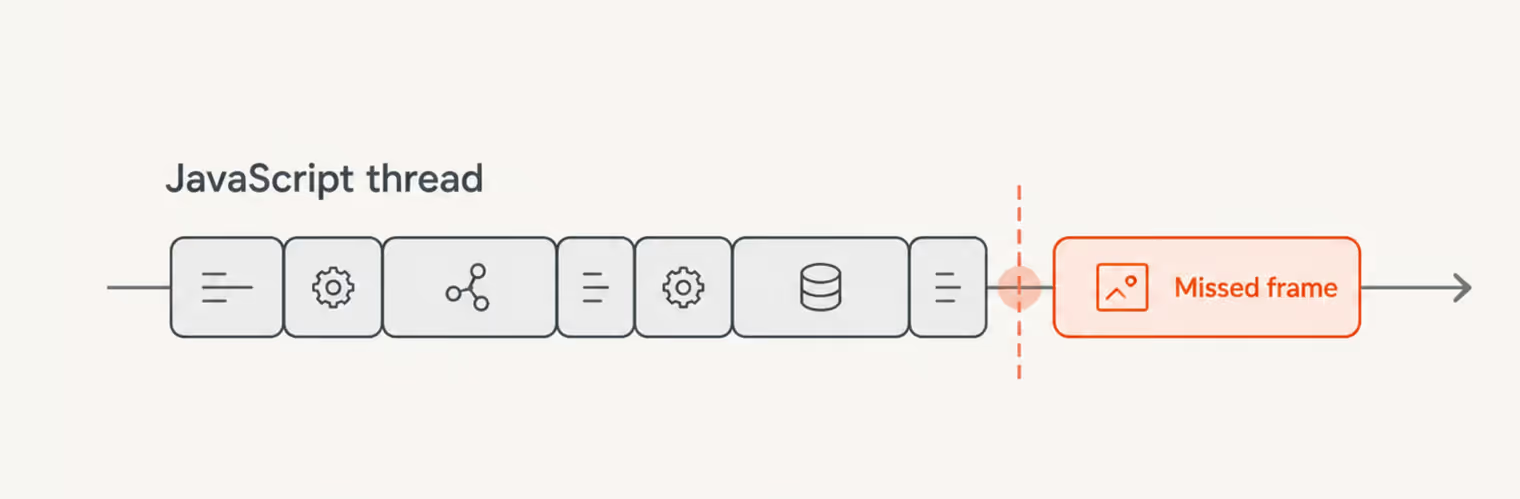
You move it off the crowded thread. React Native Reanimated runs animation logic on the UI thread instead, so it can keep updating even while JavaScript is busy elsewhere — the difference between a carousel that glides mid-load and one that jerks. Getting that result takes understanding a handful of core pieces and seeing them function together. This guide covers how Reanimated works and builds three real UI patterns with it: a floating action button, an interactive slider, and an animated todo list.
{{banner}}
Reanimated’s power comes with a real API surface and setup, so it isn’t the automatic choice for every animation. The built-in Animated API stays simpler for lightweight motion, which makes the decision worth drawing clearly:
The gesture-driven case is where the difference is easiest to feel, and a common one shows it plainly. Think about a shopping app with a draggable product carousel. If the animation runs on the JavaScript thread, swiping while the app loads product data turns choppy — the swipe and the data fetch are competing for the same thread. Move that swipe onto the UI thread with Reanimated, and it glides through the load because it no longer waits for the fetch to finish. Performance under load is also one of the key differences we look at in our Flutter vs React Native comparison.
If an animation has to stay responsive while the JavaScript thread is busy, that’s when Reanimated really earns its place.
Getting Reanimated running takes two things: the packages themselves and a Babel plugin that rewrites your animation code to run on the UI thread. The setup differs a little between Expo and bare React Native, so both are covered here.
Reanimated v4 needs both the main library and the worklets runtime. On Expo:
npx expo install react-native-reanimated react-native-workletsThis assumes Expo SDK 54 or later with the New Architecture enabled. For bare React Native projects, make sure your React Native, Reanimated, and Worklets versions are compatible.
For React Native CLI projects, install with yarn and set up the iOS pods:
yarn add react-native-reanimated react-native-worklets
cd ios && pod install && cd ..Reanimated relies on a Babel plugin to transform your animation code into worklets, and how you add it depends on your setup.
On Expo, there’s nothing to do — babel-preset-expo configures the plugin automatically. On bare React Native, add it to babel.config.js yourself:
module.exports = {
  presets: ['module:metro-react-native-babel-preset'],
  plugins: [
    'react-native-worklets/plugin', // Must be listed last
  ],
}
The plugin is what converts your animation functions into worklets, so the ordering matters — it has to be listed last.
Under the hood, Reanimated is built from a small set of pieces that fit together: values that hold animation state, a hook that turns those values into styles, components that accept the styles, and functions that drive the values over time. Worklets sit underneath all of it, so that’s the place to start.
A JavaScript function that executes on the UI thread rather than the JavaScript thread — that’s a worklet, and it’s the mechanism behind smooth Reanimated animation. The useful thing in practice is that you rarely write one by hand. The Babel plugin promotes the right functions into worklets for you, specifically the callbacks passed to useAnimatedStyle, gesture handlers, and useDerivedValue.
You can see it happen without doing anything special:
import { useAnimatedStyle } from 'react-native-reanimated'

const animatedStyle = useAnimatedStyle(() => {
  // This entire function is a worklet (runs on UI thread)
  return {
    opacity: fadeValue.value
  }
})
That callback becomes a worklet automatically, without a directive or wrapper.
On the UI thread, a shared value holds the animation state. Unlike React state, this value is mutable, and writing to it skips the re-render entirely — which is what lets an animation run frame by frame without pulling React into the loop:
import { useSharedValue } from 'react-native-reanimated'

const MyComponent = () => {
  const translateX = useSharedValue(0)

  // Update directly
  translateX.value = 100
}useAnimatedStyle is the bridge between a shared value and what’s on screen. It returns a style object that recomputes whenever the values it reads change:
import { useAnimatedStyle } from 'react-native-reanimated'

const animatedStyle = useAnimatedStyle(() => {
  return {
    transform: [{ translateX: translateX.value }]
  }
})A shared value and an animated style need a component that knows how to apply them, which is what Reanimated’s animated components are for:
import Animated from 'react-native-reanimated'

<Animated.View style={animatedStyle}>
  {/* Your content */}
</Animated.View>
The set covers the common primitives: Animated.View, Animated.Text, Animated.ScrollView, Animated.Image, and Animated.FlatList. Put together, the three pieces — a value, a style that reads it, and a component that applies it — make a complete animation:
import Animated, { useSharedValue, useAnimatedStyle } from 'react-native-reanimated'

const Example = () => {
  const opacity = useSharedValue(1)

  const animatedStyle = useAnimatedStyle(() => ({
    opacity: opacity.value
  }))

  return (
    <Animated.View style={animatedStyle}>
      <Text>Fades in/out</Text>
    </Animated.View>
  )
}On their own, shared values change instantly. The animation functions are what make a change happen over time, easing a value toward its target instead of snapping to it:
import { withTiming, withSpring } from 'react-native-reanimated'

// Timing-based animation
opacity.value = withTiming(0, { duration: 300 })

// Spring-based animation
translateY.value = withSpring(-100)
Reanimated ships several of these, and five cover the large majority of cases:
Tap the round button in the corner of Gmail or Google Drive, and it blooms into a fan of smaller actions. That’s a floating action button, and it’s the first thing we’ll build — a good opener, because the effect that looks like one smooth motion is really several animations composed together: shared values, animated styles, animation functions, interpolation, and a stagger that makes the buttons arrive in sequence.
Here’s the full component, which we’ll then take apart piece by piece:
import React from 'react'
import { View, Pressable, StyleSheet } from 'react-native'
import Animated, {
  useSharedValue,
  useAnimatedStyle,
  withSpring,
  withDelay,
  withTiming,
  interpolate
} from 'react-native-reanimated'

const FloatingActionButton = () => {
  const isExpanded = useSharedValue(0)

  const toggleMenu = () => {
    isExpanded.value = isExpanded.value === 0 ? 1 : 0
  }

  // Main button rotation
  const mainButtonStyle = useAnimatedStyle(() => ({
    transform: [
      {
        rotate: withSpring(`${interpolate(isExpanded.value, [0, 1], [0, 45])}deg`)
      }
    ]
  }))

  // Action button 1
  const actionButton1Style = useAnimatedStyle(() => ({
    transform: [
      {
        translateY: withSpring(interpolate(isExpanded.value, [0, 1], [0, -70]))
      },
      {
        scale: withDelay(50, withSpring(isExpanded.value))
      }
    ],
    opacity: withTiming(isExpanded.value)
  }))

  // Action button 2
  const actionButton2Style = useAnimatedStyle(() => ({
    transform: [
      {
        translateY: withSpring(interpolate(isExpanded.value, [0, 1], [0, -140]))
      },
      {
        scale: withDelay(100, withSpring(isExpanded.value))
      }
    ],
    opacity: withTiming(isExpanded.value)
  }))

  // Action button 3
  const actionButton3Style = useAnimatedStyle(() => ({
    transform: [
      {
        translateY: withSpring(interpolate(isExpanded.value, [0, 1], [0, -210]))
      },
      {
        scale: withDelay(150, withSpring(isExpanded.value))
      }
    ],
    opacity: withTiming(isExpanded.value)
  }))

  return (
    <View style={styles.container}>
      <Animated.View style={[styles.actionButton, actionButton3Style]} />
      <Animated.View style={[styles.actionButton, actionButton2Style]} />
      <Animated.View style={[styles.actionButton, actionButton1Style]} />

      <Pressable onPress={toggleMenu}>
        <Animated.View style={[styles.mainButton, mainButtonStyle]} />
      </Pressable>
    </View>
  )
}

const styles = StyleSheet.create({
  container: {
    flex: 1,
    justifyContent: 'flex-end',
    alignItems: 'flex-end',
    padding: 20
  },
  mainButton: {
    width: 60,
    height: 60,
    borderRadius: 30,
    backgroundColor: '#007AFF'
  },
  actionButton: {
    position: 'absolute',
    bottom: 0,
    width: 50,
    height: 50,
    borderRadius: 25,
    backgroundColor: '#34C759'
  }
})

export default FloatingActionButtonThe whole animation comes down to one number moving from 0 to 1. Everything below traces how that single value becomes rotation, movement, fade, and a timed reveal.
A single shared value tracks whether the menu is open, and a handler flips it between two positions:
const isExpanded = useSharedValue(0)

const toggleMenu = () => {
  isExpanded.value = isExpanded.value === 0 ? 1 : 0
}
We use 0 for collapsed and 1 for expanded. Unlike React state, updating a shared value doesn’t trigger a component re-render, and Reanimated can use it directly to drive the animation.
interpolate is what turns that bare toggle into real screen values, mapping a number from one range onto another:
interpolate(isExpanded.value, [0, 1], [0, 45])Here, 0 maps to 0 and 1 maps to 45, with everything in between scaled proportionally — 0.5 becomes 22.5. That’s how a single 0-to-1 toggle can drive degrees of rotation, pixels of movement, and opacity all at once, each mapped to its own output range.
Three of the animation functions from earlier each do a specific job in this component. withSpring drives the main button’s rotation and the action buttons’ upward movement, giving both a natural settle rather than a mechanical stop:
withSpring(targetValue)withTiming fades each action button in over a fixed duration, so the opacity ramps smoothly:
withTiming(targetValue, { duration: 300 })And withDelay wraps a withSpring call to offset it in time, which is the mechanism behind the staggered reveal in the next section:
scale: withDelay(50, withSpring(isExpanded.value))Giving each action button a slightly larger delay makes them appear one after another rather than all at once:
// Button 1: 50ms delay
{ scale: withDelay(50, withSpring(isExpanded.value)) }

// Button 2: 100ms delay
{ scale: withDelay(100, withSpring(isExpanded.value)) }

// Button 3: 150ms delay
{ scale: withDelay(150, withSpring(isExpanded.value)) }
The rising delays — 50ms, 100ms, 150ms — cascade the buttons into view, which is what makes the expansion feel deliberate. Staggered reveals like this show up all over: app launchers opening their grids, notification centers dropping items in, anywhere several elements need to arrive in sequence.
A whole multi-element animation — rotation, movement, fade, and stagger across four elements — runs from one shared value on the UI thread, with no manual frame math and no coordination logic living in React. Each style declares what it should be at each end of the 0-to-1 range, and Reanimated works out the rest.
A slider has one job that’s harder than it looks: the handle has to stay glued to your finger as you drag, then report where it landed once you let go. We’ll build one for any numeric value — volume, brightness, progress — keeping the drag smooth on the UI thread and handing the final number to React when the gesture ends.
Here’s the complete slider before we break down how each part works:
import React, { useState } from 'react'
import { View, Text, StyleSheet } from 'react-native'
import Animated, {
  useSharedValue,
  useAnimatedStyle,
  useDerivedValue,
  clamp
} from 'react-native-reanimated'
import { Gesture, GestureDetector } from 'react-native-gesture-handler'
import { scheduleOnRN } from 'react-native-worklets'

const SLIDER_WIDTH = 300
const THUMB_SIZE = 40

const InteractiveSlider = () => {
  const [displayValue, setDisplayValue] = useState(0)

  const translateX = useSharedValue(0)
  const context = useSharedValue({ x: 0 })

  // Derive progress (0-1) from position
  const progress = useDerivedValue(() => {
    return clamp(translateX.value / SLIDER_WIDTH, 0, 1)
  })

  // Define the callback in RN Runtime scope
  const updateDisplayValue = (value) => {
    setDisplayValue(Math.round(value * 100))
  }

  // Pan gesture
  const panGesture = Gesture.Pan()
    .onStart(() => {
      context.value = { x: translateX.value }
    })
    .onUpdate((event) => {
      // Update position with constraints
      translateX.value = clamp(
        context.value.x + event.translationX,
        0,
        SLIDER_WIDTH
      )
    })
    .onEnd(() => {
      // Update React state with final value
      scheduleOnRN(updateDisplayValue, progress.value)
    })

  // Animated thumb position
  const thumbStyle = useAnimatedStyle(() => ({
    transform: [{ translateX: translateX.value }]
  }))

  return (
    <View style={styles.container}>
      <Text style={styles.label}>Value: {displayValue}%</Text>

      <View style={styles.sliderTrack}>
        <GestureDetector gesture={panGesture}>
          <Animated.View style={[styles.thumb, thumbStyle]} />
        </GestureDetector>
      </View>
    </View>
  )
}

const styles = StyleSheet.create({
  container: {
    flex: 1,
    justifyContent: 'center',
    alignItems: 'center'
  },
  label: {
    fontSize: 24,
    marginBottom: 20
  },
  sliderTrack: {
    width: SLIDER_WIDTH,
    height: 4,
    backgroundColor: '#E0E0E0',
    borderRadius: 2
  },
  thumb: {
    width: THUMB_SIZE,
    height: THUMB_SIZE,
    borderRadius: THUMB_SIZE / 2,
    backgroundColor: '#007AFF',
    position: 'absolute',
    top: -18
  }
})

export default InteractiveSliderMost of the slider’s work — the drag, the bounds, and the position-to-value calculation — happens on the UI thread. React only comes back into the picture when the gesture ends.
Gestures come from react-native-gesture-handler, and a pan gesture is defined through three lifecycle callbacks — one for the start of a drag, one for each movement, and one for the release:
const panGesture = Gesture.Pan()
  .onStart(() => {
    context.value = { x: translateX.value }
  })
  .onUpdate((event) => {
    translateX.value = clamp(
      context.value.x + event.translationX,
      0,
      SLIDER_WIDTH
    )
  })
  .onEnd(() => {
    scheduleOnRN(updateDisplayValue, progress.value)
  })
onStart records where the thumb was when the finger landed, so movement can be measured from that point. onUpdate fires on every frame of the drag, setting the new position from the start point plus how far the finger has travelled. onEnd runs once on release. The gesture is then attached to the thumb by wrapping it in a GestureDetector.
Left unchecked, dragging would carry the thumb straight off the end of the track. clamp prevents that, holding a value between a minimum and maximum:
translateX.value = clamp(
  context.value.x + event.translationX,
  0,              // minimum
  SLIDER_WIDTH    // maximum
)
Whatever the finger does, the position stays between 0 and SLIDER_WIDTH, so the thumb travels the length of the track and no further.
The position in pixels is what the gesture produces, but pixels are awkward to work with — 0 to 300 means nothing to a label or a callback expecting a percentage. useDerivedValue computes a cleaner value from the raw one, reactively and on the UI thread:
const progress = useDerivedValue(() => {
  return clamp(translateX.value / SLIDER_WIDTH, 0, 1)
})
This turns the 0-to-300 pixel position into progress between 0 and 1 — 0 at the start, 0.5 in the middle, 1 at the end. The reason to derive it rather than compute translateX.value / SLIDER_WIDTH inline is reuse: the label, the styles, and the end-of-gesture callback all need progress, and deriving it once means the calculation lives in a single place instead of being repeated at each.
Because progress depends on translateX, Reanimated recalculates it automatically whenever the thumb moves:
finger drag
↓
translateX updates
↓
progress recalculates
↓
any worklets using progress update
All of this runs on the UI thread, which is why the slider tracks the finger without a hitch.
The gesture runs entirely on the UI thread, but the label is React state, and setDisplayValue has to run on the JavaScript thread. scheduleOnRN is the bridge across that boundary:
import { scheduleOnRN } from 'react-native-worklets'

// Define callback in RN Runtime scope
const updateDisplayValue = (value) => {
  setDisplayValue(Math.round(value * 100))
}

// Use in worklet (gesture callback)
.onEnd(() => {
  scheduleOnRN(updateDisplayValue, progress.value)
})
Because the gesture callback is a worklet on the UI thread and setDisplayValue is a React setter on the JavaScript thread, the call has to be scheduled across threads rather than made directly — which is what scheduleOnRN does. The slider updates the label only on release, which keeps the crossing rare.
One caution: the scheduled function has to be defined in RN Runtime scope, outside the worklet — and it’s worth using sparingly, since every call crosses the thread boundary.
A music player’s volume slider, for instance, works exactly this way. The handle responds to touch instantly on the UI thread, and the audio volume updates through a native module when the gesture ends, so dragging stays smooth and the expensive work happens once.
Gesture logic and the value it produces both live on the UI thread, and the slider stays responsive even while React is busy rendering or fetching. React hears about the result when the drag ends — the one moment the two threads need to meet. That’s the pattern behind every smooth interactive control: keep the interaction on the UI thread, and cross to JavaScript when there’s a final value worth reporting.
The first two examples managed animation by hand — creating shared values, reading them in styles, and driving them with functions. This one barely touches a value at all. It’s a to-do list where items fade in as they’re added, slide away when deleted, and glide into their new positions when the list shifts around them — and all of it comes from three props, with Reanimated handling the motion itself. This is the library’s declarative side: you say what should animate.
Here’s the component in full, with the animation contained in three props on each list item:
import React, { useState } from 'react'
import { View, Text, Pressable, StyleSheet } from 'react-native'
import Animated, {
  FadeIn,
  SlideOutLeft,
  LinearTransition
} from 'react-native-reanimated'

const AnimatedTodoList = () => {
  const [todos, setTodos] = useState([
    { id: 1, text: 'Learn Reanimated' },
    { id: 2, text: 'Build smooth UI' },
    { id: 3, text: 'Ship to production' }
  ])

  const addTodo = () => {
    setTodos([
      ...todos,
      { id: Date.now(), text: `Todo ${todos.length + 1}` }
    ])
  }

  const removeTodo = (id) => {
    setTodos(todos.filter(todo => todo.id !== id))
  }

  return (
    <View style={styles.container}>
      <Pressable onPress={addTodo} style={styles.addButton}>
        <Text style={styles.addButtonText}>Add Todo</Text>
      </Pressable>

      {todos.map(todo => (
        <Animated.View
          key={todo.id}
          entering={FadeIn}
          exiting={SlideOutLeft}
          layout={LinearTransition}
          style={styles.todoItem}
        >
          <Text style={styles.todoText}>{todo.text}</Text>
          <Pressable onPress={() => removeTodo(todo.id)}>
            <Text style={styles.deleteButton}>✕</Text>
          </Pressable>
        </Animated.View>
      ))}
    </View>
  )
}

const styles = StyleSheet.create({
  container: {
    flex: 1,
    padding: 20
  },
  addButton: {
    backgroundColor: '#007AFF',
    padding: 15,
    borderRadius: 8,
    marginBottom: 20
  },
  addButtonText: {
    color: 'white',
    textAlign: 'center',
    fontSize: 16,
    fontWeight: '600'
  },
  todoItem: {
    flexDirection: 'row',
    justifyContent: 'space-between',
    alignItems: 'center',
    backgroundColor: '#F0F0F0',
    padding: 15,
    borderRadius: 8,
    marginBottom: 10
  },
  todoText: {
    fontSize: 16
  },
  deleteButton: {
    fontSize: 20,
    color: '#FF3B30',
    fontWeight: 'bold'
  }
})

export default AnimatedTodoListEverything animated in this case rides on three props — entering, exiting, and layout — each covering one moment in an item’s life: arriving, leaving, and shifting position when its neighbors change.
The entering prop animates an item as it mounts. FadeIn brings it up from transparent to opaque:
import { FadeIn } from 'react-native-reanimated'

<Animated.View entering={FadeIn}>
  {/* Content */}
</Animated.View>
There’s a preset for most entrances — FadeIn, FadeInDown, FadeInUp, FadeInLeft, FadeInRight, SlideInDown, SlideInUp, SlideInLeft, SlideInRight, ZoomIn — and each can be tuned by chaining:
entering={FadeIn.duration(500).delay(100)}The exiting prop handles the reverse, animating an item on its way out. SlideOutLeft slides it off to the left before it goes:
import { SlideOutLeft } from 'react-native-reanimated'

<Animated.View exiting={SlideOutLeft}>
  {/* Content */}
</Animated.View>
The component stays mounted for the length of the animation and unmounts once it finishes, so nothing disappears mid-motion. The exit presets mirror the entrances: FadeOut, FadeOutDown, FadeOutUp, FadeOutLeft, FadeOutRight, SlideOutDown, SlideOutUp, SlideOutLeft, SlideOutRight, ZoomOut.
The layout prop covers the subtler case: an item that isn’t entering or leaving but has to move because something above it did. LinearTransition animates it from its old position to its new one:
import { LinearTransition } from 'react-native-reanimated'

<Animated.View layout={LinearTransition}>
  {/* Content */}
</Animated.View>
When a sibling is added or removed, Reanimated notices the position change, measures the gap between the old spot and the new one, and animates across it — no measurement code on your side. The options here are LinearTransition, FadingTransition, SequencedTransition, and JumpingTransition, tunable the same way:
layout={LinearTransition.duration(300).delay(50)}This is the pattern behind almost any list that changes as you watch it — cart items in a shop, tasks in a manager, incoming notifications, results filtering in and out of a search. Take a shopping cart, for example: a new item fades in at the bottom while the rest hold their place, and removing one slides it off to the left as the lines below glide up to close the gap — the three props handling the arrival, the exit, and the shift together.
Animating a list as items come and go — by hand — means measuring each position, calculating the deltas, tracking animation state, and cleaning up listeners afterward, easily past a hundred lines. Reanimated replaces all of it with three props:
entering={FadeIn}
exiting={SlideOutLeft}
layout={LinearTransition}Reanimated does most of the work to keep animations smooth, but a few habits make the difference between fast and merely working. Each of the four below comes down to keeping the animation on the UI thread and off the paths that force extra work. For a wider look at how React Native performance stacks up against fully native code, see our React Native vs Swift breakdown.
Animating transform properties is generally faster than animating layout properties because transforms don’t require layout recalculation on every frame. These are the fast ones:
transform: [
  { translateX: value },
  { translateY: value },
  { scale: value },
  { rotate: value }
]
Animating dimensions or position instead forces the layout engine to recalculate every frame, which is far slower:
{
  width: value,
  height: value,
  top: value,
  left: value
}
Where you have the choice, reach for a transform — a translateX instead of left, or a scale instead of width — to avoid unnecessary layout work.
Reading a shared value’s .value in the body of a React component forces a synchronization from the UI thread back to the JavaScript thread, which undoes the reason the value lives on the UI thread in the first place:
const MyComponent = () => {
  const translateX = useSharedValue(0)
  console.log(translateX.value) // Forces UI → JS sync
  return <Animated.View />
}
Read it inside a worklet instead — a useAnimatedStyle callback, a gesture handler — where it stays on the UI thread:
const animatedStyle = useAnimatedStyle(() => {
  console.log(translateX.value) // OK -- inside worklet
  return { transform: [{ translateX: translateX.value }] }
})
Reading a shared value on the wrong thread can erase the performance benefit you created it for.
A useAnimatedStyle callback returns the style Reanimated re-applies on every update. Anything static in there gets reprocessed each time along with the values that actually change.
Here the shadow offset never changes, so it doesn’t belong in the animated style at all — only translateX does:
const animatedStyle = useAnimatedStyle(() => ({
  transform: [{ translateX: position.value }],
  shadowOffset: { width: 0, height: 2 } // static -- shouldn't be here
}))
Move the static parts into a StyleSheet and merge them with the animated style using array syntax. The animated callback then returns only what’s driven by shared values:
const styles = StyleSheet.create({
  box: { shadowOffset: { width: 0, height: 2 } },
})

const animatedStyle = useAnimatedStyle(() => ({
  transform: [{ translateX: position.value }],
}))

// <Animated.View style={[styles.box, animatedStyle]} />
This keeps each style value in one place and lets the animated callback stay focused on the dynamic values, which is what Reanimated is optimized to update.
Simulators and emulators don’t reproduce real-device performance reliably, so a performance issue can hide in development and only surface once the app is on a phone. Test on the devices where problems show first:
There’s an asymmetry at the heart of animation work: a smooth interface is almost invisible, while a janky one is noticed immediately. Few people will stop to admire how cleanly a list reorders or how closely a slider follows their finger, but a stutter in either can make the whole product feel less polished. The same holds on the web, where the animation techniques that feel natural are the ones users barely notice.
The examples in this guide are small, but they show the pattern that matters most: keep motion close to the UI thread, minimize unnecessary work across runtimes, and let Reanimated handle what would otherwise require manual coordination. Do that well, and animation stops feeling like an effect added on top — it simply becomes part of what makes the product feel right.
{{banner-2}}