


Halo Lab’s approach to dashboard design starts with the data model and the decisions users need to make — not with chart types or visual style.
We structure information hierarchies, define navigation patterns, and design drill-down flows so every layer of the interface earns its place.


3 main challenges holding back your growth
Outgrown identity
Your company has grown, but the brand no longer reflects scale or direction.
Outgrown identity
Your company has grown, but the brand no longer reflects scale or direction.
Outgrown identity
Your company has grown, but the brand no longer reflects scale or direction.
.webp)
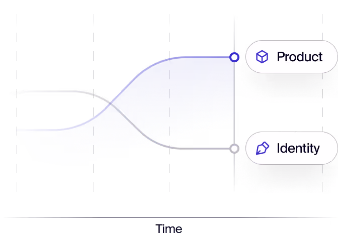
Too much data, no hierarchy
All metrics equal weight — users see everything, act on nothing.
.webp)
Charts without context
Numbers without comparison or trend — data displayed, not communicated.
.webp)
Role-blind interface
One view for every user type — built for no one in particular.
“All projects in which we’ve involved Halo Lab have been great successes, but their leadership on our brand refresh is worth highlighting.”

“We’ve had feedback from users, investors, and employees, and everyone has said that Halo Lab did a fantastic job with the branding.”

“We’re proud of their branding services. They not only do what we tell them but also make suggestions to help us improve our offerings.”

What we deliver
Dashboard design from
data to handoff
Data Architecture Review
We map your data model to user goals — defining what each role needs to see and when.
Dashboard UX
Hierarchy, grouping, and navigation designed before any chart type is chosen.
Chart & Visualisation Design
Chart types chosen for the data — not for aesthetics. Every visualisation earns its place.
Role-Based Views
Separate views for each role — executives, operators, and analysts get what they need.
Empty & Loading States
Zero-data and loading states designed so the interface guides users, not confuses them.
Filter & Date Range Controls
Contextual controls that let users explore the data without breaking the layout.
Design System Integration
Dashboard components built to the shared design system — tokens, variants, and naming aligned.
Developer Handoff
Annotated specs, component notes, and charting library guidance for a clean build.


How we work
Our process for your
dashboard

Start with a strategy call where we align on your goals, challenges, and priorities, and set a clear direction for the entire branding process.
3–4 Days
Research & analysis
Data & User Discovery
We review your data model, user roles, and key decisions users need to make — mapping what the dashboard must show before any design begins.
2–3 Days Data brief
UX Architecture
We design the layout hierarchy and navigation — grouping metrics, defining drill-downs, and mapping each role's primary view.
3–4 Days Dashboard wireframes
.webp)
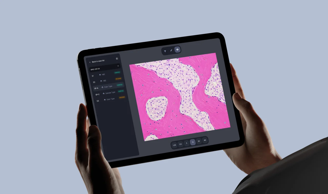
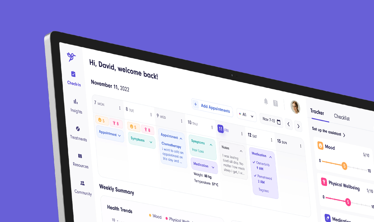
Visual Design
We apply your design system to every view — choosing chart types, defining color semantics, and building states and variants per role.
6–10 Days Dashboard UI
%20(2).webp)
Review & Iteration
Structured review with product and data stakeholders. Edge cases, empty states, and data density decisions finalised before handoff.
2–3 Days Approved designs

Handoff
Annotated Figma specs, component inventory, and chart library guidance — so engineers build correct data relationships without guessing.
1–2 Days Handoff package
Start with a strategy call where we align on your goals, challenges, and priorities, and set a clear direction for the entire branding process.
3–4 Days
Research & analysis
Industries we serve
Dashboard design for
diverse markets


Healthcare
Clinical dashboards for care teams — patient data, outcomes, and alerts structured for fast decisions.

Financial Services
Trading, risk, and portfolio dashboards — financial data with the hierarchy that drives action.

Logistics
Fleet and supply chain dashboards — real-time status and route data surfaced for operators.

Real Estate
Property and portfolio dashboards — occupancy, revenue, and listing data in clear, role-based views.

Education
Learning analytics dashboards — student progress and cohort data for educators and administrators.

Web3 & Blockchain
On-chain analytics and wallet dashboards — complex blockchain data made legible for every user type.

Wellness/Fitness
Health tracking dashboards — progress metrics and habit data presented clearly and motivationally.
Information Technology
DevOps and SaaS analytics dashboards — system monitoring and product metrics built for engineering teams.
6 reasons why clients
choose Halo Lab
Team with industry depth
Strategy before design
Custom-only approach
Expertise for complex needs
Clear, collaborative process
Flexible value for any budget
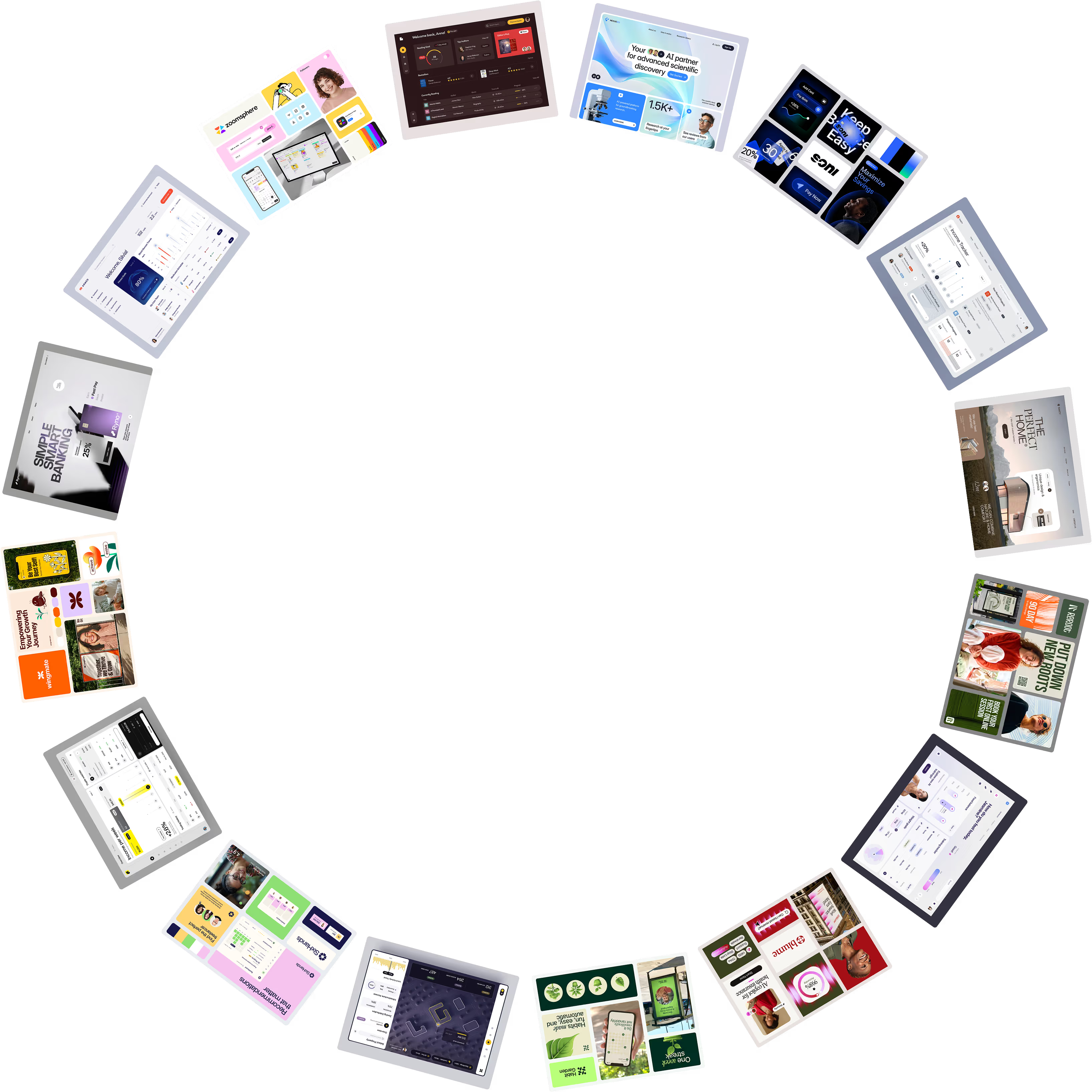
100+ verified
love letters
“Halo Lab is very organized in planning to achieve the goals within the set deadlines. We feel they were part of our internal team project.”

“Their experts have a very diverse range of skills and always find a solution to exposed issues. The communication process was clear.”

“During the collaboration, Halo Lab prioritized our people, always taking into account our input and ideas and giving all team members a voice.”

“The Halo Lab team unified branding across our patients’ app, showcasing professionalism, convenience, and consistency.”

“Halo recreated our existing portal with a modern and beautiful experience, greatly increasing usability and delight for the end user.”

“Halo Lab is brilliant. We were impressed with their timely delivery, cost-effectiveness, and the people who knew what they were doing!”

“The value we get from Halo Lab and their quality designs sets them apart from others. They are the right mix of price, talent, and style.”

“We gave the Halo Lab team a chance, and we immediately knew they were the ones we wanted to work with.”

“The Halo Lab work pleasantly surprised us, and bringing in their professional design team has been a worthy investment for us.”

“When collaborating with Halo Lab, we felt that communication was straightforward and that the deliverables fit what we expected.”

“Halo Lab has helped us with a rebrand and defined a new name, logo, and color palette. We’ve had a great experience working with them.”


12 years
We’ve built one of the most trusted agencies
150+
Specialists in design, engineering & product management
78%
Returning clients in Europe & North America
FAQ
Why invest in branding services?
Why invest in branding services?
What makes a good dashboard design?
Clear hierarchy, role-specific views, and chart types chosen for the data — not for appearance. Every element should reduce the time from opening the dashboard to making a decision.
Do you design for different user roles?
Yes. We design role-based views so executives, operators, and analysts each see what they need — without a single crowded interface that serves no one well.
Can you work with our existing charting library?
Yes. We design to your existing stack — whether Recharts, Chart.js, D3, or another library. Handoff notes reference your component conventions and charting API.
How long does a dashboard design project take?
Most dashboard projects take 3 to 6 weeks depending on the number of views, roles, and data complexity. Timeline is confirmed after the data discovery session.
Do you design empty states and loading states?
Yes. Zero-data states, loading skeletons, and error states are all part of the deliverable — a dashboard that handles real conditions, not just the happy path.
Will the dashboard connect to our design system?
Yes. Dashboard components are built to your design system — using shared tokens, component naming conventions, and variants so the dashboard extends the system rather than diverging from it.
What if our data model is complex or undefined?
We start with a data and user discovery session to map what exists and what each role needs. Ambiguous data models are a starting point, not a blocker.
Do you also design admin panels?
Yes. Dashboard and admin panel design are often combined in one engagement — both are data-dense interfaces that benefit from the same design approach and shared component system.
Do you offer support after delivery?
Yes. Post-handoff support for implementation questions, new view additions, and iteration as product features or data models evolve over time.