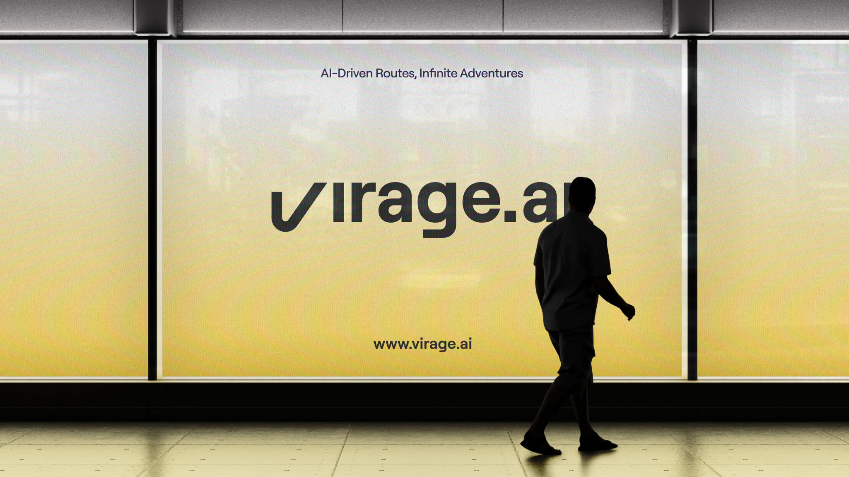


Virage.AI — brand design and intuitive interface for the best biking journeys

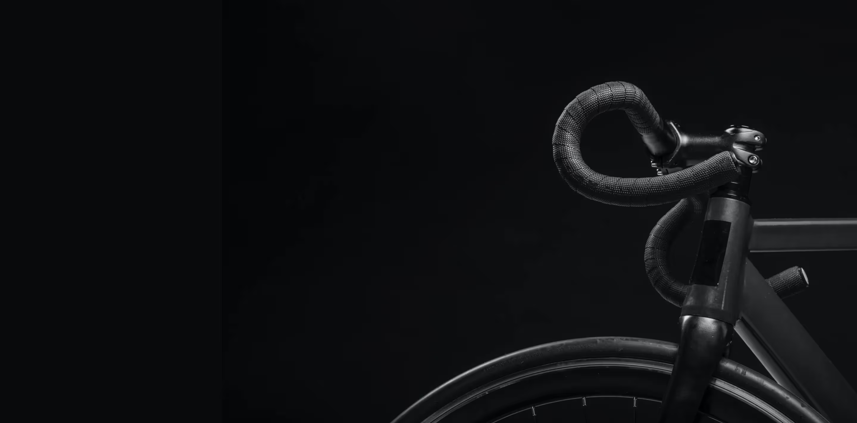
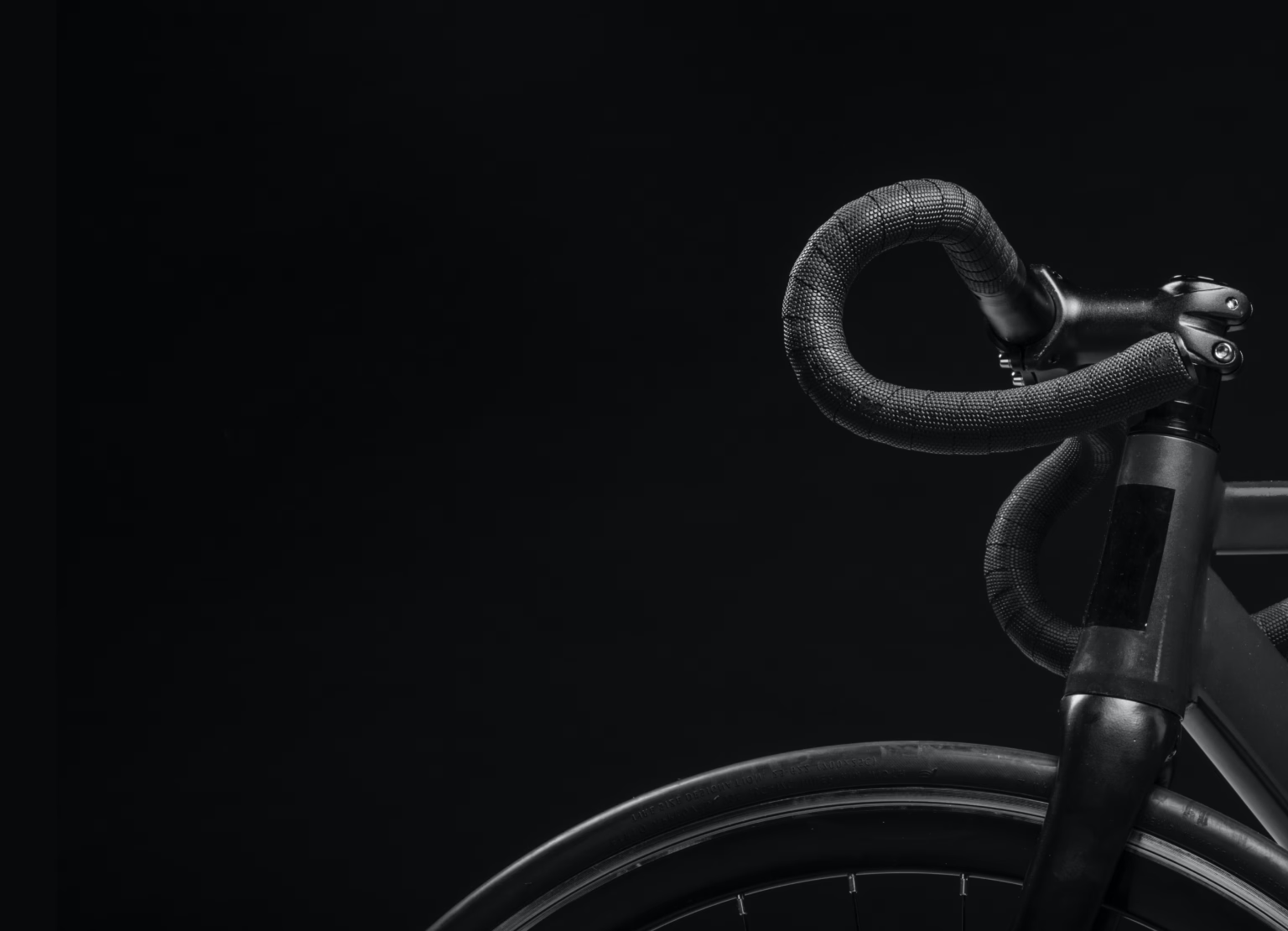
Boost your ride and pave the way with a smart assistant — a new biking experience for cycle enthusiasts
Virage.AI is a cycling platform accessible across all devices. Its primary goal is to enhance route planning and deliver crucial data, such as distance, speed, time, and heart rate, in the most convenient and digestible format.
The AI navigation system provides turn-by-turn directions to keep cyclists focused on their ride. Apart from that, the platform allows for exchanging destinations and useful tips — all to ensure users have fun and achieve better results together.
Visualizing movement — peak performance in every curve
We created a logo highlighting Virage.AI’s mission to revolutionize biking adventures. With the dynamism of bike routes in mind, it features a subtly curved “V” letter. Also, our designers chose white and blue colors to stress freedom, space, and activity.
Despite minimalism, the logo attracts attention with its simplicity and style. Recognizable and alluring, it focuses on modern technology and innovation, conveying the message of a sporty and active lifestyle.

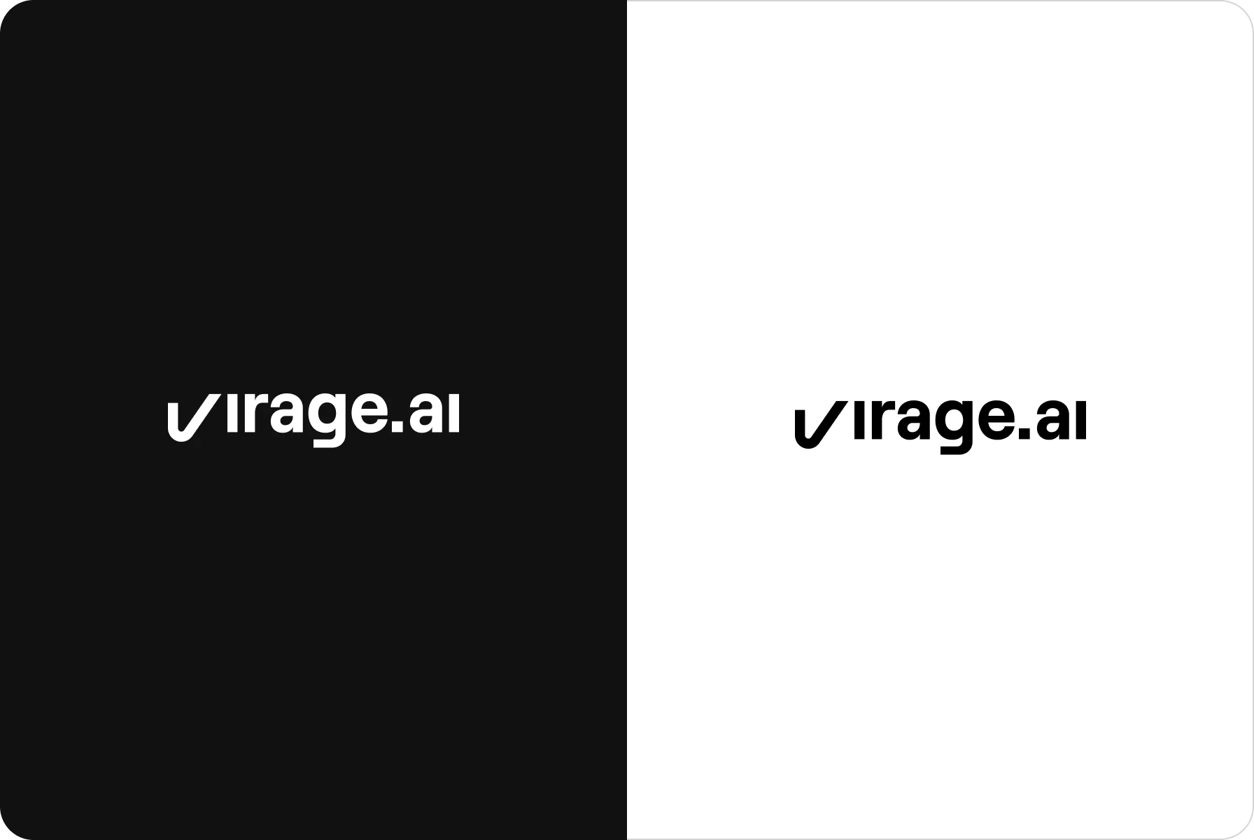
The logo boasts a simple yet inviting design, complemented by soothing colors that welcome users and offer them a comfortable experience.
{{mais-t}}
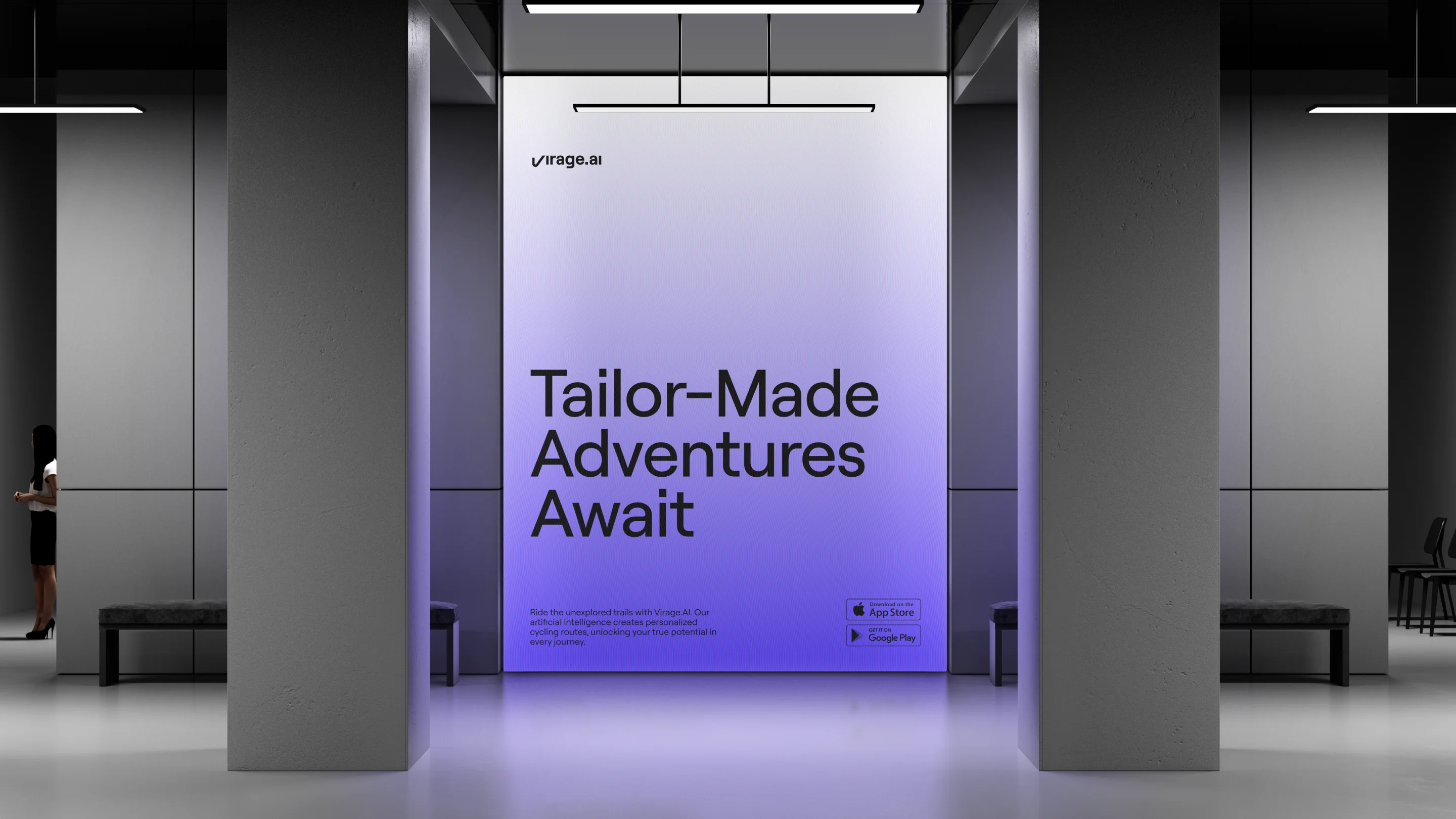
Stylish interface design for smooth and clear interaction
The environment comes alive with rich and vivid tones of yellow, red, and blue. Such a combination was chosen not only for aesthetic pleasure but also to evoke positive emotions in users. Yellow is for brightness, red is for energy, and blue — for technology.
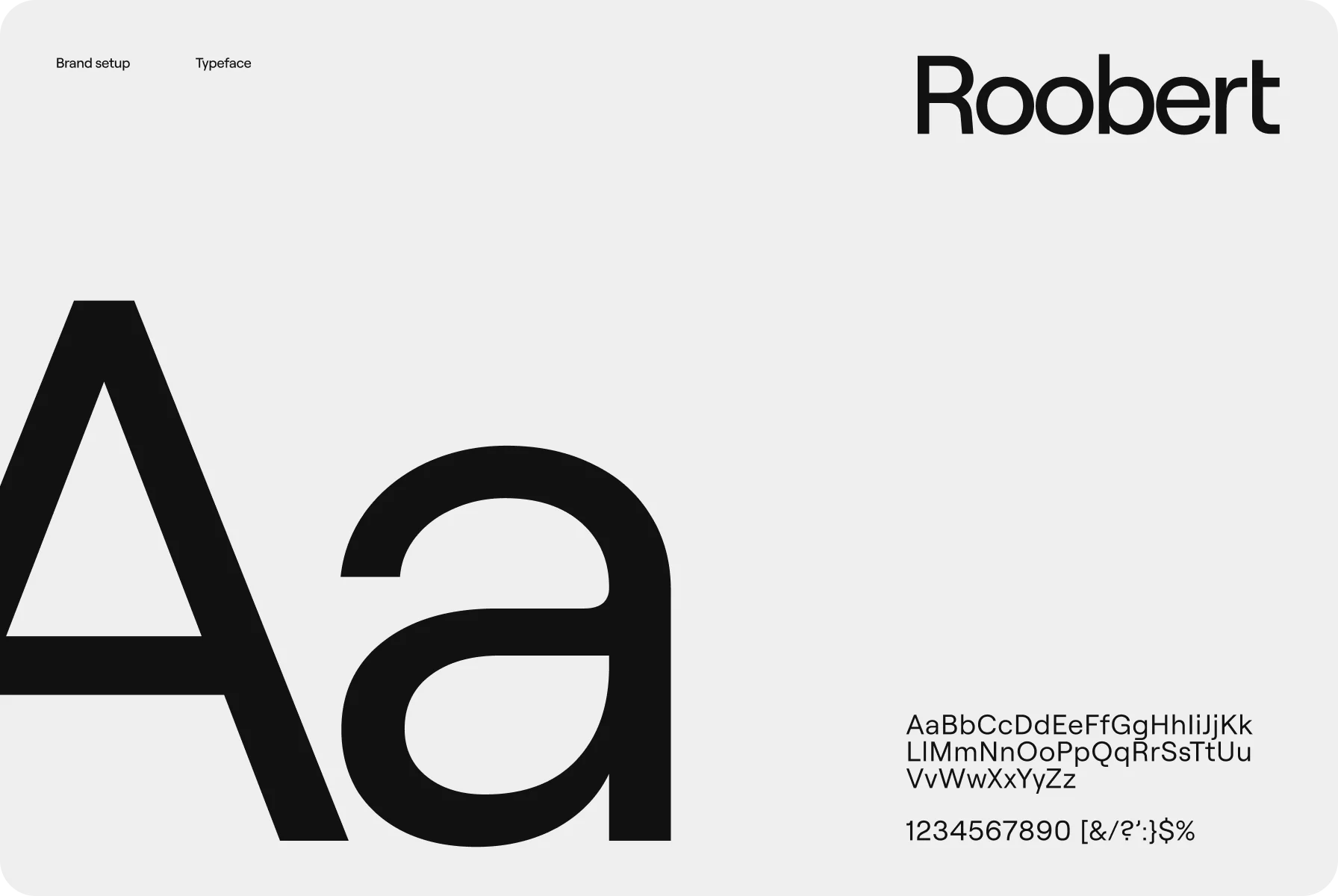
To achieve a more polished appearance, we chose the Roobert font for its sharp edges and well-balanced proportions. Besides, we integrated images and icons of bikes, mountains, sneakers, and other parts of equipment to mirror the lifestyle of bicycle lovers.
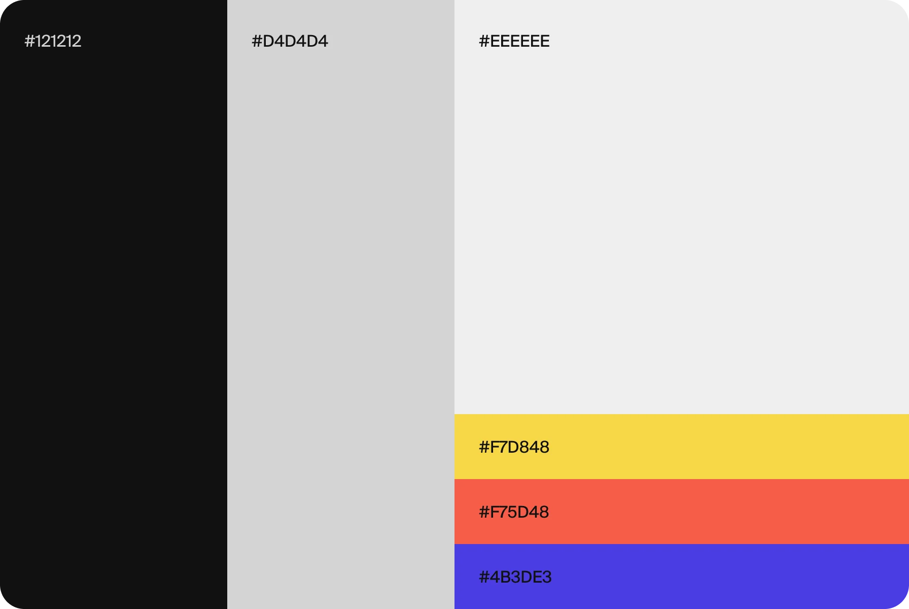
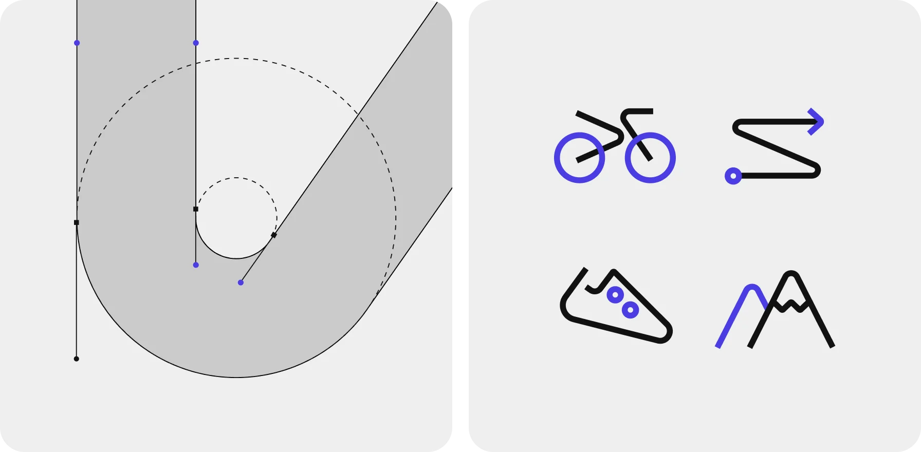
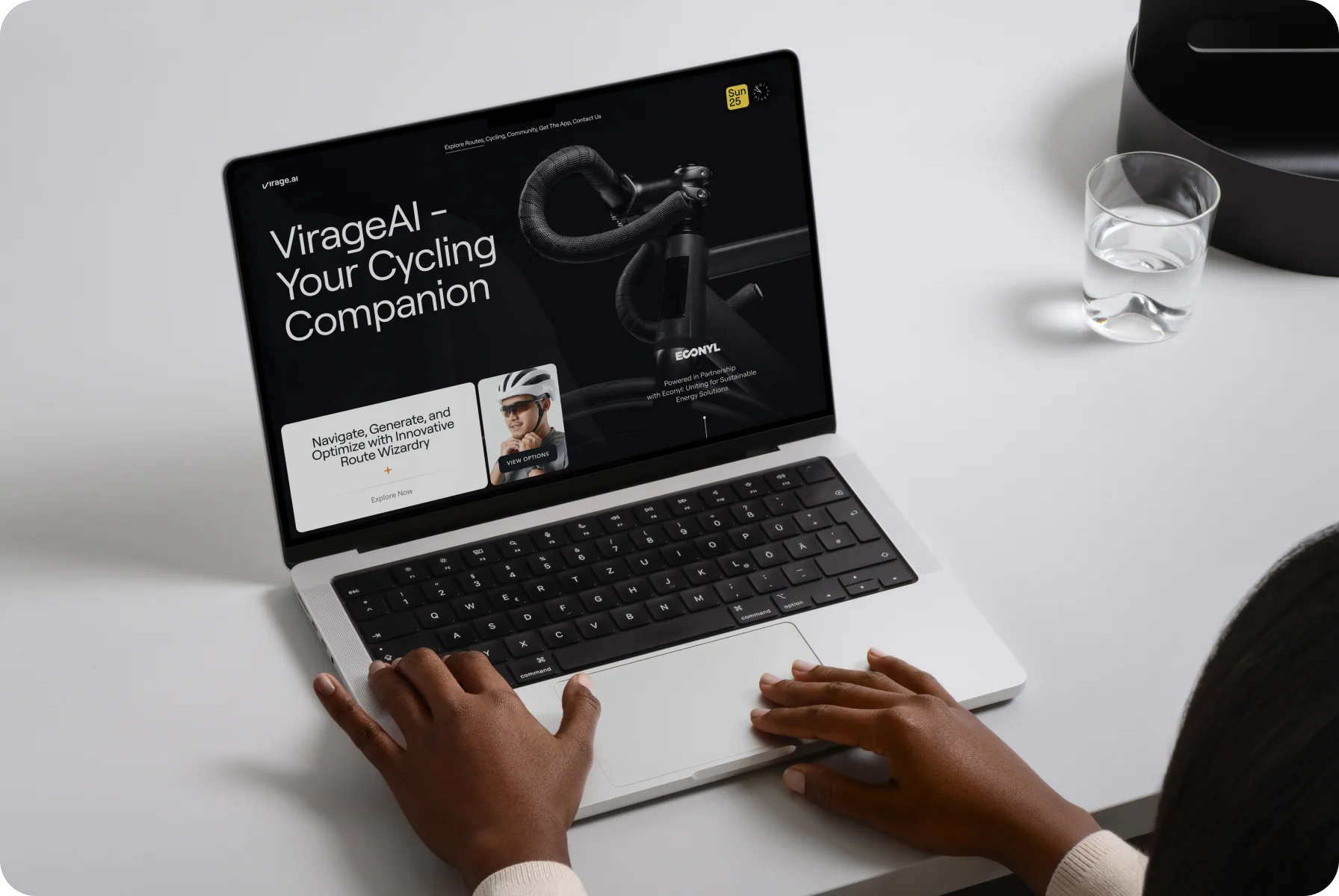
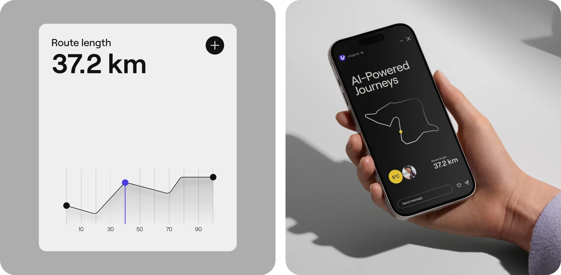
We aimed to strike a balance between capturing attention and staying true to the defined goal for a friendly user experience.
{{mais-t}}
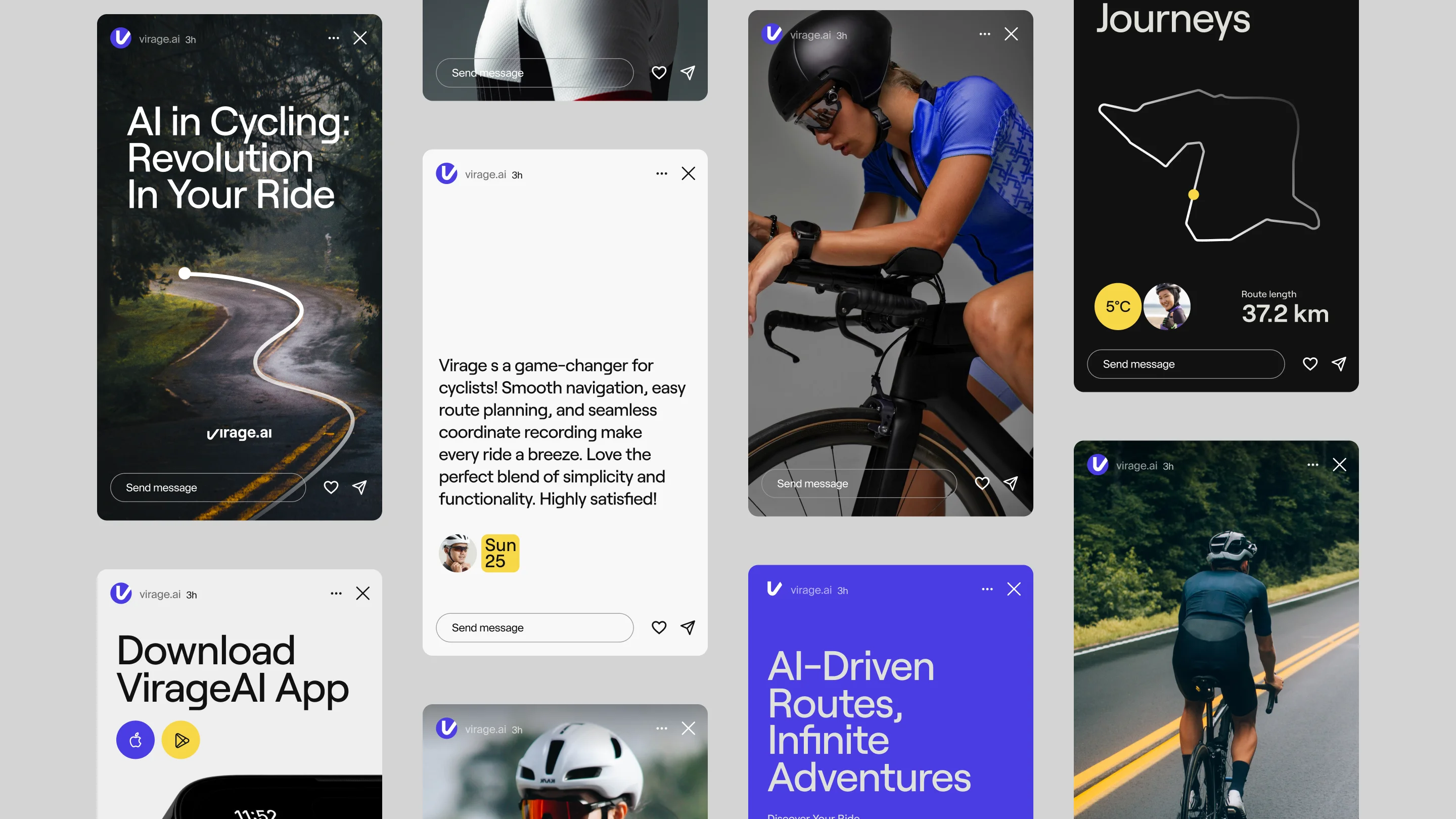
Developing a customized identity for AI-driven journeys
While creating the company’s corporate image, our goal was to embody the concepts of speed, movement, and technological advancement. As a result, Virage.AI has it all — they spotlight the innovative spirit of AI and fuel the drive for new achievements in life.
Every element reflects the shape of landscapes and twisty cycling trails, symbolizing travel and mobility. Such a comprehensive approach to branding makes it attractive to bicycle enthusiasts and enriches the aesthetics of adventure and freedom.
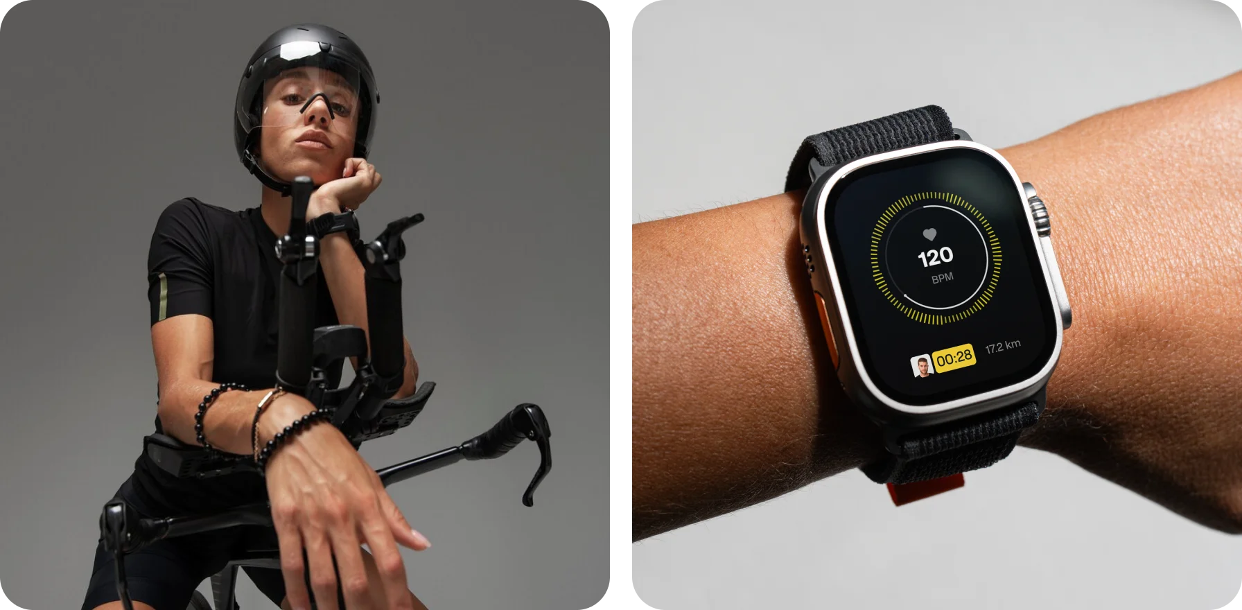
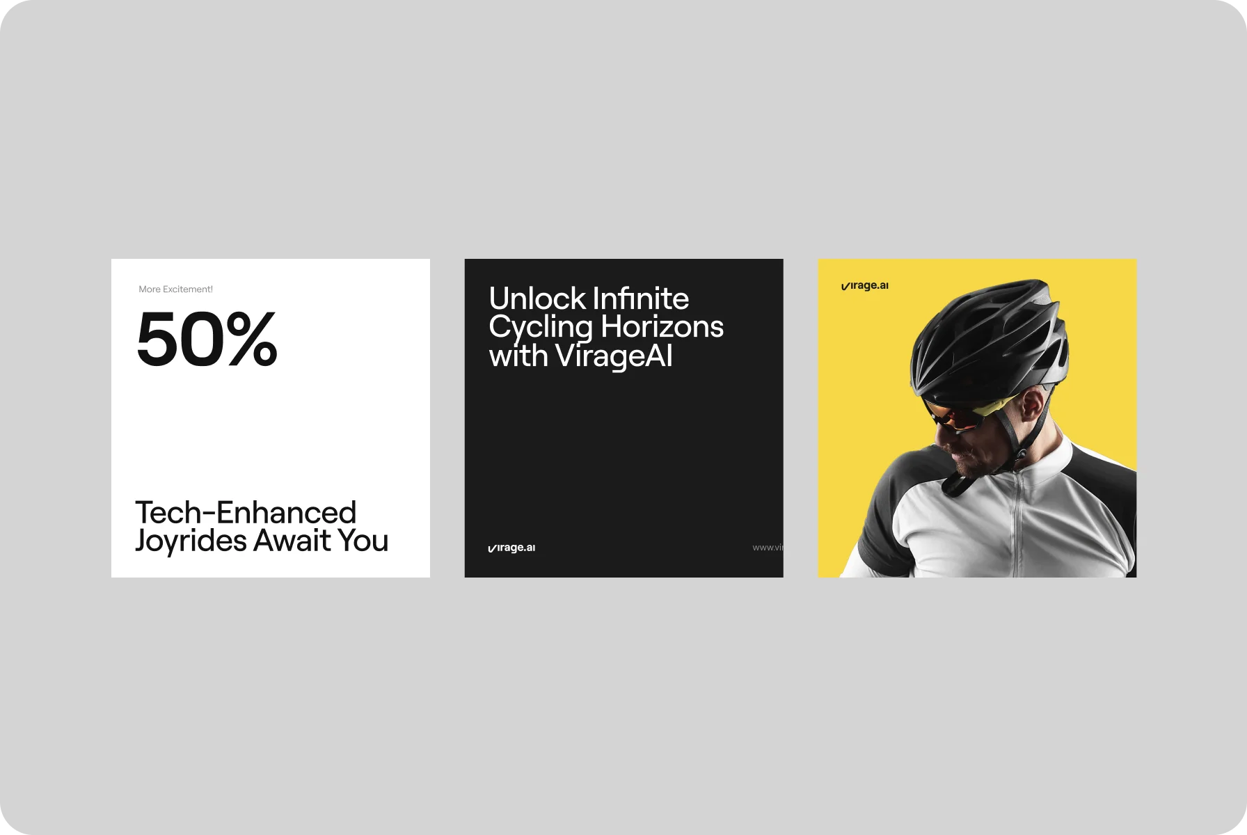
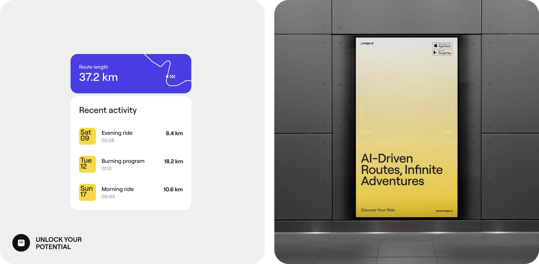
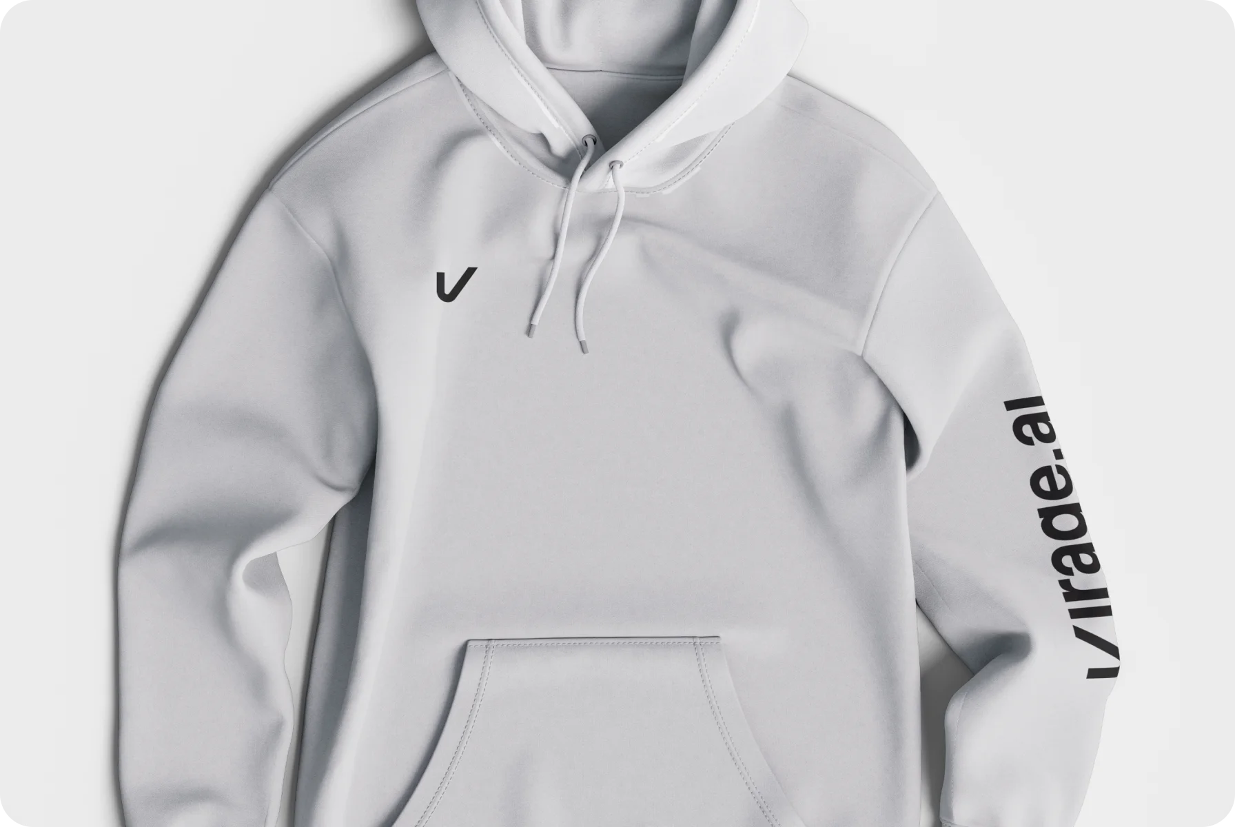
Just like their users, Virage.AI is about energy, fun, and life full of bright colors and positive emotions. And a stylish, edgy brand is what emphasizes this philosophy, giving rise to a new community of cyclists who are not afraid to conquer challenging routes.
{{mais-t}}