




A nationwide mobile phlebotomy service bringing at-home diagnostics to patients and labs
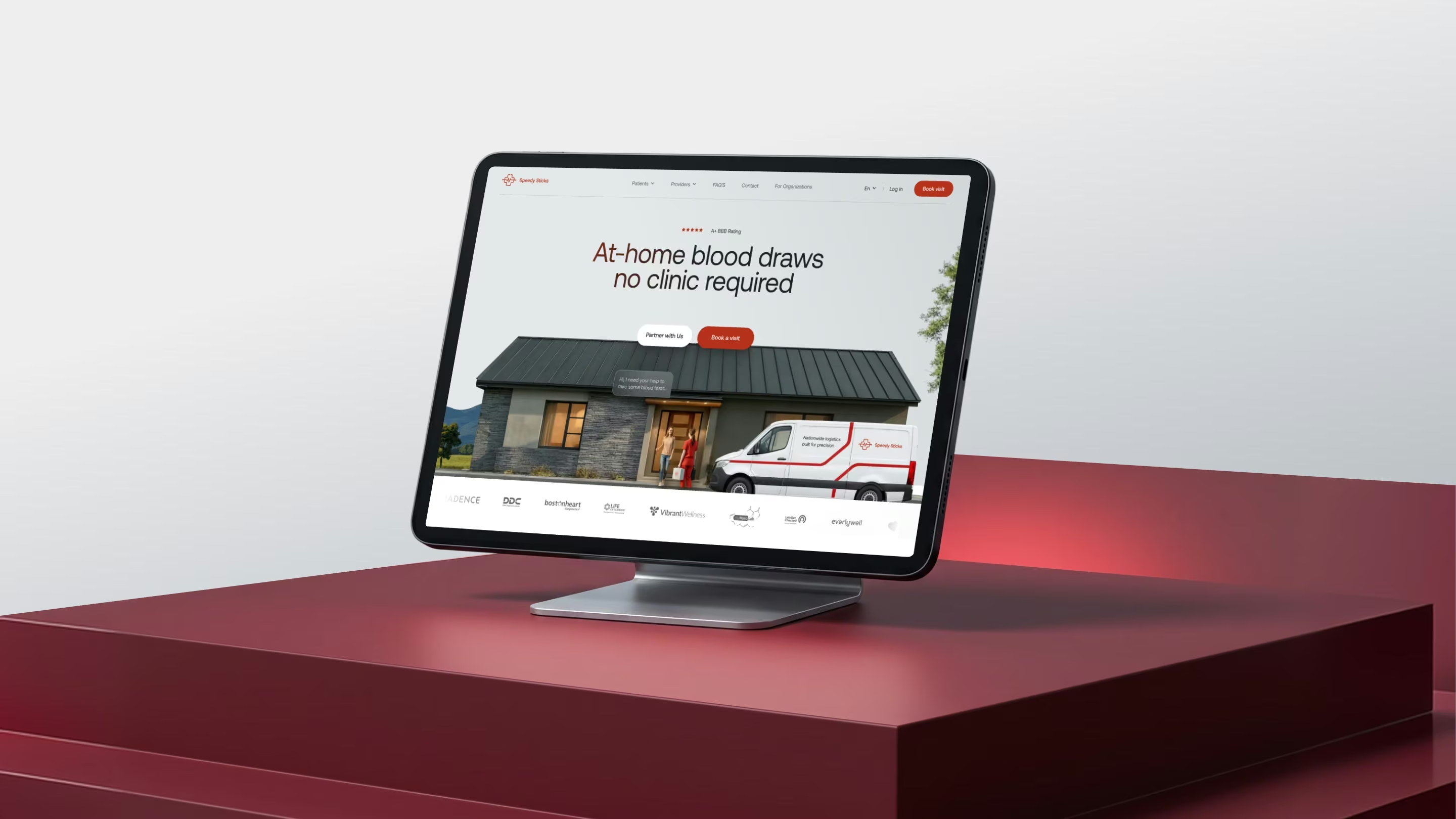
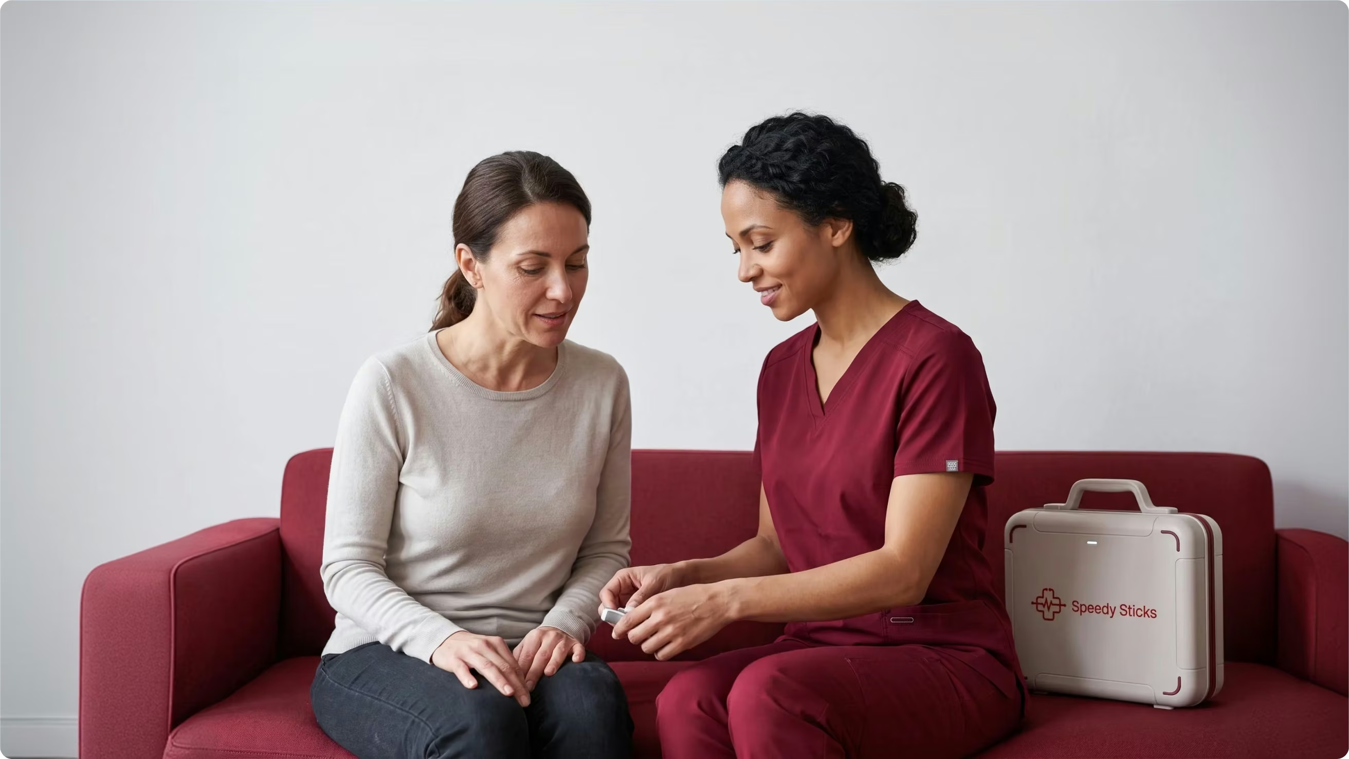
Speedy Sticks is a nationwide U.S. mobile phlebotomy service, bringing lab-quality blood testing directly to patients’ doors. Certified phlebotomists perform at-home blood draws, lab-kit collections, and specimen handling, so patients complete testing without visiting a clinic.
Now spanning all 50 states, with 100,000+ blood draws completed for 20,000+ patients, the service answers to two very different audiences: individuals booking a home visit for convenience, and the labs, hospitals, and healthcare systems that rely on it for compliant specimen collection at scale.
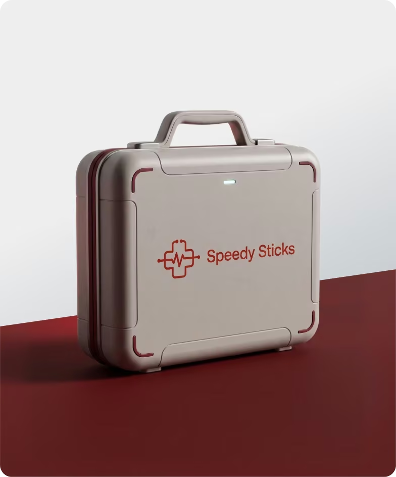
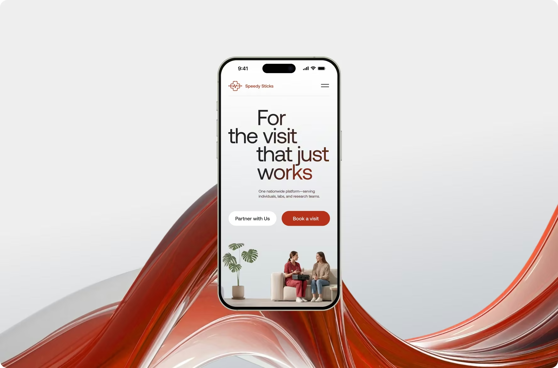
Speedy Sticks’ existing homepage read as static and generic, doing little to signal innovation, trust, or technological leadership in a market of similarly flat competitors. The client wanted a modern, interactive redesign in the spirit of today’s leading health-testing platforms, one that drove bookings while clearly serving both patients and B2B partners.
We turned a flat, single-note homepage into an interactive, motion-led experience, rebuilding the structure from the ground up to guide patients and healthcare organizations toward action within one continuous scroll.
{{dropdowns-1}}
{{review}}
Strong results start with open dialogue. At every stage, we work closely with the client’s team, running workshops, gathering feedback, and refining ideas through multiple iterations. If your product needs the same level of care, contact us — and we’ll help turn complexity into an experience people can understand, trust, and use with confidence.
{{approach}}

“What stood out most was their ability to quickly understand our business and translate complex services into a clear, cohesive website experience. They balanced thoughtful design with practical execution, and stayed flexible and focused on a result that aligned with our goals.”

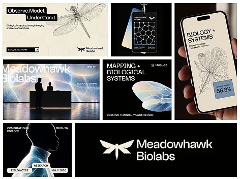
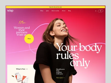
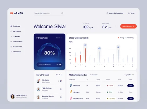
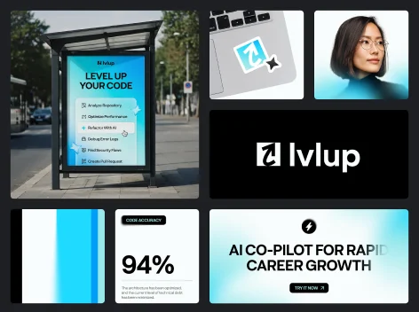
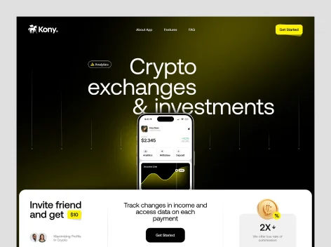
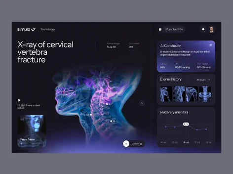
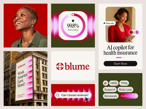
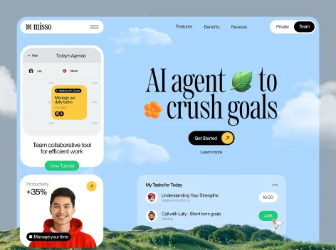
We started by analyzing the brief and the two audiences behind it to define clear goals for each. Next, we studied modern health-testing platforms the client admired alongside direct mobile-phlebotomy rivals, shaping a mood board that set the emotional tone and visual metaphors before any design began.
After that, our team mapped a conversion-first homepage. The hero offered two clear paths, book a visit or create an account, backed by a step-by-step explainer. Service tabs, a lab-partnership block, and grouped FAQs kept dense information easy to scan.
High-fidelity screens introduced a deeper, muted red for a more professional, trustworthy feel, paired with animated gradients and smooth scroll motion. After client input, we added B2B sections so a single homepage spoke clearly to both audiences.