Real Estate
Link to Industry
Website Design
Link to Service
UX/UI Web Product
Link to Service
LandLock

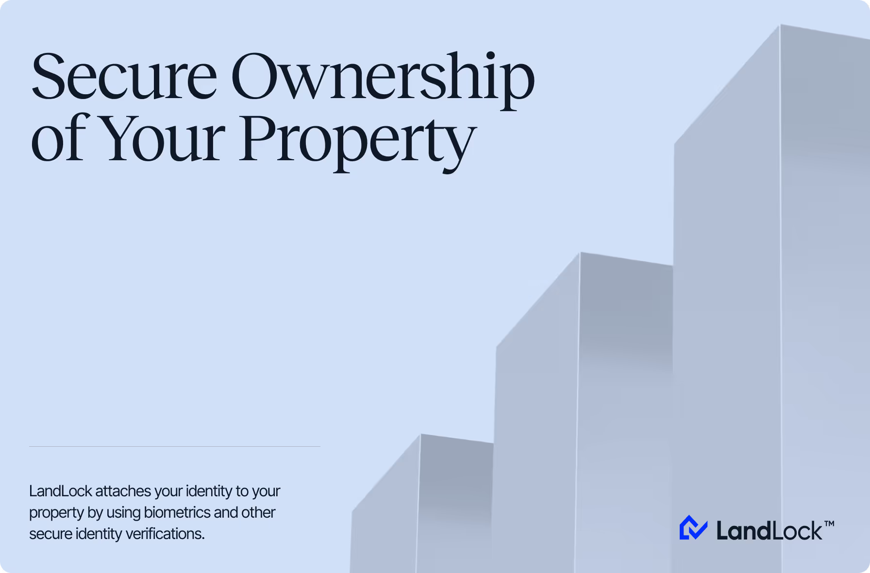
Trust-first identity and landing page for a property title protection platform

1
2
3
Real Estate
Link to Industry
2025

About the project

LandLock is a US-based PropTech company that built a patent-pending system to prevent real estate title theft — a growing form of fraud where criminals forge deeds and illegally sell properties without the owner’s knowledge.

The platform links verified owner identity to a property through a county-recorded notice, making ownership verification visible during title checks. Any sale or refinancing requires re-verification by the true owner, including biometric authentication and authorization, helping prevent fraud before it occurs.

Services
Branding
Website Design
UX/UI Web Product

Challenge

As LandLock handles sensitive identity data, credibility is the foundation that the entire product stands on. With no existing brand, the client needed a trustworthy identity built from scratch and carried consistently across a new landing page and into the redesigned product platform.

Our process

A broad work scope covered branding, web design, marketing assets, and platform redesign, giving the client a visual foundation built to grow with the product.

Branding

Stepping away from generic patterns, we built LandLock’s brand identity research-first, uncovering the right positioning and shaping a credible visual presence.

{{dropdowns-1}}

Landing page & marketing

A specialized product needs sharp communication, so we designed a conversion-focused landing page and marketing materials to support it across channels.

{{dropdowns-2}}

Platform design

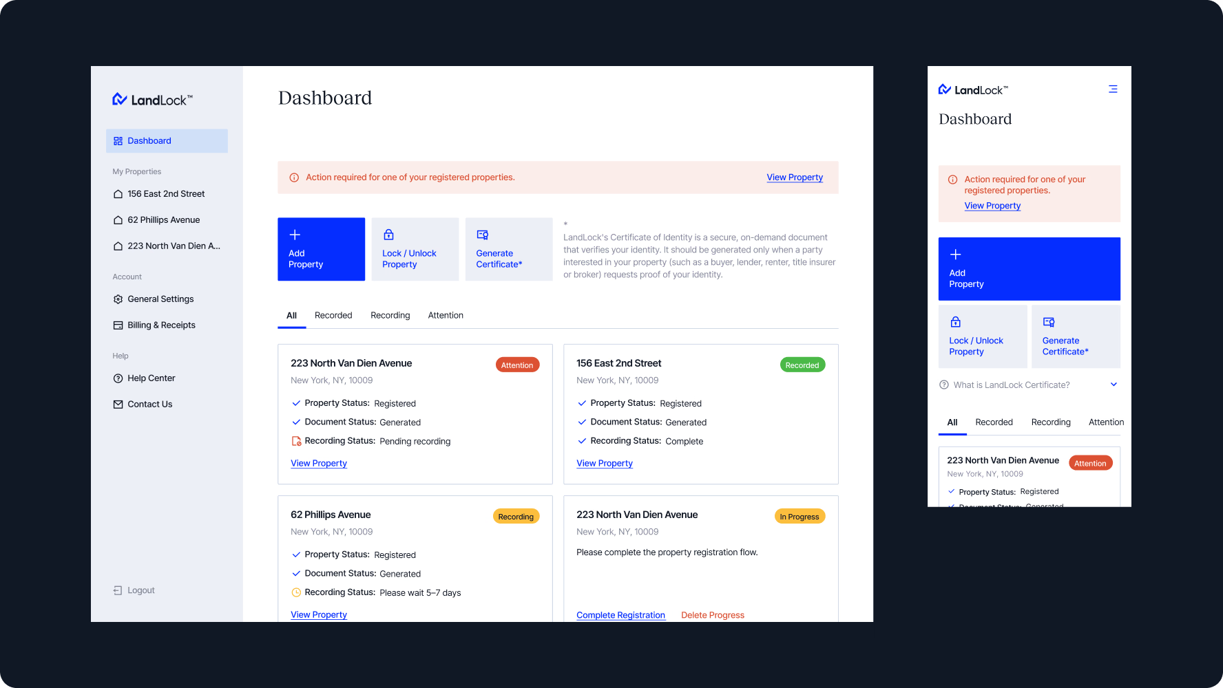
With the identity and landing page in place, we moved on to redesigning the core product, bringing the established visual language into the web app experience across all key flows.

{{dropdowns-3}}

{{slider-1}}

Results

  • Trust-first brand identity for a credibility-sensitive category
  • Conversion-focused landing page optimized for clarity and meaningful user engagement
  • Full marketing suite across digital and print channels for multi-platform outreach
  • Redesigned product platform, carrying the established visual language coherently across every screen
  • Dev-ready assets and guidelines for consistent implementation
  • Future-ready design foundation for scaling the product ecosystem

Our approach

Putting trust first, we shaped LandLock’s visual presence around the balance between legal credibility and the simplicity that makes the platform concept clear.

{{approach}}

5.0
star iconstar iconstar iconstar iconstar icon
5.0
star iconstar iconstar iconstar iconstar icon
Want to discuss your product vision with our team?
Book a call

01  ·  Brand discovery & research

We started by mapping the market against key competitors to identify positioning gaps and visual conventions to move away from. Taking into account the client’s references, we identified a visual direction toward trust-grade minimalism.

Deliverables

  • 3 competitors analyzed
  • Conceptual moodboard

02  ·  Logo & visual identity

We anchored the logo in the product’s core idea — a blue house paired with a tick mark, expressing secured ownership. A grey-and-blue palette with orange accents, thematic illustrations, and minimalist icons conveyed control and stability.

Deliverables

  • Logo concept directions
  • Color & typography system

03  ·  Brand system & guidelines

Our team consolidated all assets into a complete brand system covering logo, color, typography, and iconography. To ensure cohesive use of brand elements and scalable application across touchpoints, we developed clear usage guidelines.

Deliverables

  • Brand guidelines
  • Brand kit

01  ·  Web design

Since title theft is unfamiliar to most visitors, the content was structured to move them from awareness through trust to action. UI followed the brand system with scroll animations, closing with a dev-ready kit with buttons, pop-ups, tabs, and more.

Deliverables

  • 2 landing page concepts
  • Desktop & mobile layouts
  • UI kit

02  ·  Marketing materials

To support the brand’s outreach, we delivered a set of digital and print materials, including social media visuals, Google Ads banners, and flyers for distribution. The visual identity was then extended to email format through branded banners.

Deliverables

  • Social media designs
  • Promo & email banners
  • Print-ready assets

01  ·  UX design

To optimize the platform experience, we mapped user journeys across key touchpoints. The focus was on making complex verification flows clear — from sign-up and account settings to property registration and dashboard management.

Deliverables

  • User flow mapping
  • UX wireframes

02  ·  UI design & handoff

Our designers crafted screens for key modules, covering registration and management, following the established brand system. The engagement closed with a handoff package for accurate implementation by the client’s team.

Deliverables

  • Component library
  • Desktop & mobile layouts
  • Dev handoff package

Team

A cross-functional team worked in close sync, continuously adapting to new insights from classroom trials and robot behavior.

  • 1 Project Manager
  • 2 Brand Designers
  • 2 UI/UX Designers
  • 2 Web Designers
  • 1 Front-end Developer
  • 1 Back-end Developer
  • 1 QA Engineer

Technologies

Our stack supported offline interaction, hardware communication, scalable content management, and smooth cross-platform UI.

Team

  • 1 Project Manager
  • 1 Brand Designer
  • 2 Web Designers
  • 2 UX/UI Designers

Technologies

Figma

Figma

Ready to discuss your project with us?

Let’s discuss how we can craft a distinctive brand identity that captivates, connects, and converts.
BOOK A CALL