


Relocate Now — a memorable brand story inspired by home


All-in-one solution for stress-free global moves where no detail is ever overlooked
Relocate Now, a spin-off of the Portuguese advisory firm Westonbridge, is designed to simplify moving to a new country. With years of experience, the service takes care of everything — from paperwork to finding a place to live.
The team consists of experts in law, tax, accounting, and management. They work together to prepare the necessary documents, help with pet transporting, and other details to make the relocation effortless and worry-free.
- 900+
relocations done - 40+
nationalities shaken hands with - 1400+
subscription to services

Challenge
Relocating to a new country can be overwhelming, with endless paperwork, legal hurdles, and logistical nightmares. The process is often so complex that it leaves people stressed and confused, struggling to handle all of the details on their own. This challenge creates a need for a service that simplifies and streamlines every step of the move.


A brand that brings the warmth of home
Taking the research insights into account, we decided to create a loyal branding image by building emotional connections through personal stories and unique illustrations. The main idea was to engage with the audience.
Our designers shaped identity, focusing on care, reliability, and creating a positive experience for everyone making a big move. To resonate with the industry, we honed in on familiar elements like cozy home imagery.

Two creative takes on the relocation industry
We designed this idea to make the moving feel positive and welcoming. The brand elements use house-like shapes that hold photos, turning them into something familiar and fresh. For the client, it was love at first sight.
This concept focused on the idea that moving can be calm and smooth yet still filled with the thrill of new adventures. We played with simpler shapes for the photos, making them more flexible so everything just falls into place.
{{slider-1}}
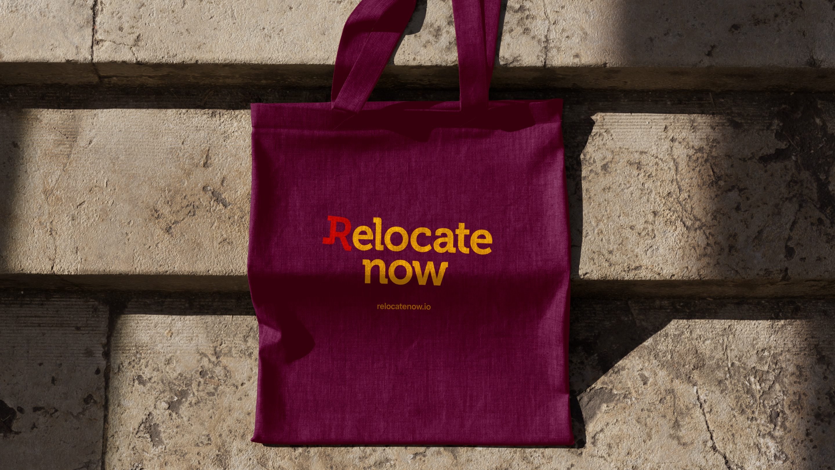
A wordmark that’s always on the move
The main request was a standout wordmark, so that’s where we put our focus and efforts. Designers came up with five different concepts, but the one that made the most sense among them featured a stepping “R” letter.
Such a little detail beautifully captures the idea of movement and change, while a slab serif font gives a playful vibe to the first letter. This logo became a favorite right away, but to perfect it, we added a bit more tilt in the “R.”
Bold branding ideas with a trustworthy twist
One of the main challenges our team faced was finding the right mix of energy, stability, and trust. We needed to create an identity that felt vibrant but also gave off that reliable, confident vibe that defines the company.
To do this, we experimented with different shapes, colors, and fonts, testing how they worked together in the overall style. The result is a brand book that perfectly captures the balance between boldness and dependability.

We wanted to break away from the typical brand book approach and instead focus on capturing the emotional essence of the identity.
{{elena-popovichenko}}

Winning trust through web design strategy
On the website, our designers showed what sets this company apart, presented its services, and listed relocation stages. These are meant to build trust with visitors, helping them feel confident about taking the next step.
We also used storytelling to draw users in, gradually introducing them to the website and what it offers. With examples, stats, and cool features, we made sure people know they’re making the right choice with Recolate Now.

Putting the focus on a website that connects
This concept uses big, bold headlines, happy photos, and clear calls to action, all paired with a warm, inviting color scheme for an engaging vibe. To mix things up and keep it fun for the user, we added a house-shaped section.
Another concept goes for a cleaner look. The main idea is a central axis that organizes all the content, giving the site a sense of movement. The second section acts as a nudge, helping users intuitively take the next step.
{{slider-2}}
Every scroll brings more to discover
For a friendly touch, we drew inspiration from angled branding elements. Our designers bring that by creating animations where house shapes gently rotate as users scroll, making the whole experience feel dynamic and welcoming.
With interactive details, we wanted to make the navigation smooth while keeping the unique style. These subtle movements helped maintain storytelling throughout the website, encouraging users to scroll all the way to the end.

Custom solutions with future focus in mind
We built the website from the ground up using Webflow, making sure every design detail was spot on. Our developers tailored everything to fit the client’s needs, so the final result looks great and works exactly how it should.
To make the whole experience more engaging, we brought to life some custom touches, like animations and interactive features. A key element was the Google Maps block, integrated with future expansion in mind.

We were tasked with turning the design into a fully functional site, styled and tailored to exact specifications — and we nailed it.
{{kostia-kazachenko}}
Step-by-step documentation for easy updates
To provide smooth content management, we added detailed comments to each CMS block in the admin panel. These notes make it easier to understand and update the site, providing clear guidance every step of the way.
We also fully configured one page in the CMS as a complete example, demonstrating how to use the admin panel effectively. This page serves as a hands-on guide, helping to navigate and manage the site with confidence.

{{cta}}
Halo Lab is very organized and methodical in their planning, ensuring goals are met within established deadlines, even when additional features or software customizations are involved. Communication was easy and valuable, making them feel like a part of our internal team project. They exceeded our expectations!


Based on 80+ reviews

with 100% Job Success

AgencY IN UAE

WORLDWIDE

Logo creation
Elements that bring the brand to life

Color palette
A splash of elegance with a dash of playfulness
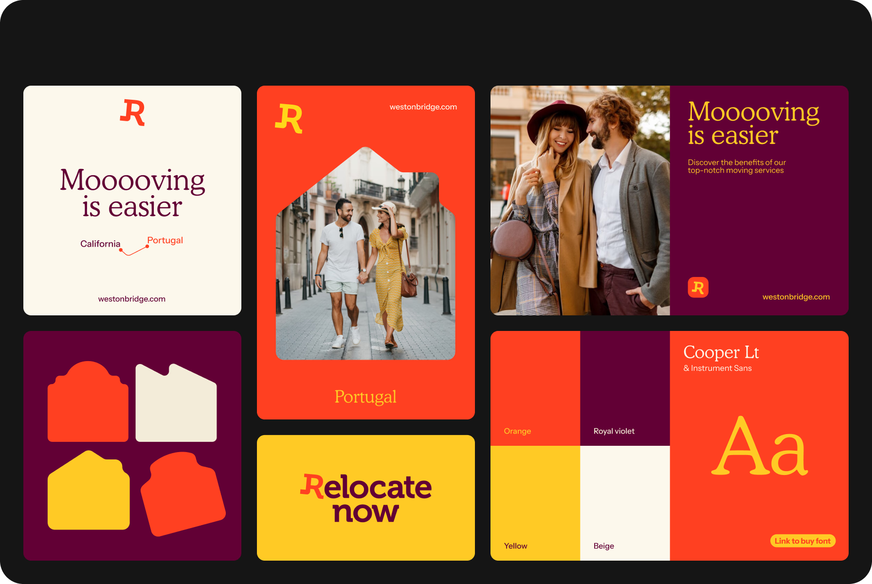
For the color palette, we carefully chose five tones that bring out a playful, light, yet sophisticated vibe — Burgundy, Ivory, Red, Yellow, and Beige. These hues work together to set the right mood, whether we need to be serious or a bit more relaxed.

Typography
Typography that makes the message pop
We picked a font combo that really captures the brand’s essence. Cooper, with its soft and rounded style, is perfect for headlines — adding a welcoming vibe that draws users in. Instrument Sans, in turn, is modern clarity, making everything easy to read and professional.

Abstract forms
A sense of home with the visual elements
Abstract house shapes became a core part of our visuals. These soft, rounded forms bring out that comforting, safe feeling of home and serve as perfect spots for text or images. These shapes are super flexible, as they can be recolored or adjusted to fit any need.

Photo style
Moments of joy and excitement in every frame
The photos bring out the excitement and joy of discovering new places, making this life stage feel even more special. We chose them to highlight those emotions, adding a touch of warmth and vibrancy to the visuals, symbolizing a fresh start.

UI icons
Icons with a warm, personal touch
To make the identity more personal, we’ve designed UI icons that carry a friendly, approachable style. With soft lines and simple shapes, they work well with the rest of the design elements, making every interaction with the brand feel warm and engaging.
Logo creation
Building dynamic site with the best in tech solutions

Custom functionality
To bring features to life, we used JavaScript and created custom functionality tailored to the client’s needs. For styling, our developers leveraged the flexibility of CSS, going beyond Webflow’s standard offerings to get every element perfectly designed.
Interactive experiences
Our team made the site dynamic and engaging by using Webflow’s built-in animation tools to create smooth interactions. Additionally, Swiper was implemented as a custom solution for specific blocks, adding a touch of fluidity to the animations.

User-friendly content management
We set up and configured a CMS, making it easy for the client to manage and edit content through an intuitive admin panel. With this approach, our team ensured that the site remained up-to-date and relevant without any hassle.

Enhanced navigation and appearance
For easy navigation, we integrated an interactive Google Map using the client’s API key. Remodal was used to implement sleek and user-friendly modal windows, influencing the overall user experience.