


CSS keeps actively evolving, boasting new properties and features. By learning and using them, we can simplify and expedite web development, follow modern trends and solve various problems more easily. In addition, with CSS, it is possible to create functionality that previously could only be implemented using JavaScript. This increases the reliability of applications and optimizes their performance.

This article will examine some of the relevant CSS properties mentioned in the annual State of CSS survey. This survey seeks to understand the current CSS ecosystem and inform us about the main directions it took. This year, Lea Verou, a member of the W3C working group and a person at the forefront of all the changes that are taking place, has joined in to help draft the questions for it. Probably partly due to her participation, this year’s survey focused on new and upcoming CSS features.
First of all, let’s focus on the features and capabilities that can be used today. They are well-supported by popular browsers, and their usefulness is confirmed through practice. While we’re at it, we will also cover some of the innovations that are expected in the near future.
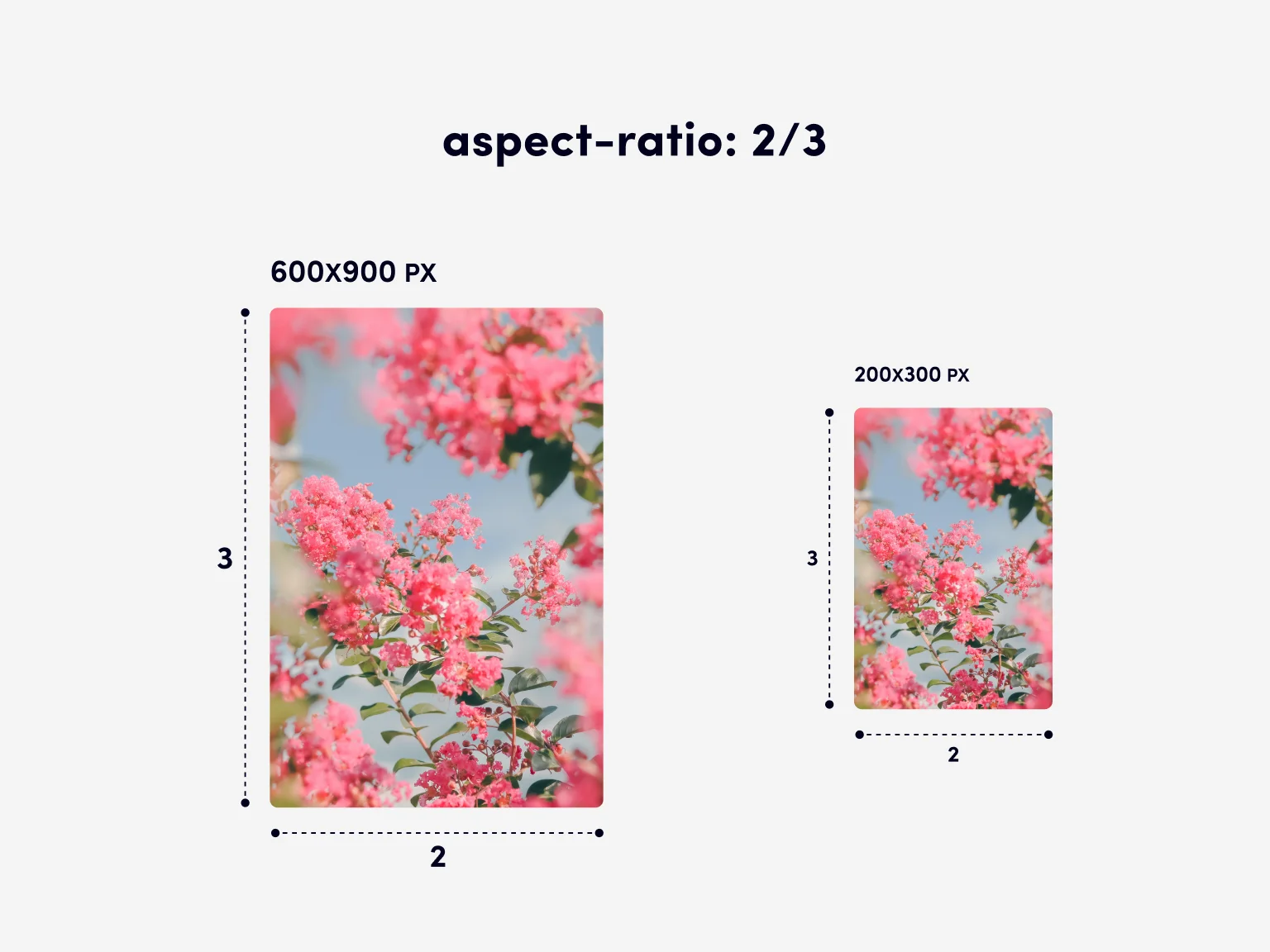
aspect-ratio
The aspect-ratio property offers a simple, convenient and straightforward method of setting the aspect ratio for an element. It is defined as the ratio of an element’s width to its height and calculates the other side based on the size of the one already known.
The aspect-ratio property will be useful for the adaptive layout of maps, cards, videos, iframes, and other elements for which it is important to keep the aspect ratio when resizing.
Code example
Let’s create an element that has 100% of the width of the parent element and a width-to-height ratio of 2 to 3:
For images and videos, it is convenient to combine the aspect-ratio property with the object-fit property, where aspect-ratio defines the aspect ratio of an element, and object-fit specifies how the content will fill it.
Previous approaches
Before the aspect-ratio property, we used the padding-top property to maintain the aspect ratio. This is possible because the padding property, expressed as a percentage, is based on the parent element’s width.
For example, in order to set the aspect ratio of the 16/9 video, we had to write the following:
Such an entry is counterintuitive and obscure, resembling a hack rather than a basic language feature.
Compare it with how we can define such a ratio today:
The usage has become much clearer and does not require revising the padding property to implement something outside of its normal scope.
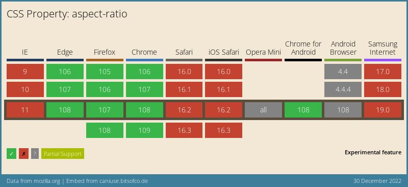
Browser support: 91.23%
Specification: W3C Editor’s Draft
content-visibility
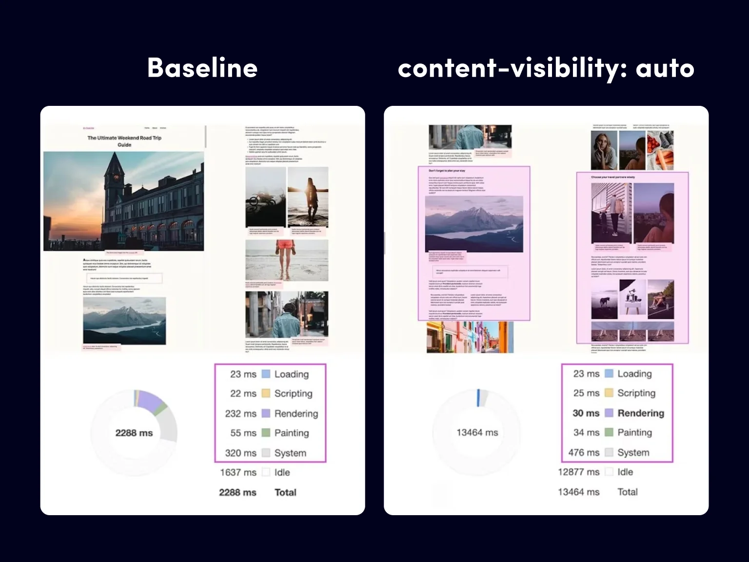
The content-visibility property aims to expedite the first loading and first rendering of the web page so that you can interact with the newly rendered content immediately without waiting for the rest of the content to load.
By using the content-visibility property, developers can tell a browser which parts of a page contain isolated content. This, in turn, will allow the browser to optimize page rendering through delayed calculations.
Code example
Let’s optimize the loading of sections. The content-visibility property with the auto value ensures the maximum possible performance gain with minimal effort.The height of the section (in this case, 1000 px) must be specified so that the browser will reserve space for it.
With the content-visibility property, a browser will load and style the content that the user currently sees on the screen. For the rest of the content, it is enough to specify its height. In this case, contain-intrinsic-size acts as a placeholder.
Previous approaches
Without the content-visibility property, a browser loads and styles all parts of the page regardless of whether they are currently visible to users. When it’s applied, however, the browser will load and style only the content currently visible to the user (on the screen), treating the rest of the content as if it contained empty sections. This leads to a significant increase in rendering speed.
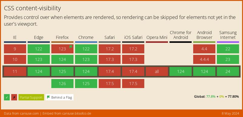
Browser support: 72.95%
The content-visibility property was announced in August 2020. It works in Chrome and Opera but is not supported by Safari and Firefox.
Specification: W3C Working Draft
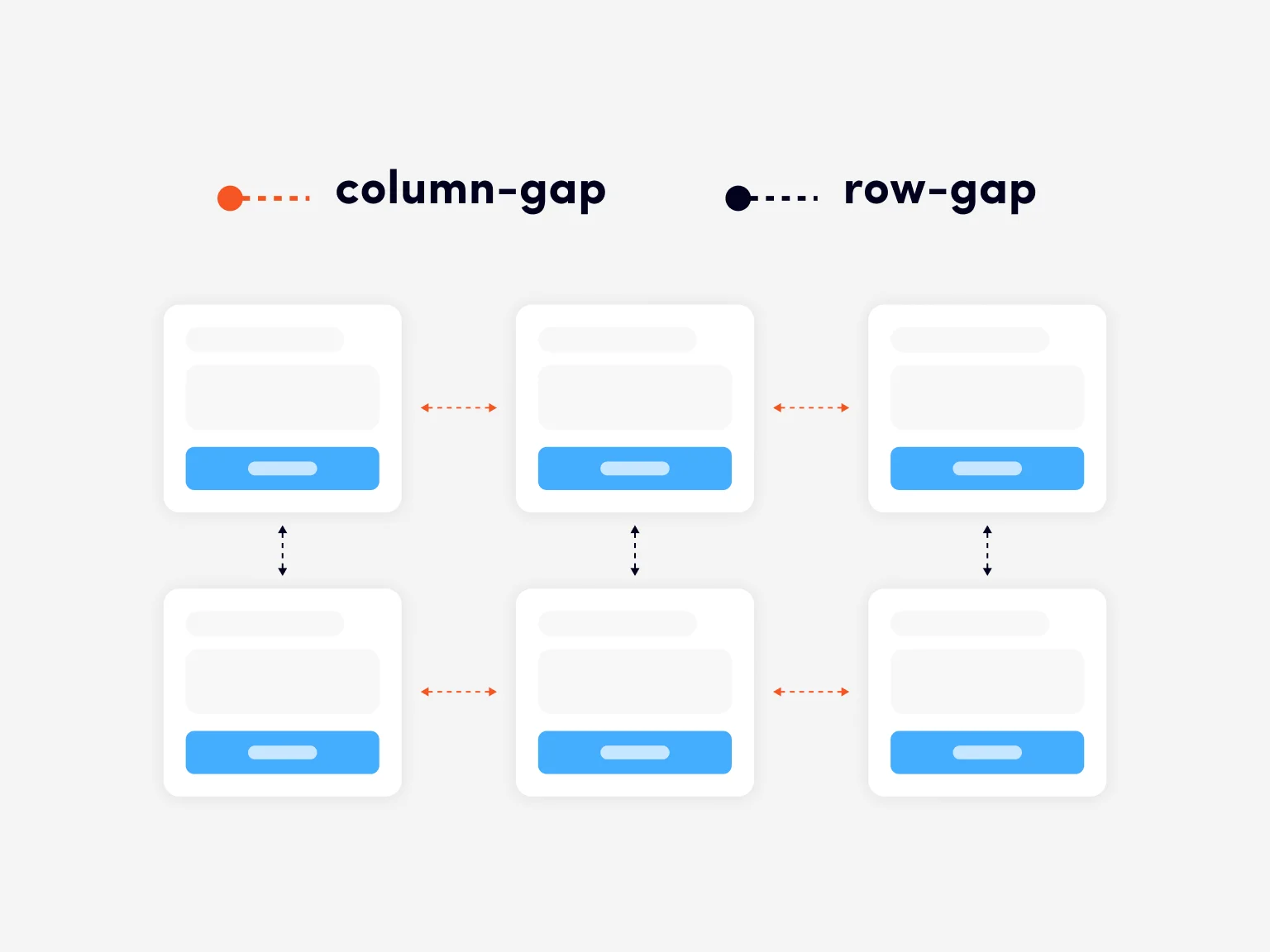
gap property for flexbox
The gap property in flexbox is used to set the distance between flexbox items.
To specify the same distance between rows and columns, we use the gap property with one value. If the distance between rows and columns is different, we use gap with two values, first specifying the distance between rows and then between columns. To make the code clearer and more transparent, you can use two properties: row-gap and column-gap.
Code example
We specify the gap property to the flex container. By using the row-gap and column-gap properties, we can set the distance between the rows and columns of the flex elements:
The same code fragment can be made shorter:
Previous approaches
Before the property gap, the margin property was used to set distance between flex elements. The downside of this approach was that the margin property also added an indent between the element and the edge of the container.
To solve this problem, one could use various methods:
- The :last-child pseudo-class, allowing to specify that the last element is not indented;
- Setting a negative value for the margin property;
- The three-character CSS selector, which is often called the “lobotomized owl selector”. It looks like this: * + *, resembling the blank stare of an owl, hence the name. This selector allows you to specify properties for an element only if it comes after another element of the same type.
In addition to their complexity and non-obviousness, all of these methods had another disadvantage — they worked only when flex elements were arranged in a single line and were not suitable for multi-line structures.
The gap property works for both single-line and multi-line arrays of flex elements, allowing you to specify the indentation between elements without resorting to such hacks and tricks, instead just relying on the basic features of the language.
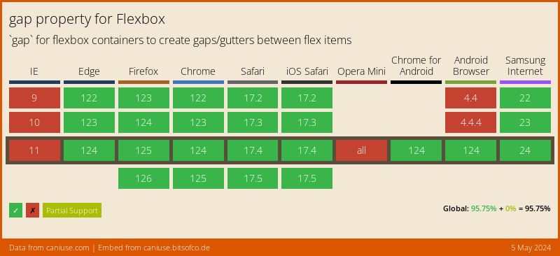
Browser support: 95.42%
The gap property in flexbox was introduced quite recently in 2021 as a result of migration from a grid, but due to its simplicity and ease of use, it quickly became popular.
Specification: W3C Editor’s Draft
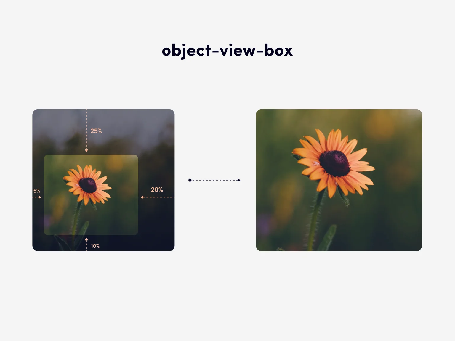
object-view-box
The object-view-box property allows displaying only the specified portion of an image or video on a web page. It is somewhat similar in effect to the viewBox svg attribute.
The object-view-box property will be useful when you want to display only certain portions of an image or video for different elements or at different resolutions. It can also be used to zoom or pan images and videos.
Code example
Let’s assume we need to cut a square from an image, a 25% margin from the top edge, 20% from the right edge, 15% from the bottom edge, and 5% from the left edge. Code allowing us to do that would look that:
The inset(25% 20% 20% 15% 5%) values indicate the top, right, bottom and left positions of the frame within the original image to be displayed. And the object-fit property with the cover value ensures that the resulting fragment will not be distorted.
Currently, we cannot animate the object-view-box property through the transition property, but it can be animated using @keyframes to obtain a smooth change in scale or viewport.
Previous approaches
Without the object-view-box property to solve the problem of cropping images or videos, we had to use a wrapper element with the overflow: hidden; property, positioning and scaling the content inside it. For images, you can also use the background-image property instead of the img tag, applying the background-position and background-size properties for positioning and scaling. Another common, though perhaps suboptimal, solution, is to use different files for different fragments of the same image.
Browser support:
The object-view-box property is totally new, being introduced in May 2022. Despite that, it is already supported by the latest versions of Google Chrome and Opera.
Specification: W3C Editor’s Draft
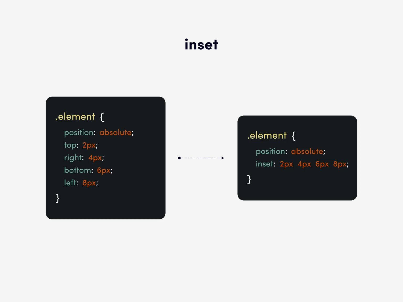
inset
The inset property replaces the four other properties: top, right, bottom, and left, allowing you to specify the inset of the positioned element on all four sides at once.
The inset property is like a shorthand for the margin and padding properties. It allows you to specify the inset of the positioned element from the top, right, bottom, and left.
Code example
This is code for a perfectly positioned pop-up modal window that takes up the entire area of the browser:
This short entry solves a common problem of stretching a completely positioned element to the full width and height of the page.
Previous approaches
Before the inset property, we would solve the problem of stretching a positioned element over the whole area of the view window like this:
It goes without saying, that using one property instead of four is convenient and compact.
Browser support: 92.12%
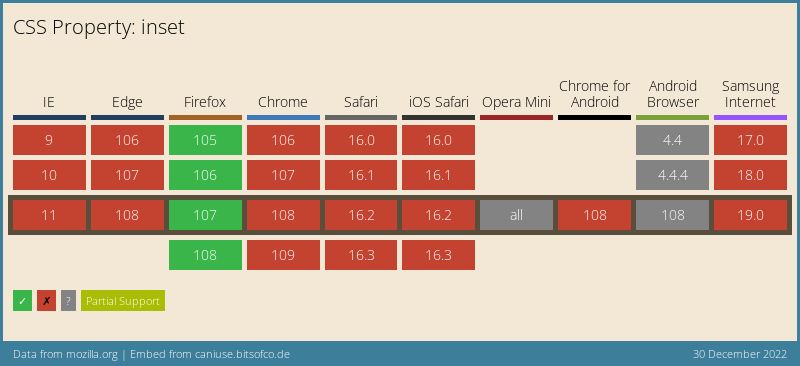
Specification: W3C Editor’s Draft
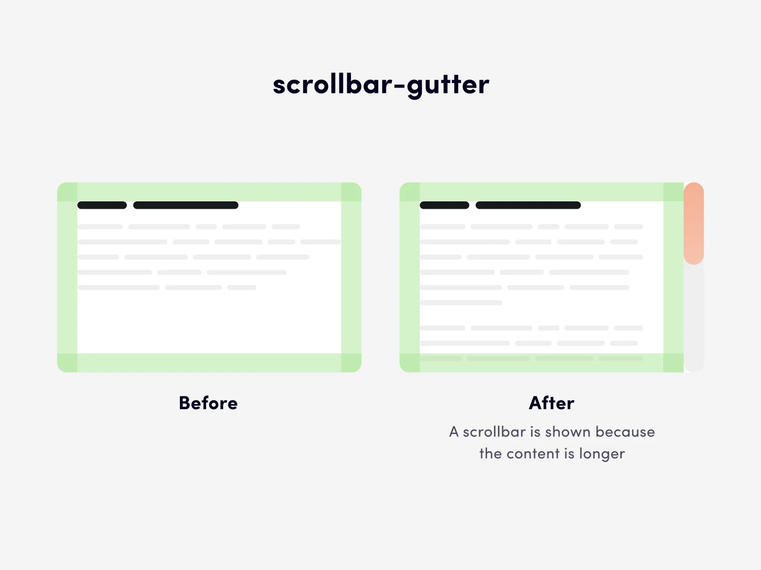
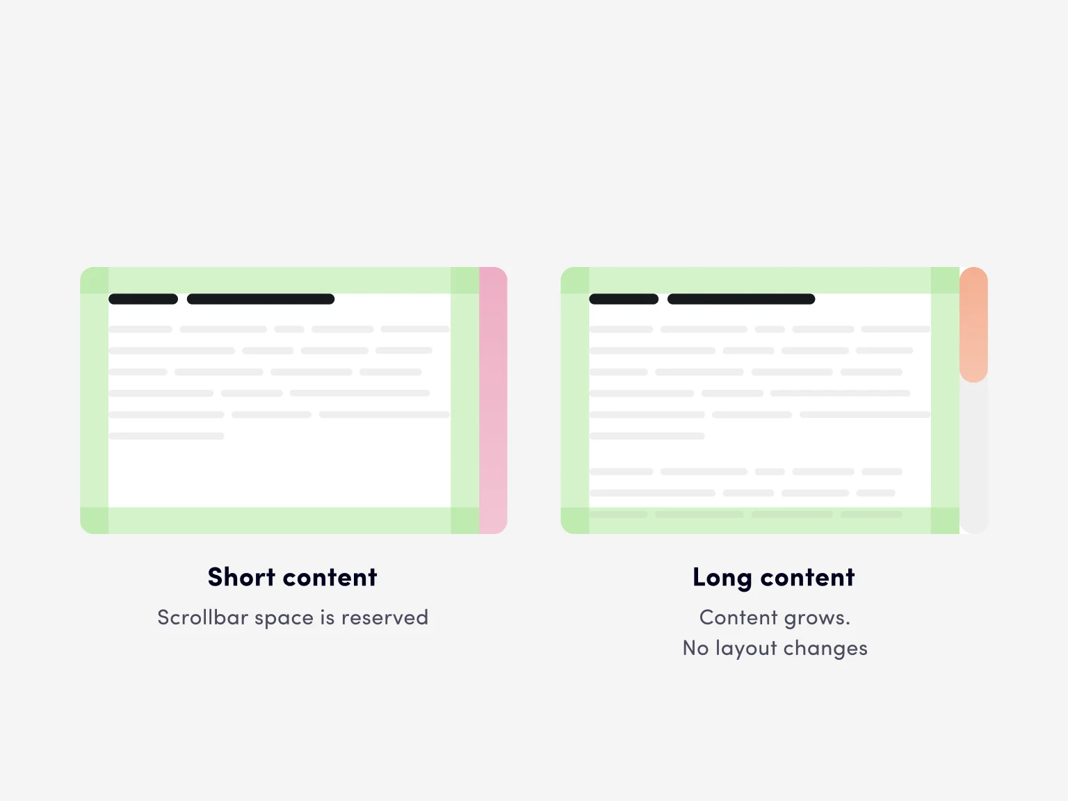
scrollbar-gutter
The scrollbar-gutter property allows for reserving scrollbar space. When we use this property, the content is not rearranged depending on whether there is a scroll bar or not.
The scrollbar-gutter property is useful for developers of single-page applications filled with dynamic content. Previously, if a scroll bar appeared in such an application, all the content would shift to the left along the scrollbar width.
Code example
This code reserves space for the scrollbar space and ensures that the content is not displaced when it appears.
Previous approaches
Before the introduction of the scrollbar-gutter property, to prevent content from being shifted when the scrollbar appeared, we had to resort to a hack with a negative margin and the overflow-x: hidden property for HTML:
Browser support: 74.6%
This property is supported by all the evergreen browsers.
Specification: W3C Editor’s Draft
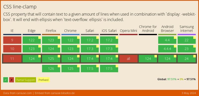
text-overflow and line-clamp
The text-overflow and line-clamp properties are used to truncate text if it does not fit inside the viewport. You can use the text-overflow property if you want to trim single-line text, and the line-clamp property is useful for truncating multi-line text.

Code examples
The text-overflow property with the ellipsis value truncates one line of text to the width of the container, leaving three dots at the end:
The text-overflow property works only for block containers if the element is also given white-space property with a nowrap value and overflow property with a hidden, scroll, or auto value.
The available values for the text-overflow property are clip (when the text is cropped exactly at the edge of the parent block) and ellipsis (when an ellipsis is added at the end of a line).
The line-clamp property is used with the -webkit prefix. A value of 2 means that only two lines of text remain visible.
The line-clamp property works only for a block container, in combination with the display and the -webkit-box-orient property. You will also need the overflow property with the hidden value to truncate the content after a specified number of lines.
Previous approaches
Truncating text to a specified number of characters can easily be done with JavaScript:
Here, count means the number of characters up to which the text should be cut. This method is simple enough, but it has one disadvantage. Unlike CSS, JavaScript knows nothing about lines of text. It can truncate it by leaving a specified number of characters, but the text containing the same number of characters can take up a different number of lines. As a result, truncating text with JavaScript will be less reliable compared to CSS.
Browser support: 96,24%
The property is used with the following prefix: -webkit-line-clamp
Specification: W3C Editor’s Draft
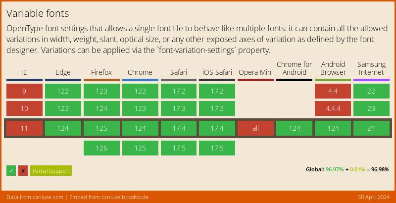
variable fonts
Variable fonts have a particular feature where one font file is used for any style. When it comes to a regular font, if your layout uses two styles, such as regular and bold, you need to upload two font files. For a variable font, only one file containing all the typeface variants needs to be loaded.
Variable fonts can be used just like regular ones, but in reality, they can offer much more. For regular fonts, the font-weight property takes values from 100 to 900 in increments of 100, while for variable fonts, it can be any integer between 1 and 999. For normal fonts, the font-style property takes two normal and italic values, whereas for variable fonts, you can specify the oblique angle from –90deg to 90deg. The font-stretch property of variable fonts varies from 50% (narrow typeface) to 200% (wide typeface), where the normal proportion corresponds to 100%. And then there’s the font-optical-sizing property, which changes the appearance of a font depending on its size.

Code example
Code for loading a variable font:
Inter is one such variable font, and it is enough to load one font file for all typefaces.
Previous approaches
Code for loading a static font:
Roboto is a static font, and for each typeface, we have to load a separate font file.
Browser support: 95,95%
The variable fonts were first introduced at the end of 2016 and can boast excellent browser support.
Specification: W3C Editor’s Draft
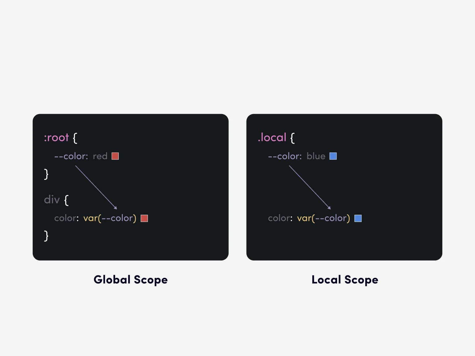
CSS custom properties (variables)
CSS variables are CSS properties with specified values that are declared by the code author so that they can be reused in a document. They also help avoid code duplication. You can define a variable only once and then reuse it in code as necessary. If you want to make a change, you only have to modify the value of a variable in one place.
CSS variables can be managed from JavaScript.
Getting a value of the CSS variable:
Setting a value of the CSS variable:
They make adding transitions between dark and light themes to apps very easy and convenient.
Code example
Declaring a variable:
How to get a CSS variable value:
Previous approaches
Variables first appeared in CSS frameworks. Their addition to regular CSS was a significant improvement, making it possible to optimize code, increase its readability, and provide greater flexibility.
Browser support: 96,7%
CSS variables were proposed in 2017. Currently, they are in the W3C’s candidate recommendation (CR) stage, i.e., they are the closest to actual implementation among the other features described in this article. Supported by all the popular browsers.
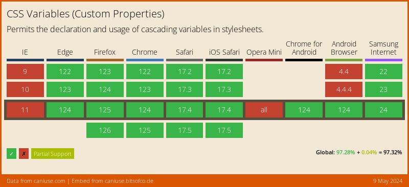
Specification: W3C Candidate Recommendation
min(), max(), clamp() CSS functions
The min(), max(), and clamp() CSS functions make up a group of comparison functions. They take several values and return one of them. The min() function returns the minimum of the values, while the max() function returns, you guessed it, the maximum one. The clamp() function takes three values: minimum, recommended, and maximum, and returns the recommended value if it is within the specified limits.
These comparison functions can expand our ability to create dynamic layouts and design flexible components. You can use them to adjust element sizes, fonts, indents, and more. Even though we could already specify minimum and maximum values for an element’s width and height, it’s the comparison functions that made it possible to do the same for font size and indentation.
Code examples and previous approaches
There’s a common task — to create a container element that stretches across the entire width of the parent, limiting its maximum size. The traditional solution looks as follows:
And here’s a one-line solution with the help of the min() function:
Here’s another real challenge — to create a 100vh high section while specifying its minimum height:
And here’s a one-line solution with the max() function:
Note that for min() and max() functions, the order of the arguments does not matter. In any case, the former returns a smaller value, and the latter returns a larger one. The same cannot be said for the clamp() function, where values must go from lesser to greater:
We have a design element that takes up half the width of the parent element, but its width cannot be less than 350 px or more than 650 px.
Before the clamp() function, we would usually solve this using media queries, having specified different element widths for different screen resolutions. With the clamp() function, the task has become much simpler, and the change in element size is continuous within a specified range of values.
Browser support: 94,44%
Support for comparison functions arrived in 2020, and they work in all the popular browsers.
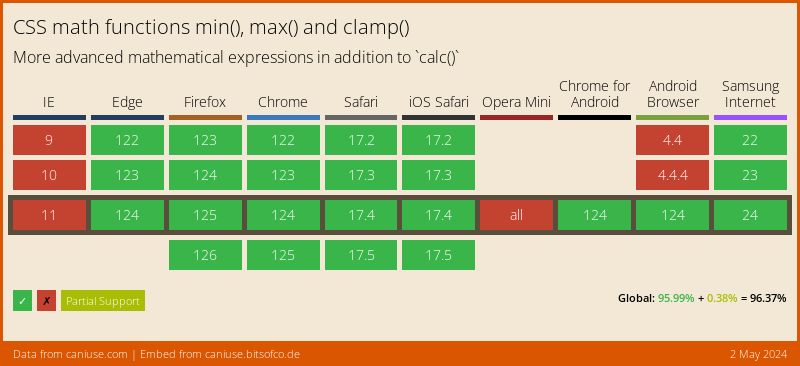
Specification: W3C Editor’s Draft
Conclusion
CSS is considered to be one of the simplest and yet one of the most complex languages at the same time. It’s simple enough in the beginning — you define the style properties and their values for specific elements, and that’s pretty much all you need to know!
However, CSS is constantly being updated; the approaches are changing, and new features and functionalities are introduced to find new solutions for old problems. This requires developers to be constantly aware of current changes and to improve and evolve.
I hope that the properties and capabilities described in this article were of interest to you and will be useful in your work.
FAQ
Why invest in branding services services services?