


Crafting visual order for a system built on power and accuracy


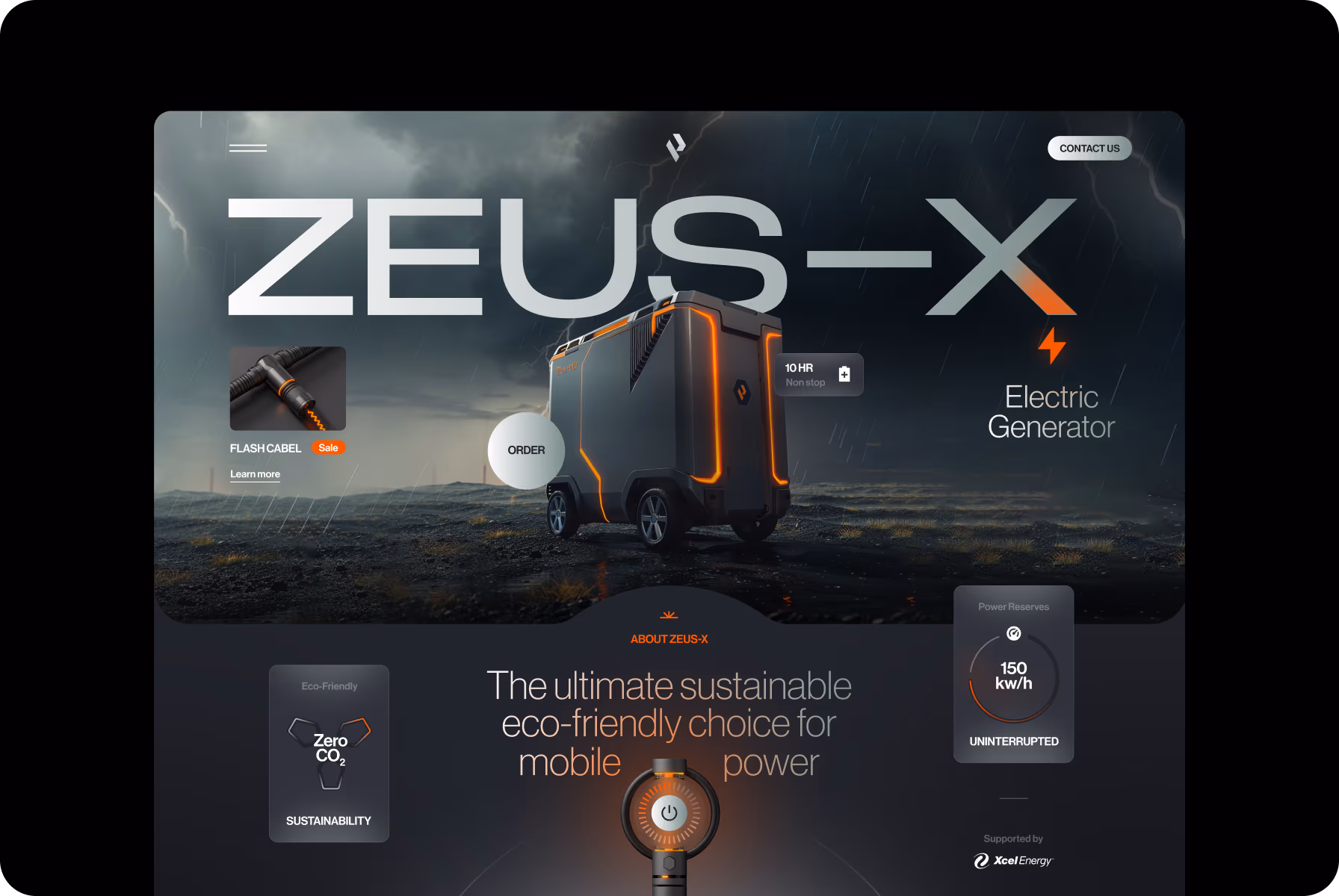
Pioneering high-performance sustainable power solutions for a cleaner, energy-efficient future
Phoenix Energy Solutions develops advanced mobile generators and smart power systems that merge innovation with sustainability. Their technology ensures reliable, efficient power for businesses, events, and remote operations.
The company responds to global demand for cleaner energy alternatives by reducing fuel waste and emissions. Its hybrid systems deliver consistent output in diverse environments, shaping a new standard for mobile power worldwide.

Precision and balance in every line
The logo is built on a geometric grid, where each line and point defines the proportions of a stylized “P.” We wanted to convey engineering accuracy and reflect the client’s approach to designing advanced power systems.
Every element was refined for clarity and balance, resulting in a mark that remains sharp at any scale. The gradient finish was introduced to bring warmth, helping the mark feel more tactile without losing its simplicity.
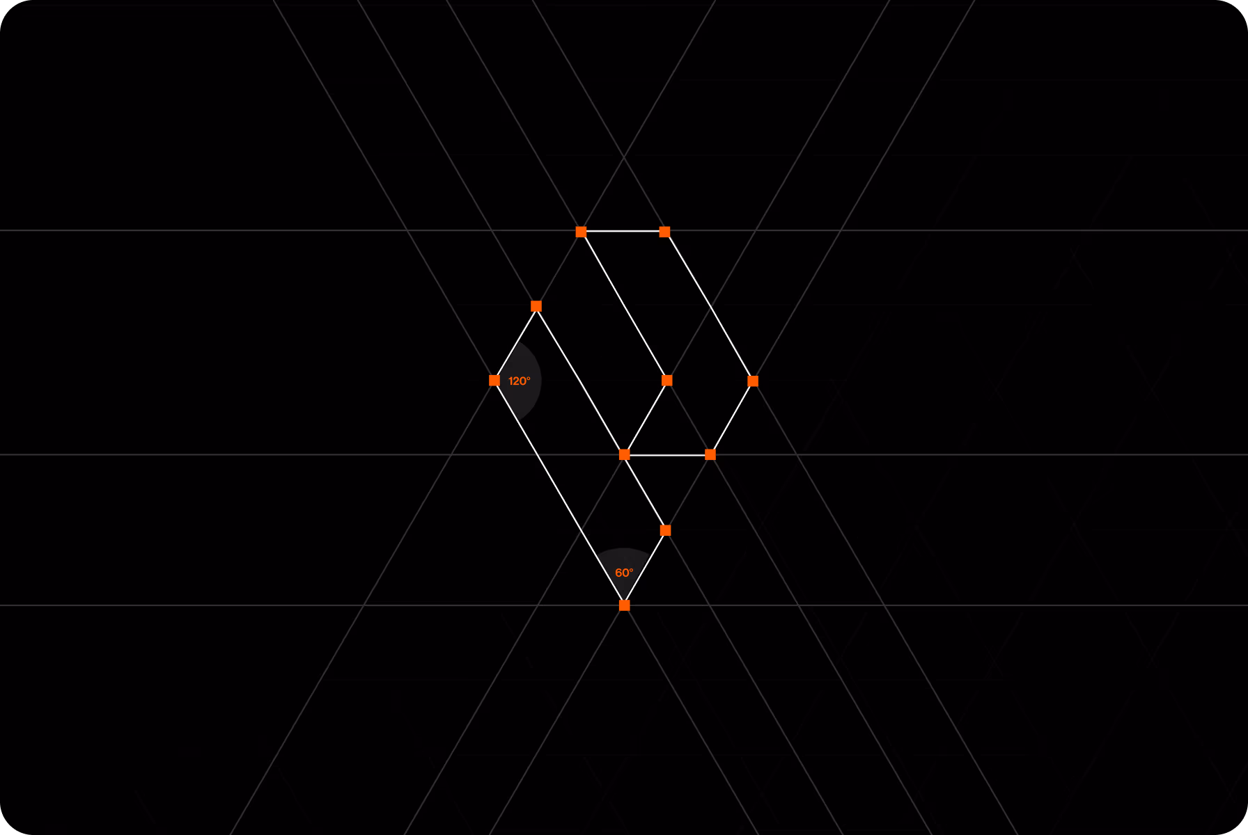

We designed the logo to represent the formation of power, showing how individual elements align to build force.
{{mais-t}}

Design language shaped by energy and control
We developed a design system that relies on clarity and tension. Neue Haas Grotesk handles the core interface elements, ensuring functional readability, while Monument Extended brings weight to headings and technical highlights.
For color, we grounded the palette in charcoal and gray tones, using vibrant orange gradients to convey motion and electrical energy. The combination adds structure and impact, keeping the interface expressive yet controlled.

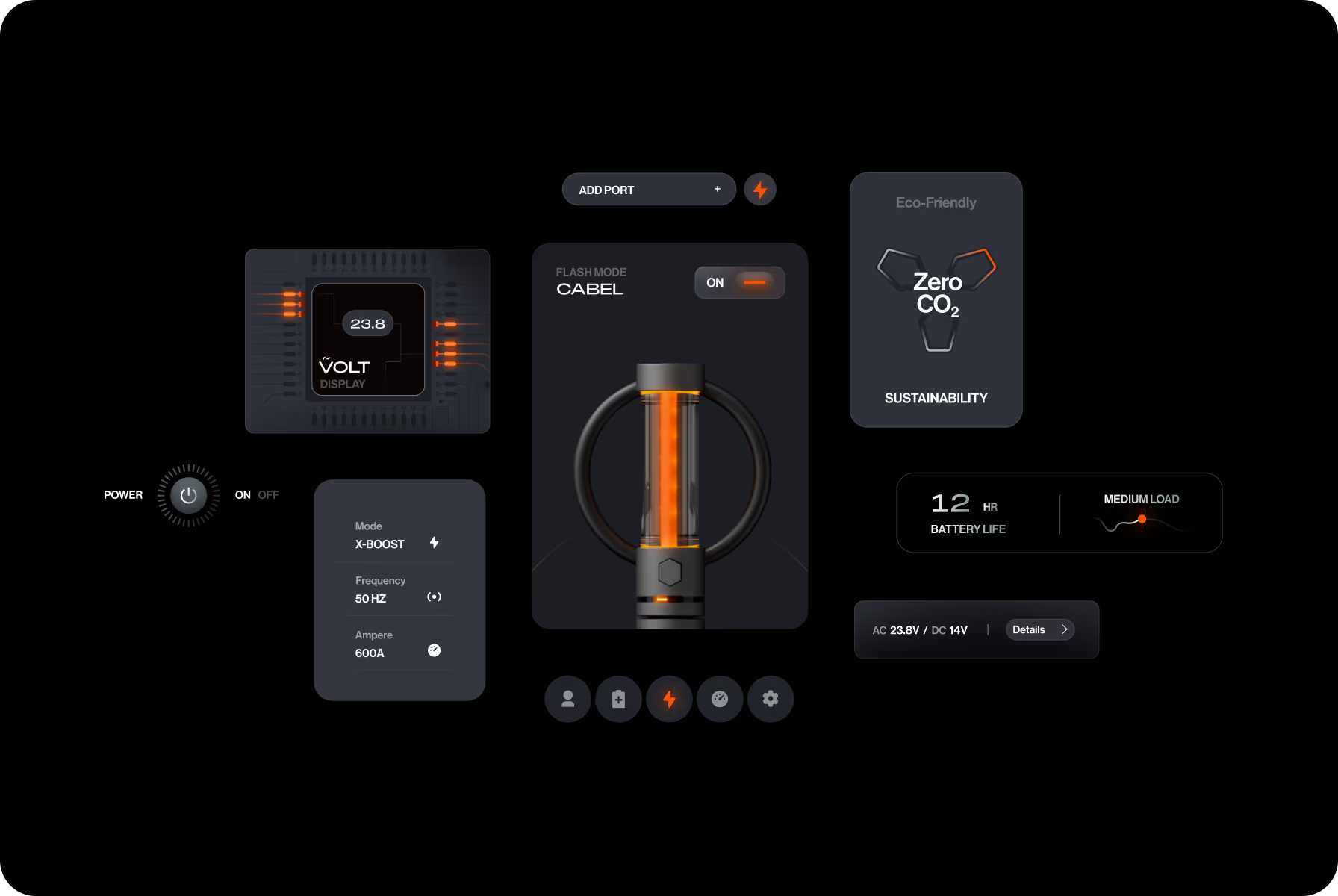


The gradients were utilized to resemble waves of energy. Each transition in tone suggests that power was actually flowing through the design.
{{mais-t}}
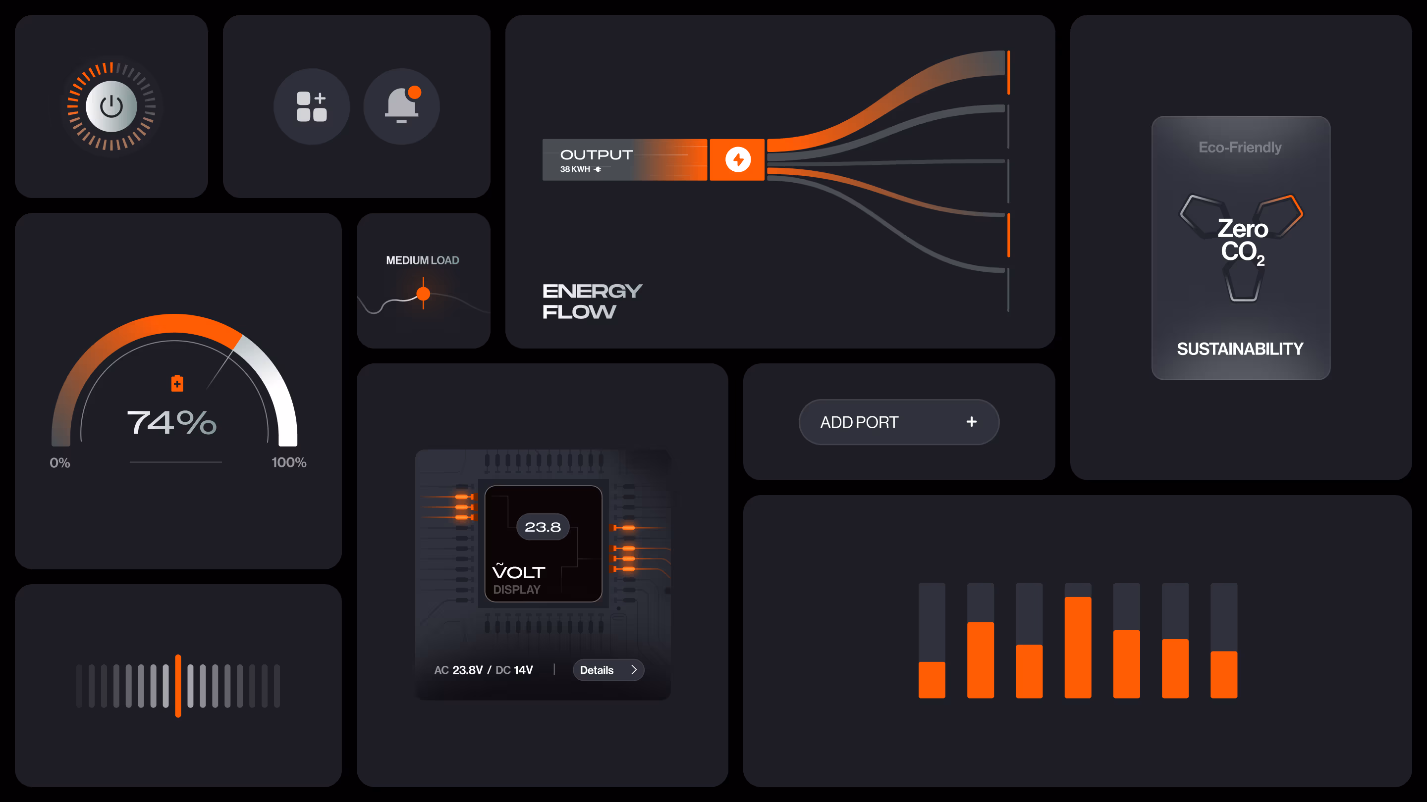
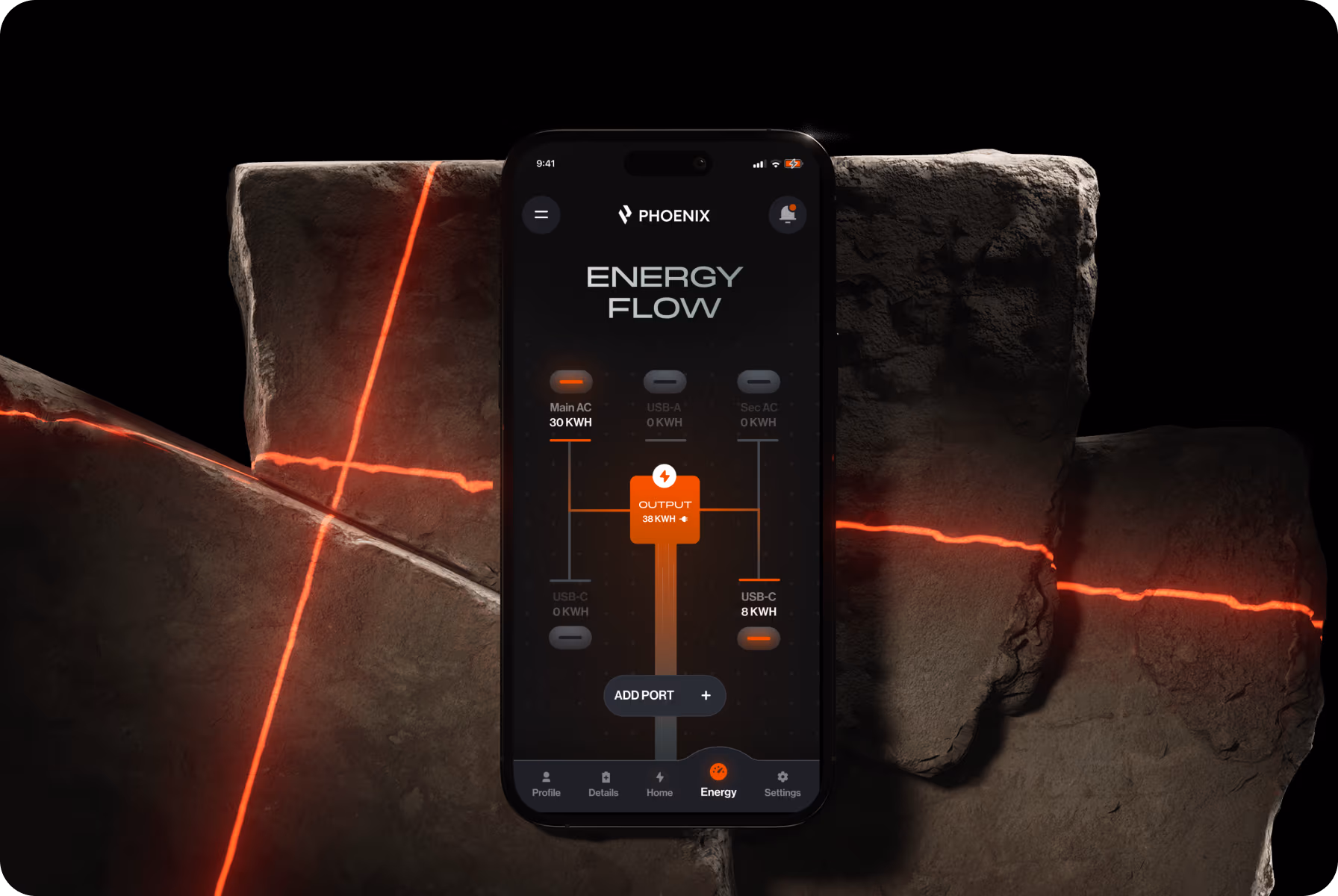
Interface logic defined by measurable order
Inspired by the pulse of electricity, we set out to design an interface that reflects its energy without noise. The structure is based on a grid system, allowing information to stay scanable and consistent across all screens.
Our team transformed raw parameters into a clear visual rhythm. Dynamic contrasts, restrained color, and responsive transitions echo real structures in action, transforming processes into an intuitive experience.


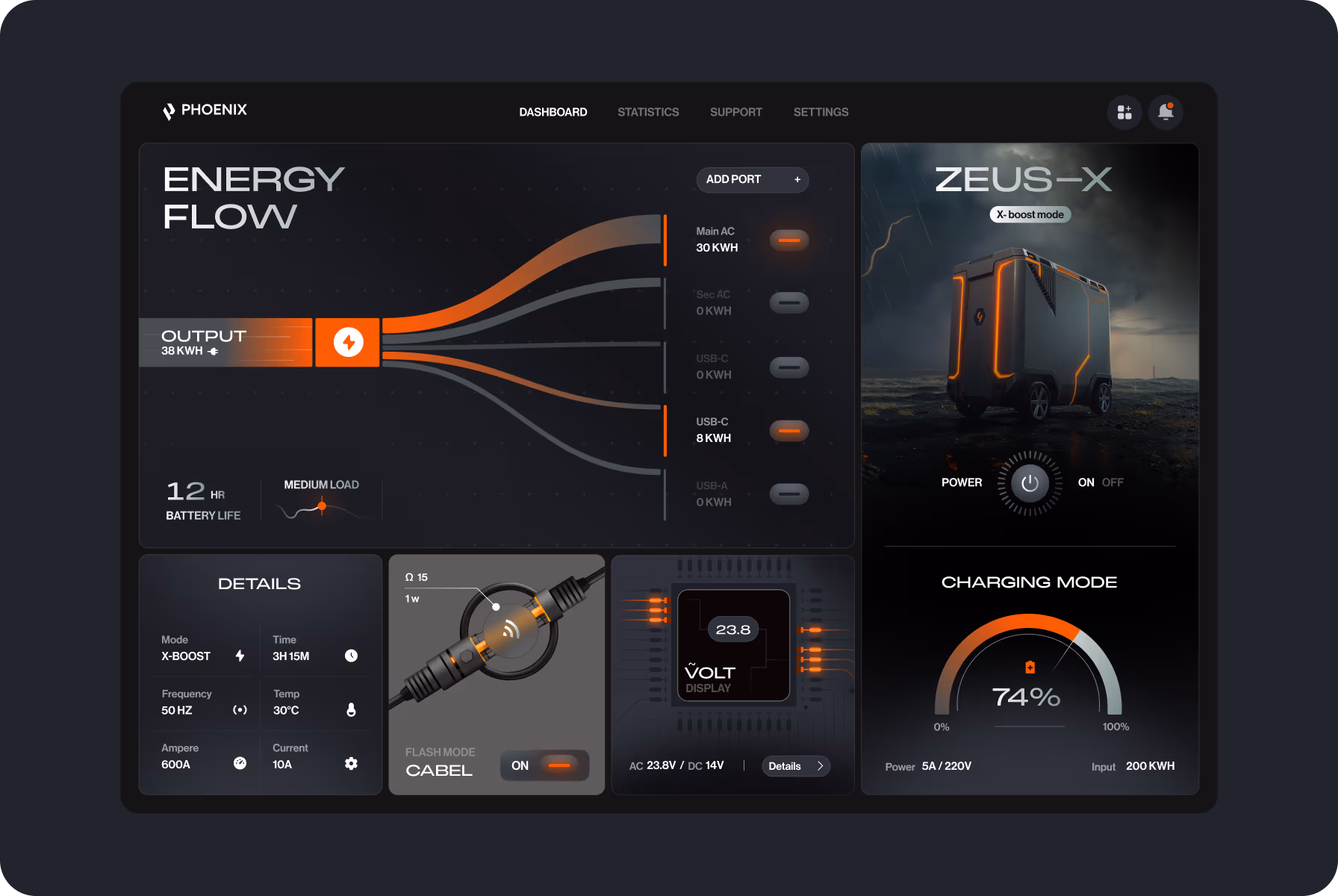

Keeping the parameters readable under constant updates was the hardest part — the layout had to stay calm no matter the data load.
{{mais-t}}


Based on 80+ reviews

with 100% Job Success

AgencY IN UAE

WORLDWIDE
