


PawHome: crafting a visual identity that drives trusted pet adoption

Modern hub for thoughtful pet adoption — where premium service meets empathy, trust, and clear user journeys
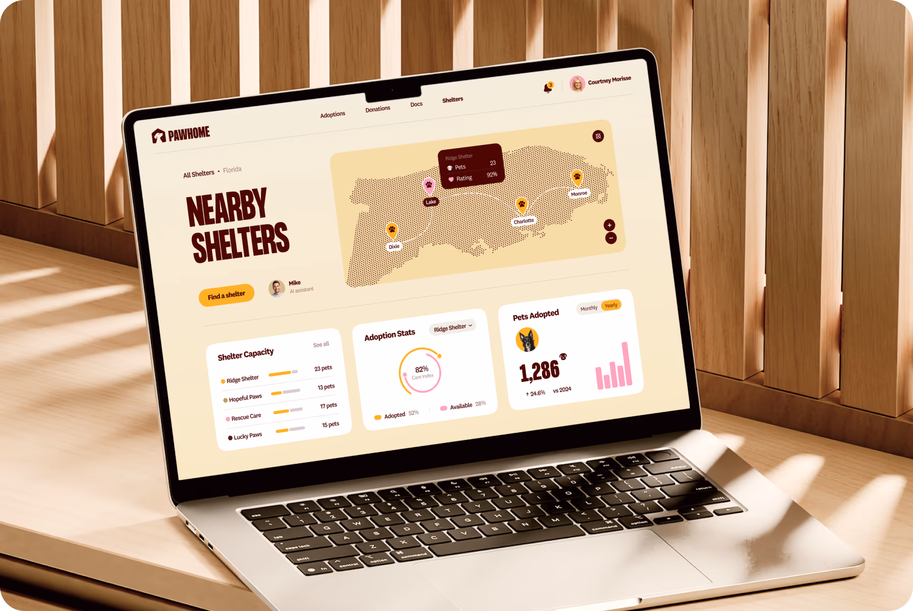
PawHome is a digital platform for responsible pet care and adoption. It leads families through daily needs — health, nutrition, play — while creating a place where animals can be seen, supported, and connected with new homes.
Many face scattered advice and hidden adoption options. PawHome unites resources, stories, and care guidance, helping users make confident decisions and giving every animal a visible path toward a loving family.
Modern hub for thoughtful pet adoption — where premium service meets empathy, trust, and clear user journeys
PawHome is a digital platform for responsible pet care and adoption. It leads families through daily needs — health, nutrition, play — while creating a place where animals can be seen, supported, and connected with new homes.
Many face scattered advice and hidden adoption options. PawHome unites resources, stories, and care guidance, helping users make confident decisions and giving every animal a visible path toward a loving family.

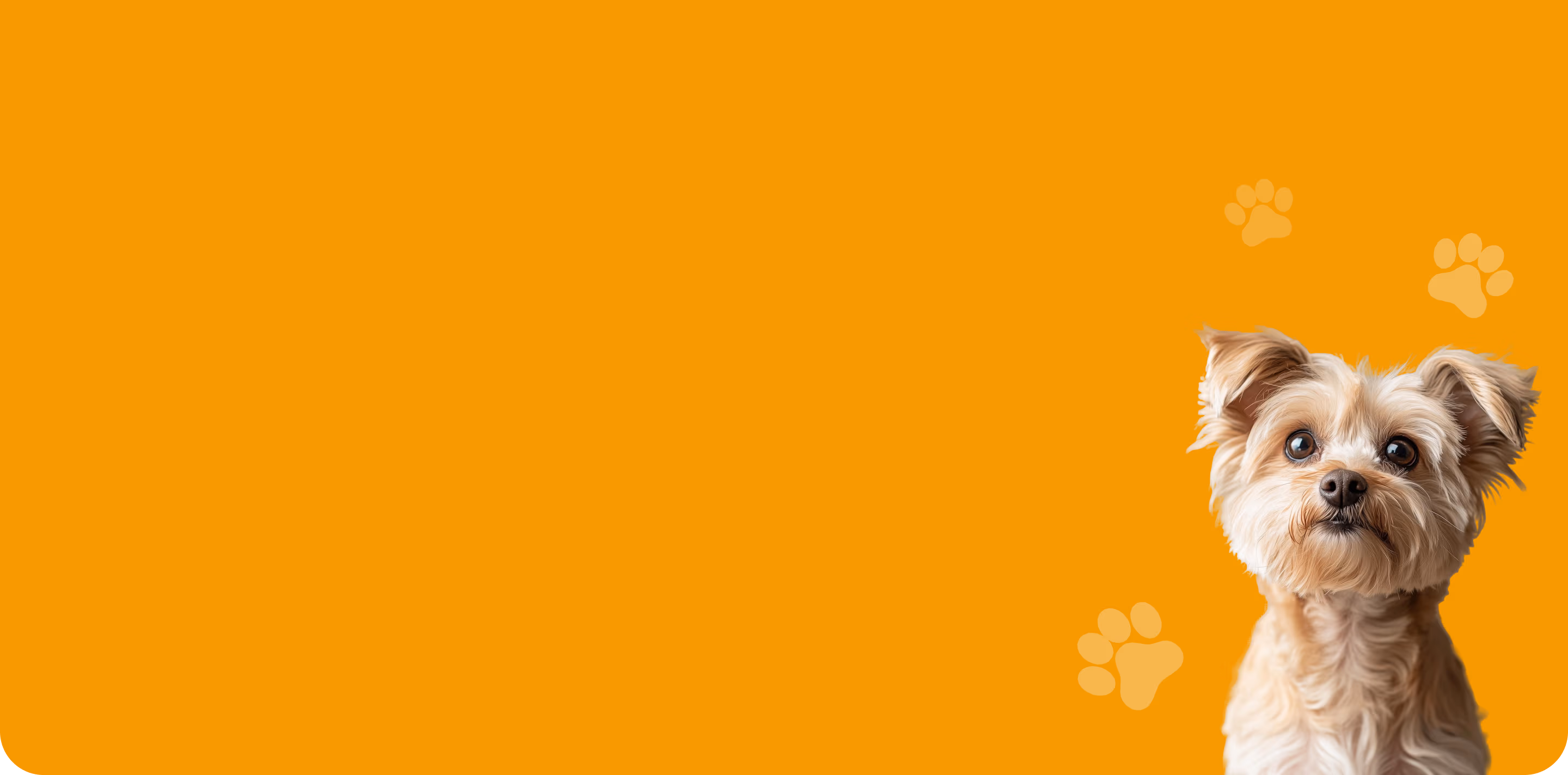
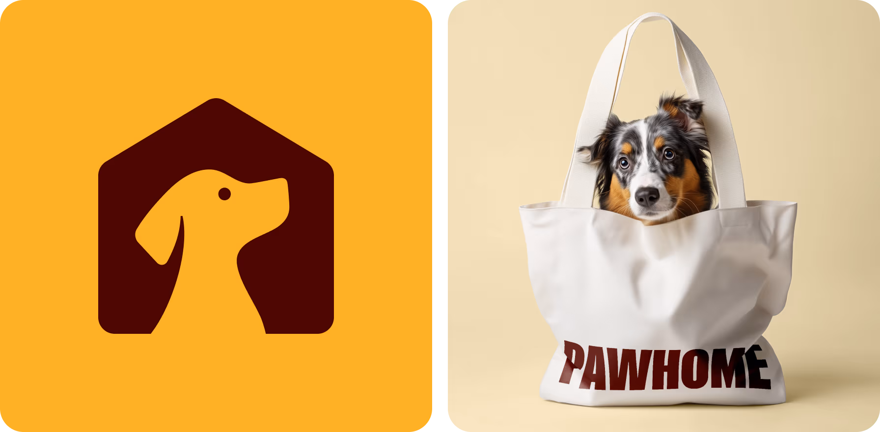
A warm, welcoming logo for pet lovers
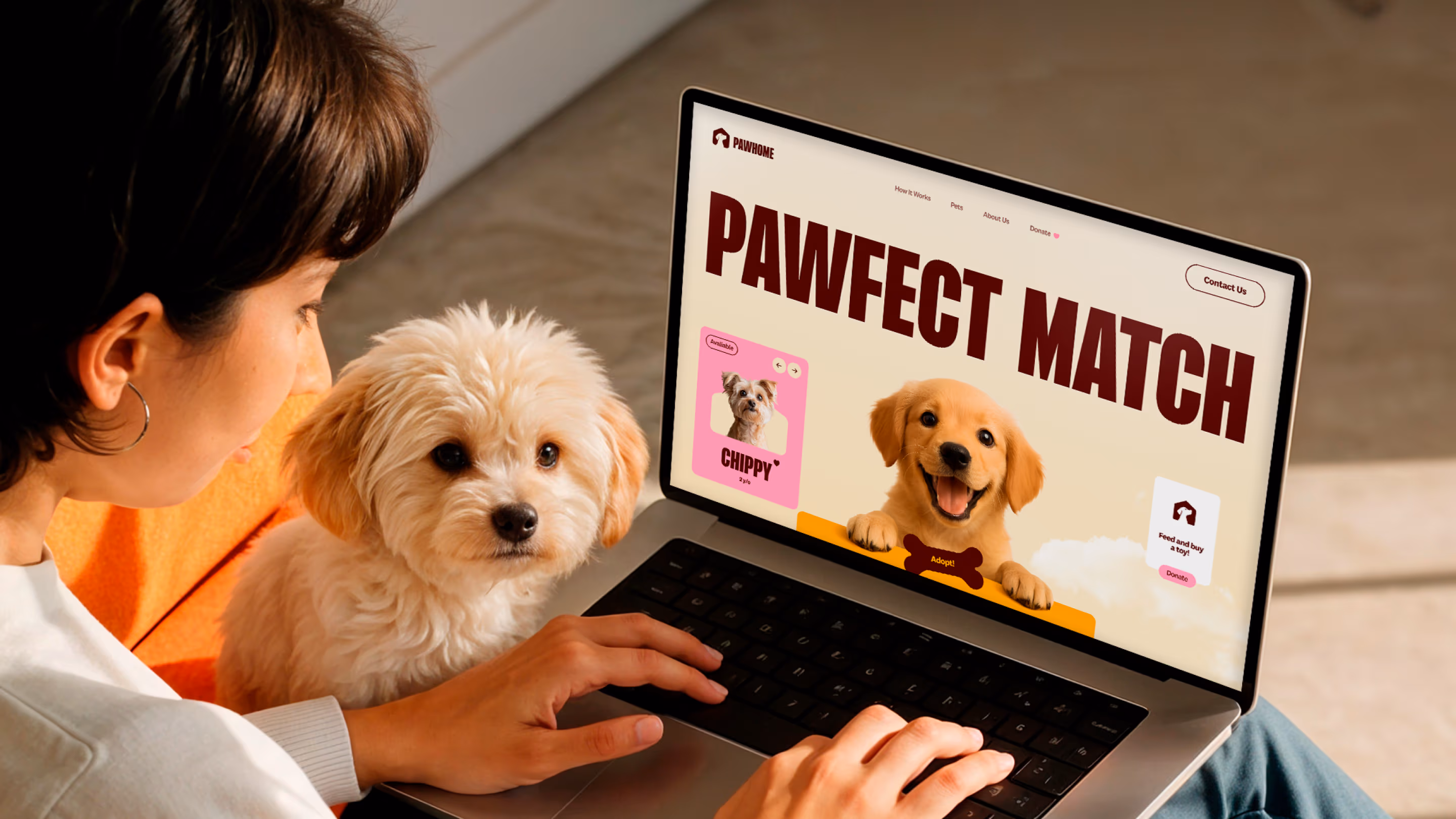
Our team designed a logo that links a playful dog silhouette with the outline of a home, symbolizing safety and belonging. This mark reflects the main platform’s task while making the brand instantly approachable and trustworthy.
We enhanced the concept with a warm palette of earthy brown and bright orange, combining energy with comfort. The result is a flexible logotype that works across digital and print, radiating friendliness in every context.

A logo in this space must inspire confidence. So, our goal was to convey warmth and loyalty above all else.
{{mais-t}}
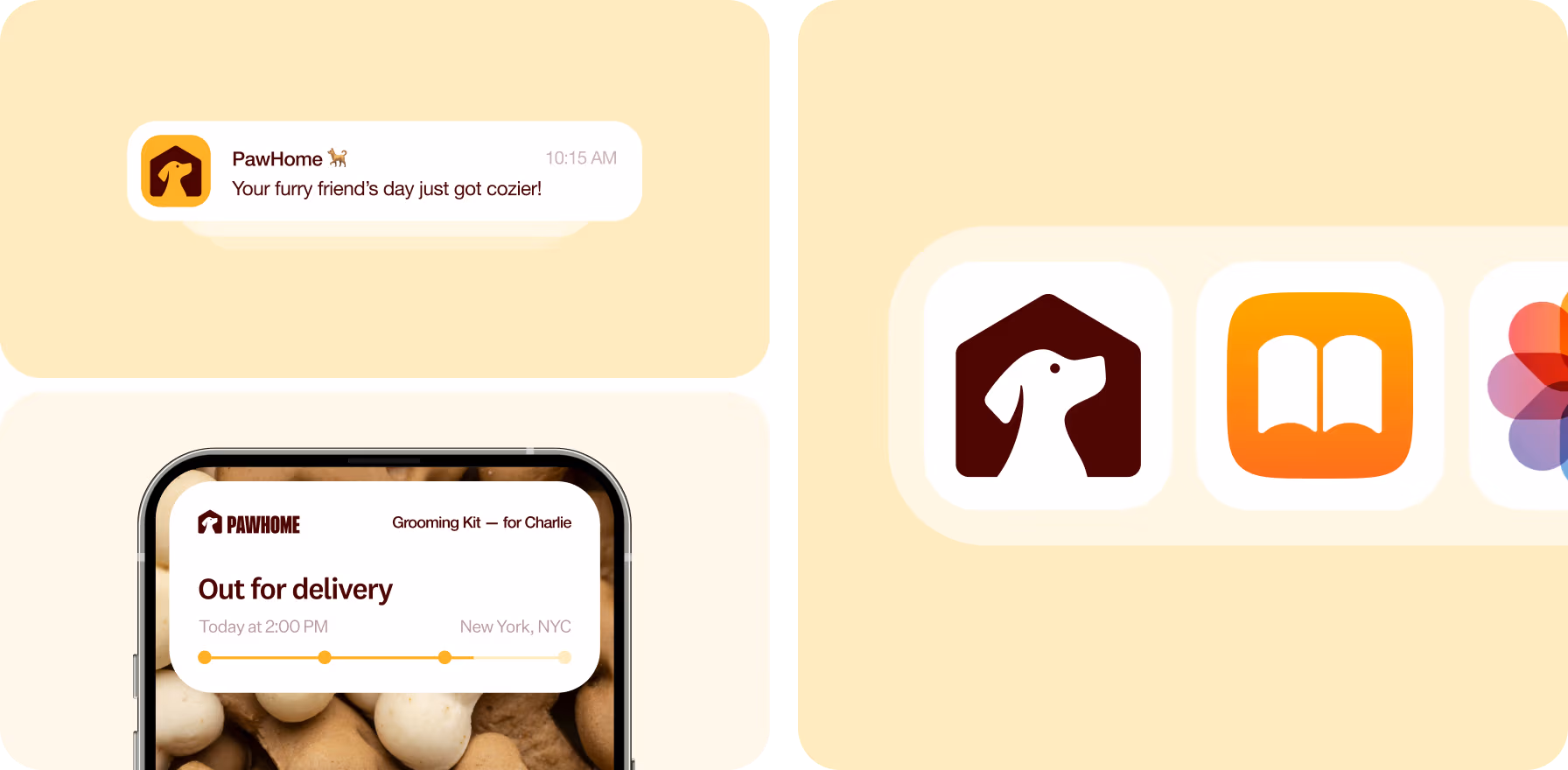
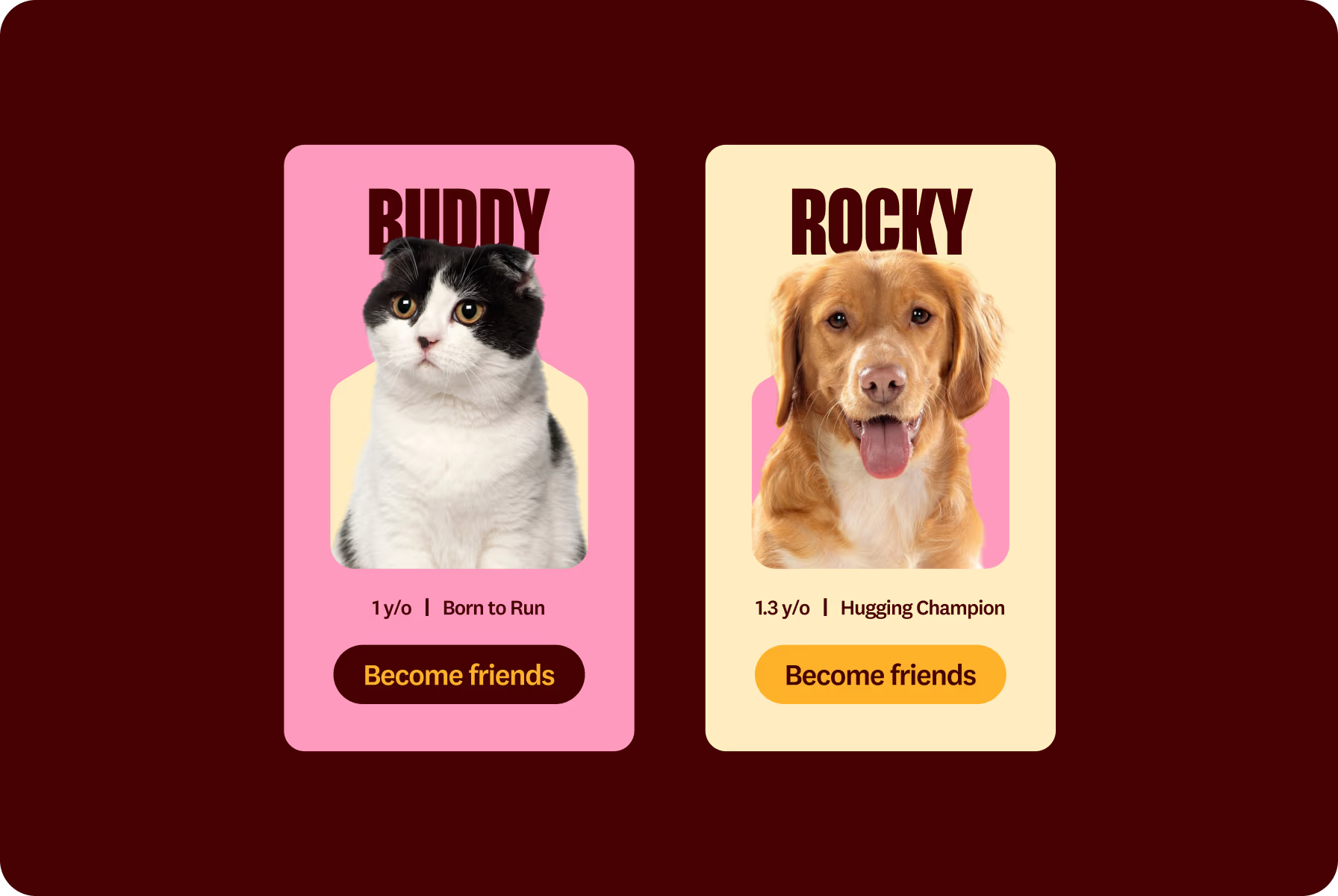
Where design supports joyful routines
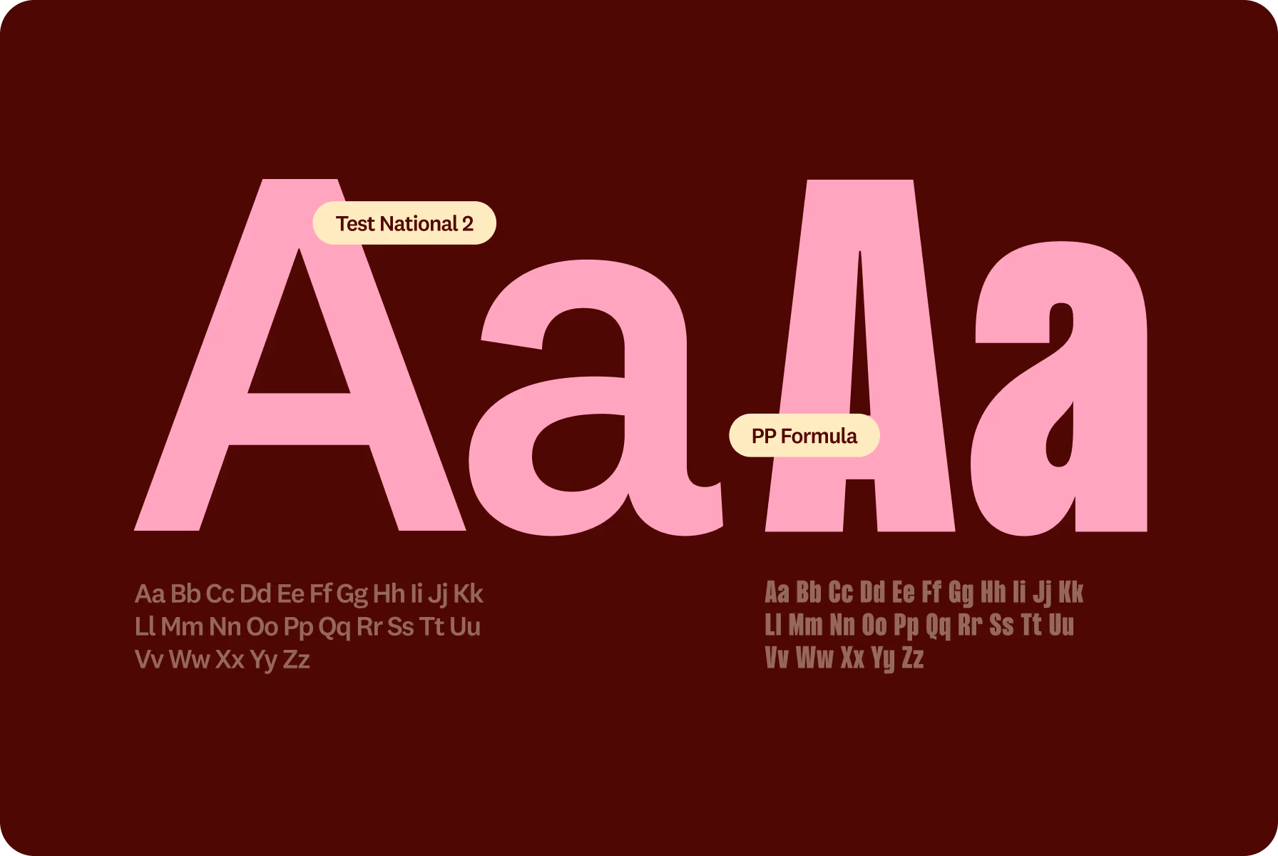
We crafted a color palette that blends warmth with playfulness — from soft tones like Cream and Vanilla to vibrant Sunray, Maroon, and Rose. Together, they evoke comfort, optimism, and the everyday joy of caring for pets.
To match this energy, we paired Test National 2 for headlines with the friendly clarity of PP Formula for body text. The result is a system that’s cheerful yet practical, helping users feel supported from tap to scroll.


If users feel calm and connected, the design is doing exactly what it was made to do. And that’s what we aimed for.
{{mais-t}}
A heartfelt identity built to spark connection
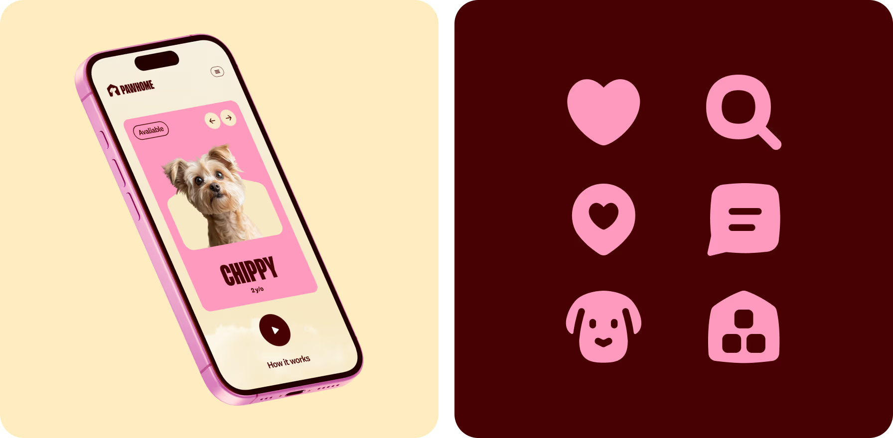
Inspired by the everyday joy of adoption, we focused on real emotional touchpoints — care, trust, and companionship. From billboard copy to in-app pet cards, every detail reflects the close bonds people form with animals.
Using bold color contrasts, rounded typography, and expressive pet photos, we gave PawHome a look that’s both joyful and purpose-driven. The system invites users to engage, explore, and feel good about every interaction.
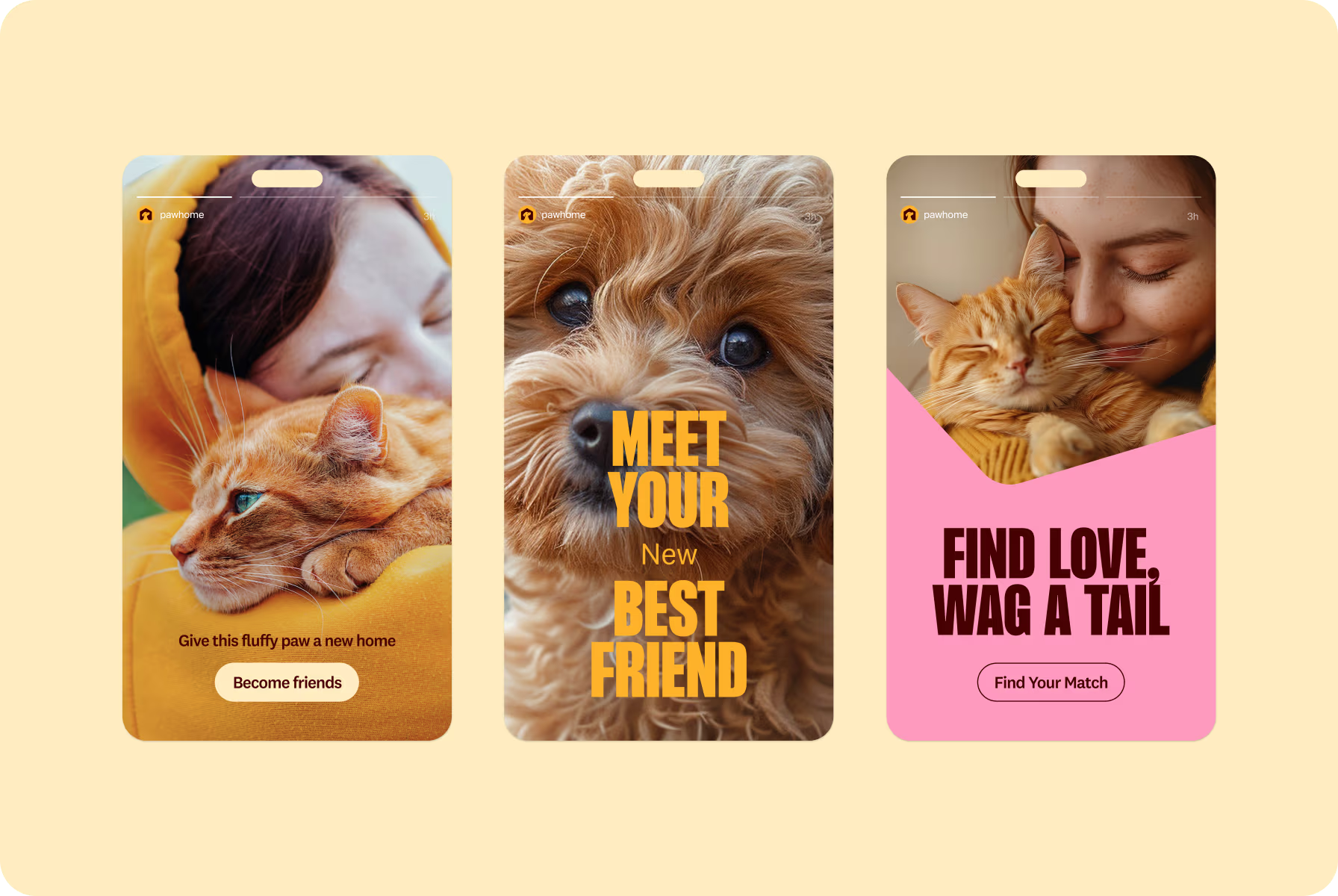
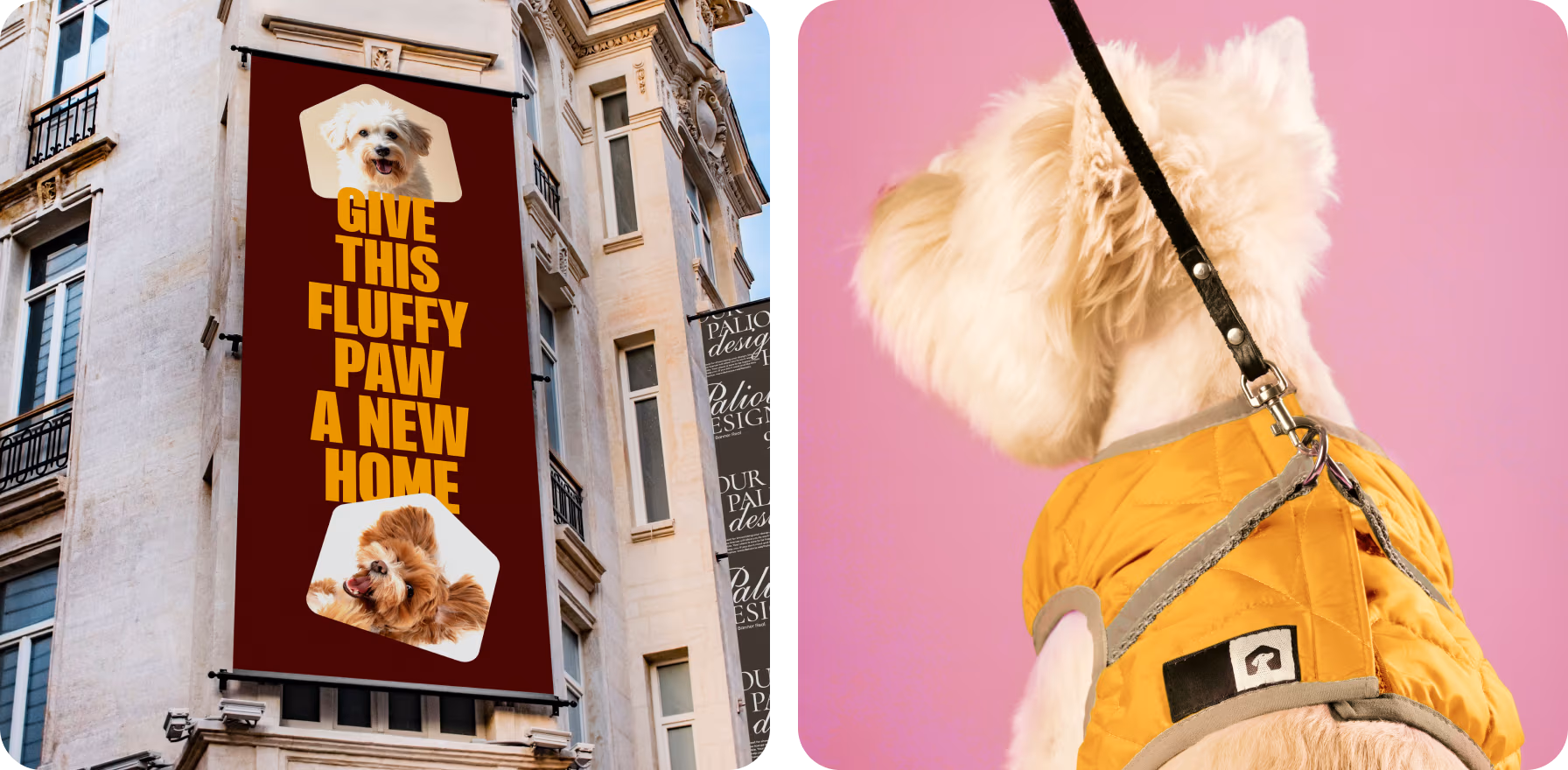
We wanted every element to feel like an invitation — to connect, adopt, and start something meaningful.
{{mais-t}}


Based on 80+ reviews

with 100% Job Success

AgencY IN UAE

WORLDWIDE
