


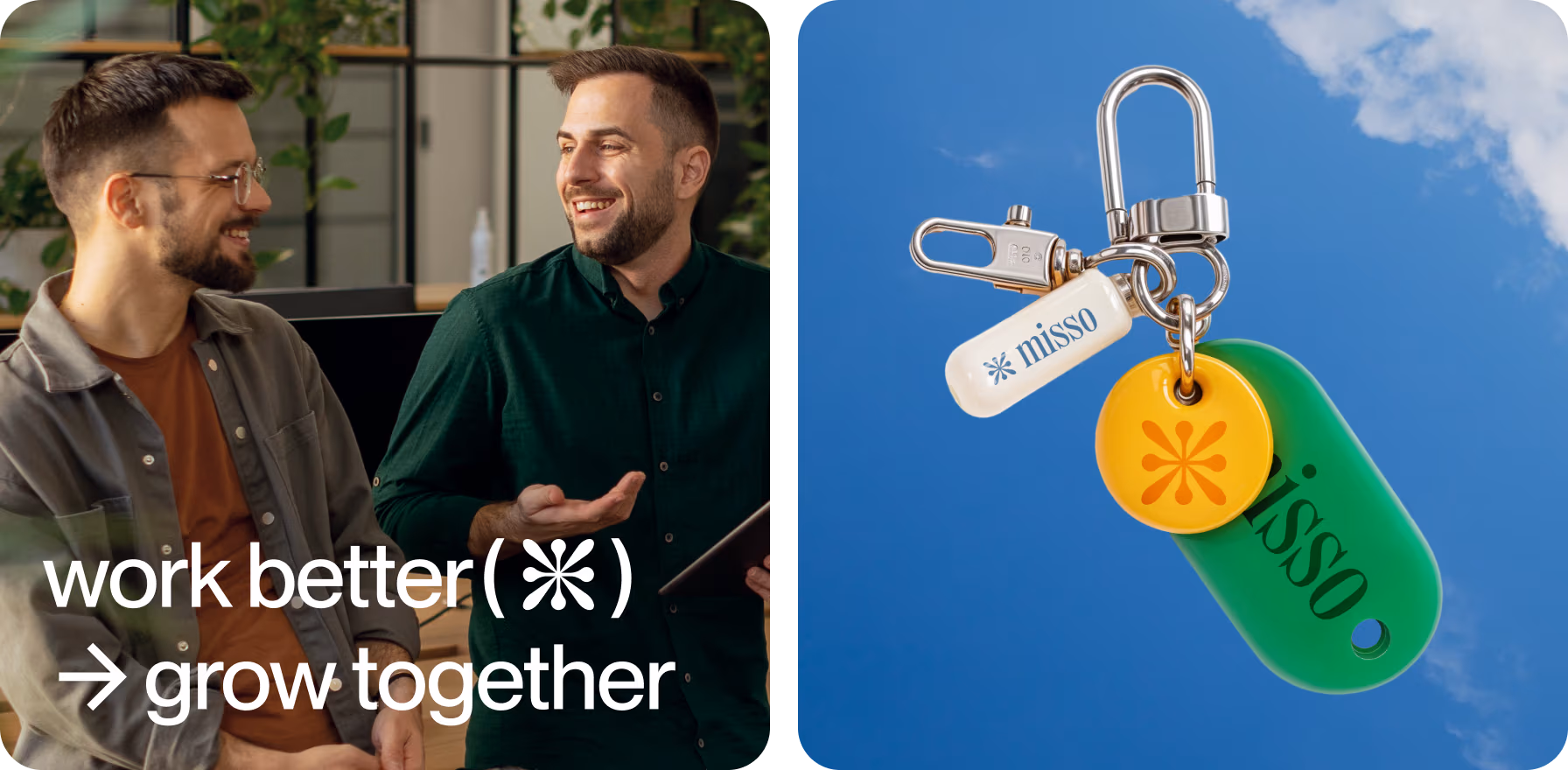
Shaping a design language that reflects how Misso helps teams grow


An advanced workspace built to help people organize, collaborate, and move toward their goals with confidence
Misso is a collaborative platform where teams and individuals can structure tasks, exchange ideas, and work towards shared goals. It builds motivation, creating a work environment shaped for clarity, direction, and steady progress.
Modern work often suffers from scattered tools, unclear priorities, and constant overload. Misso responds with one unified space for planning, communication, and tracking, helping people focus on what matters and achieve results.

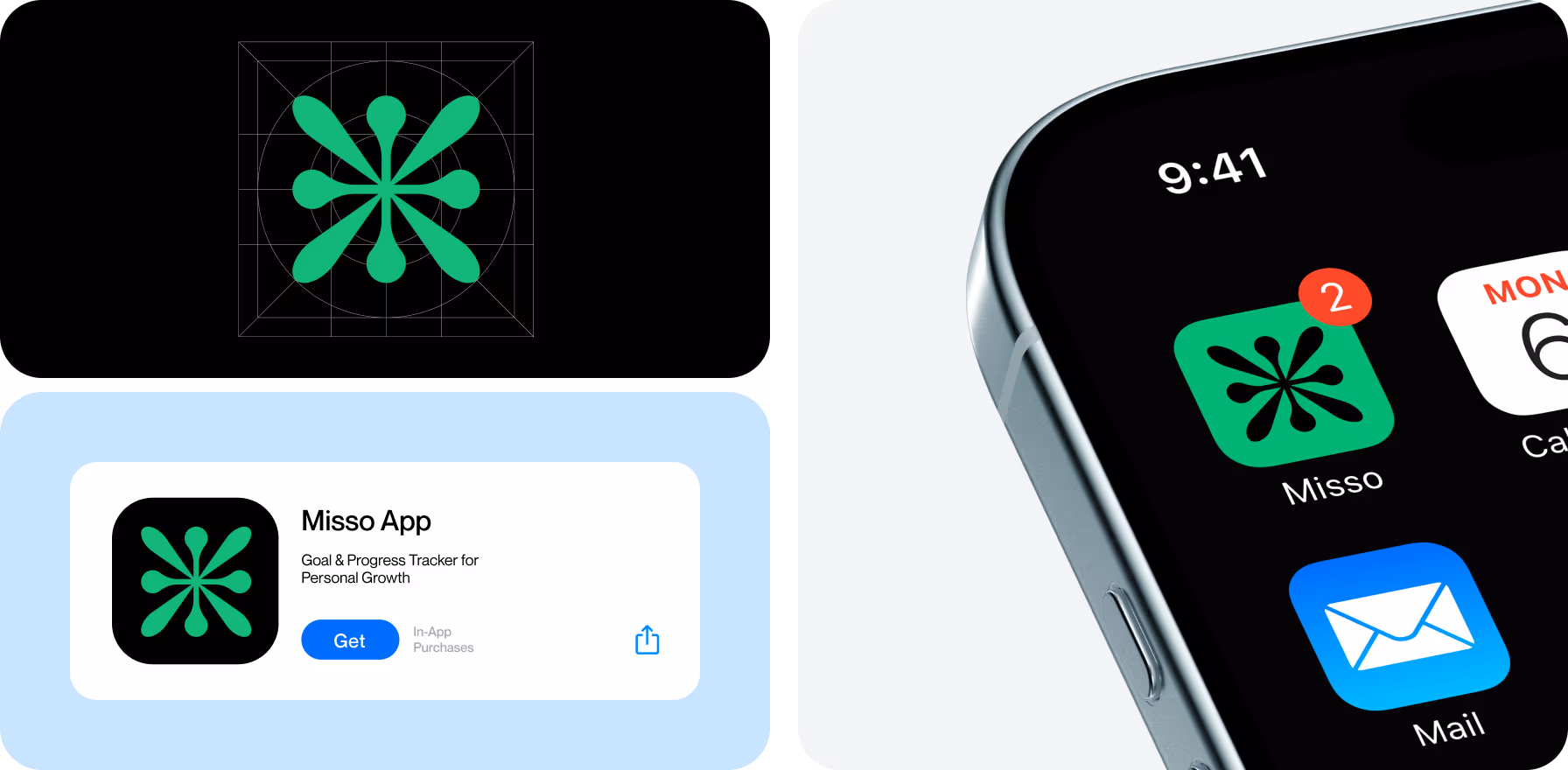
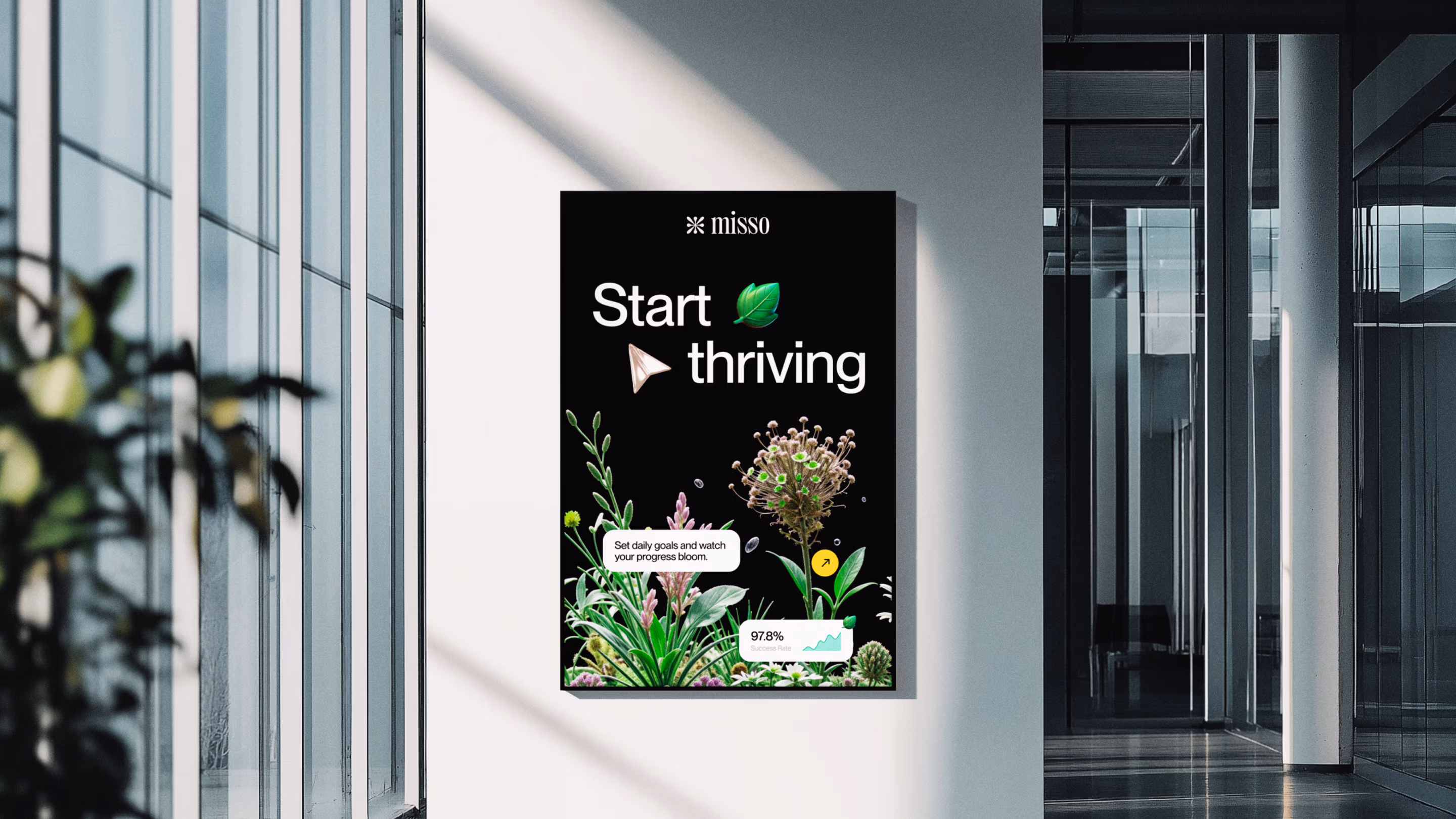
A symbol of growth inspired by nature’s motives
We designed the logotype around the idea of natural growth. Its blooming emblem, paired with a refined serif wordmark, reflects how collaboration and ambition unfold organically — much like a flower opening toward progress.
The logo’s petal-like form adapts across media with ease. Clean proportions and motion create visual harmony, while the fresh green accent reinforces the brand’s focus on renewal, making the mark both elegant and full of life.
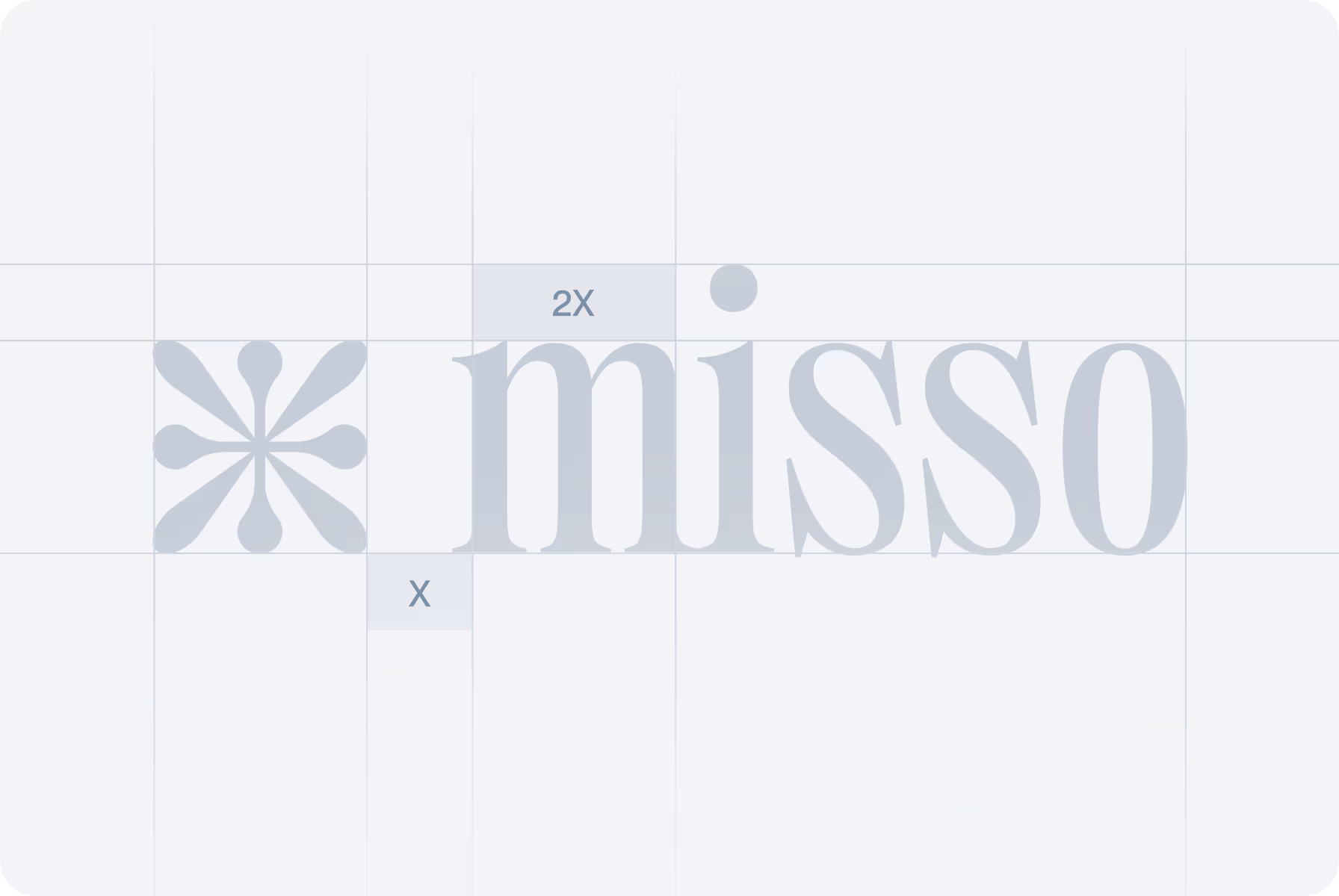
Our goal was to create a logo that feels alive — built to guide, adapt, and support purposeful progress.
{{mais-t}}

A visual toolkit tuned for human energy
Our team introduced a palette of green, yellow, blue, and calm neutrals that energize the platform. The colors guide attention naturally, helping users stay organized while reflecting Misso’s uplifting spirit.
Typography combines purity with character: Neue Montreal brings order and structure, while Regional adds expressive touches. The pairing delivers messages that are easy to follow, engaging, and full of personality.


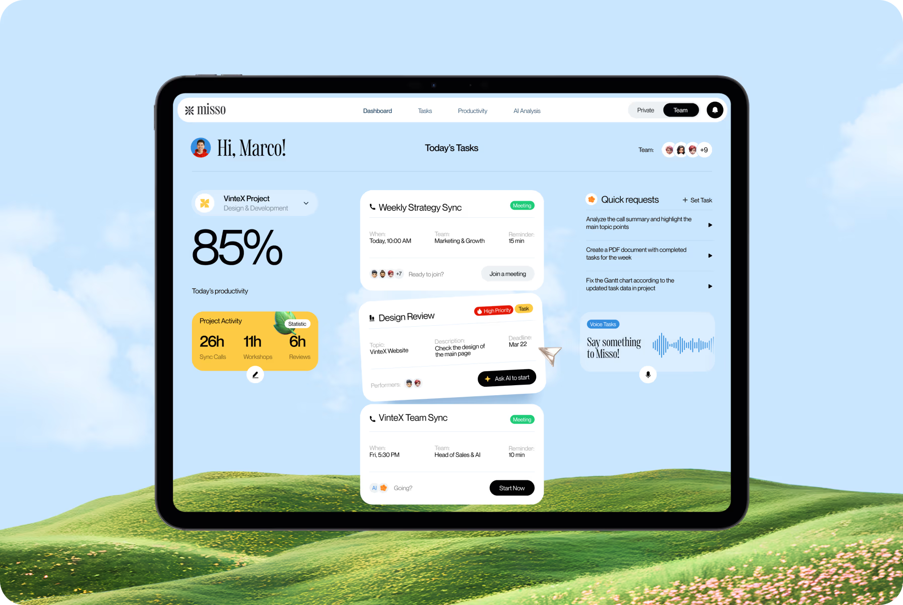


We wanted the design system to feel like it’s breathing — color shifts and light details that guide users without overwhelming them.
{{mais-t}}
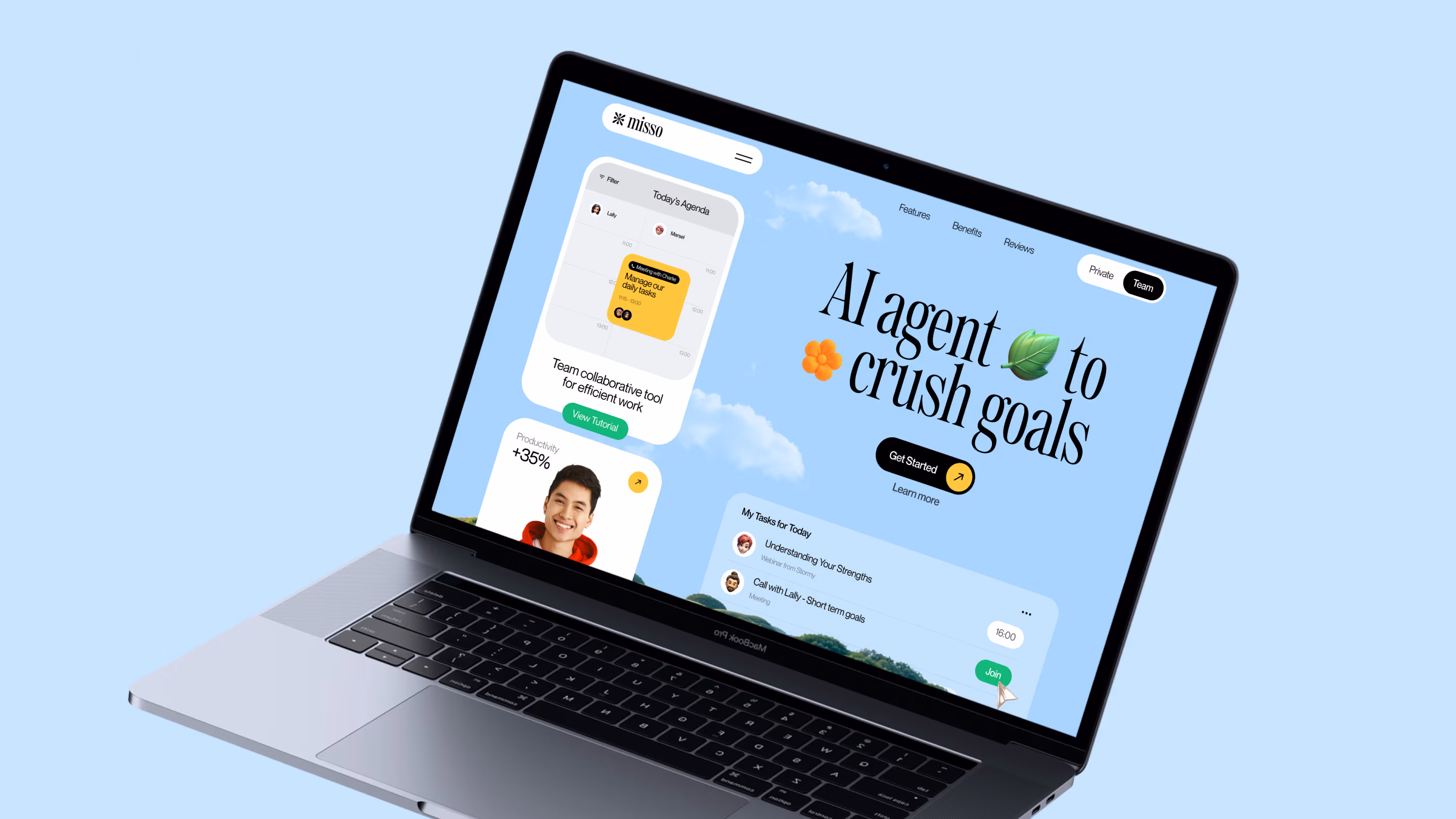
Creative branding for a purposeful platform
The visual identity blends balanced layouts, lively color accents, and soft plant-inspired illustrations — all designed by our team to convey optimism and growth. Each detail captures how collaboration can flourish naturally.
Our designers built a flexible system rooted in organic forms. Botanical motifs, adaptable icons, and responsive visuals maintain consistency across platforms, giving the brand a cohesive look that feels alive and evolving.

Each visual decision came from a simple thought: what would make someone want to stay, explore, and keep creating within this space?
{{mais-t}}


Based on 80+ reviews

with 100% Job Success

AgencY IN UAE

WORLDWIDE
