






HiCloud is a secure data storage and management platform offering cutting-edge solutions for virtualized security. Its aim is to safeguard people’s digital space while ensuring efficiency and reliability in asset retention.
With intuitive drag-and-drop features, the website simplifies navigations through files and folders. Plus, easy-to-use tools empower users to organize , access, and share information with both comfort and high protection from unauthorized access.
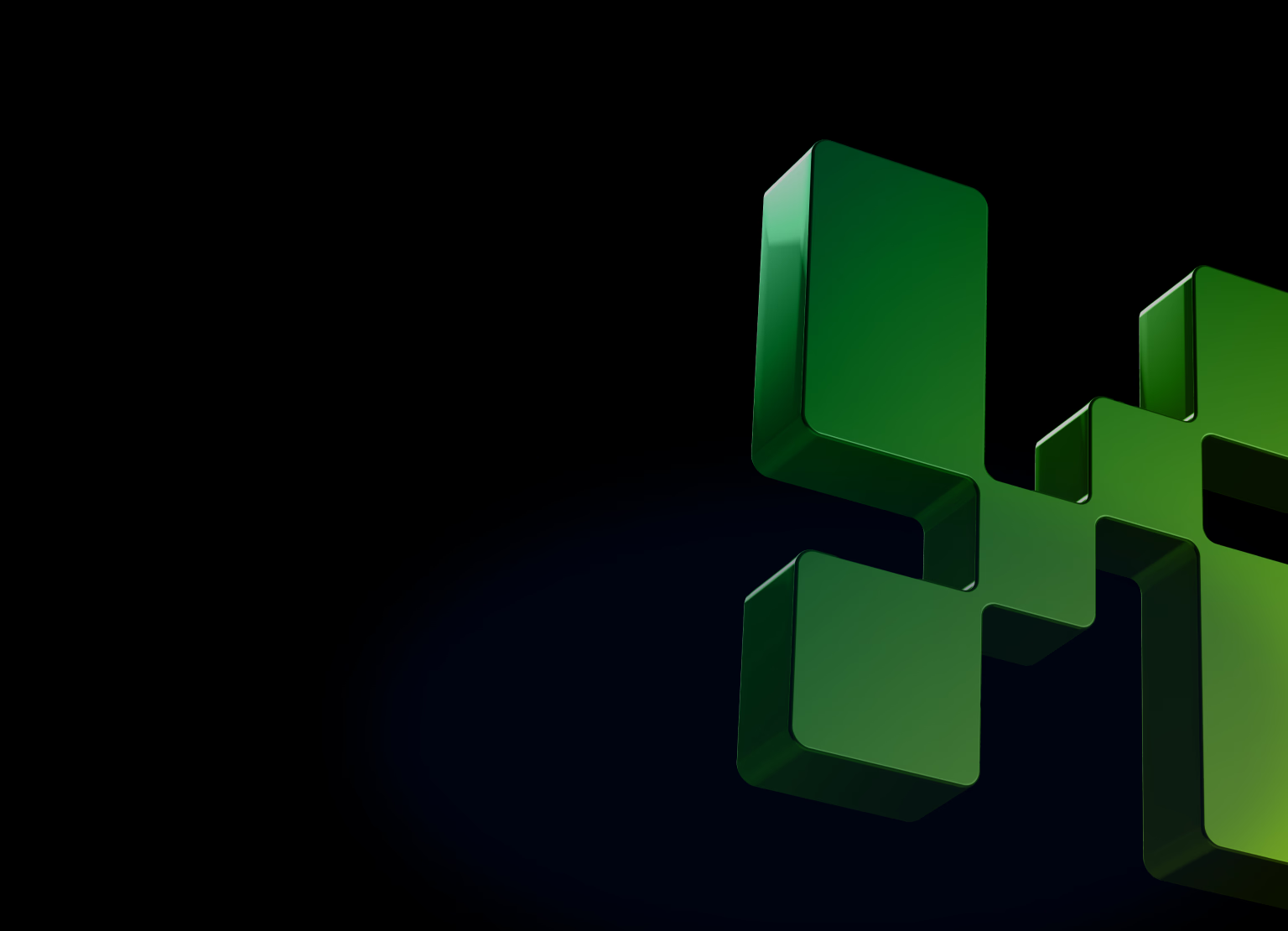
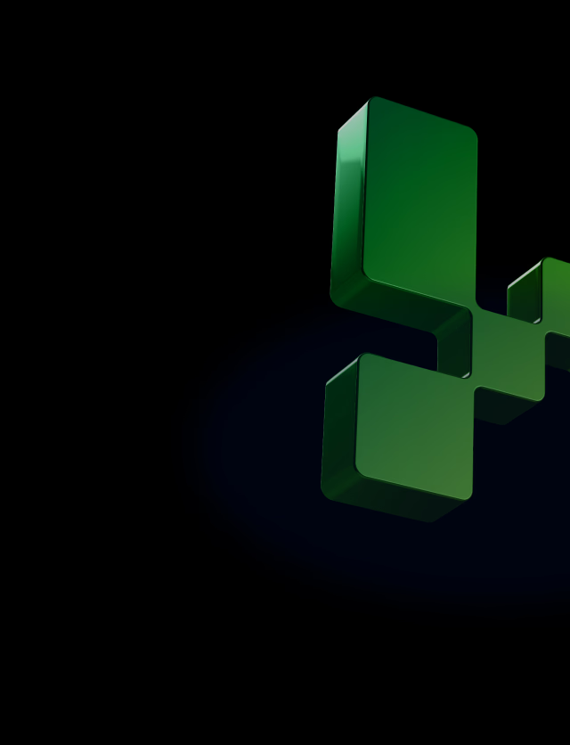
The core element of our designed logo is a bold reinterpretation of the letter “H.” Its shape resembles a digital doorway that leads to users’ data storage while protecting their digital environment against cyber intruders with high-tech solutions.
To reflect the virtual nature of the website’s services, we gave the logo a unique pixelated style. Each pixel acts as a building block, symbolizing the secure foundation upon which the platform stores users’ valuable data in a vast cloud storage universe.
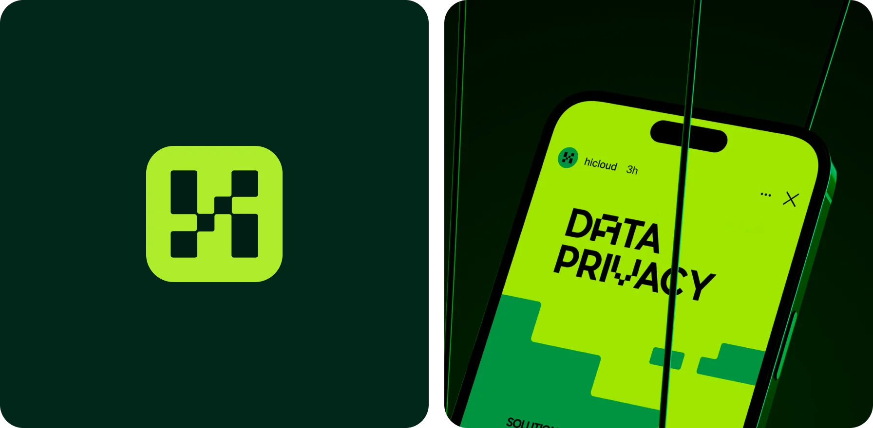
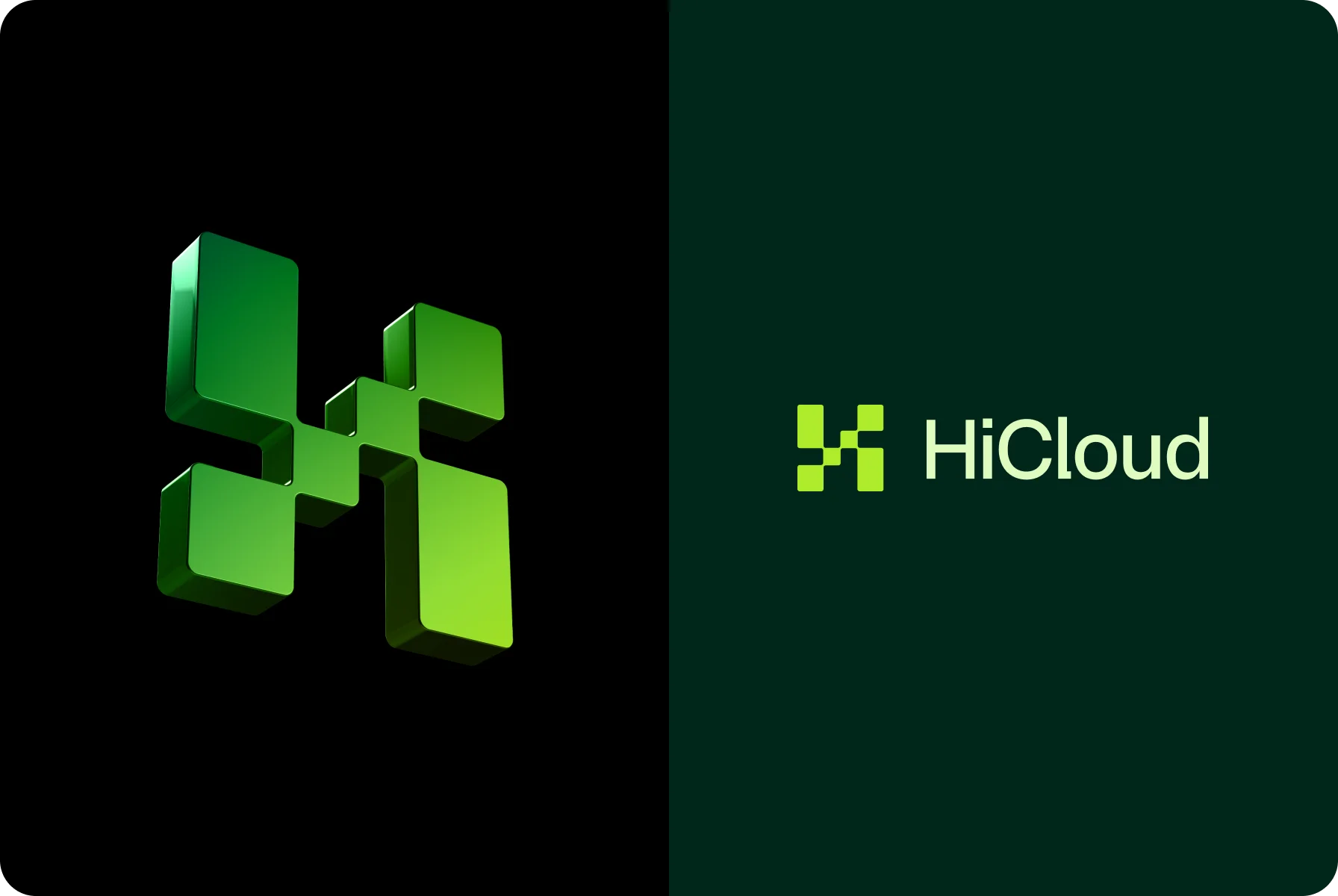
So, to make the logo stand out, our team went with a pixelated shape. It represents a reliable way to store and manage data but with a touch of tech-fluent fun.
{{mais-t}}
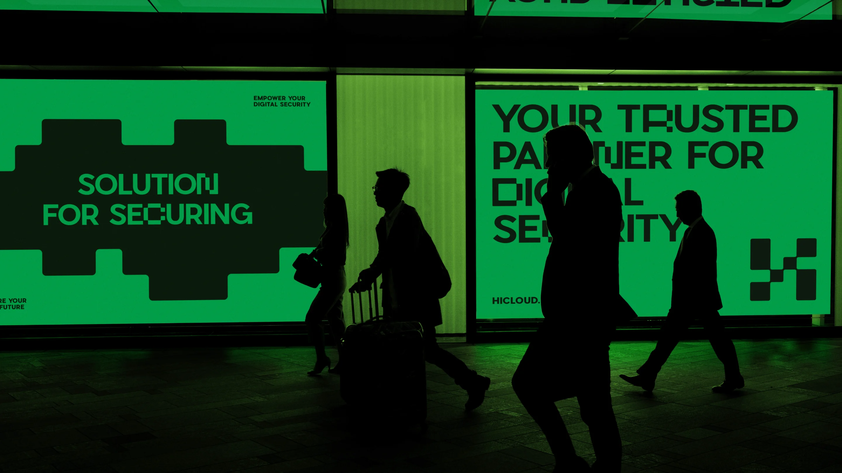
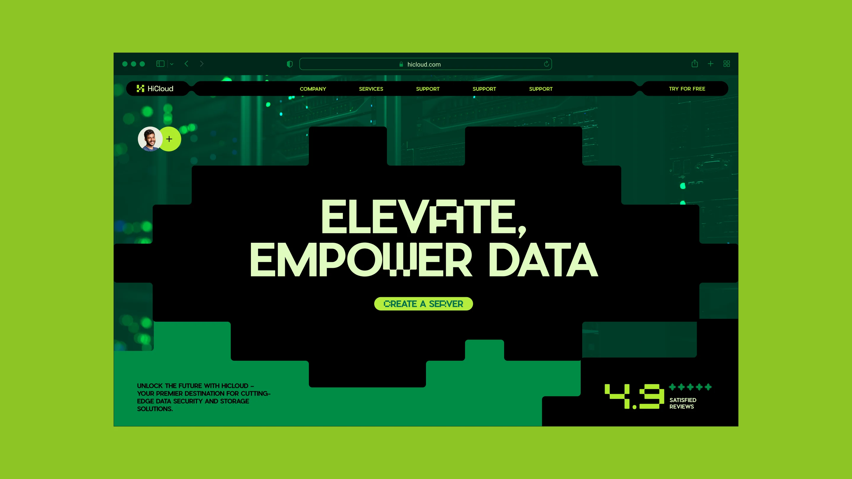
Reflecting on the platform’s digital space, our design team settled on a futuristic look. For its color scheme, we chose accented neon, emphasizing progressiveness, and various shades of green associated with security and stability.
To add a touch of modernity, we adopted a monospaced Monopik font throughout the layout. With bold, pixel-like shapes, it complements the minimalist yet effective design and ensures legibility across various applications.
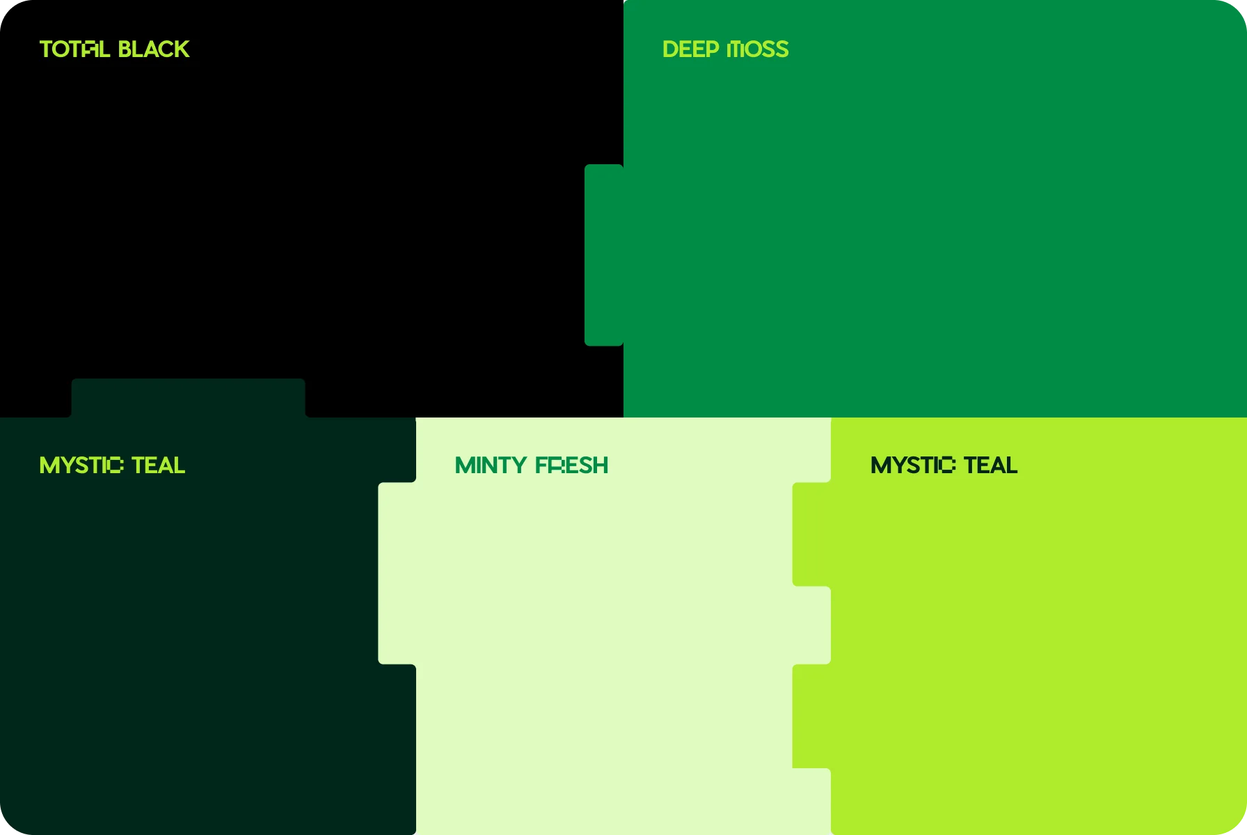
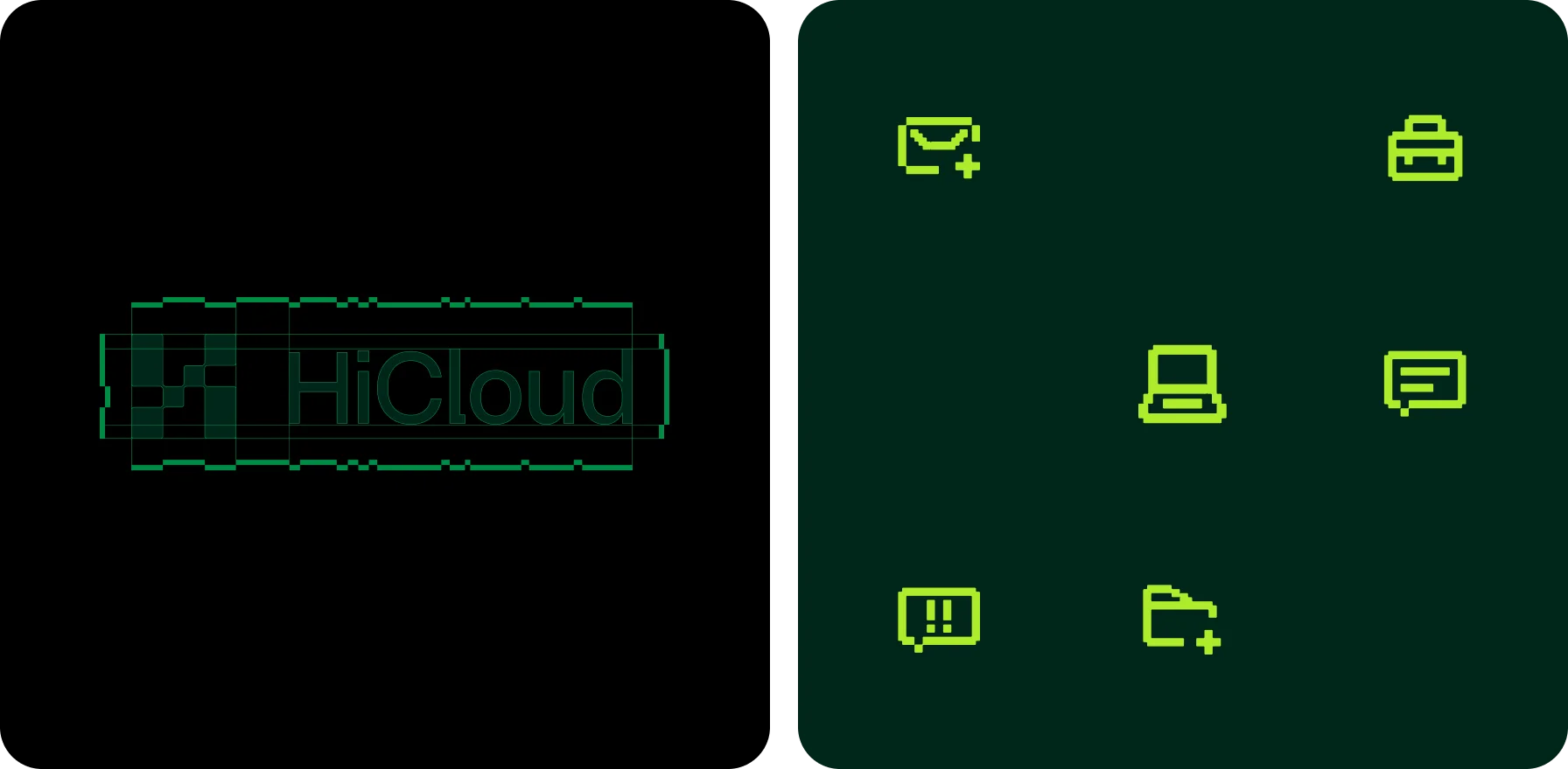
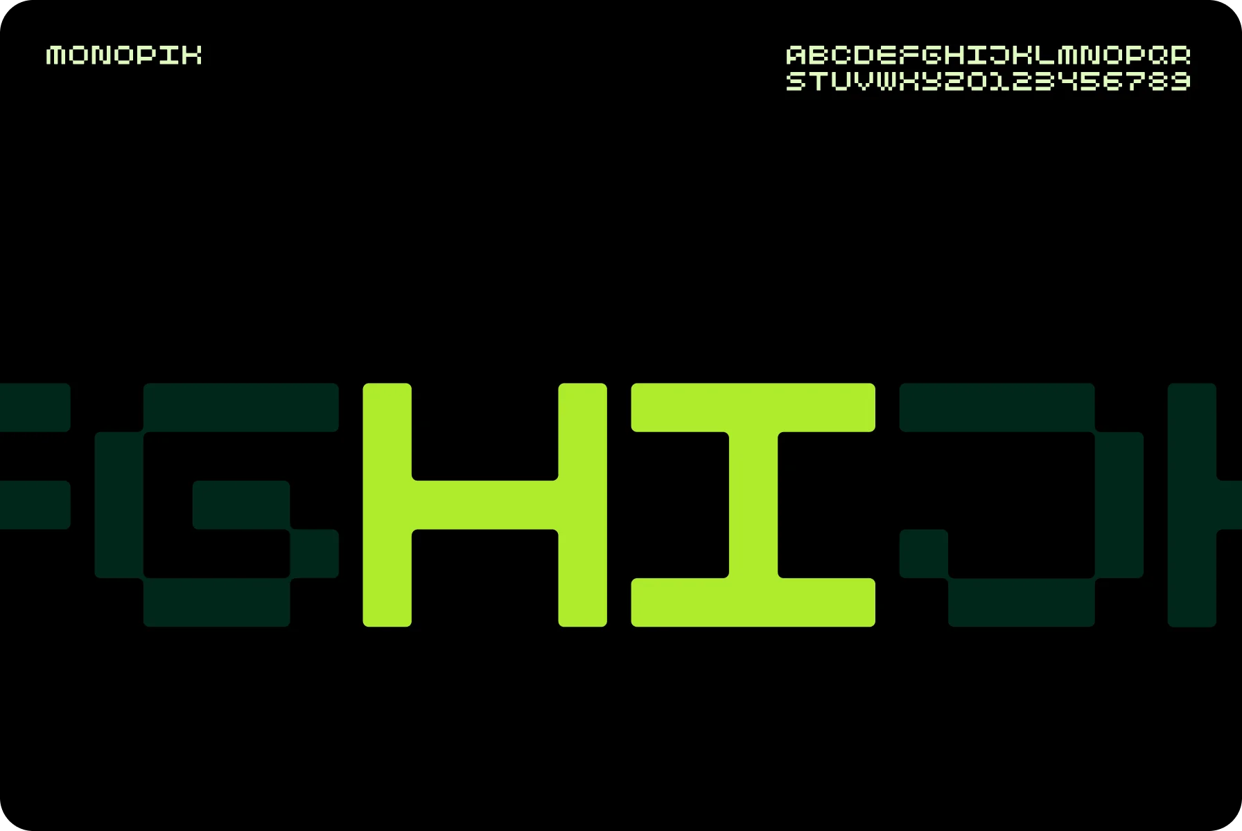
To convey the image of a transformative and trusted platform, we used recognizable neon shades of green and pixelated visual effects.
{{mais-t}}
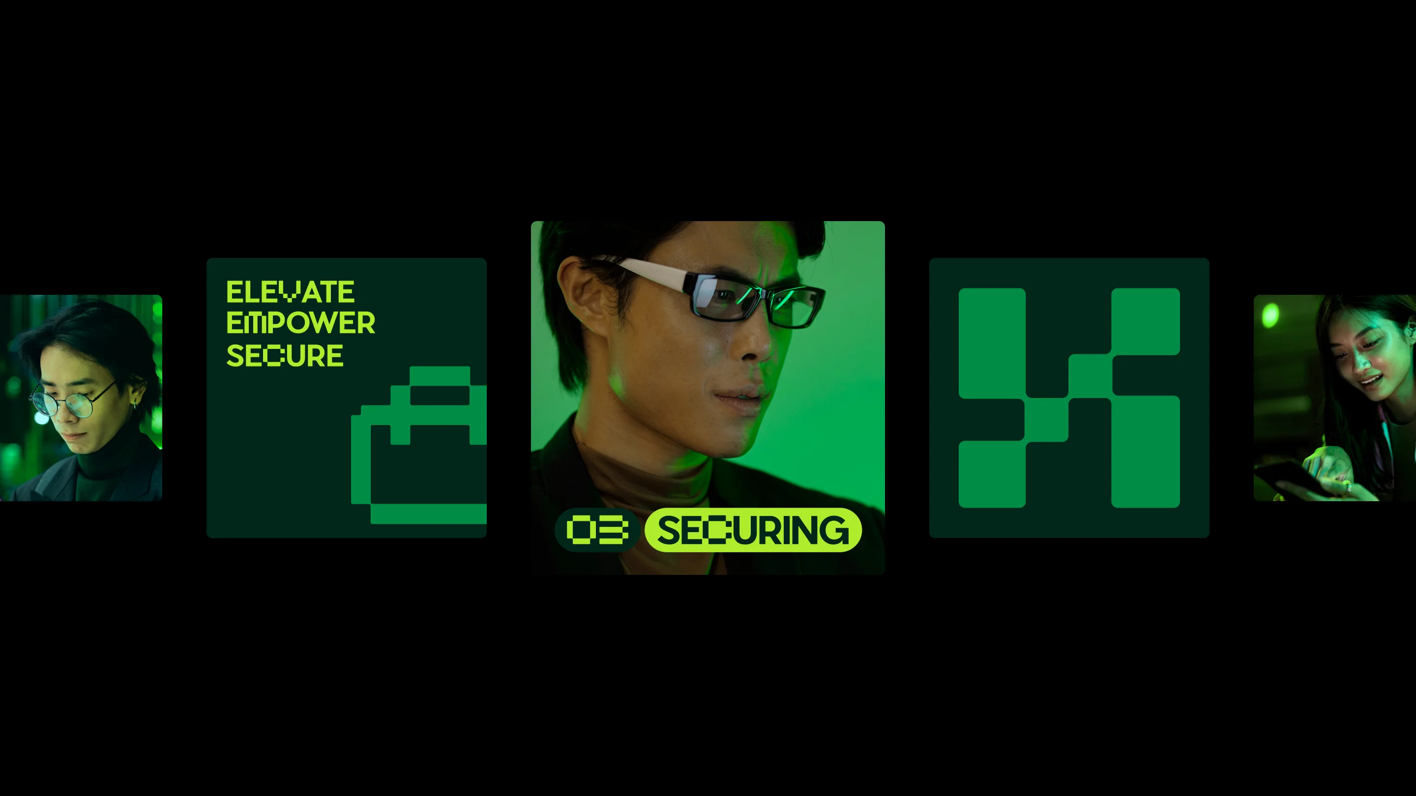
Our team focused on the depth and scalability of the digital world to create a unique branding image. With a pattern of pixels running through the platform, we evoked the pioneering spirit of the computer age and the fundamentals of digital graphics.
Following up, we intertwined this plain motif with jagged icons and high-quality photos of hardware and cybersecurity experts. Together, these contrasting elements bridge the gap between the past and present, inviting users to experience the future of data storage.
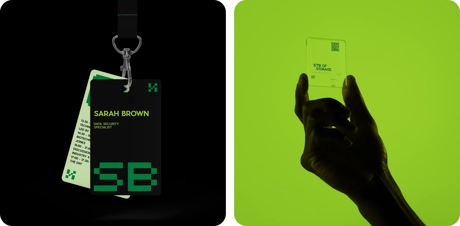
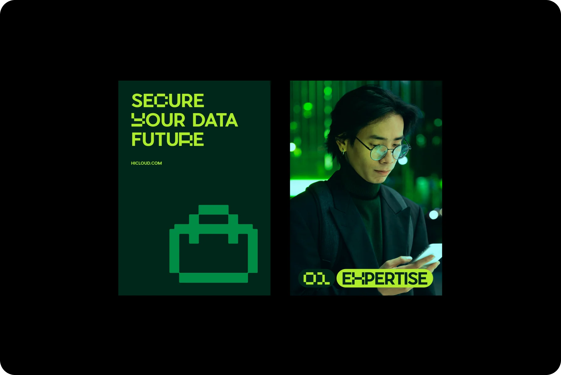
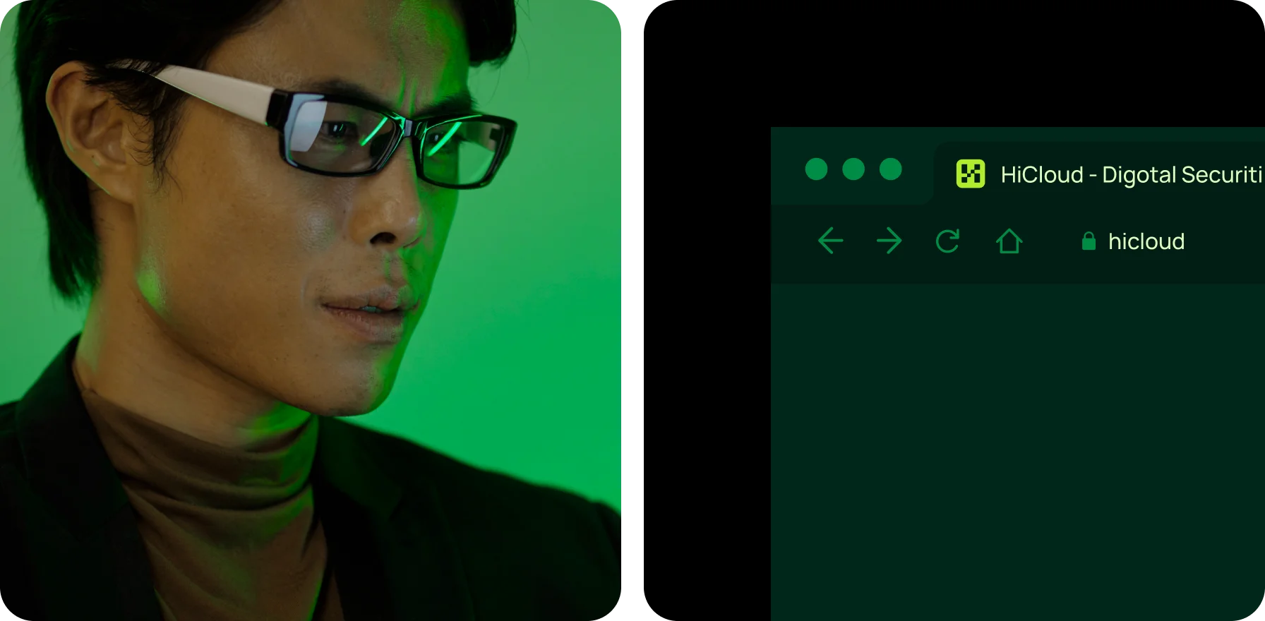
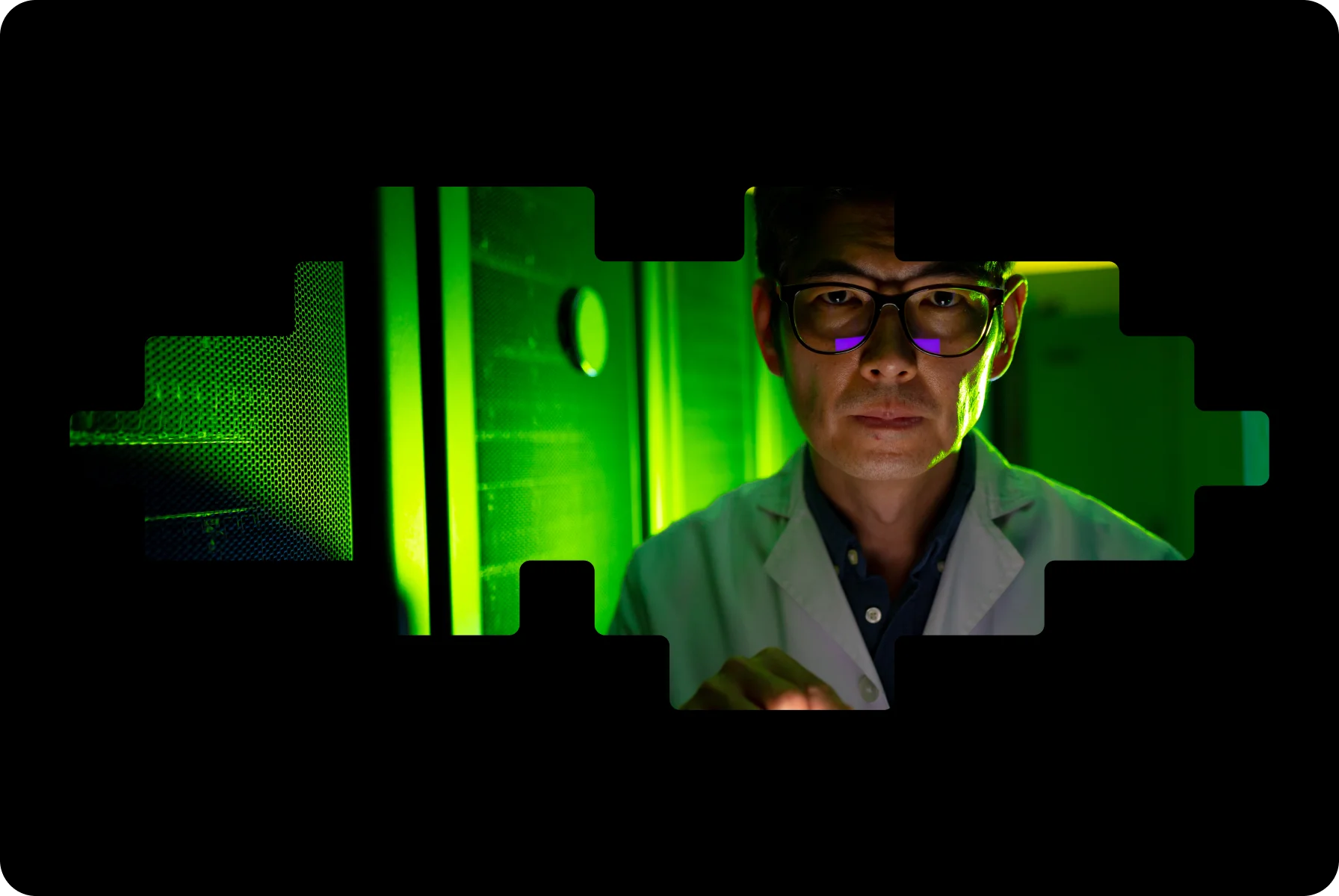
For this brand identity, we wanted it to scream “tech-savvy” without being cold or sterile. That’s why we came up with the pixel idea.
{{mais-t}}