








FlowsApp is the go-to solution for task and project management. With intuitive features and smooth integration of additional tools, it helps users efficiently organize their work no matter the size of the project.
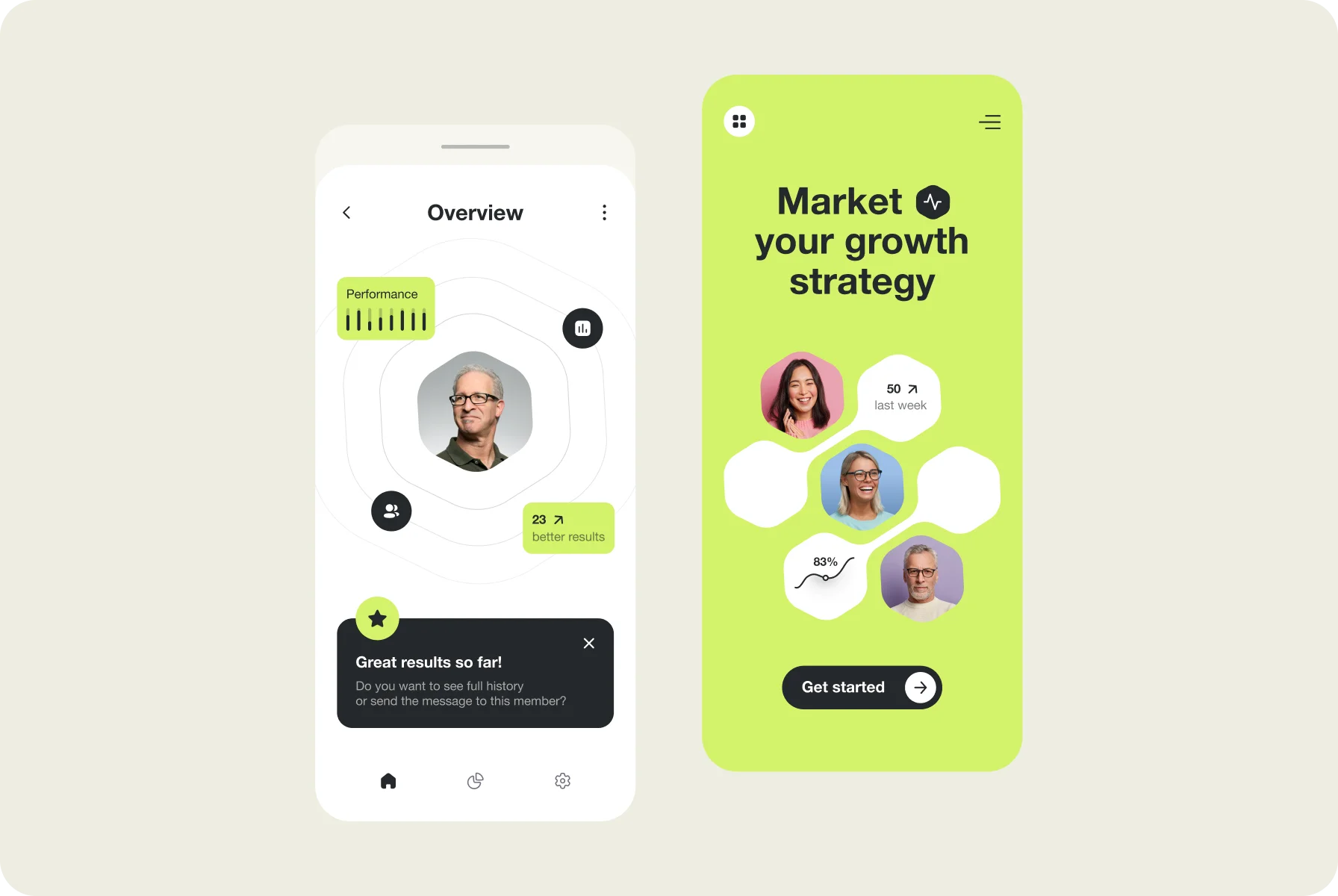
Focused on teams of all sizes, this application allows one to tackle big tasks, manage daily routines, and stay on track. Managers get a lot of options and can add teams, assign roles, and monitor the number of hours spent.
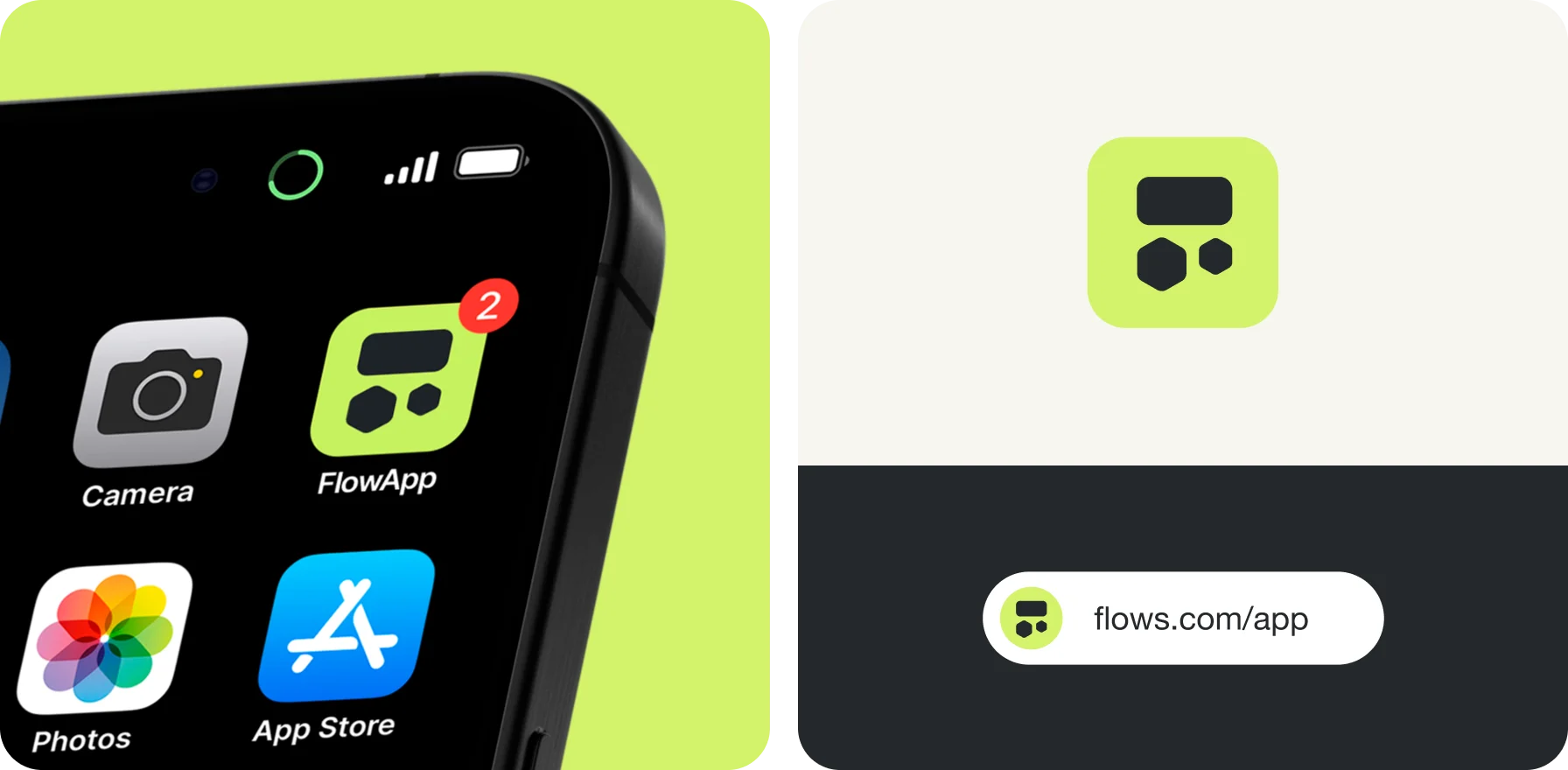
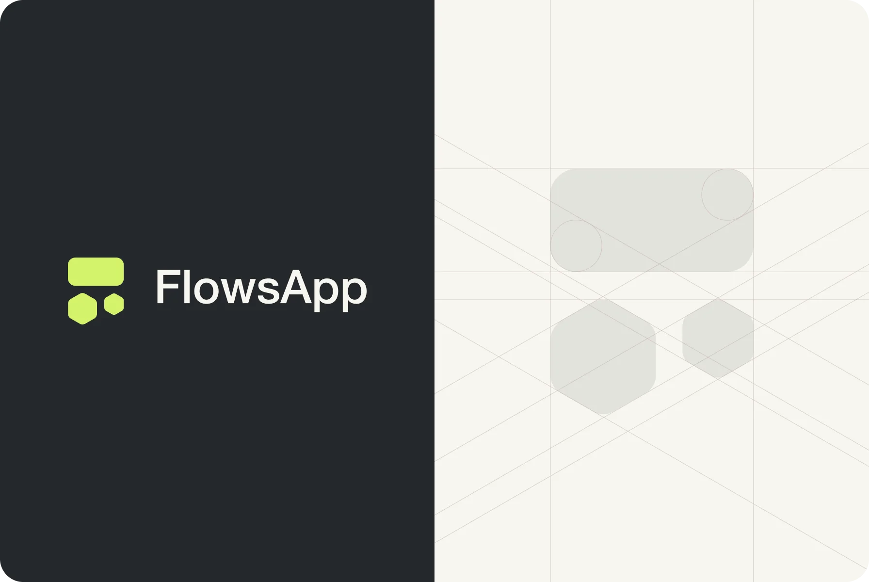
At first glance, the logo might look like just three separate shapes. But there’s more to it. With a rounded rectangle and two hexagons, our designers created a symbol that any manager would recognize — a task board.
This familiar element shows how the app helps teams stay organized and manage their projects effectively. The shapes are meaningfully placed with the proper use of white space to create a sense of order and symmetry.
For each logo element, we chose the optimal size to fit within the overall design. This attention to detail kept a balanced look.
{{mais-t}}
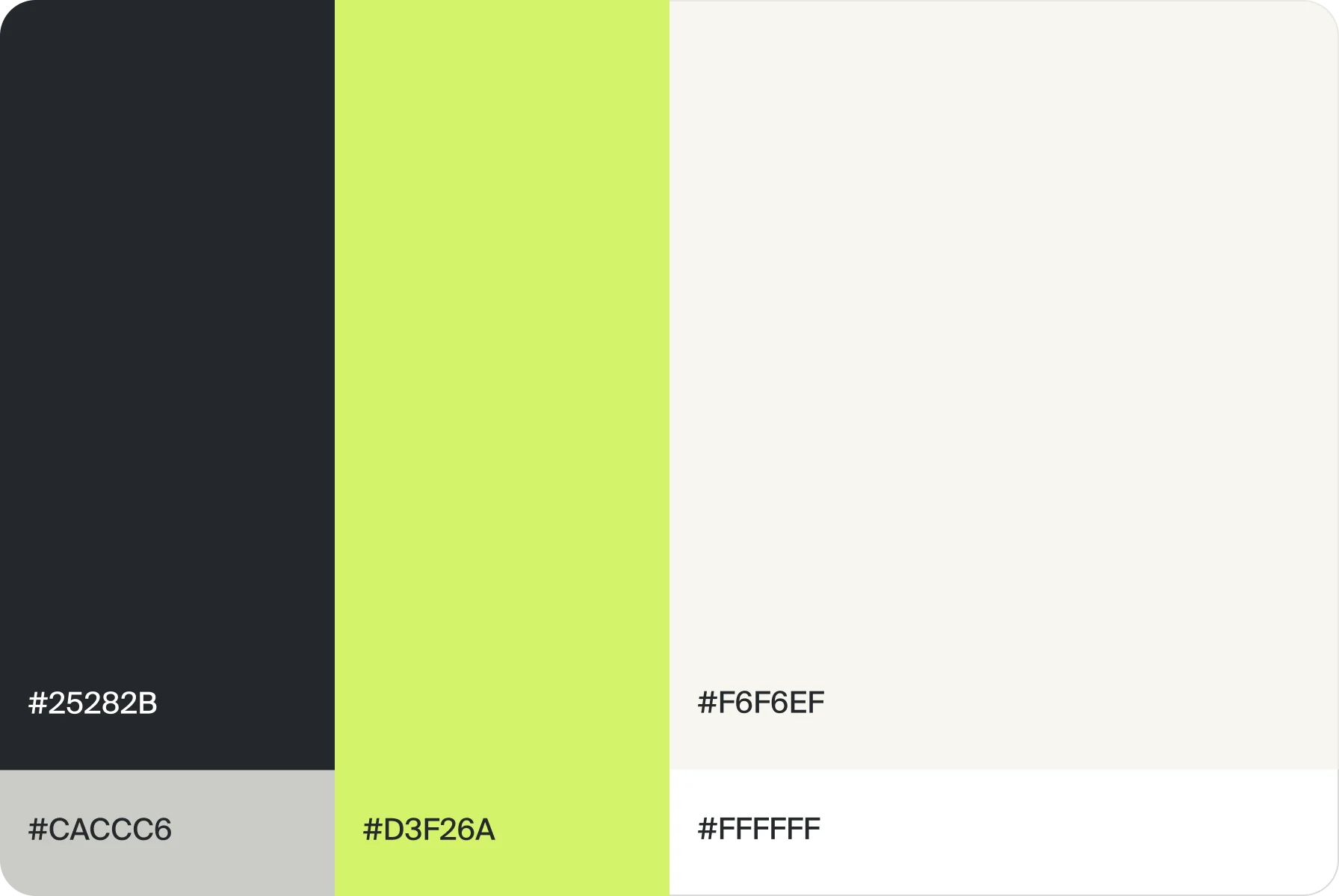
In design, we went with a lemon-yellow as an accent color, screaming for attention right off the bat. But when mixed with muted dark gray and sandy tones, it creates a balanced feel and eye-pleasing contrast.
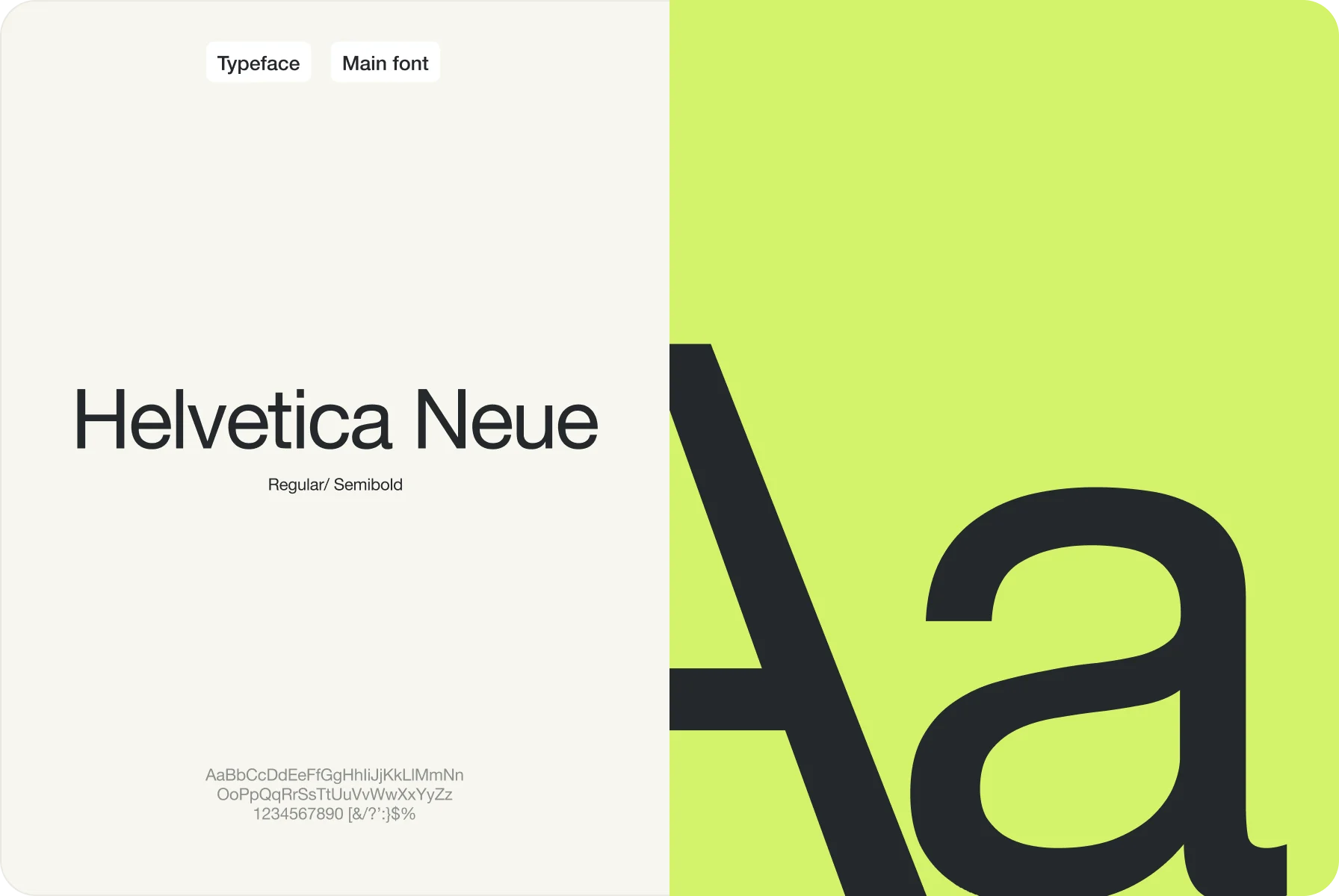
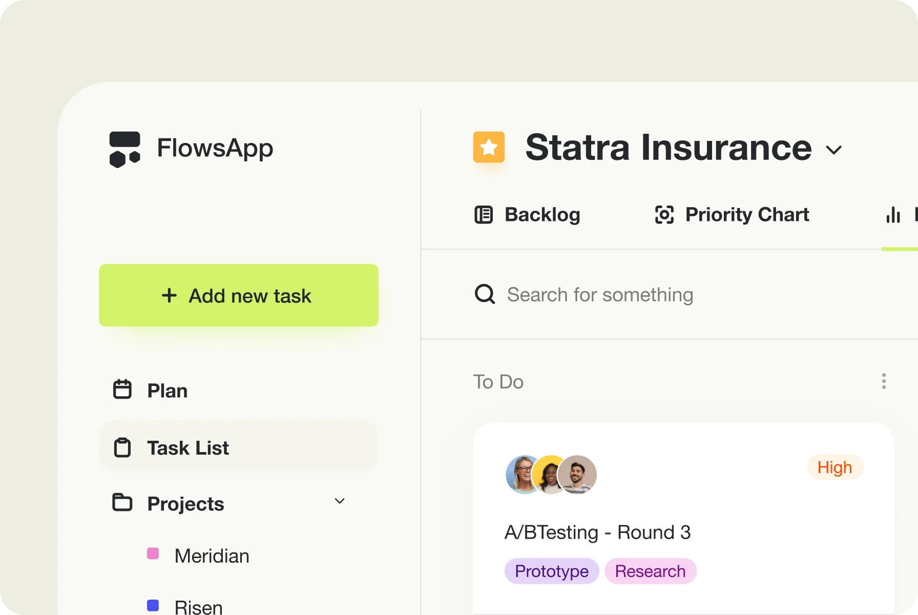
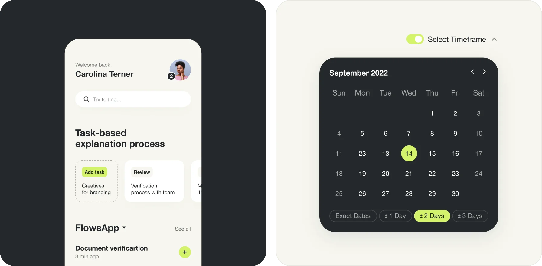
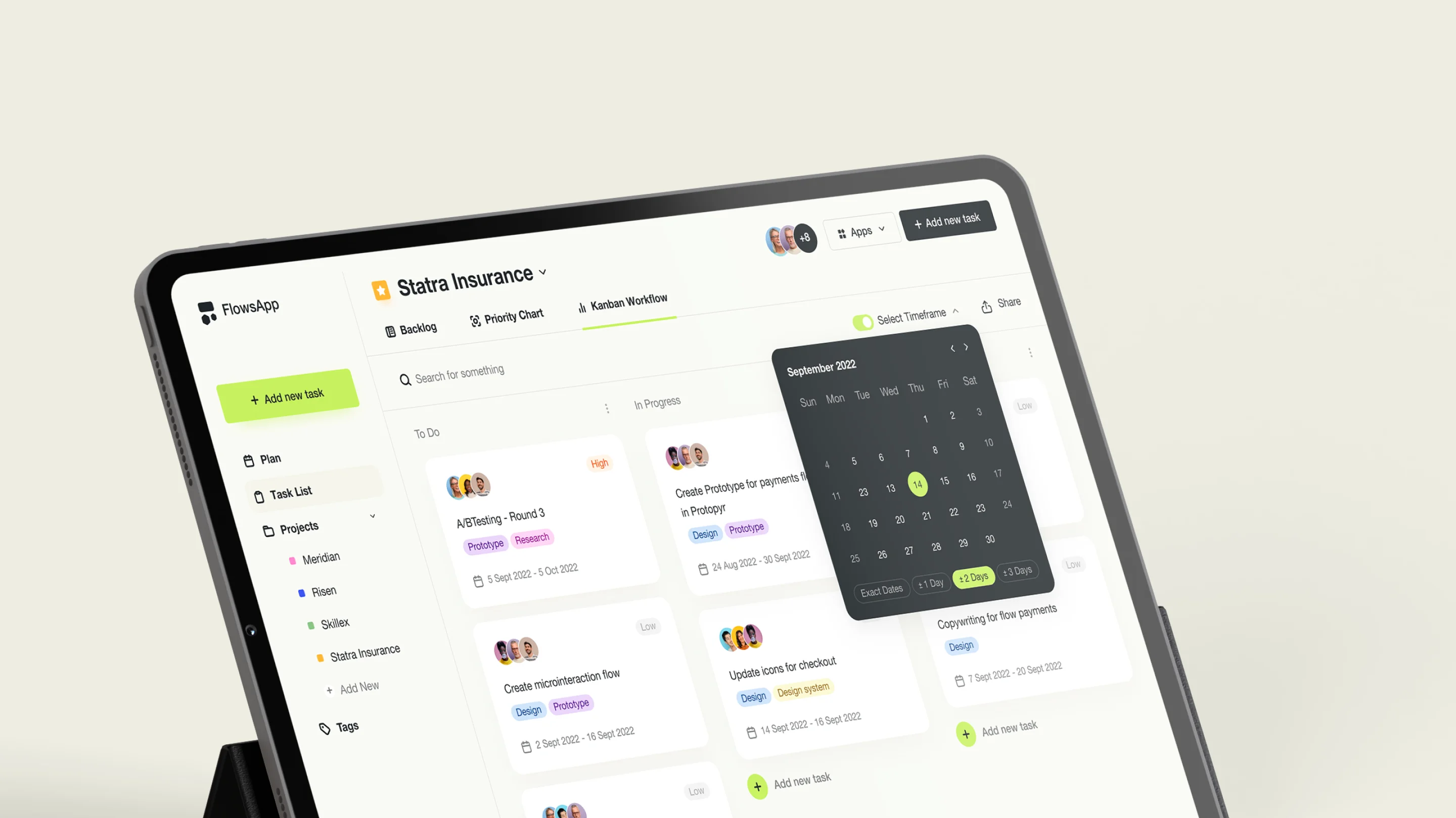
Alongside this approach, we added tags to each task so users can easily track their progress and completion stages. For the typeface, our team chose Helvetica Neuem, which keeps things simple for employees.
To add more fun, we’ve used different hues for task statuses. This way, users can sort and track to-dos by color without getting confused.
{{mais-t}}
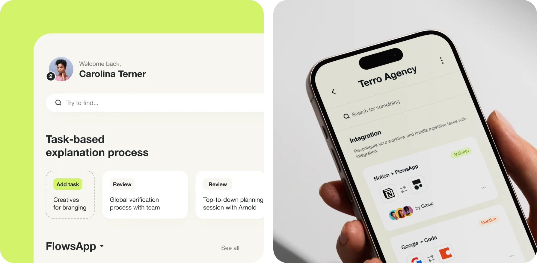
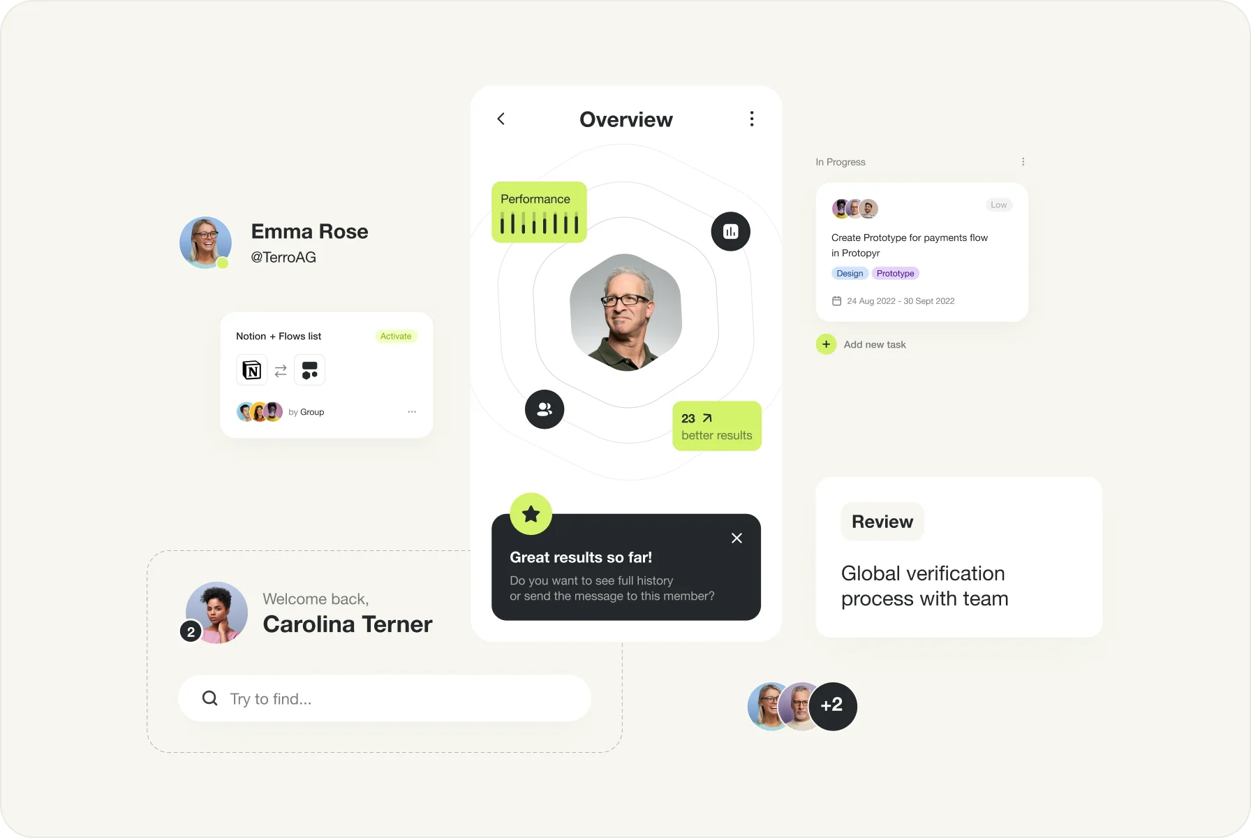
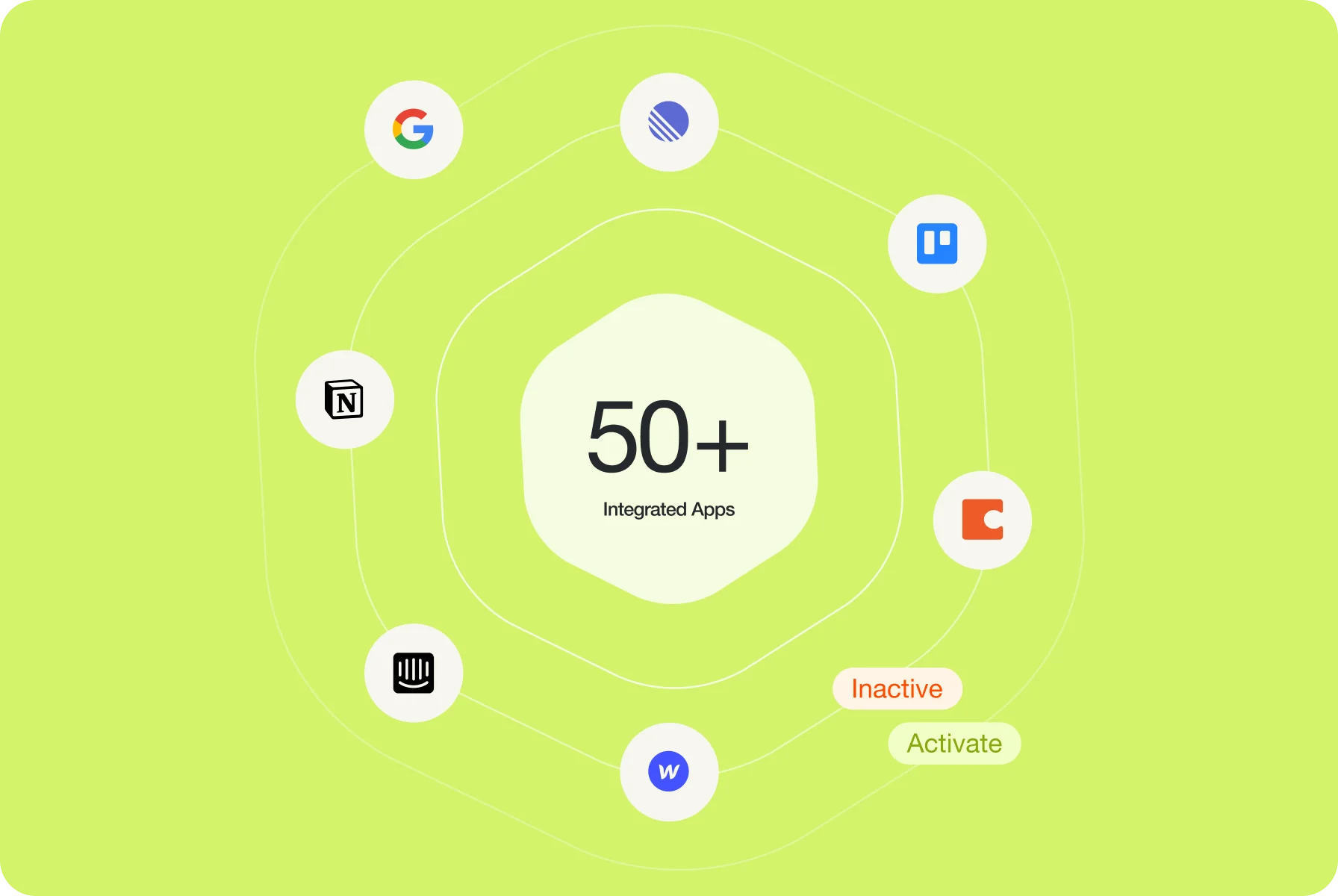
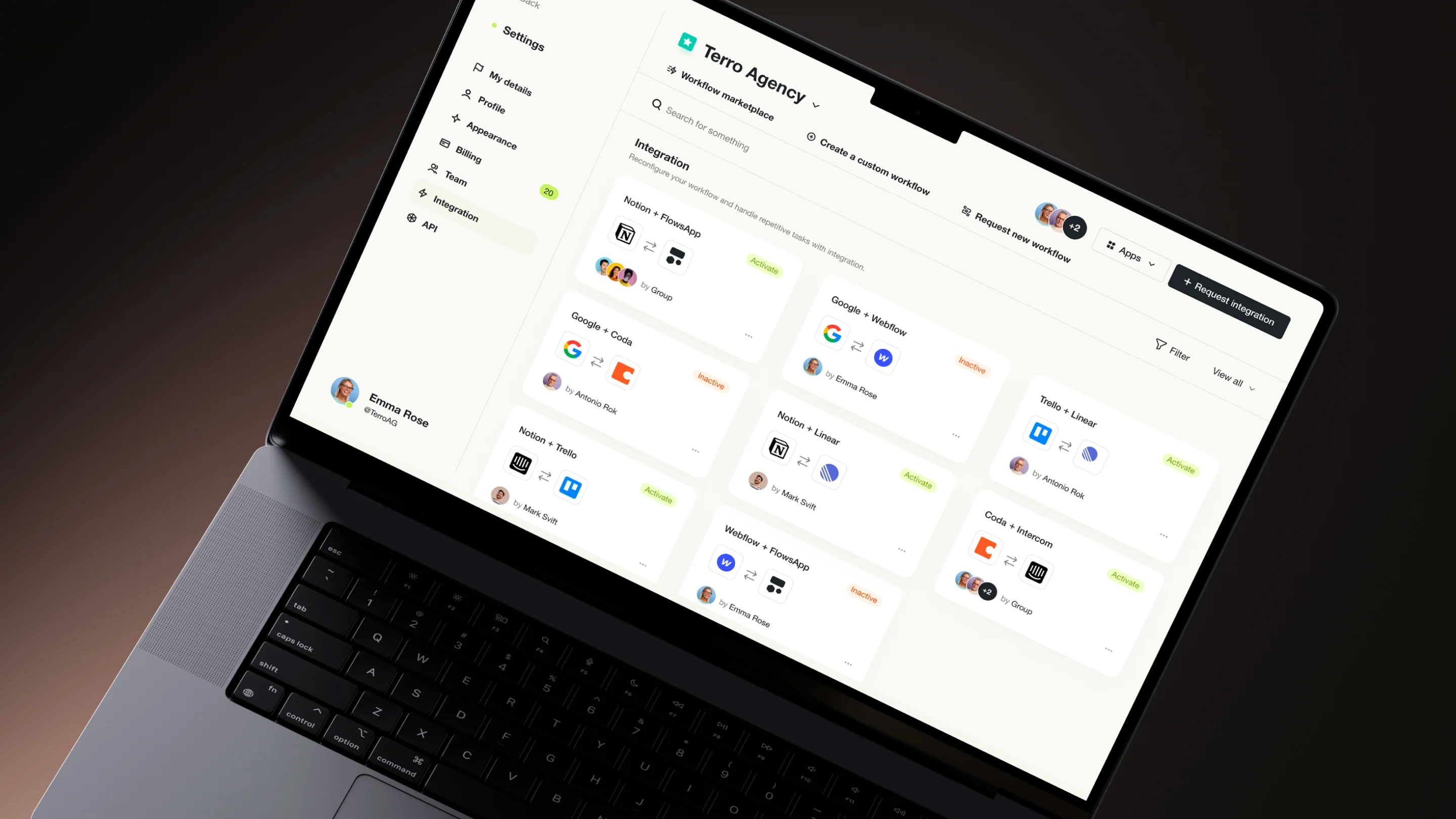
To make working processes run smoothly within the app, we connected additional services. Considering that each team uses various tools, our goal was to integrate as many apps as possible for easy interaction.
As a result, we incorporated over 50 programs, including Google, Notion, Trello, and many others. Now, each user can access the desired platforms right in one place or even install one themselves if necessary.
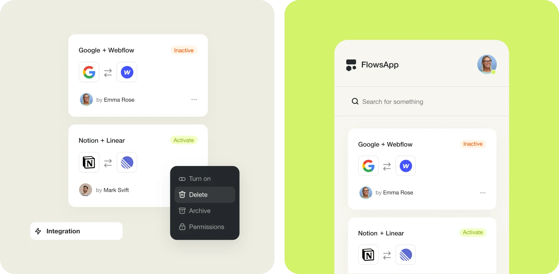
By integrating additional tools, we’ve made it easy for users to access everything in one place instead of dealing with multiple apps.
{{mais-t}}