






Fertile is an agricultural company that grows and supplies organic food. They champion sustainable farming, using the best practices that are good for people and the planet, and contribute to a greener and happier future.
The vivid and easy-to-use platform allows people to browse the assortment, place an order, and even track its status. With these features, customers can get eco-friendly and fresh vegetables from vast fields to their tables.
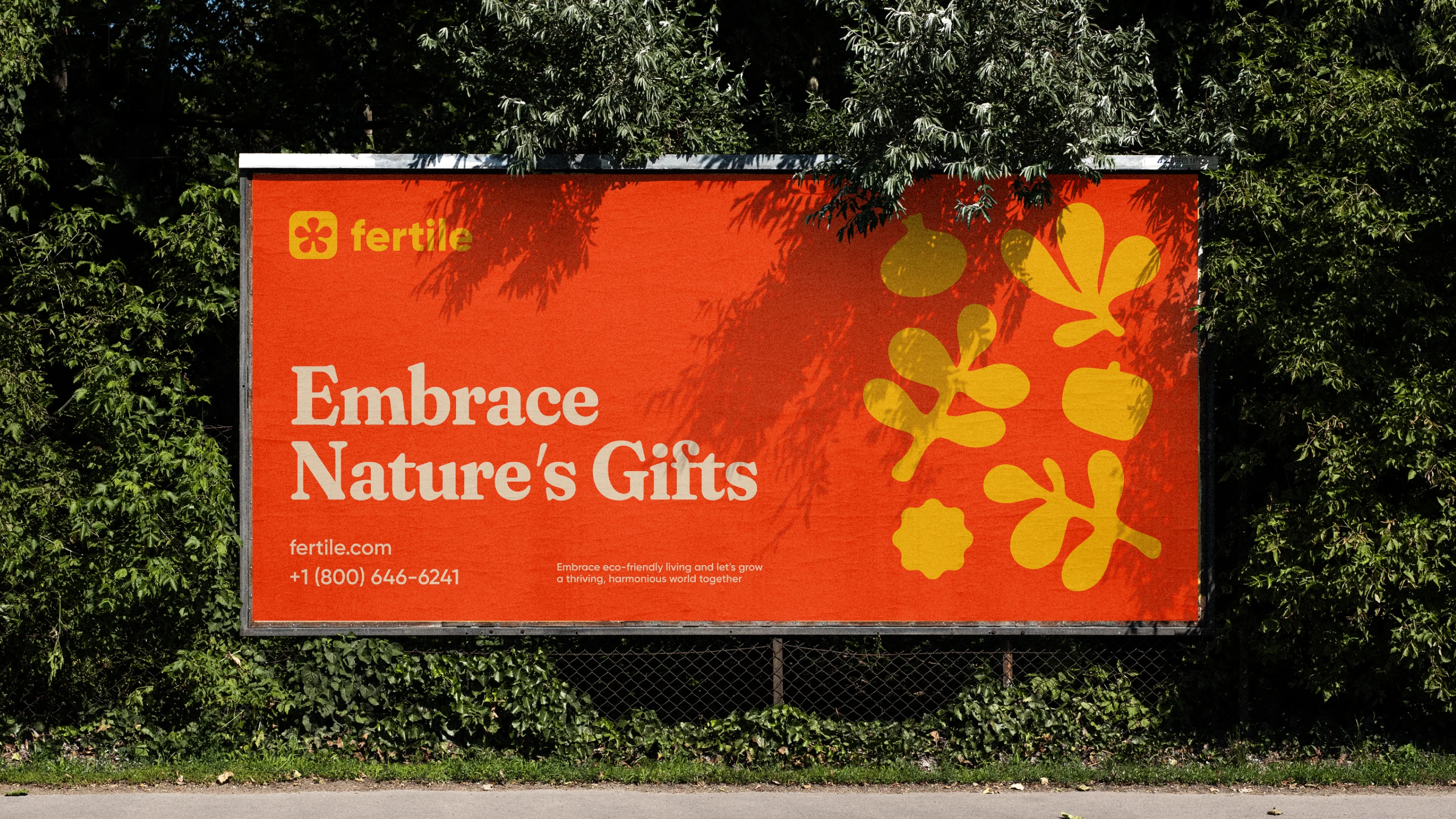
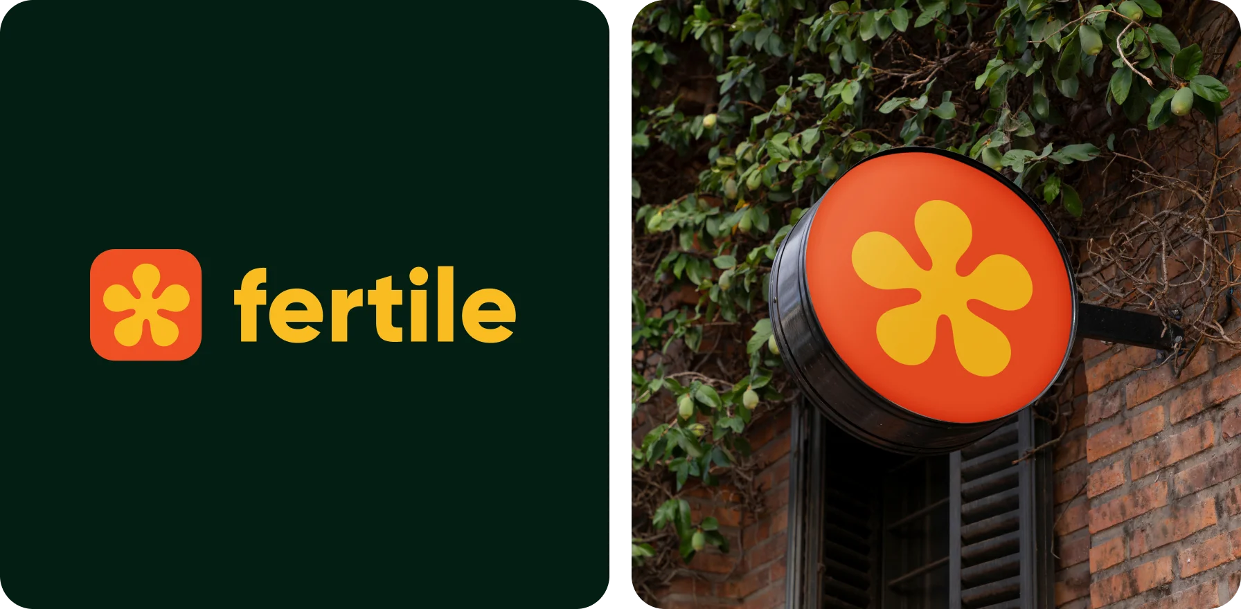
For the logo, we came up with a symbol bursting with potential and growth — a bright yellow flower. Set against a red backdrop, it blossoms forth, symbolizing the company’s passion and energy in cultivating a greener tomorrow.
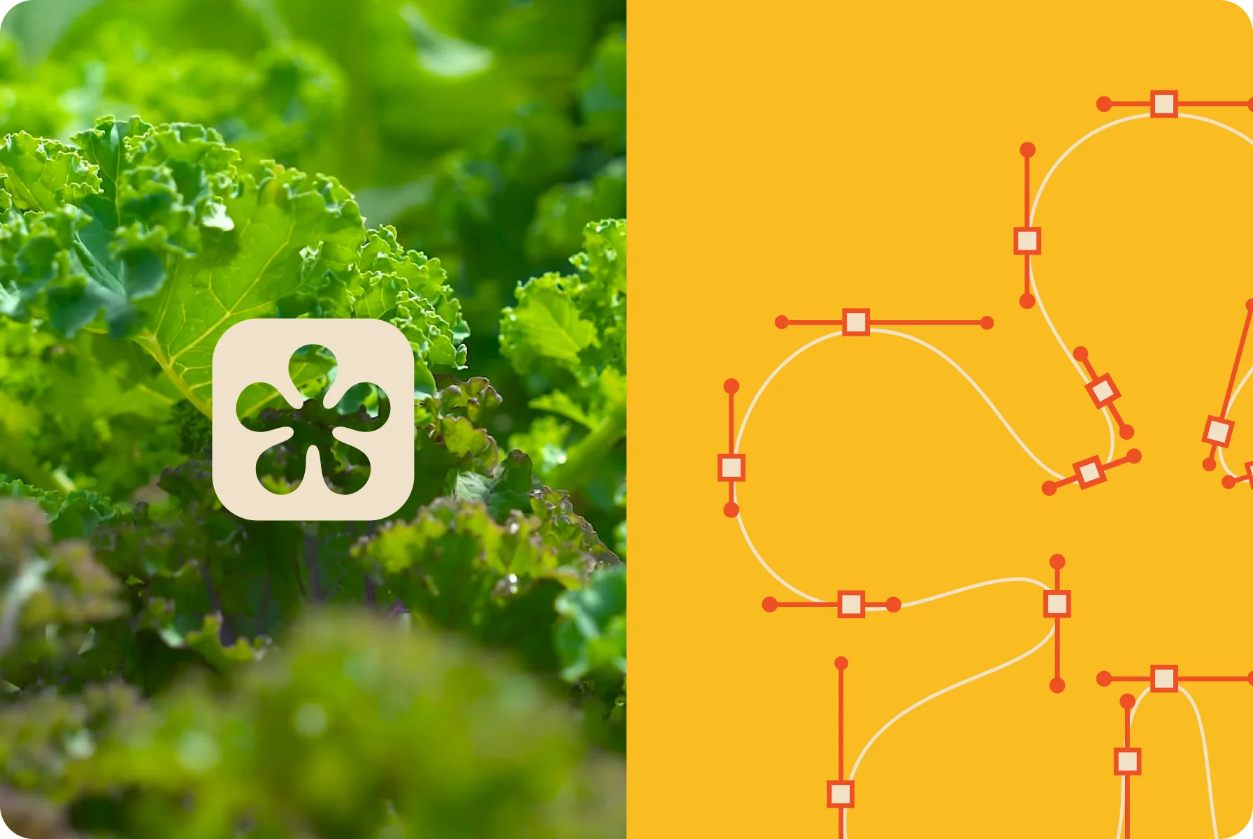
The rounded, smooth shapes evoke a sense of harmony, mirroring the gentle curves of each petal found in nature. With this idea, we managed to create a unique image that clearly shows the industry that the company serves.
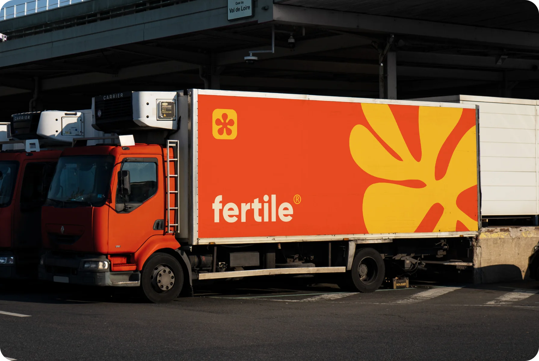
We wrapped the logo in a clean, modern design to capture the essence of growth and express the promise of delicious and organic products.
{{mais-t}}
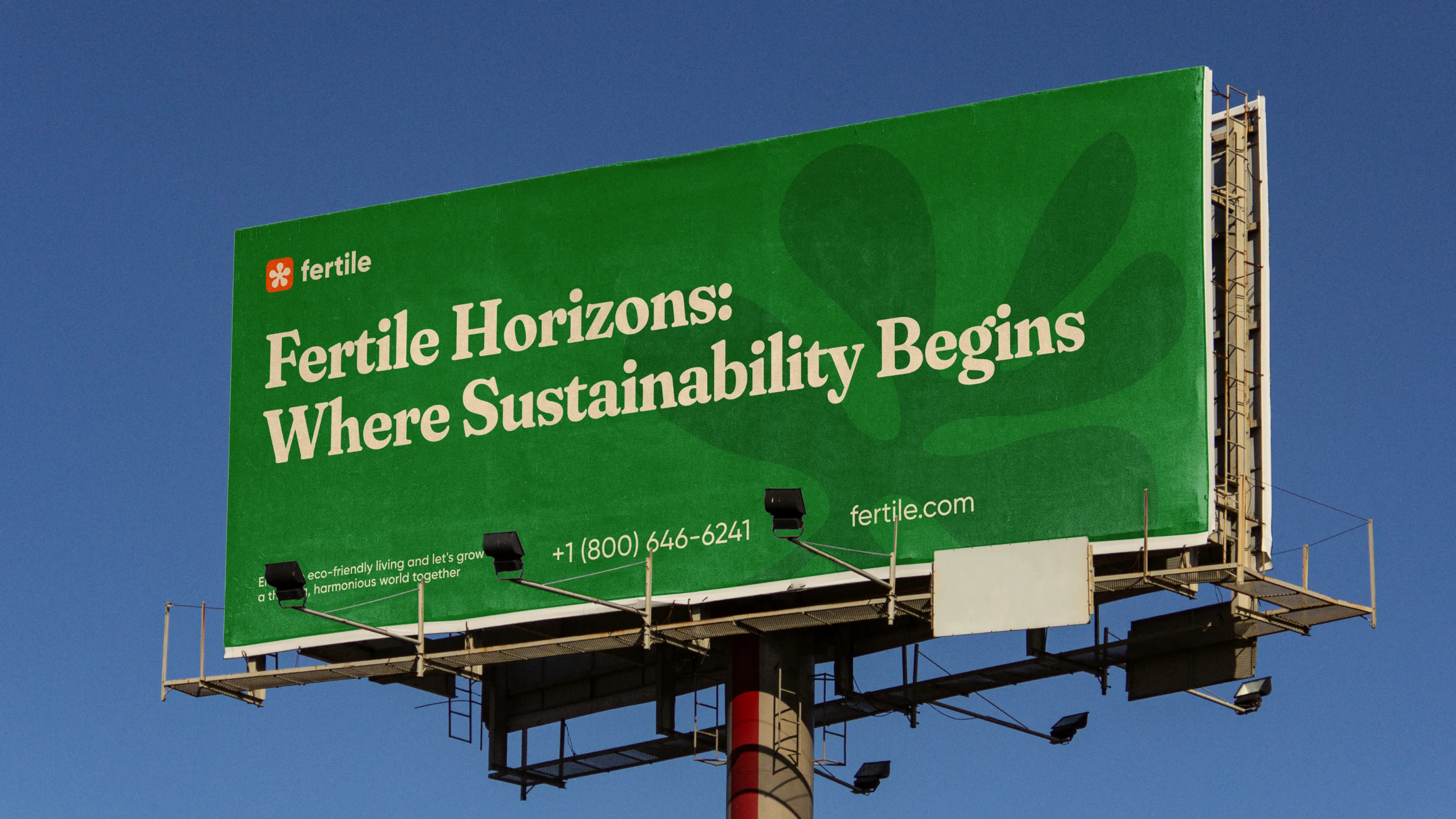
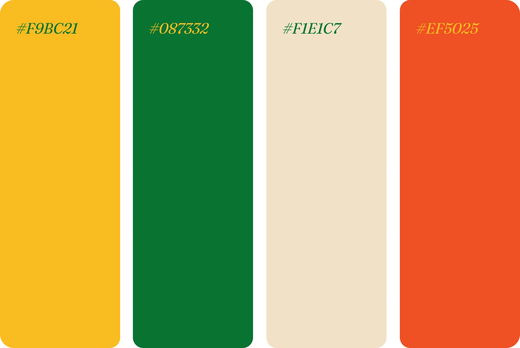
Our design system for the company aimed to bring the charm of the farm to one’s screen. For this, we used a bold color scheme with green, yellow, white, and pops of red — as natural and healthy as the delicious harvest itself.
The typeface we chose is soft-serif Fraunces set in bold, italic, and regular styles. Whether you’re browsing for vitamin-rich broccoli or tracking your order, this font makes all descriptions, prices, and other data easy to spot.


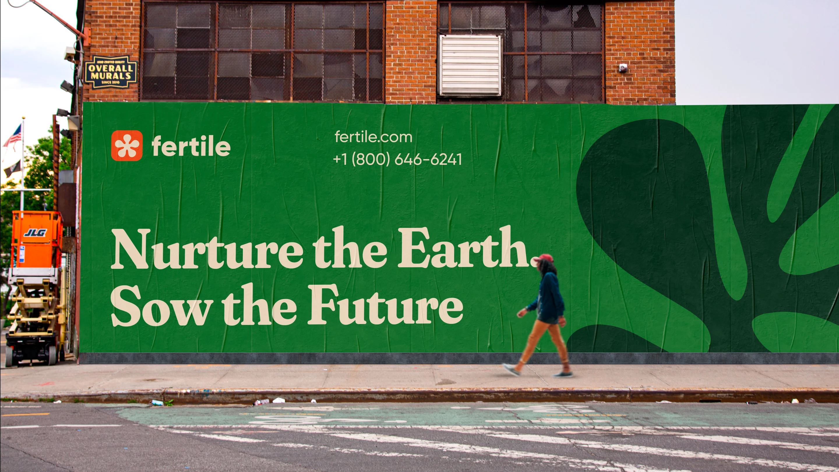
While developing the company’s visual appearance, we envisioned an environment where farm-fresh meets user-friendly, and we succeeded!
{{mais-t}}
Simplicity was the key to crafting Fertile’s brand identity. Our designers created plain and charming veggie illustrations. They depict playful silhouettes of delicious vegetables, from tomatoes and onions to various greens.
We also added photos of vibrant flowering plants, highlighting the beauty that goes into growing good food. A series of our designed stickers, on top of that, make the brand attractive and show its connection with customers.
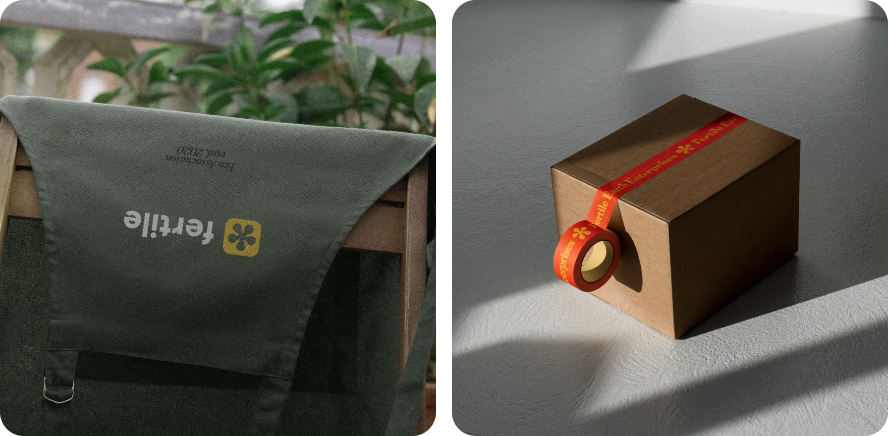
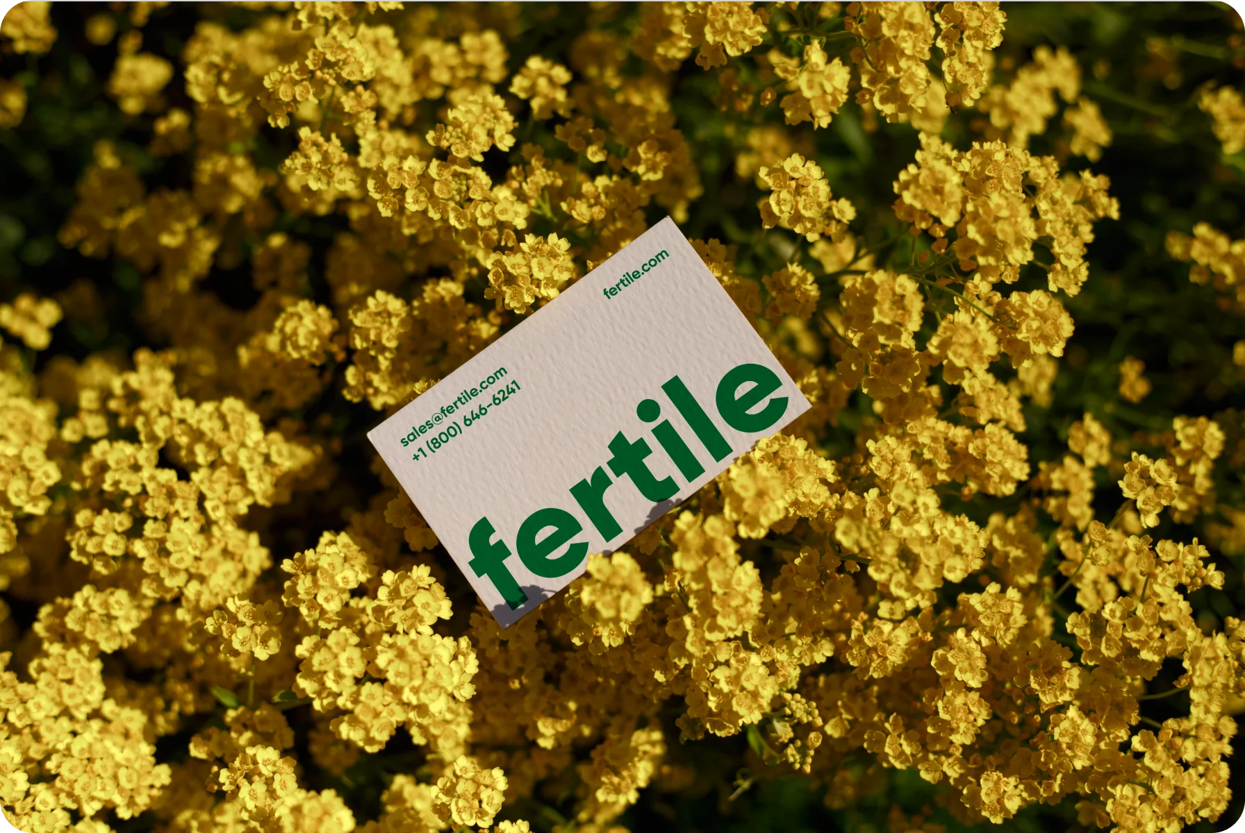

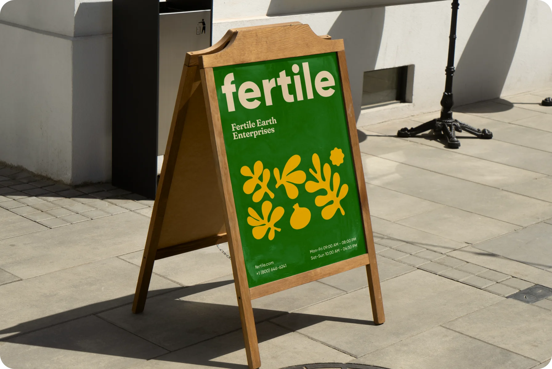
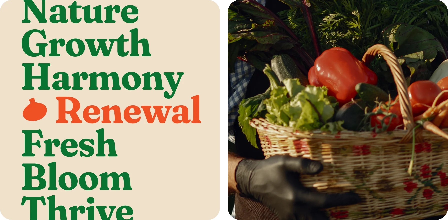
Our team crafted engaging brand elements that are eye-catching and appeal to the company’s energy, cheerfulness, and positive outlook.
{{mais-t}}