The content is only as good as how its consumers experience it. To engage, excite, and persuade readers, one needs to write not merely well but clever too.


To help improve both your writing and your reader’s experience, we have prepared these 14 helpful UX writing examples. Whether you’re a fledgling writer or an experienced author, it always pays to apply these tricks in your work. Stay with us, and we’ll do our best to explain all that and more.

What is UX writing?
While UX design helps users navigate websites, clever UX writing explains to them what to do. At its core, it’s about crafting readable and persuasive texts that help users interact with the interface, essentially compelling them to act. This includes the text of buttons, menus, tooltips, error messages, etc. We call a small piece of text such as those a microcopy.
When web content creation is user-oriented, the main objective is to convey clearly and concisely what a website offers, providing users with relevant information. Most website owners believe web content should mainly be used to improve their page rankings in search engines. However, proper content refinement can improve not just the ranking of a website but the entire user experience to boot. By “user experience,” we should understand users’ emotions and feelings both during and after interaction with a product or service. In other words, it is the result of all the interactions a user may have with the brand or company.
With that in mind, the written content should correspond to the brand image and the company’s vision. If the experience is pleasant for users, they will feel more connected to a company, product, or even community. And let’s face it — this is a crucial step for developing customer loyalty. This is why it is so important to write in a way that improves the overall experience of your users.
How do people read online?
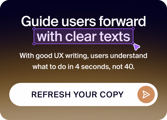
Before delving deeper into writing tricks, let’s first try to understand how the consumers of our future content will actually read it. This may come as a surprise for some, but most people, in fact, quickly scan the pages for the relevant information. It is a critical stage because this is when visitors determine whether the text they’re reading is fulfilling their needs or simply wasting their time. What is important is that this process takes only around 4 seconds, so there’s little room for error.

How to write well?
Writers should consider several factors when creating content that is both easy to scan and interesting enough for the users to stay and read on. And as we mentioned earlier, the first few seconds spent on a website are crucial.
To craft genuinely compelling and, by extension, successful content, you will need to consider the following general tips:
- Pay close attention to your titles and button names. Quite often, it is titles that make or break the content. If they are too long, convoluted, poorly phrased, or just outright weird, the users will judge the entire piece accordingly.
- Break your text into paragraphs and try to provide only the relevant information. Keep in mind that it is best to assign one idea per paragraph and one concept per a single sentence.
- Be clear and direct. Use active voice cleverly as it goes well with confident writing. Consider your target audience, possible cultural contexts, or different digital channels, and adjust your tone and style accordingly.
{{banner-2}}
Allow your writing to anticipate and solve potential concerns.
- Carefully think through how you add internal or external links to your page. Everything needs to be super clear so that the user wouldn’t have to wonder where the link they’re about to click will take them. This is especially important when you rely on those clicks for conversions or sales. Links are also helpful when you have a lot to say with limited space. Adding a link to another page will let users explore more of your product at their own pace, provided they’re interested.
- Complement your text with a visual component to help further improve the overall reading experience and comprehension. Be sure to use high-quality images with the proper size and resolution and avoid animated GIFs as they tend to distract the users.
- Use an inverted pyramid writing style by bringing the most important information at the beginning of the piece. This would allow customers the freedom to continue reading about the topic that interests them.
Examples of good UX writing
Clear actions
When writing a microcopy for a website or app, your priority number one must always be going for clarity in what you say. Be concise and straightforward with the user. State things the way they truly are/they are going to be. Allow your writing to anticipate and solve potential concerns.
Achieving clarity and conciseness often requires that your tone sounds natural, as close as a real human interaction would go.
Metaphors
Since being clear to your user is your first priority, using metaphors can be your best ally when attempting to convey complex content in a simple manner. It is an excellent method to help visitors understand abstract or unfamiliar content. By associating such information with a specific concept, people find it easier to comprehend it.

Guidance and suggestions
A great way to make the user feel like they are being provided with the best experience is when things are easy. And sometimes, especially when some areas or parts of your process require complex thinking, this means being helpful through an extra suggestion. Think of the websites that place part of their FAQ section at all times on their webpage so that the users feel inclined to seek guidance.
The human touch
Achieving clarity and conciseness often requires that your tone sounds natural, as close as a real human interaction would go. Start thinking about live interactions and how you would address a customer in them. Customers are more likely to stick around and engage in microbehaviors when they feel they interact within a friendly, human-like interface. A great example of this is the usage of AI helplines.
Data visualization
A surefire way to convince a user to carry a determined behavior is by showing them data that could be either interesting, useful, or vital to them. That said, the information you offer should be exact and straight to the point. For example, "90% of our users have improved their writing after using our service".

Navigation & Taglines
Getting around a webpage, app, or service site can be daunting at times, especially if what you offer covers a broad spectrum. To solve this, aim to simplify: the shorter the time a visitor has to spend looking for a particular tagline or option, the more likely they are to use it. Provide your users with a customized menu and the most relevant options.
Meeting a customer with humor when something goes wrong with your product is a great way to diffuse tension.
Brand personality
A perfect way to bring a brand to life through text is by doing the following exercise. Imagine your brand as a person. What would your brand look like? What are your brand’s demeanor and character? Once you establish your brand’s personality, writing in that tone should help you streamline your UX writing. Follow the examples of fintech and banking services, which aim to sound trustworthy and professional. Or those of art and design tool services, which lean on their "enabler" behavior to sell.
When users interact with a product, they expect friendly language to guide them through a particular flow of events.

Page titles
We have already touched upon this topic, and for a good reason. At its core, understanding how to write a page title will help you get a firmer grasp of the other elements of UX writing. Why? Because of the requirements for a good title.
- It must have a setup, preferably within the first three words.
- It must cover the main point without unnecessary deviations.
- It must be as short as possible.

Humor and entertainment
Why so serious? Having a well-developed sense of humor and a general understanding of what is entertaining at the moment are great tools to connect with and, eventually, persuade your users. Allow yourself to have some fun, and don’t be shy to amuse them. Meeting a customer with humor when something goes wrong with your product is a great way to diffuse tension — "Oops! We couldn’t find that page for you. Here’s a picture of a cute puppy, though."

Additional support
While clever UX writing aims to convince your user and make their experience as easy and positive as possible, do not be afraid to give them tools for extra support when needed. This could be an optional pop-up or a comment in appropriate sections of your website when the user fills out a form, for example.
Be aware of the timing
Having awareness and tact toward your user’s situation can help you generate the connection needed for them to become loyal to your brand. It’s not always about having an overall impactful message but delivering the right message at the right time. For example, with the pandemic, many online services have leaned on how they can help the users with their lives during these tough times.
Motivate your users
An effective UX microcopy includes the proverbial "carrot on a stick": a motivator element. Think about why your average user might be inclined to carry out a microaction within your website, service, or app. Practical examples are text that offers benefits after a microaction, such as "receive 10% discount for subscribing to our newsletter".

Be inclusive
Even when your website or app might display a specialized service, it is good to cast a "wide net" regarding inclusion and usability. A great example of this is the web pages that adjust their text size and color scheme for easy reading, those with a dark mode, text-reader-friendly, etc. It’s best to keep in mind that we risk unintentionally excluding users if we do not intentionally include them.
Minimal writing
Once you’ve understood how to apply the above elements, it’s time to review your content. Does it feel like you could say the same while letting go of some of the text? Go for it. When we prioritize our content to be minimal and easy to scan, we are more likely to retain users.

Takeaway
UX writing is one of the most powerful tools in an age where most processes seem automatized and streamlined. It’s turning to our human values to improve the portrayal of our services. There are many tools and best practices to improve the user experience through writing. The goal here is to understand what’s needed. Be as straightforward, concise, enticing, and friendly as possible. That way, you will soon be able to recognize and learn what works for others (and what doesn’t) and, in turn, what works best for yourself. Happy writing!
FAQ
Why invest in branding services services services?