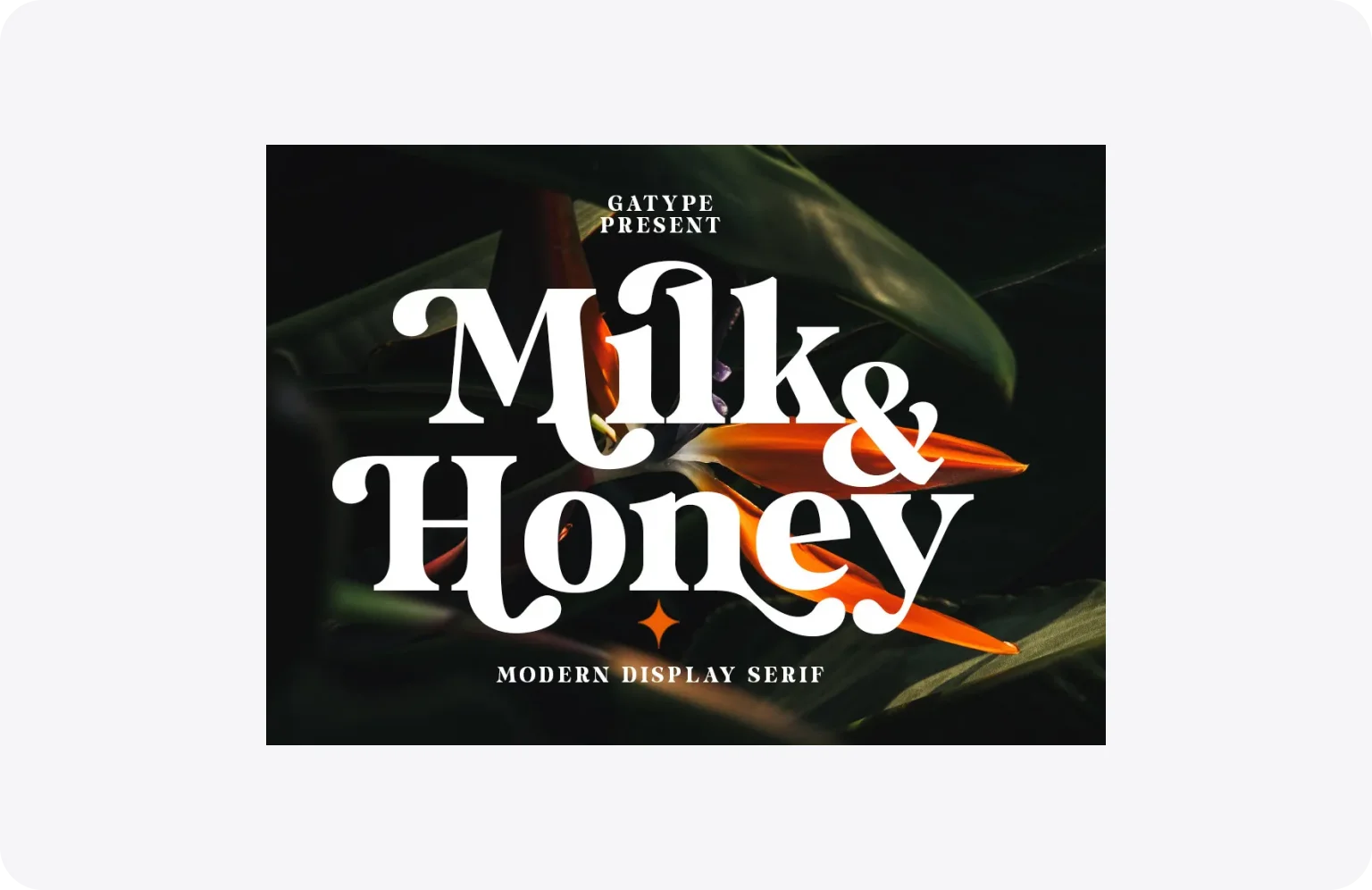



26 serif font examples to improve your branding and website design in 2026

updated
6 August 2026
5 January 2024
5 min read

Choosing fonts for a brand or website isn’t a purely aesthetic decision — it’s a business one. The typeface on your landing page shapes how investors, clients, and users perceive your product before they’ve read a word of your copy. Get it right, and your design feels authoritative and intentional. Get it wrong, and even a strong product can come across as unpolished. For founders and product teams, that distinction matters.

This article gives 26 serif fonts to refine your branding and website design in 2026. Find out why they’ve gained popularity, explore prime examples, and learn how to maximize the advantages of these typefaces. Keep reading, as there are so many insights we want to share with you today.

What is a serif font?

Serif fonts are known for the small lines attached to letters. They have roots in the mid-1800s and have maintained popularity due to readability and visually pleasing design.

Versatile and adaptable, serif fonts are widely used across print formats, including magazines, books, newspapers, and other long-form publications. Although they have become more prevalent on the web, combining serif and sans-serif fonts can be highly effective for establishing contrast and typographic hierarchy. (But more about their duo in the next chapter.)
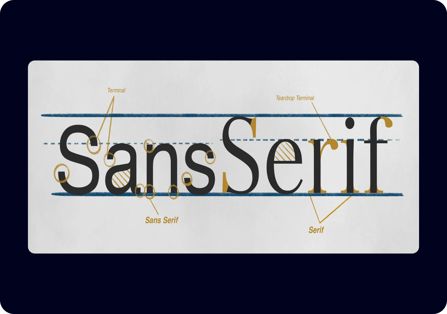
Each serif, each curve, and each flourish adds depth and personality to the text, turning a simple string of words into a captivating narrative.

What’s the difference between serif and sans-serif fonts?

As we already mentioned, pairing serif and sans-serif fonts is a valuable tool in typography and design. It offers a balance of tradition and modernity, readability and contrast, as well as hierarchy and emphasis. Although these types are considered to be great when mixed together, they aren’t the same.

Many people may not immediately notice the differences between serif and sans-serif fonts, especially without close attention to typography. However, the details, while subtle, play a crucial role in shaping the visual and psychological impact of text.
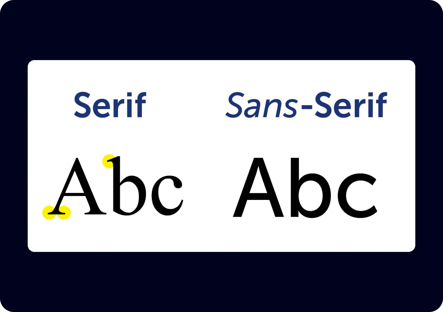
The key distinction between the two typefaces lies in the presence of serifs — the small lines concluding a letter’s strokes. Serif fonts exude a classic, formal vibe, perfectly suited for print media such as books and newspapers. Their association with readability and reliability makes them a preferred choice in traditional publishing.

In contrast, sans-serif fonts lack these decorative strokes and present a modern, minimalistic look, often used for headings, websites, and user interfaces. They excel in digital media and informal contexts for clarity and straightforward design. The choice between serif and sans-serif fonts depends on the specific design objectives and the tone a project aims to convey.

Serif fonts are the trusted classics of typography, while sans-serif fonts offer a sleek, modern twist. Each serves its purpose in conveying information and aesthetics.

When should you opt for serif fonts?

Serif fonts are an all-in-one choice suitable for a wide range of industries and applications, blending professionalism with a touch of elegance. They play a significant role in branding and corporate image. From logos to headings, serif fonts lend a touch of class that can enhance a company’s visual identity, making it memorable and reputable. If you’re at the logo stage, our step-by-step guide to logo design shows where typeface choice fits into the wider process.
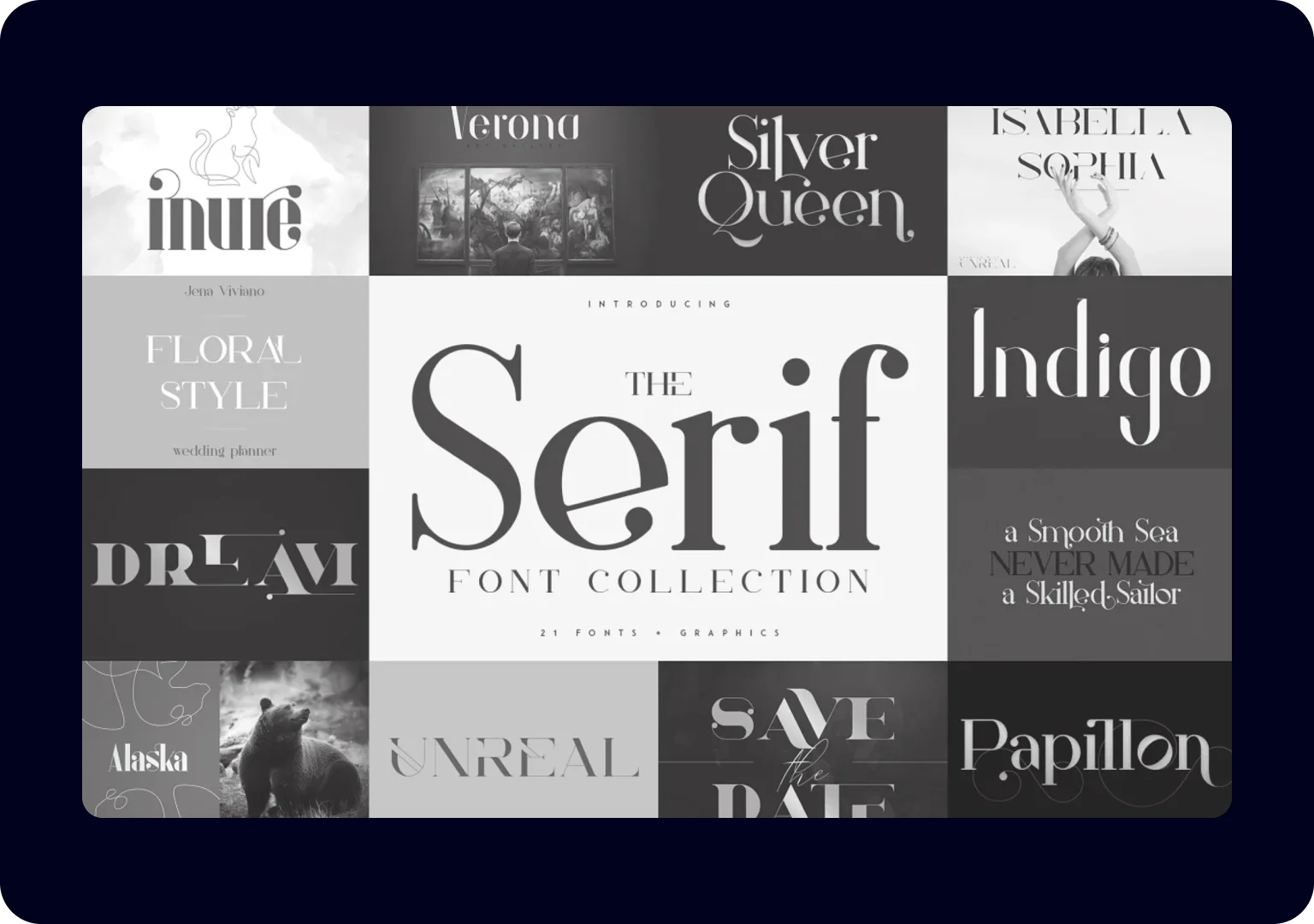
In web design, serif fonts are strategically used to add refinement and elegance to websites. They are popular choices for headings and design elements that require a more formal tone. When paired harmoniously with sans-serif fonts, these typefaces create a balanced and visually pleasing layout, elevating the user experience. For a look at how that plays out above the fold, browse our collection of website header design examples.

Ultimately, the decision to use serif fonts hinges on the project’s objectives and desired tone. Whether crafting legal documents, building a prestigious brand, or designing a stylish website, serif fonts offer a friendly yet professional way to convey reliability, trustworthiness, and classic style.

Typography choices like these sit at the intersection of brand strategy and visual design, so getting them right from the outset can save significant rework later on. If you’re building or refining a brand identity, Halo Lab’s branding services can help move from font shortlist to a complete, cohesive visual identity that remains effective across all user touchpoints.

Tips for using serif typefaces

Now, let’s uncover five invaluable tips for maximizing the potential of serif fonts. Armed with this knowledge, you will be able to make thoughtful design selections and produce even more influential communication materials:

  1. Choose the appropriate context. Select serif fonts for contexts that require a touch of tradition and formality. They work exceptionally well in print materials such as books, newspapers, resumes, and formal invitations.
  2. Pair with sans-serif. Create visual contrast and hierarchy by pairing serif fonts with the already mentioned sans-serif fonts. Use the serif typeface for body text and the sans-serif for headings and subheadings to improve readability and guide the reader’s eye.
  3. Mind readability. Pay attention to font size and line spacing to maintain readability, particularly in longer passages. Avoid using serif fonts at very small sizes, as intricate details may become less legible. The same rules on line length and spacing we cover in our principles of good design apply here.
  4. Use italics and bold. Take advantage of italic and bold variations within the serif font family for emphasis and hierarchy. Italics are useful for book titles or citations, while bold can draw attention to important content.
  5. Maintain consistency. Matching font size, style, and spacing is key to a polished design. Ensure a uniform typographic hierarchy throughout your project to create a cohesive and visually appealing layout

26 best serif fonts for your brand & website in 2026

In the world of design and typography, selecting the right font is akin to choosing the perfect look for a special occasion. To help you figure out which “typographical outfit” is the best for you, we’ve gathered over 26 top serif fonts. Each typeface in this list serves as a clear example of serif font usage in contemporary branding and website design.

1. Kyoto

Kyoto bridges traditional Latin slab designs with influences from Japanese calligraphy. Its structured forms pair intentional contrast between heavy slabs and soft teardrop terminals, ensuring clear letterforms and visual stability across sizes. The type performs equally well in digital interfaces and print layouts, making it suitable for branding and diverse typographic applications.

Best for: brands that need to feel both structured and distinctive — particularly effective for product landing pages and identity systems where cultural depth matters.

__wf_reserved_inherit
Kyoto provides a well-defined structure with refined detailing

2. SLTF The Silver Editorial (Pixel)

SLTF The Silver Editorial Pixel Version is a serif typeface that reinterprets a classic editorial design through a structured pixel grid. It preserves the balanced proportions and contrast of the original Silver Editorial while introducing a distinct 8-bit texture. This combination produces an expressive display style that remains consistent with traditional editorial typography. 

Best for: creative studios, music brands, or cultural projects where an unconventional typographic voice is part of the brief.

__wf_reserved_inherit
Pixel reworks editorial forms with a distinct retro texture

3. Periodica

Periodica is a transitional serif typeface with a deliberately neutral character designed for extended reading. Its moderate x-height and balanced stroke contrast support steady text flow and prevent text blocks from feeling heavy. The restrained design gives layouts a calm, balanced typographic tone.

Best for: content-heavy platforms and publications where reading comfort over long sessions is the primary concern.

__wf_reserved_inherit
Periodica maintains a calm rhythm and steady, easy-to-read forms

4. Delusse

Delusse is a contemporary serif text face that dialogues with the classic French Vendôme type tradition while adapting it for modern long-form reading. With tempered contrast and softened shaping, Delusse guides the reader comfortably through lengthy passages. The type’s harmonious proportions and calligraphic rhythm make it well-suited for both editorial and branding applications.

Best for: editorial brands and publishers targeting a sophisticated adult audience — works especially well when paired with a geometric sans in a two-typeface system.

__wf_reserved_inherit
Delusse balances smooth curves and gentle contrast for text flow

5. Cotford

Cotford is a contemporary transitional serif that blends adaptable styling with an expressive character. It ranges from delicate thin strokes to bold weights, offering versatility across text and display uses. The type’s distinctive texture maintains clarity and visual interest at all sizes.

Best for: versatile enough for both body text and display — a practical choice for early-stage brands that need one typeface to carry multiple roles across print and digital.

Cotford blends varied strokes with a flexible typographic style

6. Clearly

Clearly uses flared serifs and a blend of soft curls and sharp terminals to create a warm yet assertive tone in display typography. Its condensed letterforms and varied weight range establish a strong vertical rhythm, accentuating visual impact at medium to large sizes. Primarily designed for expressive headings, it adds personality to editorial layouts and branding.

Best for: campaigns and covers that need to own the page at large sizes — not suited for body text or small UI elements.

__wf_reserved_inherit
Clearly shows condensed proportions and precise letterforms

7. Sita

Sita is a contemporary serif typeface rooted in 19th‑century Scotch Roman traditions but refined for today’s digital and print use. By balancing contrast and calligraphic influences, it gives text a sense of both clarity and elegance. As part of a superfamily with its matching sans, the font adapts fluidly from body text to complex typographic hierarchies in editorial and branding systems.

Best for: brand systems that require typographic hierarchy across multiple touchpoints — particularly strong when used alongside its matching sans companion.

Sita stands out with stroke contrast and polished text flow

8. Falutin

Falutin is a Didone-style serif that exaggerates classical letterforms for a more expressive look. Graceful curves and teardrop terminals soften the strict geometry typical of the genre, introducing a sense of movement and experimentation. Despite its dramatic contrast, the design retains a strong connection to traditional editorial typography. 

Best for: fashion and lifestyle brands where expressive personality is a feature, not a risk — best reserved for display sizes where its dramatic contrast reads clearly.

Falutin pairs high contrast with graceful curves and terminals

9. Maragsâ

Maragsâ is a display serif typeface inspired by the pakupyâ accent mark used in Filipino pronunciation, which shapes its tapered tips and sharp structural cuts. It is distinguished by sharp terminals, abrupt stroke contrasts, and angular letterforms. The type was designed primarily for visual emphasis and works well in large-scale typography and headlines.

Best for: projects where the typography itself needs to be a visual statement — cultural publications, poster campaigns, and brand identities with a bold editorial direction. 

__wf_reserved_inherit
Maragsâ features angular forms with distinct tapering details

10. Paragraf

Paragraf is a contemporary font with high‑waisted structures, a tall x‑height, and slightly narrow proportions. Its geometric simplicity, seen in rectangular terminals and crisply cut details, gives it a rather rational tone. Slightly tapered stems and open counters improve readability, keeping even tightly set text structured and clean.

Best for: branding systems and signage where geometric clarity and rational tone are priorities — well-suited to B2B brands that want structure without coldness.

Paragraf highlights tall proportions and crisp geometric detailing

11. Primo Serif

Primo Serif revives a classical Garamond‑inspired design drawn from 16th‑century book typography, updated with expanded features for modern use. The family includes a wide range of styles from lighter to heavier weights with italics and expressive alternates. As one of the popular serif fonts, it performs effectively across headers, body text, and editorial layouts.

Best for: teams looking for a reliable workhorse with classical roots — handles everything from headers to body text, making it a low-risk, high-quality choice for content-led websites. 

Primo Serif balances open counters with elegant serif forms

12. Tripsis L

Tripsis L is a modern display typeface that has tightly spaced letterforms and condensed proportions. Such a structure creates a compact rhythm, allowing stems to sit closer together and increasing the visual tension between characters. This font works better for short titles and graphic statements rather than extended reading.

Best for: large-format applications only — covers, campaign titles, and hero sections where compact visual tension is the intended effect.

__wf_reserved_inherit
Tripsis L features close-set characters with streamlined shapes

13. Ramboia

Ramboia draws on French Old‑Style serif traditions through loose curves that reject angular construction in favor of organic shapes. The typeface’s generous x-height and open counters make it suitable for both display and short body text. With multiple weights and subtle stylistic variations, designers can establish hierarchy and emphasis while keeping a harmonious look.

Best for: boutique and lifestyle brands where warmth and approachability matter as much as elegance — works well for packaging and short editorial copy.

Ramboia presents warm old‑style curves and flowing open counters

14. KTF Metro Roman

KTF Metro Roman is a serif typeface that reflects classical proportions adapted for urban wayfinding. Its upright letterforms and carved‑like serifs provide a strong presence and legibility at display sizes. The font delivers a structural, grounded character suited to branding and expressive graphic systems, particularly in signage and architectural contexts.

Best for: urban-facing brands, architecture firms, and city-oriented products where typographic weight and structural presence need to hold up at scale.

KTF Metro Roman presents carved serifs with display presence

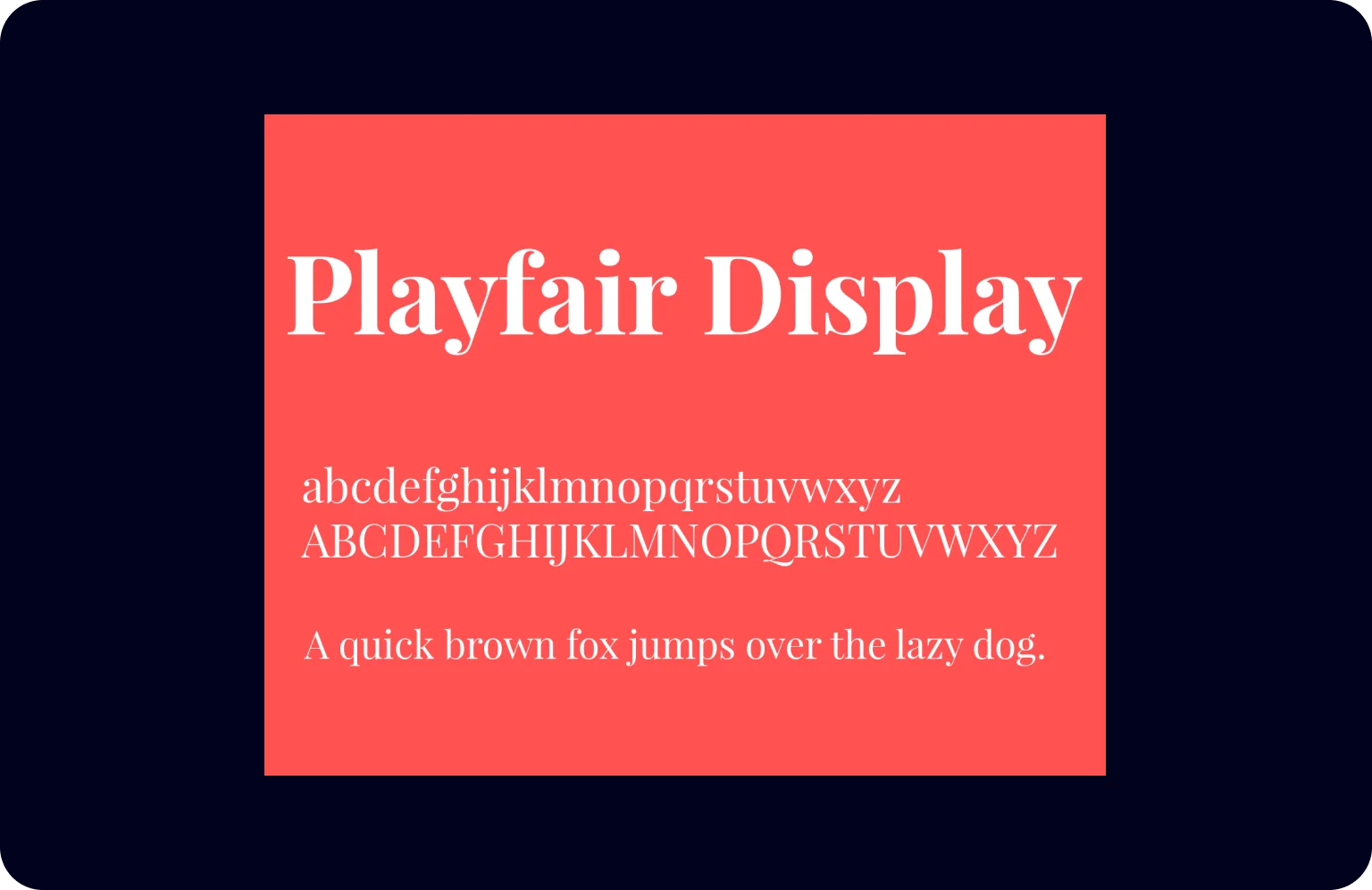
15. Playfair Display

Playfair Display uses extremely thick vertical strokes alongside very thin horizontal ones, creating a striking visual contrast. Its thin, bracketed serifs and tall x-height give the text a structured, elegant appearance. This combination is most effective at large sizes for short text, where it conveys sophistication and authority.

Best for: hero sections and short high-impact headlines for luxury or premium brands — use sparingly and pair with a neutral sans for body text to avoid visual fatigue.

Playfair Display emphasizes dramatic contrast and refined forms

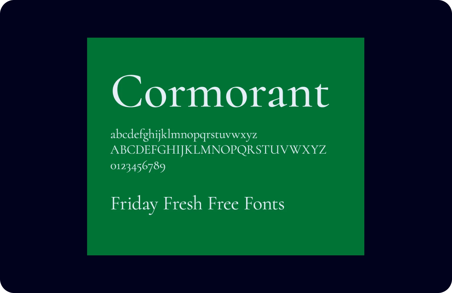
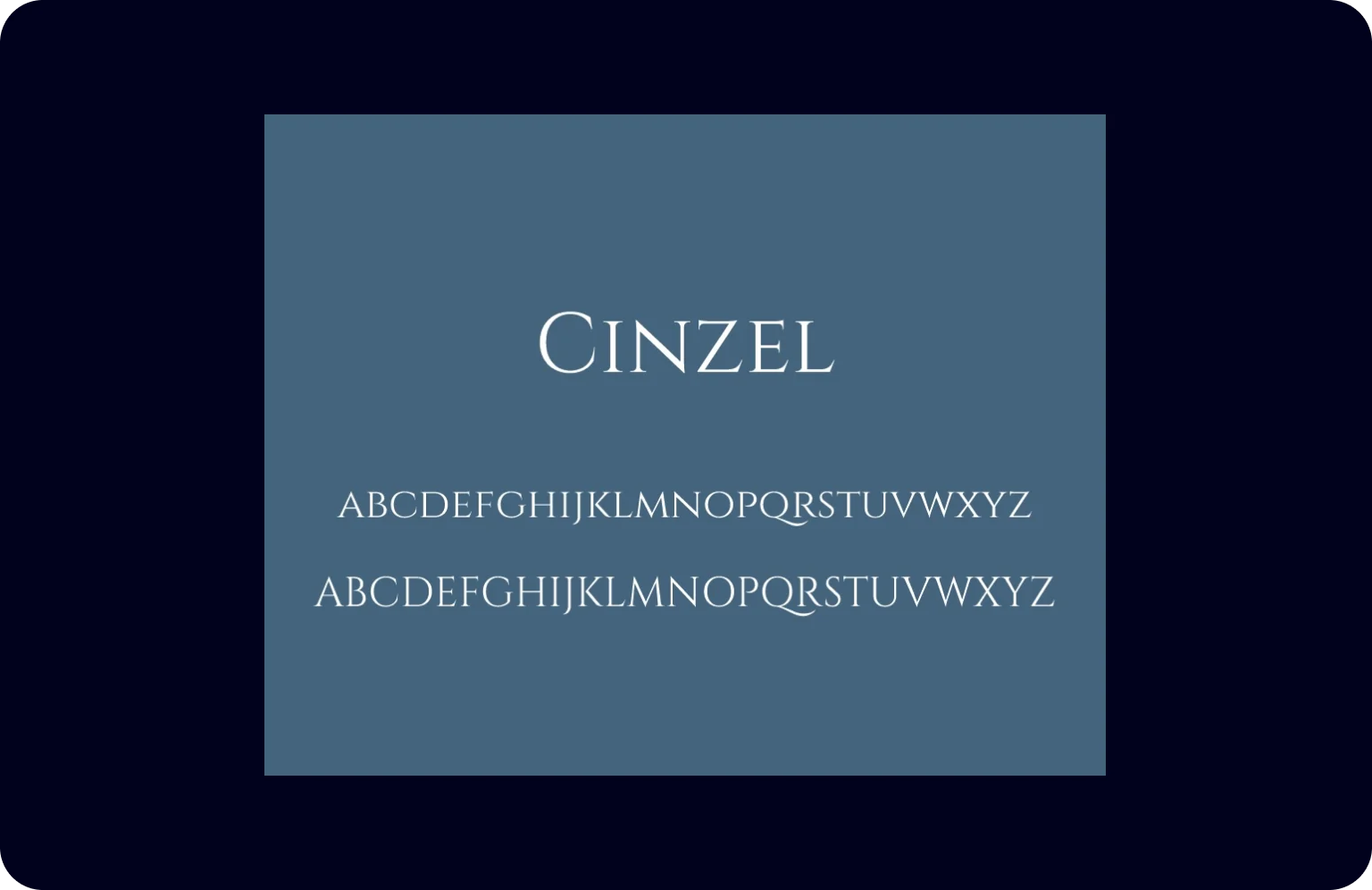
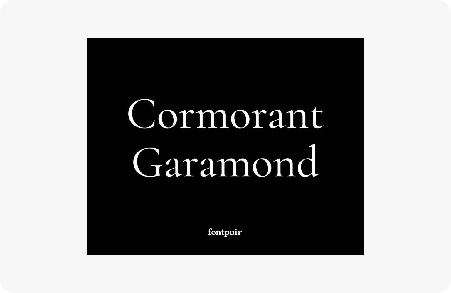
16. Cormorant Garamond

Cormorant Garamond reinterprets classic Garamond proportions with contemporary, high-contrast, condensed letterforms. Its delicate hairline strokes transition dramatically into robust verticals, while sharp serifs maintain the elegance of Renaissance ancestry. This results in a sophisticated texture that retains readability at text sizes but blossoms into ornamental detail when scaled for display.

Best for: brands where refinement and restraint are the message — particularly effective for luxury packaging, literary publishing, and any context where the audience rewards understatement.

Cormorant Garamond unites Renaissance grace with sharp contrast

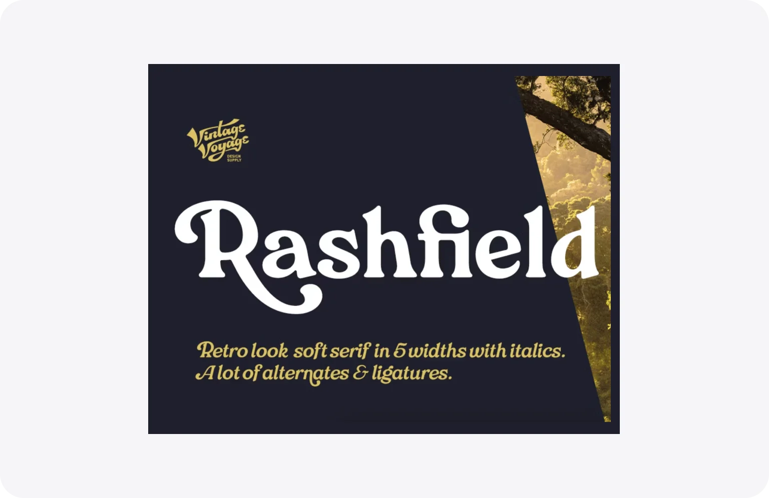
17. Rashfield

Rashfield draws inspiration from classic Windsor models, evident in its distinctively outward-bent h, m, and n characters. Soft serifs meet a robust structure, creating a typeface that balances retro warmth with a surprisingly versatile set of modern alternates. Such a gentle character makes it equally effective for both commanding headlines and more extensive passages of text.

Best for: brands that want character without eccentricity — its retro warmth makes it approachable in both logo design and web headlines without feeling niche.

__wf_reserved_inherit
Rashfield bends retro letterforms into a warm, versatile serif

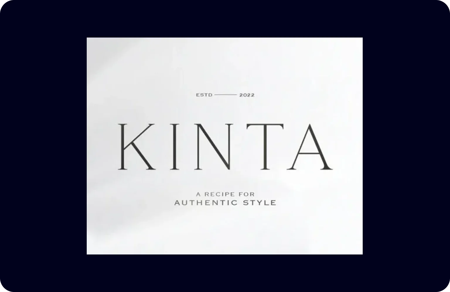
18. Kinta

Kinta delivers a refined serif where thin strokes meet moderate, controlled contrast. Clean, minimal lines are balanced with classic proportions, offering a typeface that feels both authentically traditional and distinctly modern. This thoughtful construction ensures high readability across formats while preserving its elegantly understated presence.

Best for: premium brands and formal communications where elegance needs to feel earned rather than decorative — particularly strong for print and high-end digital contexts.

Kinta pairs thin strokes with classic proportions for elegance

19. Domine

Domine draws on century-old models like Clarendon and Cheltenham, reimagined specifically for screen readability. Squarish inner counters and shorter‑than‑usual serifs open up the letterforms, while deep stem‑to‑branch joins prevent dark spots at small sizes. Originally engineered to perform between 11 and 16 pixels, this slab serif remains remarkably legible even during prolonged reading sessions.

Best for: the practical choice for text-heavy websites and blogs where screen legibility across devices is non-negotiable — designed specifically for sustained on-screen reading.

__wf_reserved_inherit
Domine opens up letterforms for sustained on-screen legibility

20. Ortica

Ortica pairs a sharp, angular Bold — constructed entirely from straight segments — with a smoothly curved Light weight featuring spiky, calligraphic details. This dual‑personality serif displays its geometric construction best at larger sizes while retaining elegance in text. The deliberate contrast between rigid and organic elements makes the family equally suited for formal documents and creative display work.

Best for: designers building typographic contrast into a system — the Bold and Light weights are different enough in character to function almost as two separate typefaces.

Ortica contrasts sharp angles with curved calligraphic details

21. Editorial New

Editorial New uses consistent stroke weight and balanced proportions to create a neutral, highly legible text face. Unbracketed serifs and open apertures maintain character distinction in dense paragraphs. The typeface provides a trustworthy, unobtrusive foundation for complex information hierarchies.

Best for: enterprise products, corporate communications, and documentation where neutrality and information density take priority over personality.

Editorial New provides a clear and structured design framework

22. GT Super

GT Super applies a robust, contemporary treatment to traditional serif letterforms. Its strong vertical stress and assertive serifs command attention in headlines and logos. A balance of classic structure and modern weight ensures both distinction and readability at various scales.

Best for: media brands and premium product websites that want editorial authority — strong enough for standalone headlines, refined enough to anchor a full brand identity.

GT Super stands out with its contemporary classicism

23. Fraunces

Fraunces revives the quirky charm of early 20th‑century soft serifs, drawing clear inspiration from typefaces like Windsor and Cooper. Its construction features a variable “softness” axis that controls the roundness of forms, alongside a binary “wonk” switch that enables characterful alternates in letters like h, n, and m. This results in a display face that balances warm, approachable textures with precise optical sizing across nine weights.

Best for: startups and creative brands that want approachability alongside craft — the variable softness axis makes it adaptable across tones without switching typefaces.

Fraunces revives soft serifs with variable wonk and softness

Case in point: how ShineOn uses Fraunces for balance

Fraunces is easy to admire and harder to use well — its variable softness and “wonk” alternates give a lot of expressive range, but that range can quickly tip a brand into either too quirky or too safe. ShineOn, a US print-on-demand platform for handcrafted personalized gifts, is a good example of how to land it in the middle.

For ShineOn’s brand identity, Halo Lab paired Fraunces for headlines with Manrope for body copy and UI. ShineOn sells sentimental, handcrafted products but runs as a tech-forward e-commerce platform, so the typography had to carry both sides at once: Fraunces gives category titles and editorial moments a warm, human feel, while Manrope keeps product listings and checkout flows fast and unobtrusive.

The takeaway for product teams: a serif doesn’t have to be the loudest element on the page to do real work. Used selectively — for hero headlines, category titles, and moments of emotional emphasis — Fraunces shifts how the entire brand feels without slowing down the parts of the experience that need to be fast. If your product sits at a similar intersection of modern delivery and traditional values, it’s a typeface worth a serious look — as long as you let a clean sans do everything else.

Fraunces for expression, Manrope for readability and flow

24. Recoleta

Recoleta blends soft shapes from 1970s typefaces with fluid, angled strokes. Its variety of weights provides versatile typographic color — lighter ones suit body text while heavier weights deliver high-impact headlines. Stylistic alternates offer unique character options for logos and business cards, creating a design that feels both familiar and freshly modern.

Best for: consumer brands targeting a design-aware audience — its retro warmth resonates particularly well in DTC products, lifestyle apps, and packaging where personality drives purchase decisions.

__wf_reserved_inherit
Recoleta blends soft curves with fluid strokes for retro warmth

25. Bogart

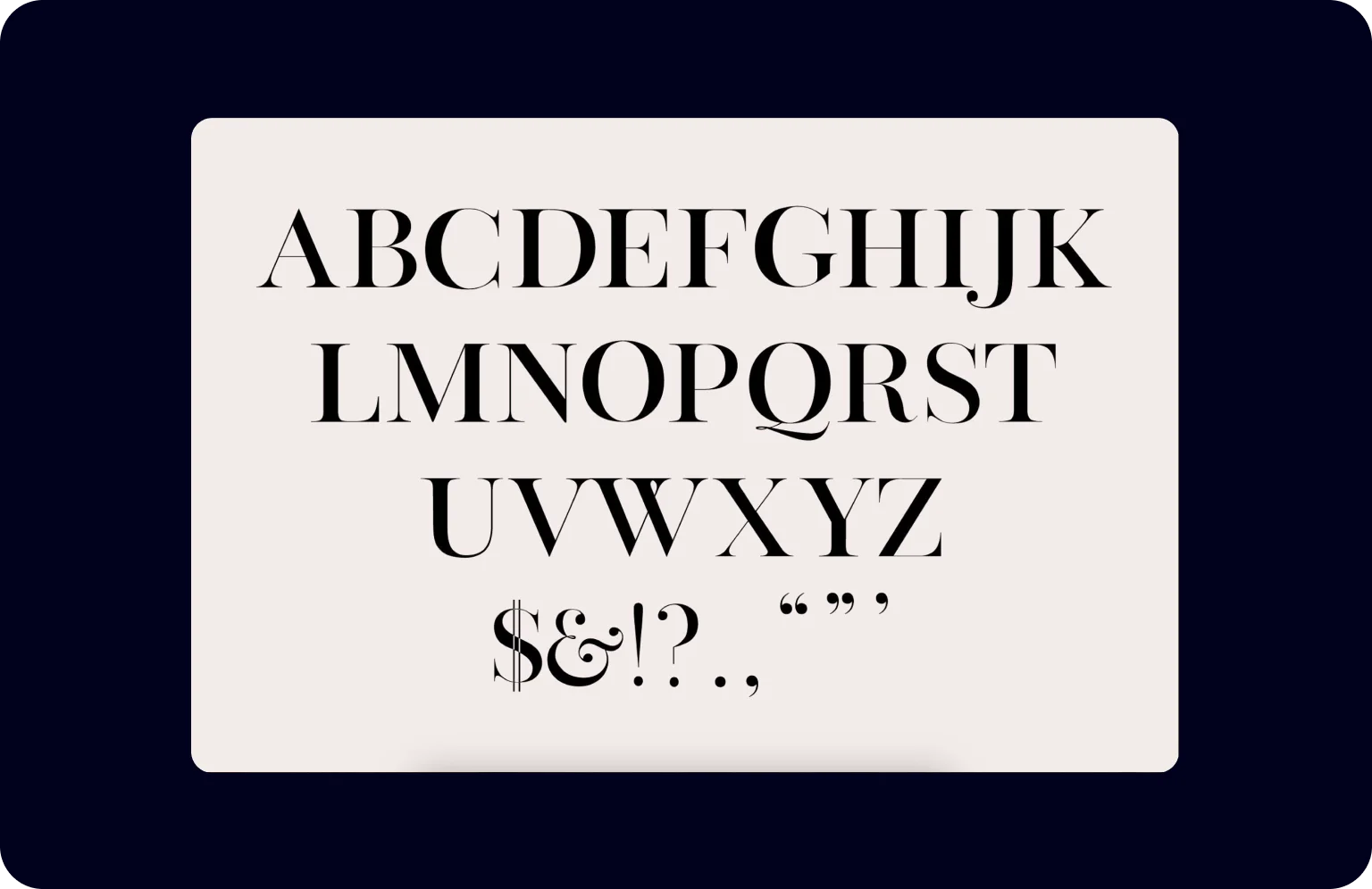
Bogart employs graceful, sweeping curves and sharp, refined terminals to achieve a precise, high-end appearance. Controlled contrast and elegant bracketing in the serifs contribute to its meticulous texture. The typeface is crafted for exclusive applications where detail and craftsmanship are paramount.

Best for: the highest-end applications only — cosmetics, fine jewelry, and luxury editorial where meticulous detail and exclusivity are the entire point.

__wf_reserved_inherit
Bogart showcases meticulous craftsmanship and precise forms

26. Instrument

Instrument combines classic serif structure with a crisp, contemporary edge evident in its clean terminals and balanced letterforms. This condensed display face features a tall x-height and sharp serifs, creating an elegant, approachable texture at larger sizes. Refined simplicity ensures clear communication while injecting a fresh, modern vibe into any application.

Best for: product teams and SaaS brands that want a serif with contemporary polish — one of the few typefaces in this list that holds up well inside a product UI as well as on a marketing site.

__wf_reserved_inherit
Instrument combines classic structure with crisp terminals

Before you commit: three things to verify

Shortlisting a font is only half the decision. Before committing, there are three practical checks that most teams skip — and regret later.

Test at actual implementation size, on an actual device

A typeface that looks refined at 32px in a design tool can feel heavy or lose legibility at 14px on a mid-range Android screen. Before finalizing any choice, render it at the sizes it will actually appear — body text, captions, UI labels — and view it on the devices your audience uses most.

Check the license before you build around it 

Not all fonts are free to use commercially, and licensing terms vary significantly — some cover web use but not app embedding, others require a separate license for each domain. Verify the license terms before investing design and development time around a typeface you may not be able to ship.

Audit performance impact for web projects 

Custom fonts add load time. A full serif family with multiple weights can add several hundred kilobytes to your page — enough to affect Core Web Vitals scores and SEO. Where possible, subset the font to the characters you actually use, and load only the weights the design requires.

{{banner}}

Choose the right variant for your website

Font selection shapes how a brand feels before a single word is read — setting the tone for trust, personality, and polish. The right serif can make a layout feel timeless or contemporary, restrained or expressive. Take the time to test your shortlist in context, weigh it against your audience and goals, and treat typography as a long-term decision rather than a finishing touch. Typography is only one piece of the picture, though — our guide to modern website design walks through the rest.

For more insights like this one, check out our blog — there’s plenty more worth a read!

FAQ

What is the most common serif typeface?

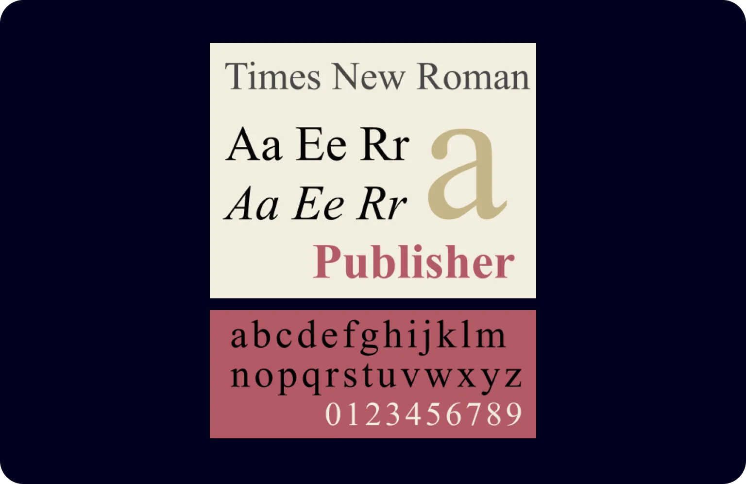
When it comes to serif typefaces, the most common one is Times New Roman. It’s the go-to choice for many of us, especially when you’re typing out an academic paper or reading a newspaper. Also, it’s the default font in many word-processing programs, making it super familiar and widely used.

Are serif fonts more suitable for body text?

Yes, serif fonts are more suitable for body text, especially in printed materials. They have a traditional and professional look, which adds a touch of class to your document. It’s also a solid choice for books, articles, and reports where you have lots of text to share.

Does the use of serifs enhance readability?

Absolutely! This is because those little feet, or “serifs,” at the ends of the letters create a sense of flow and help guide the eye along the lines of text. This makes reading long stretches of text easier and more comfortable.

What are the benefits of serif fonts?

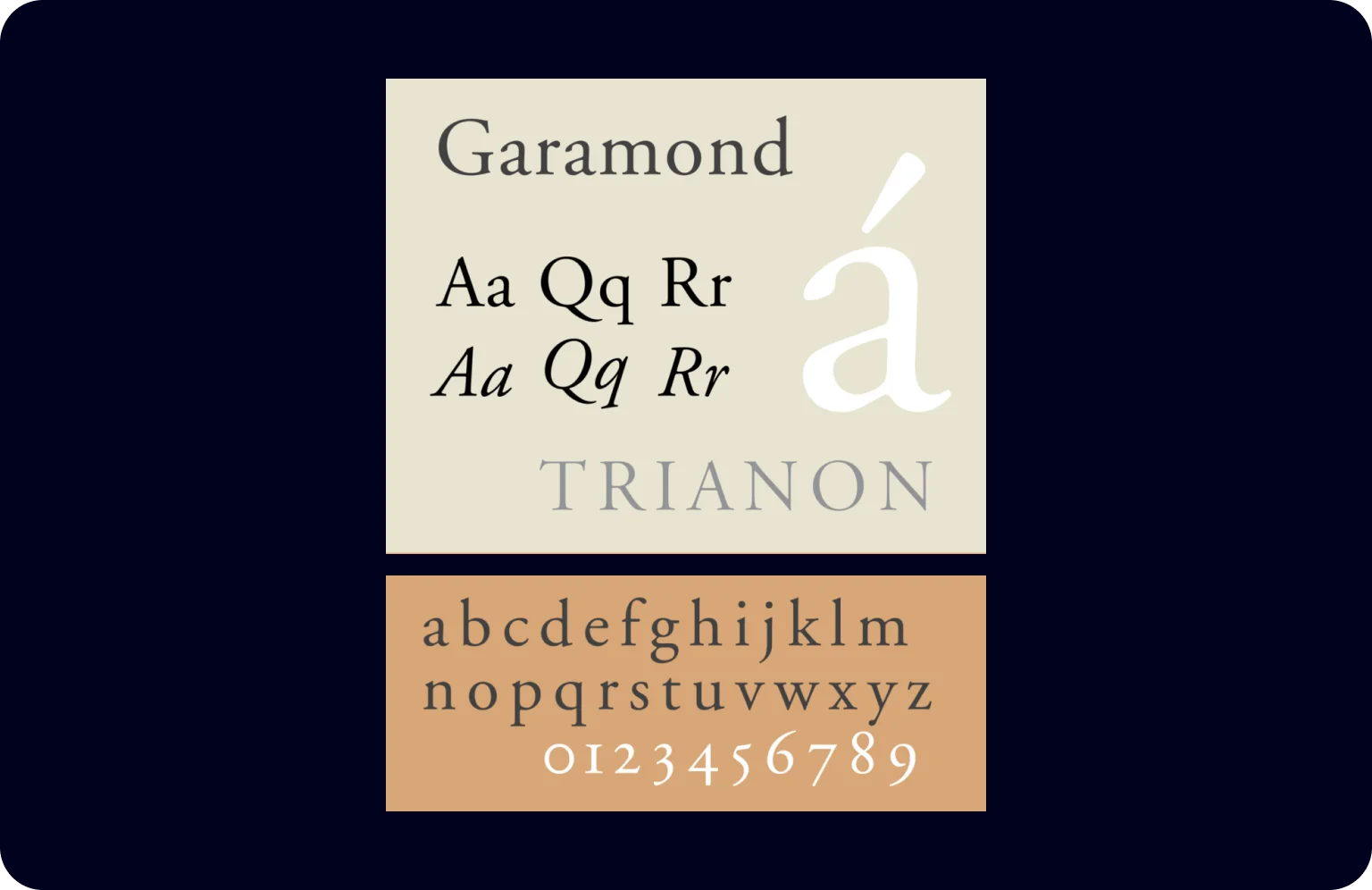
Serif fonts come with some neat benefits. Firstly, they’re often seen as more traditional and formal, which can add professionalism and credibility to your documents. Then, they are comfortable to read: those little serifs at the ends of each character make it easier for our eyes to flow from one letter to the next, especially in printed texts. Also, serif fonts offer great versatility. From classic Times New Roman to the elegant Garamond, you can find a serif font for every tone and style.

Ready to put your typography to work?

Our team runs projects from typography to a ready site.
Let’s discuss your project

copy iconcopy icon
copy iconcopy icon
Sum UP
Get a free checklist
Please, enter your full name
Please, enter your email
Please, enter your job title
Download now
Check out your email inbox
Oops! Something went wrong while submitting the form.