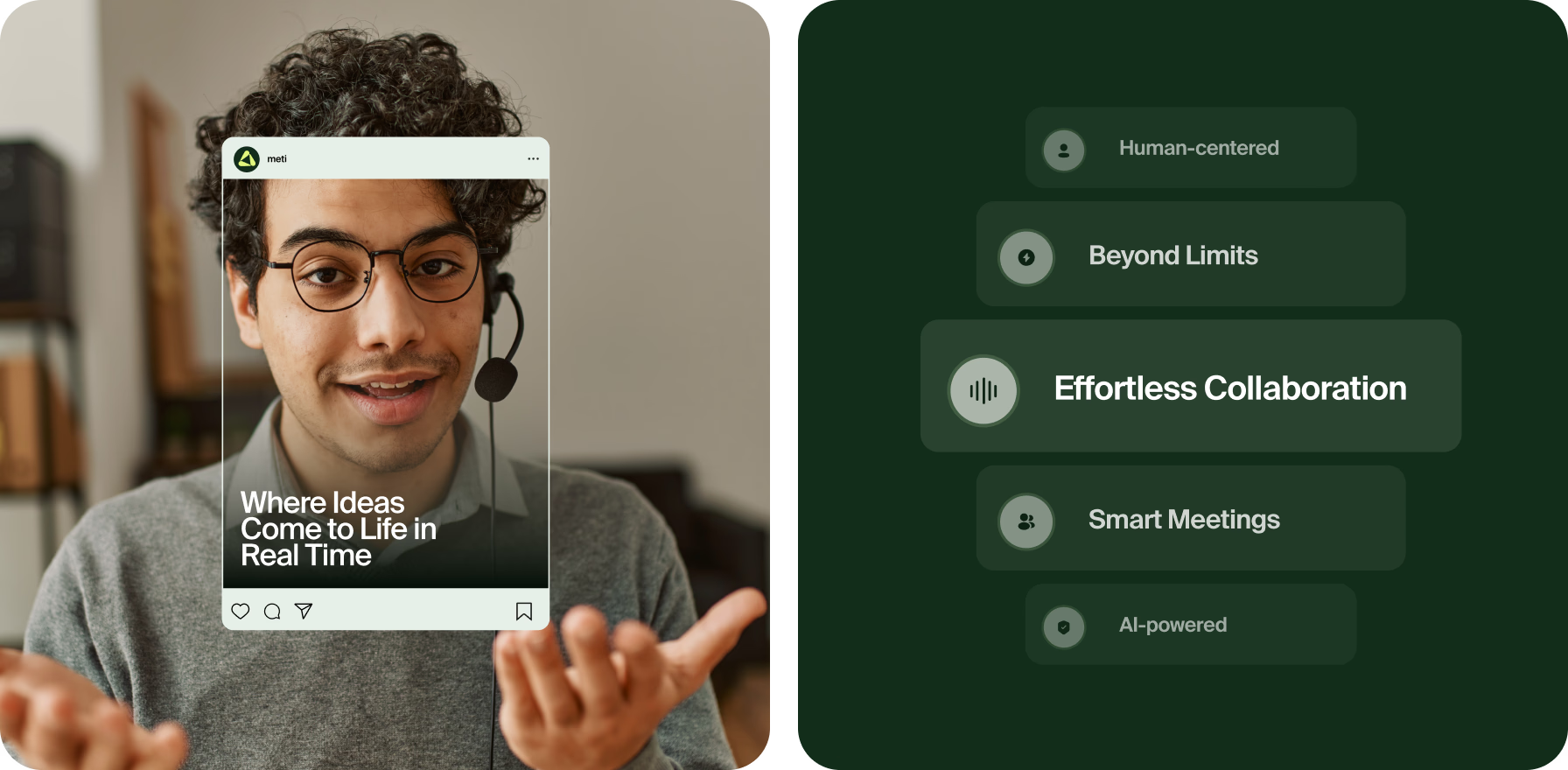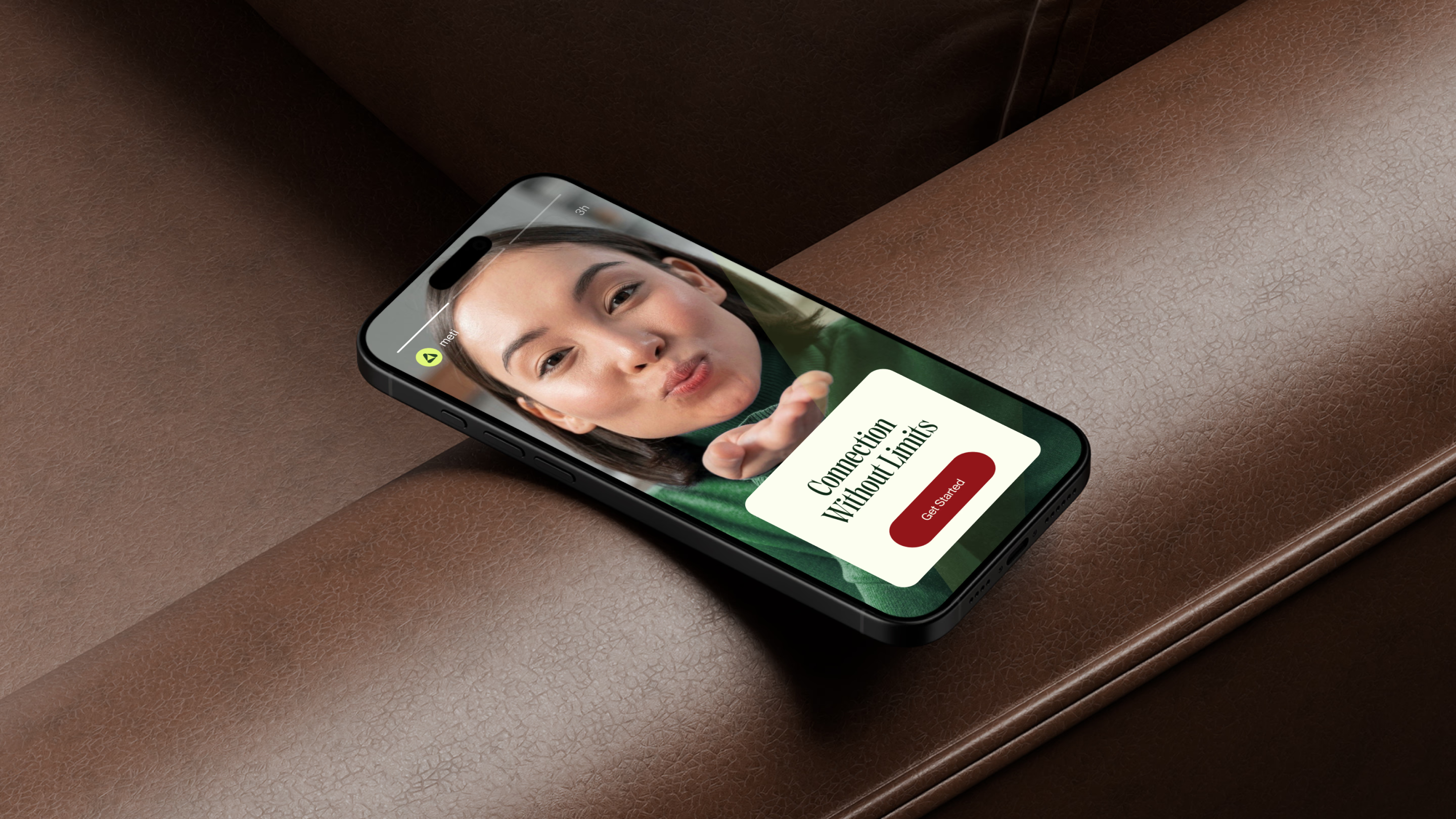


Design that gives AI a friendly face and the product a strong identity




AI-powered solution for effortless team meetings, real-time collaboration, and clear outcomes
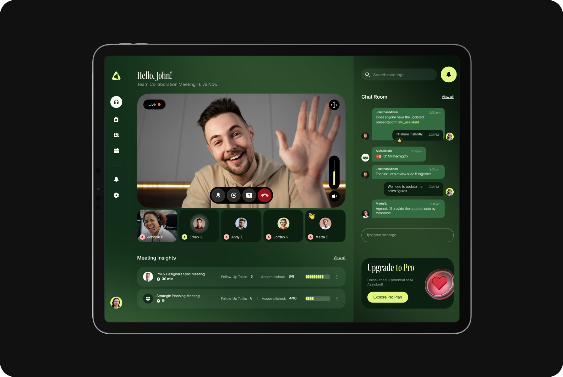
Meti is an intelligent, powerful digital platform for seamless video calls, smart meetings, and team collaboration. It’s designed to simplify remote communication and help teams stay productive in any work setting.
Whether it’s a quick catch-up or an in-depth discussion, the app supports modern workflows. With AI tools for note-taking, scheduling, and follow-ups, teams can meet, plan, and execute with greater focus and ease.
Balance, clarity, and a spark of motion
We built the Meti logo around the idea of streamlined connection. Starting with a triangular base to reflect stability, we softened the shape with rounded inner forms to convey a sense of flow, clarity, and approachability.
To give the symbol its own dynamic edge, we introduced a slight tilt and chose a bold mix of greens. This color palette adds freshness and tech appeal, while the final form captures the energy of real-time collaboration.
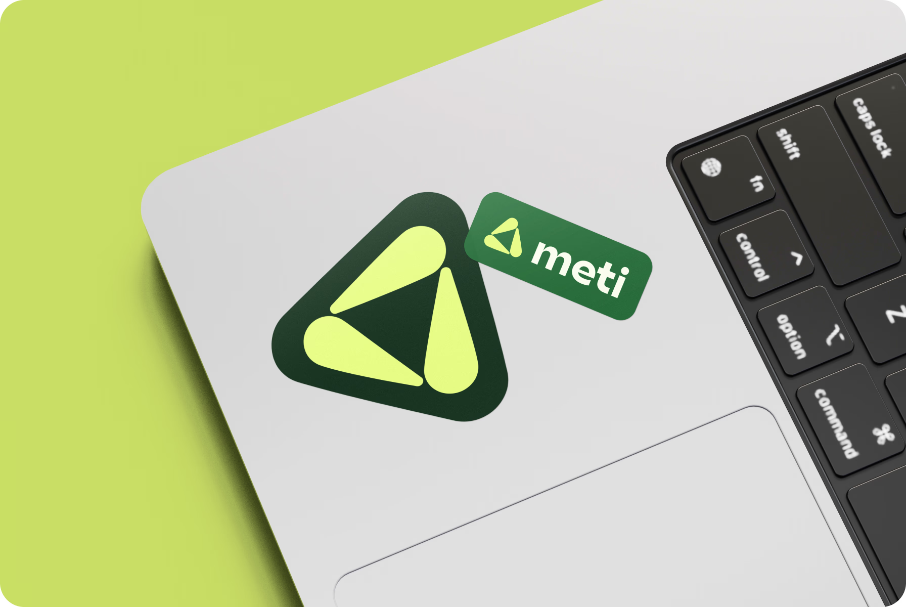
Our goal was to create a symbol that feels stable yet in motion — just like a team that’s always in sync.
{{mais-t}}
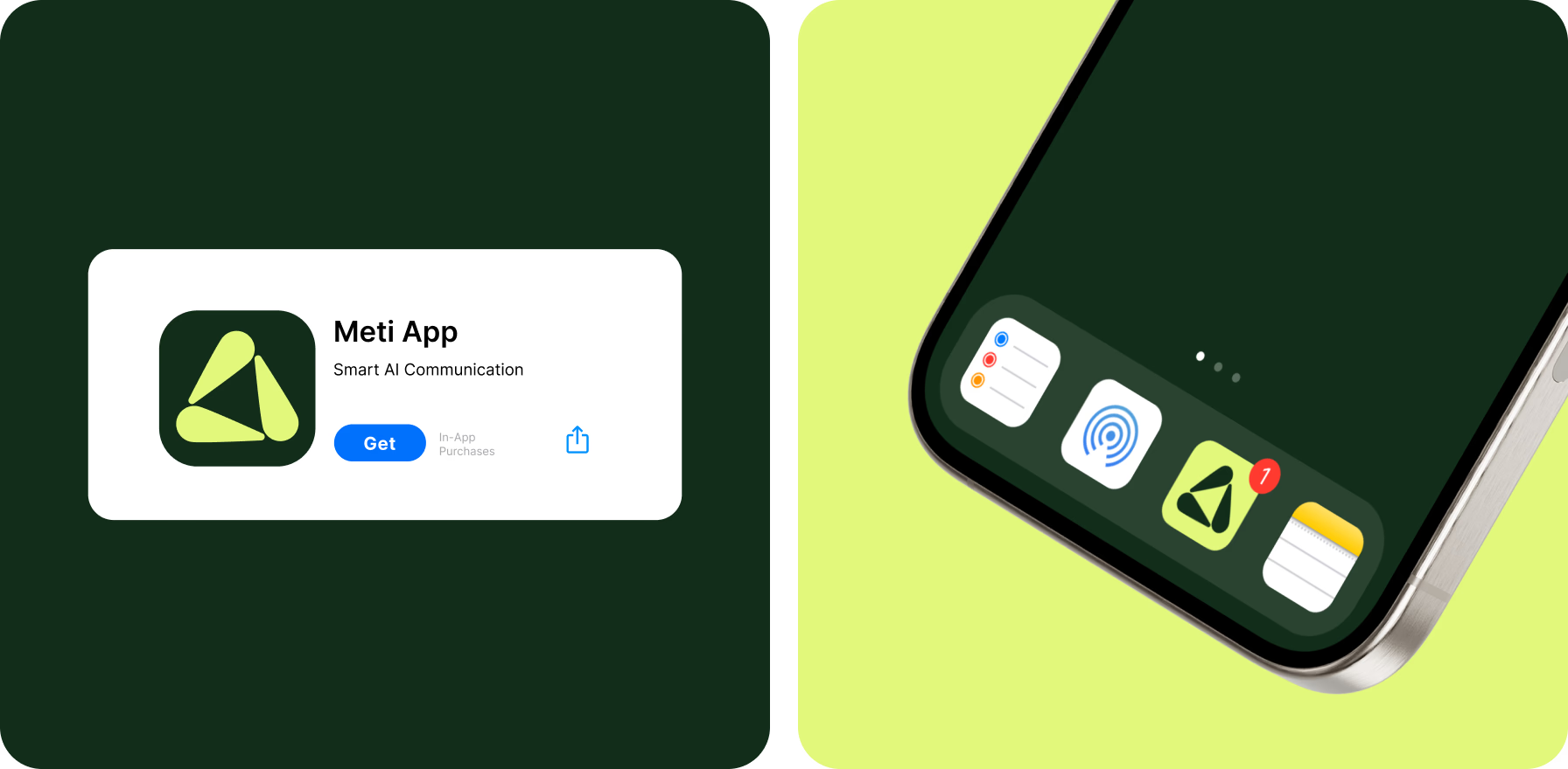
Visual rhythm that drives teamwork
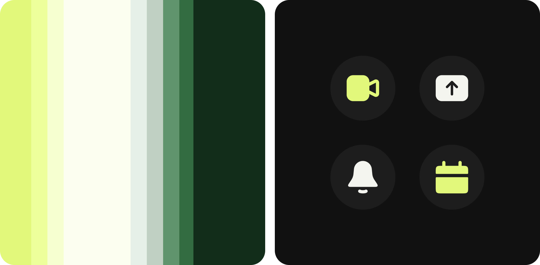
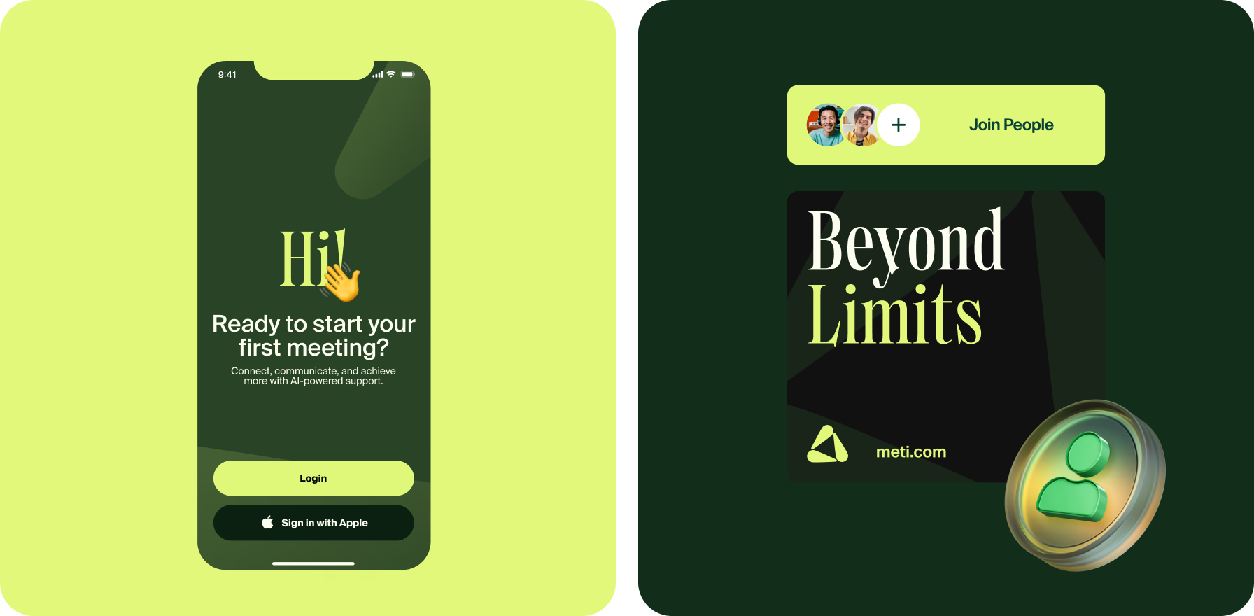
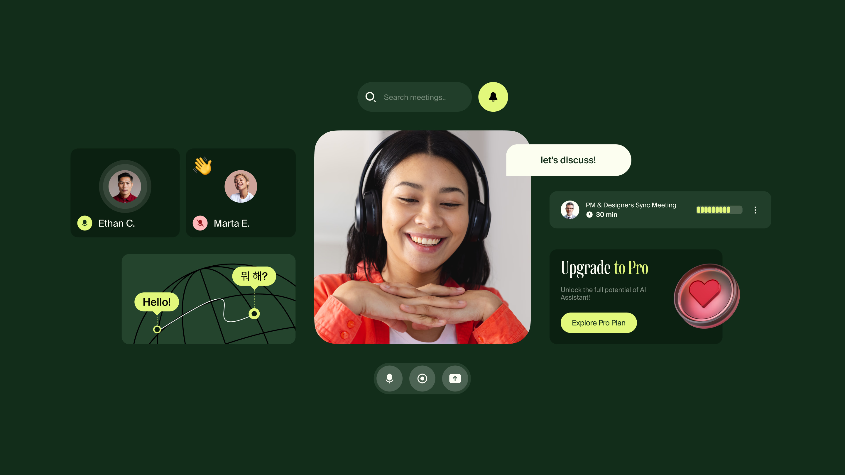
To support the app’s dynamic functionality, we created a design that feels both focused and fluid. The color palette moves between citrus-like neons and grounded greens, bringing clarity, freshness, and contrast to the interface.
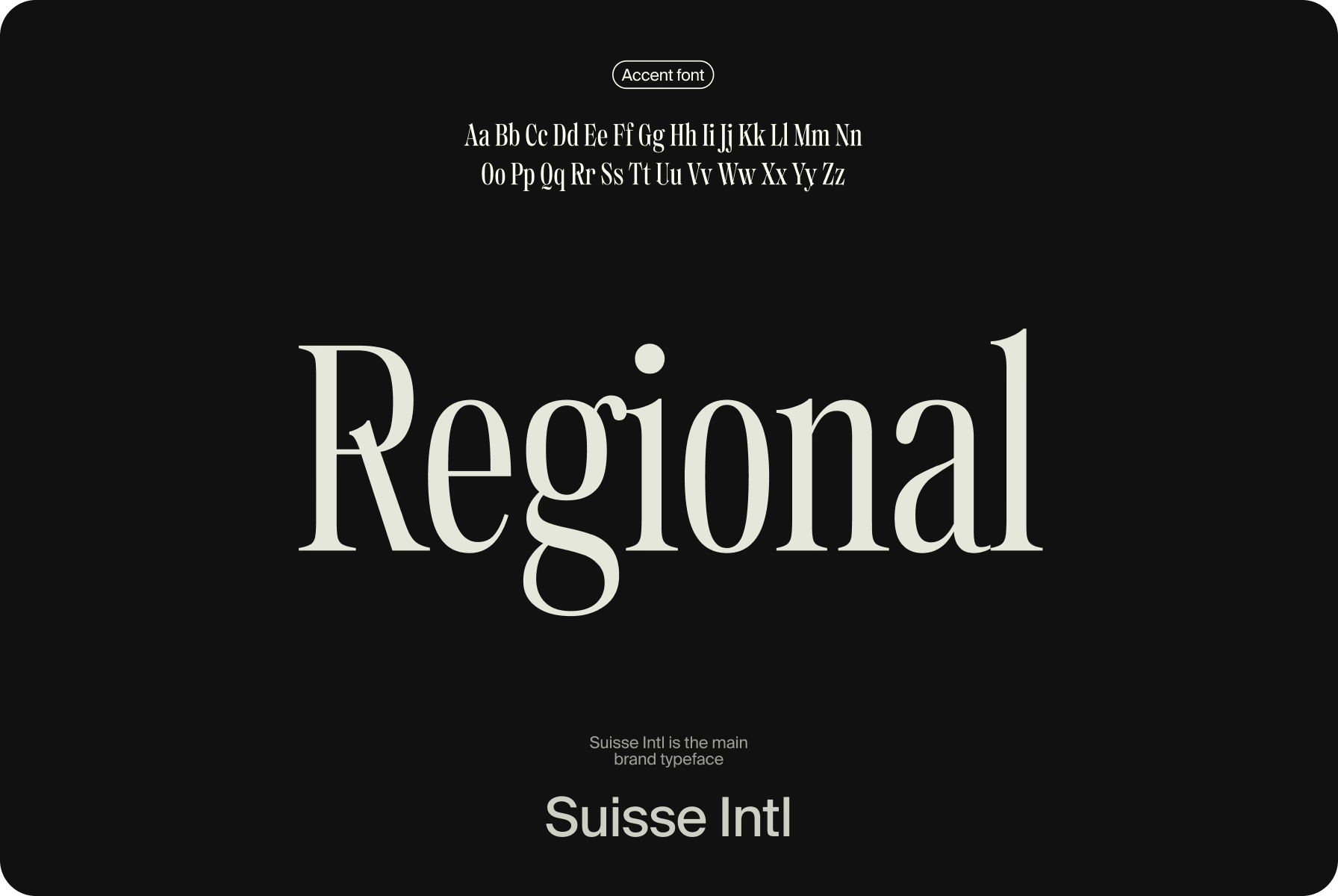
For typography, we paired Suisse Intl with a serif accent to strike a balance between utility and personality. Bold icons and consistent layouts round out the system, making every interaction feel modern and just a little playful.
Our designers gave the platform a pop of energy with fresh colors and a design that’s clear, modern, and easy to navigate.
{{mais-t}}
A warm and open brand expression
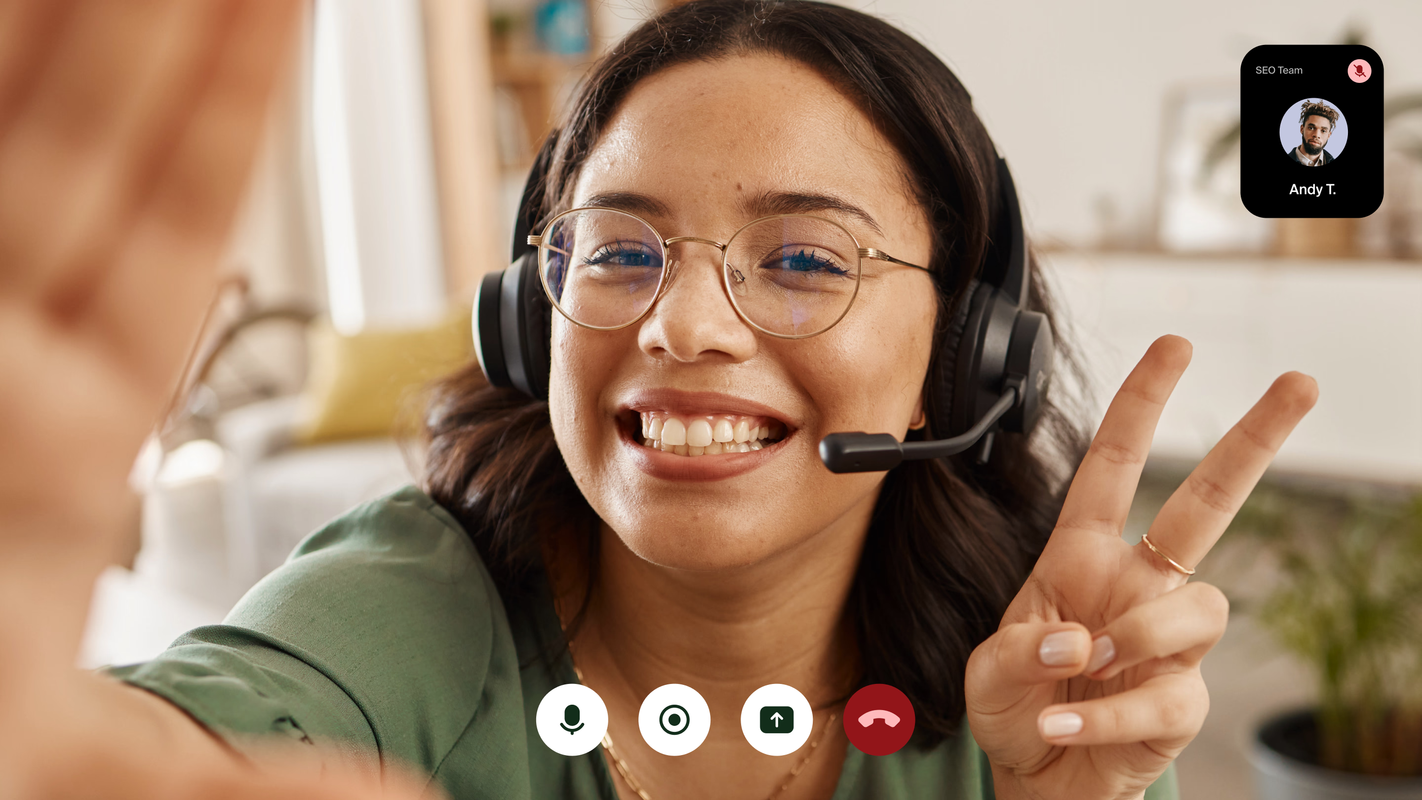
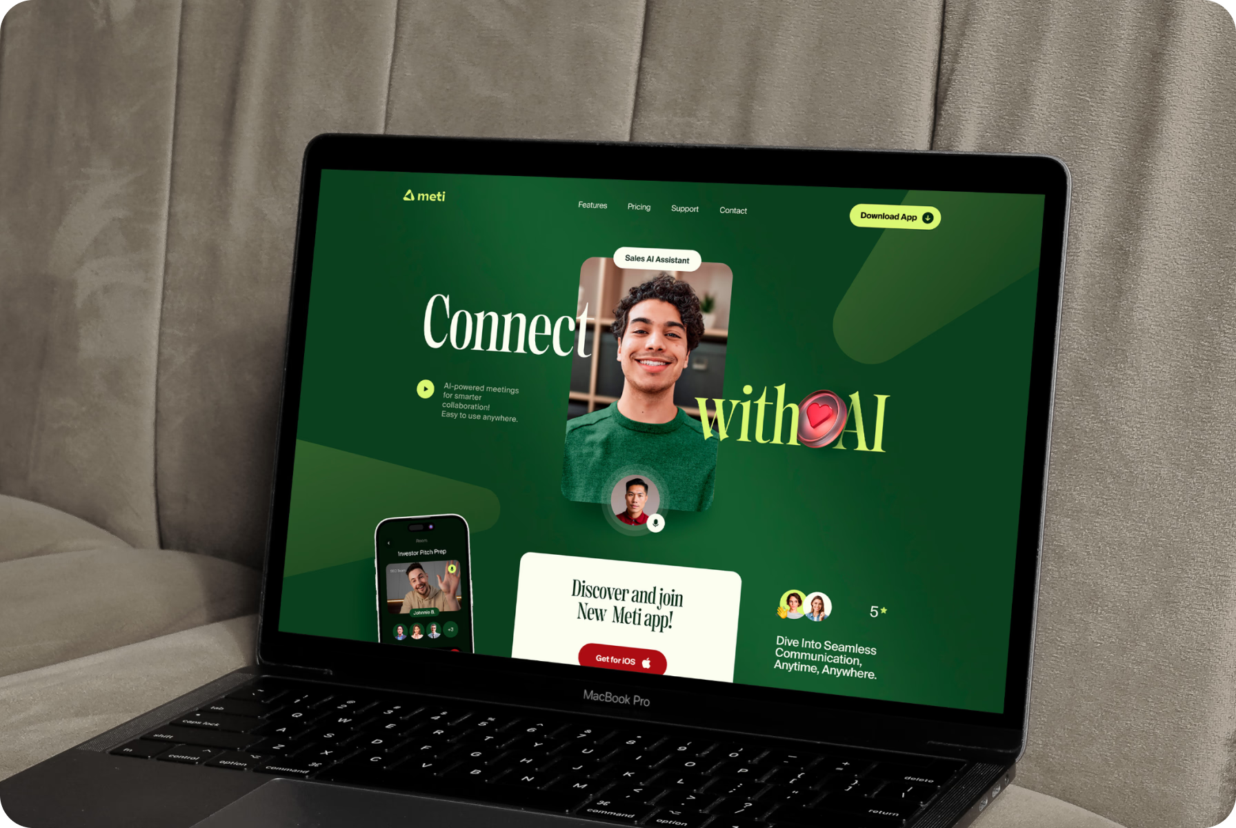
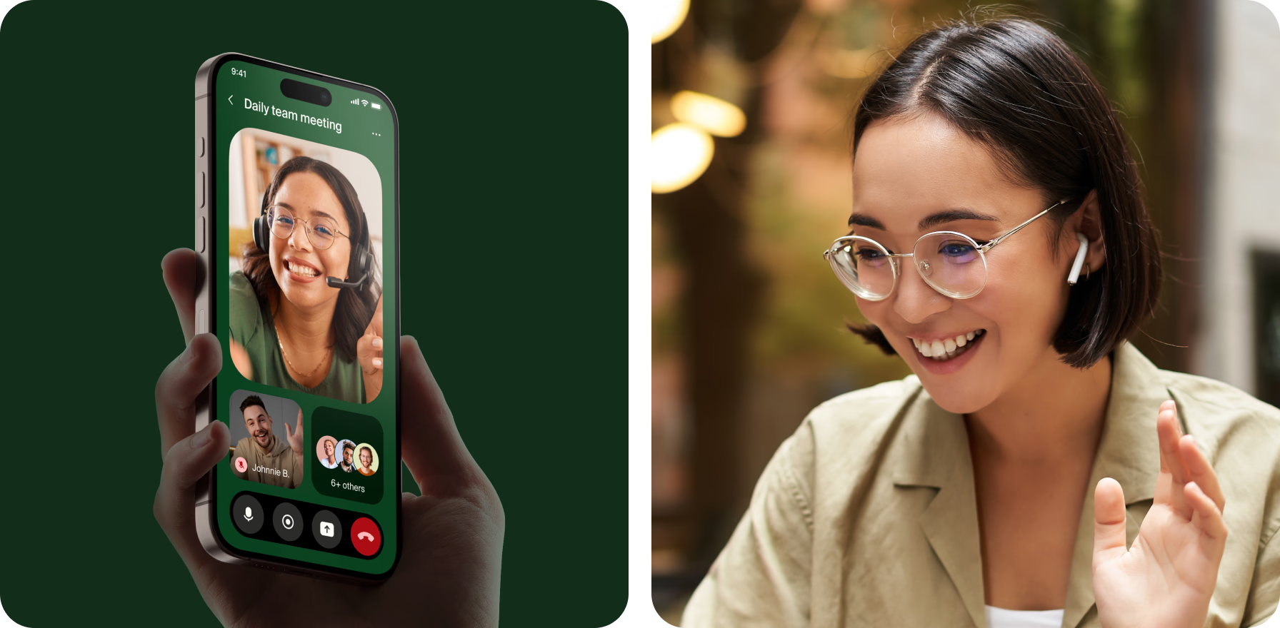
Instead of adopting an overly corporate tone, we focused on clarity, warmth, and approachability. The layouts are clean, the typography is bold yet friendly, and every detail is designed to support meaningful connection.
Bright green accents bring energy, while soft transitions and rounded shapes keep things relaxed. Paired with expressive photos and conversational copy, the identity feels human — built for real moments, not just meetings.
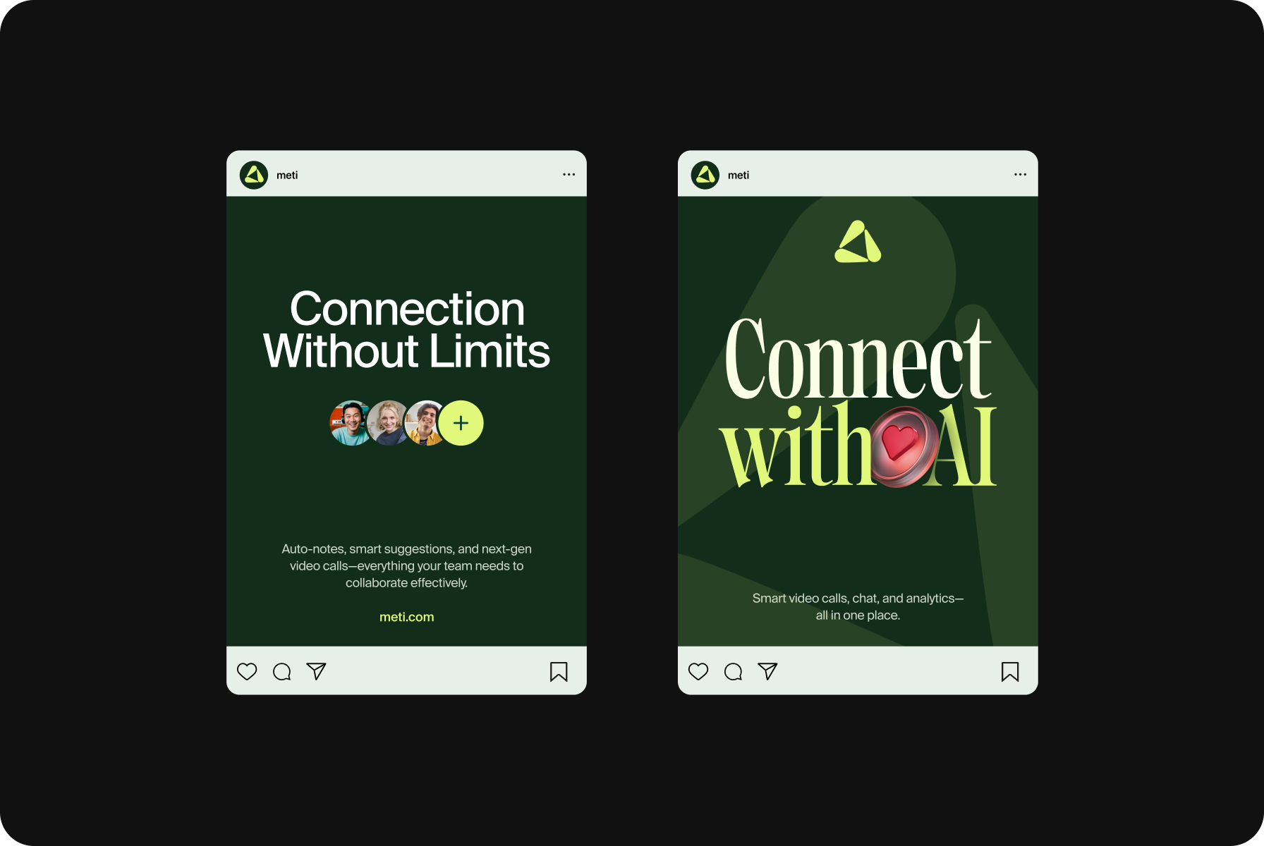
The idea was to make things feel natural and build a brand that’s open, clean, inviting, and easy to connect with.
{{mais-t}}