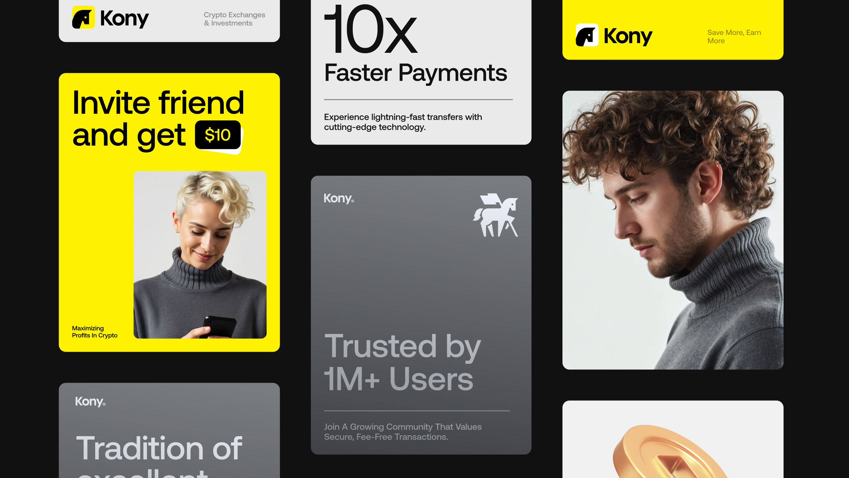


Bringing sharp edges and bold identity to Kony’s platform design



High-performance crypto platform made for serious traders and fast markets
Kony is a next-gen crypto trading platform for professionals in high-stakes markets. It delivers real-time analytics, ultra-fast execution, and secure portfolio management to support data-driven decisions with zero distractions.
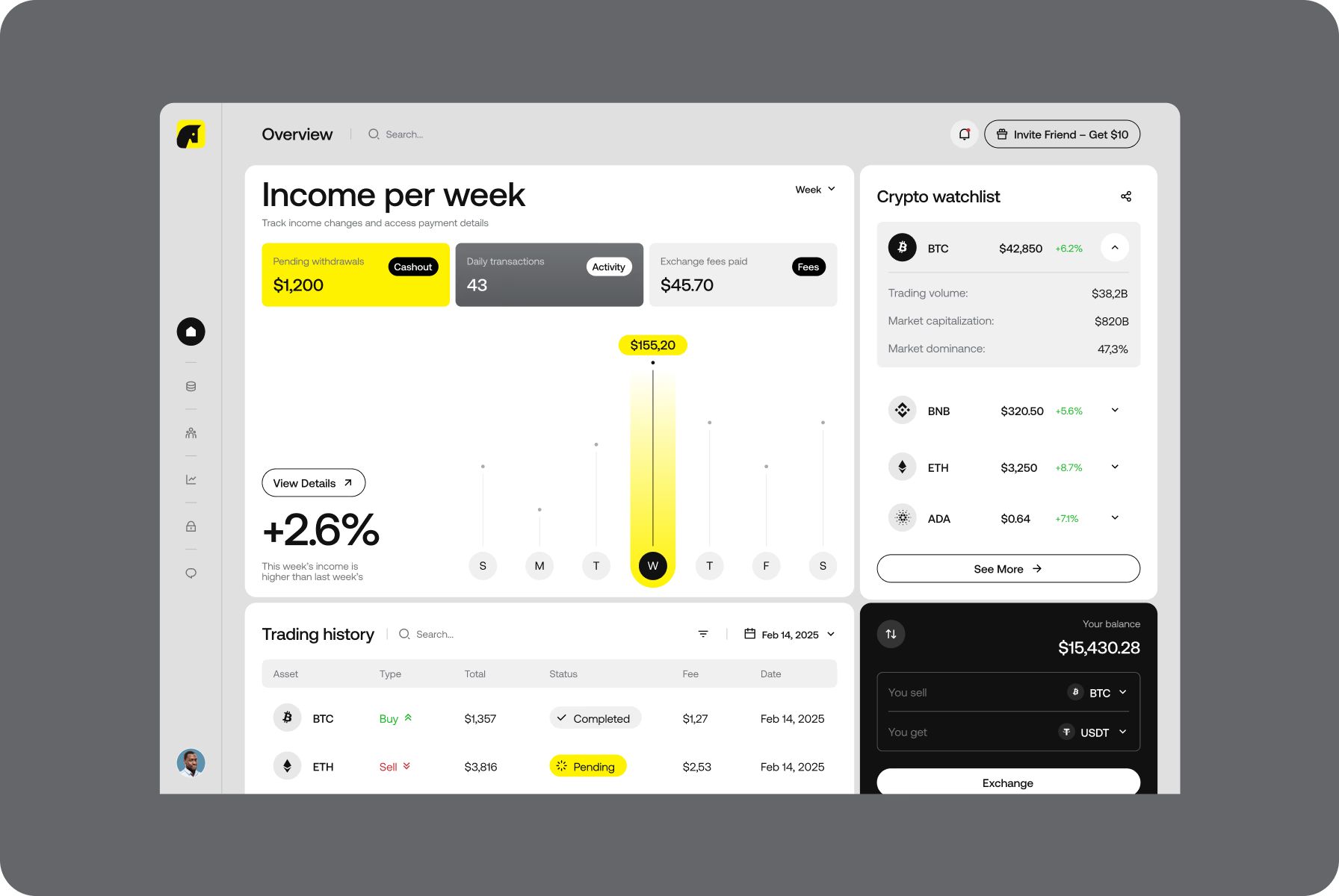
Traders can monitor multiple markets at once, place high-volume orders instantly, and keep portfolios organized. With smart alerts and streamlined dashboards, the platform enables swift decisions when every second counts.
Striking symbol of speed, strength, and precision
We crafted a bold, geometric mark built around the head of a horse — a universal symbol of strategy and controlled speed. It also echoes the name Kony, a subtle nod to the Slavic word konji, meaning horses.
With its sharp lines and solid balance, the logo reflects Kony’s focus on discipline and clarity. The vivid yellow background boosts visibility, while the compact form ensures consistency across digital and physical mediums.
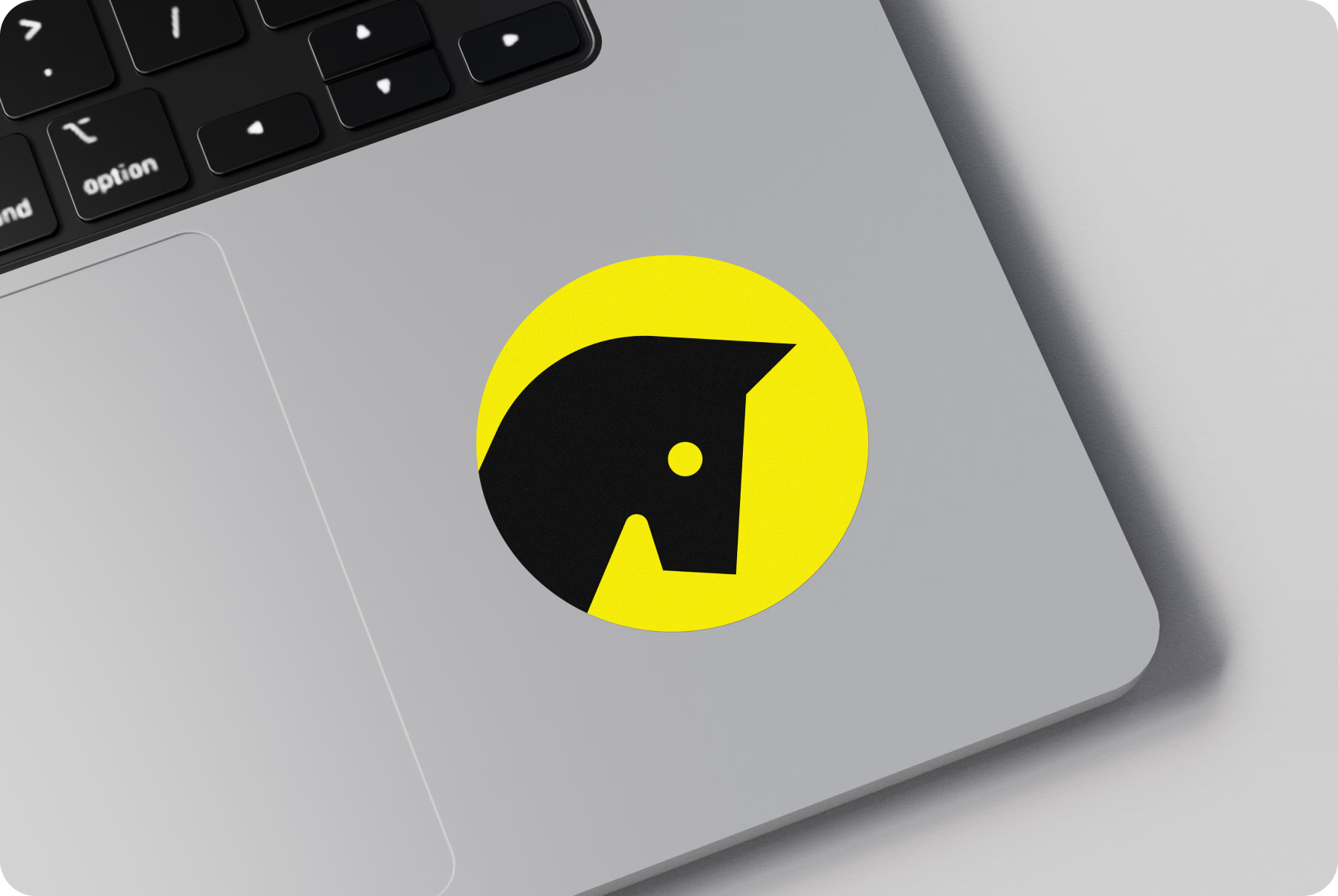
We wanted the logo to feel like a signal, something you notice instantly and remember without effort.
{{mais-t}}
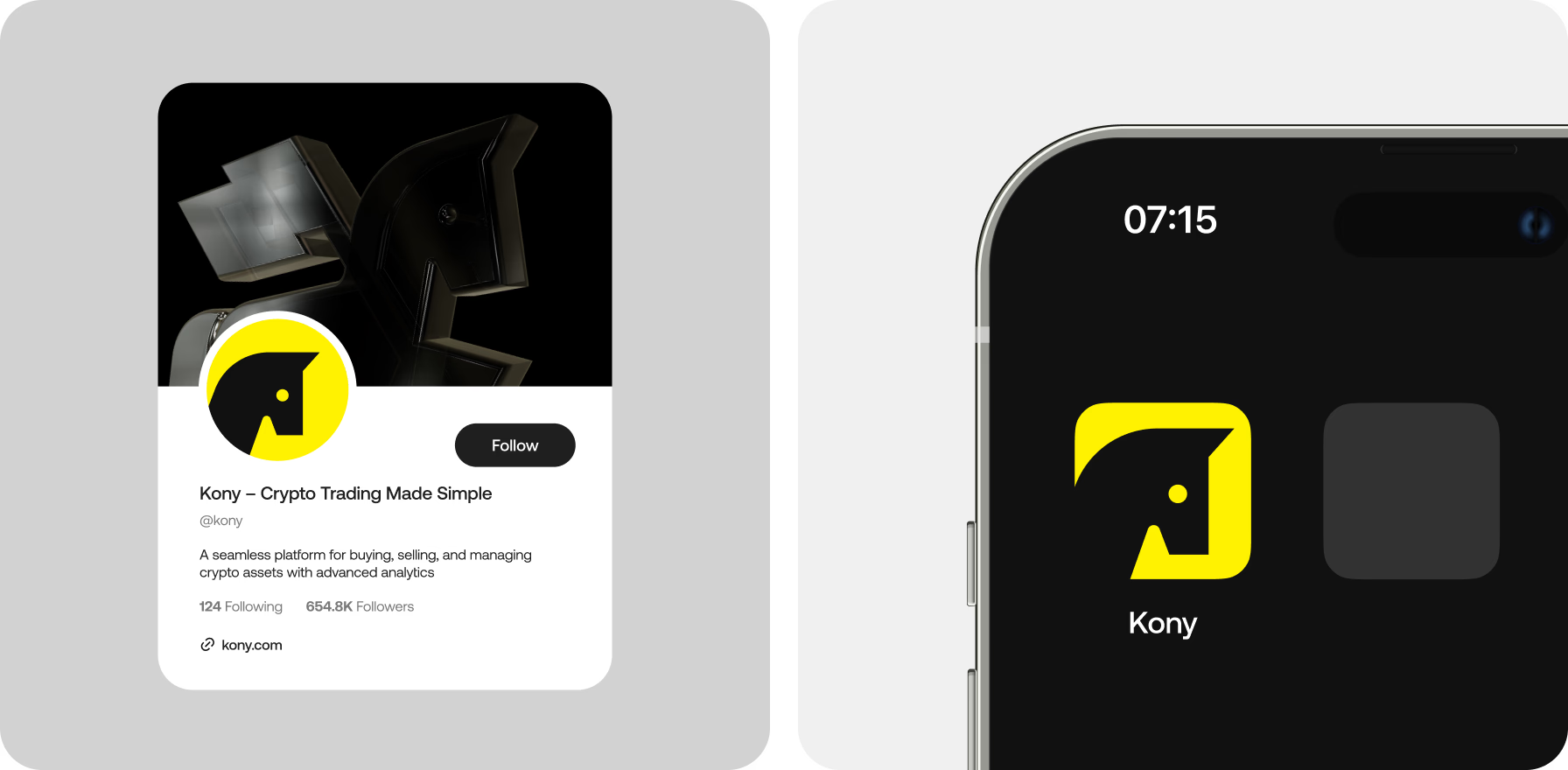
Design that keeps complex data under control
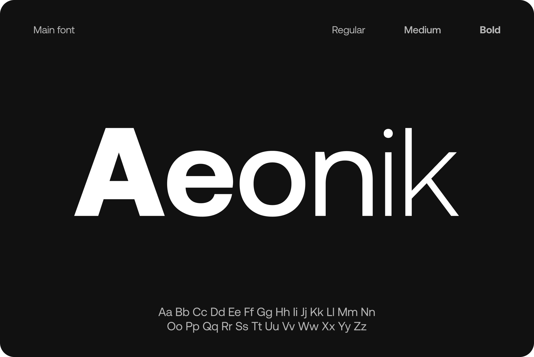
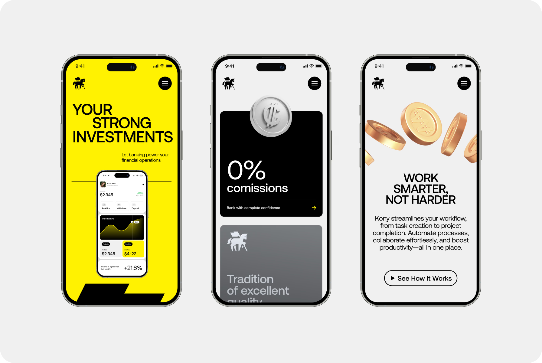
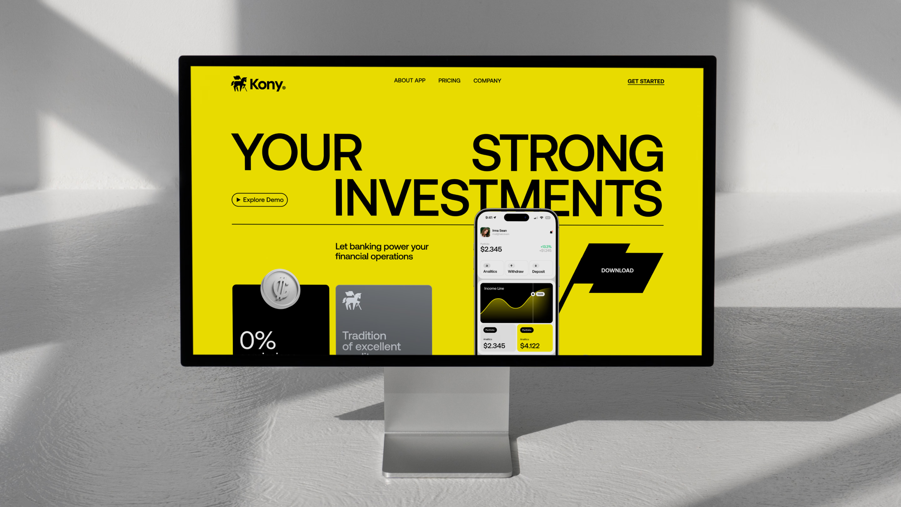
Our team built a design system to match the speed and structure of the platform. Aeonik brought the right balance of rhythm and precision, allowing complex data layouts to stay clean, readable, and consistent across screen sizes.
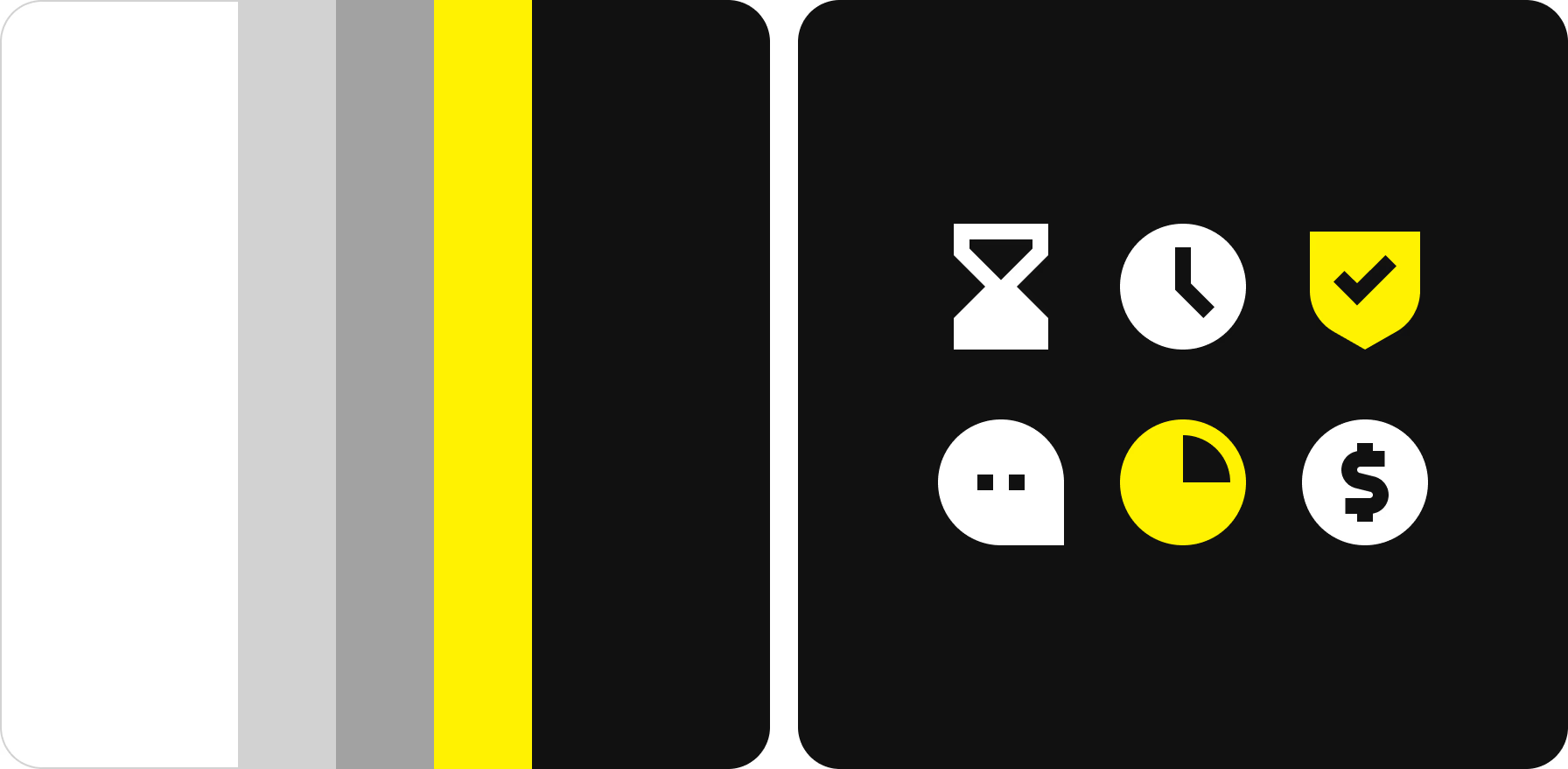
To define visual hierarchy, we paired bold yellow with a neutral mix of black, white, and gray. The icons followed the same logic: geometric, minimal, and fast to interpret. Each element was crafted to support clarity and control.
We created a visual structure that feels precise and deliberate. The kind of interface that earns trust without trying too hard.
{{mais-t}}

Brand presence built to compete and lead
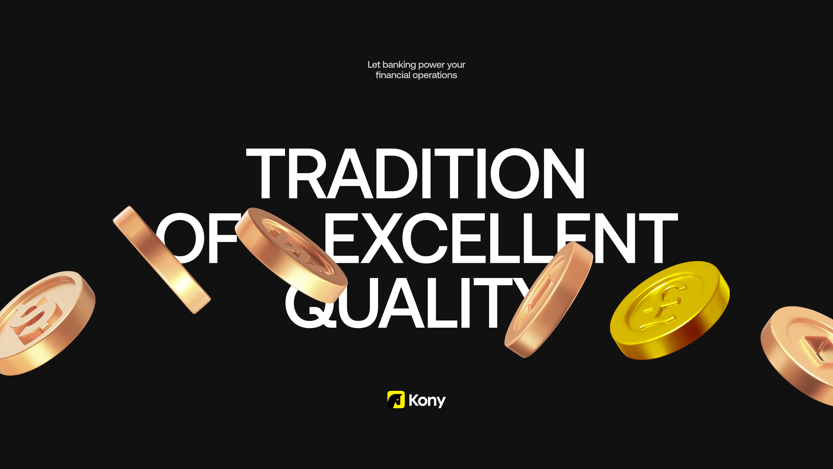
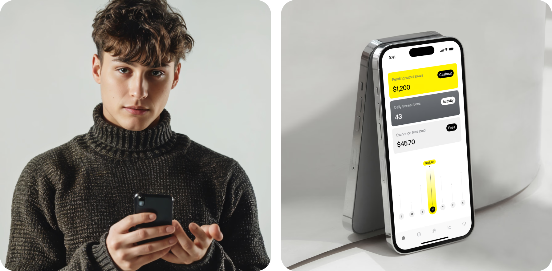
To express the brand’s bold personality, we developed a visual system that feels direct and unmistakable. The coin symbol, clean compositions, and vivid brand color work together to grab attention and build credibility.
Photos of real people using the product add authenticity, balancing the high-tech feel with everyday relevance. This blend of graphic clarity and human presence helps the brand resonate across digital and physical environments.
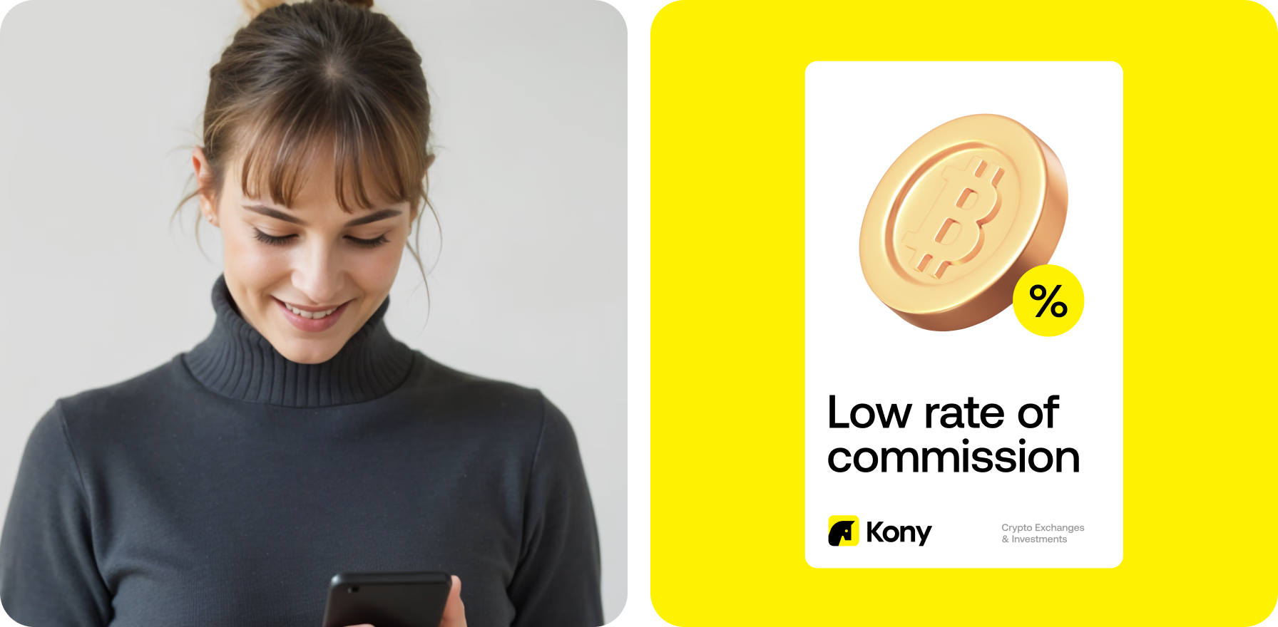
What mattered most was standing out without shouting. We created the brand to speak in a straight line — no fluff, no second takes.
{{mais-t}}