


Website images positively affect user experience, making your content more accessible and attractive. However, you can’t just add them and call it a day, you need to also optimize them. Otherwise, the outcome will be quite the opposite — the site’s UX will take a hit, and the search engine ranking will likely also plummet. To help you avoid that, today we’ll look into proper image optimization.

In this day and age, users want to receive and send high-quality information almost instantly. That is why merely creating a product is no longer enough — you also need to optimize it well.
The matter of optimization is as perpetual as it is crucial for developers. Website performance depends on many aspects, with image optimization being one of the main problems. Solving that problem allows speeding up websites by 20 to 60%, turning them into a pleasant web environment for the users.
Why optimize website images?
Through image optimization, we can reduce their size to a minimum without affecting quality, format, and resolution. In broader terms, image optimization helps:
- Increase page loading speeds. In some cases, unoptimized images can cause a delay. So, if the file size of your images is large, users will have to wait for the pages to load. And this can take considerable time.
- Enhance user interaction with a site. With a slow Internet connection, the unoptimized images might not even load. Because of that, users might miss some vital information or just think the website is poorly-made. Seeing placeholder icons instead of images that were supposed to liven up the content and evoke emotion is not the best experience.
- Improve a site’s search engine ranking (SEO). Last year Google introduced the Core Web Vitals update, and now the page loading speed is one of the essential ranking factors. With image optimization, you can ensure that both your site in general and your images in particular will rank high.
You can check the performance, accessibility, and SEO metrics of your web pages with Lighthouse.
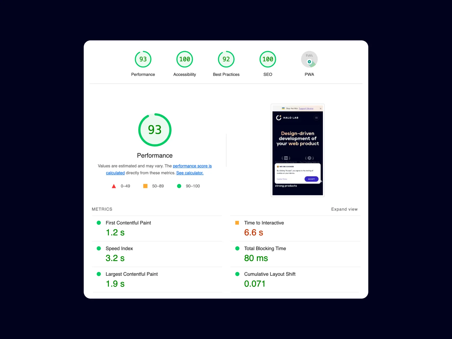
Pay special attention in the report to the following Core Web Vitals:
- Largest Contentful Paint (LCP) — measures the loading efficiency.
- Cumulative Layout Shift (CLS) — measures visual stability.
- First Contentful Paint (FID) — the time before the first interaction with the content.
If these values are poor, this could be directly related to unoptimized images. Large file size lowers the page loading efficiency, thus affecting the LCP (the optimal value is under 2.5 seconds). When the image size is not specified, your browser cannot allocate the correct amount of space in a document when loading it, which leads to a layout shift and affects the CLS indicator (the optimal value is no more than 0.1).
By focusing on images alone, you can improve your site’s overall score by a dozen points. That is why it is important to optimize images and conduct regular page checks for better performance and ranking.
Image optimization techniques
As a general rule, the main requirements for image creation are summarized as follows: Format, quality, and the size of the images. By finding the right balance between these three factors, you can reduce the image size and improve your site’s performance.
Choosing the right image format
Using the proper format is essential for a site’s productivity, and even though there are many options, it is important to know which one is best for you.
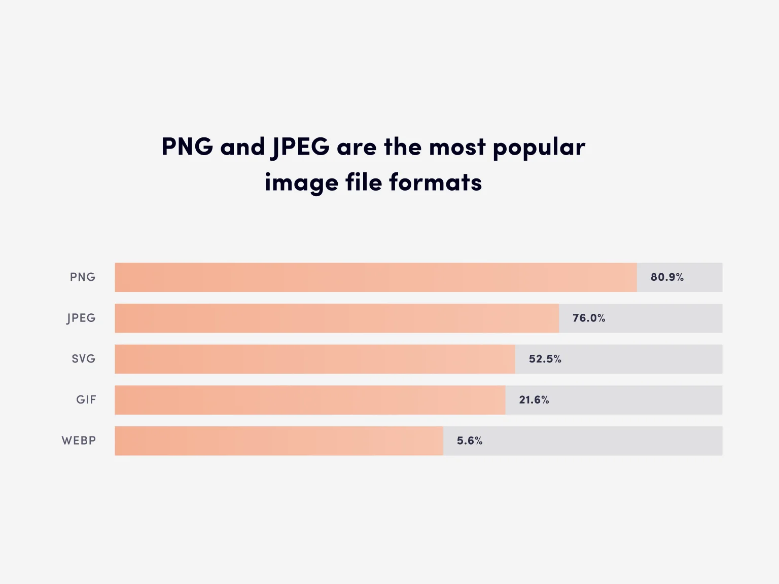
JPEG and PNG are the most widely used image formats. It’s also worth noting WebP, JPEG 2000, JPEG XR, and AVIF, as these are more modern and better options in terms of optimization.
- GIF is a format designed for simple images that do not have a lot of blended colors and is also great for animated images. However, it is outdated, and you better replace it with a more compact video format.
- PNG is a popular format that generates high-quality images and can be optimally compressed, but the file size of PNGs is quite hefty.
- JPEG is another ubiquitous image format that perfectly preserves colors and is usually smaller than PNG.
- SVG format allows displaying vector graphics. The pictures are small in size and can be scaled up without losing quality or increasing file size.
- WebP is a relatively new format developed by Google and allows for efficient image compression.
- JPEG 2000 was created as an improvement over the JPEG format. JPEG 2000 achieves lossless compression, has better resolution, and uses better algorithms for lossy compressions. It preserves image transparency and supports “progressive compression.”
- JPEG XR is an image compression standard designed for continuous-tone still images such as photographs. JPEG XR is even faster and better at image compression than JPEG 2000. It allows for lossless and lossy compression of images, has a relatively simple structure, and is less demanding when it comes to computing resources and memory.
- AVIF is a relatively new open-source image format optimized for compression. It supports animated images and features highly efficient lossy and lossless compression while maintaining high image quality.
As you can see, various formats have their pros and cons. SVG, WebP, and AVIF are the more up-to-date formats that allow for efficient image compression. They use less bandwidth and deliver assets faster, but older browsers and some development environments might not support them. JPEG 2000 and JPEG XR are also efficient formats for image compression, preserving their high quality, but they are not yet widely supported. Among the older formats (GIF, PNG, JPEG), JPEG takes the lead in terms of its capabilities and online use, however, you need to choose the format that is more suitable in your particular situation, as JPEG will not always offer optimal file size.
Choosing the right size for different devices
An image’s dimensions imply its total width and height in pixels. The larger it is, the bigger the file size and the longer it will take to load. Therefore, you need to keep your images only as big as realistically necessary.
Since users browse websites on different devices, we recommend using varying image dimensions for each of them. Loading a one-fits-all image may require up to 10 times more resources on some devices.
Suppose we have a 1600x900 image with a file size of 1 MB. When we adapt it to the size of a website section (by changing the width and height), its file size does not change. We merely reduce its width and/or height. When a user opens that site on their phone, the same 1 MB image will be loaded, even though the original 1600x900 dimensions are no longer used. This only leads to the unreasonable consumption of resources, and the more images there are, the longer the site will have to load. This is why we need to use smaller versions of the same image for different devices to prevent slow loading and reduce resource usage.
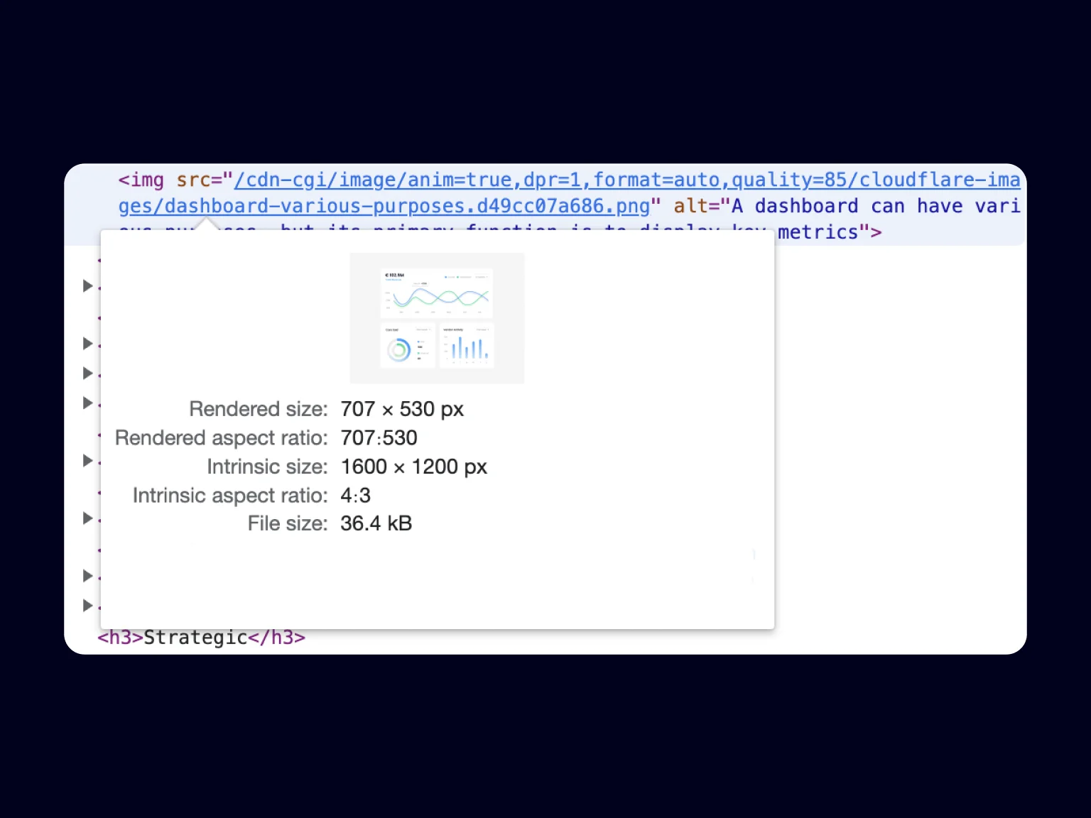
Image compression
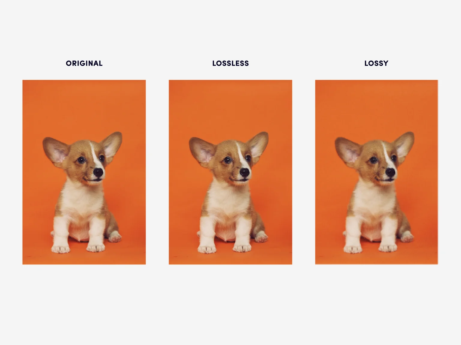
Once you’ve chosen the correct format and dimensions, you can compress your image and reduce its file size even further. There are two methods of image compression: lossy and lossless.
The lossy method involves removing unnecessary data, significantly reducing the file size of an image. Naturally, this leads to a decrease in quality. By performing mild and careful compression, you can reduce the file size with no noticeable loss of detail.
The lossless method involves removing non-essential data and prioritizing image quality. This technique is less effective than the other one, focusing on quality over file size.
Compression is important for image optimization since a smaller file size means less bandwidth and faster data transfer, resulting in “instant response.”
Caching
This image optimization technique allows storing files in the browser cache or on proxy servers using a CDN. Caching can significantly accelerate website loading, as it allows for fewer requests to the server and speeds up the delivery of images.
For example, browser caching allows you to save files locally for the user after their first visit. During all the subsequent visits, the cached data will be immediately available, thus reducing the loading times.
Caching on proxy servers and CDN allows serving images to users from the server closest to them — the closer it is, the better the response time.
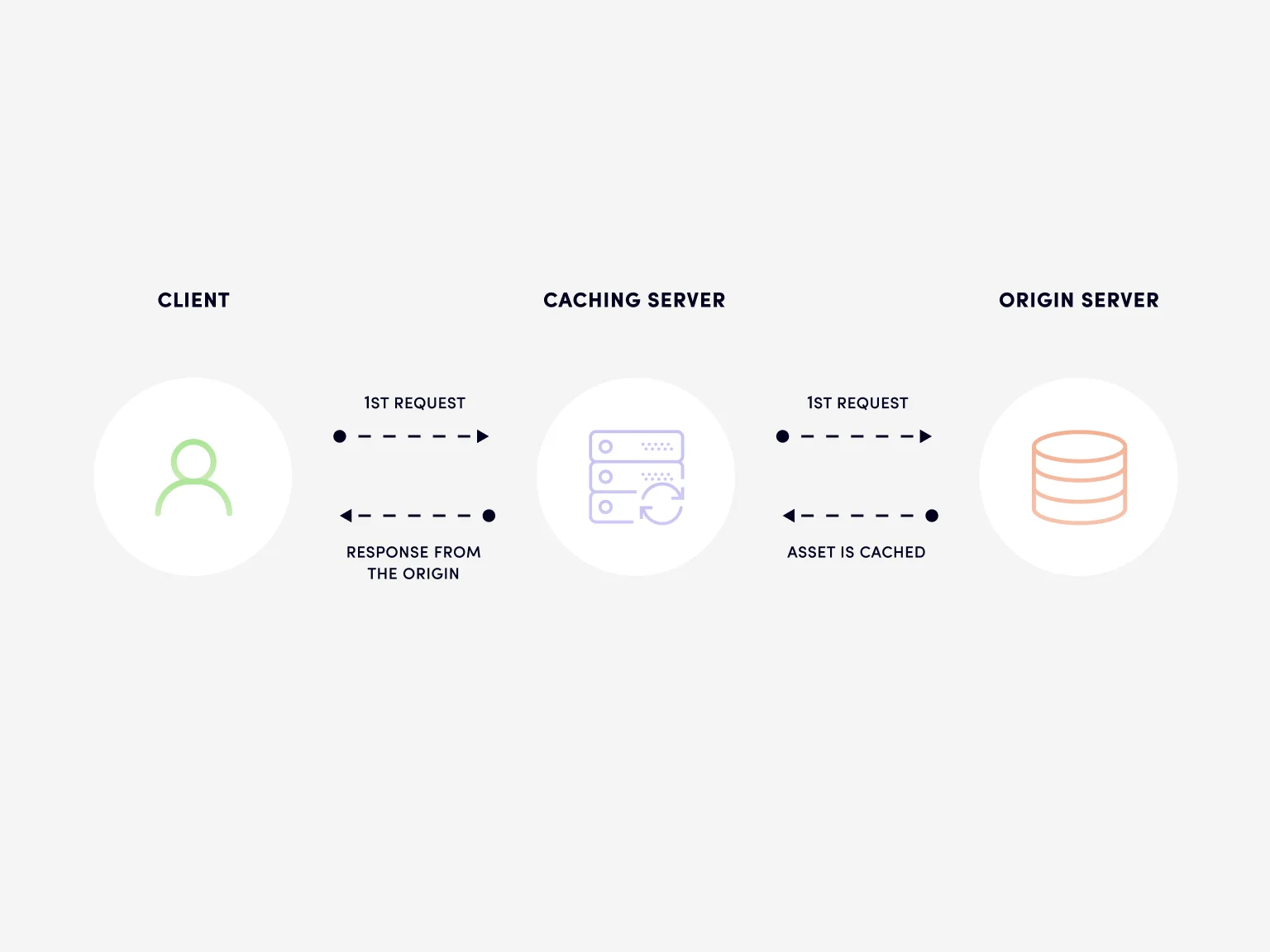
Image optimization problems for sites using 11ty
11ty (Eleventy) is a simple but powerful static site generator. It is a relative newcomer but already shows excellent results: it is fast, streamlined, boasting active support and a rapidly growing community.
When running a static site on 11ty, you have to generate images with proper dimensions for several devices in advance. This is not a real problem when there are just a few images. When that isn’t the case, however, pre-generation becomes problematic, requiring more memory. On top of that, compressing a bunch of images takes considerable time and resources since this is not a simple process.
For over a year, the Halo Lab team has been using the @11ty/eleventy-img plugin to transform images. This package is well suited for a small set of images, but we have plenty of them on our website. Each image was either in JPG or PNG format, and we had to optimize and convert them all to WebP and/or AVIF formats for different screen resolutions. Basically, we had to divide each image into 6 optimized ones. This process was slow — optimizing the entire website would take more than 20 minutes for each build.
By performing a simple test, you can detect problems when optimizing images using the eleventy-img package. Our test involved converting 15 images (in random order) with a file size of 4 kB to 6.5 MB from PNG to PNG, AVIF, and WebP formats with varying sizes. Optimal concurrency values for eleventy-img are 5–10.
Having examined the test results, I’ve noticed that with fewer concurrency, images with a small file size are processed faster, while the process for larger ones deteriorates. The processing of 4 kB images takes about 4–6s, while images with a file size of over 1 MB take 25–30s or more. The bigger the file size, the longer optimization would take.
It’s worth noting that this process may load your CPU heavily. A few times, my computer would completely freeze because the CPU was loaded at 100%, and I had to resort to a hard shutdown.
Now let’s imagine that instead of 15 images, your site has 100, 500, or even 1,000, with each of them being split not into 3 (as during the test) but a whopping 6 optimized images. This would be a lengthy process, using a lot of resources — memory, CPU load, and time.
With these results, we have concluded that eleventy-img is not the best option for bulk image processing and that we should try something different.
Having considered possible options, the Halo Lab team has decided that instead of optimizing the images on each build or CI run, it would be better to move them to Cloudflare CDN. Doing so brought us a number of advantages, such as improved delivery speeds, image caching, on-demand optimization, and on-the-fly image detection (browser-supported image format). This allowed us to reduce the project build time to around 3 minutes which significantly improved the development experience.
Cloudflare Image Resizing functionality for image optimization
Cloudflare Image Resizing is used to resize images, adjust their quality and convert them to AVIF or WebP formats if needed. Cloudflare Image Resizing also automatically caches each derived image, so having one single original image is enough. You can convert or resize an image by requesting a special URL.
Cloudflare Image Resizing supports JPEG, PNG, GIF, WebP, and SVG formats and boasts the following functionality:
- Resizes and creates images in JPEG and PNG formats (and also optionally in AVIF or WebP).
- Saves animations as GIF or animated WebP files.
- Supports ICC profiles in JPEG and PNG images.
- Saves JPEG metadata (the metadata of other formats are discarded).
- Transforms the first frame of animated GIFs into still images.
Cloudflare Image Resizing is an excellent, modern, and effective solution with flexible customization and multiple effective methods for image optimization.
Eleventy Cloudflare Image Resizing Plugin — The Best Solution
The Halo Lab team has developed its own plugin for flexible configuration and interaction of static sites using 11ty with Cloudflare Image Resizing. This plugin is easy and quick to install. It perfectly optimizes images and allows accessing them both from the Cloudflare service and a local folder.
Plugin installation
You can download the package through npm eleventy-plugin-cloudflare-image-resizing
npm install eleventy-plugin-cloudflare-image-resizing
Plugin usage example
To start using the plugin you have to first create the shortcodes. We have done so to optimize images through the Cloudflare service in the .eleventy.js file. For reference, I’ve created the following shortcodes for the .njk and .md files.
Once the shortcodes are created, you can apply them to your project. To use a shortcode, you simply need to call it:
The plugin also allows you to access only the link to the file or the attributes. It may be useful if you need to customize the img tag in your code. Below is the example of how you can add a custom class on the image tag:
You can configure your shortcode as you like, and the eleventy-plugin-cloudflare-image-resizing plugin gives you even more flexibility in using Cloudflare Image Resizing. You can find more information on how to configure it on the plugin’s GitHub page: https://github.com/Halo-Lab/eleventy-packages/tree/master/packages/eleventy-plugin-cloudflare-image-resizing.
During development, the plugin accesses your images locally to avoid additional requests to CDN, so the images from the Cloudflare service are served only when NEW_ENV=production is set. You can alter this behavior by changing the bypass parameter. I also recommend paying close attention to the zone parameter and the domain parameter in the options to generate correct URLs for Cloudflare Image Resizing in the production and local dev environment. Have a closer look at the plugin documentation to get familiar with these parameters.
Conclusion
The eleventy-plugin-cloudflare-image-resizing plugin is designed for fast and flexible configuration via the Cloudflare service. It will be a great help in solving image optimization problems if your site uses 11ty, and should provide ease and comfort to other web developers.
Halo Lab team continues to develop and improve its products, solving significant problems arising in the modern world of web technologies. If you’re having difficulty solving issues with website optimization using the standard solutions, contact us, and we will figure it out together.
I hope this article helped you understand the importance of image optimization and provided you with specific solutions. Keep gaining new insights and trying out new ideas, and may your productivity be as high as possible.
All the best and good luck!
FAQ
Why invest in branding services services services?