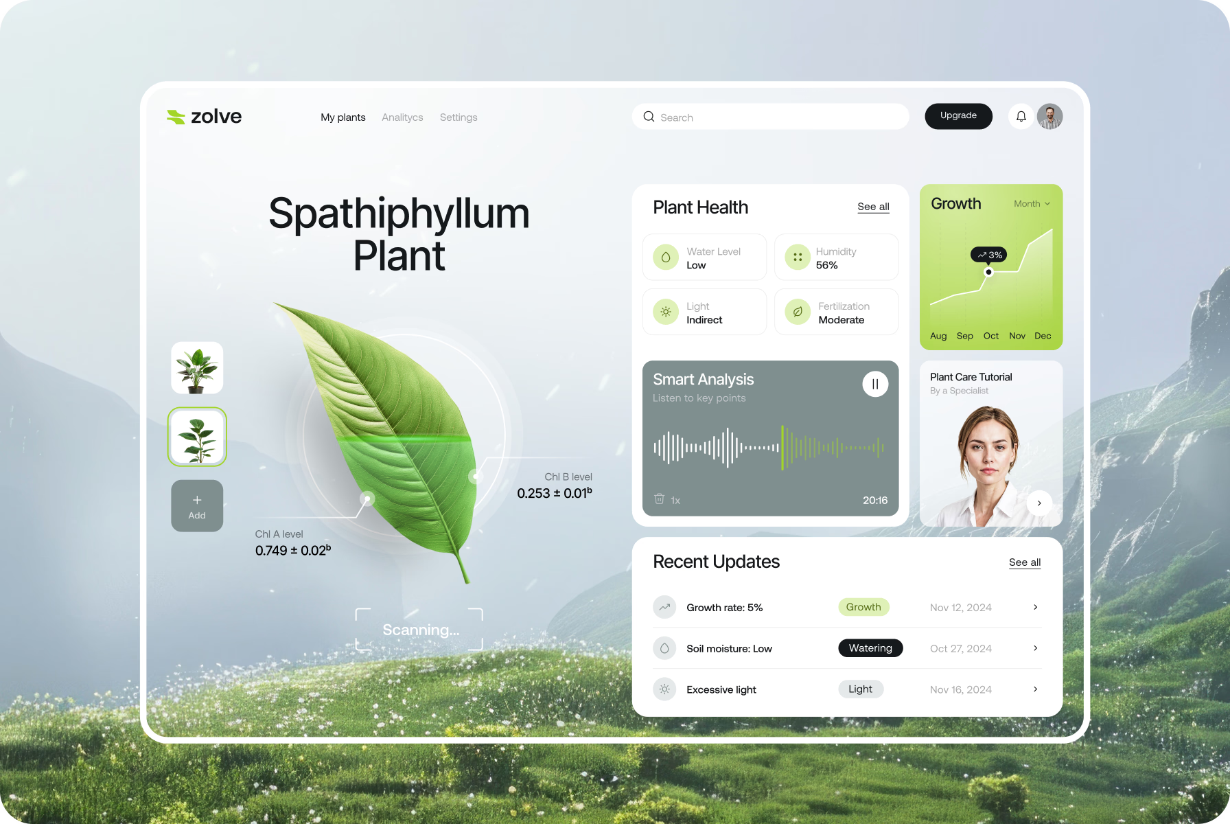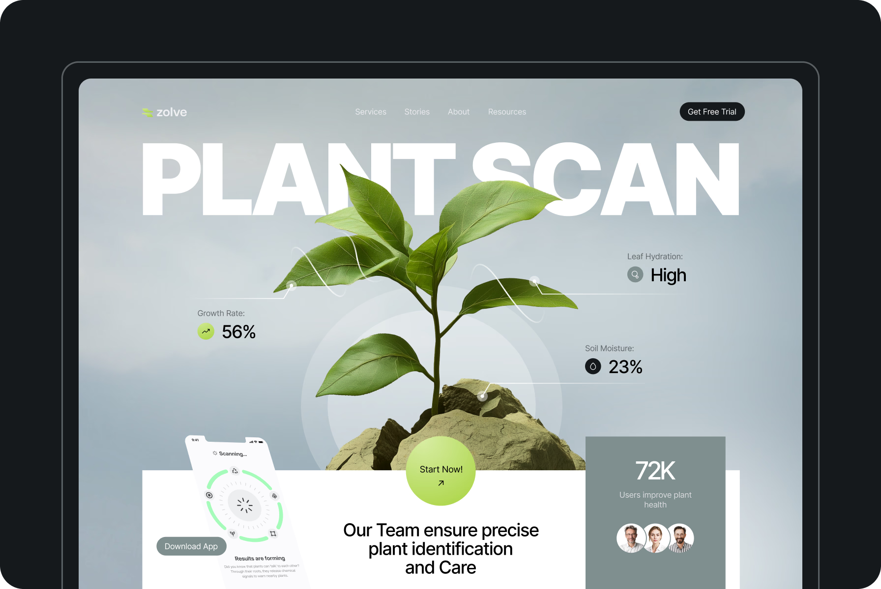








Zolve is a plant health management app equipped with the tools to nurture greenery. It’s aimed to provide real-time metrics on leaf hydration, growth rates, and soil moisture, supporting gardeners in making smart decisions.
A voice assist feature built into the platform offers personalized insights based on the input query. With all of the perks this plant expert offers, users can simplify flora care routine and help their greenery thrive.
After exploring various ideas, we crafted a minimalist logotype with two flowing curves similar to leaves in motion. The interplay of the elements suggests harmony, evoking nature’s organic shapes and growth patterns.
By omitting text from the logo, our team chose to keep the focus entirely on this symbolic representation. It’s simple enough to be recognizable at small sizes of app icons and works well in both digital and print formats.
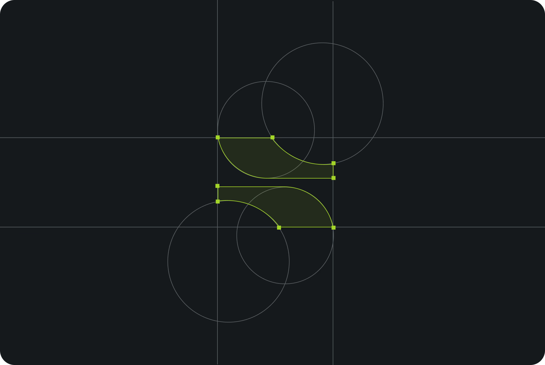
The logo we’ve built is based on green hues, perfectly suited to the industry, and is highly recognizable, which is crucial for app branding.
{{mais-t}}
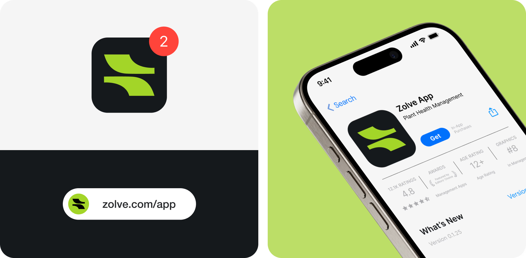
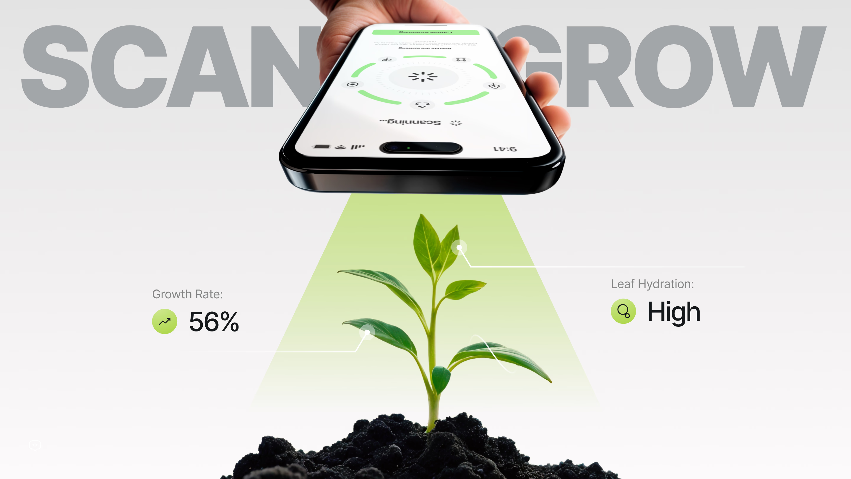
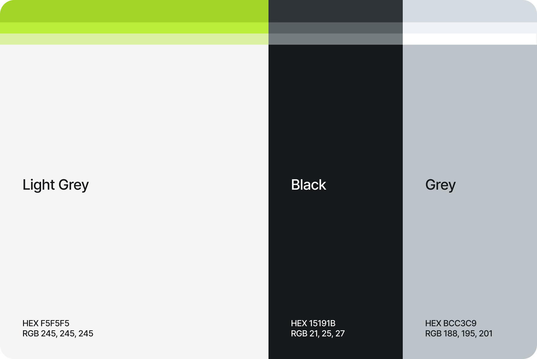
Continuing the creative journey, we chose a vibrant lime green as the primary accent color, drawing focus to key elements. To maintain balance, we complemented this bold green with light grey, grey, and black tones.
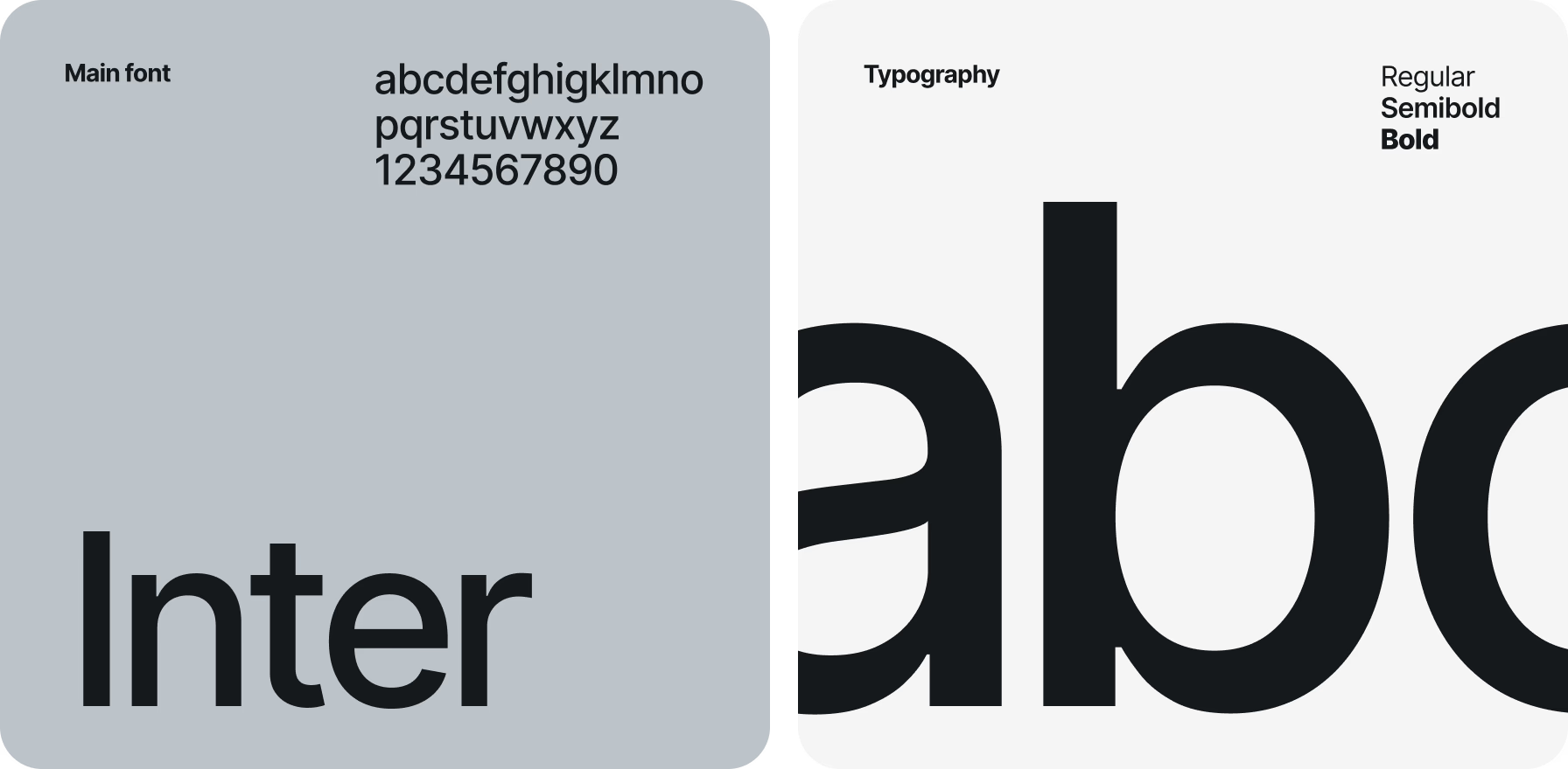
For the typography, we settled on the standard Inter font, using various weights — regular, semibold, and bold. To finish off the design system, we incorporated high-quality visuals set against a subtle grey background.
All the colors we chose complement each other beautifully and are easy to perceive both day and night.
{{mais-t}}
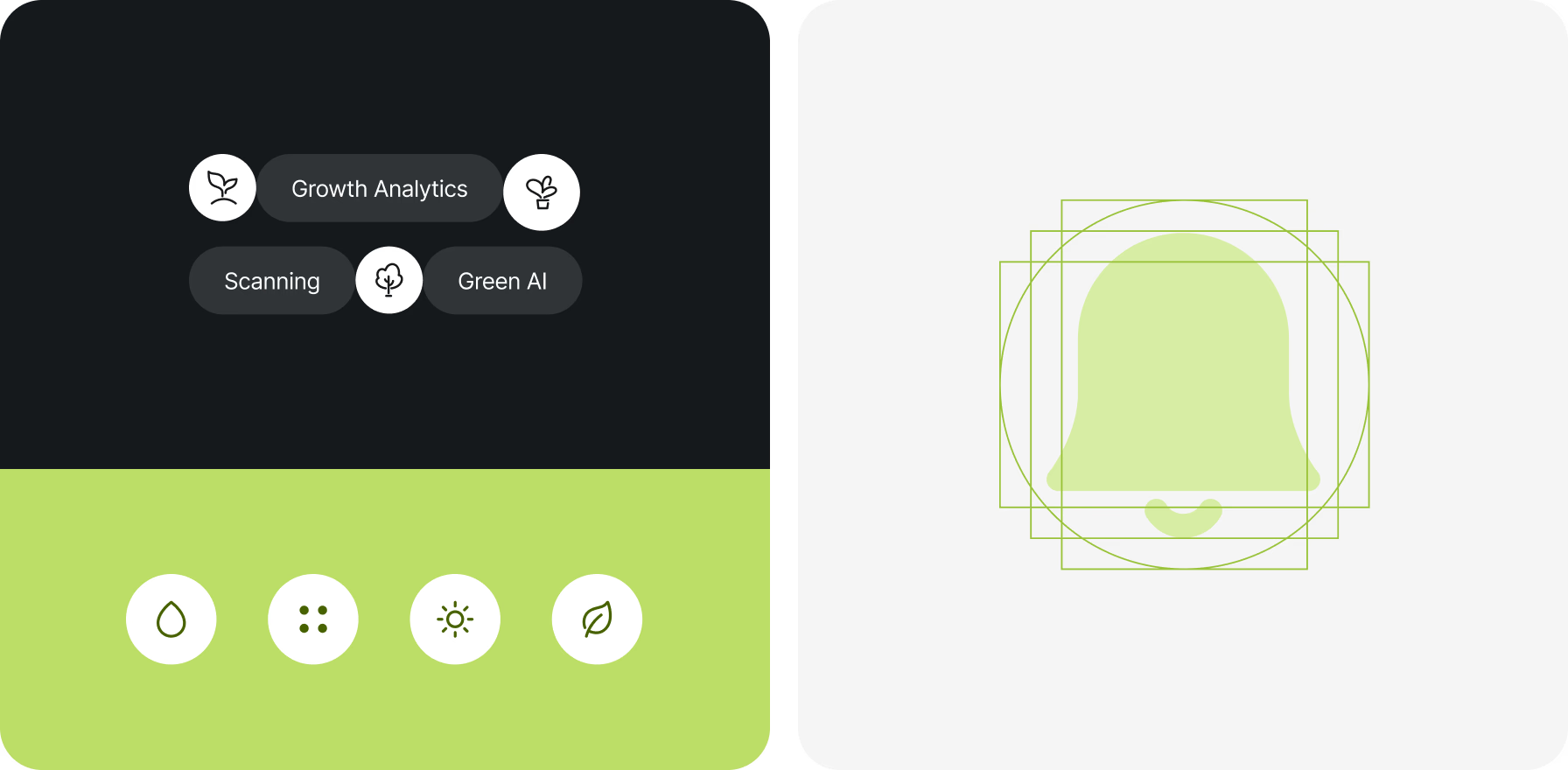
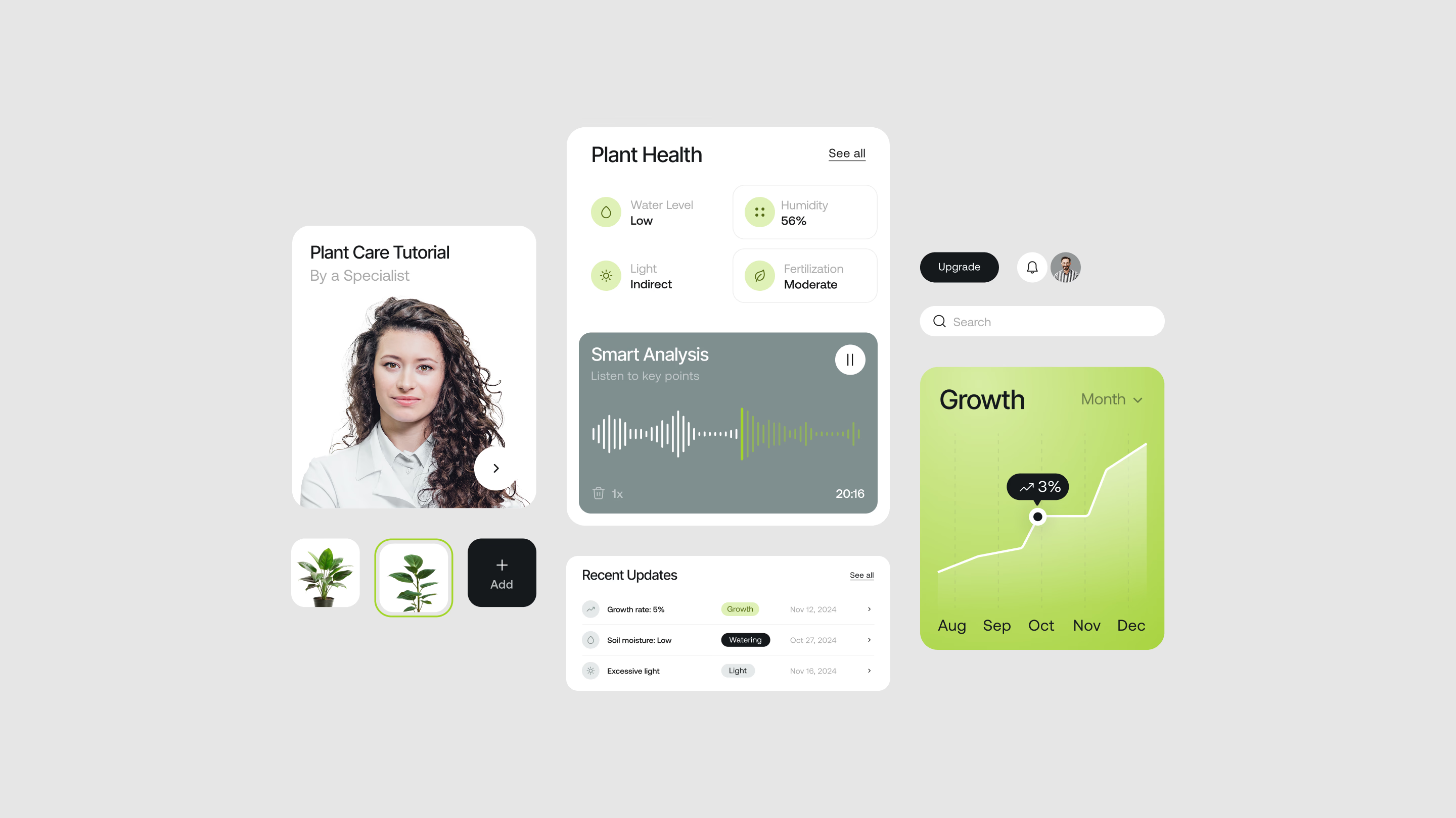
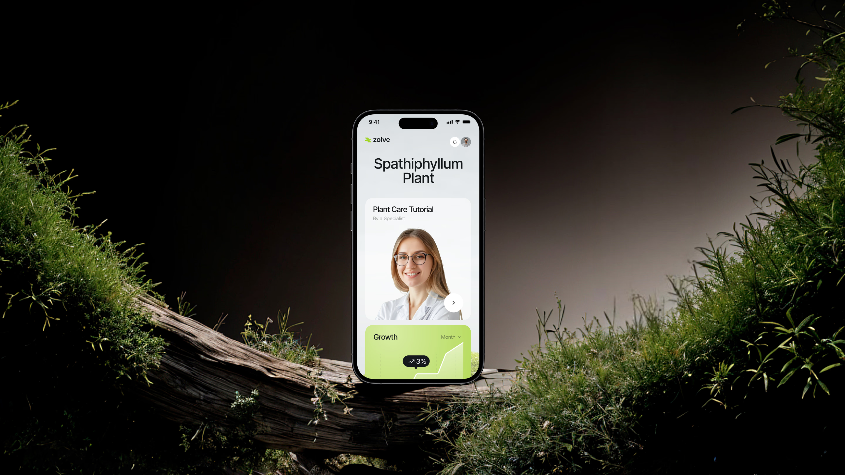
Given that the target audience prefers smartphones as their go-to device, we focused on crafting a relevant UI/UX. Our team streamlined elements to fit perfectly on a single screen, ensuring a clutter-free experience.
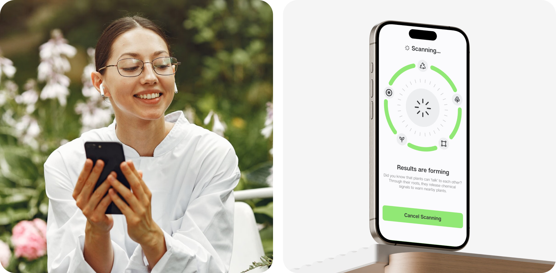
App’s features are integrated with the phone’s built-in capabilities — such as the scanner and camera. Once the user decides to analyze the data, all the relevant info is instantly displayed, simplifying further steps.
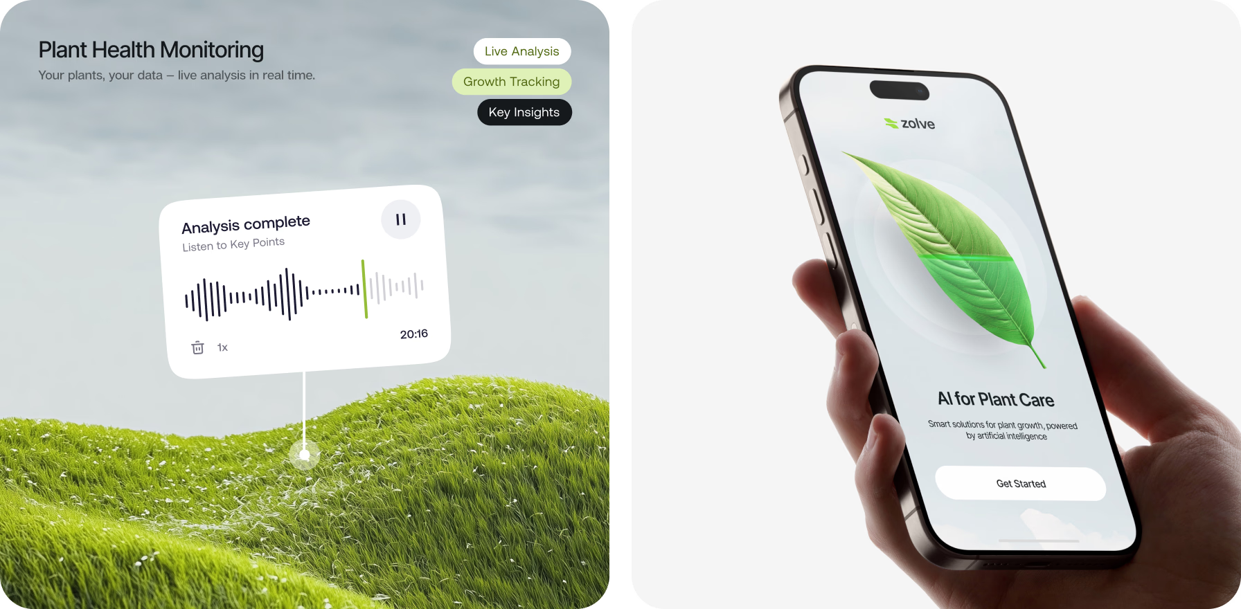
On the dashboard, we’ve displayed all the essential graphs and metrics, providing users with immediate access as soon as they open the app.
{{mais-t}}