








Versus is a platform that aims to help tennis players take their game to the next level. It allows users to set up personal accounts, register for tournaments, and get top-notch advice from the best in the sports world.
Here, people can join the community and connect with fellow tennis lovers. This platform is dedicated to motivating starting-out players or supporting those who are already a pro and compete at their best.
For the Versus logotype, we captured the spirit of tennis with the flight path of a ball. Our designers took this idea and visually represented it as a stylized “V” letter, which is reflected in the company name.
With its sleek and modern lines, the logo stands out and is easy to remember. This design symbolizes the dynamism, precision, and energy of the game, reflecting both the sport and the brand’s unique aspects.

We picked the arc-shaped trajectory on purpose due to its resemblance to a perfect tennis shot, just like the skills of the platform users.
{{mais-t}}
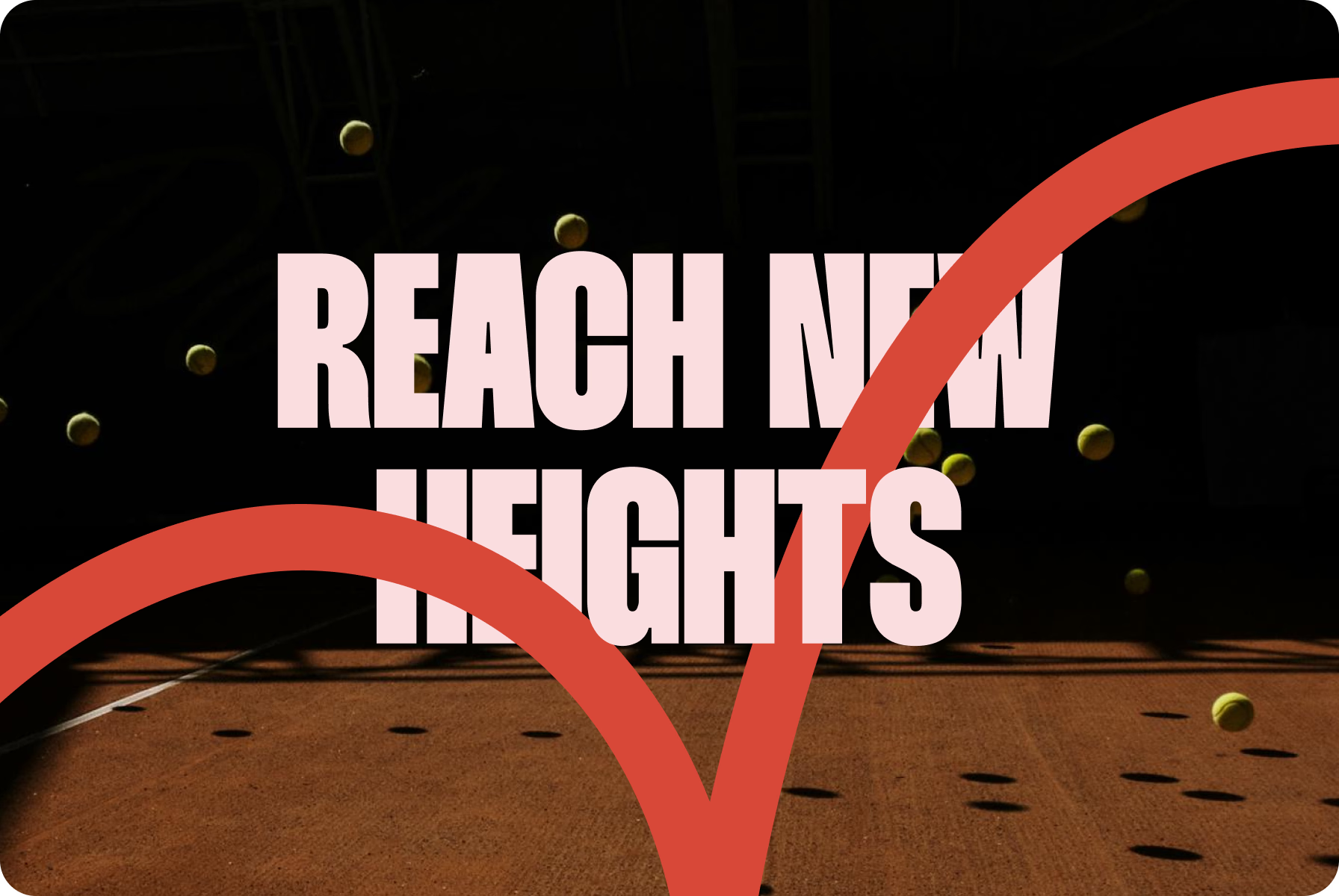
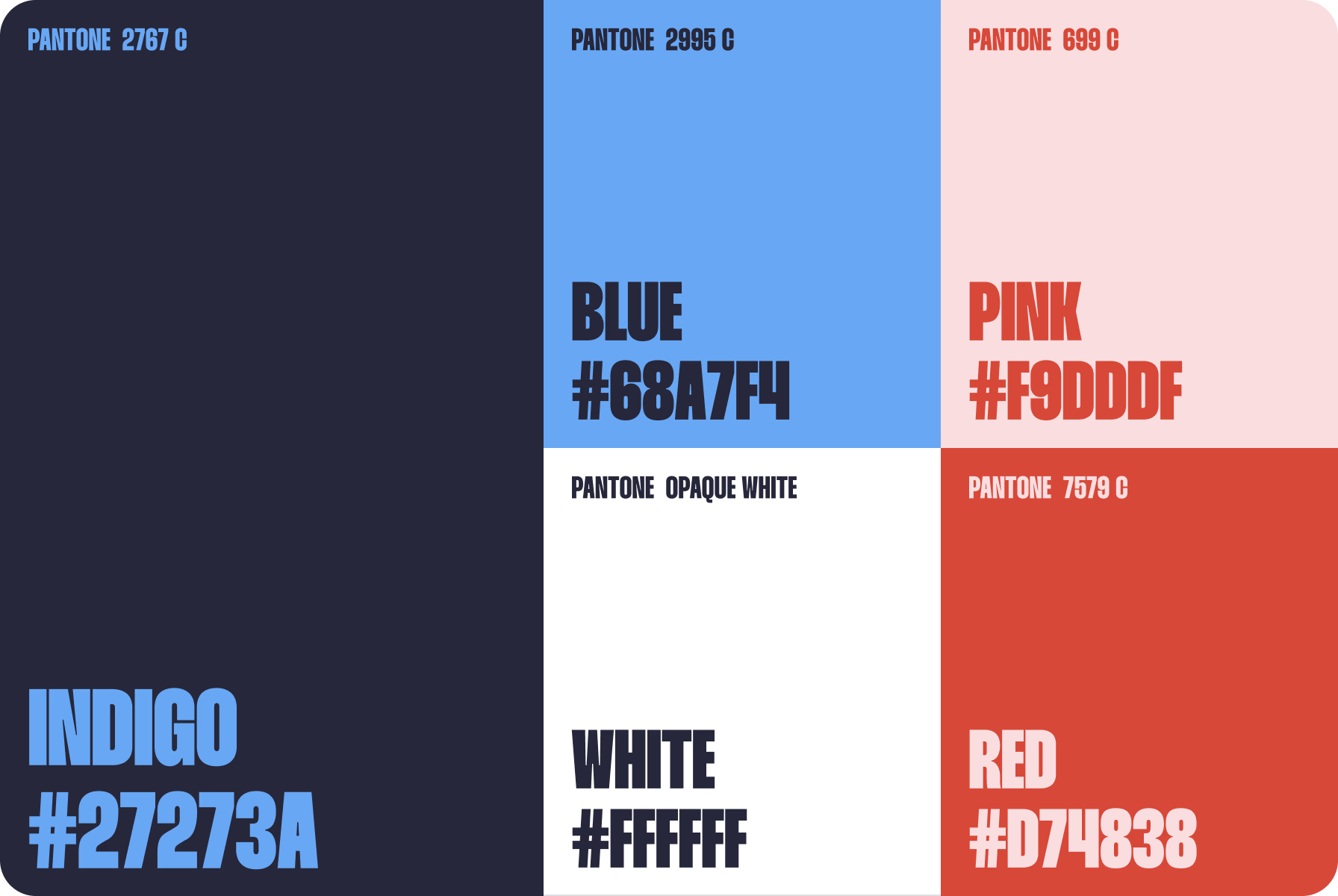
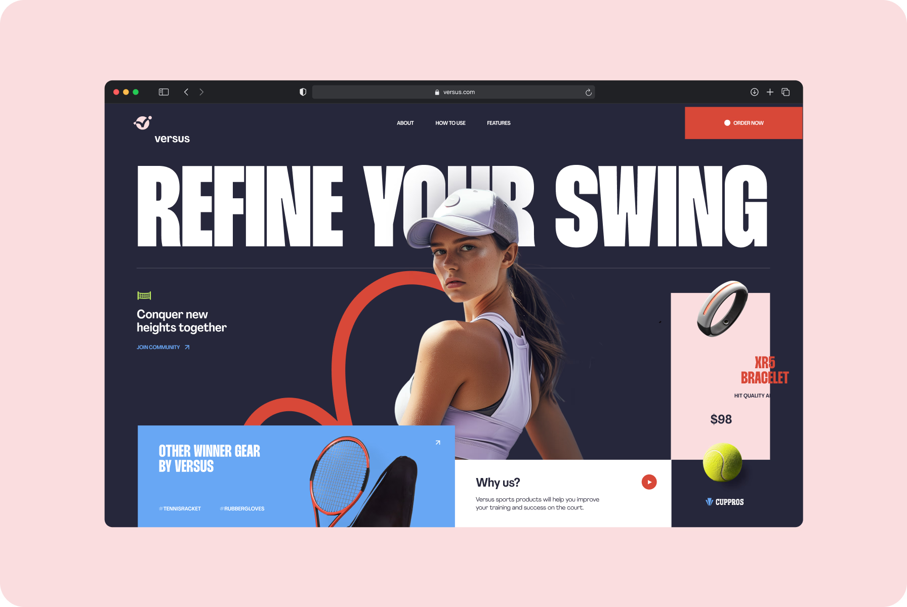
We extended the idea of our logotype into the overall design of the platform. To make it stand out, the Halo Lab team highlighted lines with a bright red color. Complementing this accent, our designers used a deep blue backdrop.
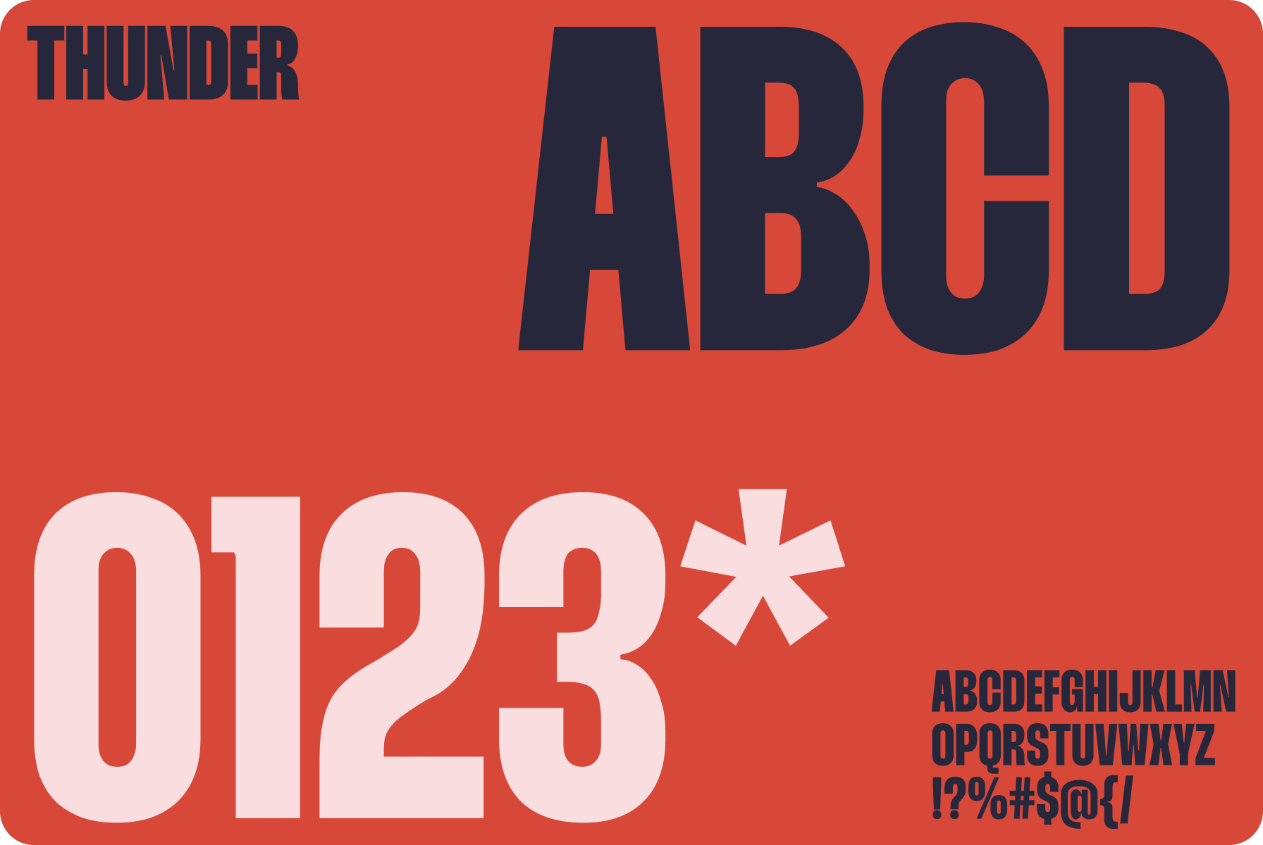
On this background, we chose the Thunder font for a headline that suited the design perfectly. Plus, we spread various elements across the layout to fulfill the site’s look including 3D details reflecting the sports industry.
A touch of 3D elements in the design solution added depth and dimension, making the platform feel more intriguing.
{{mais-t}}
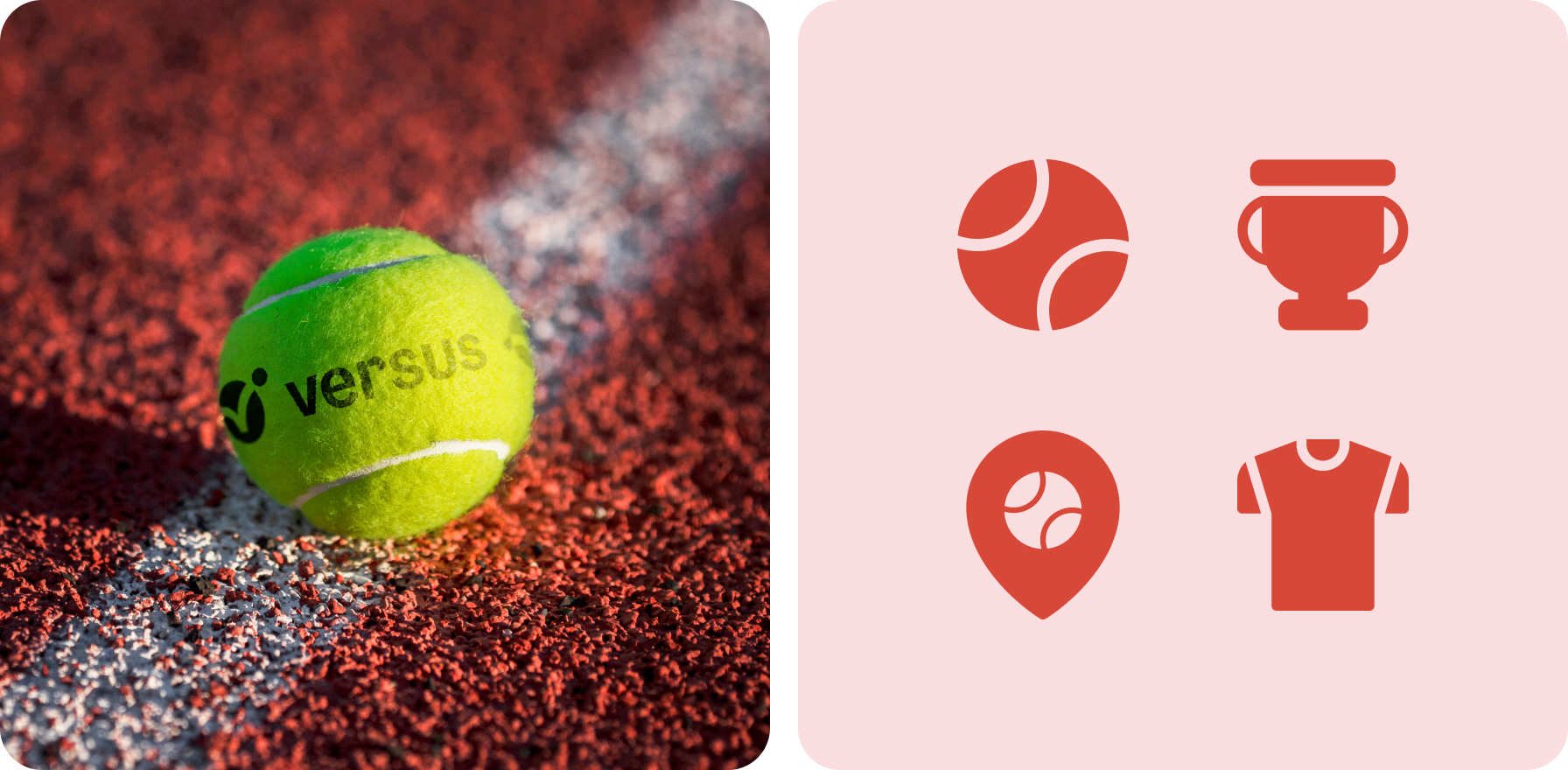
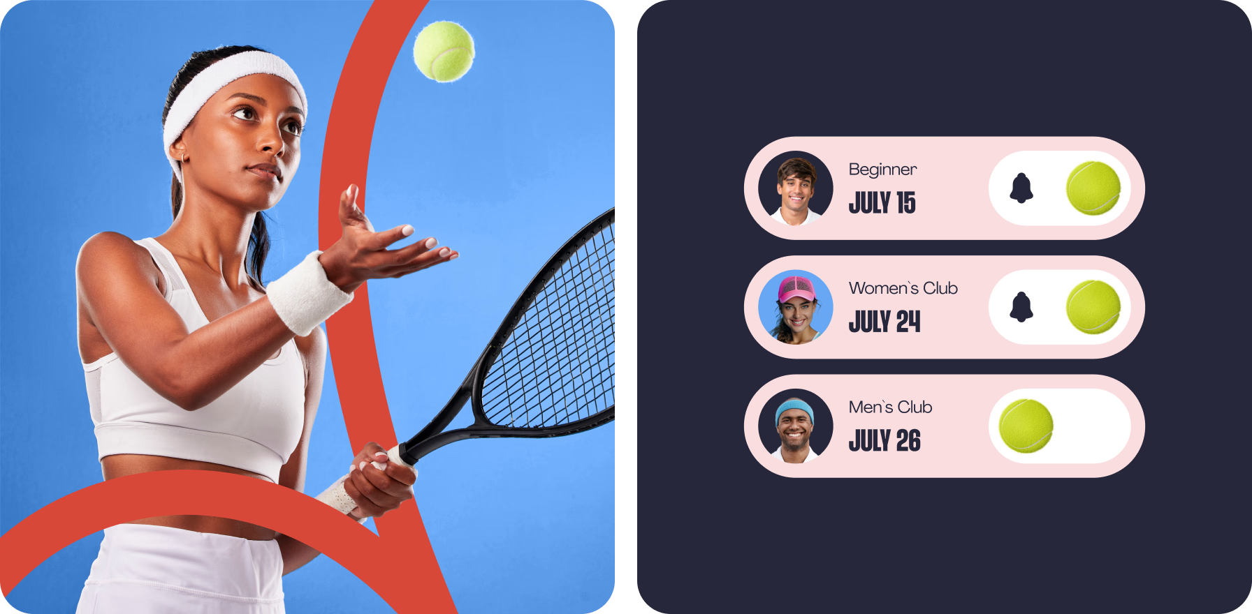
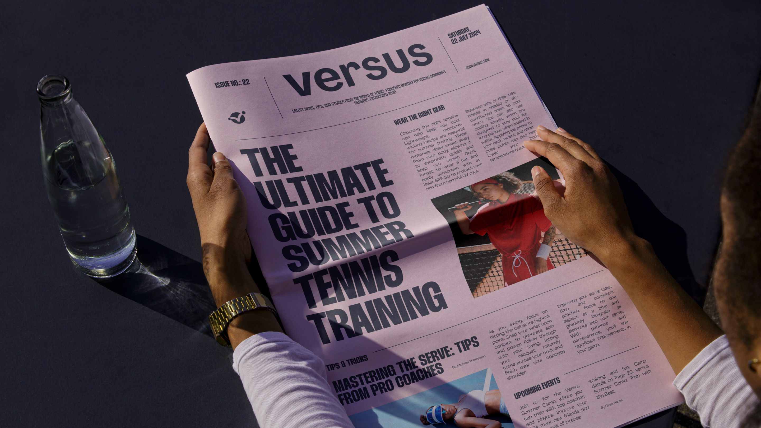
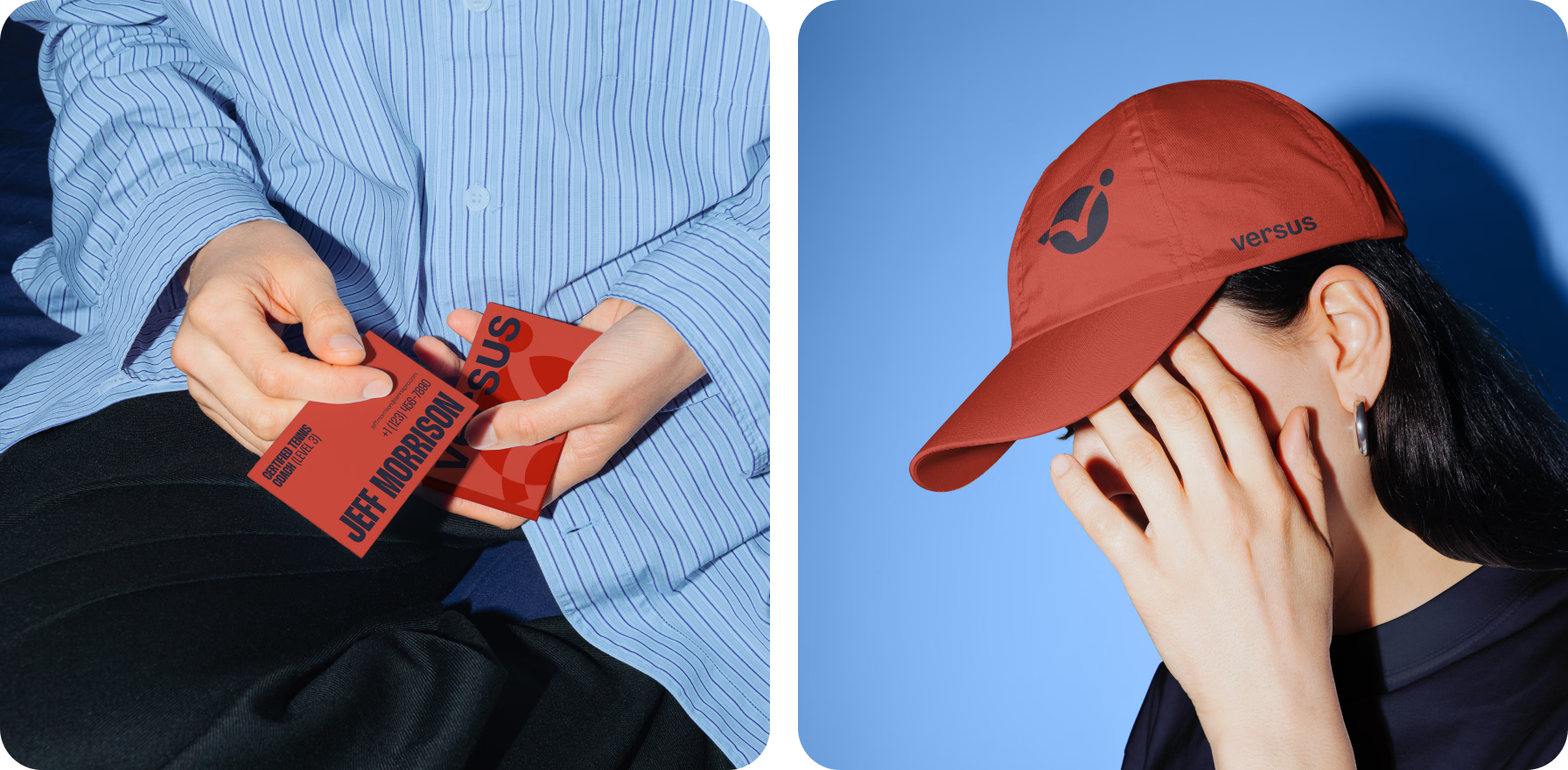
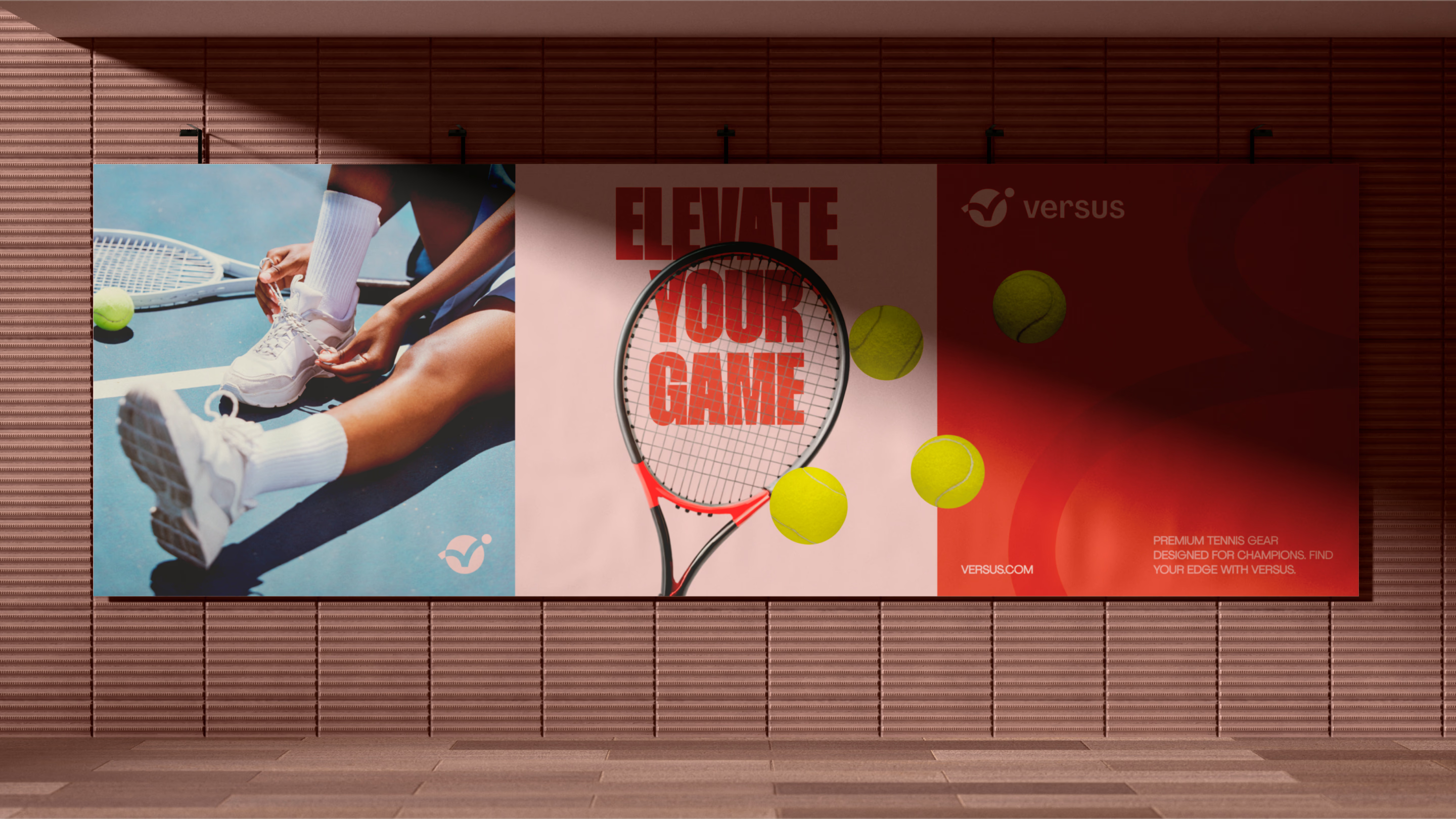
When it comes to engaging tennis players, we knew we had to nail the right vibe. So, we centered our branding around elements that look like tennis balls, making the connection to the sport clear and strong.
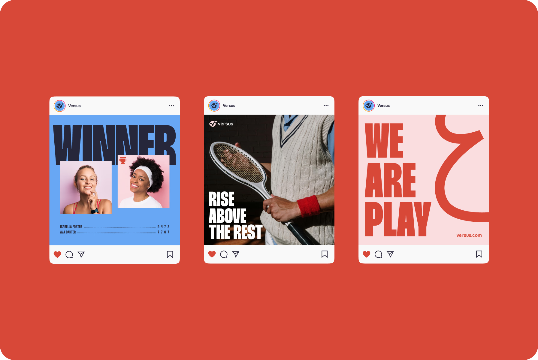
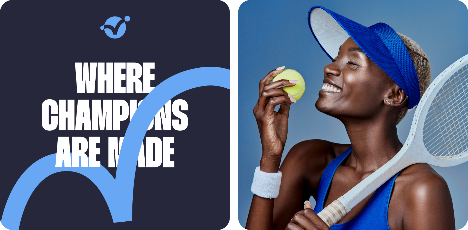
By combining a strong message and quality photos that resonate with the target audience, we set the right accents. The whole concept revolves around the idea that Versus is the place where champions are made.
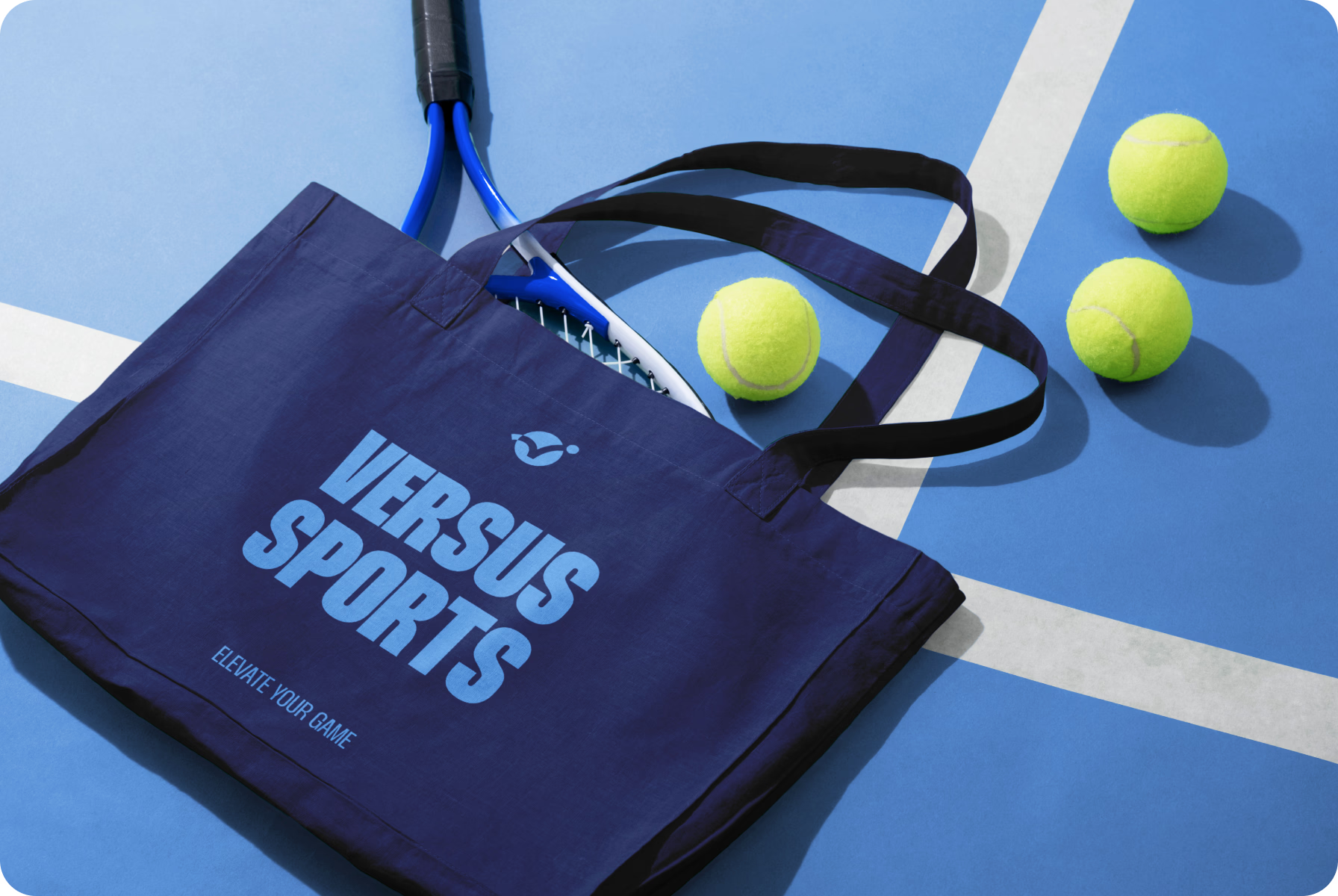
We took the lively energy of tennis and used it to shape our brand, with every element reflecting the spirit of the game.
{{mais-t}}