









Plantons is a tech-driven platform for botanical enthusiasts and plant lovers. Through innovative care solutions, it revolutionizes the way people cultivate thriving ecoscapes, regardless of their experience level.
The service includes personalized recommendations tailored to users’ specific greenery and lifestyle. By using this app, everyone can watch the plant collection flourish, transforming their home into a lush green oasis.
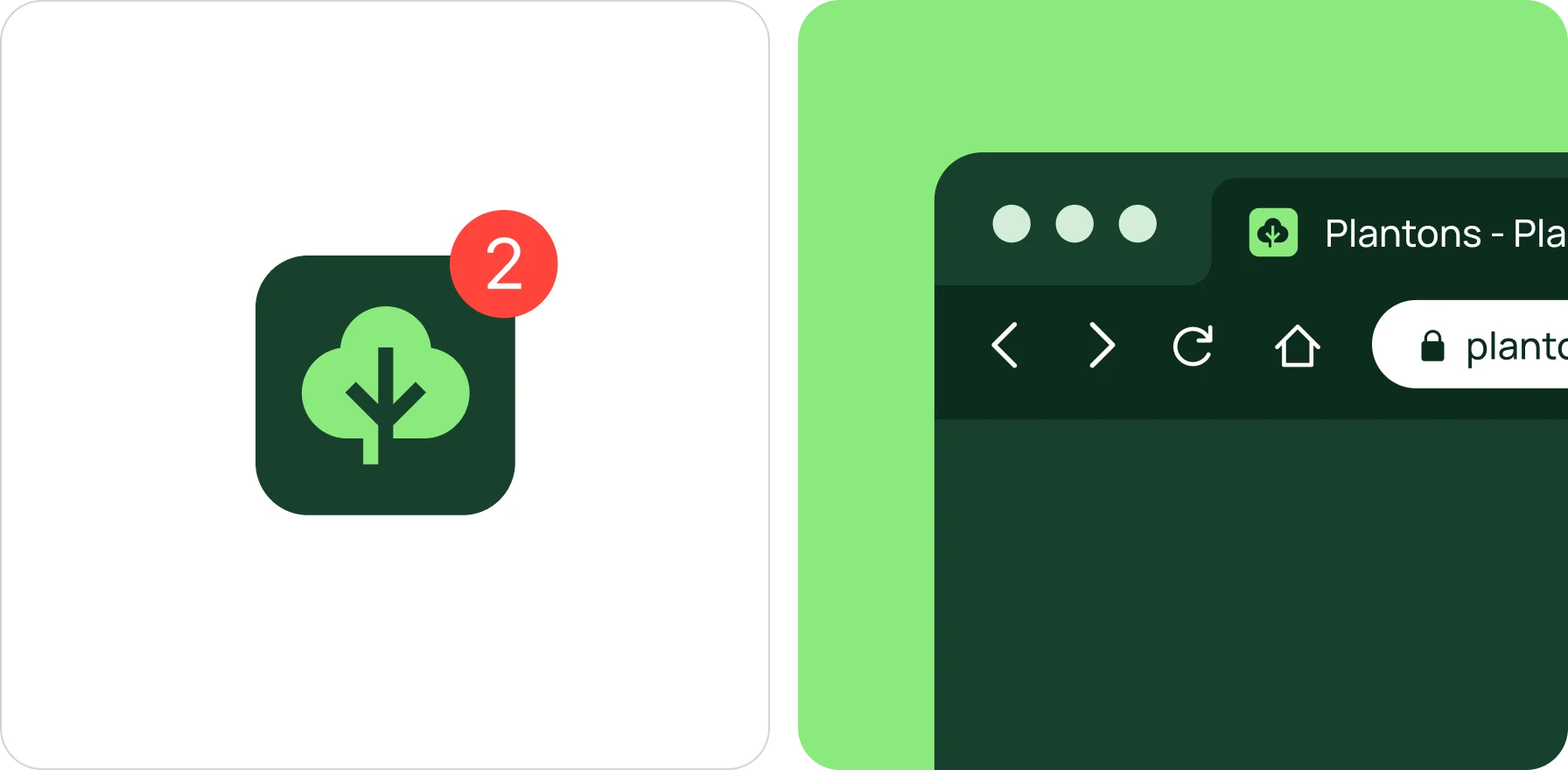
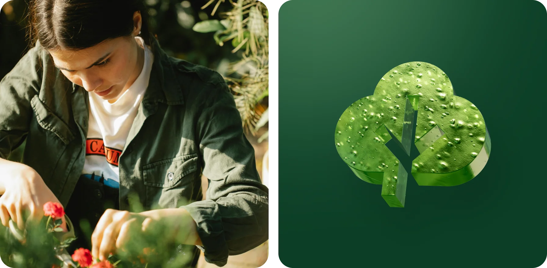
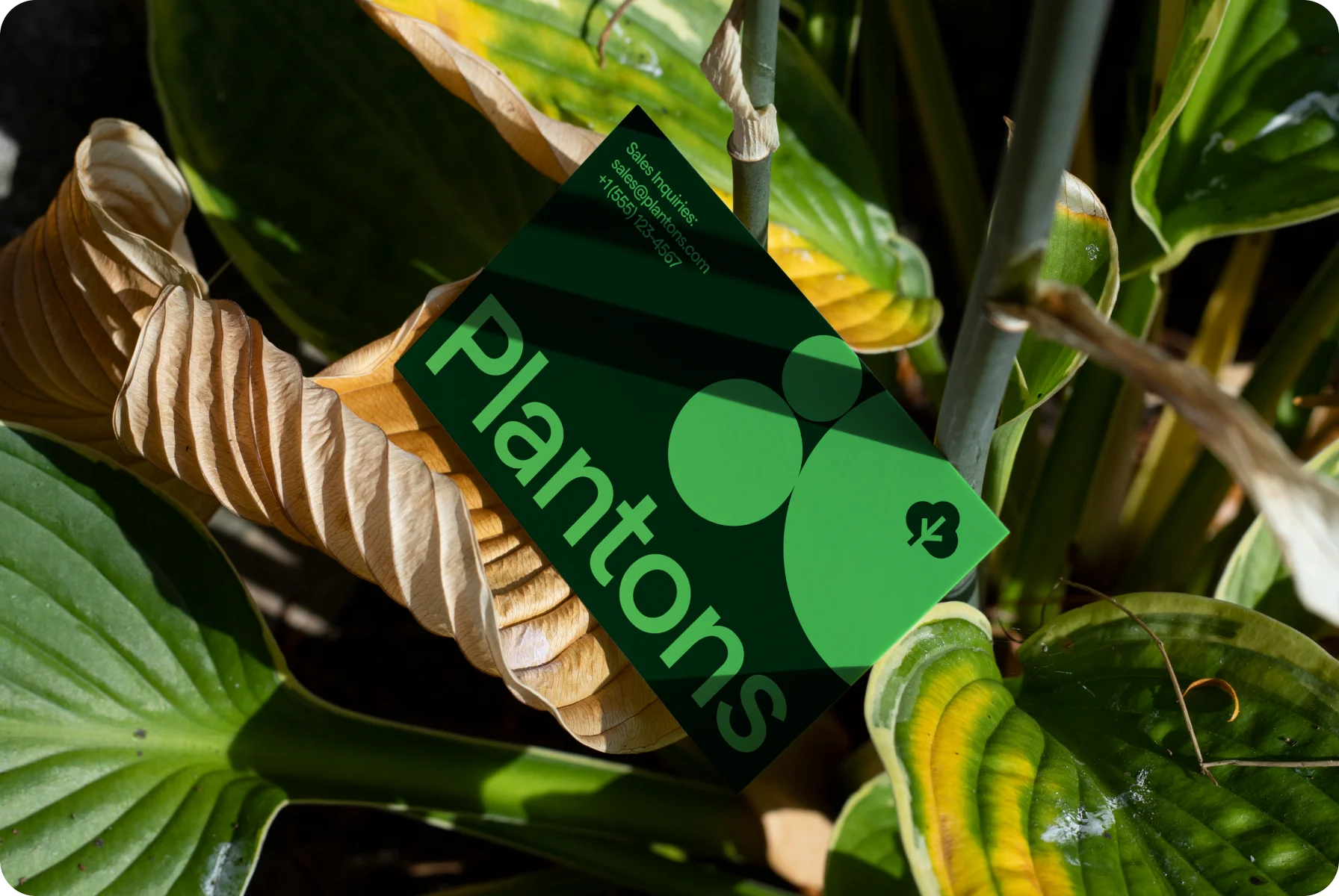
We created a logo that conveys the core company concepts — growth and vitality. At the heart of it lies a sturdy trunk adorned with dense foliage. This symbol evokes a sense of stability and new beginnings correspondingly.
With round-shaped leaves, we echoed nature’s endless cycle, symbolizing that plant care is an ongoing journey. Clean lines and a limited color palette (shades of green, of course!) make the logo fresh and approachable.
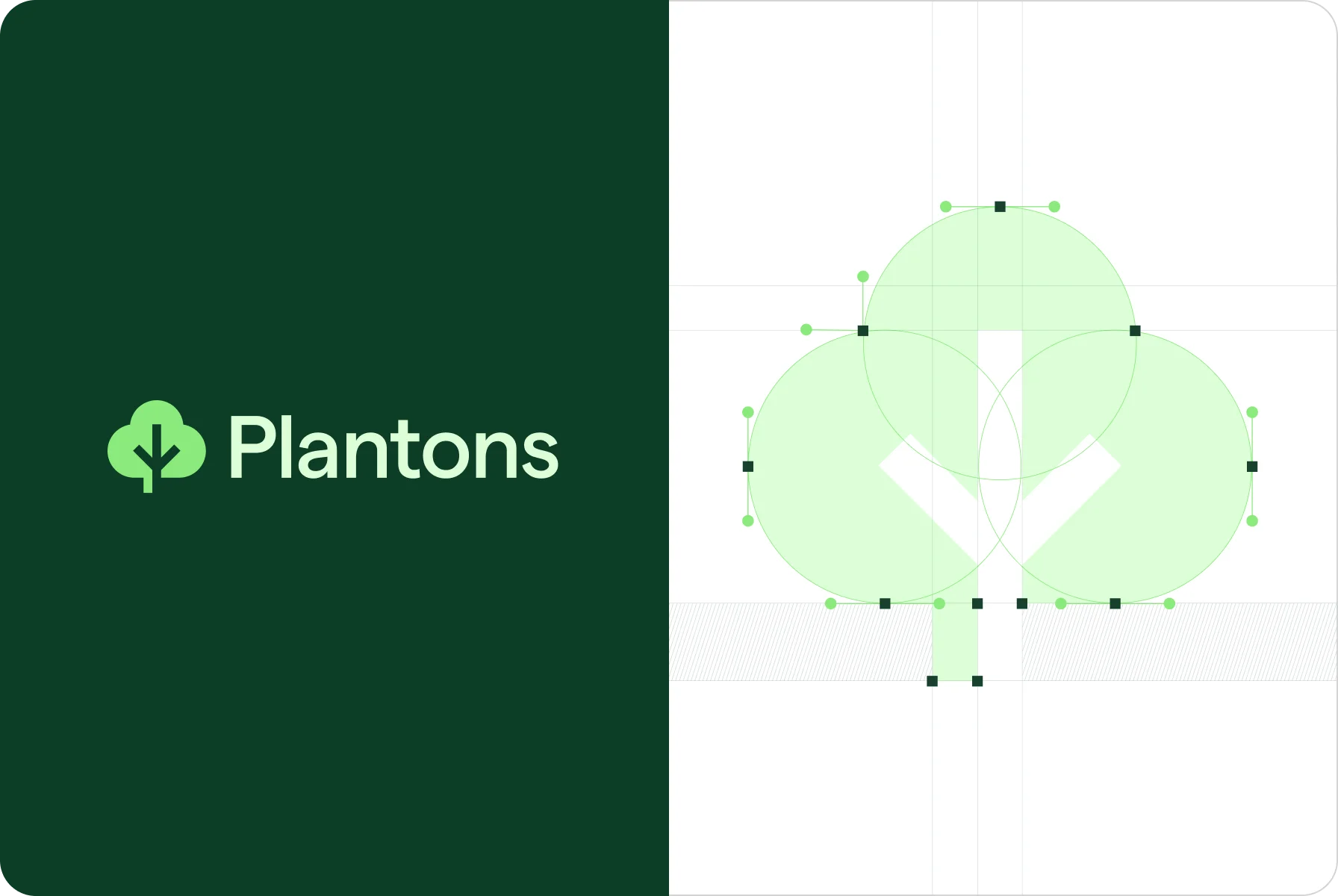
For this logo, we left out the sharp edges and went all in on circles — it feels organic and alive, like a healthy plant reaching for the sun!
{{mais-t}}
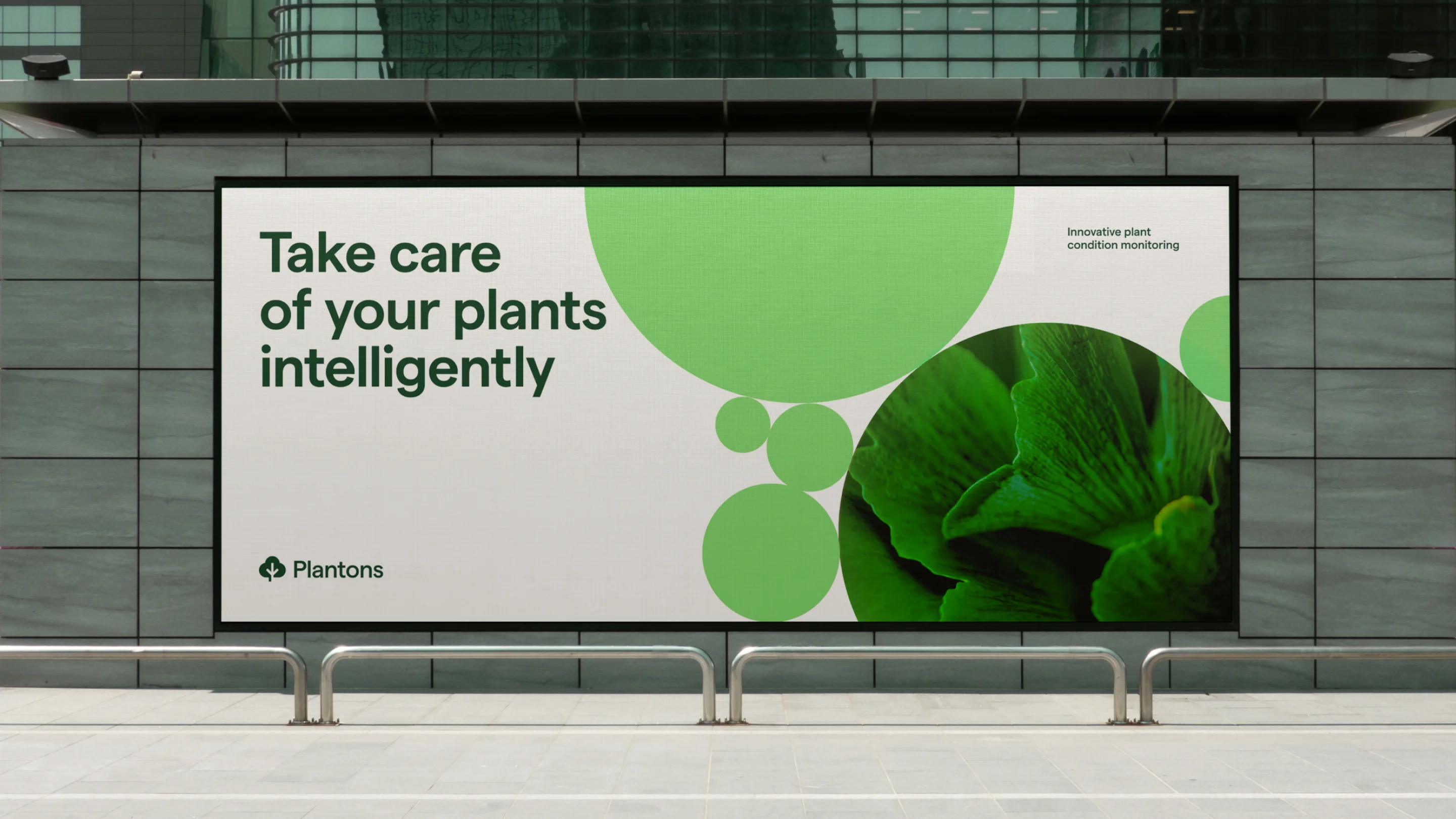
While working on design, we were inspired by nature itself. Our palette of greens ranges from soft jade to deep tones, reflecting vast landscapes. Flecks of sunny yellow add a touch of vibrancy, expressing the joy of nurturing life.
We chose Matter as the main font. Its clear forms make it easy to read even the most complex plant care guides. Together with sleek icons and charts, it blends organic beauty with modern functionality, making the app a joy to use.
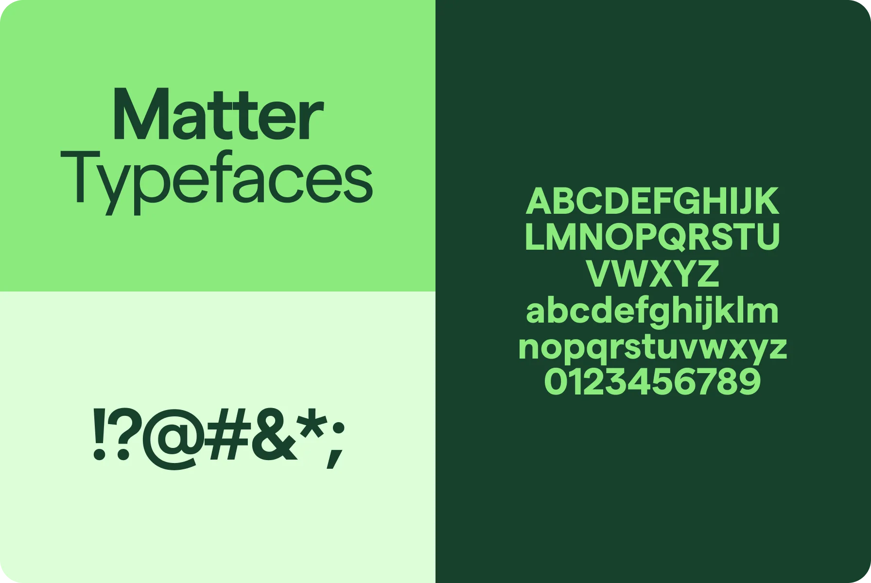
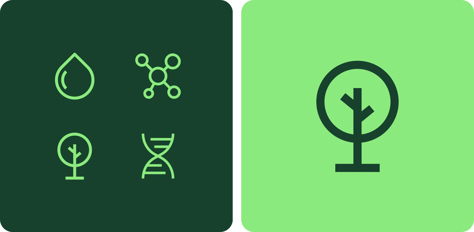
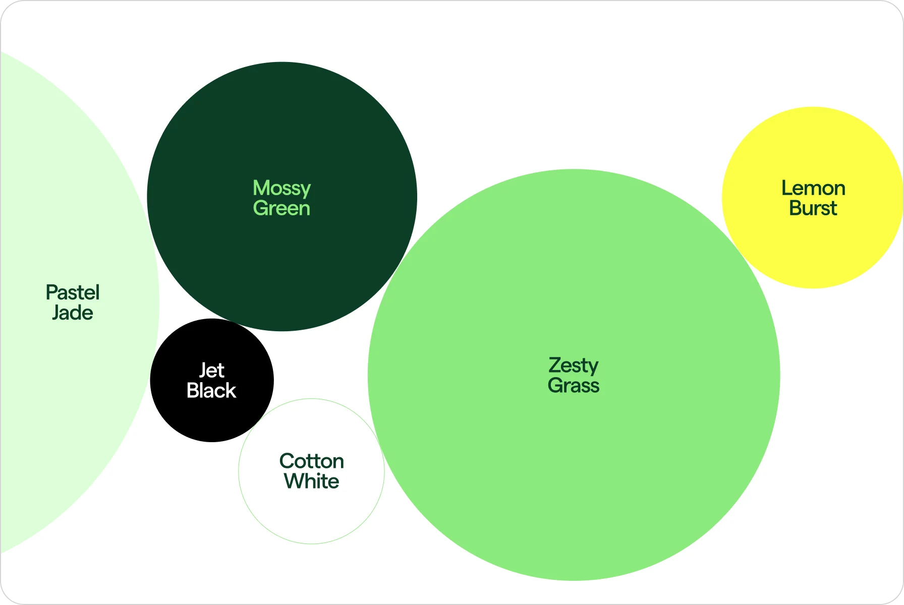

We used pleasant natural colors with easy-to-read font to make the app visually appealing for all plant lovers.
{{mais-t}}
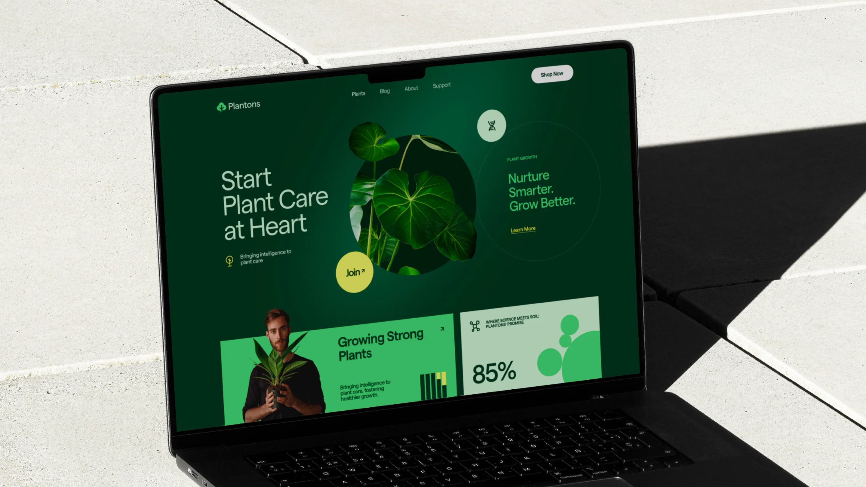
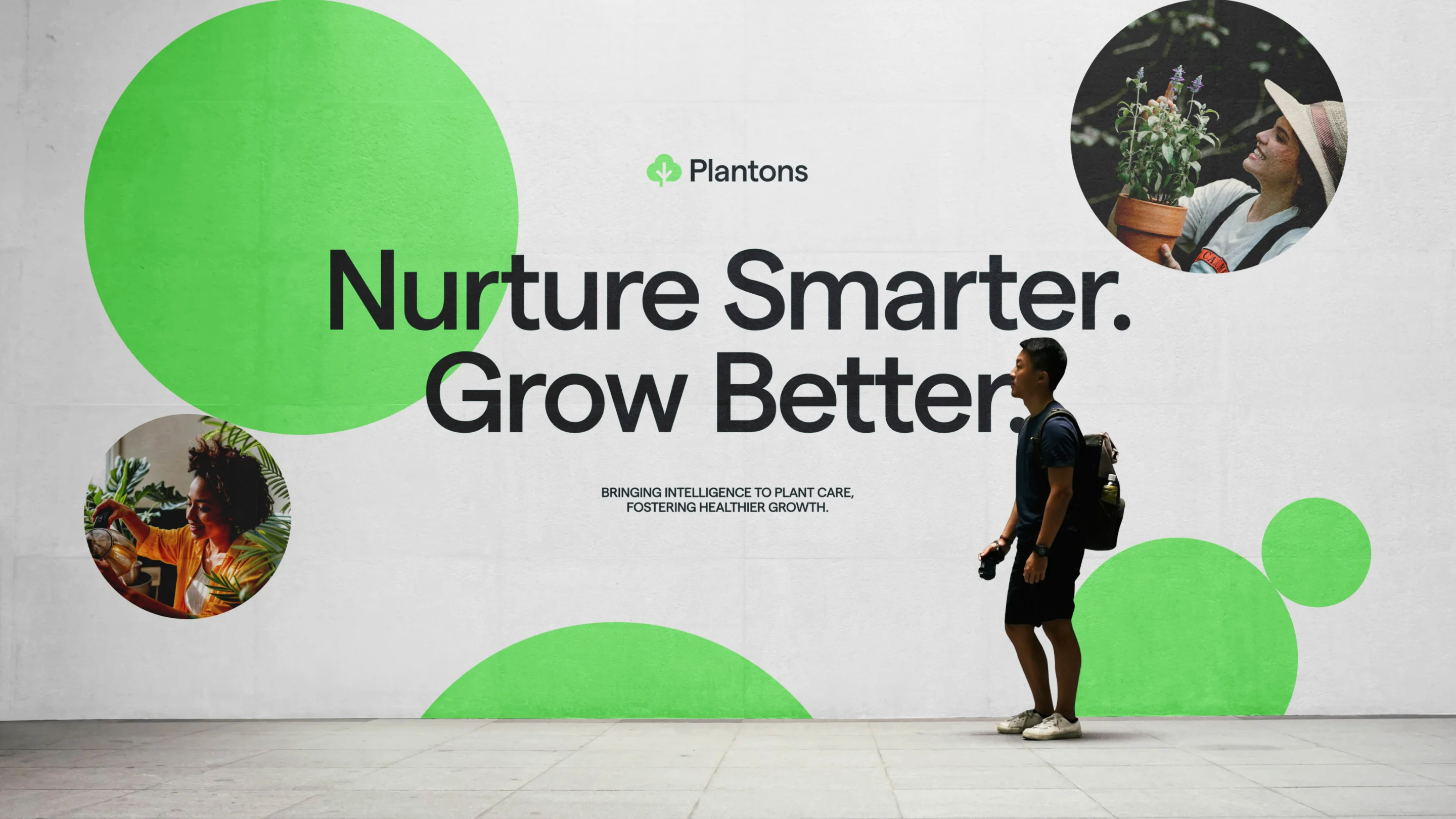
As for the brand, we focused on the beauty of gardening and the sense of fulfillment it brings. The circles, woven throughout our design elements, represent the cyclical nature of plant life and the endless possibilities it holds.
Also, we added photos of flowers and smiling faces immersed in the joy of pottering around. These images help attract people who want to take care of their leafy friends properly, creating a community of like-minded fellows.
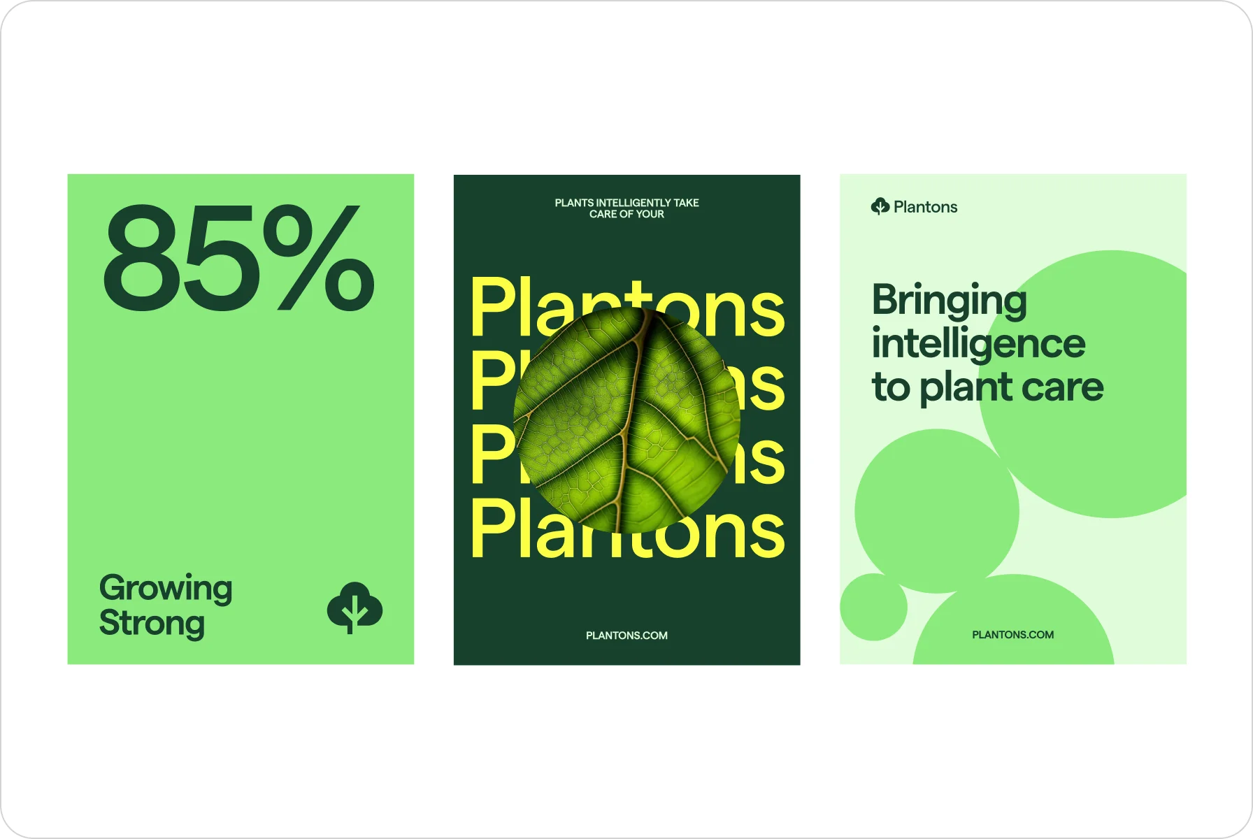
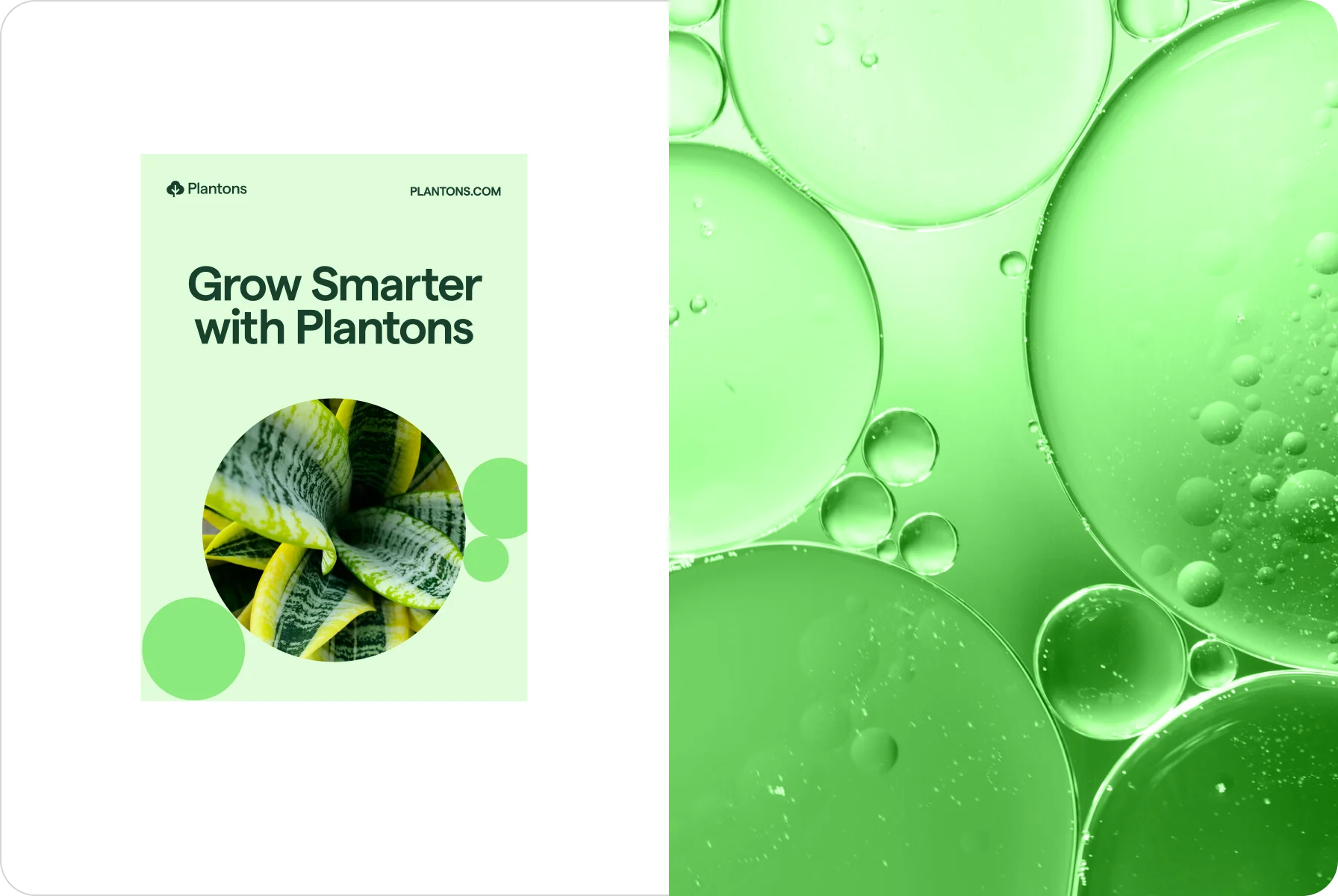
To make it interesting for users to navigate terminology and explore tips, we complemented the corporate identity with engaging color graphics.
{{mais-t}}