


Project’s backdrop
About the client
Spotbusiness is a real estate agency that provides both physical and virtual shared workspaces suitable for any type of business. Located in Casablanca, one of Morocco’s largest cities, the company offers bright and spacious offices with customization and flexible leasing terms. At Spotbusiness, everyone can find a well-organized and pleasant work environment while enjoying the stunning sea views, fresh air, and warm Moroccan sun.
{{services-provided}}
Client’s results
Spotbusiness is a subsidiary company of the Spotbills corporation. Since the inception, it has emphasized a strong commitment to the real estate industry and expanded to offer services in various areas, including business, sports, social messaging, art, electronics, and financial services. The company places its clients at the center of everything, continuously developing new products to meet their needs.
<div class="case__rich-result">
<ul>
<li>$5M Total Spotbills revenue</li>
<li>6 Large subsidiary companies</li>
</ul>
</div>
{{steps}}
Brand idea
Insightful “Lines” concept
We went the extra mile to craft a distinctive and personalized concept for Spotbusiness. It revolves around the lines used in various ways to portray the interconnectedness within the space. Each line has its own significance, symbolizing the unique journey that each individual takes as they work and collaborate within the coworking environment. By showcasing these individual paths, the concept embodies an easy-going, adaptable, and cozy coworking atmosphere, emphasizing Spotbusiness’s friendly identity and inviting environment.

Design focus
Main UI/UX goals
Once we established the brand mission, our focus shifted to finding the design goals. We understood that beyond text, the power of visuals, including images, colors, and fonts, was paramount in conveying the project’s mood and message. With this in mind, our team curated a collection of both captivating and functional elements, strategically placed to guide visitors’ attention to the key sections of the site. For the entire process, our primary goal was to create a user-friendly and intuitive interface that accurately conveys the vibrant essence of Spotbusiness coworking spaces.
{{steps2}}
Warm palette
Rich color mix
In our color selection process, we drew inspiration from the bright and lively atmosphere of Spotbusiness Marina, the client’s main workspace. As they asked, we maintained the original scheme and chose a versatile palette of eight colors — each was selected to harmoniously complement the others. Our color collection includes Blaze Orange, Powder Blue, Hit Pink, Mint Green, Kournikova, Woodsmoke, and Snow White. As a final flourish, we settled on a stunning Spot Blue accent, which adds a contemporary touch to the whole palette and evokes a sense of calmness, trustworthiness, and professionalism.

Mixed fonts
Sleek typography
For the website’s headlines, we selected an elegant and sophisticated Archia typeface in Medium weight. As an extra font choice, our designers incorporated minimalistic Helvetica Neue in three weights (Regular, Medium, and Bold) — it flawlessly suits the modern and versatile Archia, ensuring a harmonious and accessible typography experience for all users. Thanks to clean lines and rounded edges, these typefaces ensure readability and accessibility, perfectly aligning with the relaxed and casual spirit of Spotbusiness.

Final point
Spot on results
Thanks to the seamless project management process and open communication with the client, we nailed this project, presenting Spotbusiness in a whole new light. Our team put every effort into delivering a meaningful logo and brand icon along with UI/UX solutions that perfectly met the project’s specific needs and requirements. As a result, the client is thrilled with their distinctive and memorable brand, and customers can easily rent vibrant offices near the coast of Casablanca.

What’s a Rich Text element?
What’s a Rich Text element? sdffgdfgfghfgh
The rich text element allows you to create and format headings, paragraphs, blockquotes, images, and video all in one place instead of having to add and format them individually. Just double-click and easily create content.
The rich text element allows you to create and format headings, paragraphs, blockquotes, images, and video all in one place instead of having to add and format them individually. Just double-click and easily create content.
- Sdfdfg
- Dfgdfgfdg
- dfgdfgfd
- Dfgdfg
dfgdf gdfg dfgdfgidfgiudf gdf ugidfugidf ugid
- dfgfdg
- dfgdfg
dghjghj - dfgdfg
- dfgdfg
The rich text element allows you to create and format headings, paragraphs, blockquotes, images, and video all in one place instead of having to add and format them individually. Just double-click and easily create content.
- 01 dfgdfgd
- 01 dfgfdg
- 01 dfgdfg
- 01 dfgdfg
The rich text element allows you to create and format headings, paragraphs, blockquotes, images, and video all in one place instead of having to add and format them individually. Just double-click and easily create content.
The rich text element allows you to create and format headings, paragraphs, blockquotes, images, and video all in one place instead of having to add and format them individually. Just double-click and easily create content.
The rich text element allows you to create and format headings, paragraphs, blockquotes, images, and video all in one place instead of having to add and format them individually. Just double-click and easily create content.
The rich text element allows you to create and format headings, paragraphs, blockquotes, images, and video all in one place instead of having to add and format them individually. Just double-click and easily create content.
The rich text element allows you to create and format headings, paragraphs, blockquotes, images, and video all in one place instead of having to add and format them individually. Just double-click and easily create content.

The rich text element allows you to create and format headings, paragraphs, blockquotes, images, and video all in one place instead of having to add and format them individually. Just double-click and easily create content.
dfgdfgdfg
The main goal of our client was to build a patient-friendly platform with a positive and stress-free approach. As not every person is a tech guru, it was also crucial to simplify the website’s functionality, creating an intuitive interface with different languages available. Besides, the client put a strong emphasis on data security, as sensitive information about patients’ health must always remain confidential.
sdfsdfsdfsdfdg
The main goal of our client was to build a patient-friendly platform with a positive and stress-free approach. As not every person is a tech guru, it was also crucial to simplify the website’s functionality, creating an intuitive interface with different languages available. Besides, the client put a strong emphasis on data security, as sensitive information about patients’ health must always remain confidential.
Technologies used
To verify various hypotheses and to better understand what users wanted, the client conducted A/B testing and, based on this analysis, generated various tasks for us to implement. Some users were directed to the unaltered version of the site, and some would see the new one. One of the intriguing cases involved the testing of website registration methods:
- 01Through the simple page with a brief registration form and an image of a unit’s exterior.

- 01Through the simple page with a brief registration form and an image of a unit’s exterior.
To verify various hypotheses and to better understand what users wanted, the client conducted A/B testing and, based on this analysis, generated various tasks for us to implement. Some users were directed to the unaltered version of the site, and some would see the new one. One of the intriguing cases involved the testing of website registration methods:
Results in numbers
Once we had developed the configurator and Mighty Buildings concluded the lengthy closed beta testing, they launched their product publicly, raising $40 Million in Series B Funding. And they haven’t stopped there — during the subsequent funding campaigns, they’ve raised more than $100M from leading investors, including Khosla Ventures and Arctern Ventures.
- $40M
Raised in series B Funding - $40M
Raised in series B Funding - $40M
Raised in series B Funding
Pain points
The most challenging part of the project was creating an awesome identity for Spotbusiness that matched the fun, energetic vibe of its offices. To make it happen, we needed to give the company’s digital presence a complete makeover. This involved creating a cool logo, an effective branding strategy, and a user-friendly UI/UX design with lots of catchy, vibrant details. Overall, our key goal was to ensure the website looked and felt as terrific as Spotbusiness itself.

Solutions
Armed with insights about the client’s pain points, we eagerly began the journey of crafting a distinctive identity for Spotbusiness. To achieve this goal, our designers created a captivating logo, memorable brand icon, and harmonious color palette, carefully selecting typography, personalized images, and attractive containers with icons. These elements were seamlessly mixed together, resulting in a well-structured and eye-catching website for the workspace by the sea.

Pain points
The most challenging part of the project was creating an awesome identity for Spotbusiness that matched the fun, energetic vibe of its offices. To make it happen, we needed to give the company’s digital presence a complete makeover. This involved creating a cool logo, an effective branding strategy, and a user-friendly UI/UX design with lots of catchy, vibrant details. Overall, our key goal was to ensure the website looked and felt as terrific as Spotbusiness itself.
Solutions
Armed with insights about the client’s pain points, we eagerly began the journey of crafting a distinctive identity for Spotbusiness. To achieve this goal, our designers created a captivating logo, memorable brand icon, and harmonious color palette, carefully selecting typography, personalized images, and attractive containers with icons. These elements were seamlessly mixed together, resulting in a well-structured and eye-catching website for the workspace by the sea.
Redux and Redux-saga
To handle data management, we employed Redux and Redux-saga. The Redux library helps us manage the state of the application in a centralized and predictable manner, while Redux-saga enables us to manage and test side-effects such as data fetching and backend communication.
The combination of these libraries has allowed us to create a robust and maintainable front-end that is capable of handling large amounts of data and state changes.Redux and Redux-saga
Abstract logo
Our team crafted a one-of-a-kind logo for Spotbusiness, integrating the company name with a bespoke font featuring geometric shapes and striking lettering. After extensive testing, we determined that the logo shines in various hues, ultimately selecting a vibrant violet color that harmonizes with the primary website palette, accentuated by a touch of Spot Blue. With meticulous attention to detail, the logo perfectly captures Spotbusiness, reflecting its uncommon identity.

Cut-corner images
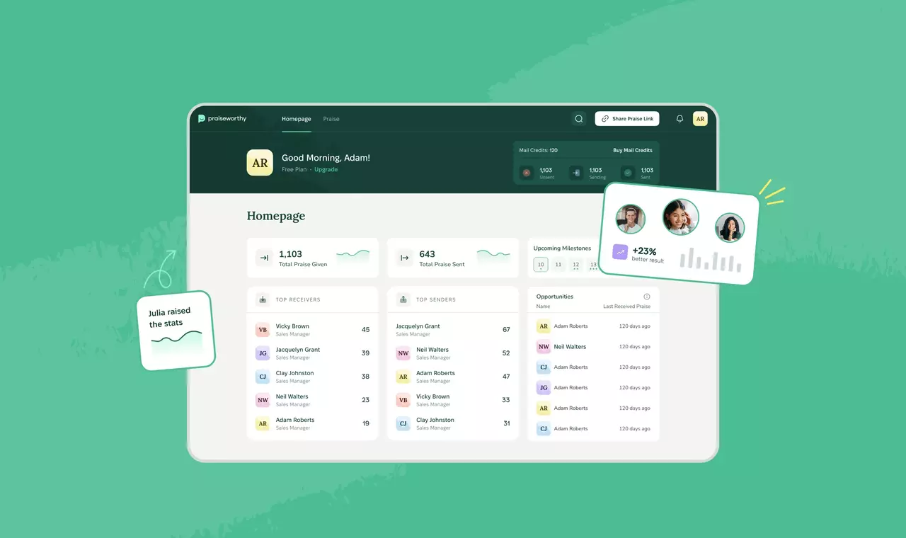
To enhance the visual appeal and individuality of Spotbusiness's website, our designers utilized unique "frames" — containers — to showcase images. We incorporated three distinct image types, including architectural shots, interior design elements, and work process photos, all capturing the productive and inviting ambiance of the workspace. These images were thoughtfully placed within containers featuring a stylish cut-corner design, enabling us to include more CTA content to further enhance user engagement.

Personalized icons
We crafted icons in gentle, muted shades that harmonized with the primary color palette of blue, pink, and orange. To maintain coherence with images, our designers placed these icons within circular containers. Besides, we opted for charming “labels” that consist of the brand icon accompanied by various texts, imparting a personal touch and fostering a sense of familiarity. These custom icons incorporate user pictures, symbolizing how Spotbusiness appreciates its customers. Using this approach, we aimed to facilitate deeper connections between the client and their target audience, employing positive messaging and a smooth user experience.

Abstract logo
Our team crafted a one-of-a-kind logo for Spotbusiness, integrating the company name with a bespoke font featuring geometric shapes and striking lettering. After extensive testing, we determined that the logo shines in various hues, ultimately selecting a vibrant violet color that harmonizes with the primary website palette, accentuated by a touch of Spot Blue. With meticulous attention to detail, the logo perfectly captures Spotbusiness, reflecting its uncommon identity.
Cut-corner images
To enhance the visual appeal and individuality of Spotbusiness's website, our designers utilized unique "frames" — containers — to showcase images. We incorporated three distinct image types, including architectural shots, interior design elements, and work process photos, all capturing the productive and inviting ambiance of the workspace. These images were thoughtfully placed within containers featuring a stylish cut-corner design, enabling us to include more CTA content to further enhance user engagement.
Personalized icons
We crafted icons in gentle, muted shades that harmonized with the primary color palette of blue, pink, and orange. To maintain coherence with images, our designers placed these icons within circular containers. Besides, we opted for charming “labels” that consist of the brand icon accompanied by various texts, imparting a personal touch and fostering a sense of familiarity. These custom icons incorporate user pictures, symbolizing how Spotbusiness appreciates its customers. Using this approach, we aimed to facilitate deeper connections between the client and their target audience, employing positive messaging and a smooth user experience.

Halo Lab has delivered really neat designs, and we’ve been satisfied with the new logo and website.
Senior Project Manager


Thank you!
We will contact you ASAP!

Hmm...something went wrong. Please try again 🙏
Our clients say


